Data Vis Dispatch, March 29

The best of last week’s big and small data visualizations

Welcome back to the 38th edition of Data Vis Dispatch! Every week, we’ll be publishing a collection of the best small and large data visualizations we find, especially from news organizations — to celebrate data journalism, data visualization, simple charts, elaborate maps, and their creators.

Recurring topics this week include climate change and war in Ukraine.

The war in Ukraine continues after a full month of fighting. Among the new maps from this week, our attention was particularly captured by the New York Times’ count of Russian strikes on civilian targets and the Neue Zürcher Zeitung’s look at how different sources are reporting the war:

The New York Times: Russia’s Attacks on Civilian Targets Have Obliterated Everyday Life in Ukraine, March 23
Neue Zürcher Zeitung: Was wir auf unserer Ukraine-Karte zeigen und wieso sie anders aussieht als jene von anderen Medien, March 25

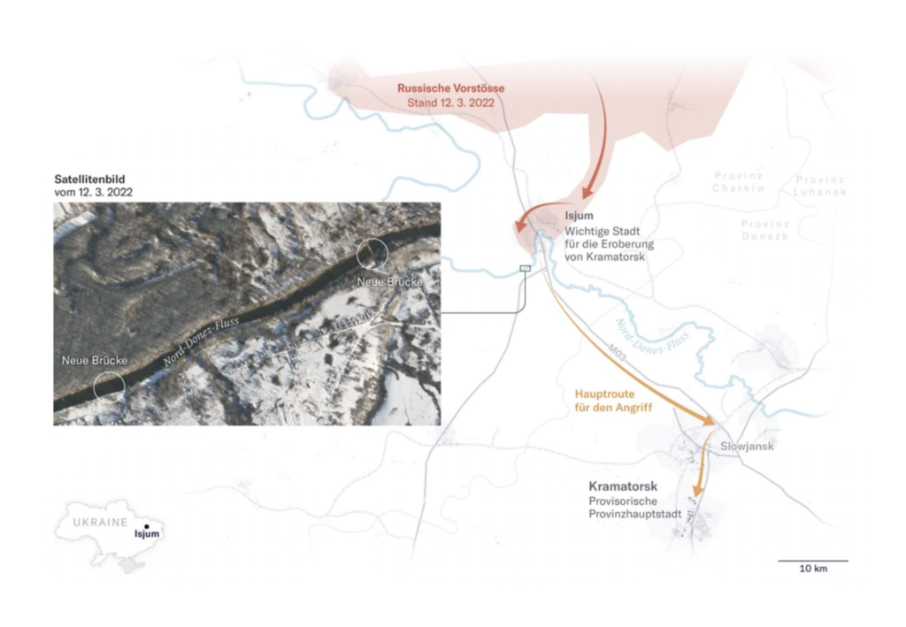
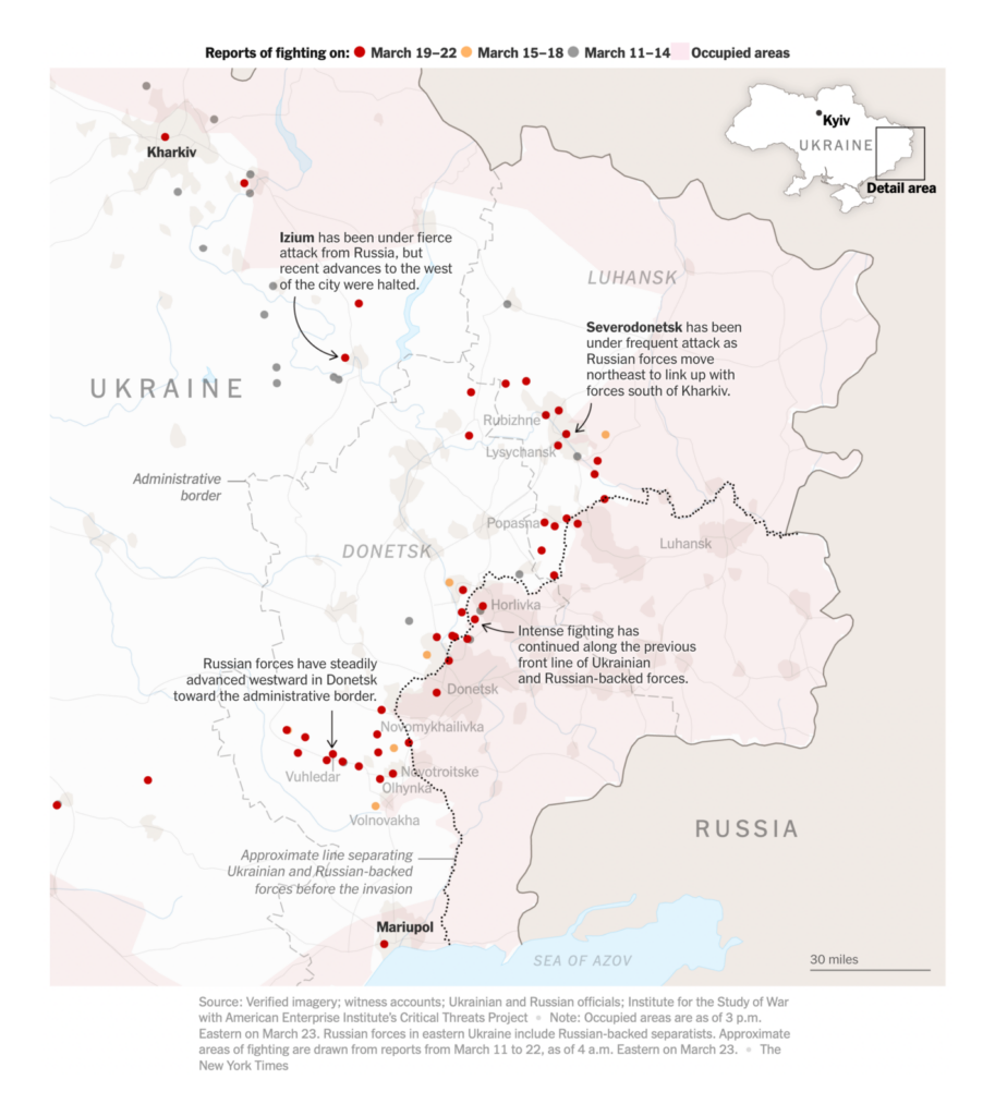
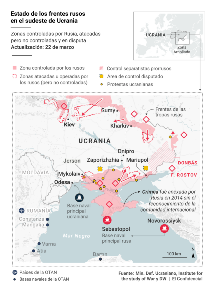
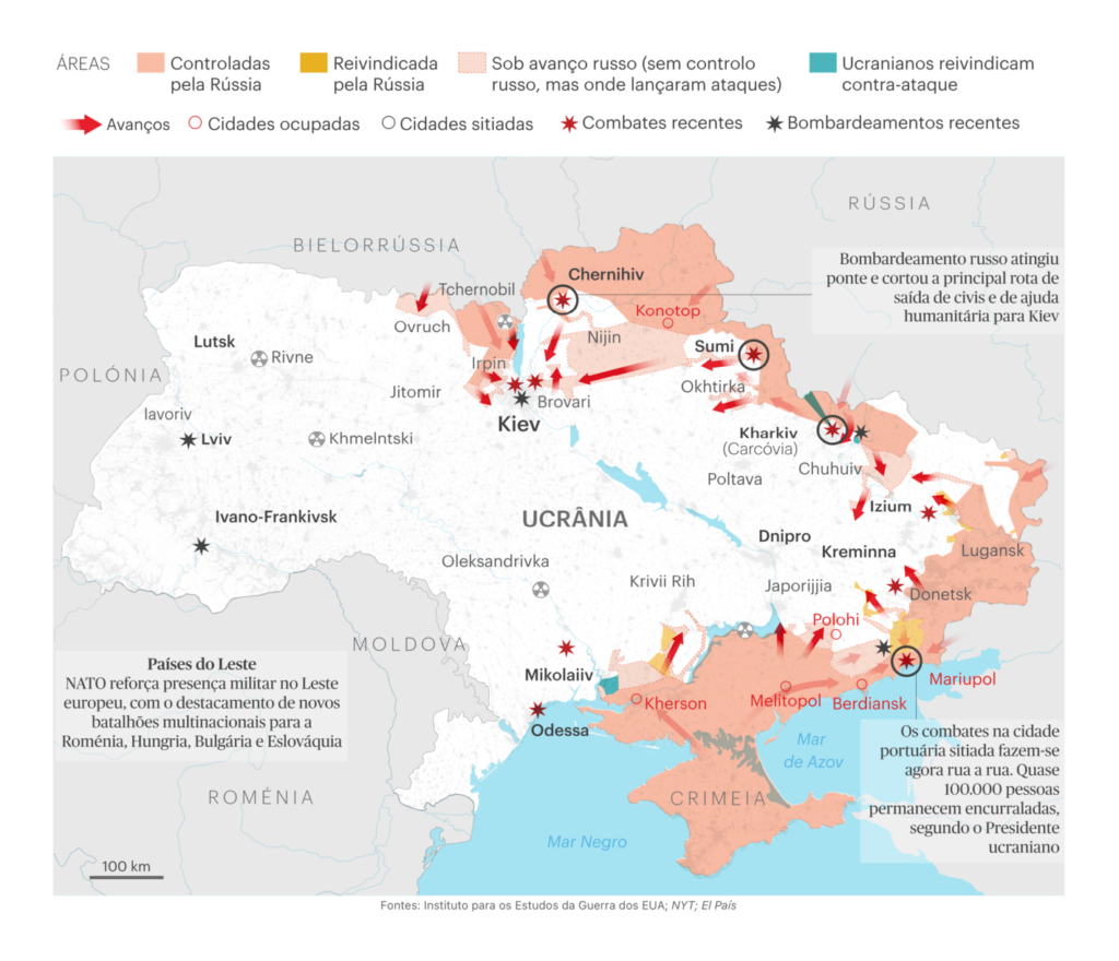
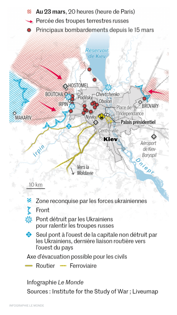
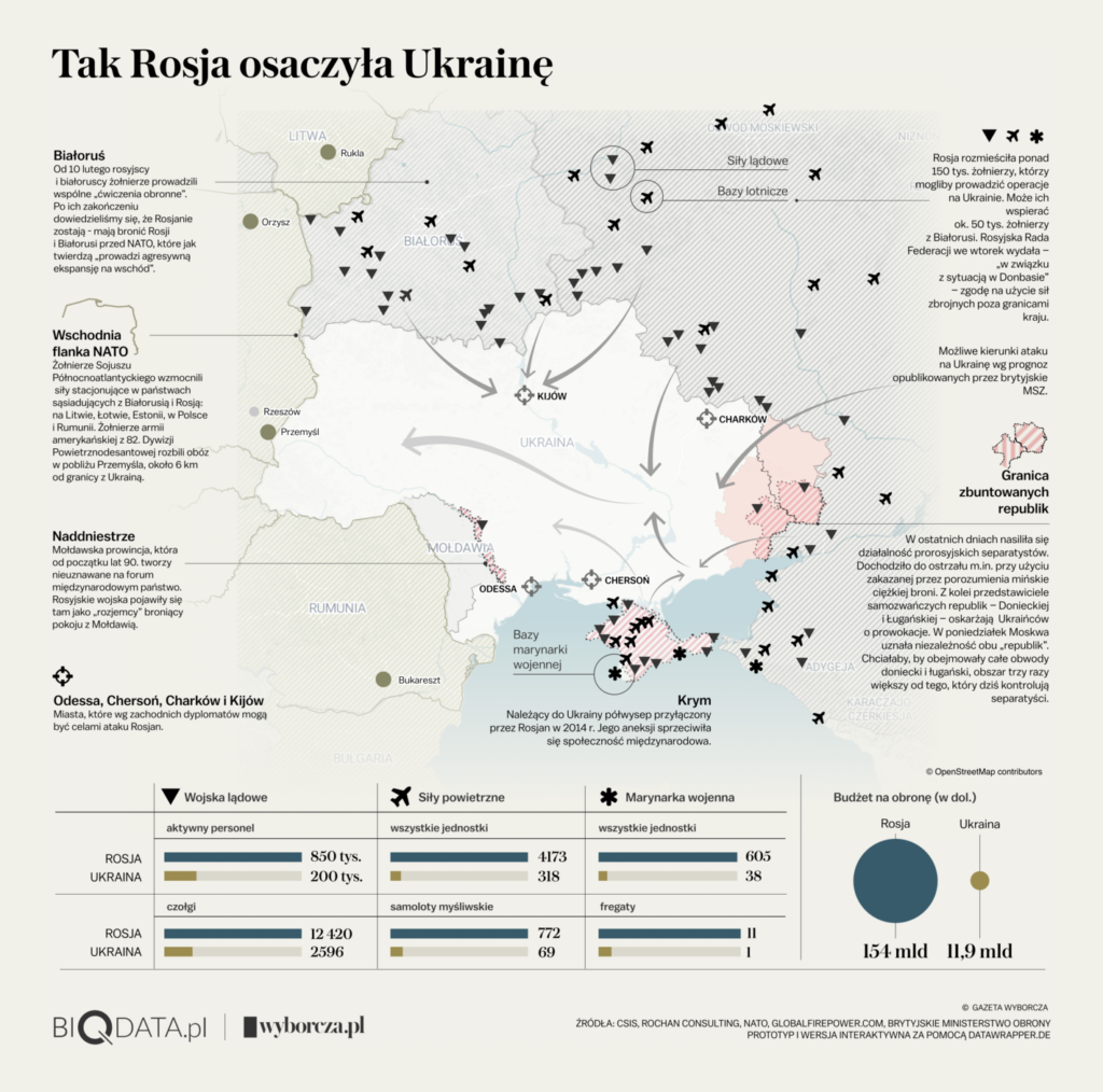
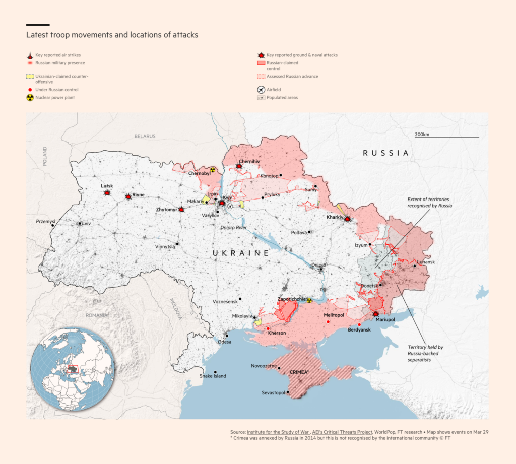
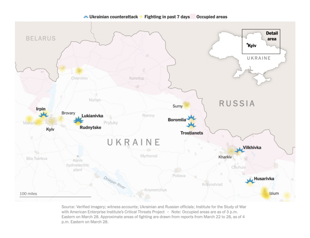
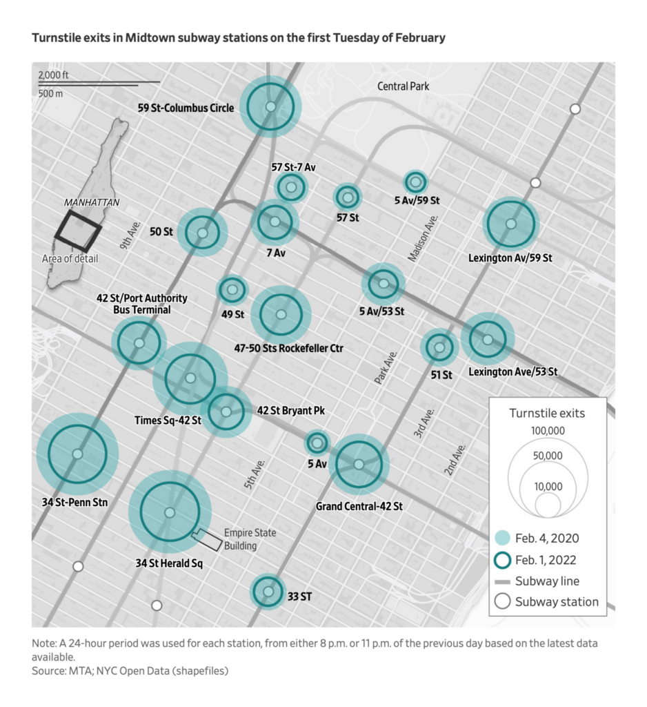
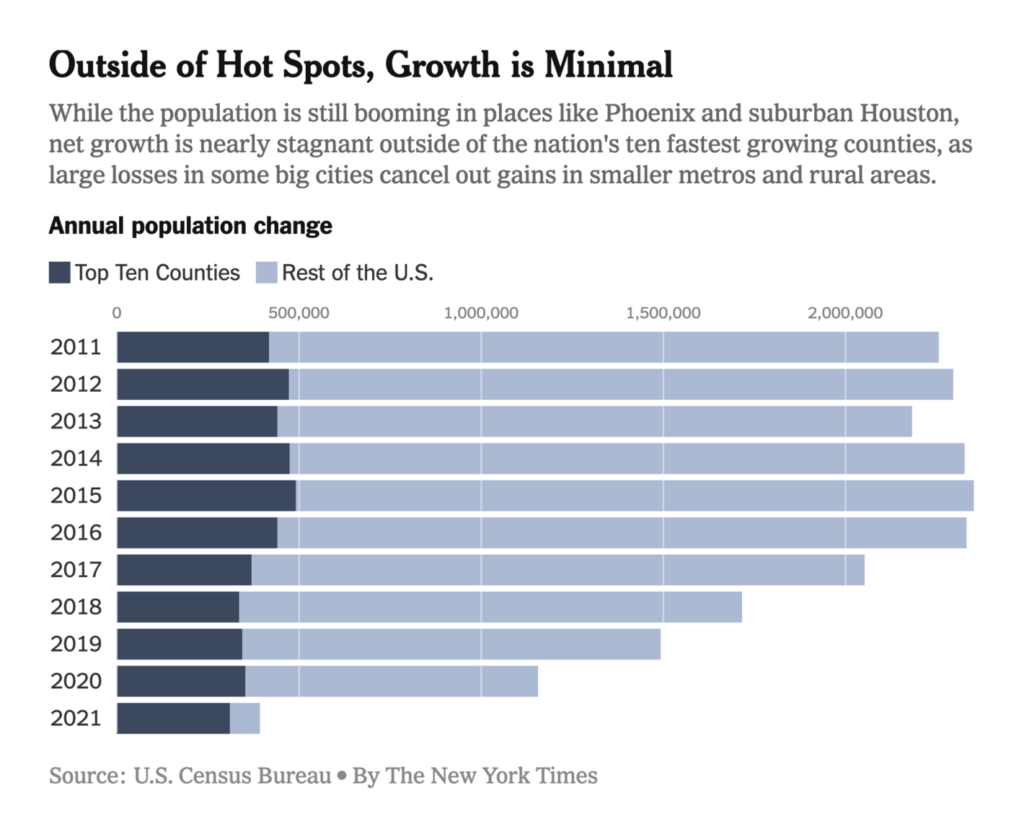
Other new maps are shown here in chronological order:

Neue Zürcher Zeitung: Ukrainer erobern mehrere Gebiete zurück – diese Karte zeigt den Stand des Krieges, March 22
The New York Times: Where Russian forces have made advances in eastern Ukraine, March 23
El Confidencial: La tenaza de Putin: un asalto terrestre y anfibio para tomar la ‘perla’ del March Negro, March 23
Publico: Um mês de invasão da Ucrânia: como evoluiu a guerra, March 24
Le Monde: Guerre en Ukraine : le front au nord-ouest de Kiev sous un déluge de feu, March 24
Gazeta Wyborcza: Atak Rosji na Ukrainę. Wojska Putina nie potrafią przełamać linii obrony, tracą kolejnych generałów, March 28
Financial Times: Russia’s invasion of Ukraine in maps — latest updates, March 29
The New York Times: Where Ukrainian forces have mounted counterattacks in the northeast, March 29

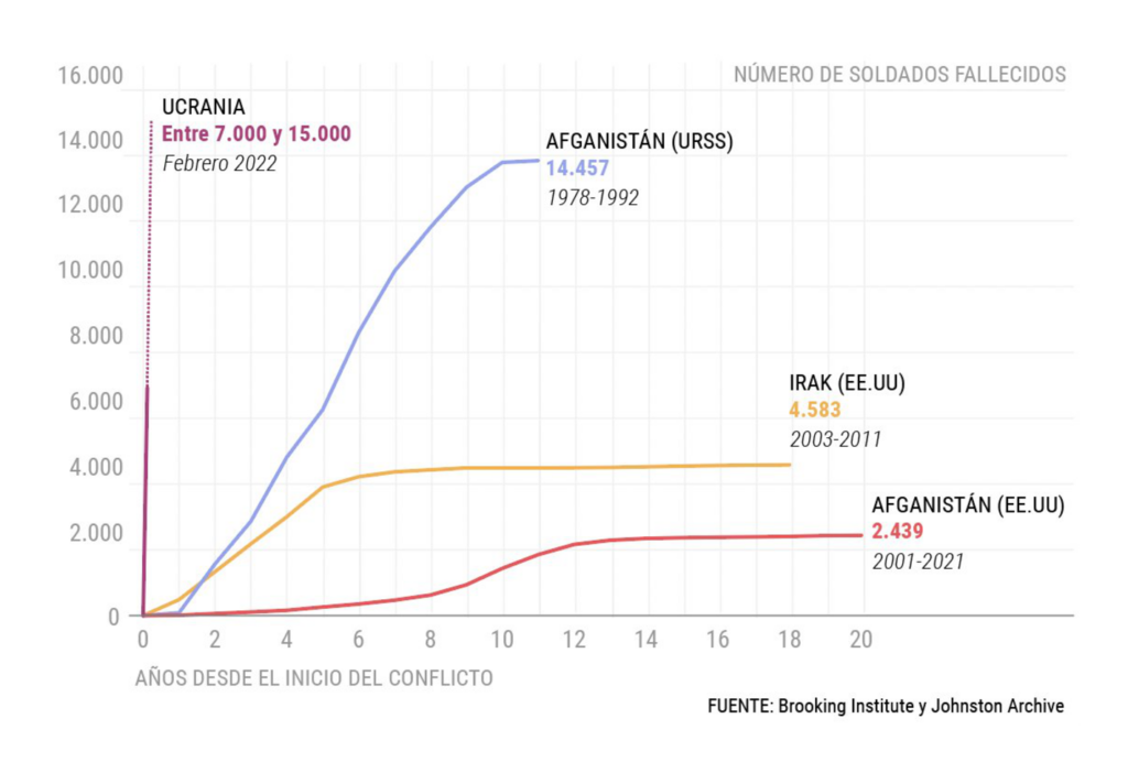
These two charts, from El Confidencial and La Vanguardia, visualize the same data to show how Russian casualties in Ukraine compare to wars from the past:

El Confidencial: ¿Cuántos soldados rusos han muerto en Ucrania?, March 24
Laura Aragó: “Si la xifra de 1.531 facilitada pel govern rus fós real, la velocitat de les baixes continuaria sent més alta que a l’Afganistan, on al llarg de 14 anys van morir 14.457 soldats,” March (Tweet, Source)

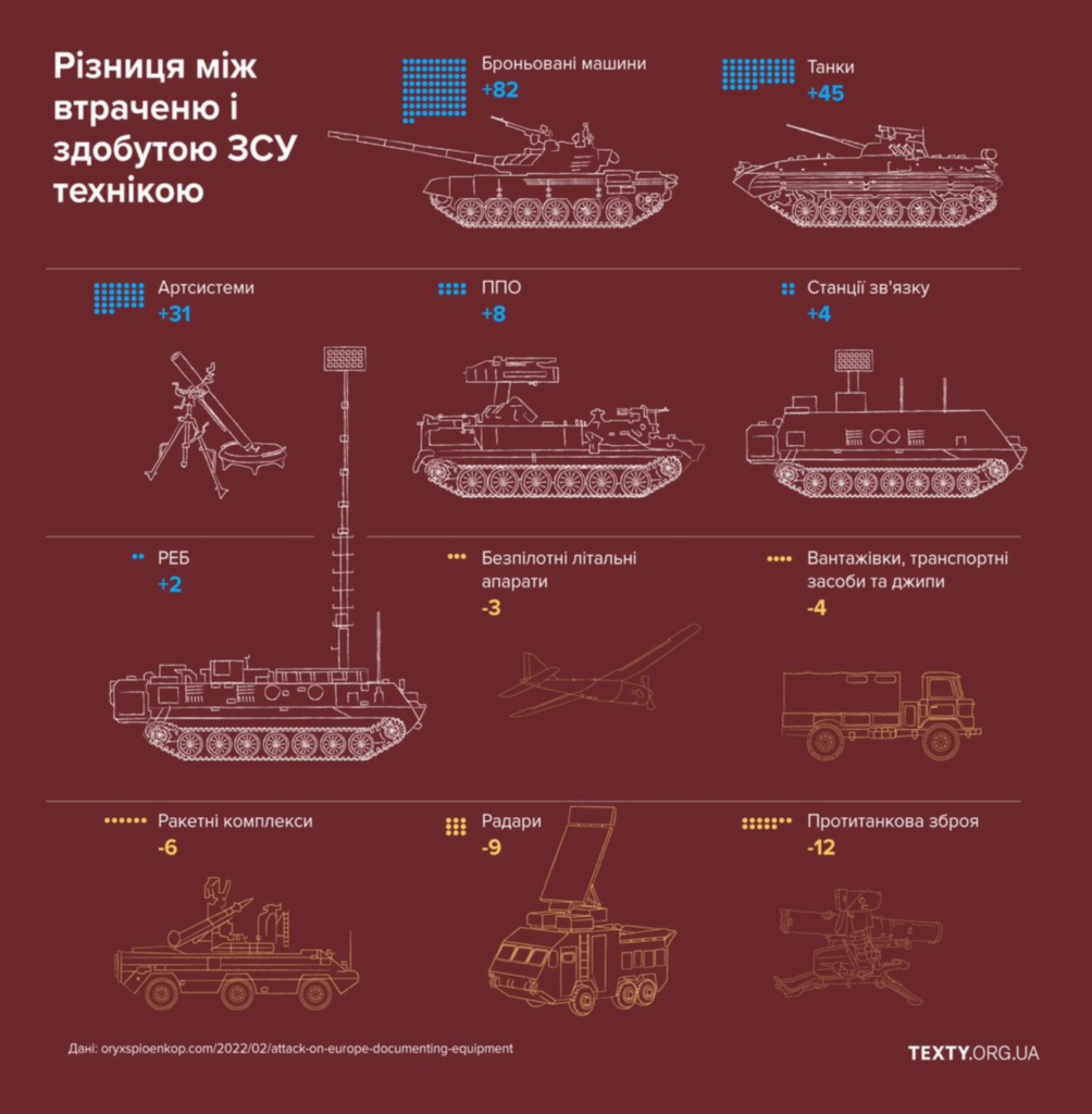
Texty looked at the loss and capture of arms and equipment:

Texty: Трофеї. У ЗСУ зараз більше танків, ніж на початку війни (Інфографіка), March 25

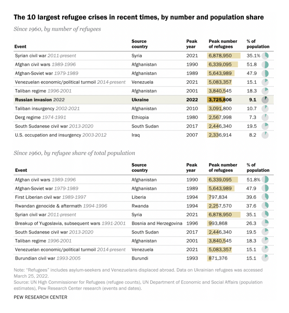
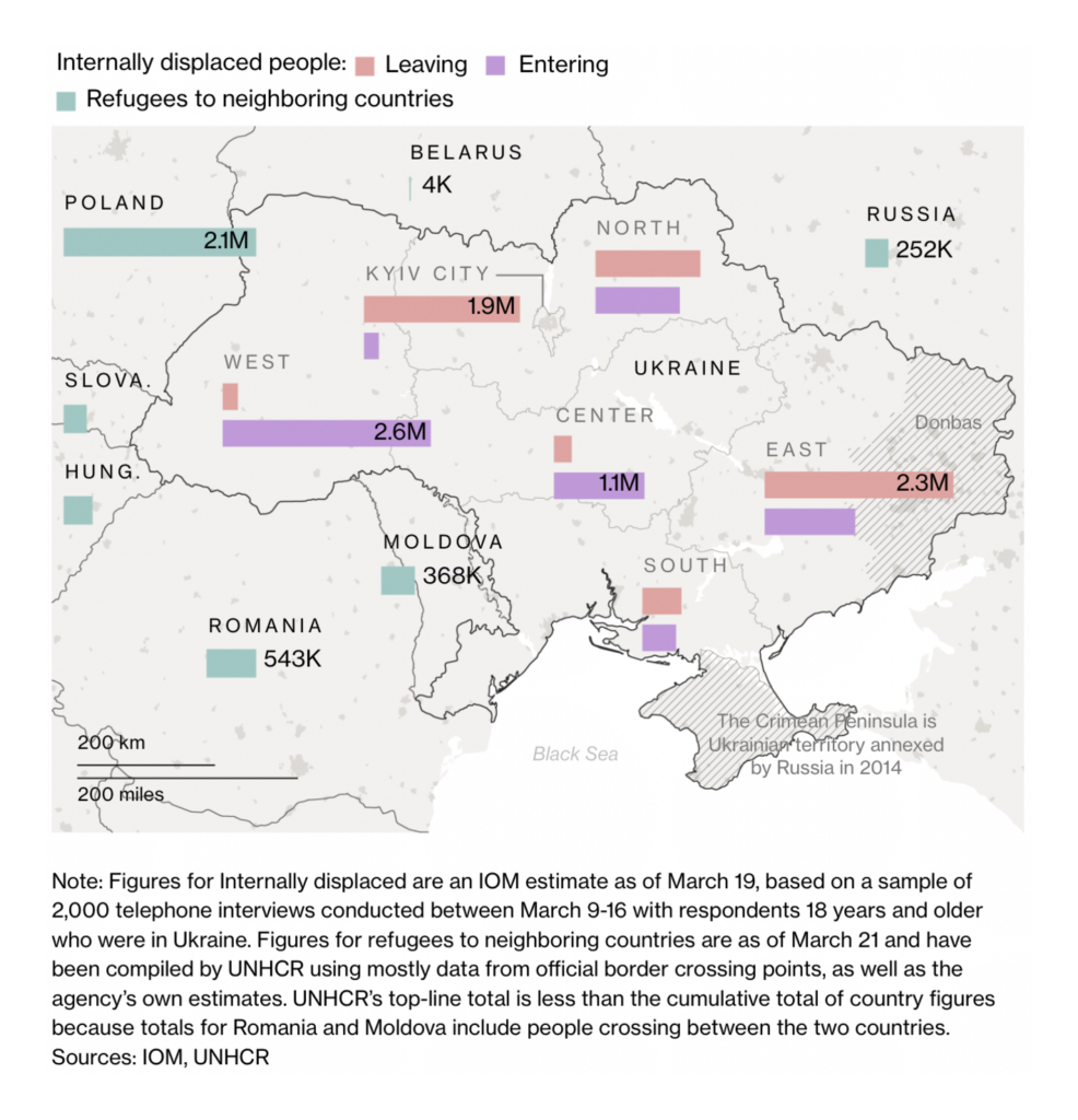
Millions of Ukrainians have already been displaced by the war, both internally and in neighboring countries:

Pew Research: After a month of war, Ukrainian refugee crisis ranks among the world’s worst in recent history, March 25
Bloomberg: A Visual Guide to the Russian Invasion of Ukraine, March 22
FiveThirtyEight: Support For Ukrainian Refugees Is High In Europe. That May Not Last, March 29

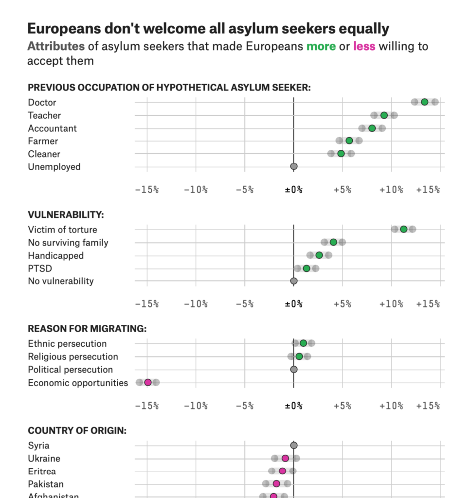
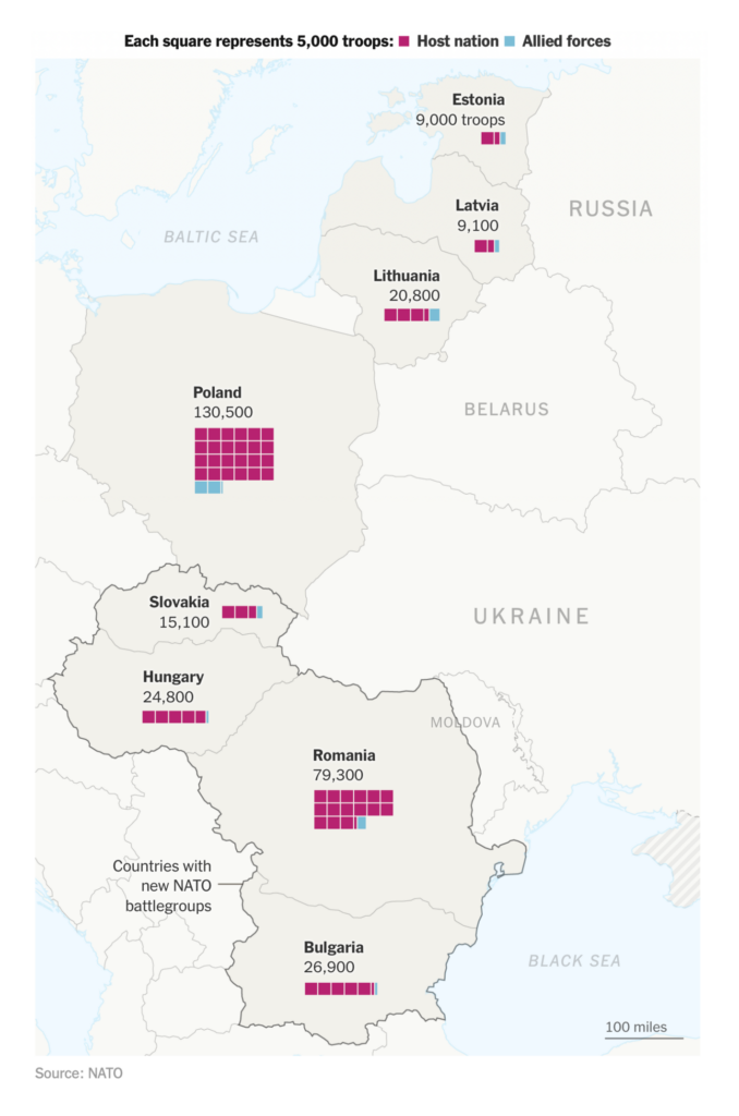
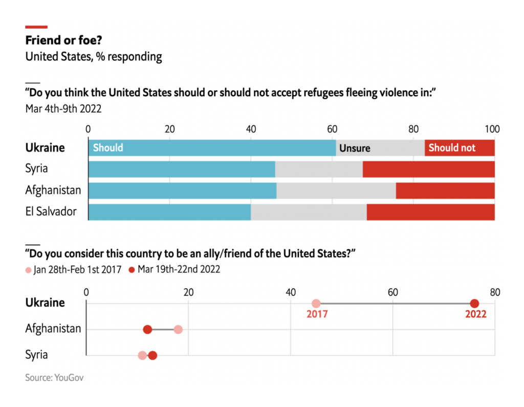
Russia’s invasion has already changed attitudes and policy in Europe and the rest of NATO:

The New York Times: NATO sharply increases its forces in Eastern Europe, March 25
The Economist: Americans are more willing to welcome Ukrainians than others fleeing violence, March 25
Politico: How loyal are Ukraine’s Western friends?, March 24

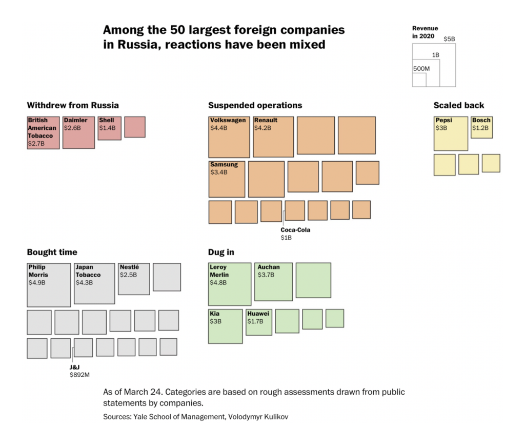
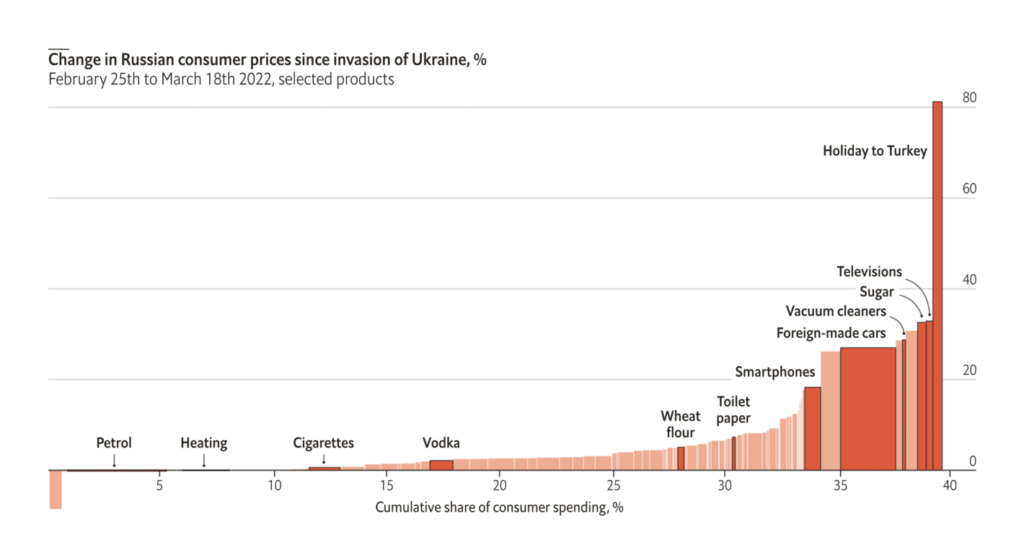
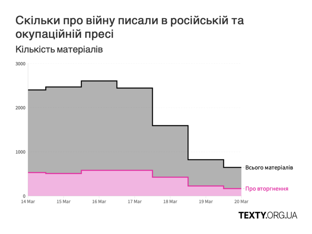
And ordinary Russians are feeling the effects of sanctions and economic isolation — though their informational isolation might be even greater:

The Washington Post: The ‘deglobalization’ of Moscow, March 25
The Economist: Russian consumers are already feeling the cost of war, March 26
Texty: Війна в російських новинах: болючі санкції та фейки про воєнні злочини (14–20 березня), March 24

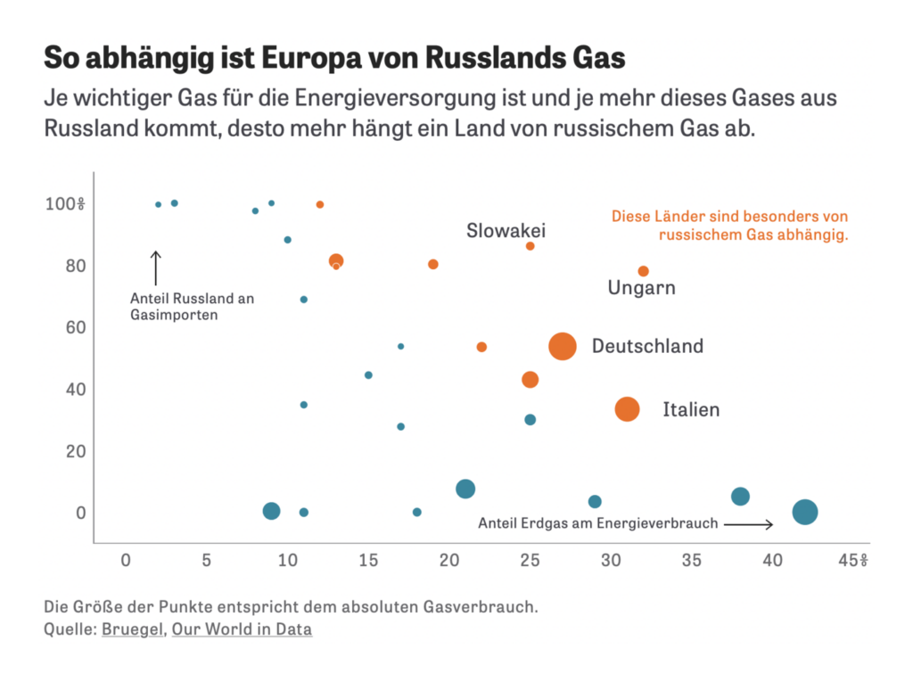
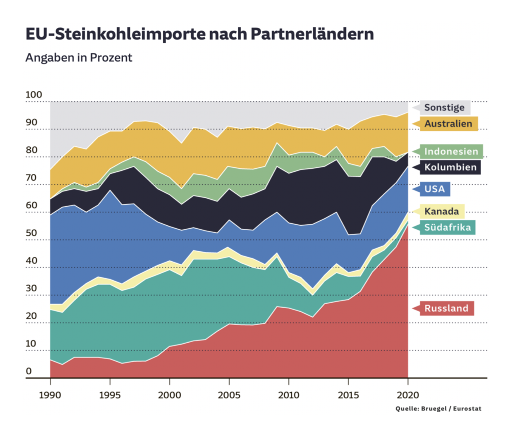
One major limitation on the international response has always been dependence on Russian energy imports:

The New York Times: Thanks to Europe, Putin’s War Is Paying for Itself, March 24
Zeit Online: Der deutsche Streit ums Gasembargo, March 28
Süddeutsche Zeitung: Schritt für Schritt weg von Russ­lands Öl und Gas, March 22
The Wall Street Journal: Gas Prices Shoot Up at Fastest Rate on Record, March 22

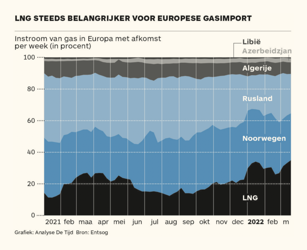
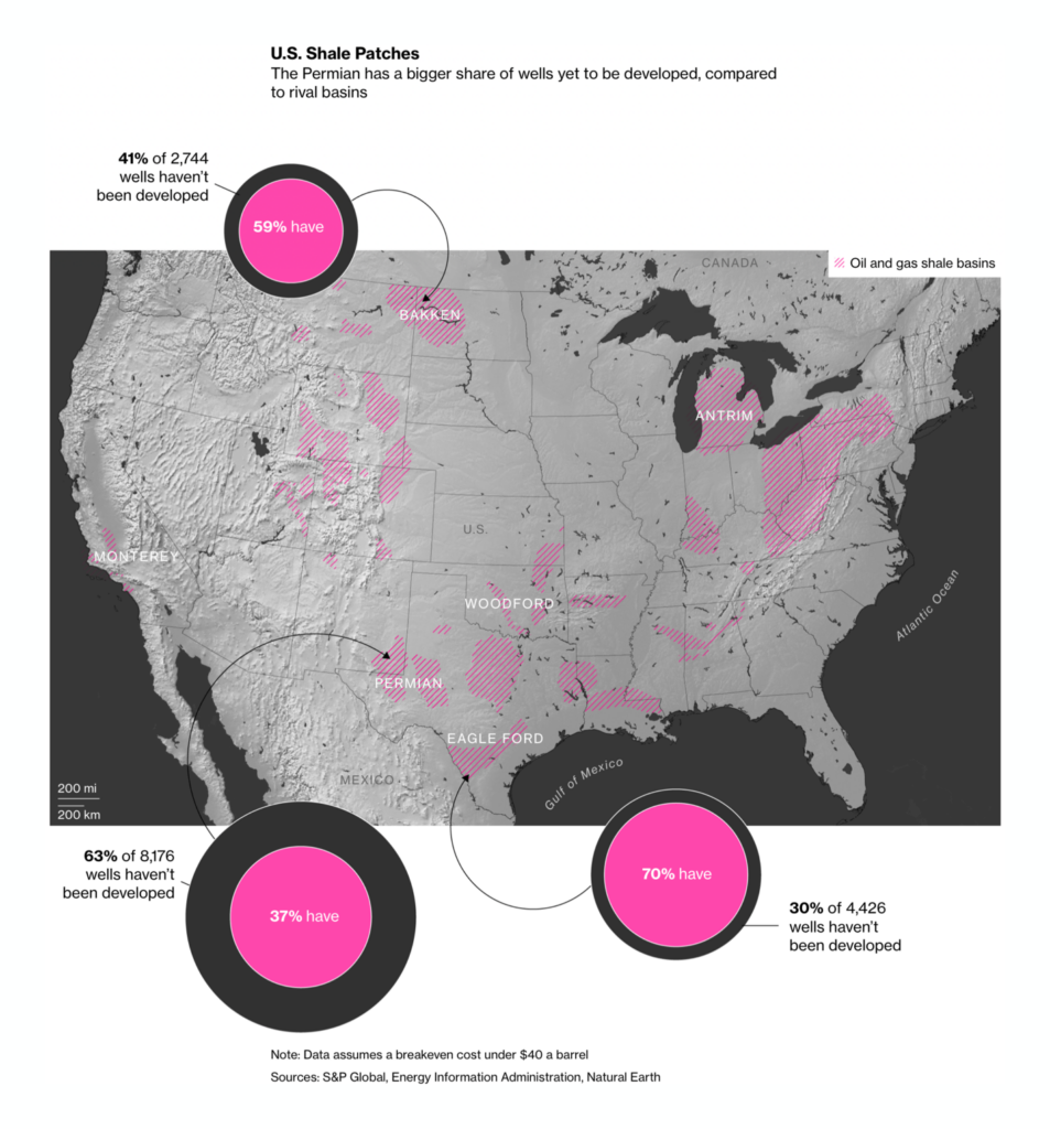
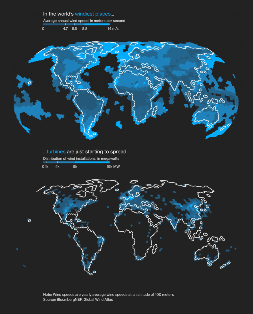
But Europe is already considering how to limit that energy dependence in the future — whether through green policy or new sources of fossil fuels:

The Washington Post: Europe wants to cut Russian energy. Climate policies can help, March 24
De Tijd: Europa vult gasreserves nu al aan, March 28
Bloomberg: Why the Global Oil Market Hinges on Five U.S. Counties, March 24

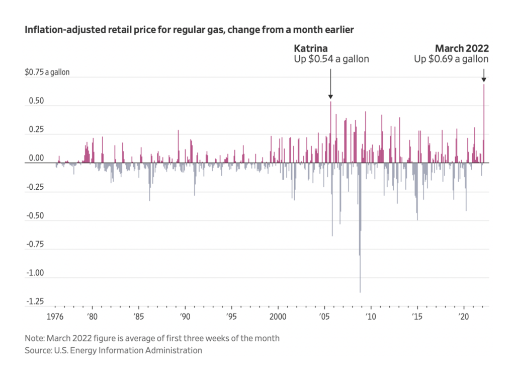
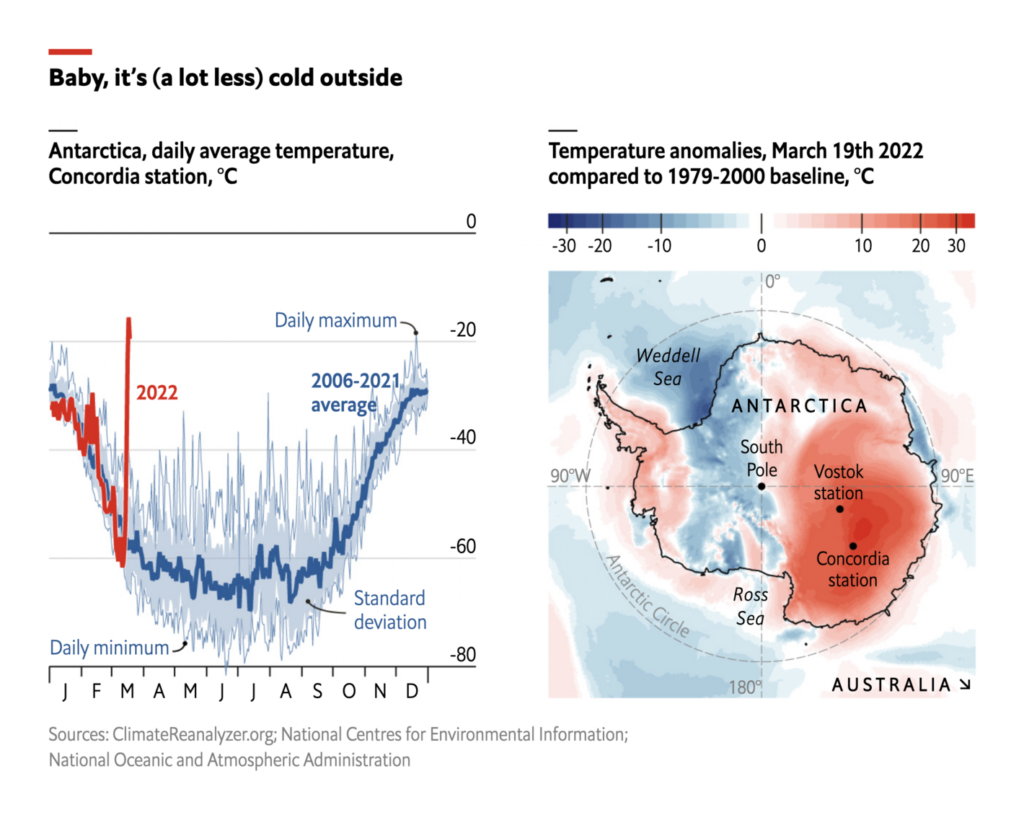
Meanwhile, there are still other good reasons to reduce our fossil fuel consumption:

The Economist: Parts of Antarctica have been 40°C warmer than their March average, March 24

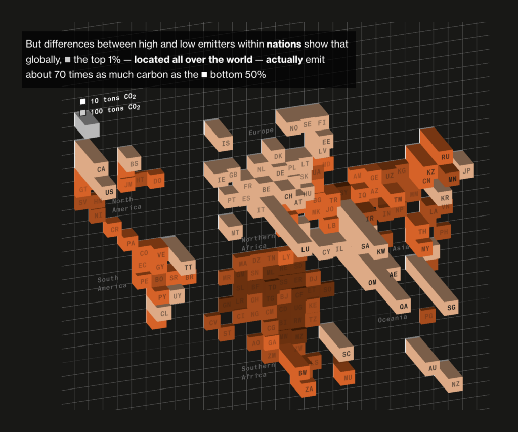
Several maps this week specifically looked at the role of economic inequality in the climate crisis:

Bloomberg: How the World’s Richest People Are Driving Global Warming, March 24
Bloomberg: London’s Housing and Climate Crises Are on a Collision Course, March 22
Bloomberg: Clean Power Isn’t Reaching Those Who Need It Most, March 28

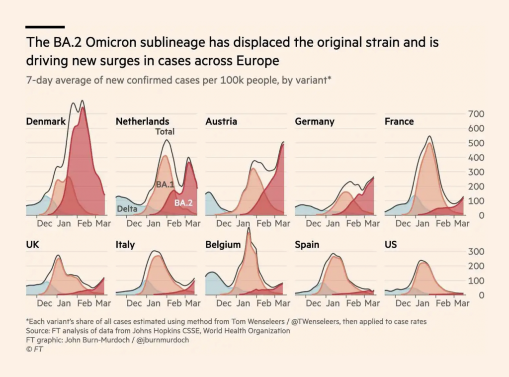
What else? Well, yet another COVID variant is displacing the original Omicron strain:

Financial Times: European wave of Omicron sub-variant BA.2 foreshadows US surge, March 25
The Wall Street Journal: Covid-19 Cases Are Up in the U.K. Does That Mean the U.S. Is Next?, March 24
The New York Times: We Study Virus Evolution. Here’s Where We Think the Coronavirus Is Going, March 28

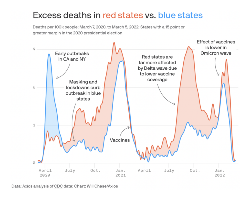
This chart from Axios neatly showed how politics and vaccines have affected the course of the pandemic in the U.S.:

Axios: The pandemic has been deadlier in red states, March 25
The Wall Street Journal: Midtown Manhattan With Fewer Office Workers: Imagining the Unthinkable, March 22

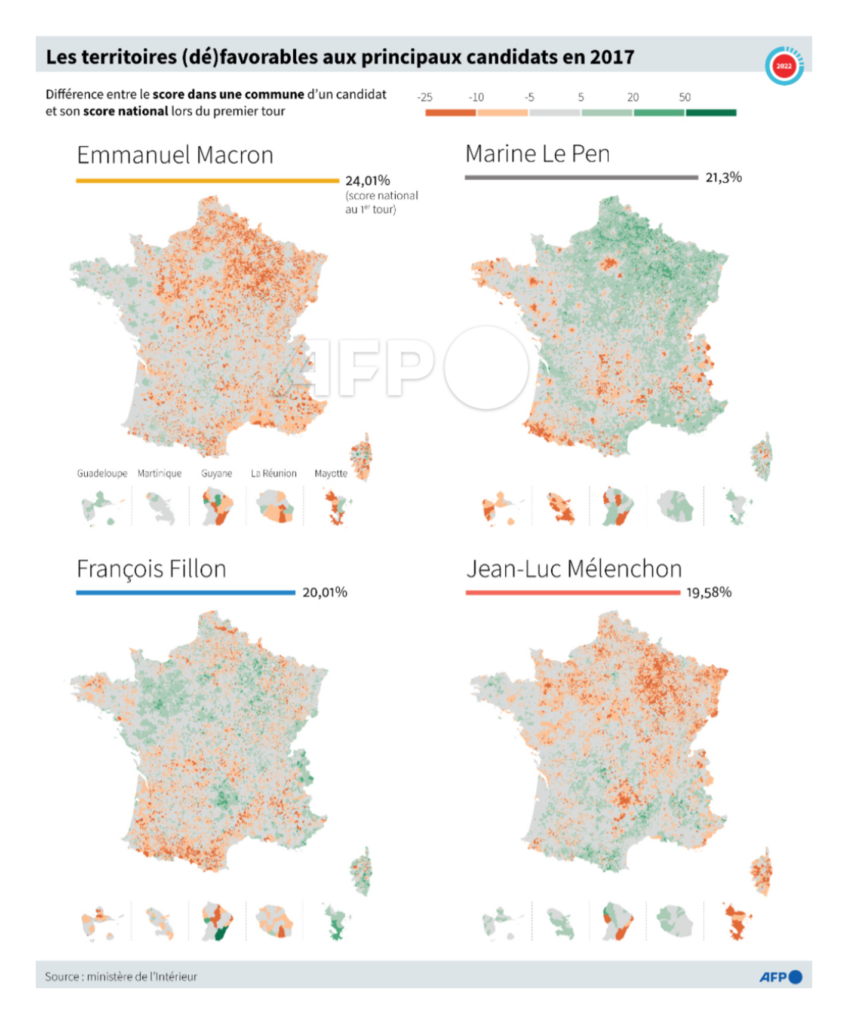
The first round of the French presidential election is almost here:

Tupac Pointu/AFP: “Les territoires (dé)favorables aux principaux candidats en 2017 par @CleaPeculier et @sophie_ramis,” March 29 (Tweet)
Le Monde: Le Pen, Mélenchon, Macron, la bataille du « vote utile » qui pourrait influencer le premier tour de l’élection présidentielle, March 29

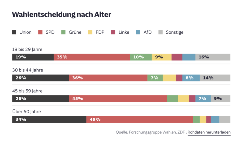
And state elections in Germany this weekend also provided some fuel for charts:

Süddeutsche Zeitung: Wie die SPD die Wahl gewonnen hat, March 28
Zeit Online: So hat die SPD die Wahl gewonnen, March 27
Süddeutsche Zeitung: Das Herz schlägt rot, March 28

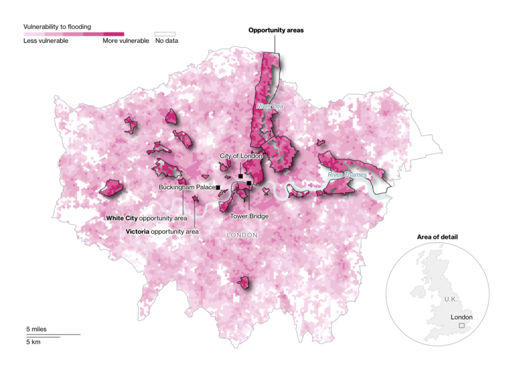
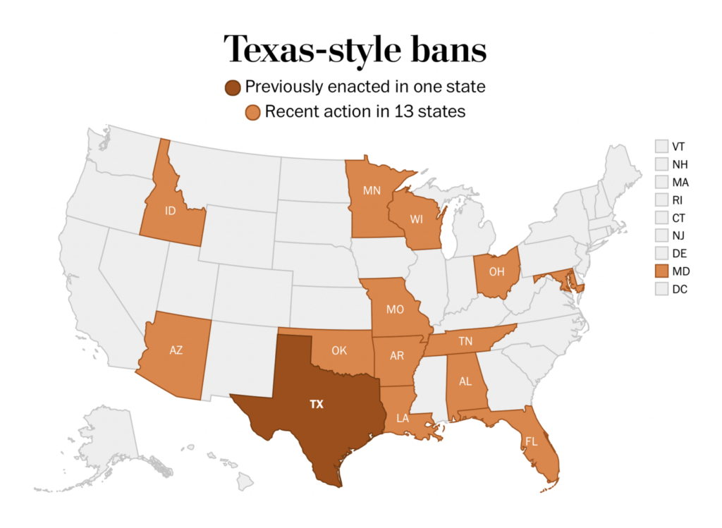
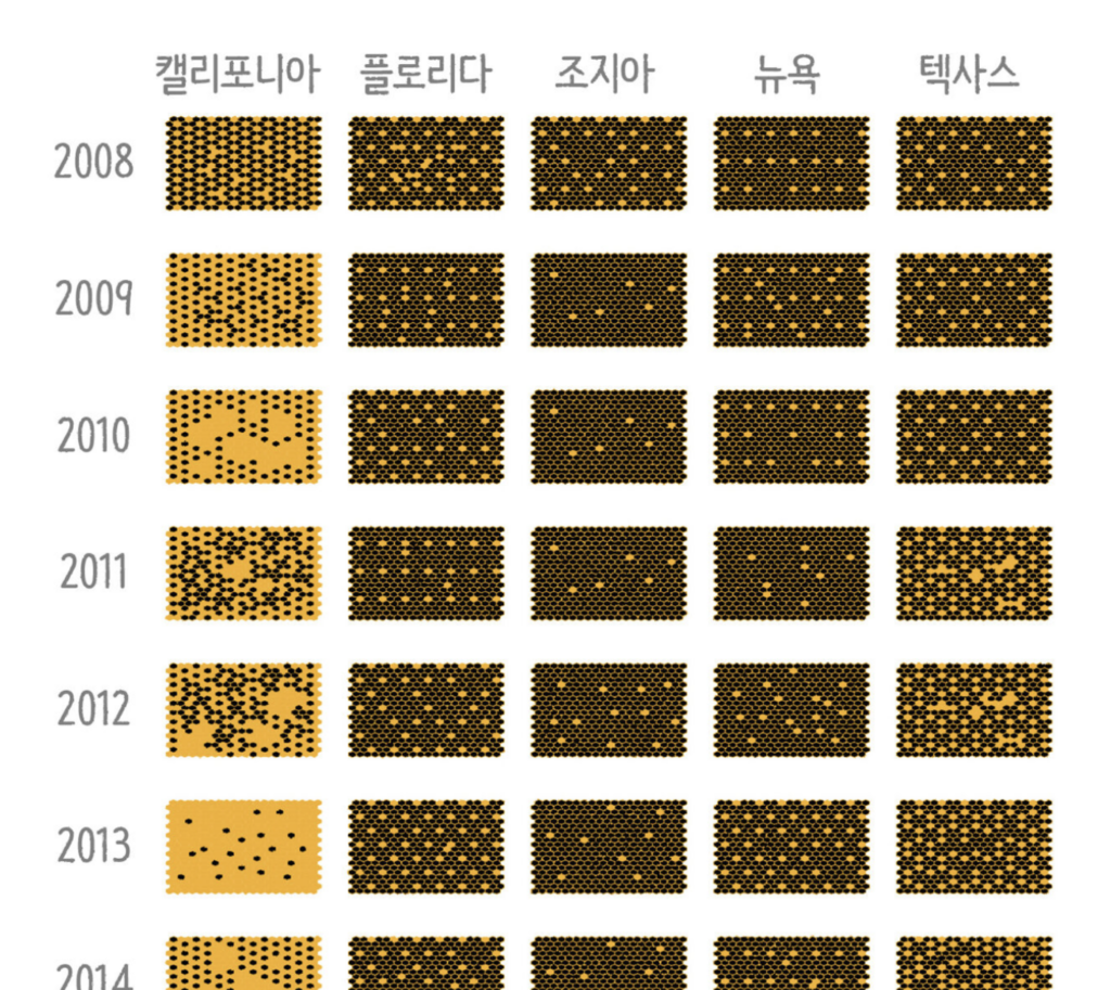
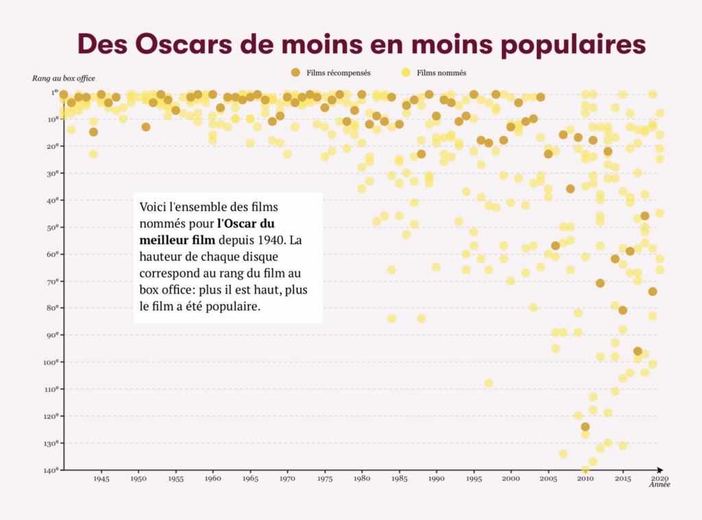
Other charts and maps covered everything from abortion bans to bee colony collapse to the Oscars:

The Washington Post: Tracking new action on abortion legislation across the states, March 26
The New York Times: Cities Lost Population in 2021, Leading to the Slowest Year of Growth in U.S. History, March 24
SBS News: 꿀벌 실종 사건이 나에게 미치는 영향은?, March 27
The Washington Post: Andy Najar has an uncommon skill set. Here’s how he operates for D.C. United, March 22
Slate.fr: Pourquoi une telle différence entre les goûts du public et les palmarès des Oscars?, March 22
The Wall Street Journal: How Popular Are the Oscars’ Best-Picture Nominees? We Ranked Them, March 24

What else we found interesting

Texty: Відео війни, March 23
Quartz: A visual guide to the corporate risks exposed by the SEC’s new climate rule, March 22
Jason Forrest: “This warehouse cut away uses color wonderfully,” March 29 (Tweet)
Clara Dealberto: “Vintage dataviz : magnifiques pages de treemaps dans l’Atlas statistique des Etats-Unis basé sur le recensement de 1870 (1874)” March 28 (Tweet, Source)

The Society for News Design recently announced winners of their Best of News Design competition in digital and print categories.

Applications are open for


Help us make this dispatch better! We’d love to hear which newsletters, blogs, or social media accounts we need to follow to learn about interesting projects, especially from less-covered parts of the world (Asia, South America, Africa). Write us at hello@datawrapper.de or leave a comment below.

Comments