We want to enable everyone to create beautiful charts, maps, and tables. New to data visualization? Or do you have specific questions about us? You'll find all the answers here.
The best of last week’s big and small data visualizations
Vivien Serve
Welcome back to the 132nd edition of Data Vis Dispatch! Every week, we’ll be publishing a collection of the best small and large data visualizations we find, especially from news organizations — to celebrate data journalism, data visualization, simple charts, elaborate maps, and their creators.
Recurring topics this week include rich and poor, natural phenomena, and health.
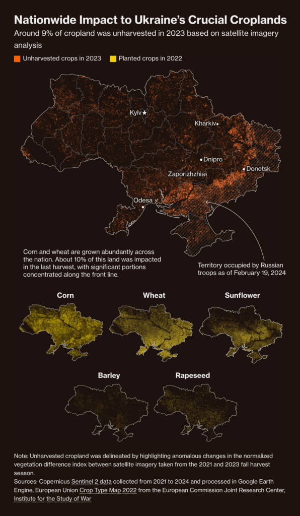
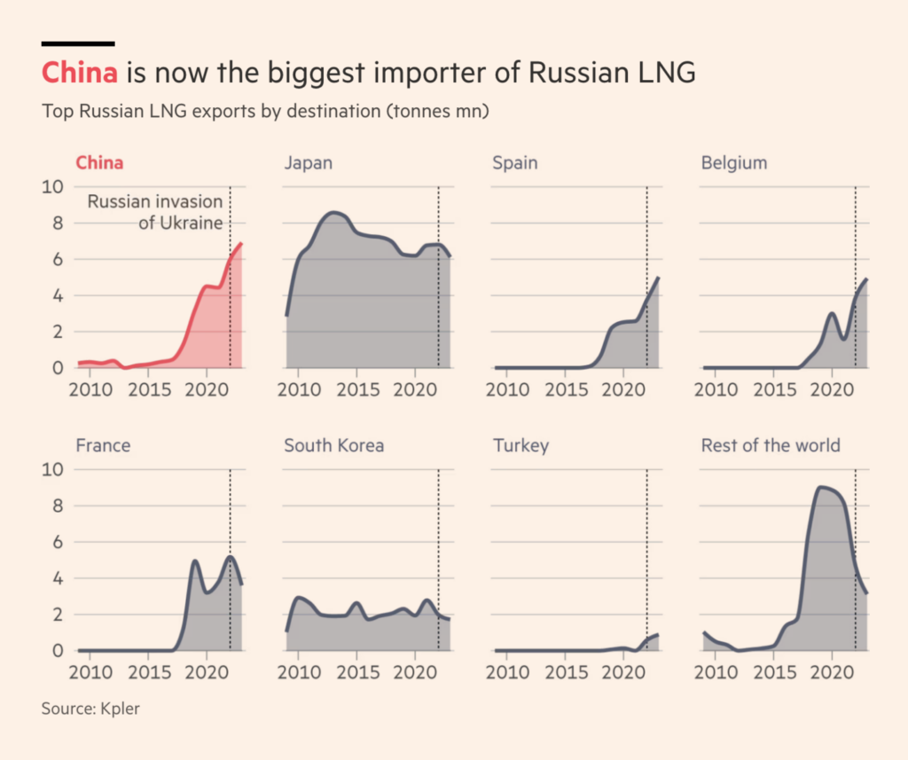
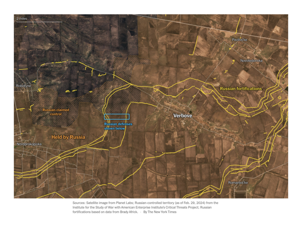
In connection with the Russian-Ukrainian war, this week we saw visualizations of the economy and supply of both countries:
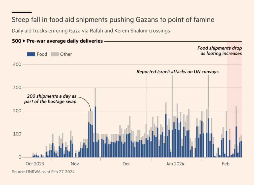
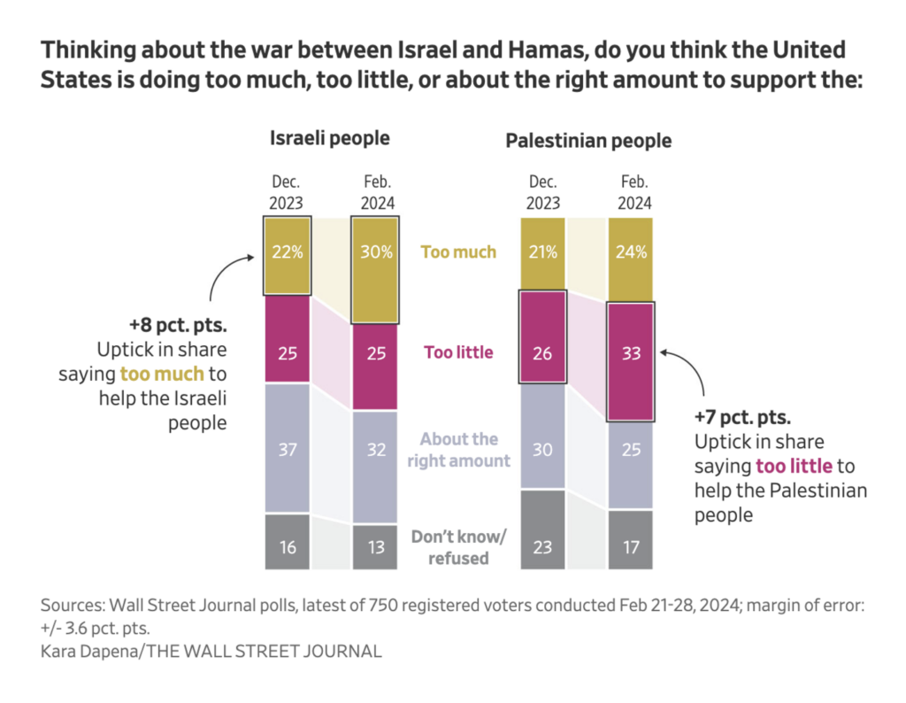
For some time, the war betweenHamas and Israel has been more than just a war between these two parties. The civilians of Gaza are in a state of famine and as much as two thirds of the population has been displaced into Rafah:
Have you ever thought about how much water a city needs? Here is a visualization that explores this question for Berlin:
Francesca Morini: “In the last few days I finally took the time to finish a small project that I started and never finished. It is called ‘Wie viel wasser?,'” February 28 (Mastodon Post)
Help us make this dispatch better! We’d love to hear which newsletters, blogs, or social media accounts we need to follow to learn about interesting projects, especially from less-covered parts of the world (Asia, South America, Africa). Write us at hello@datawrapper.de or leave a comment below.
(she/her) is a working student on Datawrapper’s Communications team. She creates the Data Vis Dispatch to keep data visualization enthusiasts up to date on exciting new projects. When she’s not working, she studies interface design, and when she’s not studying, she’s planning a festival stage or soldering light installations. Vivien lives in Potsdam.


Comments