Data Vis Dispatch, March 5

The best of last week’s big and small data visualizations

Welcome back to the 132nd edition of Data Vis Dispatch! Every week, we’ll be publishing a collection of the best small and large data visualizations we find, especially from news organizations — to celebrate data journalism, data visualization, simple charts, elaborate maps, and their creators.

Recurring topics this week include rich and poor, natural phenomena, and health.

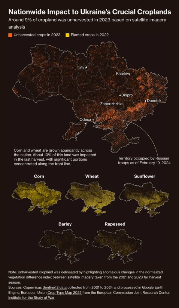
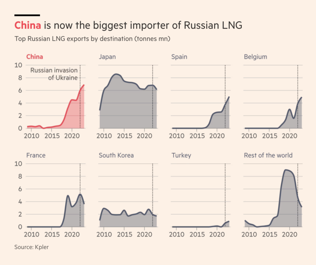
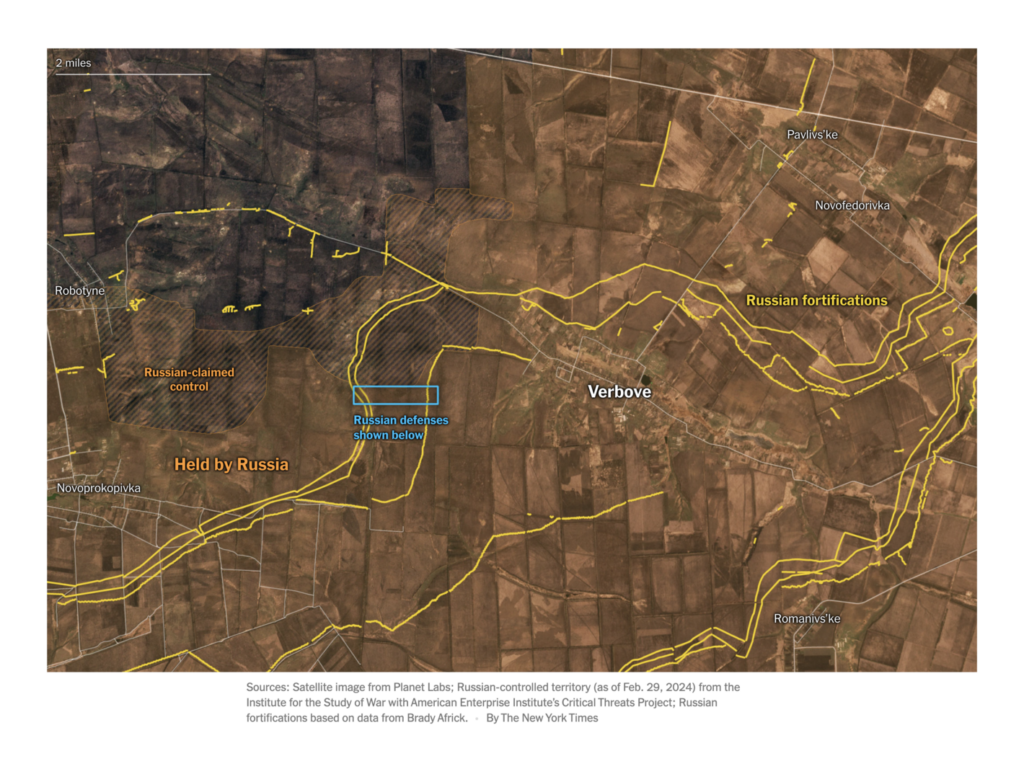
In connection with the Russian-Ukrainian war, this week we saw visualizations of the economy and supply of both countries:

Bloomberg: Ukraine Drafts Crucial Farm Workers in Desperate Rush to Bolster Military, March 1
Financial Times: Inside the brazen Arctic trip supplying Putin’s flagship energy scheme, March 1
The New York Times: Surprisingly Weak Ukrainian Defenses Help Russian Advance, March 2

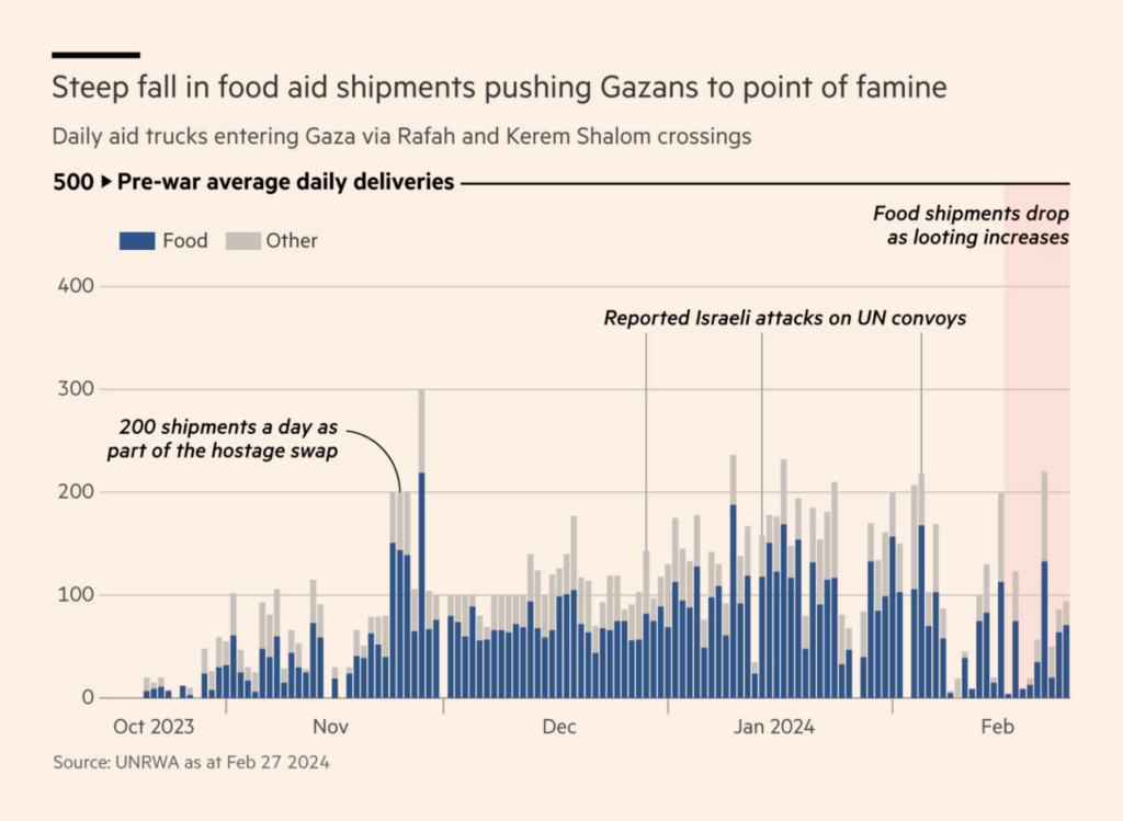
For some time, the war between Hamas and Israel has been more than just a war between these two parties. The civilians of Gaza are in a state of famine and as much as two thirds of the population has been displaced into Rafah:

Al Jazeera: Nowhere safe in Gaza, March 4
Financial Times: Famine was stalking Gaza — then an aid convoy turned to deadly chaos, March 2
Le Monde: Cisjordanie : l’autre guerre d’Israël en cartes, March 3

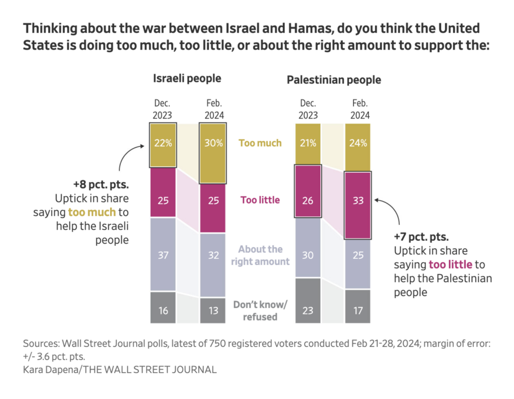
A look at how the war is perceived by U.S. voters:

The Wall Street Journal: U.S. Voter Sympathy for Palestinians Grows as Israel War Drags On, WSJ Poll Finds, March 3

Sit back as we take you on a grand tour of the world of political visualizations. Let’s start with Europe!

Der Spiegel: In der rechten Ecke, March 1
Le Monde: L’IVG inscrite dans la Constitution : le détail des votes des députés et sénateurs réunis en Congrès, March 4

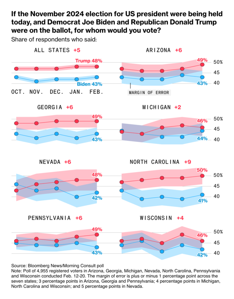
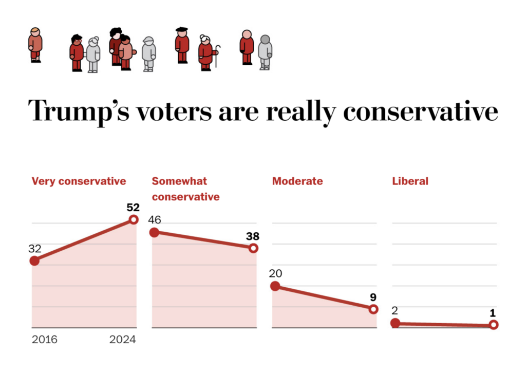
U.S. charts are mainly related to the upcoming (though not too close) presidential election:

Bloomberg: Biden Is Too Old But Trump Is Dangerous, Swing-State Poll Shows, February 29
The Washington Post: What the early primaries tell us about Trump’s changing base, February 2

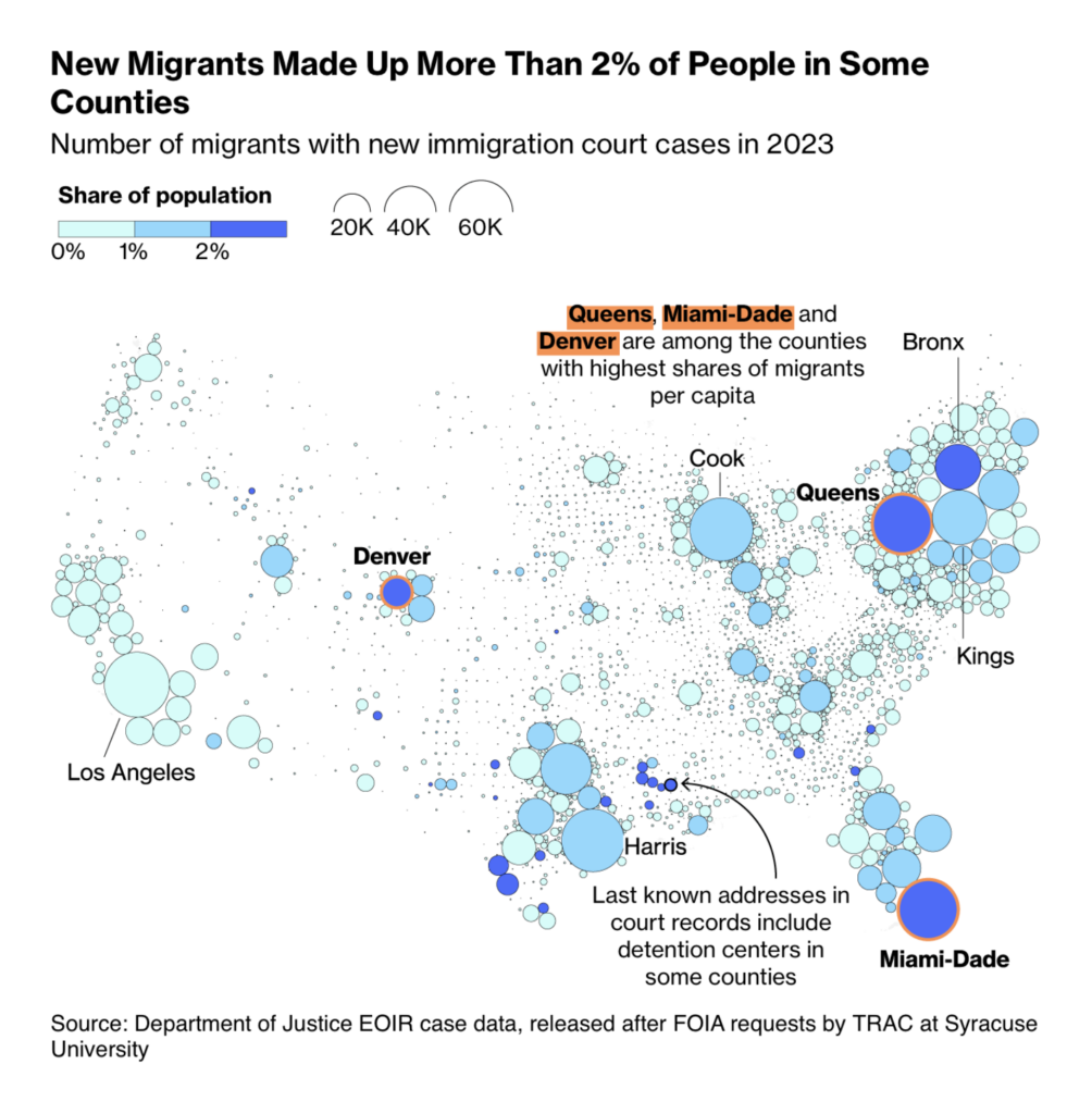
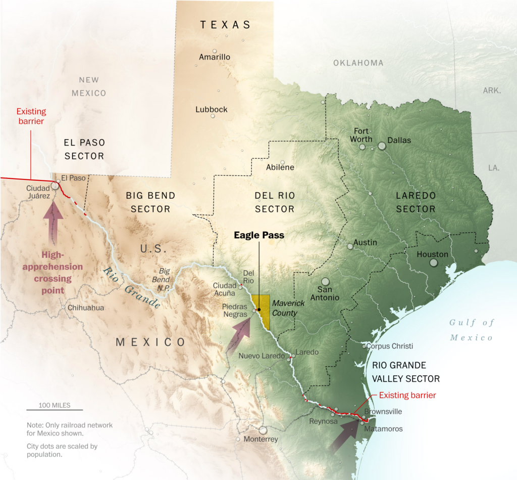
Two maps from the U.S. cover immigration and border control:

Bloomberg: This Is Where New Migrants Are Going When They Reach the US, February 28
The Washington Post: Mapping the Texas governor’s effort to control the border at Eagle Pass, February 2

A striking set of visualizations in The Economist lets you explore demographic tendencies in the U.K. electorate:

The Economist: Build a voter, March 4
The Economist: A changing British electorate is propelling Labour towards victory, February 28

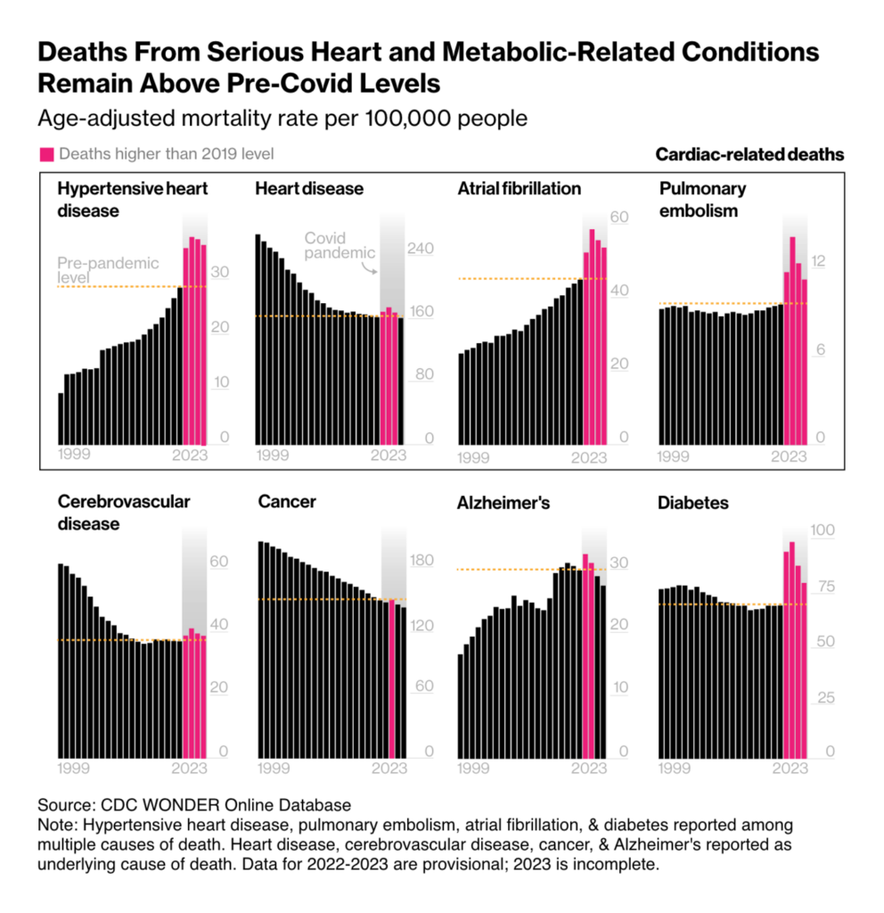
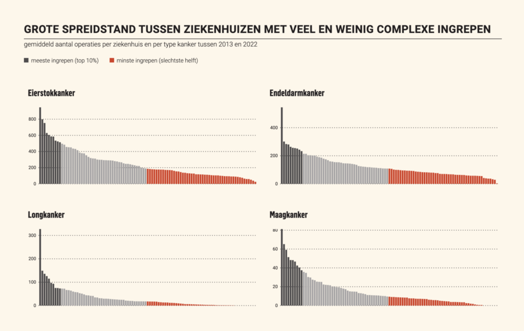
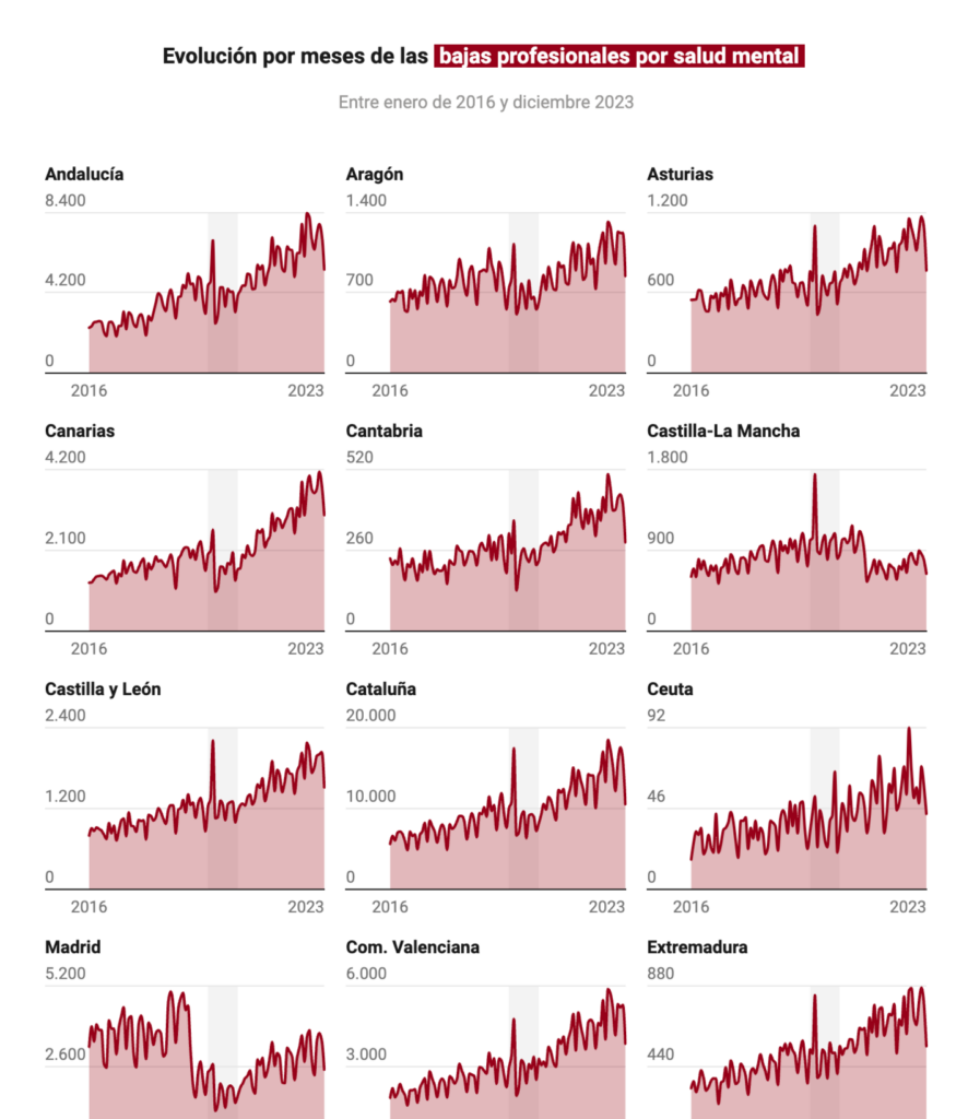
Health concerns us throughout our lives — from post-COVID heart disease to cancer surgeries to mental illness:

Bloomberg: A Spike in Heart Disease Deaths Since Covid Is Puzzling Scientists, February 27
De Tijd: Te veel ziekenhuizen zien te weinig kankerpatiënten, March 2
Rest of World: Riders in the Smog, February 27
Financial Times: ‘Epidemic of obesity’ blights children as global rates soar, March 1
Diario Sur: La salud mental en España: ¿qué profesiones acumulan más bajas médicas?, March 4

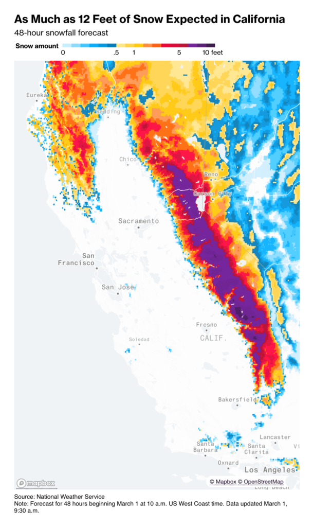
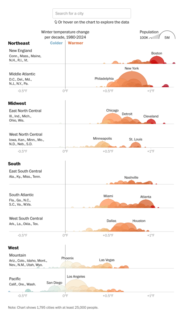
Blizzards are raging in California, even as winter is getting warmer almost everywhere:

Bloomberg: ‘Life-Threatening’ Blizzard to Slam California This Weekend, March 1
The Washington Post: Winter is warming almost everywhere. See how it’s changed in your town, March 1

Have you ever thought about how much water a city needs? Here is a visualization that explores this question for Berlin:

Francesca Morini: “In the last few days I finally took the time to finish a small project that I started and never finished. It is called ‘Wie viel wasser?,'” February 28 (Mastodon Post)

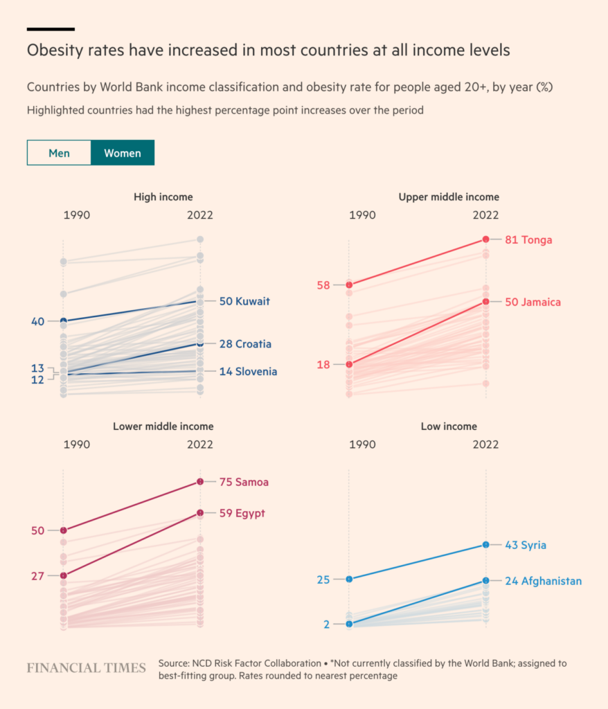
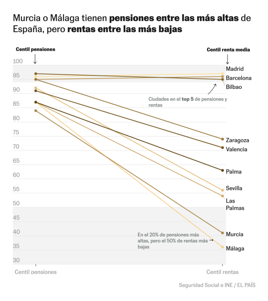
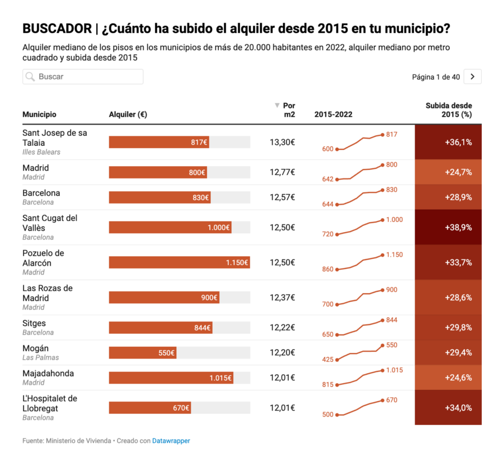
From the richest to the poorest:

The Wall Street Journal: The Friendship With Warren Buffett That Led to Her $1 Billion Donation, March 1
elDiario.es: Aumentan los hogares con ingreso mínimo vital pero la ayuda solo cubre la mitad de la pobreza extrema, March 1
The Wall Street Journal: The Fed Governor Who Proved Larry Summers Wrong, February 28
El País: El mapa de las pensiones medias por municipios en España: de 2.000 euros a poco más de 500, March 1
elDiario.es: El mapa del precio del alquiler, calle a calle: descubre dónde podrías vivir para gastar menos de un tercio de tus ingresos, March 3

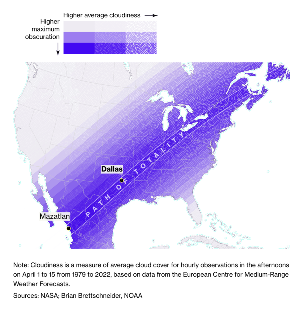
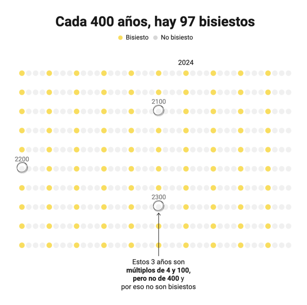
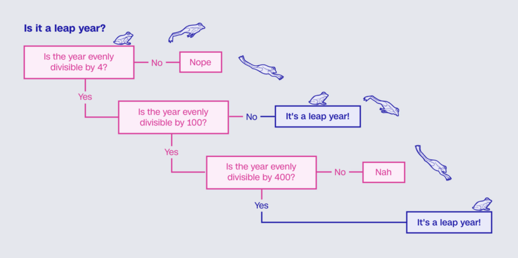
An upcoming solar eclipse and the just-past leap day!

Bloomberg: How to Find the Best Cities to Watch the Solar Eclipse, March 1
Diario Sur: La fórmula matemática que explica por qué 2024 es un año bisiesto y 2100 no, February 29

What else we found interesting

CNN: What would happen if we didn’t have leap years?, February 28
The New York Times: The Absurd Problem of New York City Trash, March 2
San Francisco Chronicle: Watch videos of Stephen Curry’s longest made shots of his career, February 28
Harry Jefferies: “My grandpa who is 85 started making this rock map of Scotland in 1992.He collected rocks during amateur geology trips over 30 years. He says it had to be geologically correct and also aesthetically pleasing […],” February 27 (Tweet)

Applications are open for…


Help us make this dispatch better! We’d love to hear which newsletters, blogs, or social media accounts we need to follow to learn about interesting projects, especially from less-covered parts of the world (Asia, South America, Africa). Write us at hello@datawrapper.de or leave a comment below.

Want the Dispatch in your inbox every Tuesday? Sign up for our Blog Update newsletter!

Comments