This article is brought to you by Datawrapper, a data visualization tool for creating charts, maps, and tables. Learn more.
Data Vis Dispatch, May 17
The best of last week’s big and small data visualizations

Welcome back to the 45th edition of Data Vis Dispatch! Every week, we’ll be publishing a collection of the best small and large data visualizations we find, especially from news organizations — to celebrate data journalism, data visualization, simple charts, elaborate maps, and their creators.
Recurring topics this week include regional elections in Germany, international sentiment towards Ukraine, and COVID deaths and wildfires in the United States.
This month marks a sad milestone: one million COVID deaths in the U.S. Many American papers tried to visualize the loss — and reconcile the scale of the numbers with the humanity of the individuals involved. (The New York Times’ contribution in particular generated both praise and criticism for its approach to that problem.)

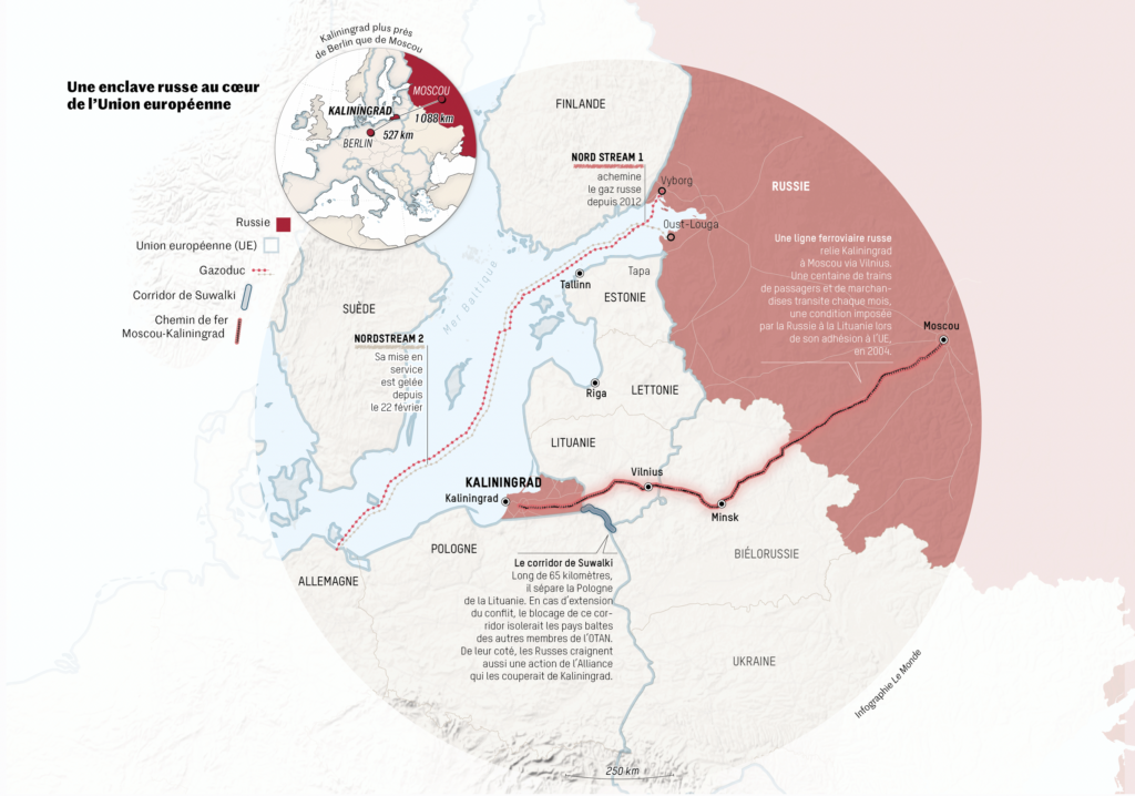
Two animations this week, from Le Monde and The Washington Post, showed how the military and diplomatic outlooks for Ukraine have changed over the past three months:
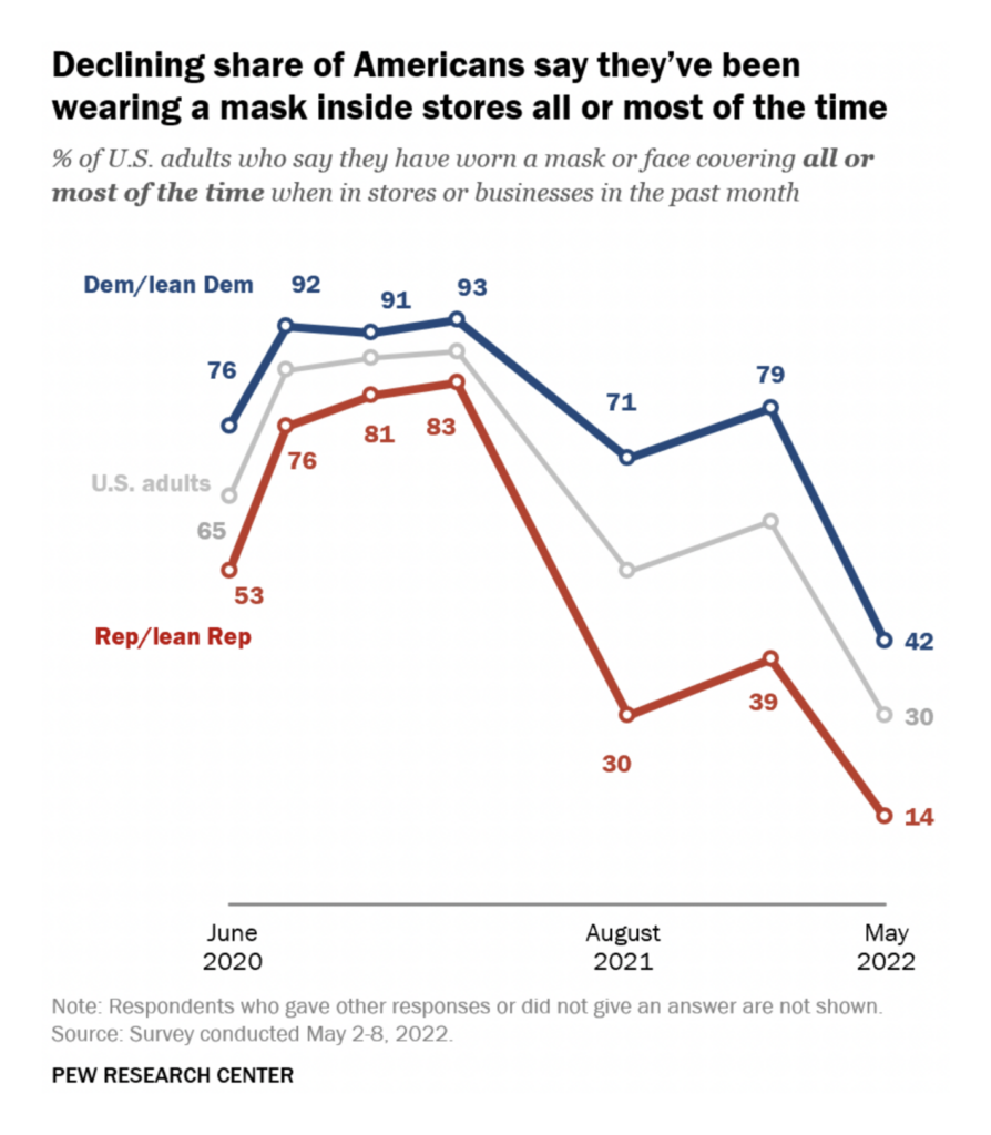
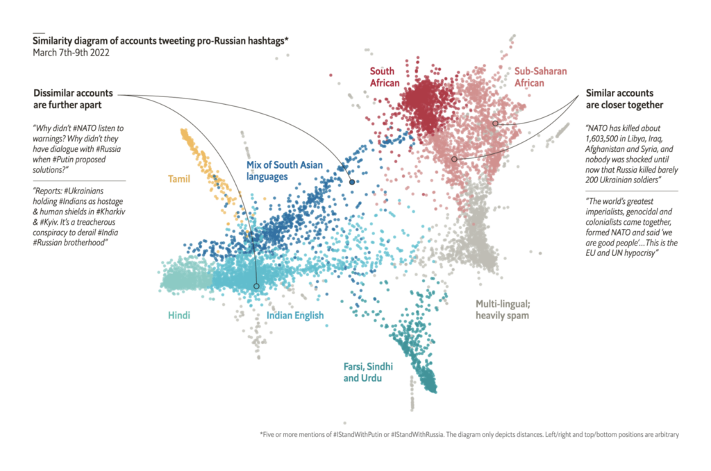
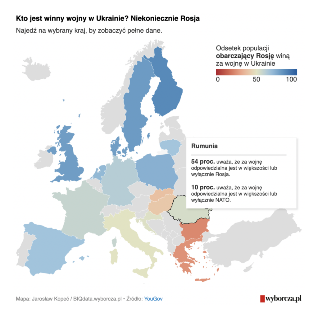
There were also charts and maps on international sympathies in the war:
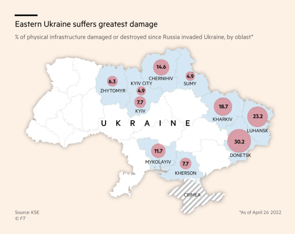
And on the damage to Ukraine’s infrastructure and natural environment:

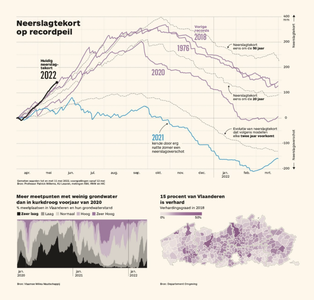
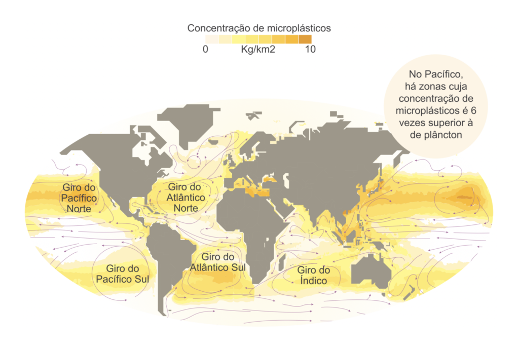
Other topics in environmental visualizations included floods, droughts, and microplastics in the ocean:

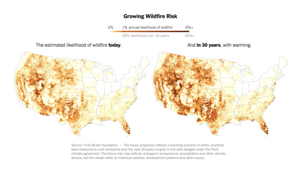
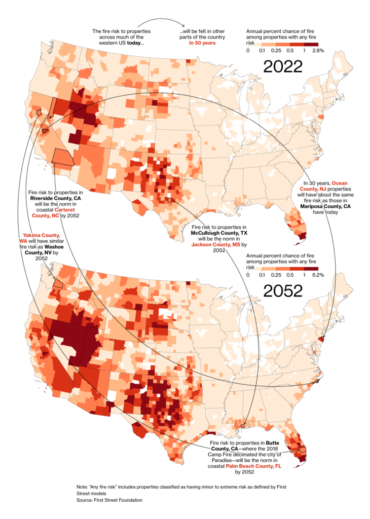
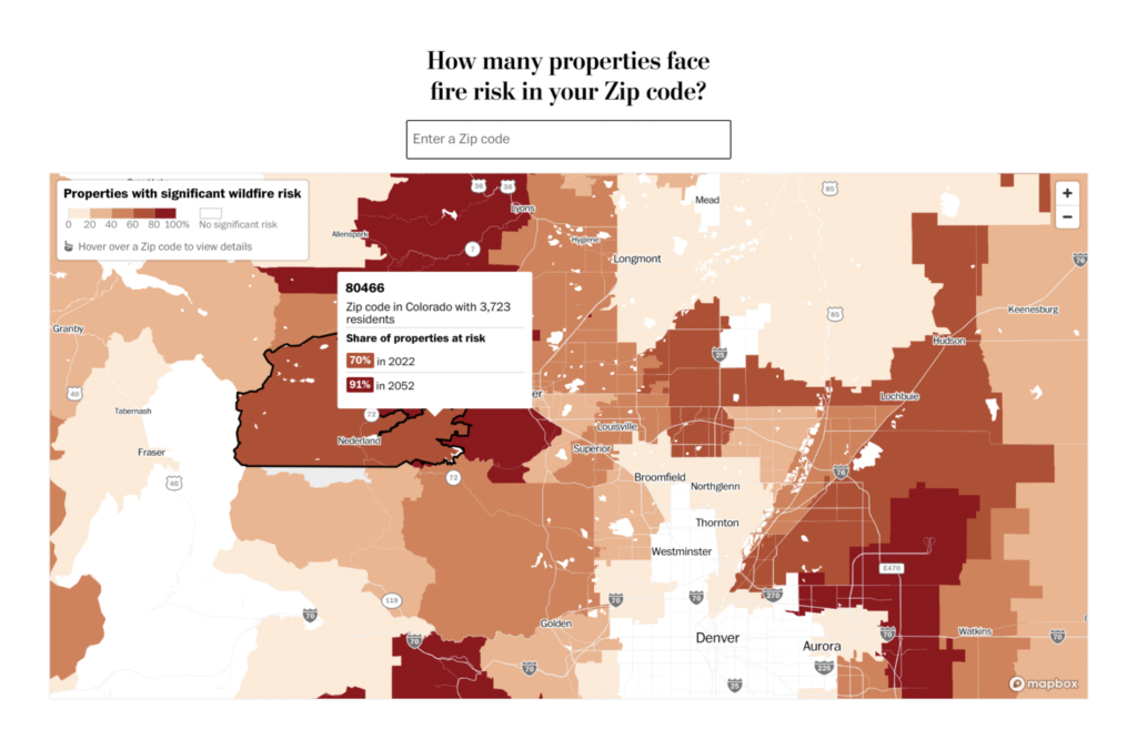
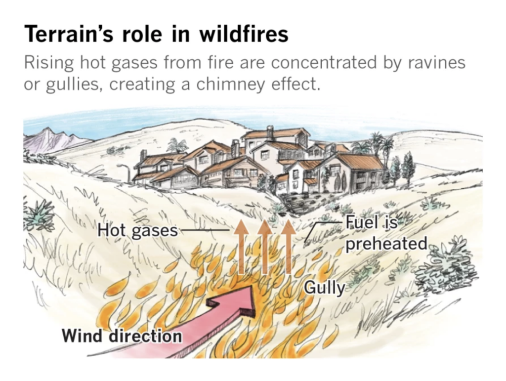
But the biggest environmental issue of the week was fire — specifically, a new assessment of wildfire risks in the United States:
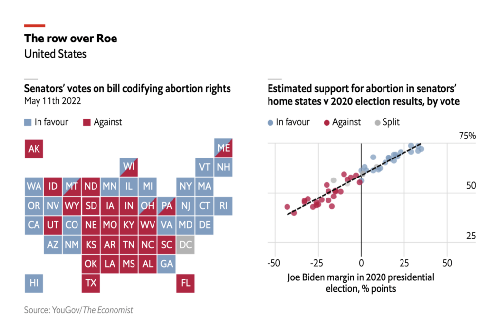
The U.S. Senate voted against protecting abortion rights in federal law — a decision, in The Economist’s analysis, that had more to do with national party politics than with the will of their constituents:

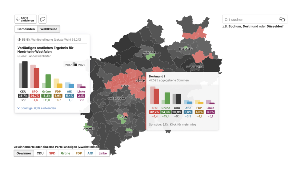
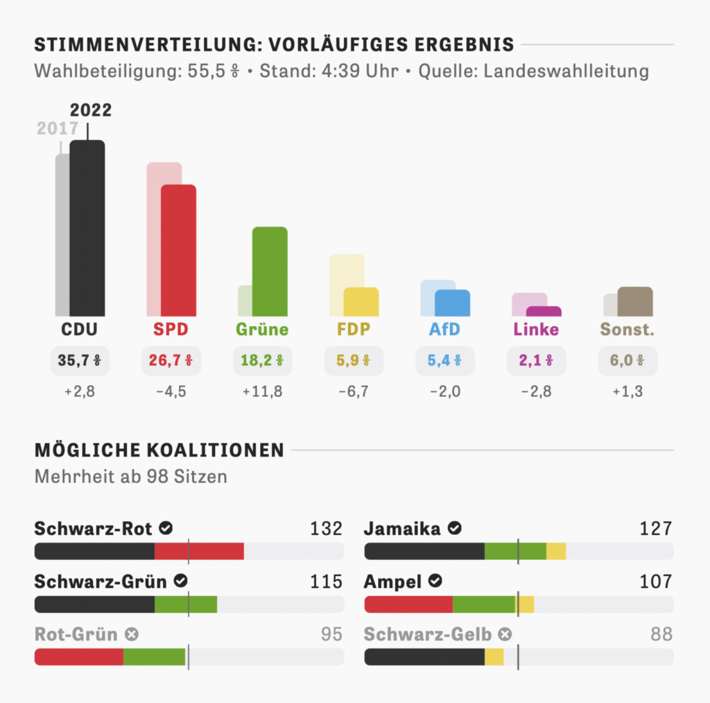
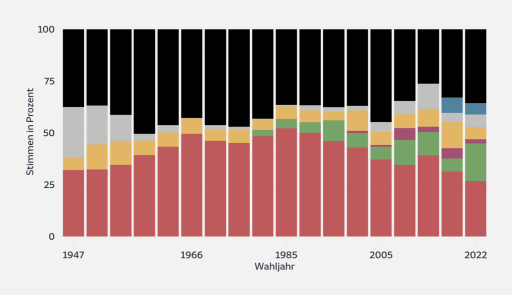
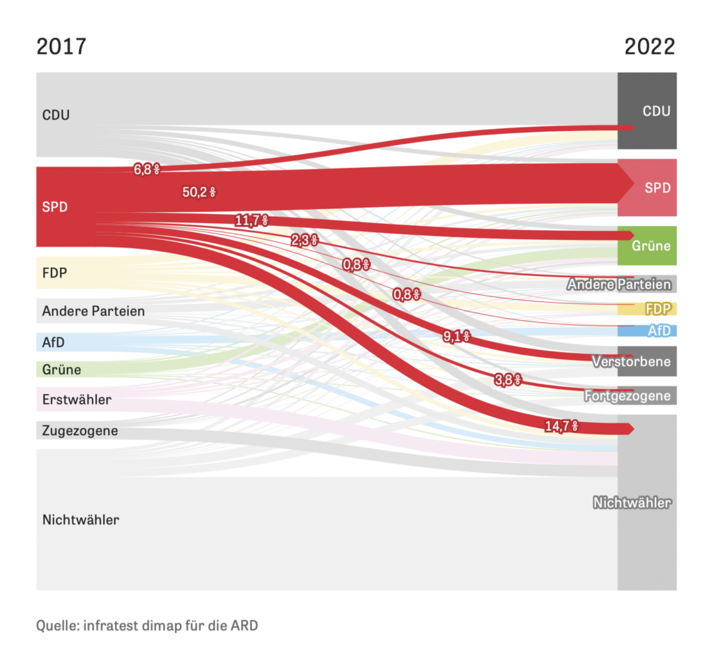
Regional elections were held this Sunday in the German state of North Rhine-Westphalia:

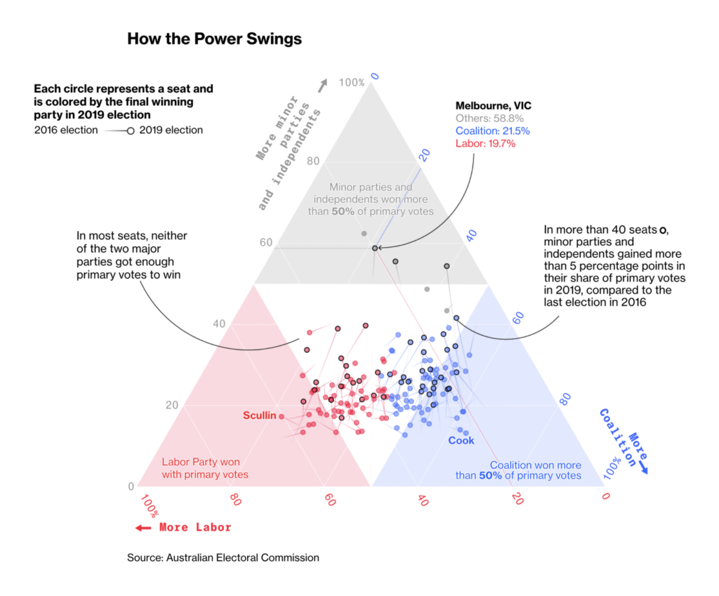
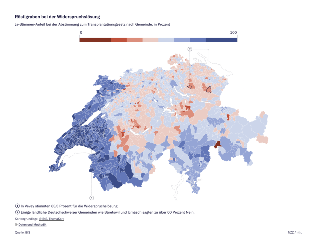
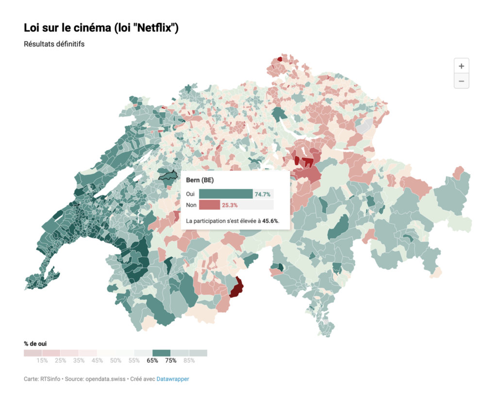
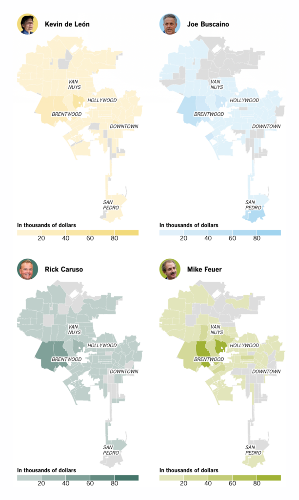
And other election visualizations covered the Australian parliament, Swiss referenda, and a mayoral race in Los Angeles:
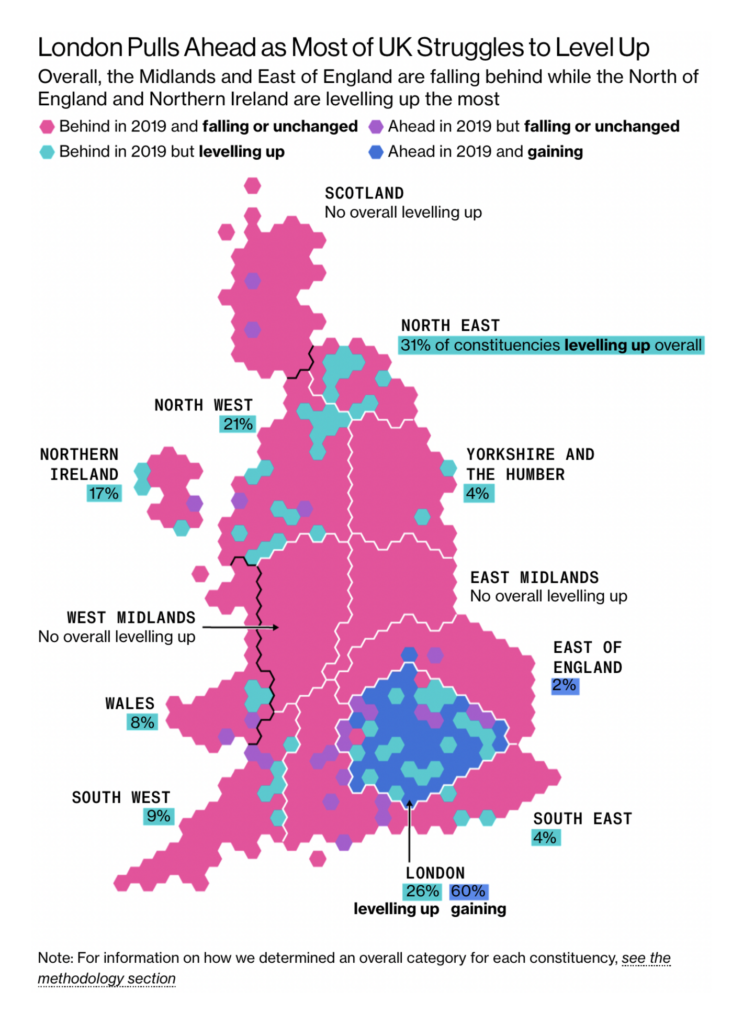
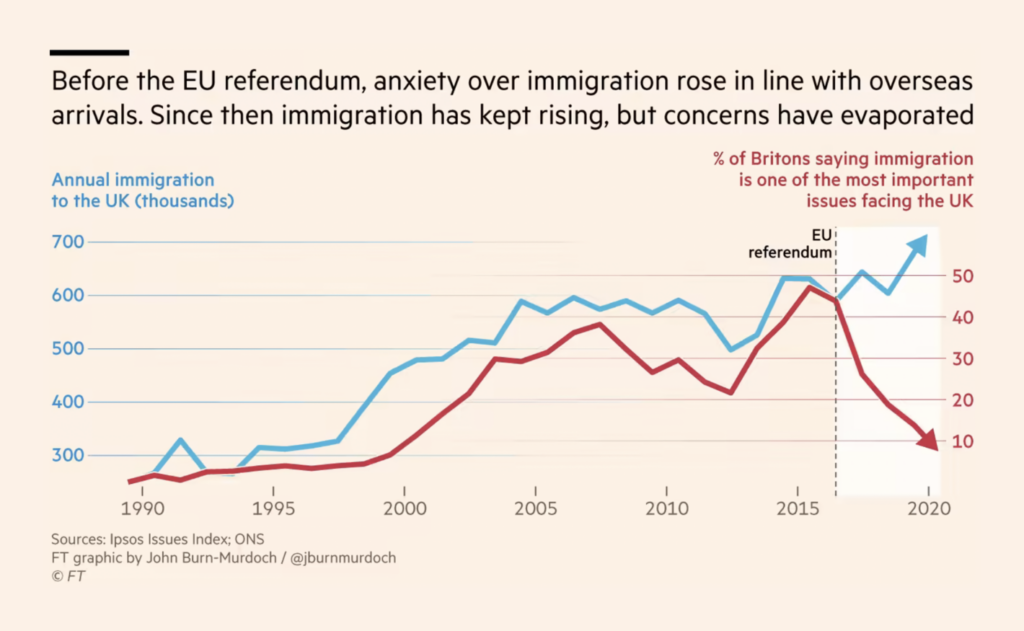
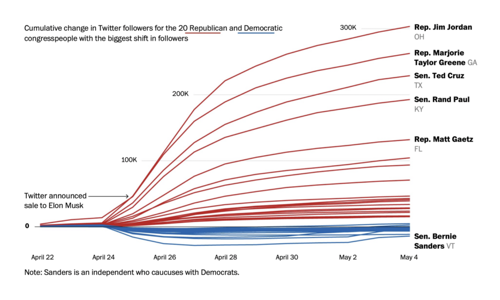
Other political topics included “levelling up,” immigration to the U.K., and partisan bias on Twitter.
For something fun, these two maps show the same radio telescopes that recently produced a picture of the black hole at the center of the Milky Way:

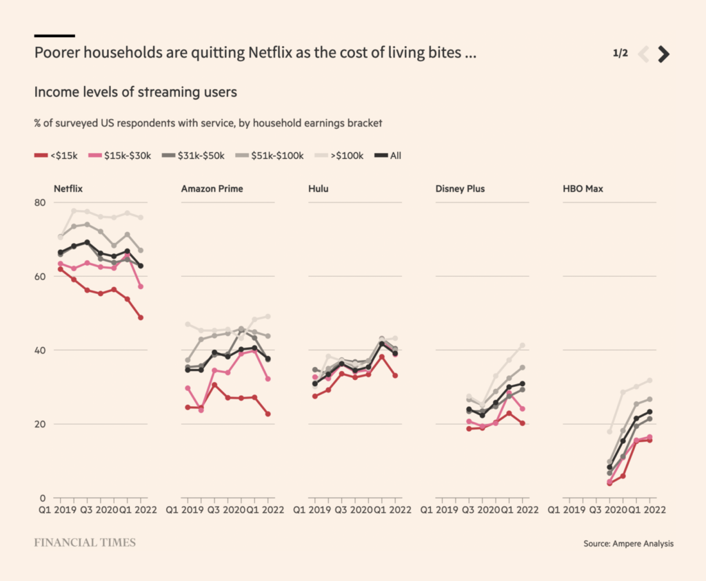
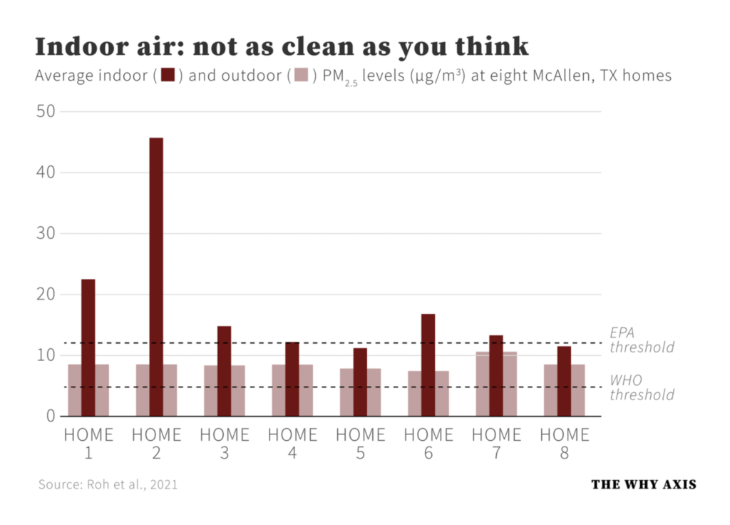
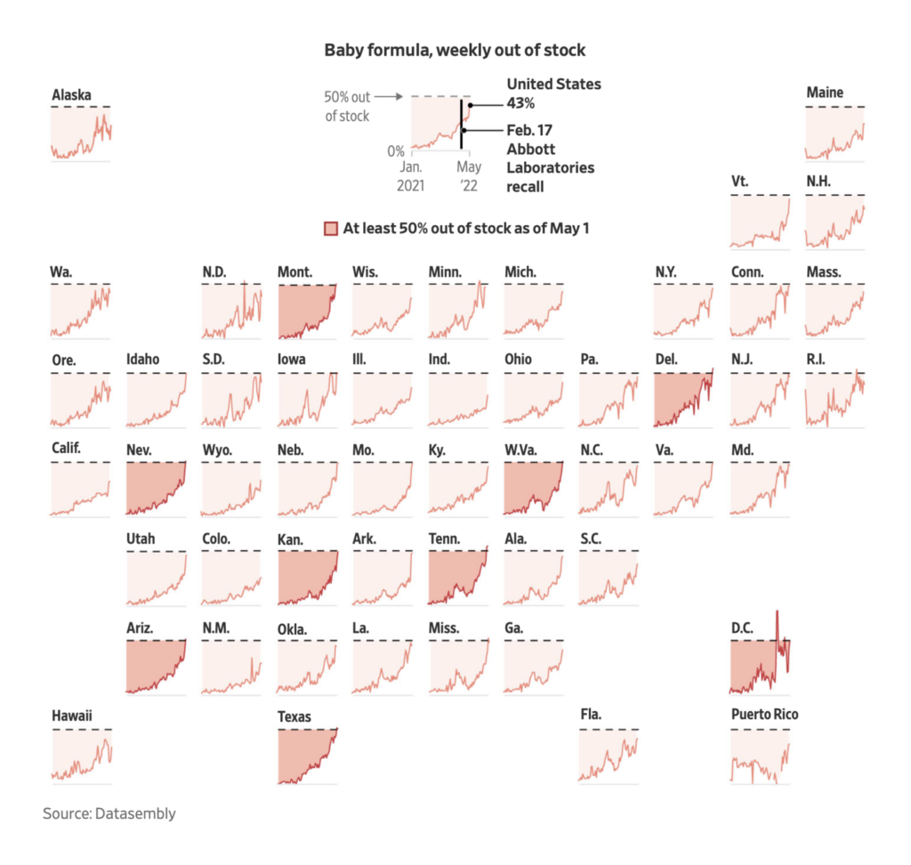
For the most part, simple charts ruled in our miscellaneous section:

But there were some fancier findings as well, like this animation from FlowingData on who Americans spend time with throughout the day:
What else we found interesting
Applications are open for…
- A graphics developer and graphics reporter at USA Today
- A research assistant at FiveThirtyEight
- A graphics intern at Reuters
- An interactive story designer at ProPublica
- A data journalist at The Guardian
- A trainee data journalist at the Süddeutsche Zeitung
- A data visuals designer/developer at The Texas Tribune
Help us make this dispatch better! We’d love to hear which newsletters, blogs, or social media accounts we need to follow to learn about interesting projects, especially from less-covered parts of the world (Asia, South America, Africa). Write us at hello@datawrapper.de or leave a comment below.


Comments