This article is brought to you by Datawrapper, a data visualization tool for creating charts, maps, and tables. Learn more.
Data Vis Dispatch, May 2
The best of last week’s big and small data visualizations

Welcome back to the 92nd edition of Data Vis Dispatch! Every week, we’ll be publishing a collection of the best small and large data visualizations we find, especially from news organizations — to celebrate data journalism, data visualization, simple charts, elaborate maps, and their creators.
Recurring topics this week include war, climate-change ecology, and gender in the labor force.
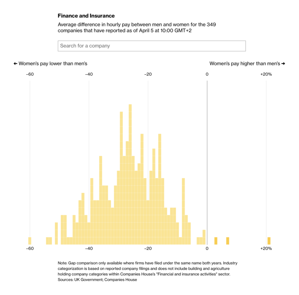
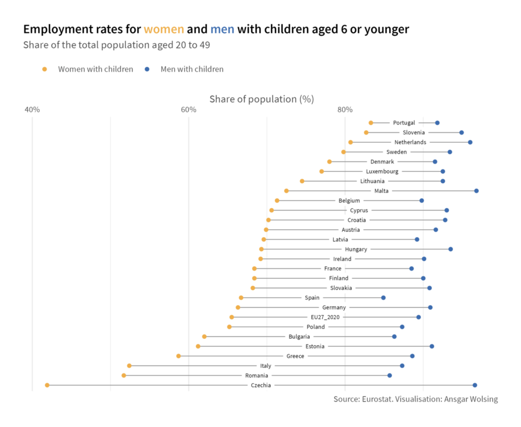
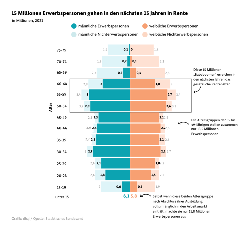
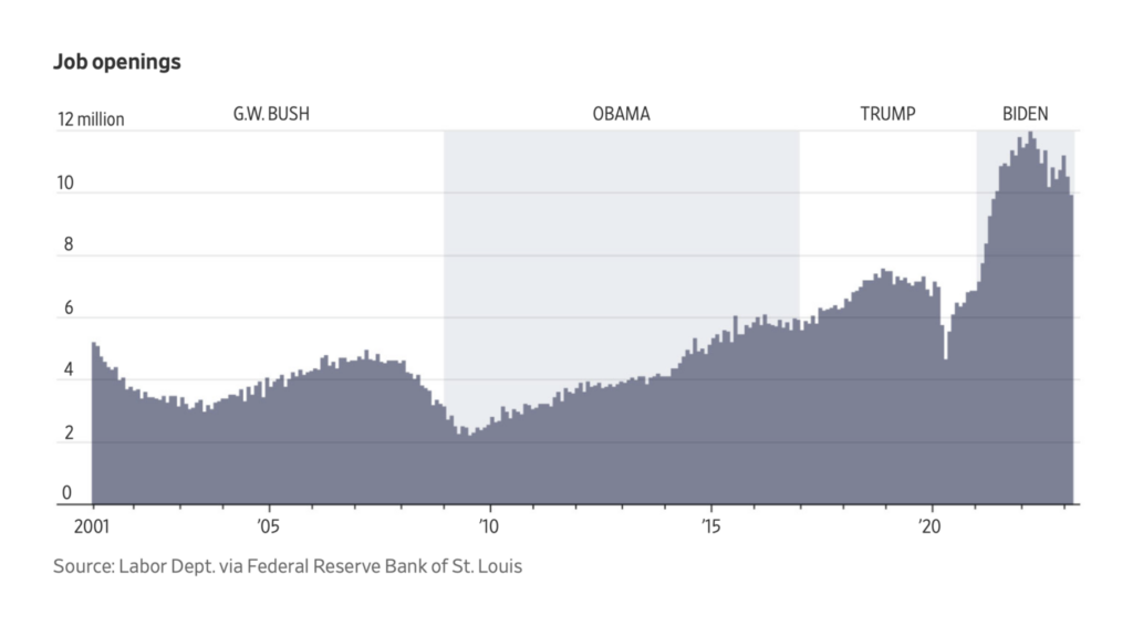
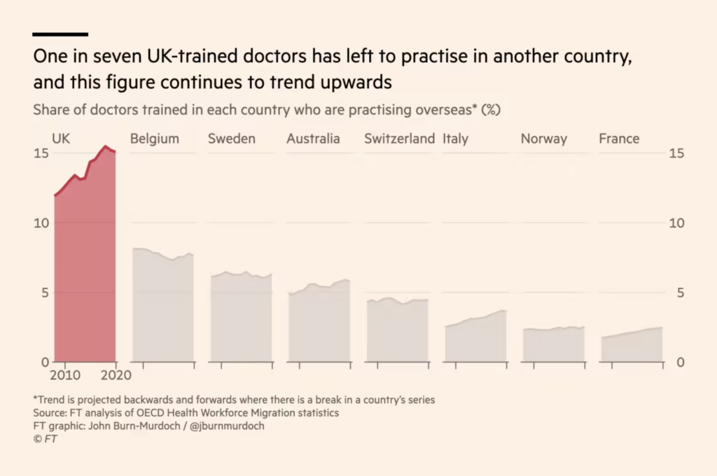
Several charts this week covered different angles on demographic trends, gender, and the workforce:
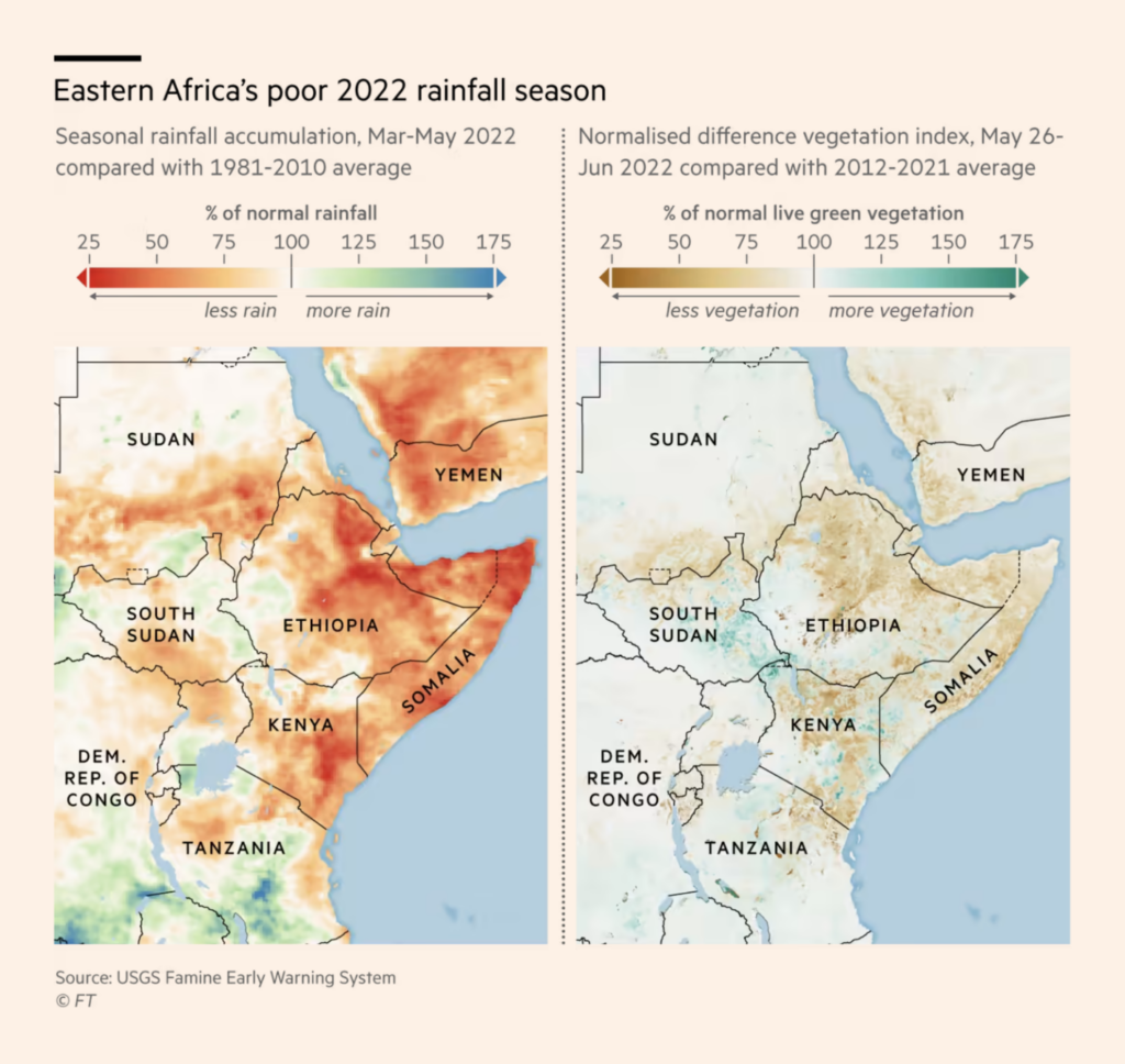
These three maps looked at ecological effects of climate change:
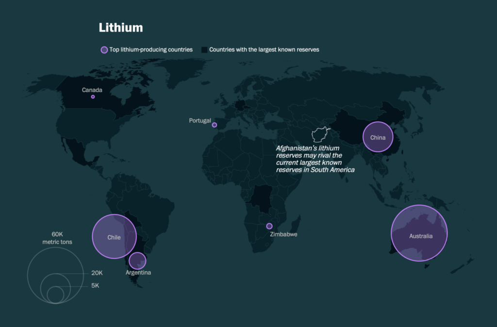
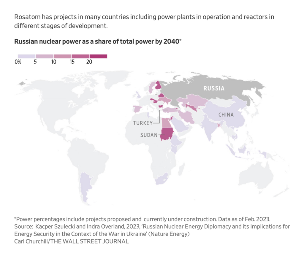
And electric vehicles and nuclear power also stayed in the news:
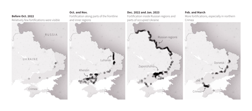
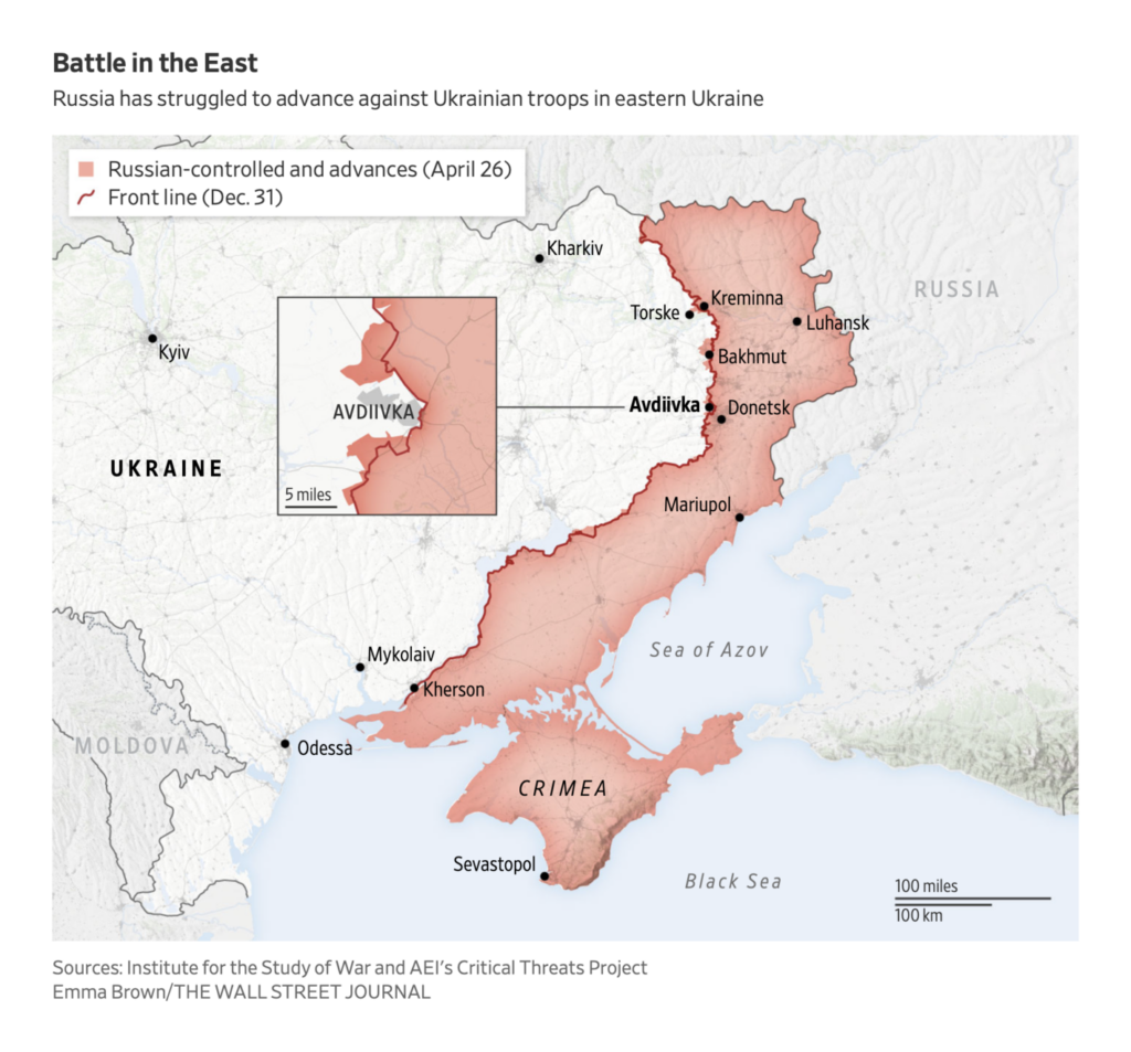
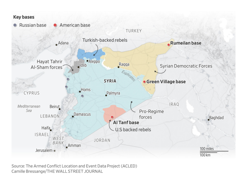
We saw maps of Russian positions in Ukraine and Syria:
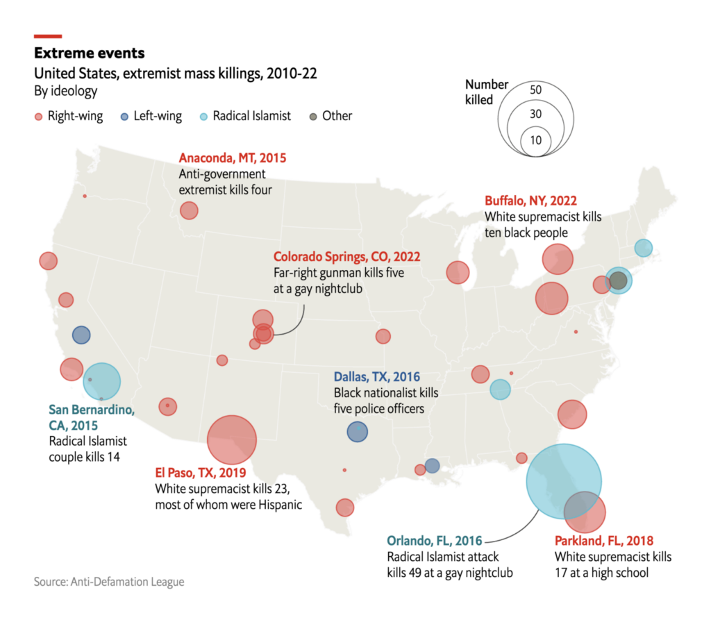
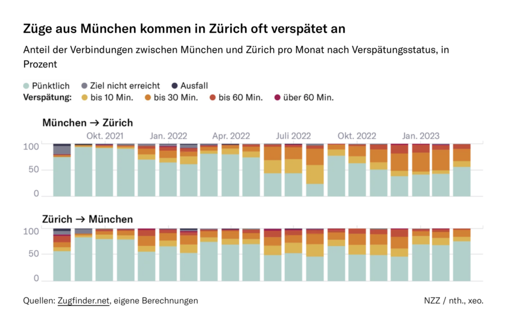
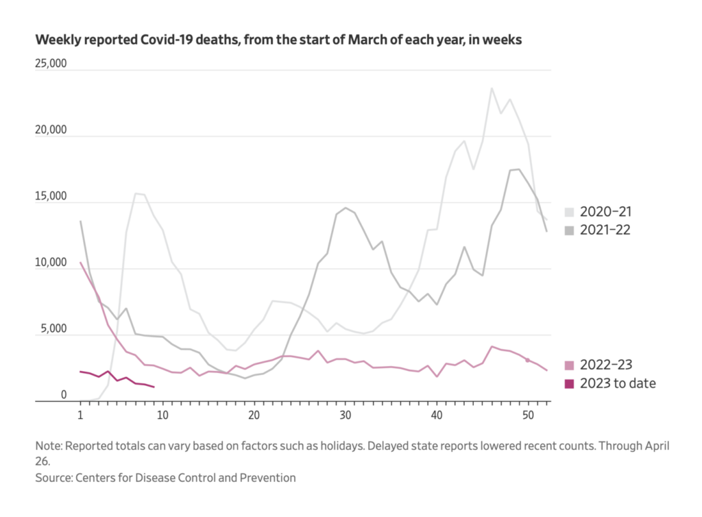
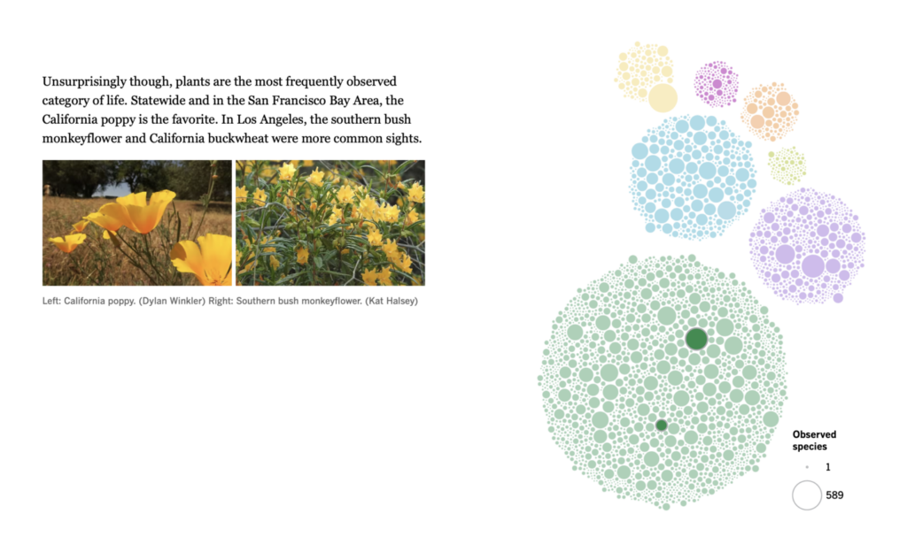
And on the bad-to-good-news spectrum — political violence, train delays, and wildflowers:
What else we found interesting

Applications are open for…
- An assistant data and graphics editor at the Los Angeles Times
- Scott Trust bursaries for postgraduate journalism students
- An interaction designer at Funke Mediengruppe
- A senior reporter, a graphics journalist, and a digital designer at the Financial Times
Help us make this dispatch better! We’d love to hear which newsletters, blogs, or social media accounts we need to follow to learn about interesting projects, especially from less-covered parts of the world (Asia, South America, Africa). Write us at hello@datawrapper.de or leave a comment below.
Want the Dispatch in your inbox every Tuesday? Sign up for our Blog Update newsletter!


Comments