We want to enable everyone to create beautiful charts, maps, and tables. New to data visualization? Or do you have specific questions about us? You'll find all the answers here.
The best of last week’s big and small data visualizations
Vivien Serve
Welcome back to the 143rd edition of Data Vis Dispatch! Every week, we publish a collection of the best small and large data visualizations we find, especially from news organizations — to celebrate data journalism, data visualization, simple charts, elaborate maps, and their creators.
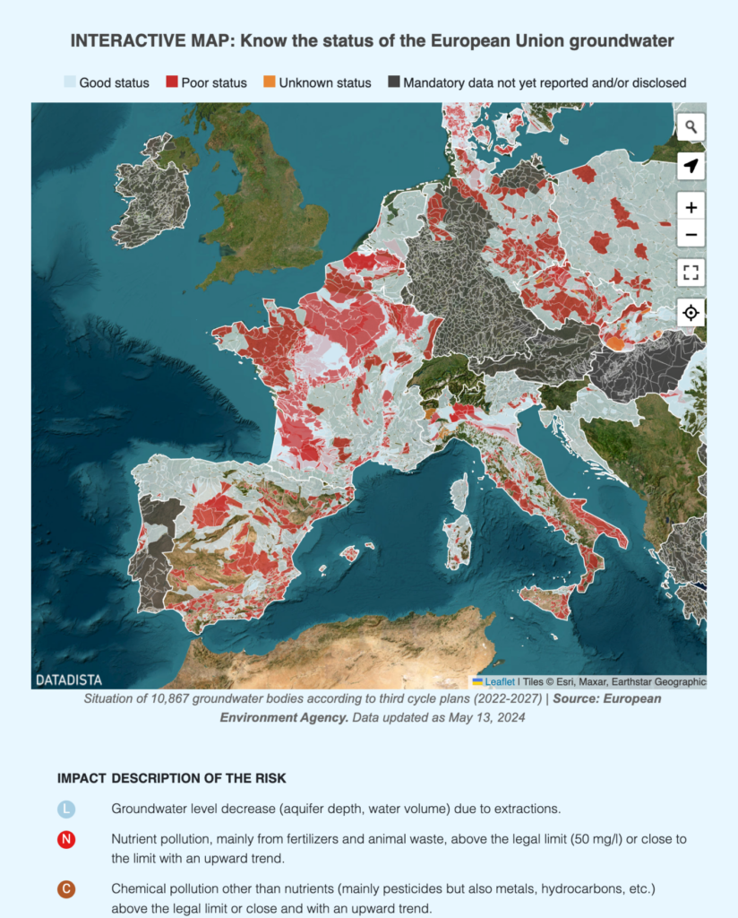
Recurring topics this week include groundwater, habitat, and how humans affect nature.
Two interactive map tools look at history on different scales — one of them offering over a million maps!
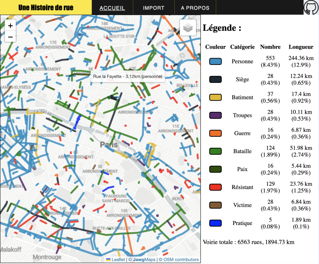
Petr Pridal: “Preview of https://TimeMap.org – the most comprehensive interactive map of history, which is launched today by @OldMapsOnline & @MapTiler teams at David Rumsey Map Center @DavidRumseyMaps at @Stanford university,” May 15 (Tweet, Website)Sur le Champ: “Quelle place occupent les rues dont le nom a une origine historique militaire à Paris ? Pour rendre ça visuel, j’ai demandé à un ami informaticien de me coder un petit outil. Je vous présente ici les résultats (je ferai un fil méthode et un autre utilisation de l’outil),” May 19 (Twitter Thread, Website)
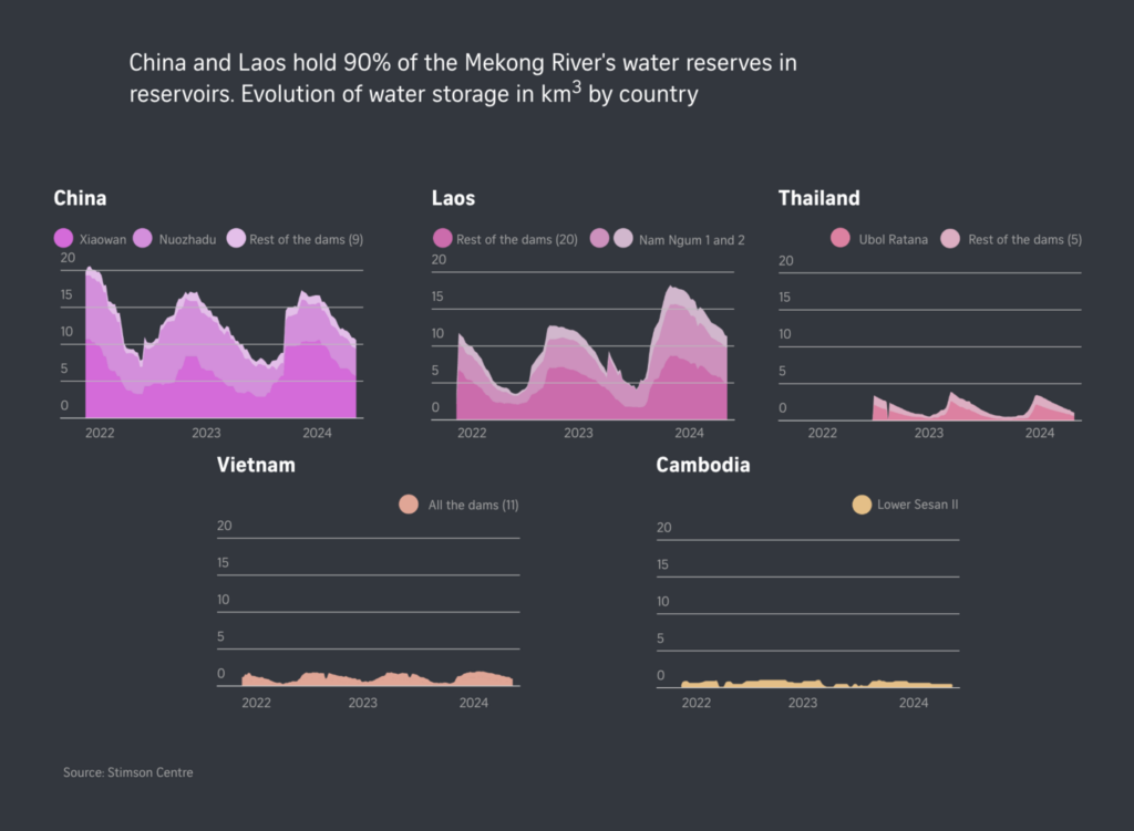
Another map topic this week was groundwater pollution:
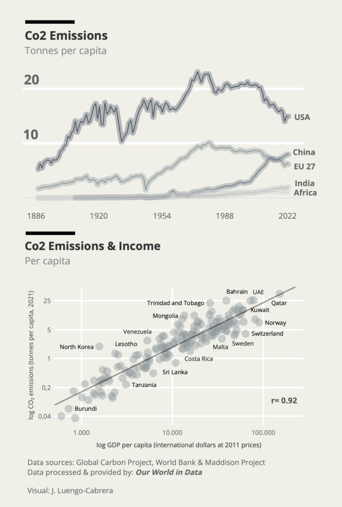
Let’s cut to a longer segment about the environment (and how it’s connected with everything else). We’ll start with CO₂ emissions:
Denis Vannier: “Une carte réalisée pour @Splannenquetes, qui publie aujourd’hui un dossier sur le coût humain des pollutions industrielles dans l’agglo nazairienne,” May 16 (Tweet, Map)José Luengo-Cabrera: “Per capita Co2 Emissions & Income Data: @gcarbonproject, @worldbankdata & @univgroningen Data processed & provided by @OurWorldInData,” May 15 (Tweet)
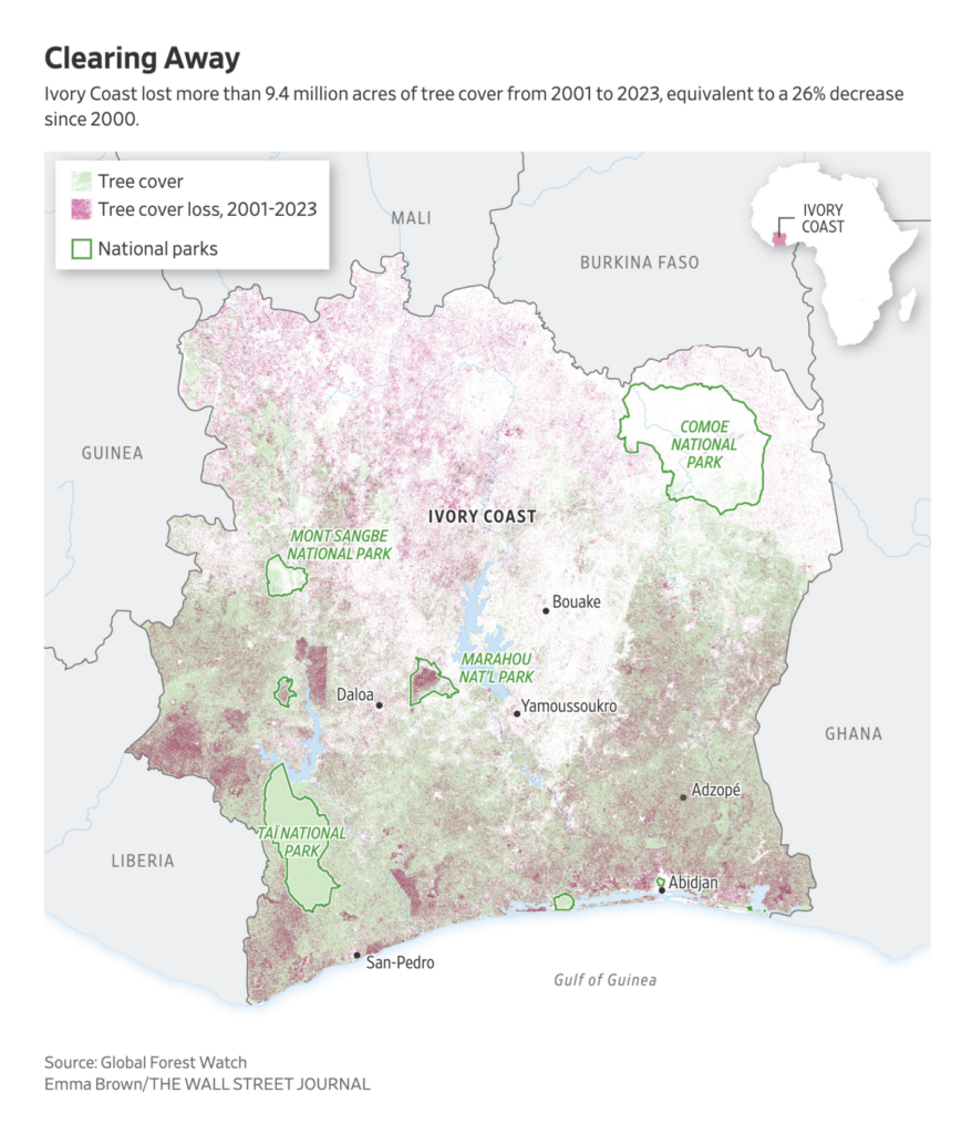
Next up — how human behavior is changing natural landscapes:
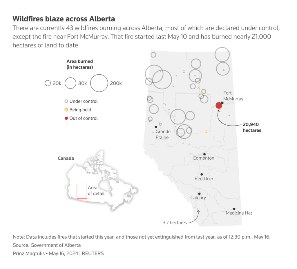
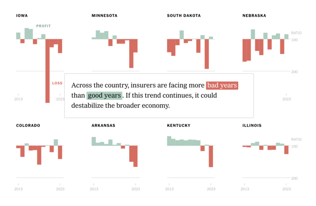
Wildfires aren’t just bad for the environment and the climate — they’re also bad for insurance companies:
Reuters: Rain helps stall wildfire near Canadian oil city, May 17The New York Times: “As climate change produces more extreme weather, insurers are losing money around the U.S. even in states with low hurricane and wildfire danger. The result is insurers are raising premiums by as much as 50% or more or leaving entire states altogether,” May 16 (Tweet, Article)
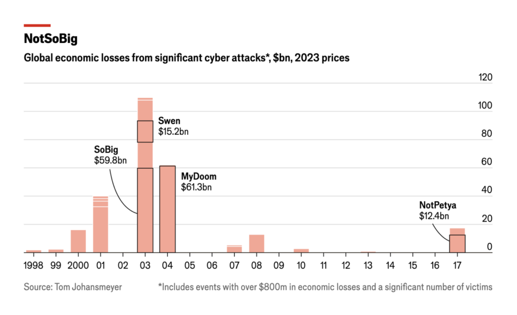
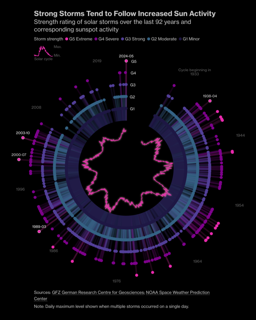
Surprisingly, major cyberattacks tend to cause far less damage than solar storms:
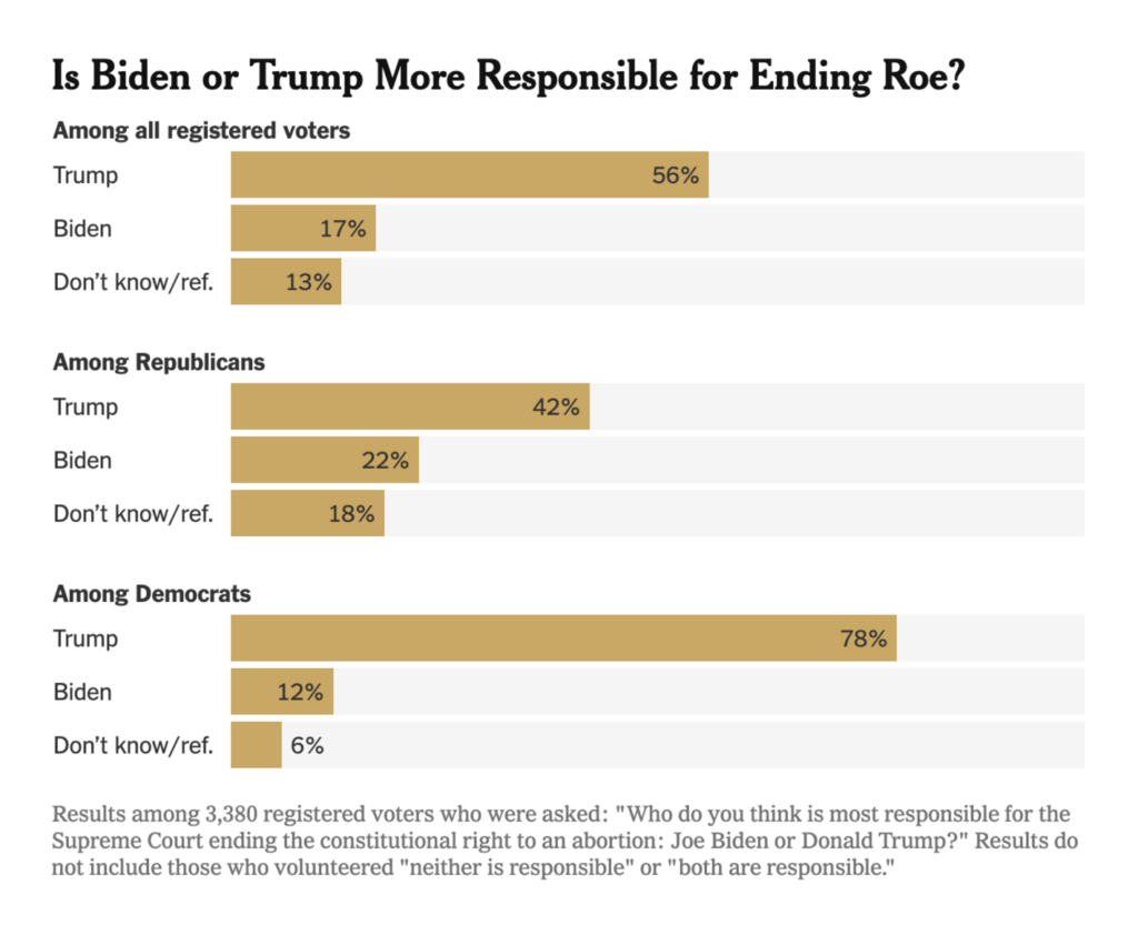
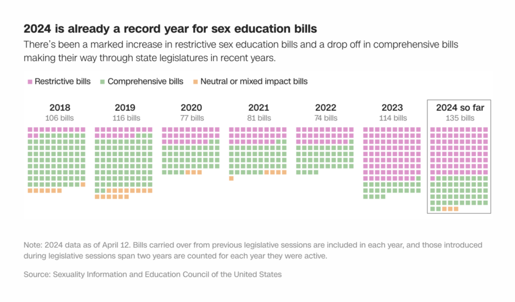
The reopened debate over abortion in the United States is also having a significant effect on national politics. And since the Dobbs ruling, the number of laws restricting sex education in schools has increased significantly:
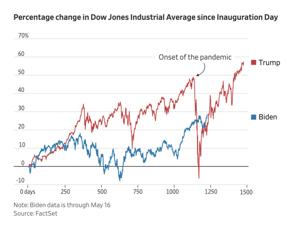
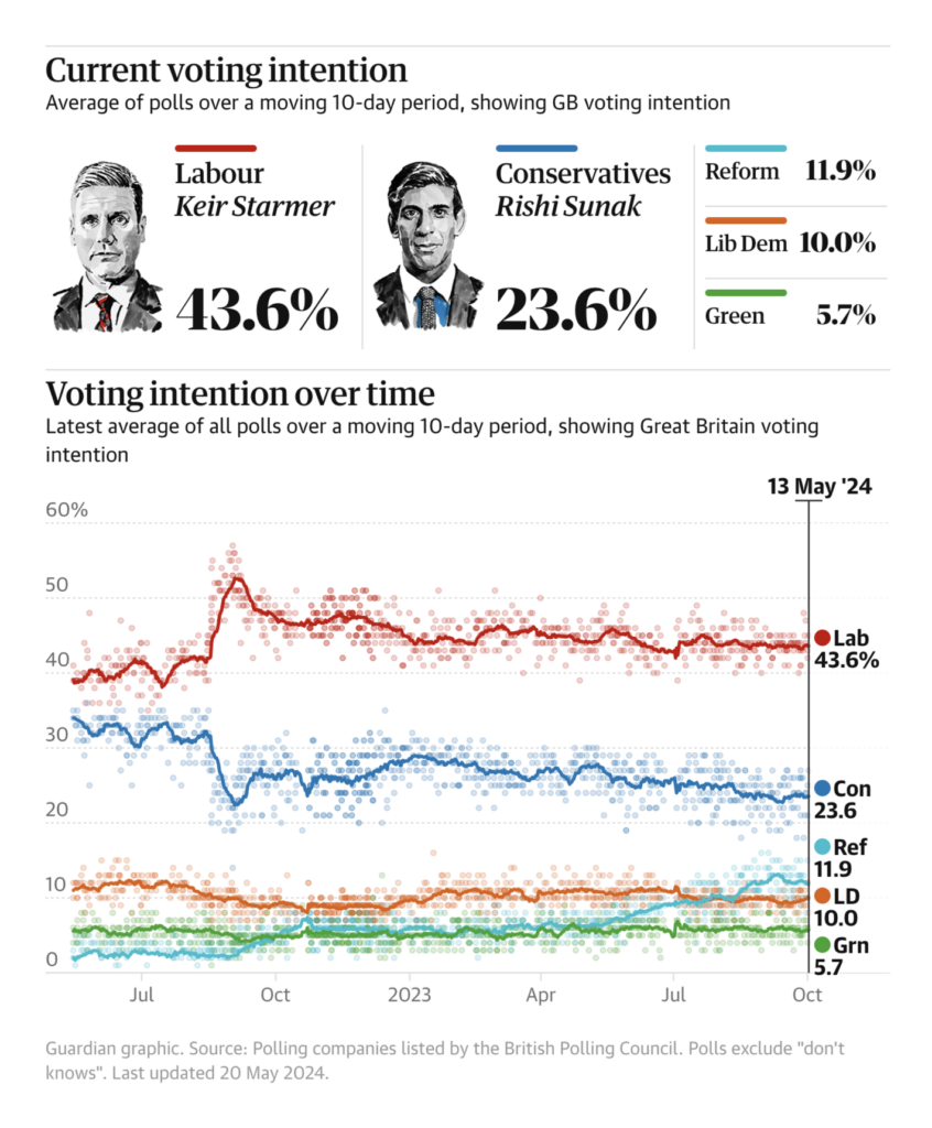
A U.K. general election is coming into view, with most analysts expecting one at the end of this year. That means the start of the poll trackers (Financial Times, BBC, The Economist, The Telegraph):
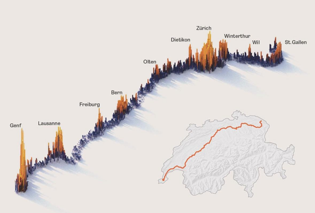
Zeit Online: Wie viel Wohnfläche haben Sie im Vergleich?, May 15 Graphicacy: “We recently had the privilege of working with @PewStates team to redesign their Fiscal 50 platform to develop a robust data explorer with a responsive suite of charts with an enhanced state-level focus,” May 15 (Tweet, Article)biwook: “One third of the population of Switzerland lives within 5 kilometers of the main train line crossing the country,” May 16 (Reddit Post)
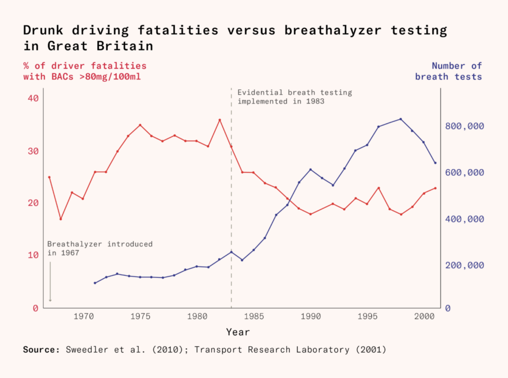
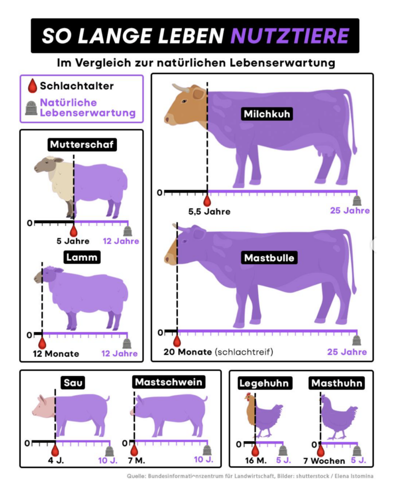
Drunk driving deaths have fallen in the UK — but farm animals are still dying far too soon:
Works in Progress: How the war on drunk driving was won, May 17funk: “6,8 Millionen Tonnen Fleisch wurden 2023 in Deutschland produziert. Unvorstellbar viel, aber deutlich weniger als im Jahr davor: 2022 waren es 7 Millionen Tonnen Fleisch. Und davor das Jahr 7,6 Millionen. Die Tendenz zeigt also: Die Fleischproduktion sinkt in Deutschland. Teilweise wurden die Lebensdauer und das Schlachtalter in Spannen angegeben. In diesen Fällen haben wir der Einfachheit halber immer die höhere Zahl gewählt […],” May 18 (Instagram Post)
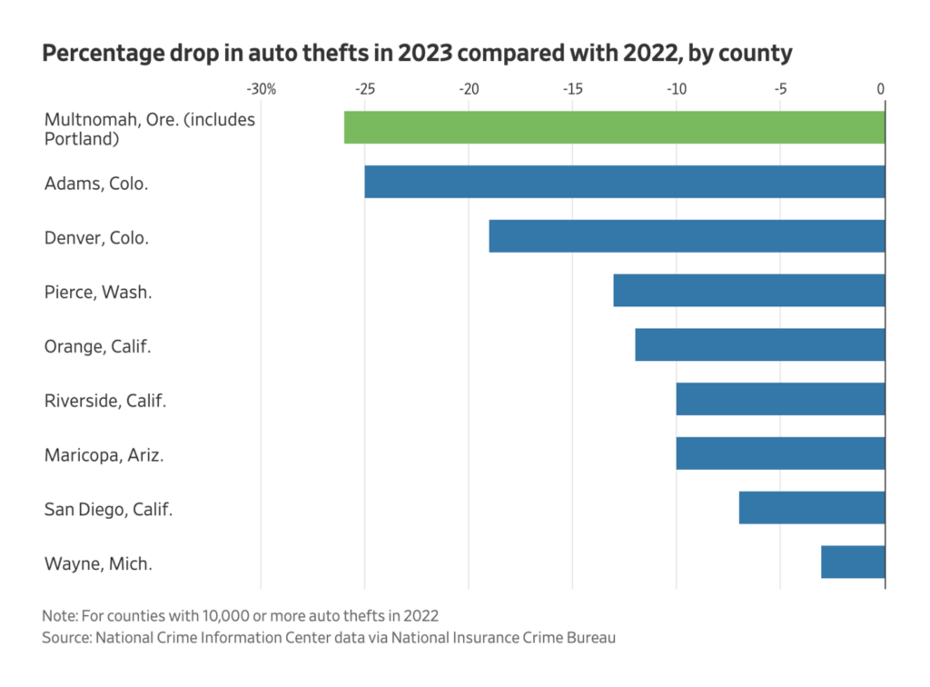
Finally, a Facebook group that beats the police at finding stolen cars:
Help us make this dispatch better! We’d love to hear which newsletters, blogs, or social media accounts we need to follow to learn about interesting projects, especially from less-covered parts of the world (Asia, South America, Africa). Write us at hello@datawrapper.de or leave a comment below.
(she/her) is a working student on Datawrapper’s Communications team. She creates the Data Vis Dispatch to keep data visualization enthusiasts up to date on exciting new projects. When she’s not working, she studies interface design, and when she’s not studying, she’s planning a festival stage or soldering light installations. Vivien lives in Potsdam.


Comments