This article is brought to you by Datawrapper, a data visualization tool for creating charts, maps, and tables. Learn more.
Data Vis Dispatch, May 23
The best of last week’s big and small data visualizations

Welcome back to the 94th edition of Data Vis Dispatch! Every week, we’ll be publishing a collection of the best small and large data visualizations we find, especially from news organizations — to celebrate data journalism, data visualization, simple charts, elaborate maps, and their creators.
Recurring topics this week include migrant labor, natural resources, and bats.
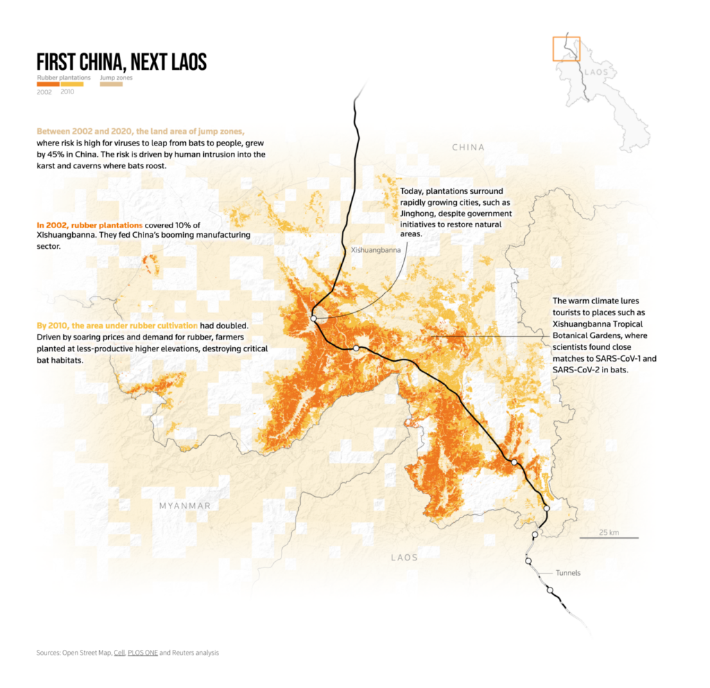
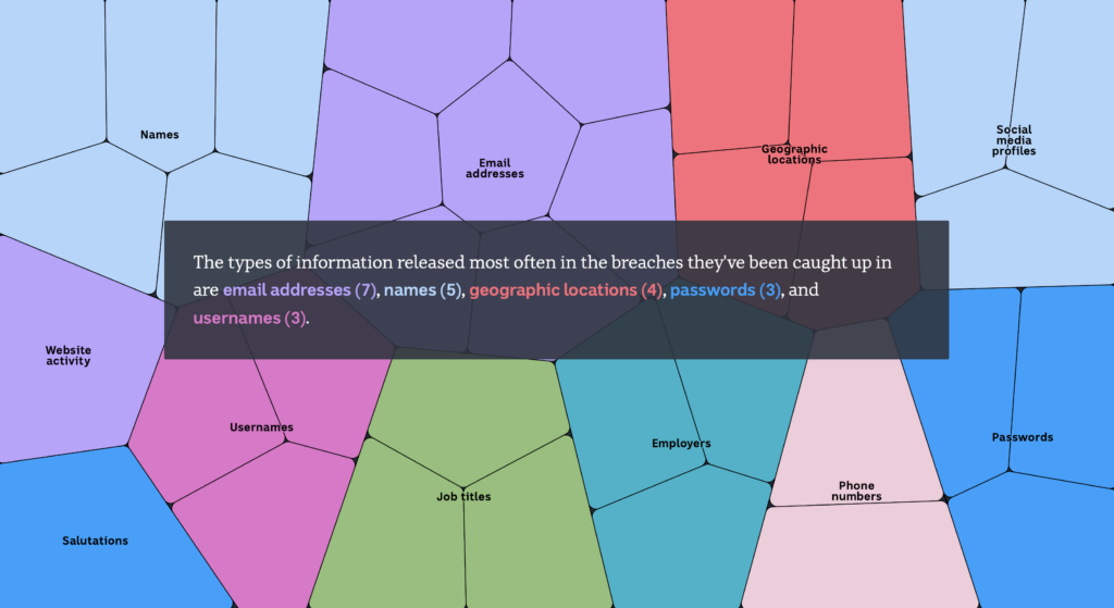
A Reuters investigation on the public health risks of increasing human-bat contact included a wealth of beautiful visualizations:
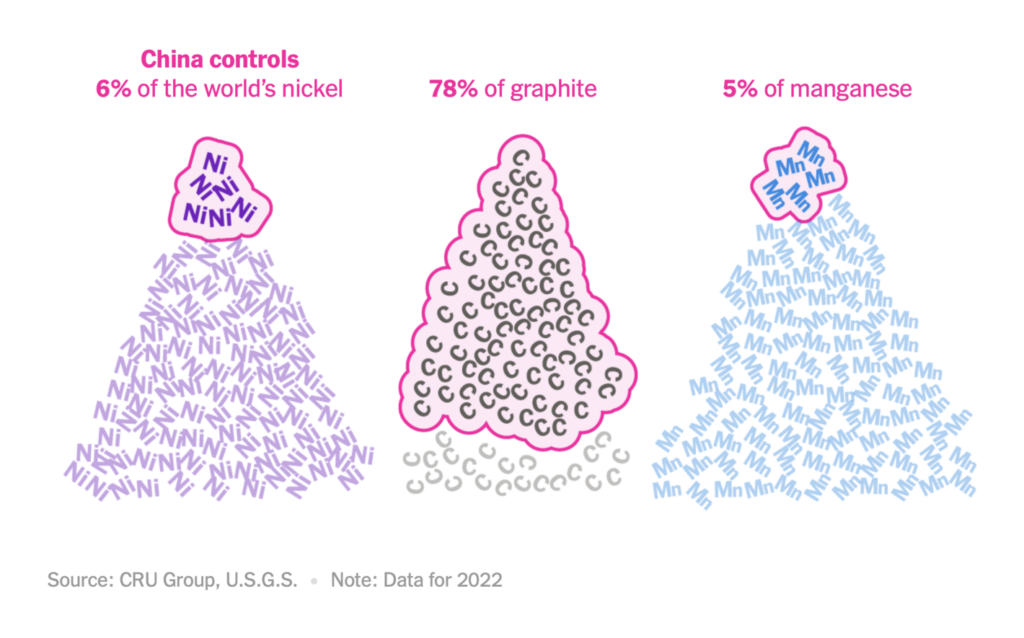
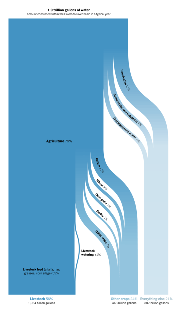
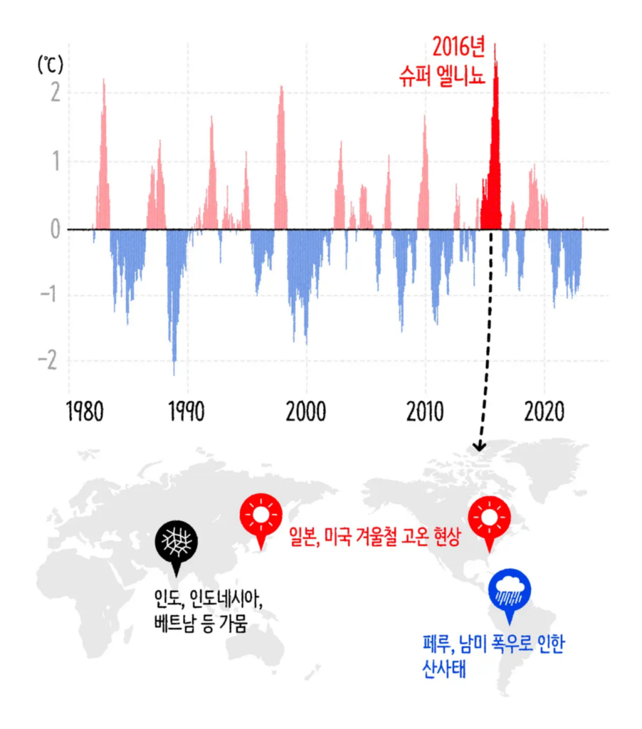
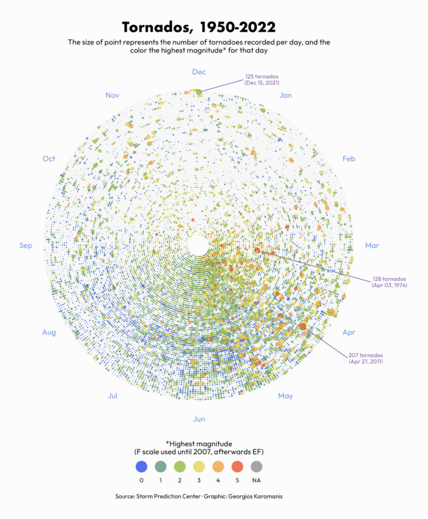
Charts on the environment covered natural resources and weather patterns:
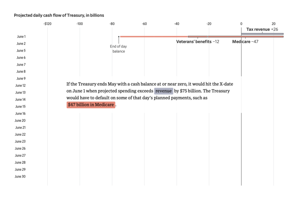
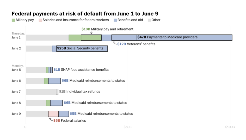
With still no deal to raise the U.S. debt ceiling, two charts explained how default might unfold:
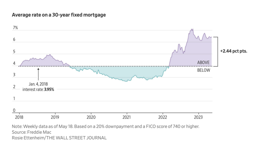
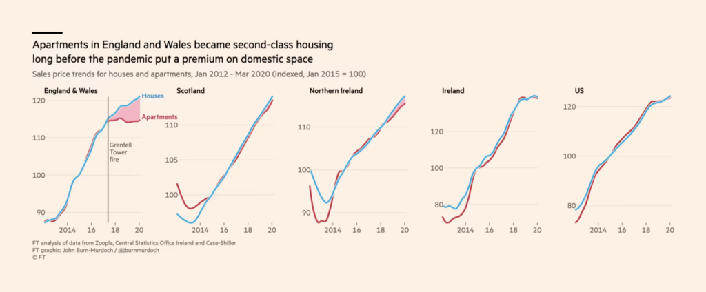
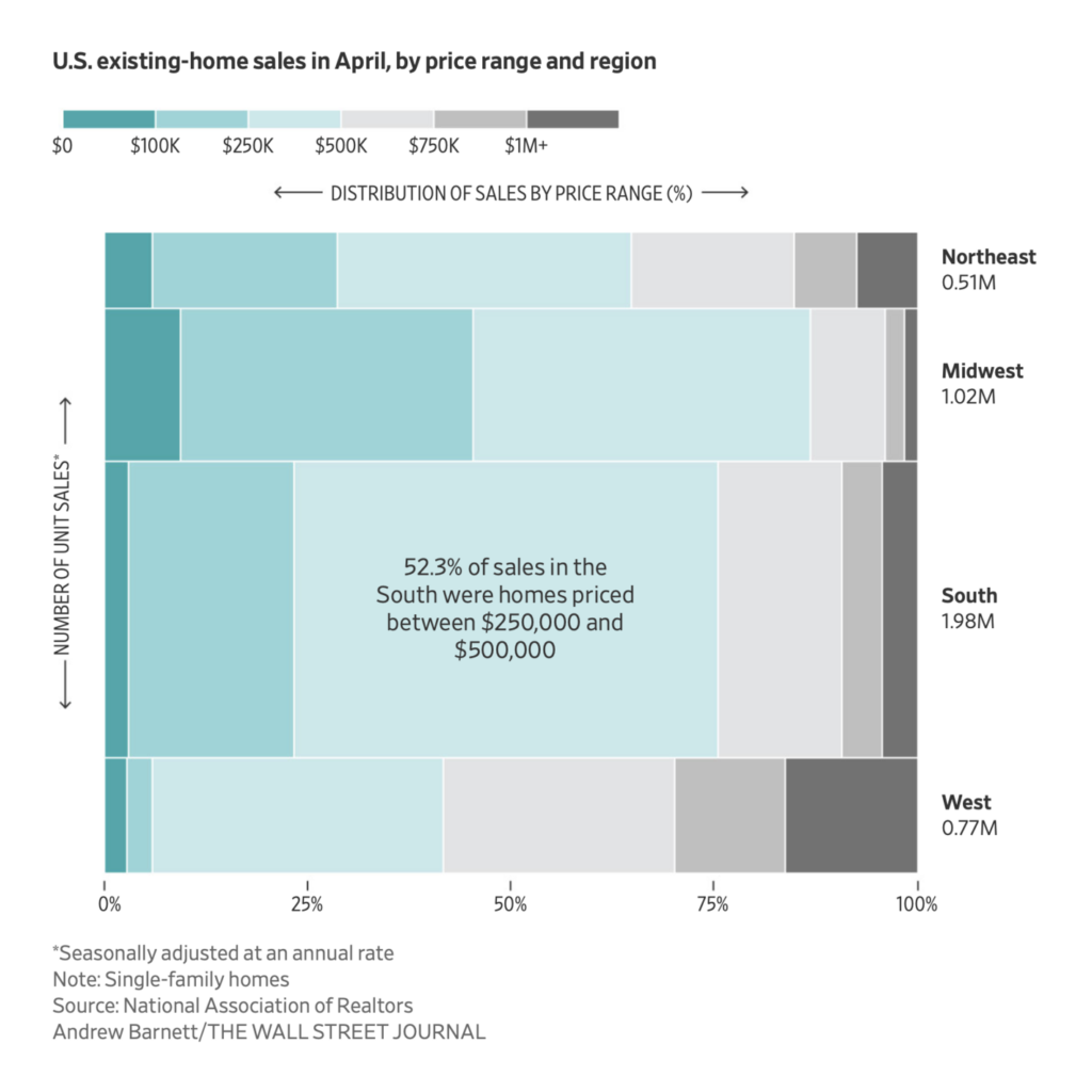
We got a look at recent real estate history in England and the U.S.:
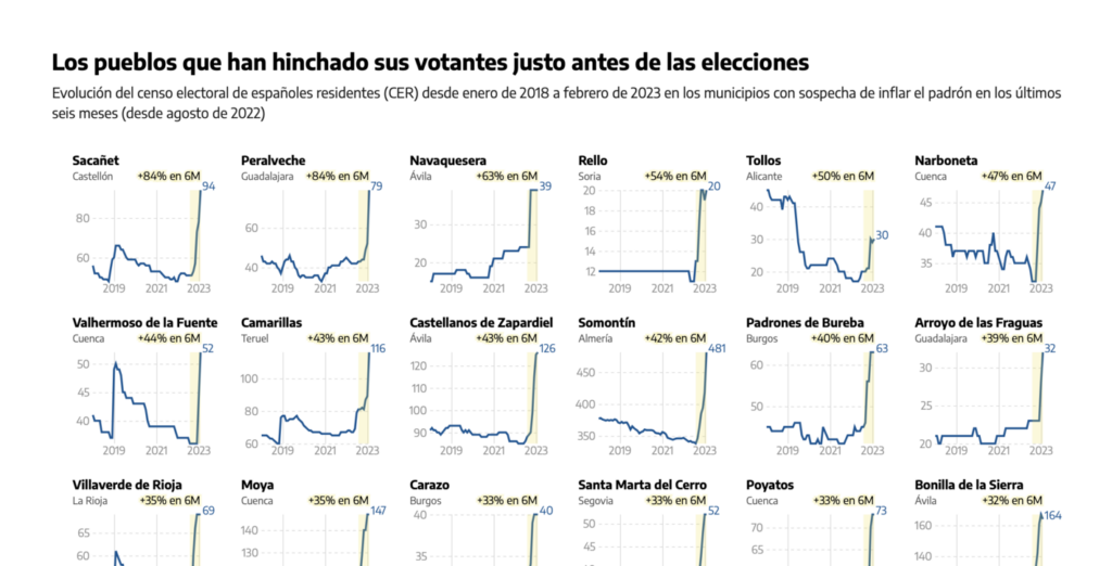
And using two very different data sets, these charts both point out patterns that smell a little fishy:
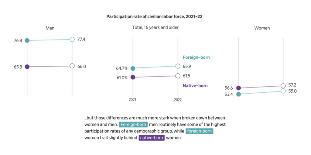
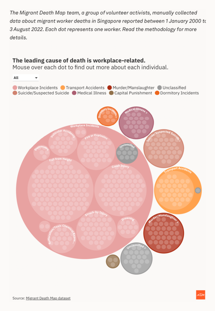
Migrant labor was a breakout topic this week:
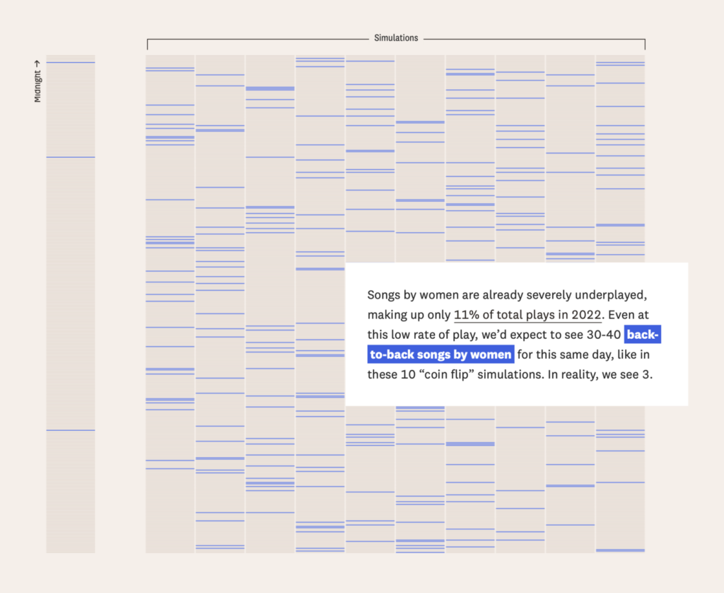
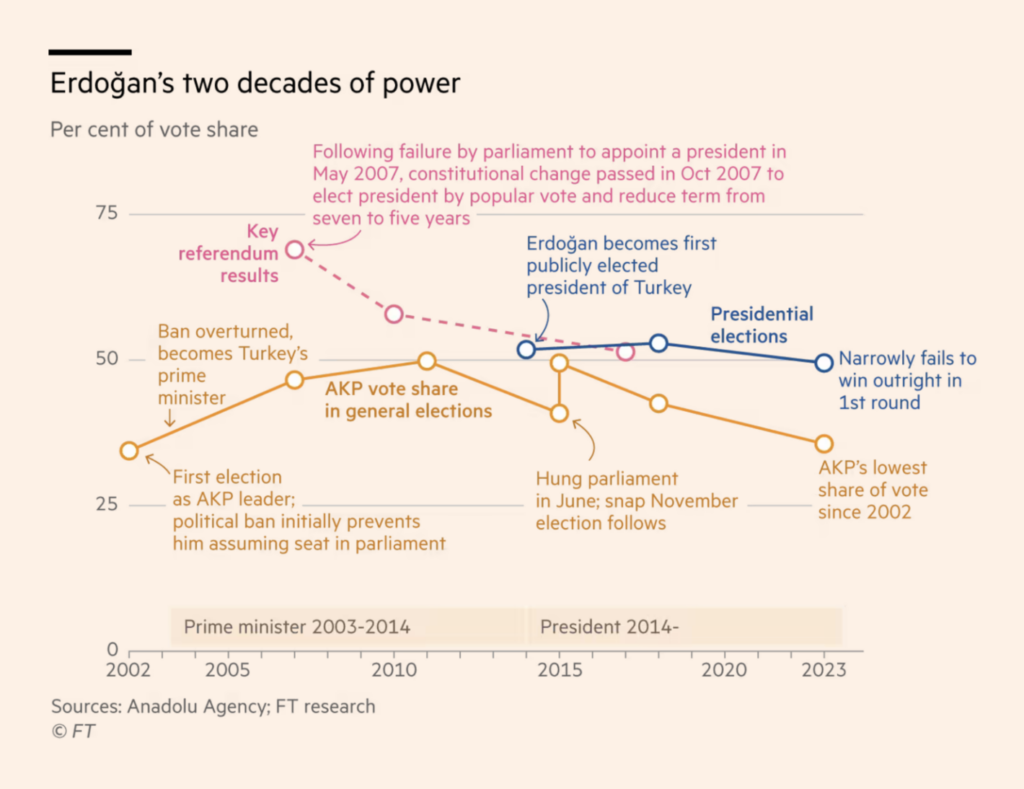
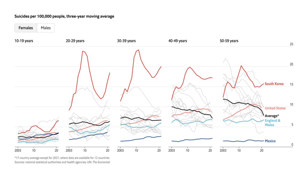
And we saw great simple line and area charts on topics from Erdoğan’s electoral successes to suicide in South Korea — plus one unconventional chart from FiveThirtyEight to finish out the week:
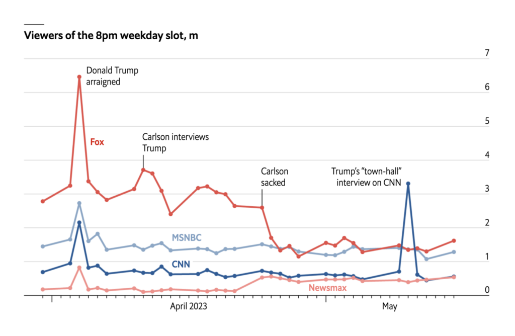
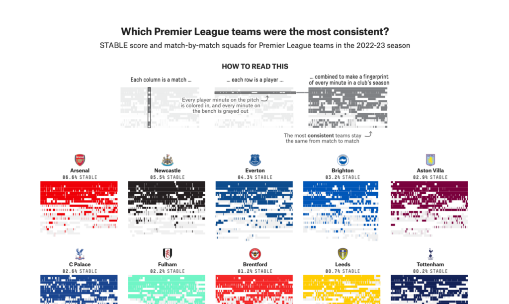
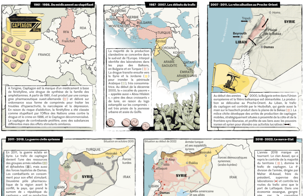
What else we found interesting

Plus: finalists for the Society for News Design’s annual awards, as well as this year’s Pulitzer Prize winners, including Mona Chalabi for her data illustrations on Jeff Bezos’ wealth.
Applications are open for…
- A data journalist at The Markup
- Data journalism trainees at the Süddeutsche Zeitung
- An editor/producer at Information is Beautiful
Help us make this dispatch better! We’d love to hear which newsletters, blogs, or social media accounts we need to follow to learn about interesting projects, especially from less-covered parts of the world (Asia, South America, Africa). Write us at hello@datawrapper.de or leave a comment below.
Want the Dispatch in your inbox every Tuesday? Sign up for our Blog Update newsletter!


Comments