Data Vis Dispatch, May 24

The best of last week’s big and small data visualizations

Welcome back to the 46th edition of Data Vis Dispatch! Every week, we’ll be publishing a collection of the best small and large data visualizations we find, especially from news organizations — to celebrate data journalism, data visualization, simple charts, elaborate maps, and their creators.

Recurring topics this week include supply chain problems, the war in Ukraine, and student loan debt in the United States.

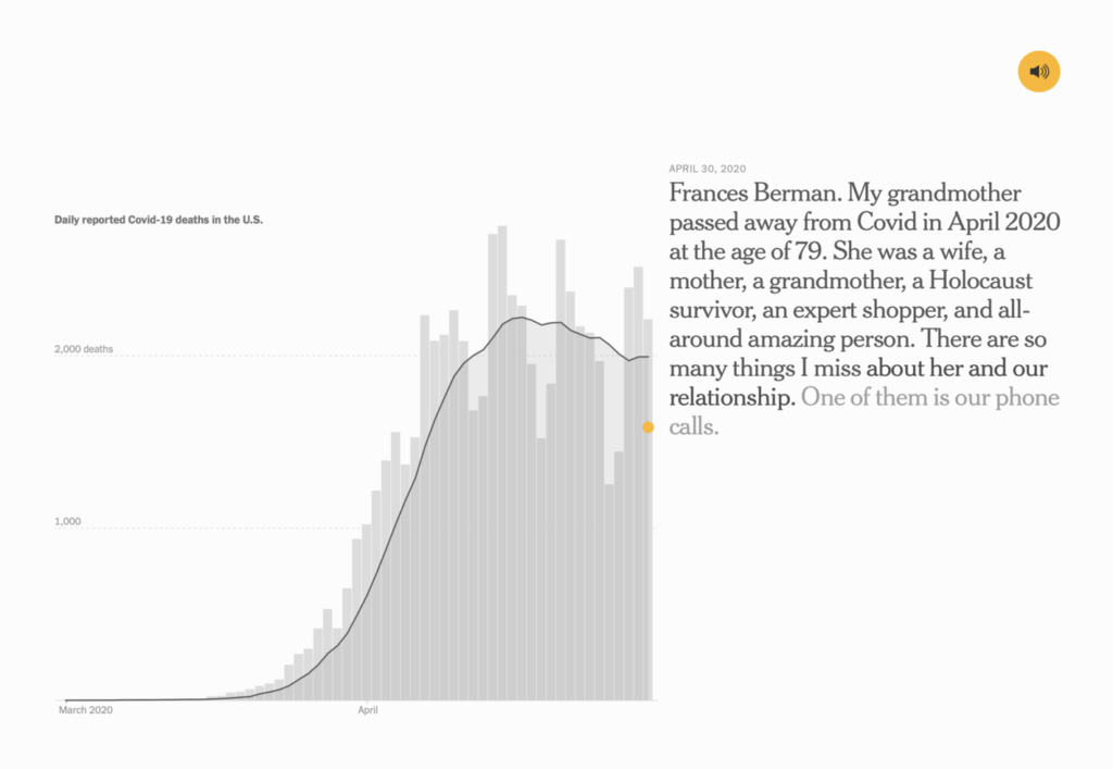
Last week’s milestone of one million U.S. COVID deaths was hard to grasp on every level. These projects tried to put the number in personal and historical context:

The New York Times: Voices of a Grieving Nation, May 19
USA Today: Pandemic leaves more than a million dead in US and many questions, May 17

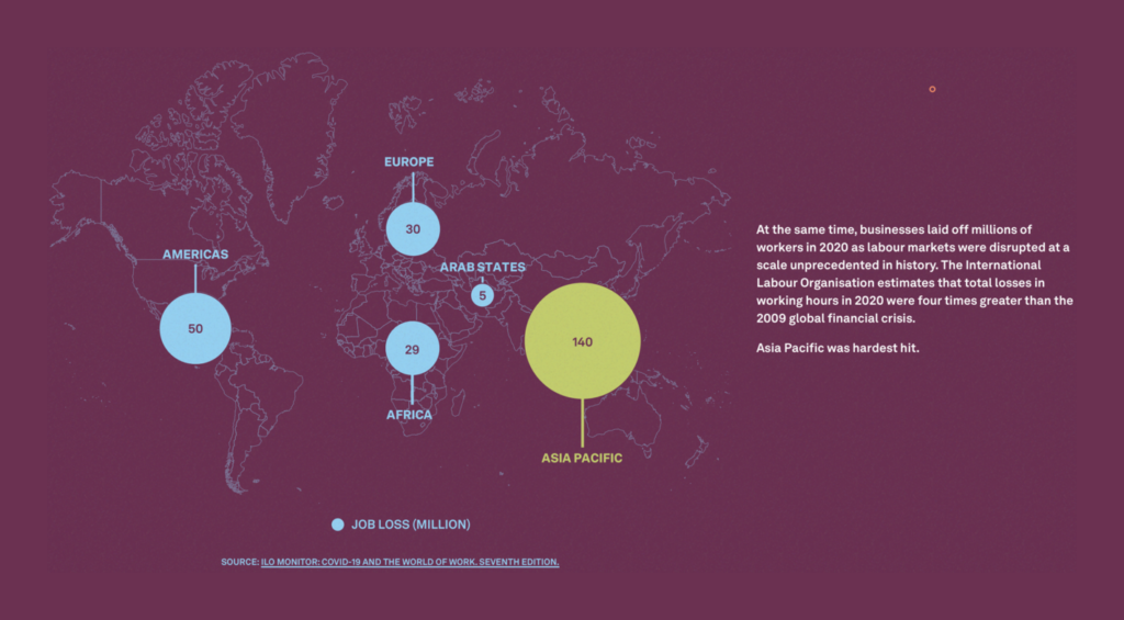
Other visualizations looked at the lasting economic effects of the pandemic:

Kontinentalist: How COVID-19 widened Asia’s wealth gap, May 18
Financial Times: Death notices for the city are premature, May 20

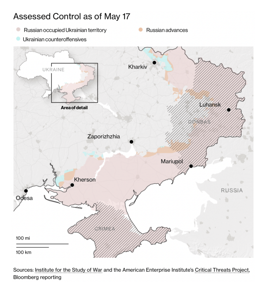
In Ukraine, the Russian army has been forced again and again to scale back its military objectives:

The New York Times: Russia’s Shrinking War, May 24
Süddeutsche Zeitung: “Wenn das so weitergeht, ist die russische Armee im Juni mit der Offensivkraft am Ende,” May 18
Bloomberg: Mariupol Has Fallen, May 10

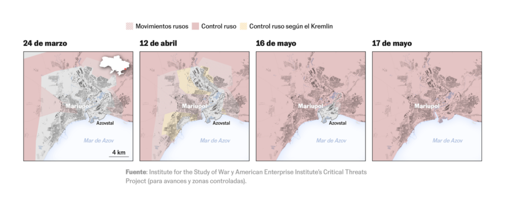
But Russia has won brutal victories too, as in Mariupol, where the last Ukrainian troops surrendered this week:

Le Monde: Le combat russe pour la conquête de Marioupol, ville symbolique et stratégique, May 21
El País: Cómo ha cambiado el mapa de Ucrania en tres meses de guerra, May 22

Evidence of war crimes by Russian troops continues to accumulate:

The New York Times: New Evidence Shows How Russian Soldiers Executed Men in Bucha, May 19
The Economist: Russian forces are killing journalists in Ukraine, May 19

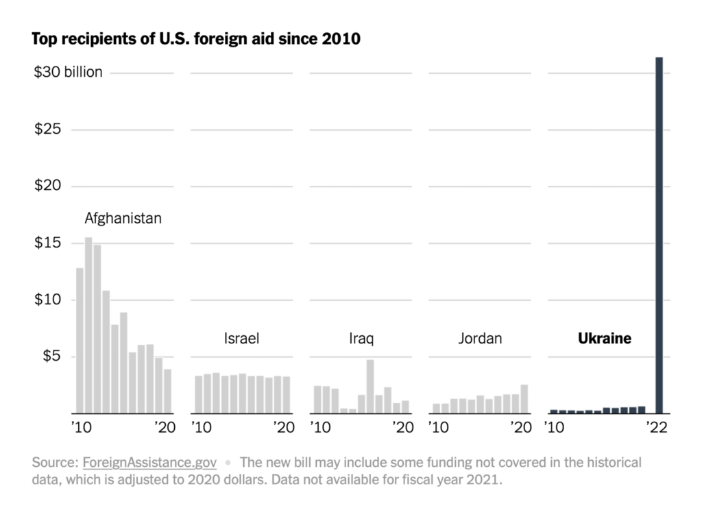
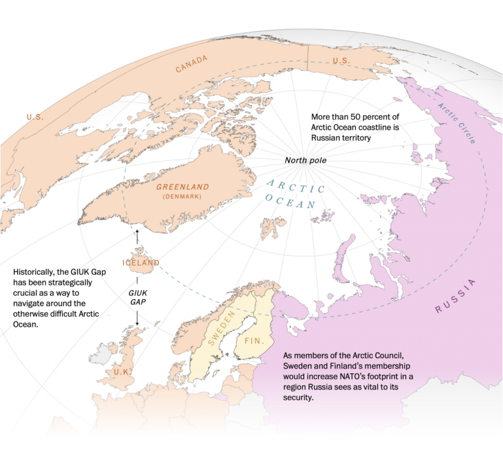
Other countries have responded with unprecedented aid to Ukraine — and by rethinking their own security:

The New York Times: Four Ways to Understand the $54 Billion in U.S. Spending on Ukraine, May 20
The Washington Post: Four maps explain how Sweden and Finland could alter NATO’s security, May 19

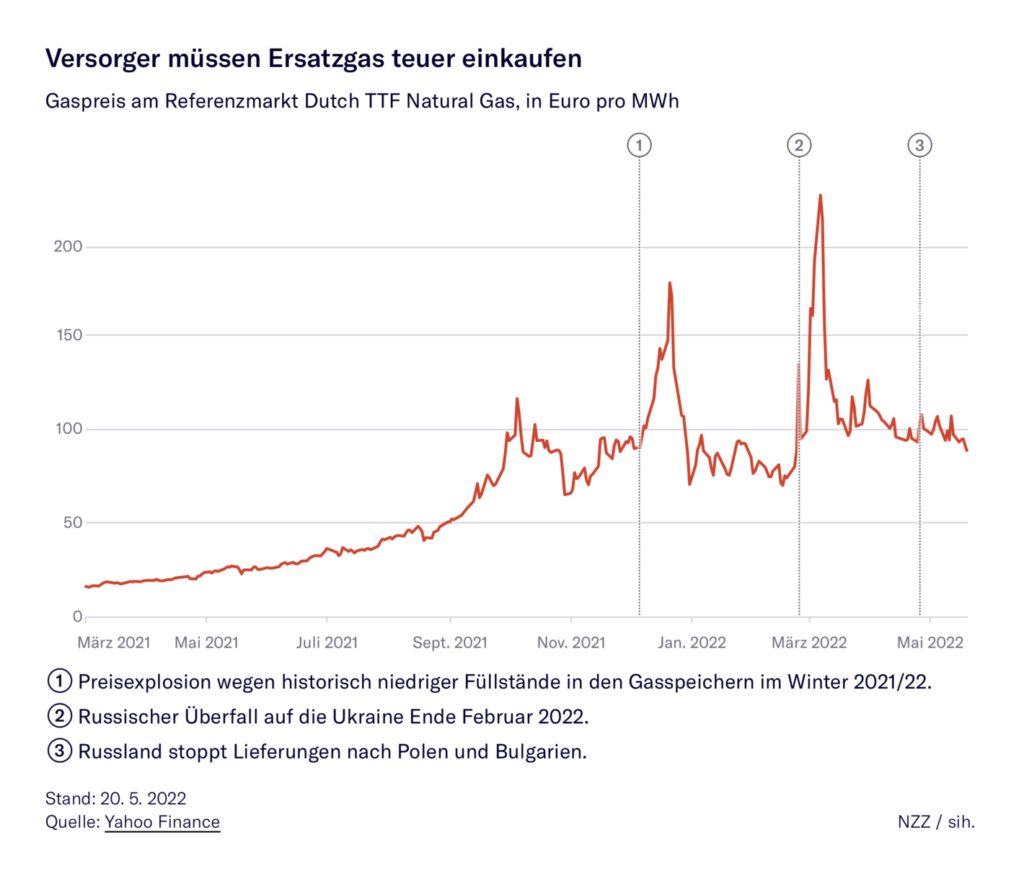
Russia is finding ways to keep energy exports flowing despite sanctions:

Zeit Online: Wie russisches Öl über die Weltmeere irrt, May 23
Neue Zürcher Zeitung: So wirkt sich die Embargo-Politik auf die Gas- und Strompreise aus, May 23

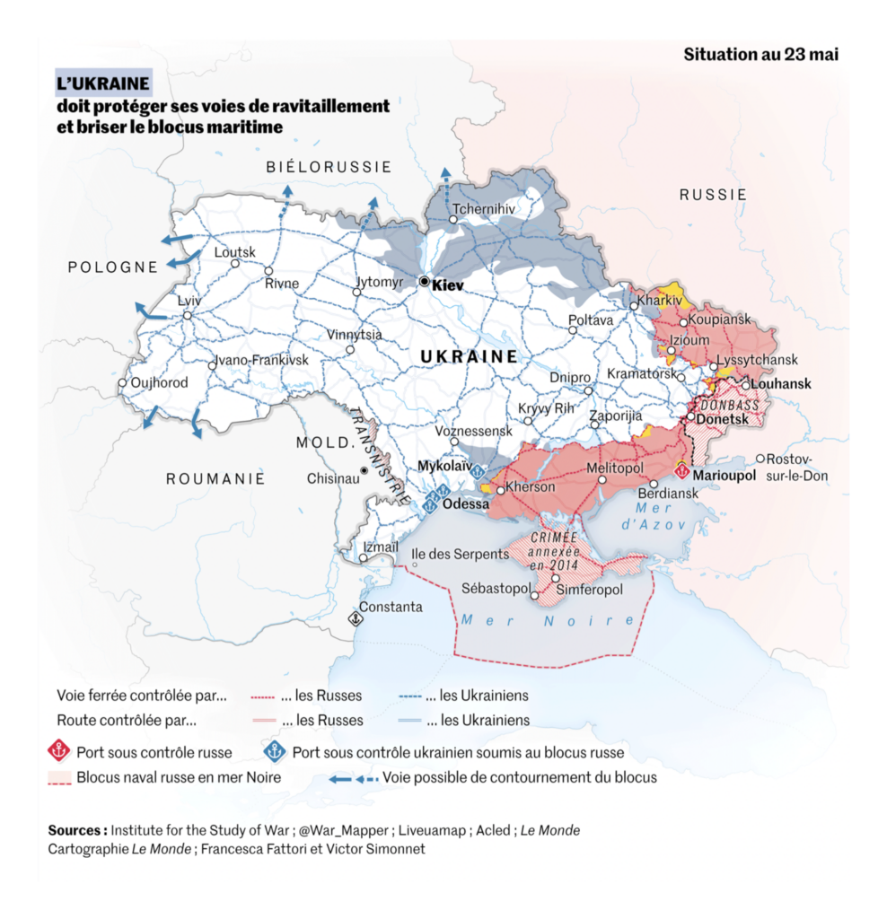
But without access to the sea, Ukraine is struggling with its own supply lines:

Le Monde: La carte de la guerre en Ukraine, jour après jour, May 24

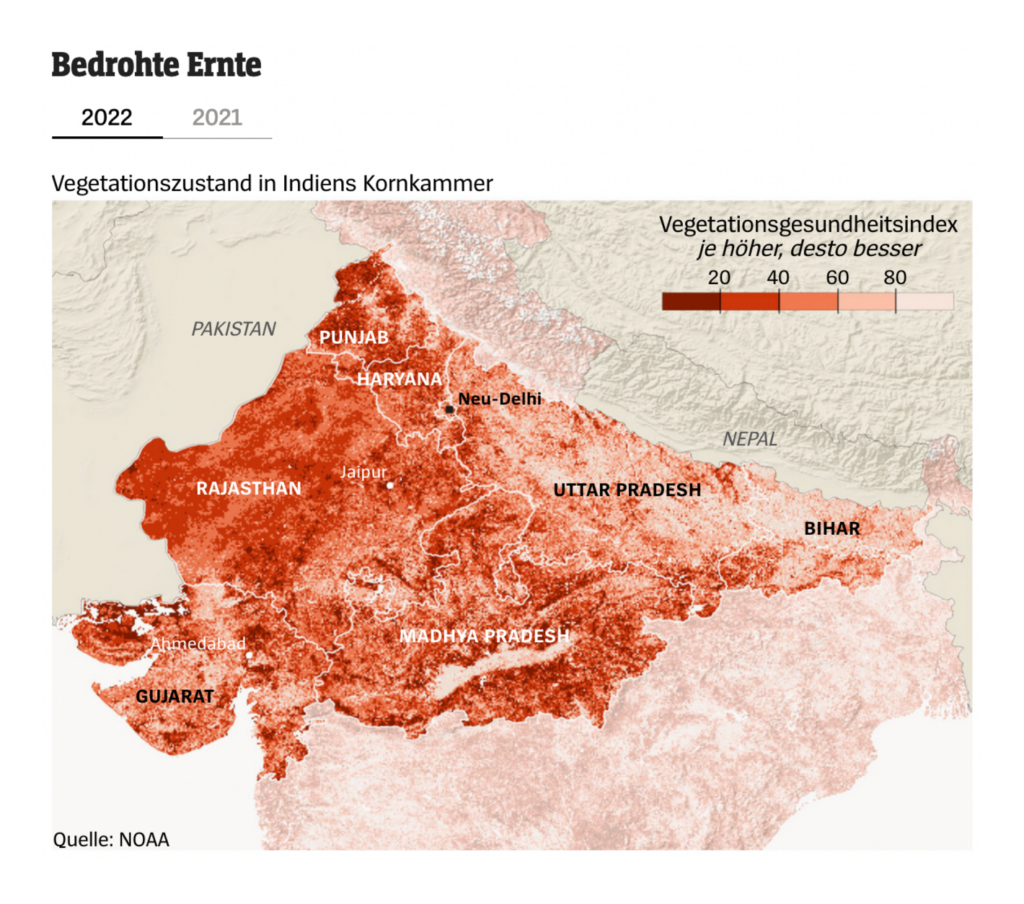
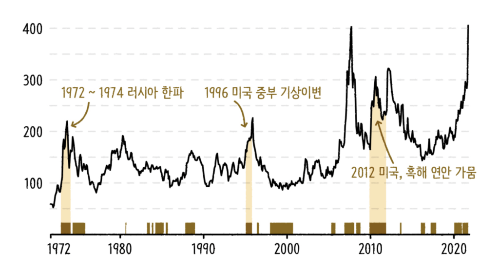
Combined with crop-killing heat in India, that means grain prices are likely to stay high:

Spiegel: Die Leute hungern, die Preise steigen, May 21
SBS News: 전쟁보다 ○○○○가 – 식량위기에 더 큰 문제라고?, May 19

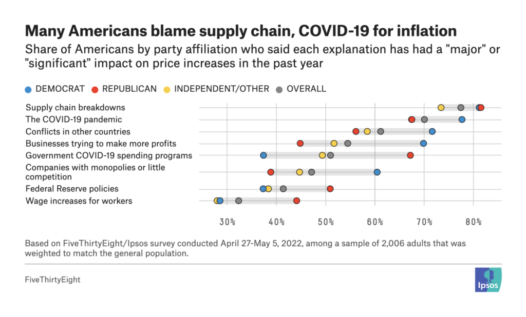
In fact, lots of visualizations this week focused on problems in the supply chain:

Financial Times: The truckers who keep our world moving, May 20
Bloomberg: What You Need to Know About the US Baby Formula Shortage, May 17
FiveThirtyEight: We Asked 2,000 Americans About Their Biggest Concern, May 17

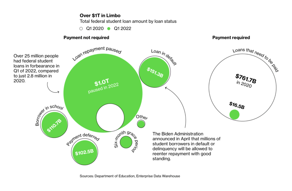
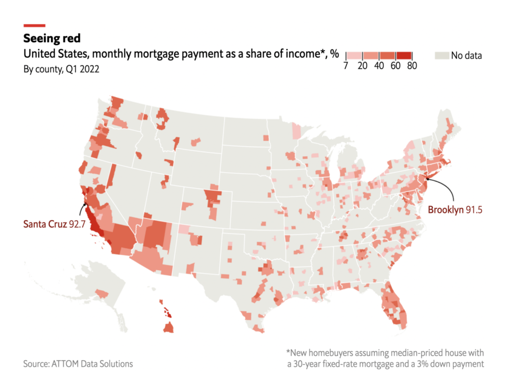
As well as other cost-of-living issues like student debt and housing:

Bloomberg: Why Forgiving Student Loan Debt Is So Complicated, May 20
The Washington Post: Who has student loan debt in America?, May 22
The Economist: Housing in America has become much harder to afford, May 23

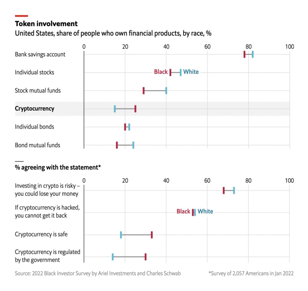
Other economic charts covered stocks and cryptocurrency:

The Wall Street Journal: Stock Market Is Top-Heavy, but Carnage Is Widespread, May 19
The Economist: Why the crypto crash hit black Americans hard, May 20

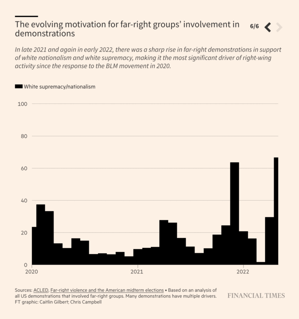
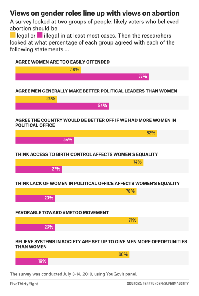
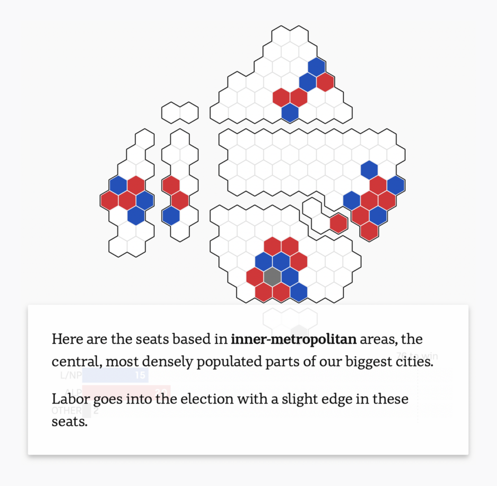
In politics, we saw visualizations on white supremacist demonstrations in the U.S. and the election map of Australia:

Financial Times: Buffalo shooting shines light on racist ‘great replacement’ theory, May 19
FiveThirtyEight: The Real Dividing Line On Abortion, May 20
ABC News: The Australian election map has been lying to you, May 19

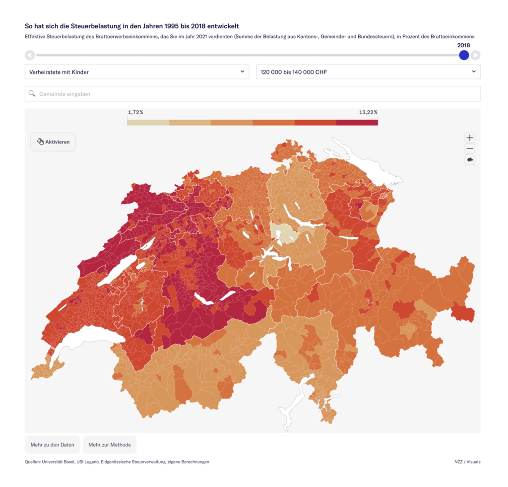
Two interactive tools let us explore data on taxes in Switzerland and infrastructure spending in the U.S.:

Neue Zürcher Zeitung: Steuerland Schweiz: So hat sich die Steuerbelastung in Ihrer Gemeinde in den letzten 27 Jahren entwickelt, May 24
McKinsey & Company: Bipartisan Infrastructure Law Navigator, May 17

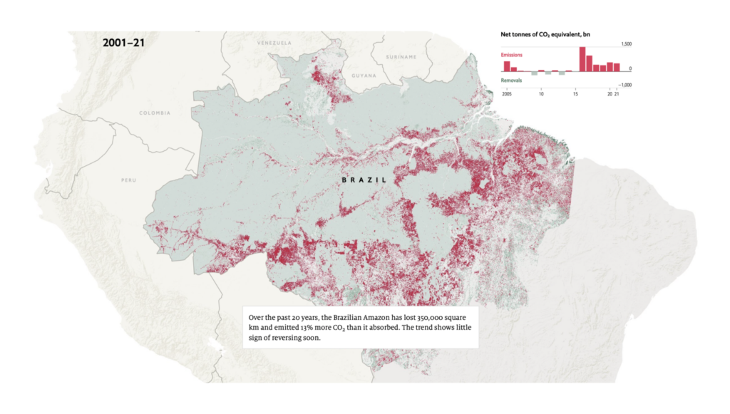
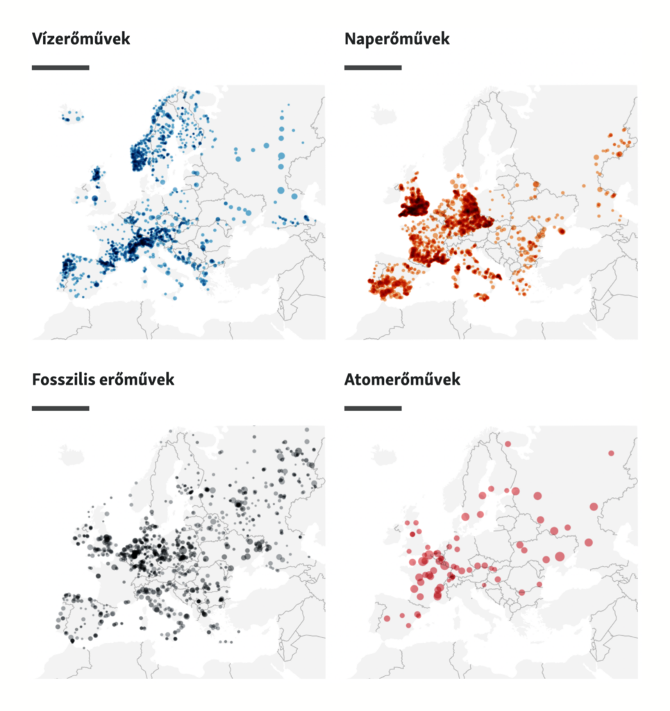
Maps on environmental issues included the Amazon as a net carbon emitter and a record-breaking wildfire in New Mexico:

The Economist: The Brazilian Amazon has been a net carbon emitter since 2016, May 21
Financial Times: Climate graphic of the week: Historic blaze in New Mexico as extreme global weather events rise, May 20
Szabad Europa: Böngéssze végig, honnan jön az energia Európában!, May 23
Shad Frigui: “New Viz. I recreated @priyamisner’s interesting graphic, which shows soil colors by state. (Here’s her work on Observable: https://observablehq.com/@pmisner/state-soils….) Recreated it with #VegaLite. No D3; no JavaScript. Just simple JSON syntax,” May 24 (Tweet, Inspiration)

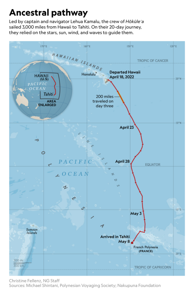
Other visualizations looked at traditional Pacific navigation and public mental health issues:

National Geographic: This woman navigated a 3,000-mile Pacific voyage without maps or technology, May 18
Bloomberg: When Amazon Puts a Warehouse Next Door: ‘We Can’t Escape It,’ May 17
European Data Journalism Network/H-Alter: A luxury called psychotherapy, May 17
Civio: The suicide rate among people in pretrial detention is double that of convicted prisoners, May 17

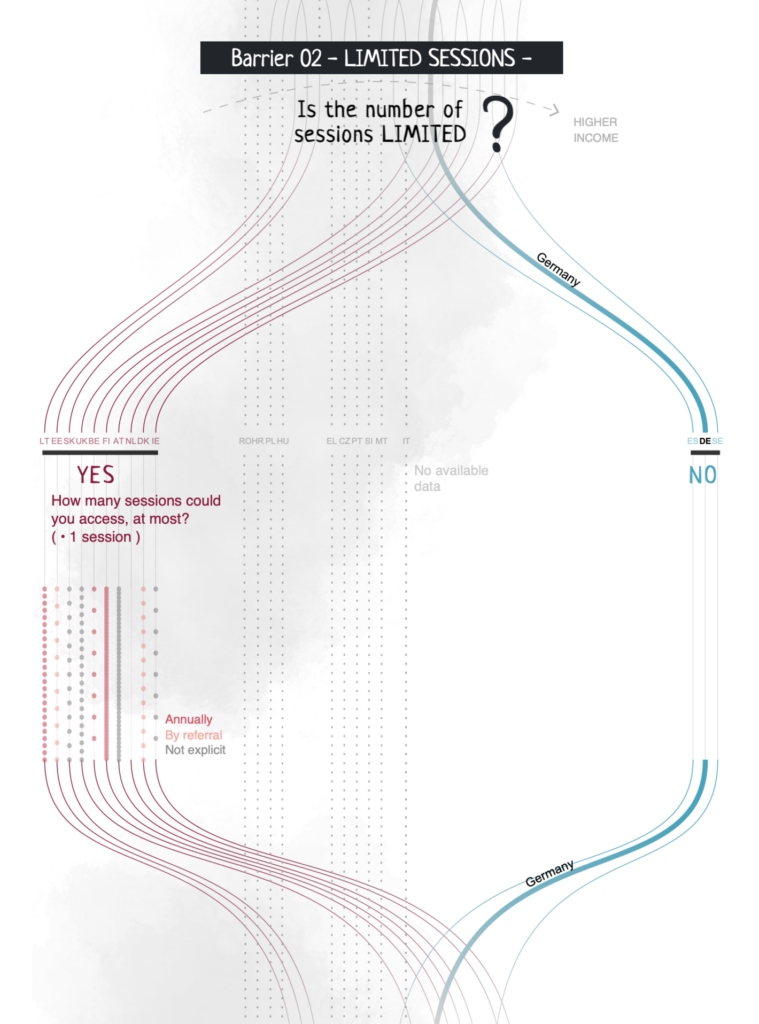
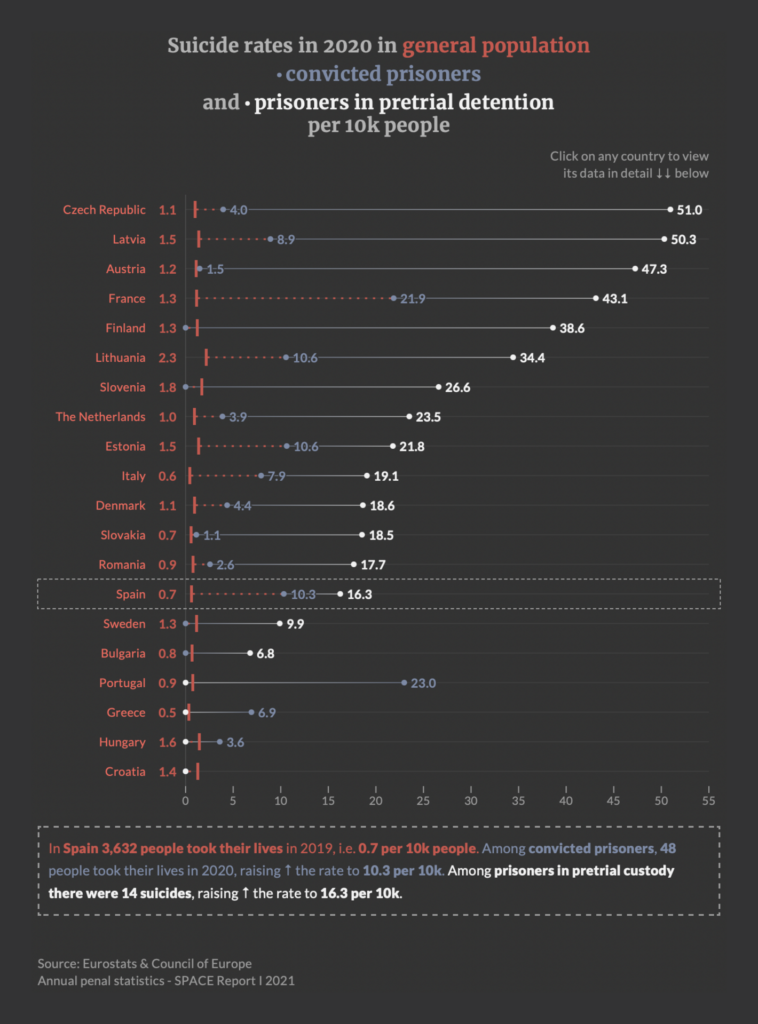
What else we found interesting

The Washington Post: Cut short, May 19
Le Monde: Cœur de porc dans un corps d’homme : où en est-on des xénogreffes ?, May 17
Süddeutsche Zeitung: Von Menschen und Tieren, May 20
Vox: The many, many costs of breastfeeding, May 17
The Washington Post: Quiz: Do you know the sweaty truth about these common fitness myths?, May 18

Applications are open for…


Help us make this dispatch better! We’d love to hear which newsletters, blogs, or social media accounts we need to follow to learn about interesting projects, especially from less-covered parts of the world (Asia, South America, Africa). Write us at hello@datawrapper.de or leave a comment below.

Want the Dispatch in your inbox every Tuesday? Sign up for our Blog Update newsletter!

Comments