We want to enable everyone to create beautiful charts, maps, and tables. New to data visualization? Or do you have specific questions about us? You'll find all the answers here.
The best of last week’s big and small data visualizations
Vivien Serve
Welcome back to the 144th edition of Data Vis Dispatch! Every week, we publish a collection of the best small and large data visualizations we find, especially from news organizations — to celebrate data journalism, data visualization, simple charts, elaborate maps, and their creators.
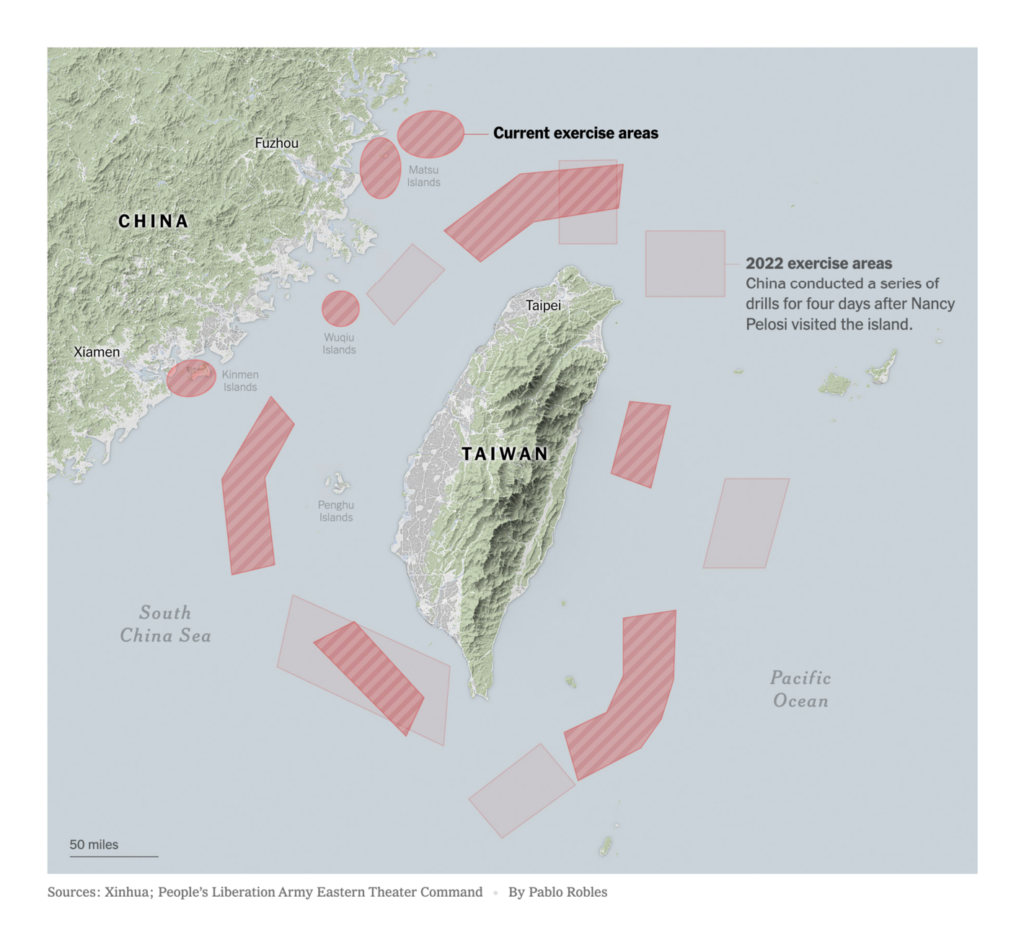
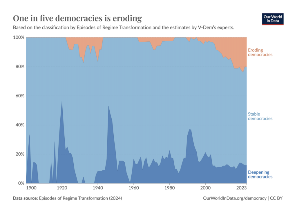
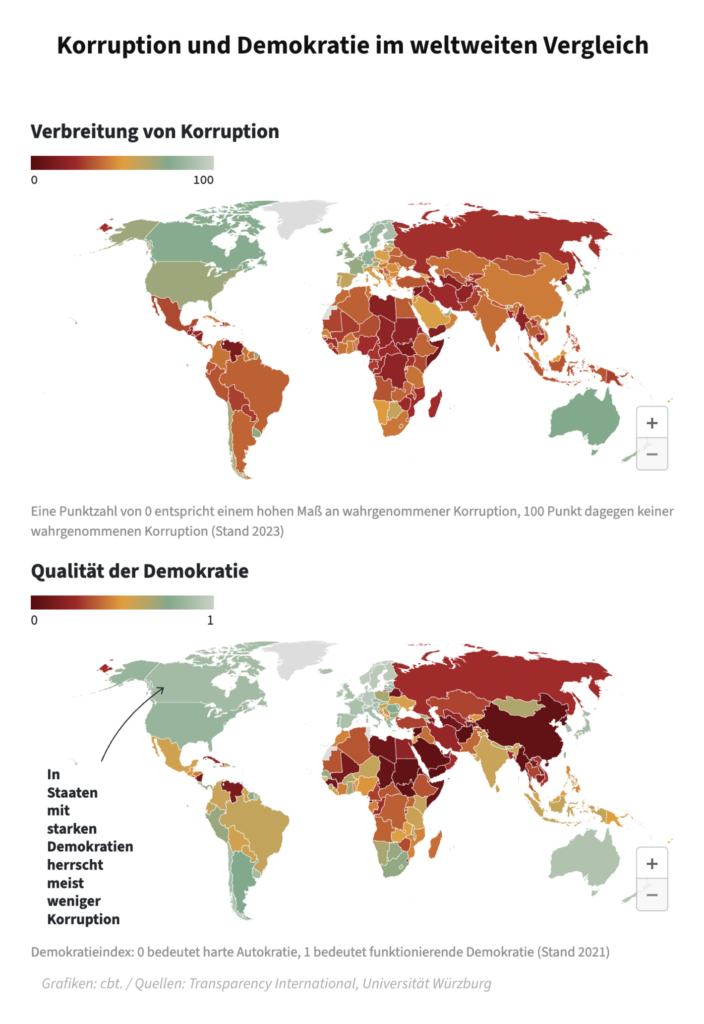
Recurring topics this week include turbulence, democracies, and elections (again!).
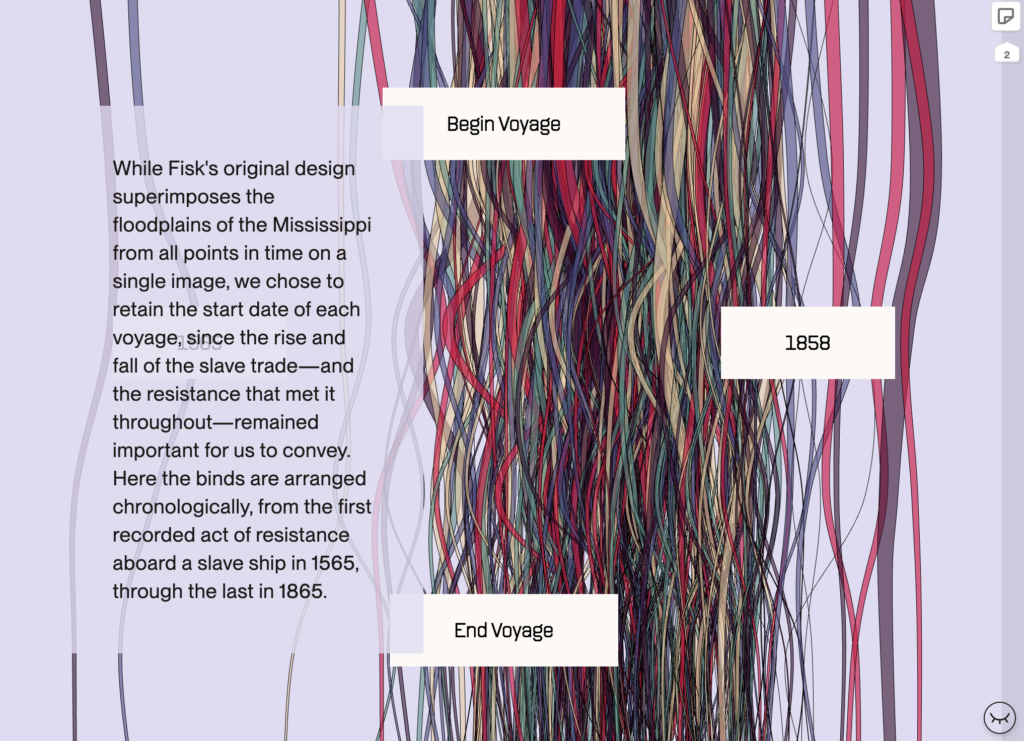
The interactive book “Data by Design” is now online and ready for community review — take a look!
JasonForrest: “An epic thread with an epic take on a history of dataviz which continues to grow and be enriched by more voices and perspectives. I’m humbled to be a source and can not wait until this is out in the world!!!” May 21 (Tweet, Public Beta)
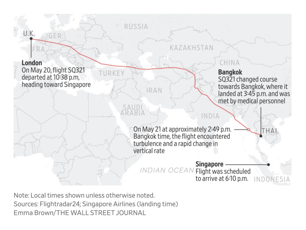
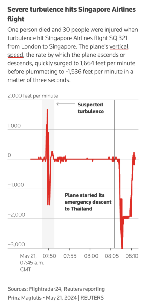
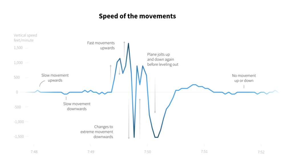
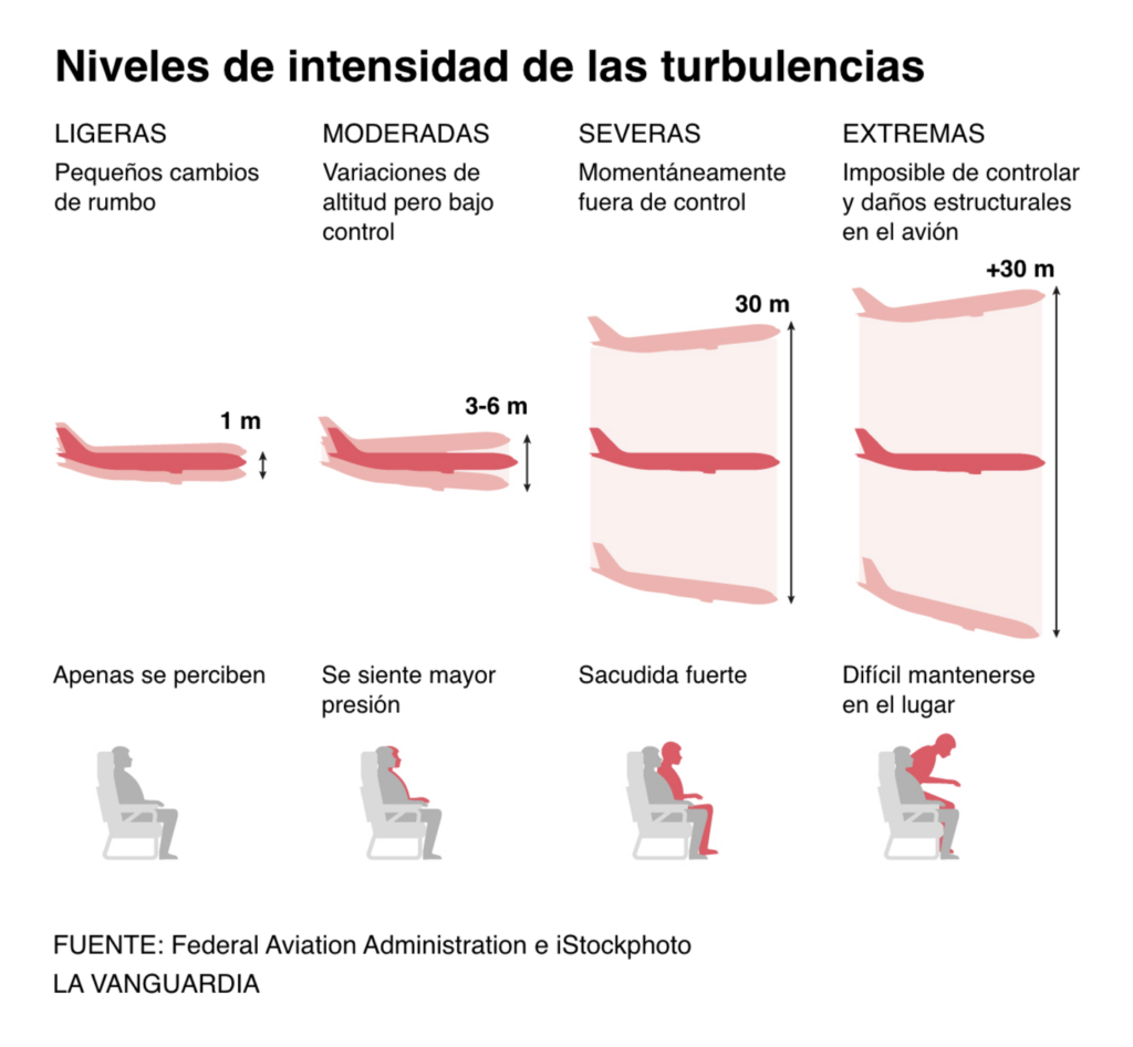
Last Monday, turbulence on a Singapore Airlines flight killed one passenger and injured dozens more. Climate conditions are making severe turbulence more likely:
It’s not just turbulence — summer travel is predicted to get busier and messier. The interaction style in this log-scale Bloomberg chart deserves special highlighting:
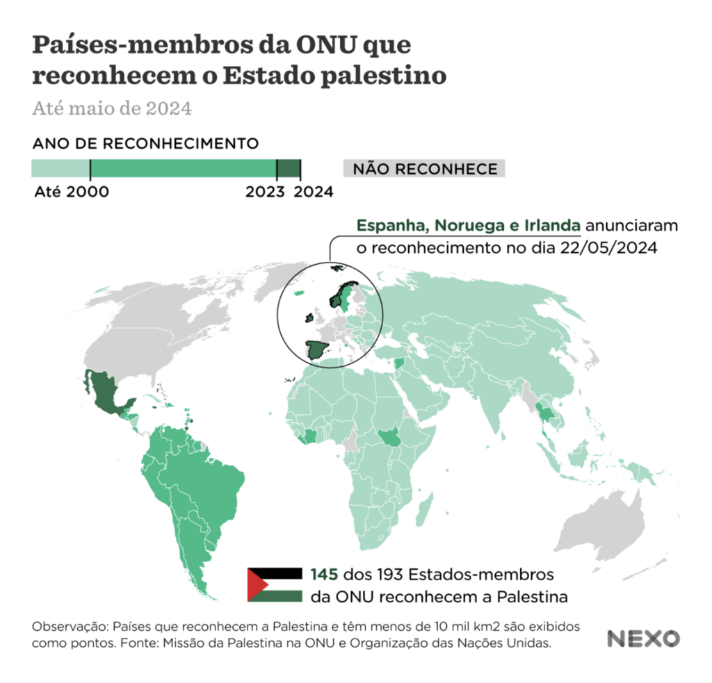
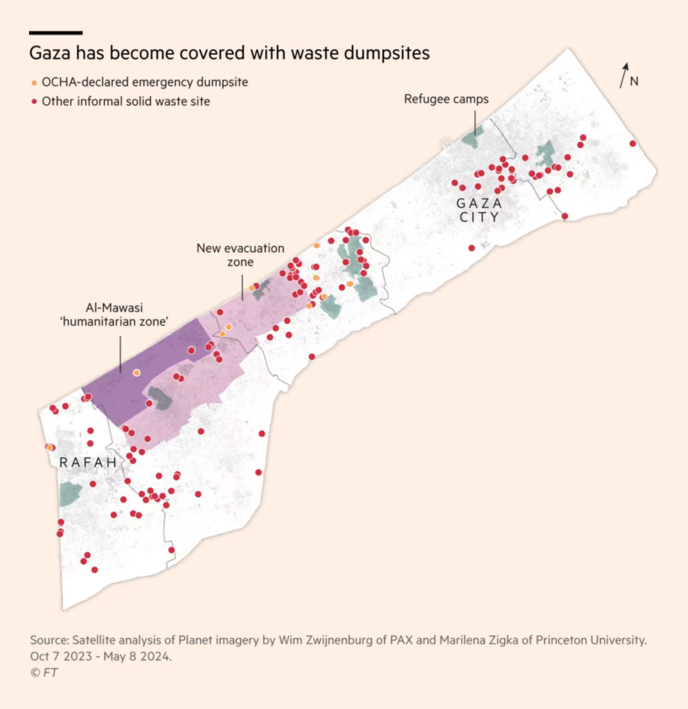
This week’s visualizations on Israel/Palestine include a map of Israeli hostages, the recognition of Palestine as a state by several European countries, and the dangerous problems of waste management in Gaza:
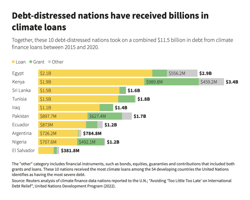
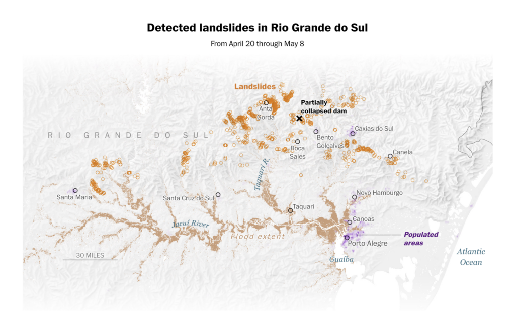
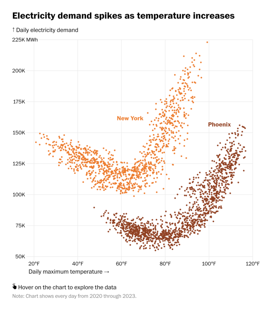
Environment-related topicsincludedclimate loans, groundwater pollution, landslides, and the correlation between rising temperatures and electricity demand:
But we’re also here for good climate news, like more ambitious national energy and climate plans:
Chelsea Bruce-Lockhart: “NEW: A chart for climate optimism. Lots more data to explore on EU countries’ latest NECP targets – setting out ambitions for the clean energy transition,” May 24 (Tweet, Tracker)
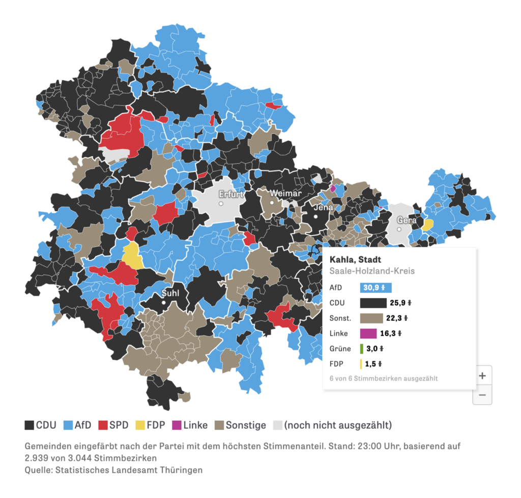
It’s the year of election visualizations — for this week, a look at the huge number of parties in India and local elections in Germany:
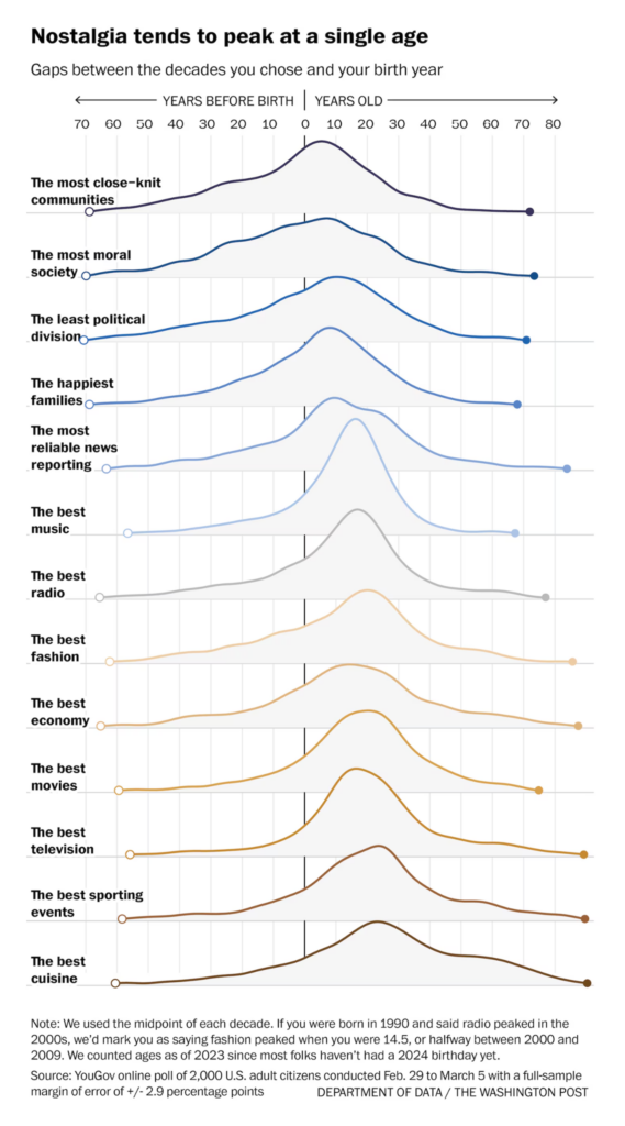
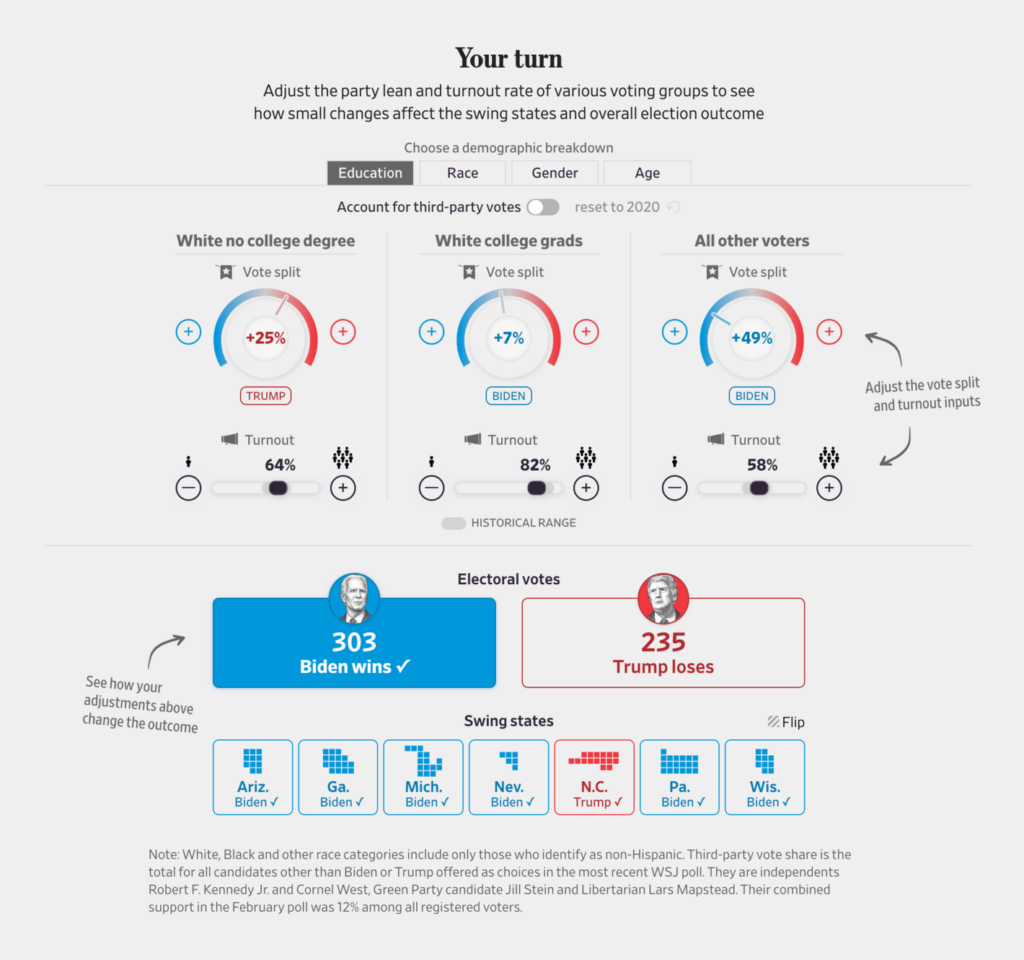
What social factors influence elections? These visualizations explore the legacy of apartheid in South Africa, and generational nostalgia and election-denying rhetoric in the U.S.:
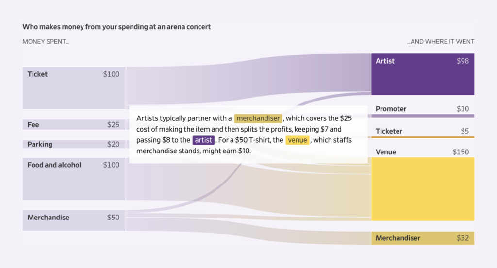
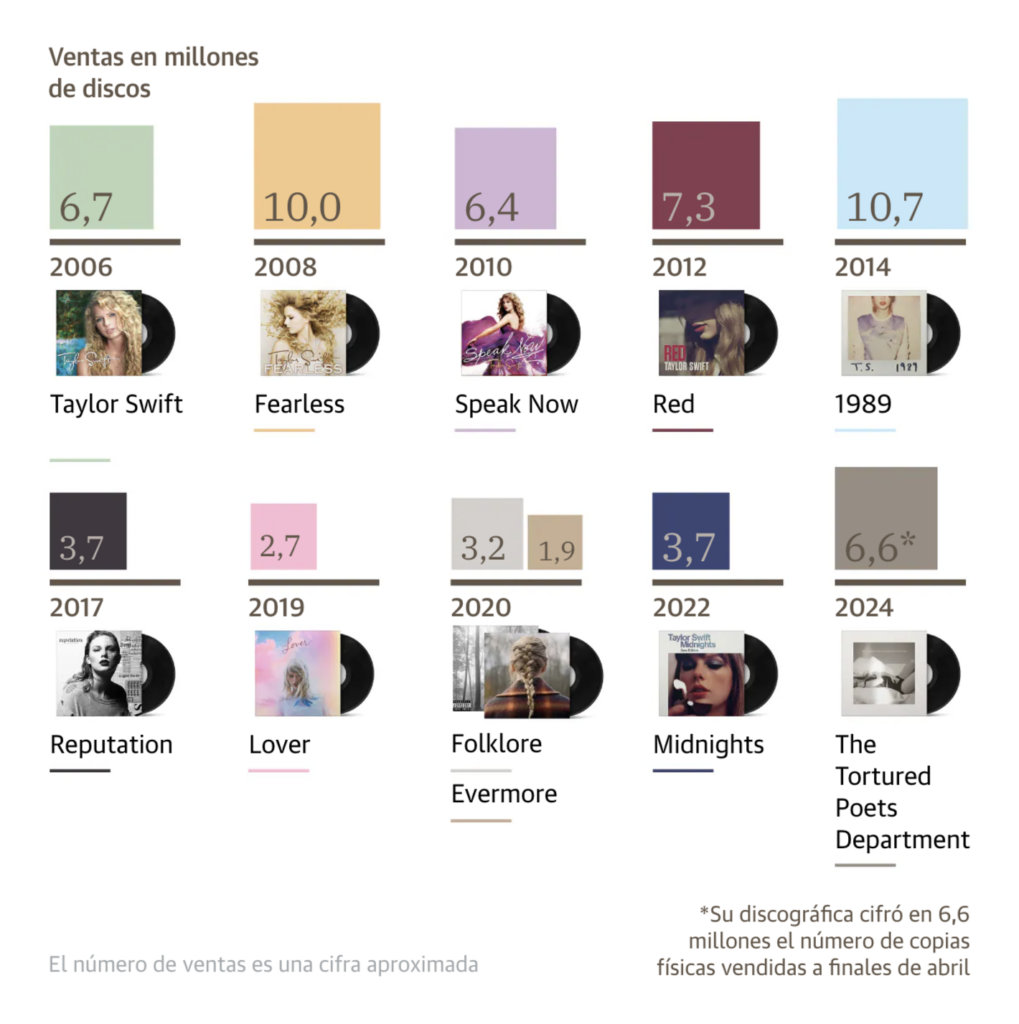
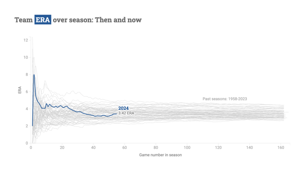
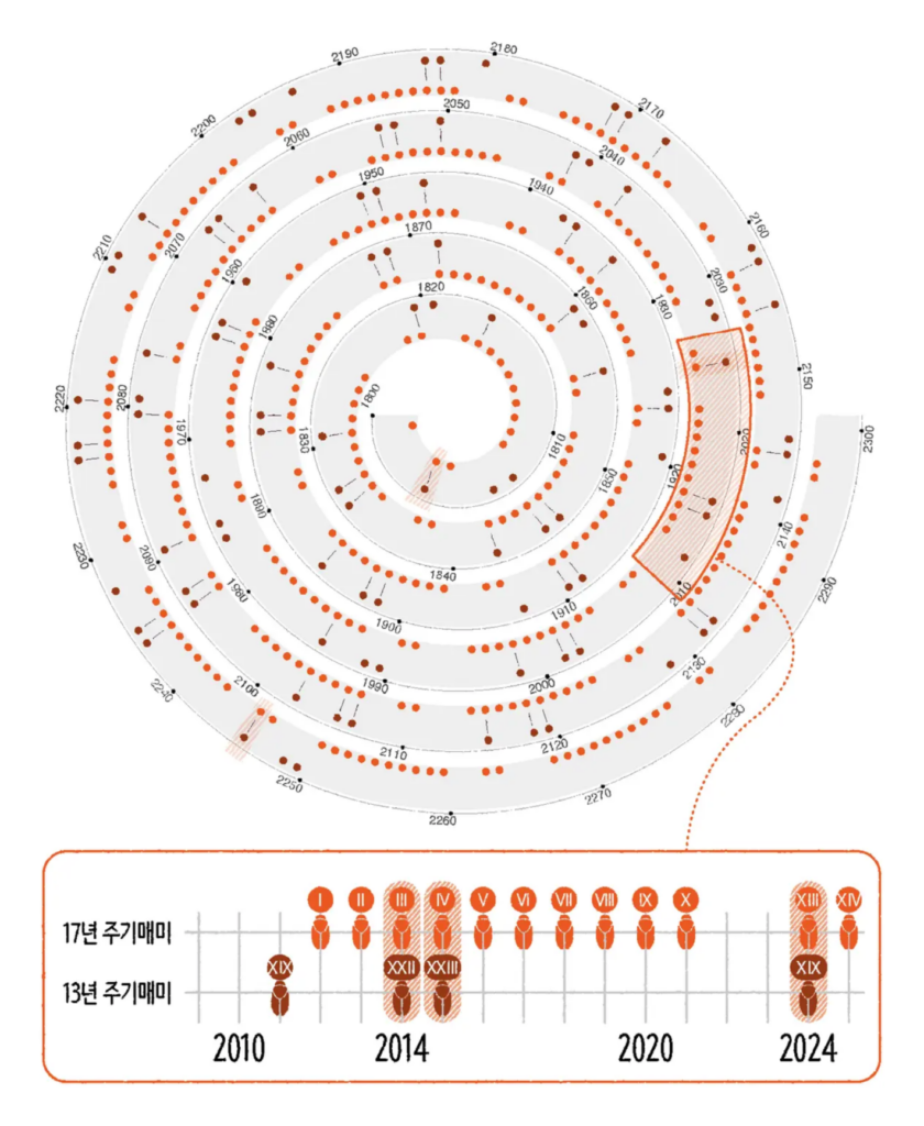
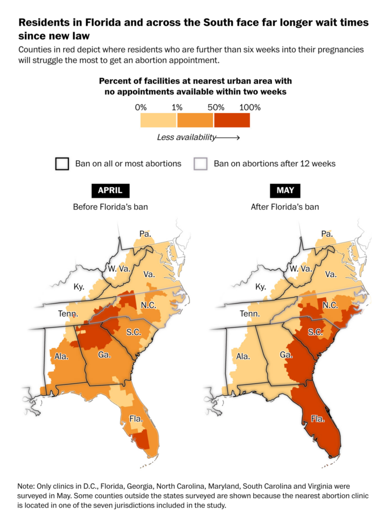
What do a livebaseball dashboard, cicada broodchart, and abortion lawmap have in common? Not too much — but they all deserve to be featured in this Dispatch:
Help us make this dispatch better! We’d love to hear which newsletters, blogs, or social media accounts we need to follow to learn about interesting projects, especially from less-covered parts of the world (Asia, South America, Africa). Write us at hello@datawrapper.de or leave a comment below.
(she/her) is a working student on Datawrapper’s Communications team. She creates the Data Vis Dispatch to keep data visualization enthusiasts up to date on exciting new projects. When she’s not working, she studies interface design, and when she’s not studying, she’s planning a festival stage or soldering light installations. Vivien lives in Potsdam.


Comments