Data Vis Dispatch, May 28

The best of last week’s big and small data visualizations

Welcome back to the 144th edition of Data Vis Dispatch! Every week, we publish a collection of the best small and large data visualizations we find, especially from news organizations — to celebrate data journalism, data visualization, simple charts, elaborate maps, and their creators.

Recurring topics this week include turbulence, democracies, and elections (again!).

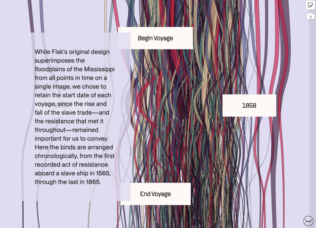
The interactive book “Data by Design” is now online and ready for community review — take a look!

JasonForrest: “An epic thread with an epic take on a history of dataviz which continues to grow and be enriched by more voices and perspectives. I’m humbled to be a source and can not wait until this is out in the world!!!” May 21 (Tweet, Public Beta)

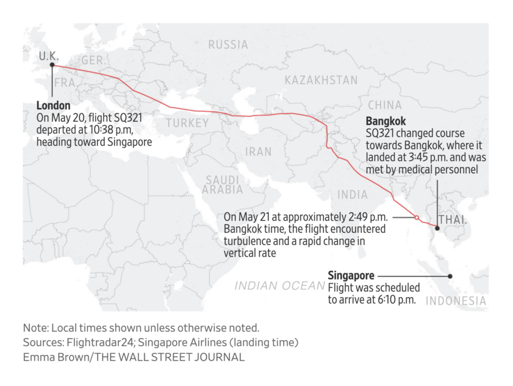
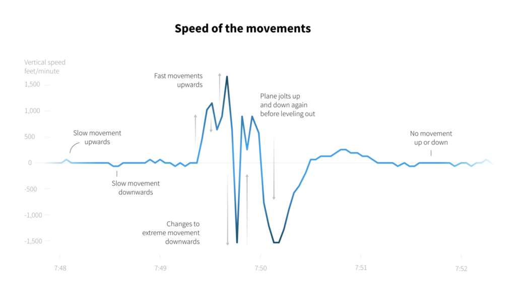
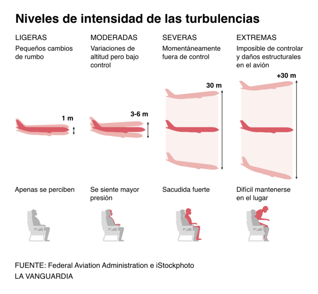
Last Monday, turbulence on a Singapore Airlines flight killed one passenger and injured dozens more. Climate conditions are making severe turbulence more likely:

The Wall Street Journal: Singapore Airlines Flight Puts Focus on Rising Turbulence Danger, May 22
Reuters: Singapore Airlines flight hits severe turbulence, one passenger dead, May 22
Reuters: The mechanics of turbulence, May 23
La Vanguardia: Un verano con más turbulencias, May 23

It’s not just turbulence — summer travel is predicted to get busier and messier. The interaction style in this log-scale Bloomberg chart deserves special highlighting:

Bloomberg: Flying Will Be Messy This Year. See How Bad It Is Across the US, May 23

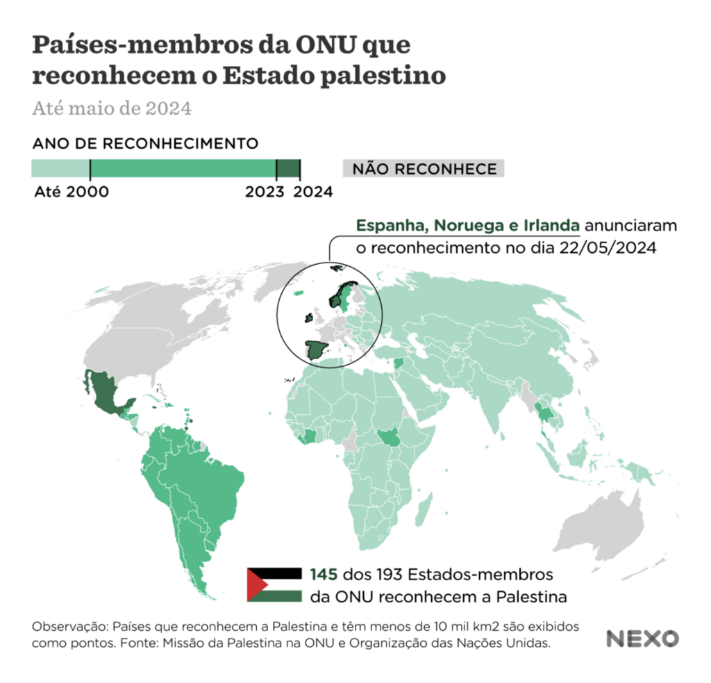
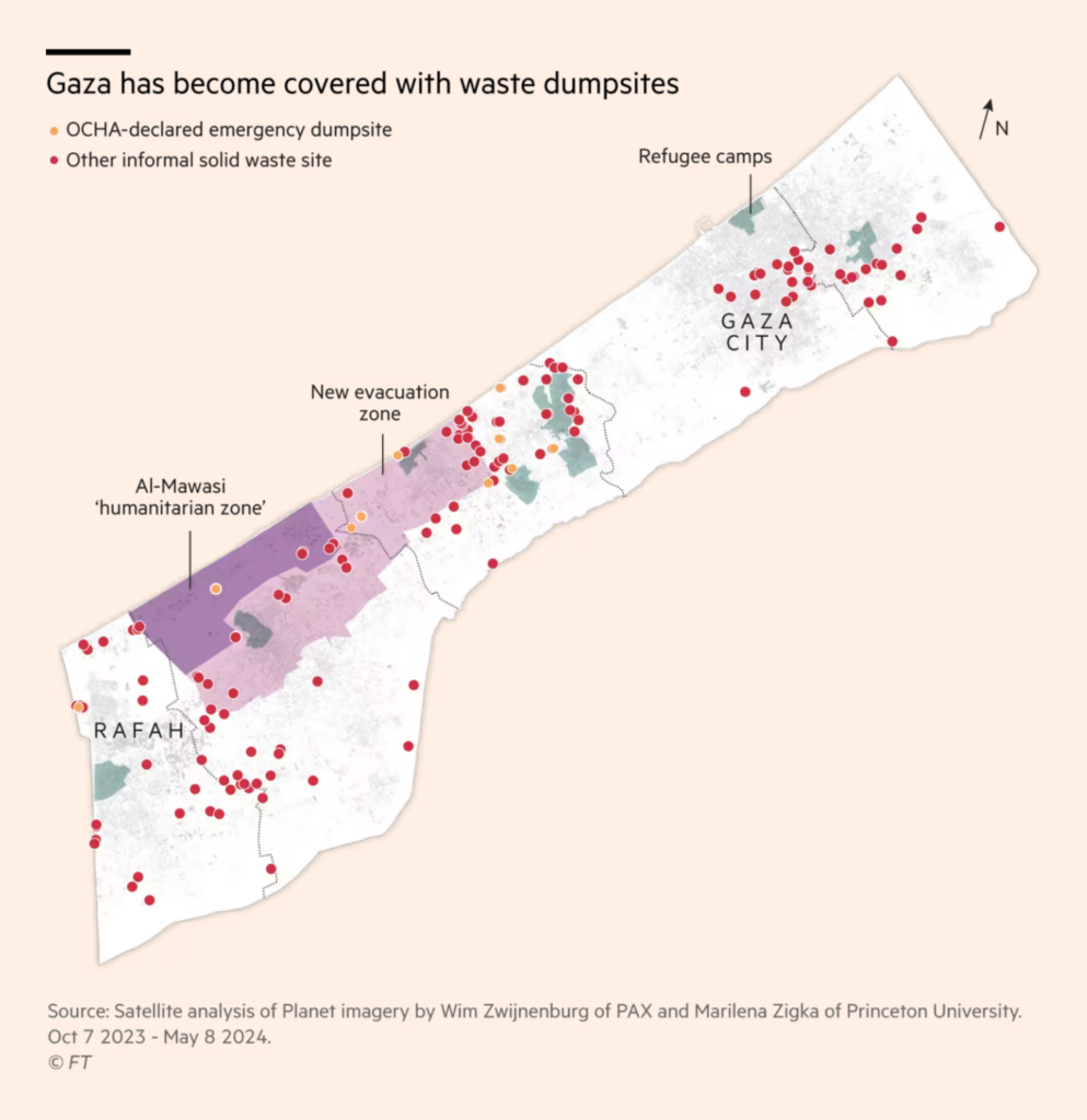
This week’s visualizations on Israel/Palestine include a map of Israeli hostages, the recognition of Palestine as a state by several European countries, and the dangerous problems of waste management in Gaza:

Le Monde: Israël-Hamas : qui sont les otages du 7 octobre ?, May 26
Nexo Jornal: 8 países reconheceram a Palestina desde o começo da guerra, May 23
Financial Times: Visual analysis: the growth of Gaza’s wartime trash mountains, May 26

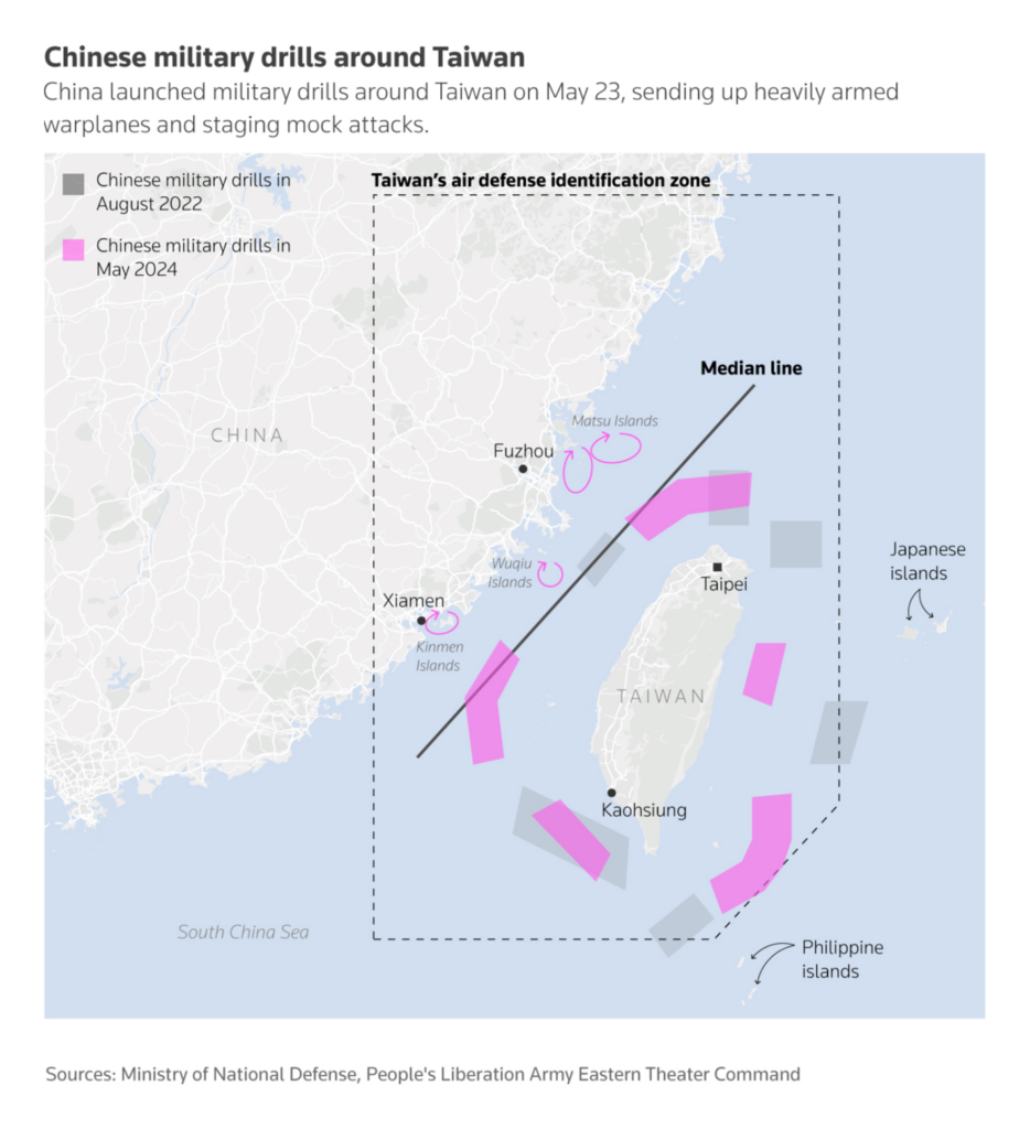
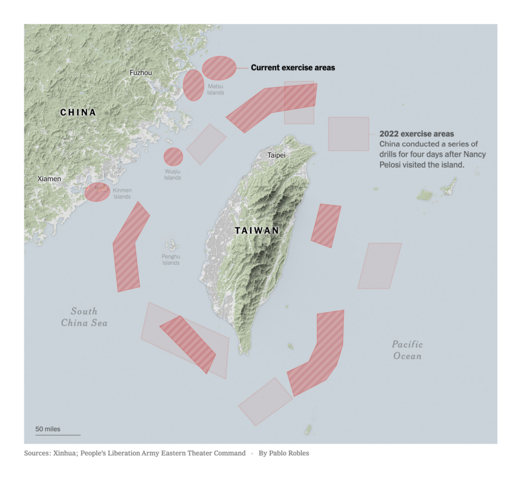
Same continent, different coast — after the inauguration of the new Taiwanese president, China surrounded the island in military exercises:

Reuters: China launches ‘punishment’ war games around Taiwan, May 24
The New York Times: China Launches Military Drills Around Taiwan as ‘Punishment’, May 22

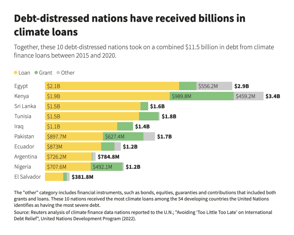
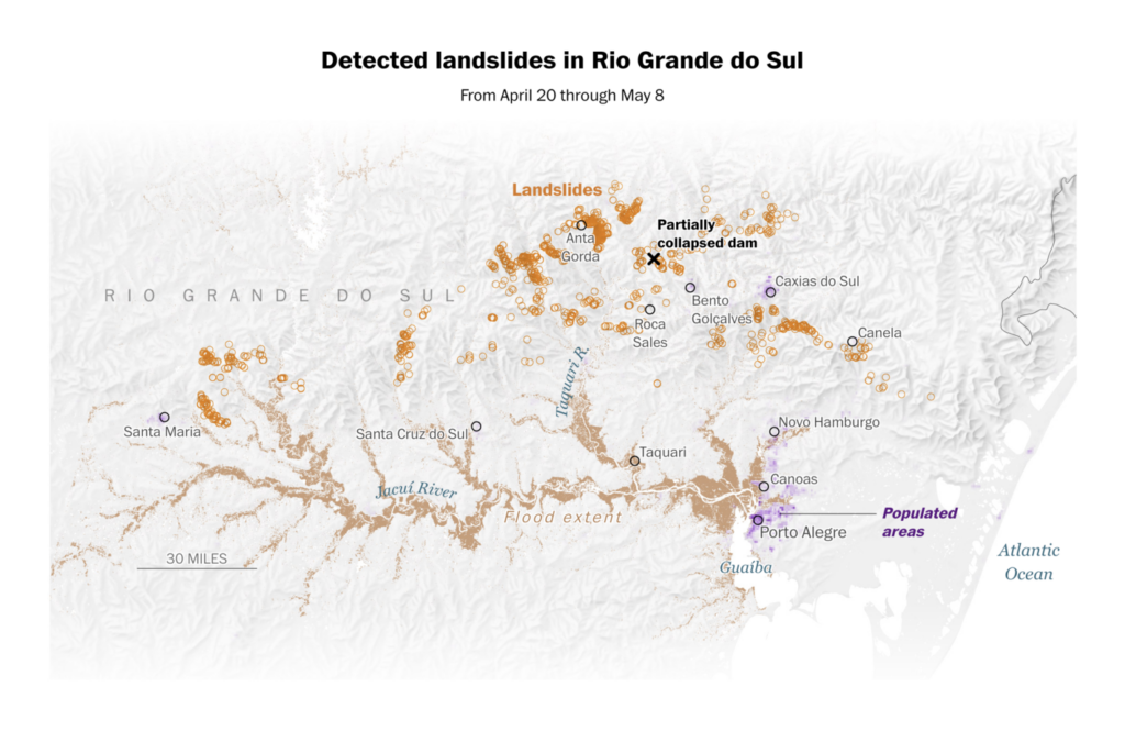
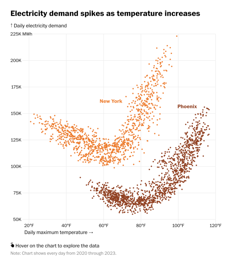
Environment-related topics included climate loans, groundwater pollution, landslides, and the correlation between rising temperatures and electricity demand:

Reuters: A program meant to help developing nations fight climate change is funneling billions of dollars back to rich countries, May 22
DATADISTA and elDiario.es: Veneno en el grifo: ruta por la España sin derecho al agua potable, May 26
The Washington Post: Visualizing the scale of the floods that left south Brazil submerged, May 24
The Washington Post: Where heat waves might cause blackouts: Look up your area, May 22

But we’re also here for good climate news, like more ambitious national energy and climate plans:

Chelsea Bruce-Lockhart: “NEW: A chart for climate optimism. Lots more data to explore on EU countries’ latest NECP targets – setting out ambitions for the clean energy transition,” May 24 (Tweet, Tracker)

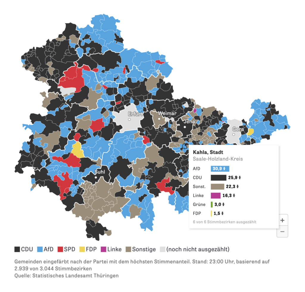
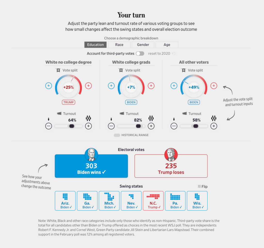
It’s the year of election visualizations — for this week, a look at the huge number of parties in India and local elections in Germany:

Reuters: Panorama of parties, May 27
Zeit Online: Thüringen rückt nach rechts, May 27

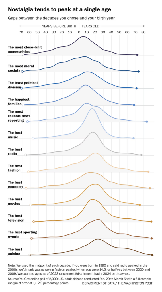
What social factors influence elections? These visualizations explore the legacy of apartheid in South Africa, and generational nostalgia and election-denying rhetoric in the U.S.:

Bloomberg: Apartheid’s Long Shadow Hangs Over South Africa’s Election, May 25
The Washington Post: When America was ‘great,’ according to data, May 24
The New York Times: Trump’s Pattern of Sowing Election Doubt Intensifies in 2024, May 24
The Wall Street Journal: What Does It Take to Flip the 2024 Battleground States?, May 22

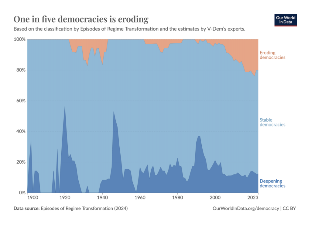
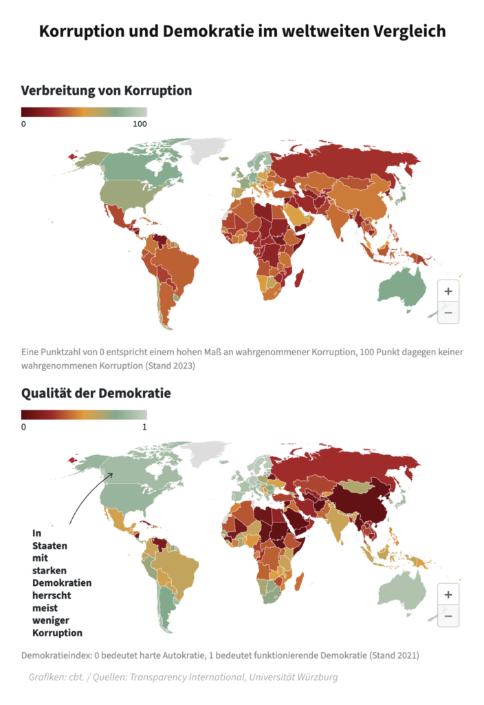
With all these elections, how is democracy doing out there?

Our World in Data: One in five democracies is eroding, May 27
Frankfurter Allgemeine Zeitung: Das Gift der Korruption, May 27

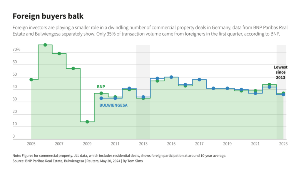
In economic charts, real estate and what’s coming next for the Chinese economy:

Reuters: Germany property trough worsens as foreign investors scale back, May 21
San Francisco Chronicle: S.F.’s Painted Ladies: Why does one pay $1,000 in property tax and another $44,000?, May 24
Bloomberg: ‘Are You Better Off?’ Asking Reagan’s Question in Xi’s China, May 21

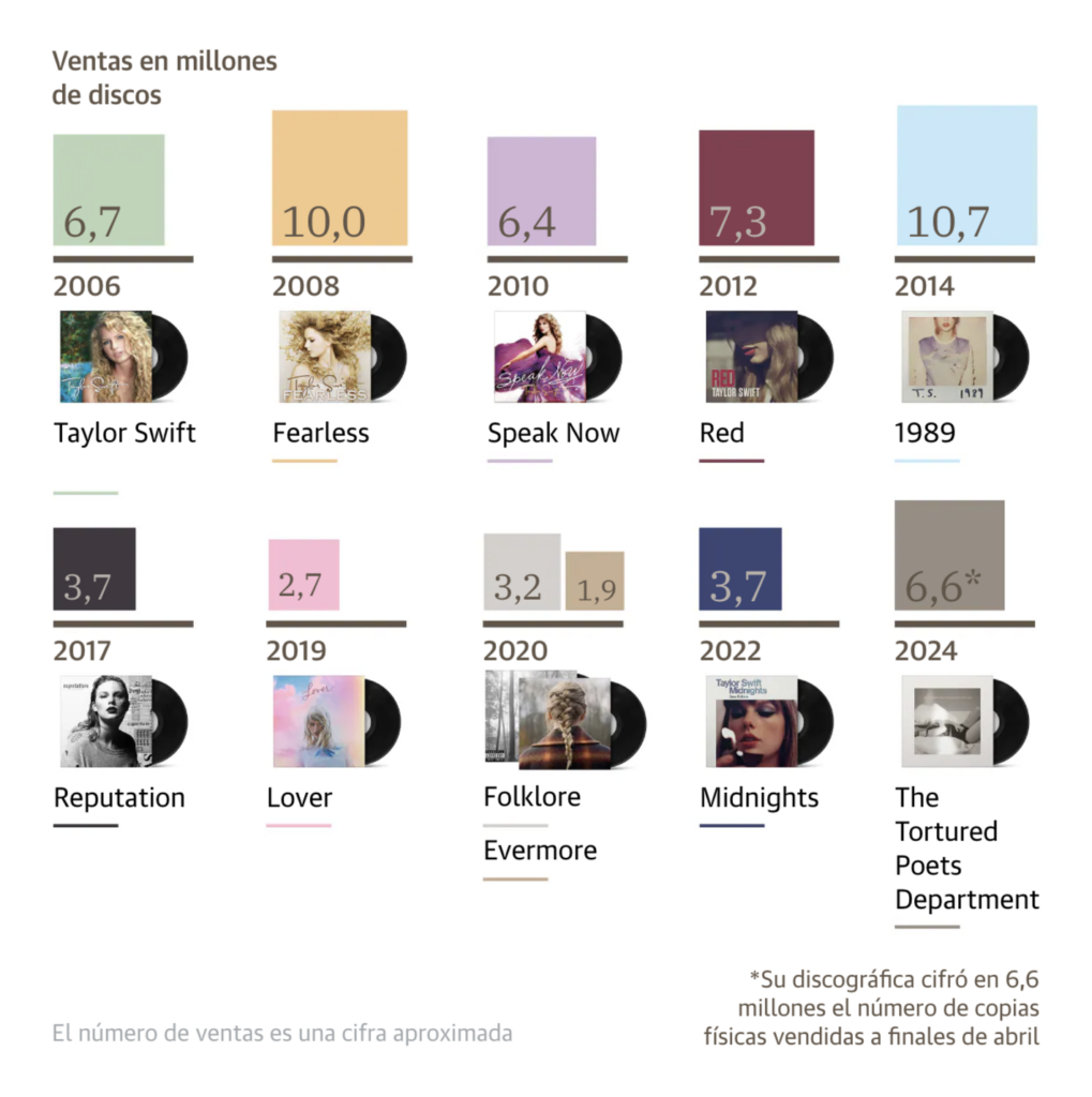
She’s back — Taylor Swift and the Data Vis Dispatch aren’t never ever ever getting back together:

The Wall Street Journal: Who Is Making Money on Your Concert Tickets? It’s Not Just Taylor Swift, May 23
Diario Sur: Los número de Taylor Swift: la artista que bate récord tras llegar a 26.000 millones de escuchas, May 27

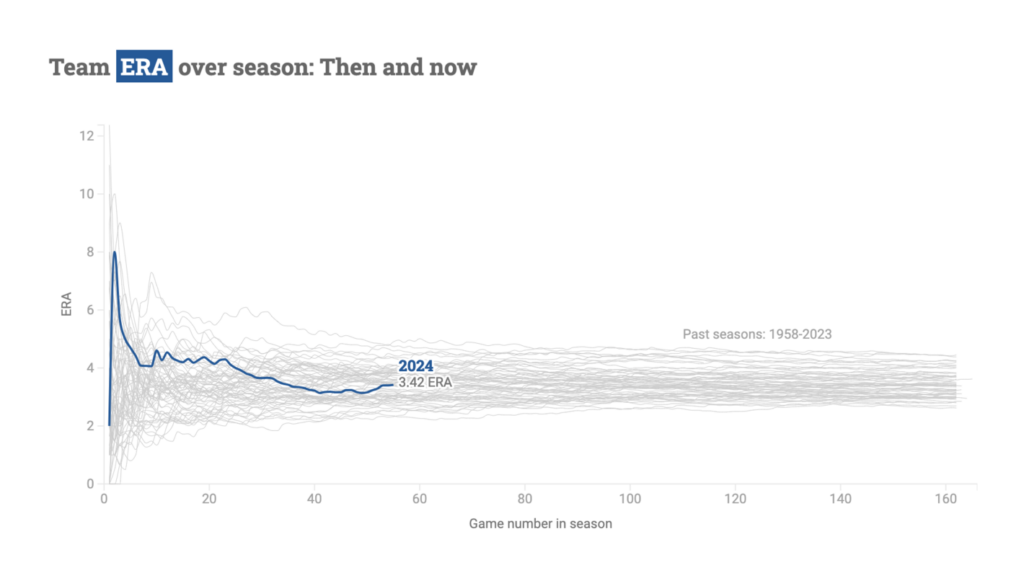
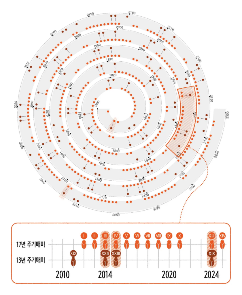
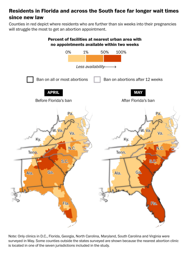
What do a live baseball dashboard, cicada brood chart, and abortion law map have in common? Not too much — but they all deserve to be featured in this Dispatch:

Dodgers Data Bot: How are the Dodgers doing?, May 26
SBS News: 올 여름, 매미 1000조 마리가 창궐한다면?, May 23
The Washington Post: How Florida’s abortion law is affecting East Coast abortion clinics, May 24

What else we found interesting

CNN: A shrinking life: Why some Asian youth withdraw from the world, May 25
Dr. M.F. Khan: “Venice was built on a foundation of about 10,000,000 underwater wooden logs or 8 to 10 tree logs per sq meter. Trunks function as roots. 1200 years later, those same trunks still support almost all of central Venice […],” May 23 (Tweet)
WeVis: เลือกตั้งสภาร่างรัฐธรรมนูญ : ปรุงสูตรไหน…ให้ใช่ในแบบคุณ?, May 23

Applications are open for…


Help us make this dispatch better! We’d love to hear which newsletters, blogs, or social media accounts we need to follow to learn about interesting projects, especially from less-covered parts of the world (Asia, South America, Africa). Write us at hello@datawrapper.de or leave a comment below.

Want the Dispatch in your inbox every Tuesday? Sign up for our Blog Update newsletter!

Comments