This article is brought to you by Datawrapper, a data visualization tool for creating charts, maps, and tables. Learn more.
Data Vis Dispatch, May 3
The best of last week’s big and small data visualizations

Welcome back to the 43rd edition of Data Vis Dispatch! Every week, we’ll be publishing a collection of the best small and large data visualizations we find, especially from news organizations — to celebrate data journalism, data visualization, simple charts, elaborate maps, and their creators.
Recurring topics this week include deforestation, housing costs, and media in politics.
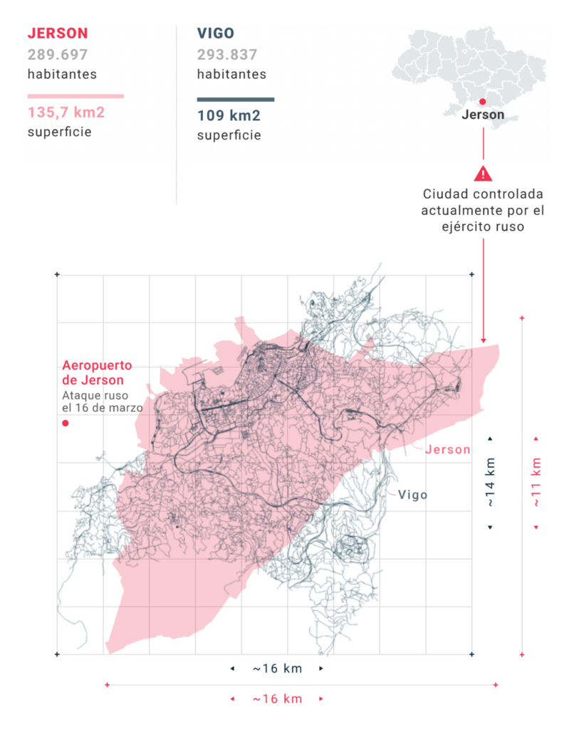
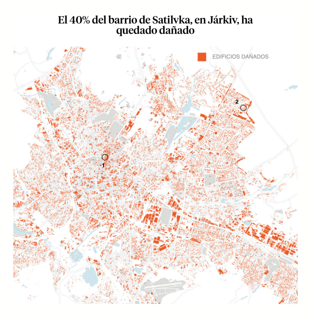
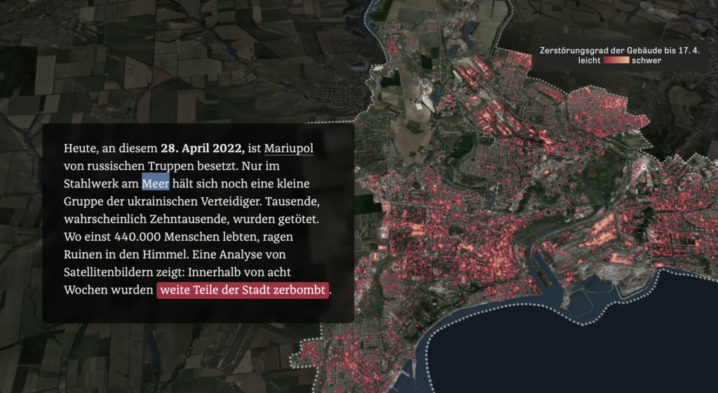
The war in Ukraine is in its third month, and eastern cities in particular have been under nearly constant attack. These three maps showed the destruction at street scale of the cities of Kherson, Kharkiv, and Mariupol:
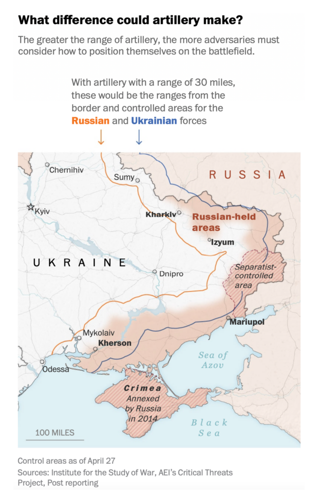
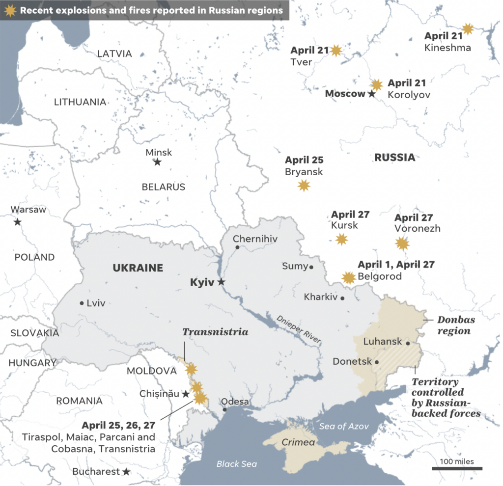
Recent military developments include expanded arms shipments to Ukraine from the West and a series of explosions and fires inside Russia:
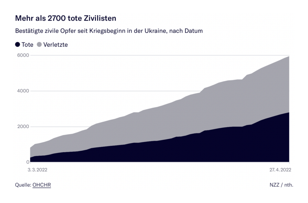
And the humanitarian crisis includes thousands of civilian deaths:
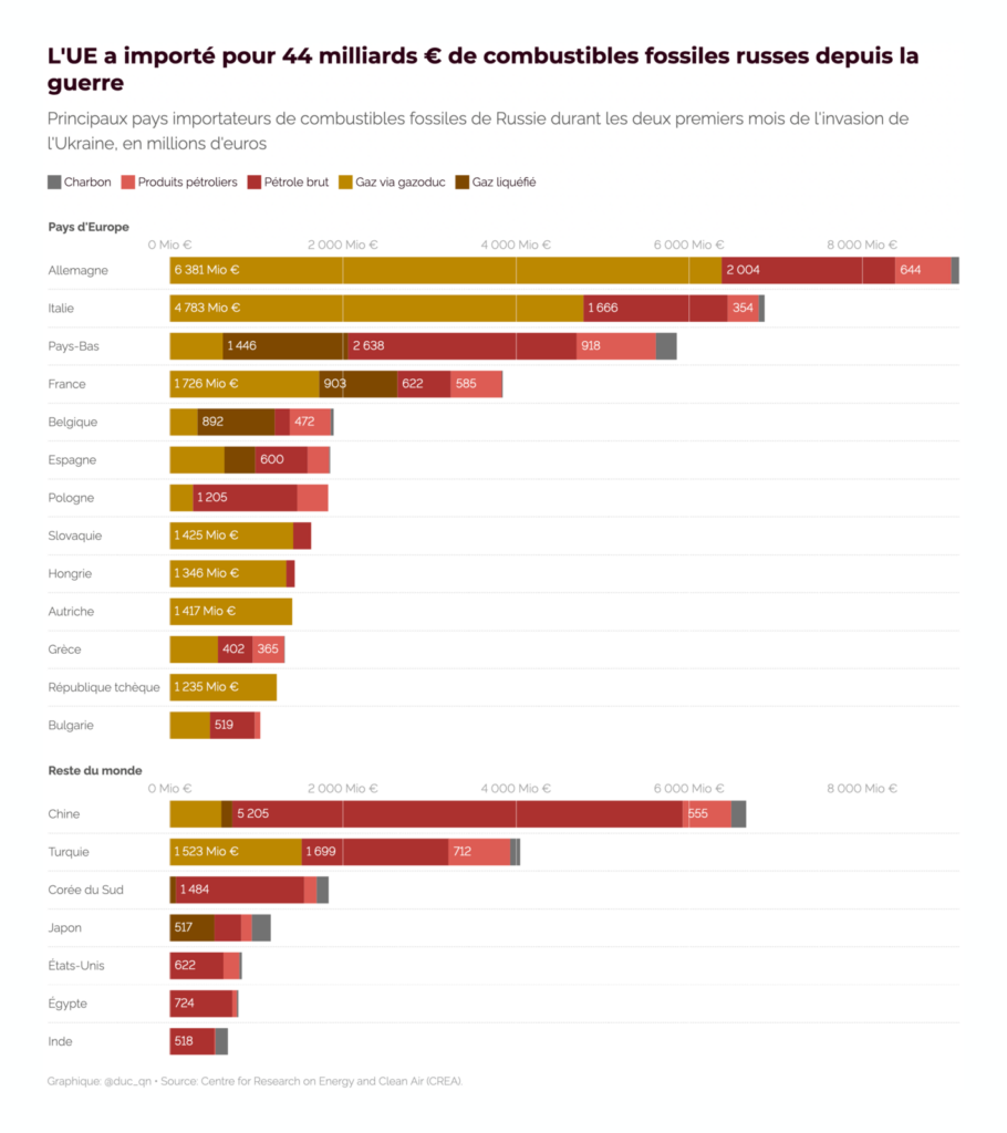
Although most sectors of Russia’s economy are under heavy sanctions, the EU continues to import billions of euros’ worth of Russian fossil fuels:

And fuel shortages make a deadly heatwave in India and Pakistan even more dangerous in the short term:
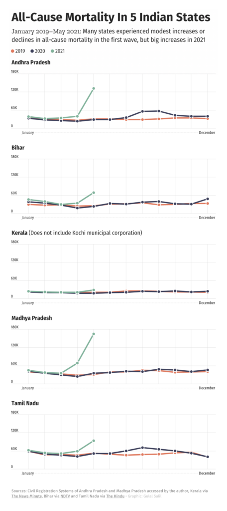
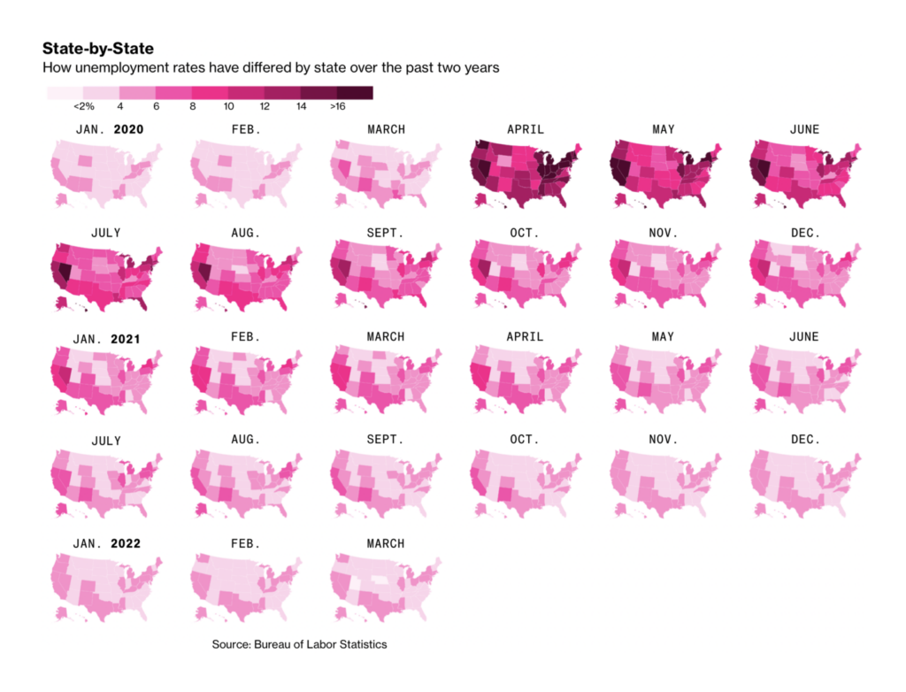
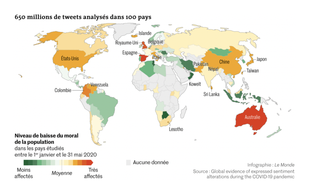
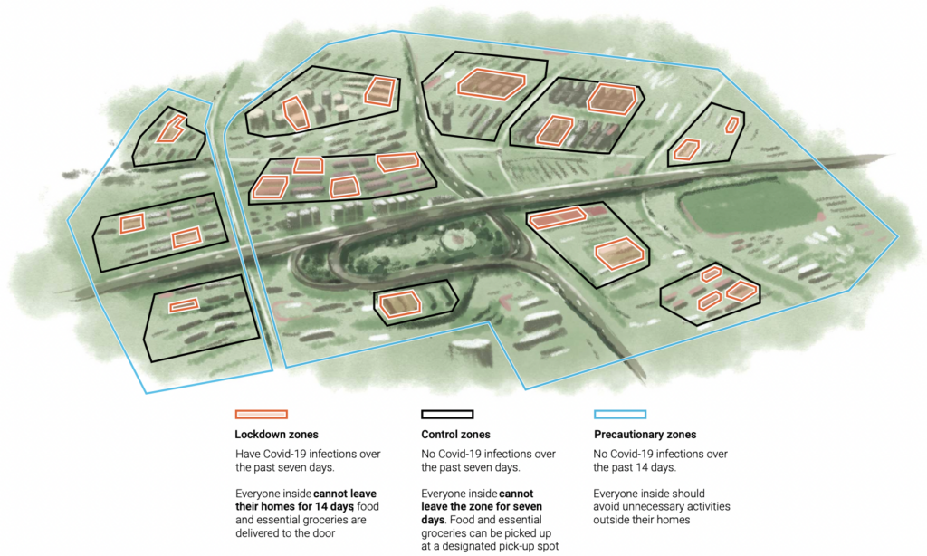
In COVID visualizations, we got a closer look at India’s excess mortality. Plus, how the pandemic has affected everything from unemployment to morale in tweets:

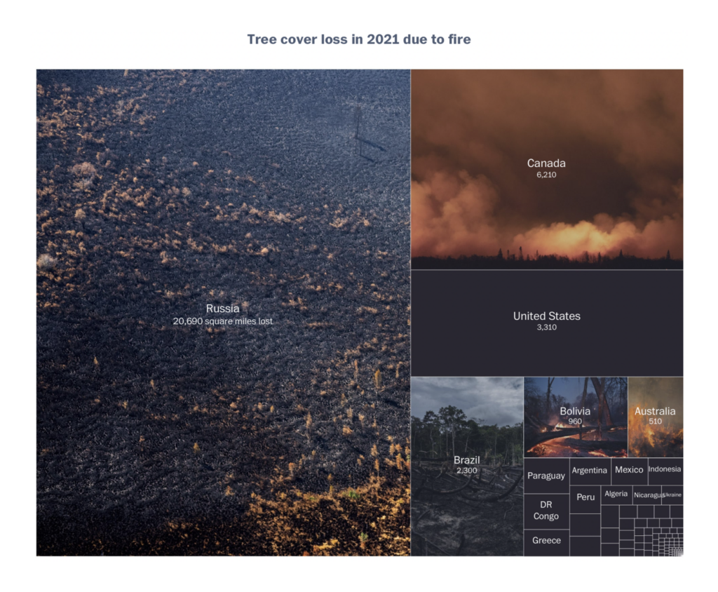
One breakout topic this week was deforestation:
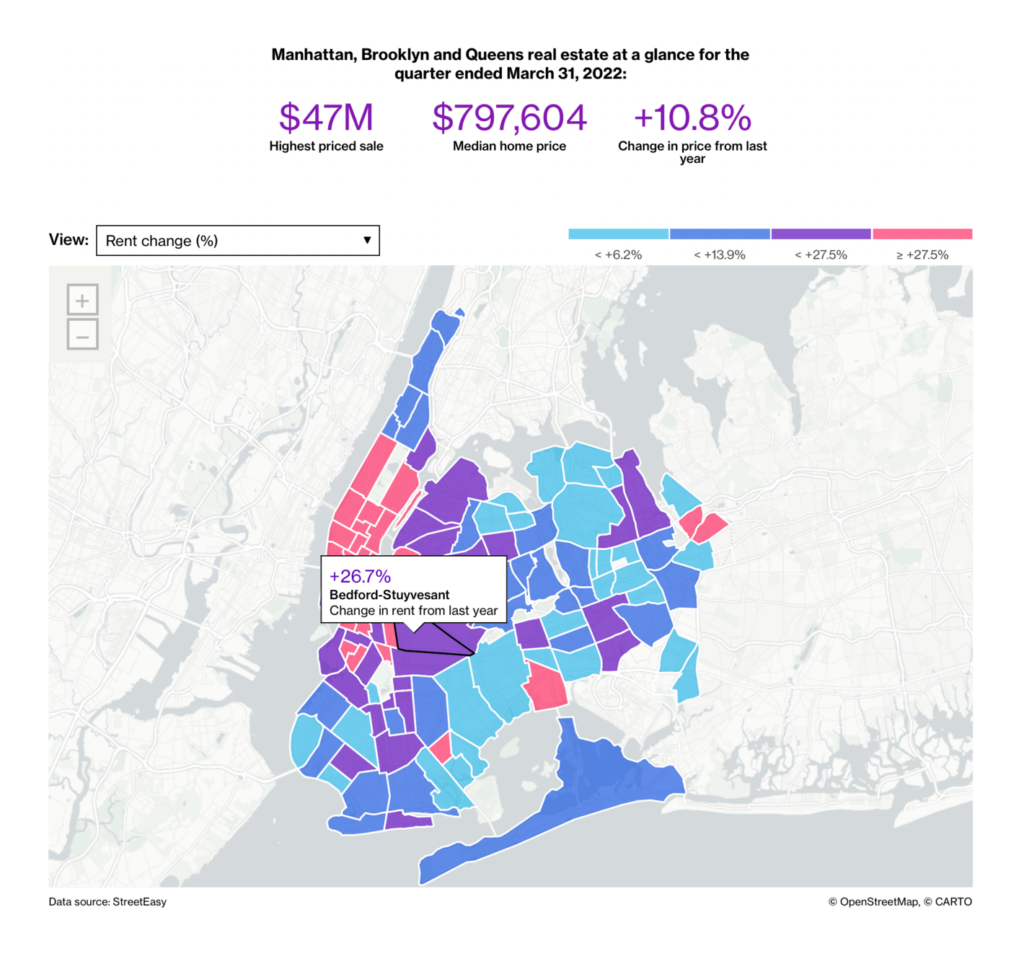
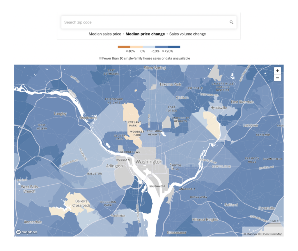
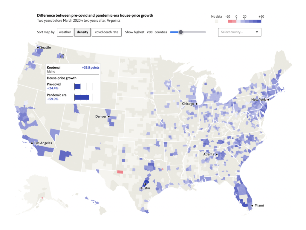
And a second, the cost of housing in U.S. cities:
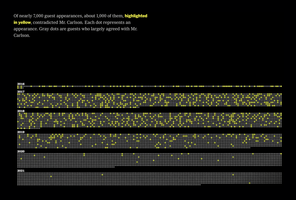
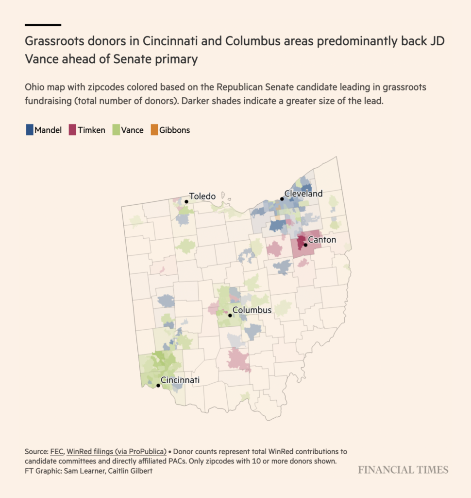
In U.S. politics, the role of media took this week’s spotlight:

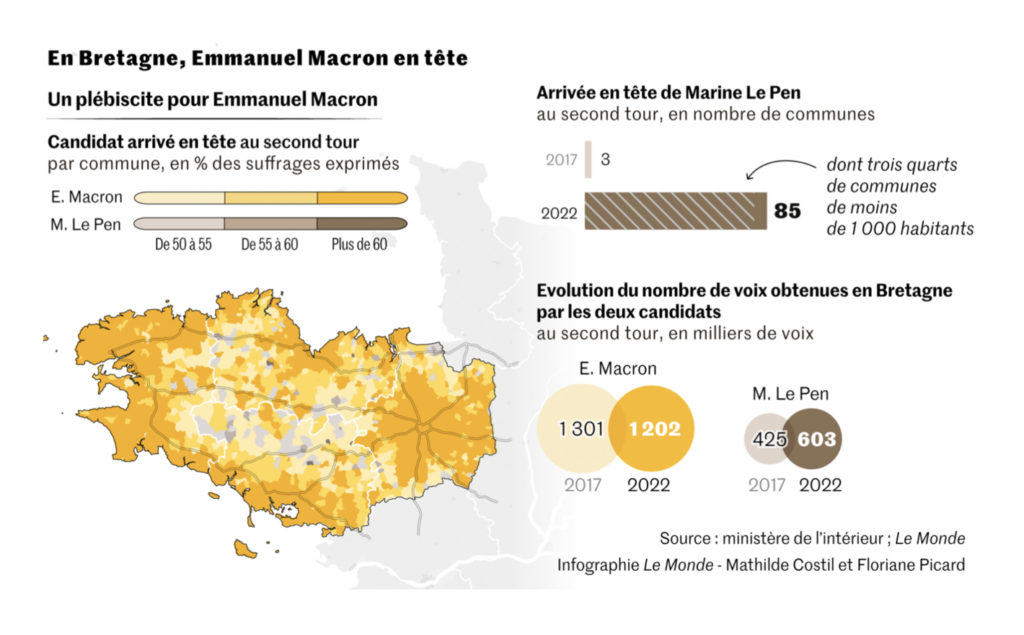
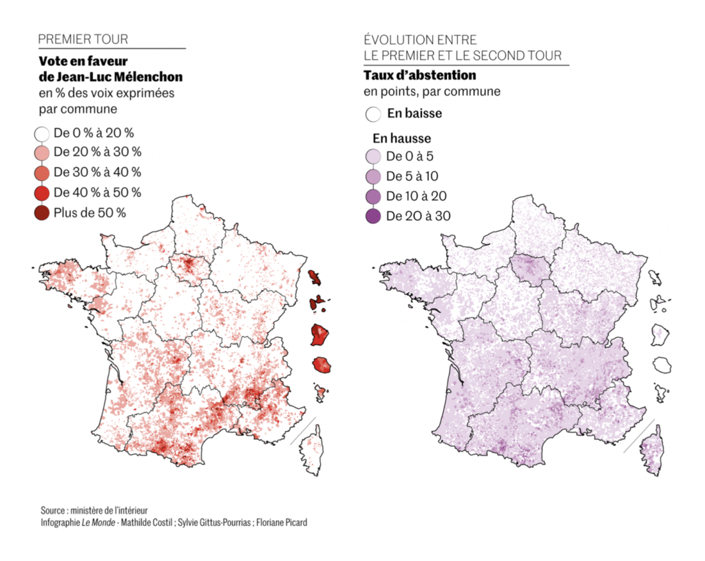
And a week after the vote, there was still more analysis of the French presidential returns:
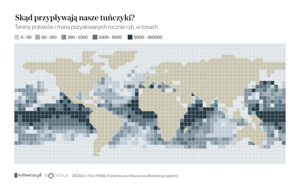
Other maps covered everything from noisy streets in Paris to the geography of tuna:

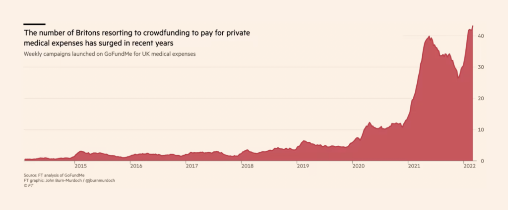
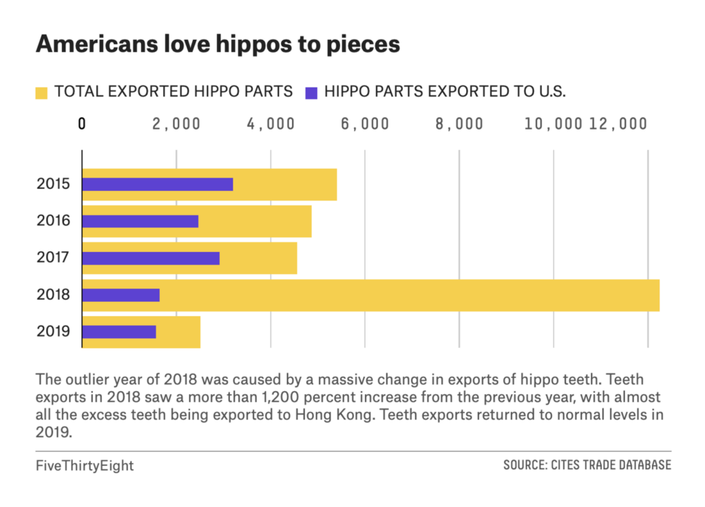
And other charts covered topics from medical crowdfunding in the U.K. to the hippo parts market in the U.S.:
What else we found interesting

Applications are open for…
- The Times Corps mentorship program for student journalists at The New York Times
- A data journalism intern at the Hindustan Times
- A general manager and an editorial and marketing intern at Kontinentalist
- A senior election data designer and a climate graphics reporter at The Washington Post
- An interactive designer / developer at The Guardian
- A graphics reporter at The Wall Street Journal
Help us make this dispatch better! We’d love to hear which newsletters, blogs, or social media accounts we need to follow to learn about interesting projects, especially from less-covered parts of the world (Asia, South America, Africa). Write us at hello@datawrapper.de or leave a comment below.
Want the Dispatch in your inbox every Tuesday? Sign up for our Blog Update newsletter!


Comments