Data Vis Dispatch, February 18: German election polls, corruption, and tariffs
February 18th, 2025
9 min
Datawrapper lets you show your data as beautiful charts, maps or tables with a few clicks. Find out more about all the available visualization types.
Our mission is to help everyone communicate with data - from newsrooms to global enterprises, non-profits or public service.
We want to enable everyone to create beautiful charts, maps, and tables. New to data visualization? Or do you have specific questions about us? You'll find all the answers here.
Data vis best practices, news, and examples
250+ articles that explain how to use Datawrapper
Answers to common questions
An exchange place for Datawrapper visualizations
Attend and watch how to use Datawrapper best
Learn about available positions on our team
Our latest small and big improvements
Build your integration with Datawrapper's API
Get in touch with us – we're happy to help
This article is brought to you by Datawrapper, a data visualization tool for creating charts, maps, and tables. Learn more.
The best of last week’s big and small data visualizations
Welcome back to the 95th edition of Data Vis Dispatch! Every week, we’ll be publishing a collection of the best small and large data visualizations we find, especially from news organizations — to celebrate data journalism, data visualization, simple charts, elaborate maps, and their creators.
Recurring topics this week include immigration, poaching, and elections in Spain.
Elections are always big news in the Data Vis Dispatch, and Spain’s local elections this Sunday were no exception:
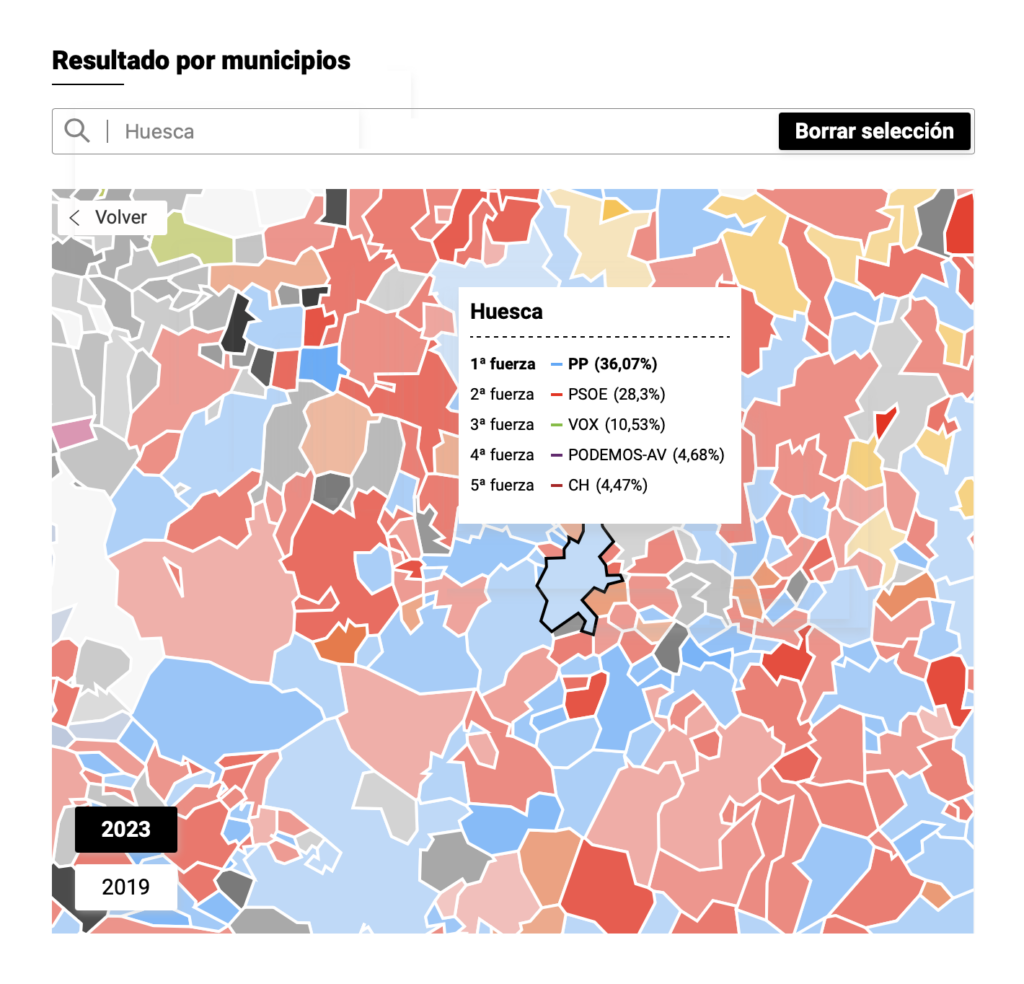
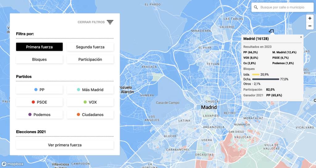
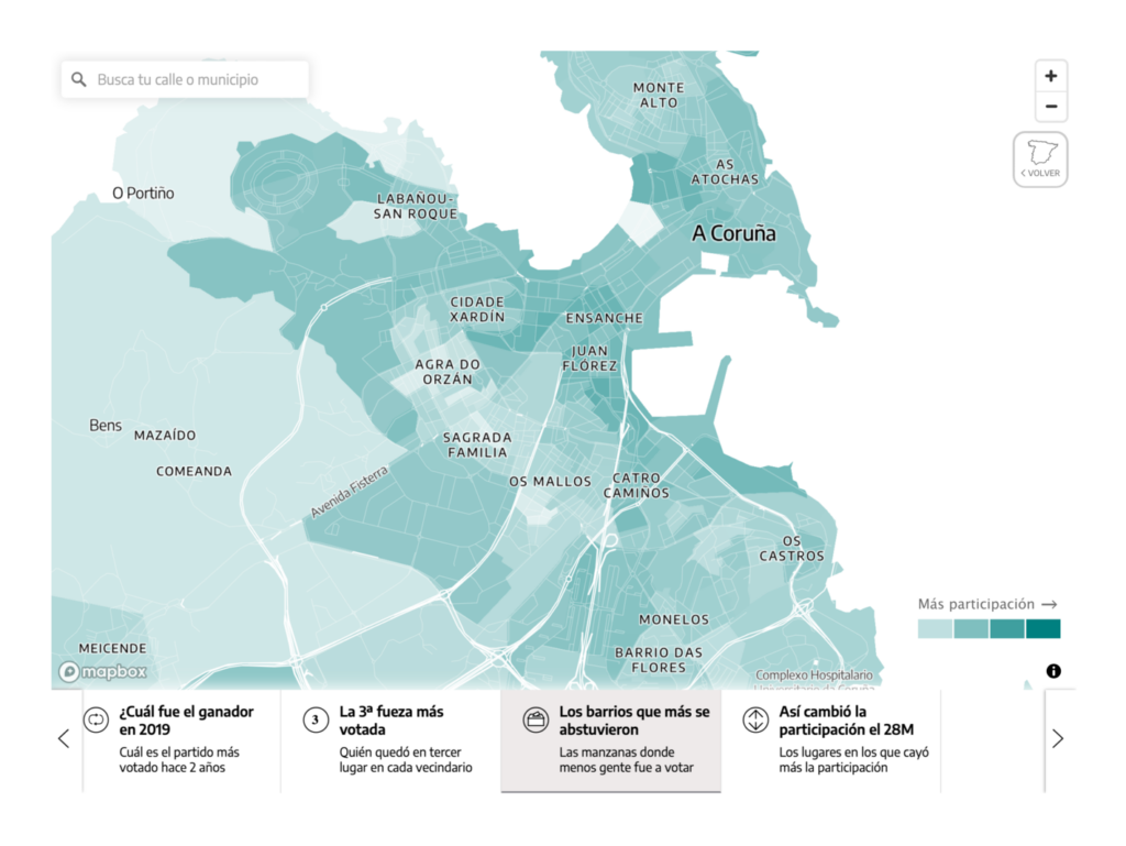
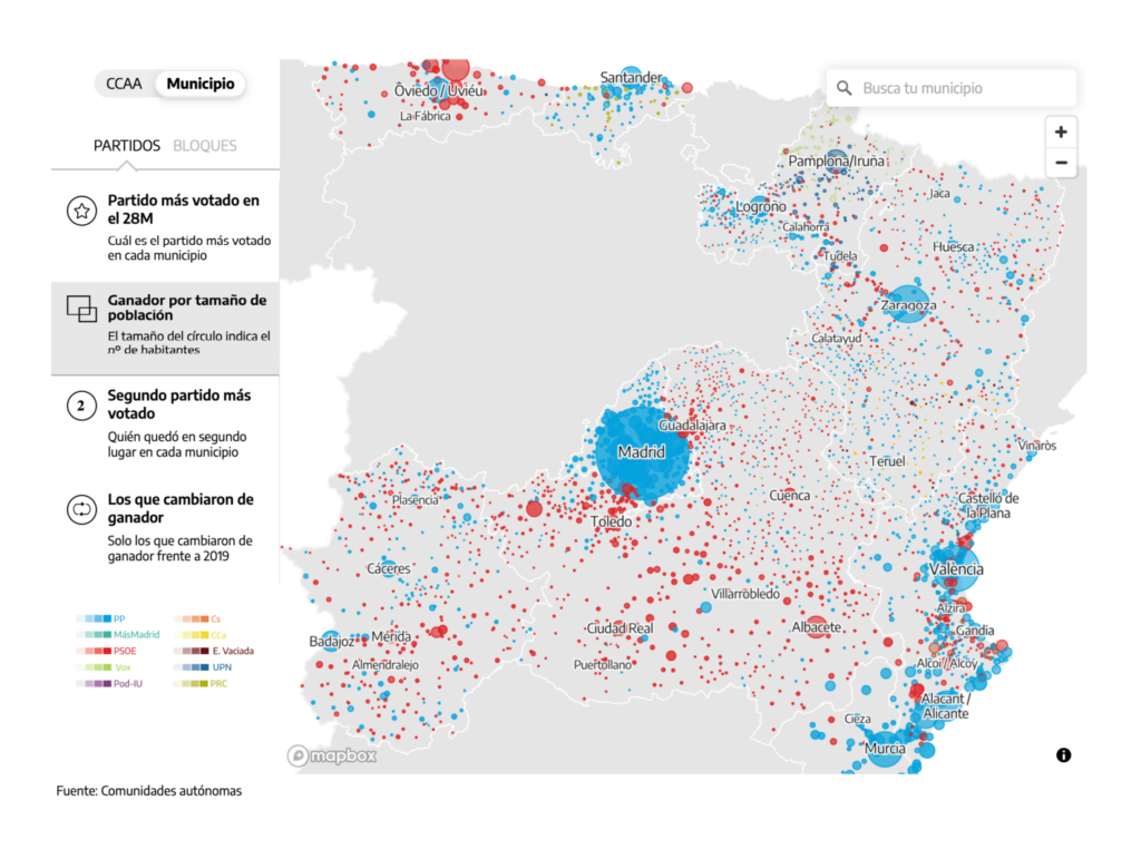
This week’s U.S. focus was on right-wing politics, from anti-trans legislation to book bans to January 6 prosecutions:
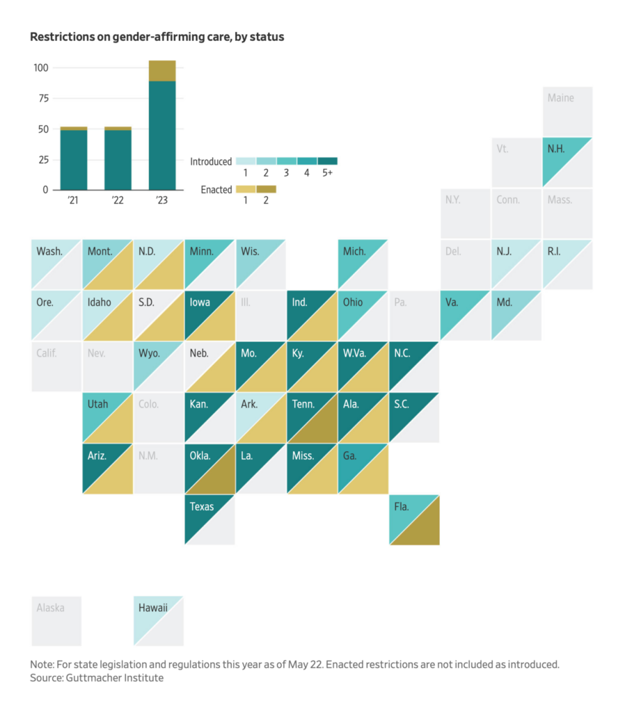
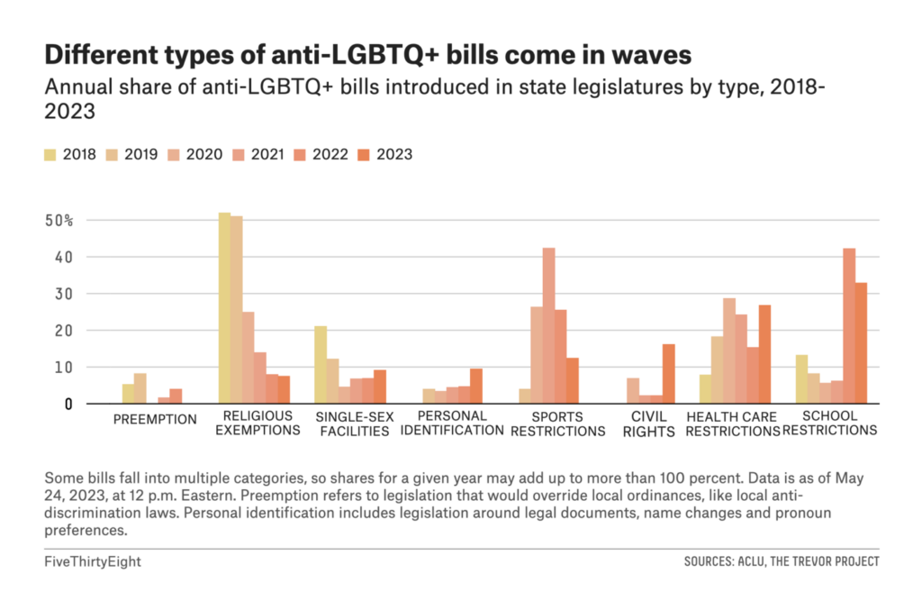
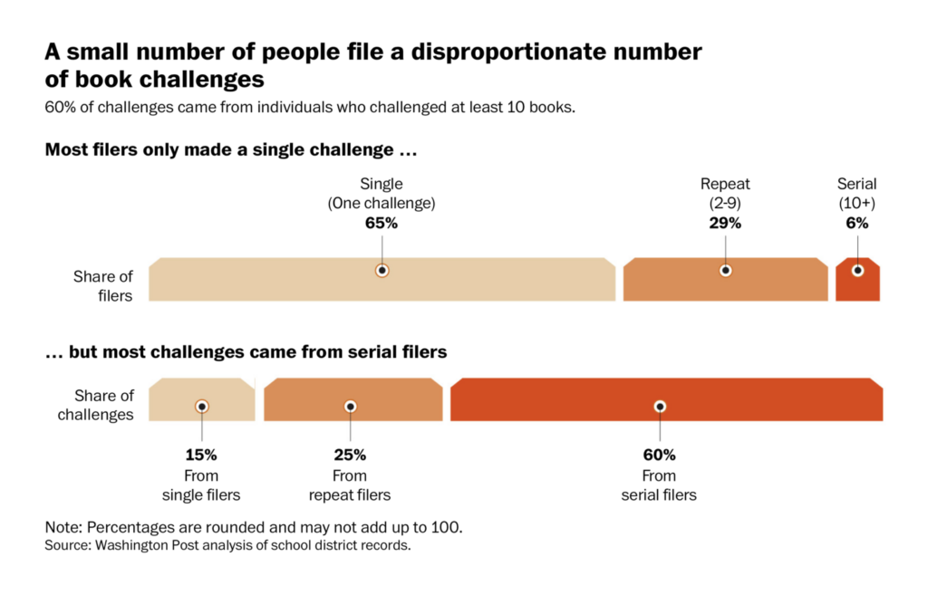
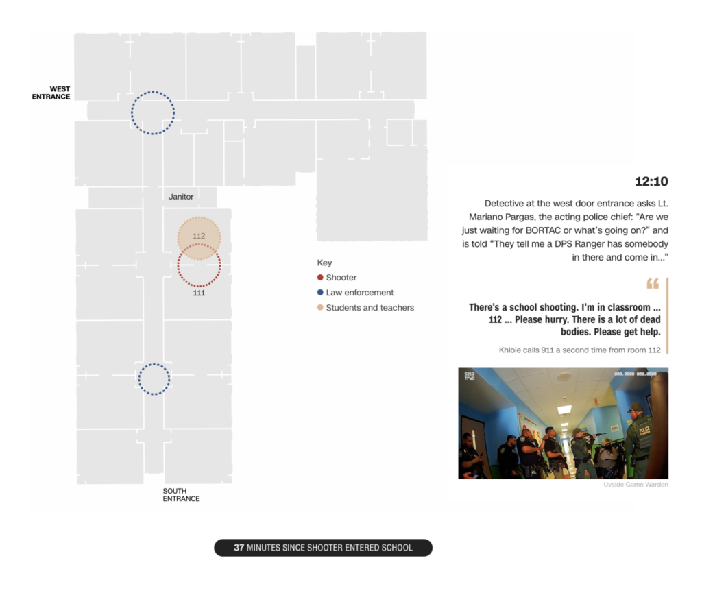
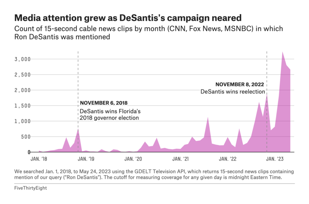
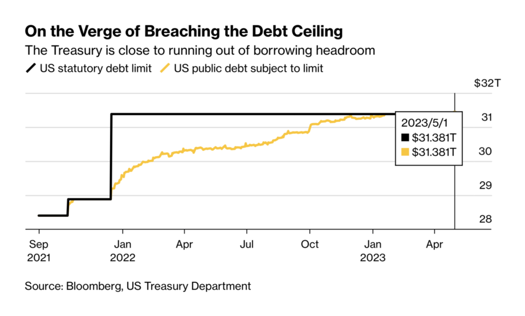
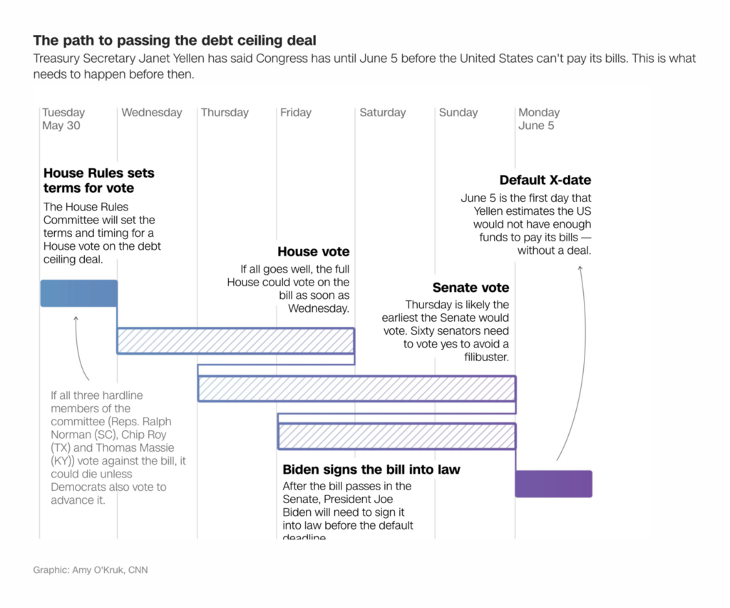
And in short-term problems, a debt crisis still looms:
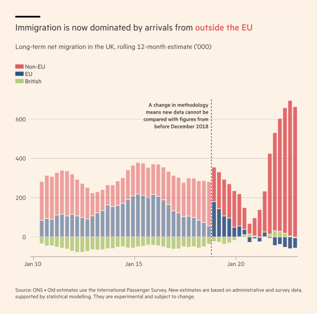
In Germany and the U.K., it’s been a year of record immigration…
… in part due to refugees fleeing the war in Ukraine:
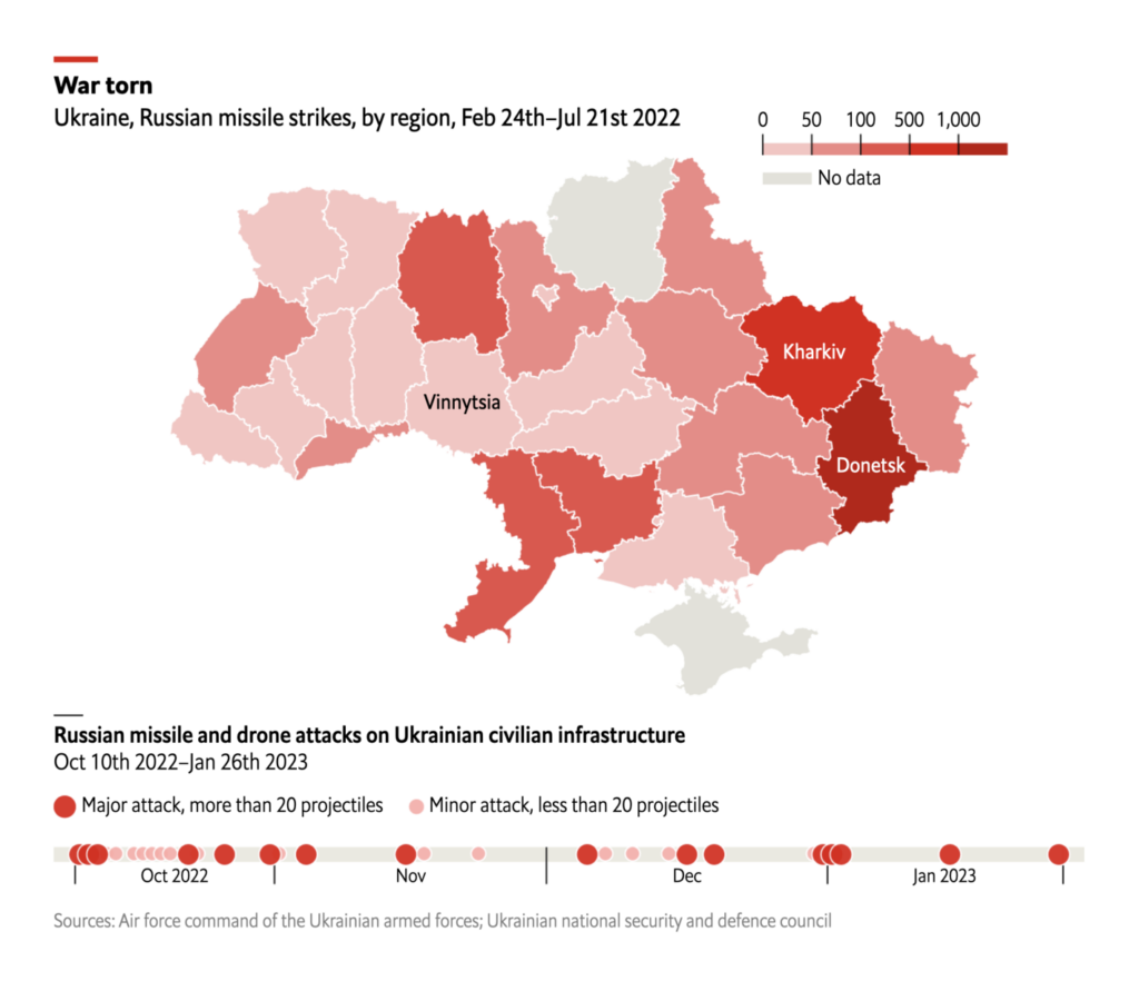
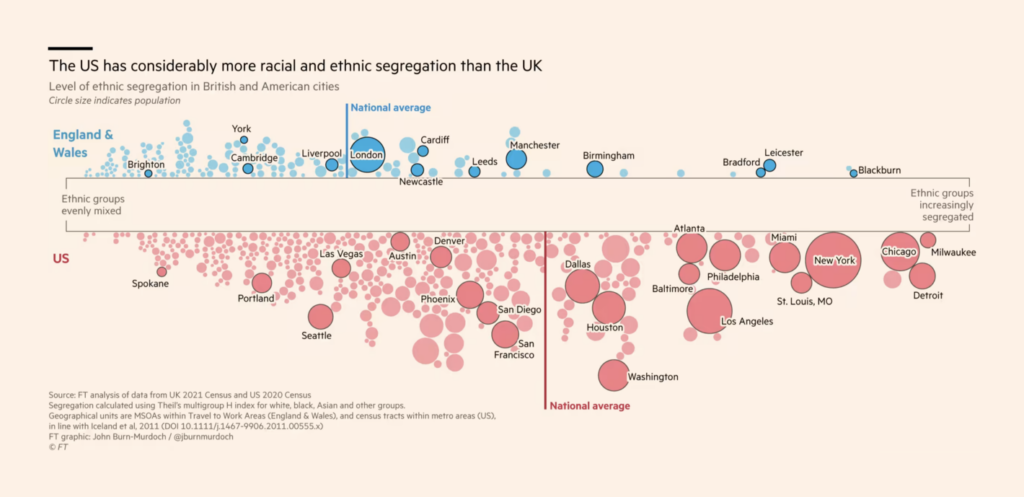
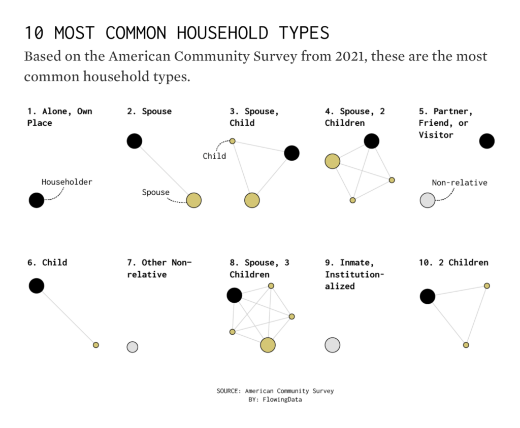
Three charts looked at housing prices, segregation, and social arrangements:
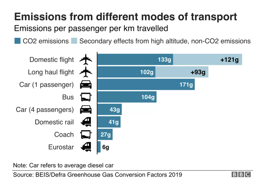
In environmental topics, it was a week for visualizing personal footprints…
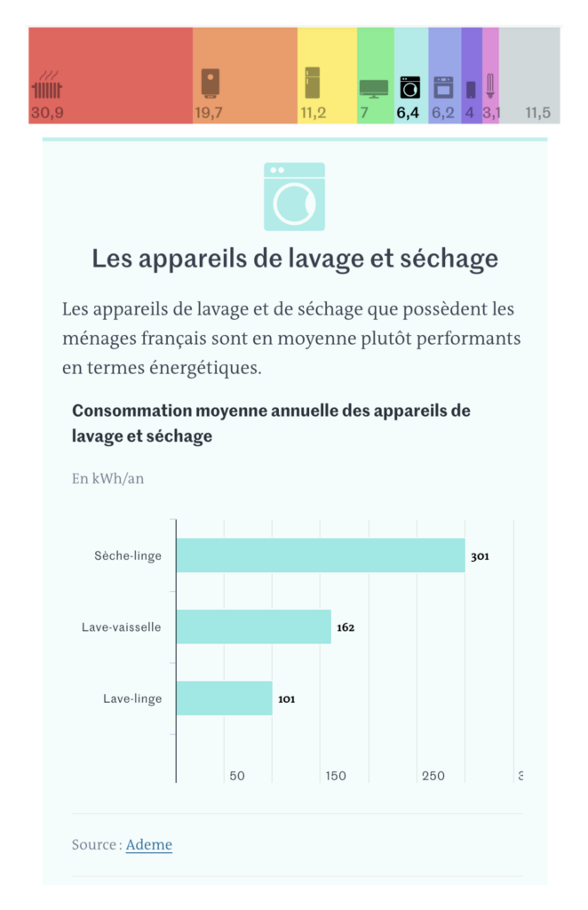
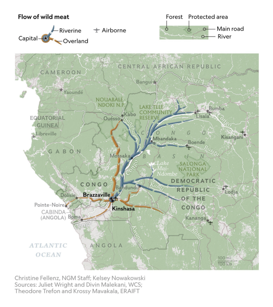
… and illegal fishing and hunting:
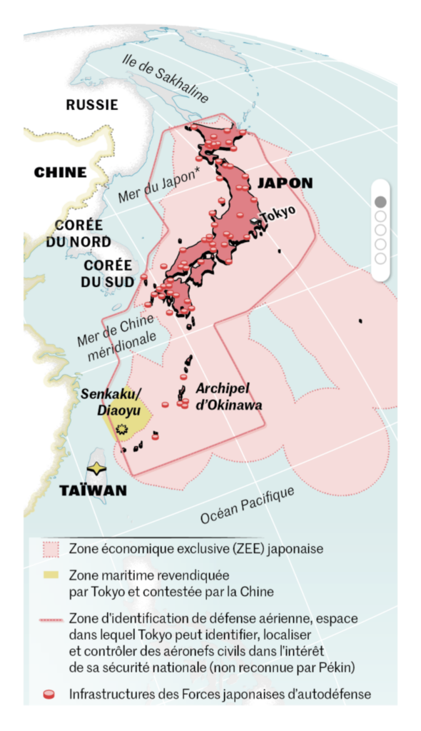
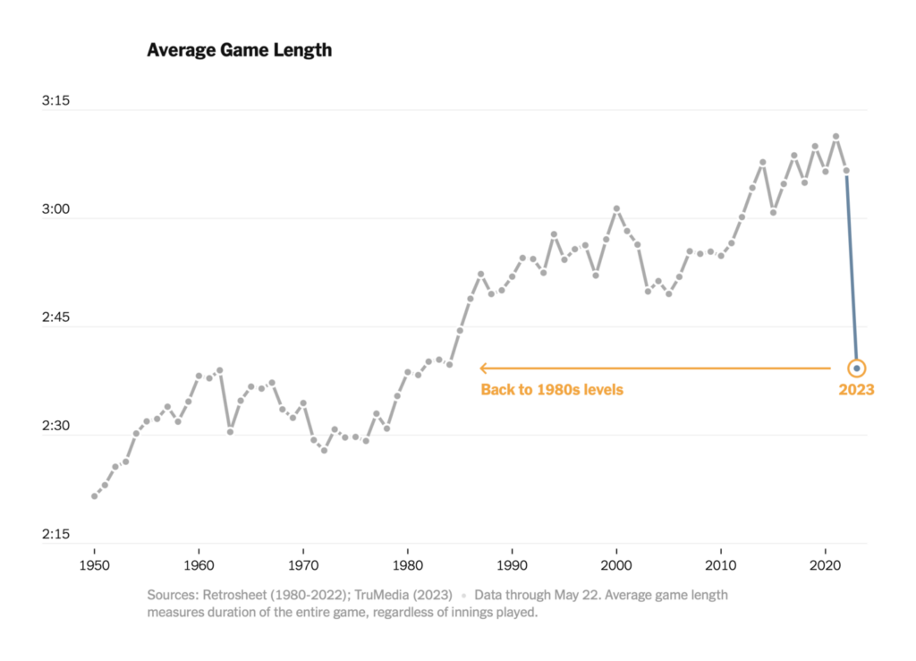
Other charts and maps covered everything from declining press freedoms to shorter baseball games:


Help us make this dispatch better! We’d love to hear which newsletters, blogs, or social media accounts we need to follow to learn about interesting projects, especially from less-covered parts of the world (Asia, South America, Africa). Write us at hello@datawrapper.de or leave a comment below.
Want the Dispatch in your inbox every Tuesday? Sign up for our Blog Update newsletter!
Comments