This article is brought to you by Datawrapper, a data visualization tool for creating charts, maps, and tables. Learn more.
Data Vis Dispatch, May 31
The best of last week’s big and small data visualizations

Welcome back to the 47th edition of Data Vis Dispatch! Every week, we’ll be publishing a collection of the best small and large data visualizations we find, especially from news organizations — to celebrate data journalism, data visualization, simple charts, elaborate maps, and their creators.
Recurring topics this week include transportation in London, wheat exports from Ukraine, and gun violence in the United States.
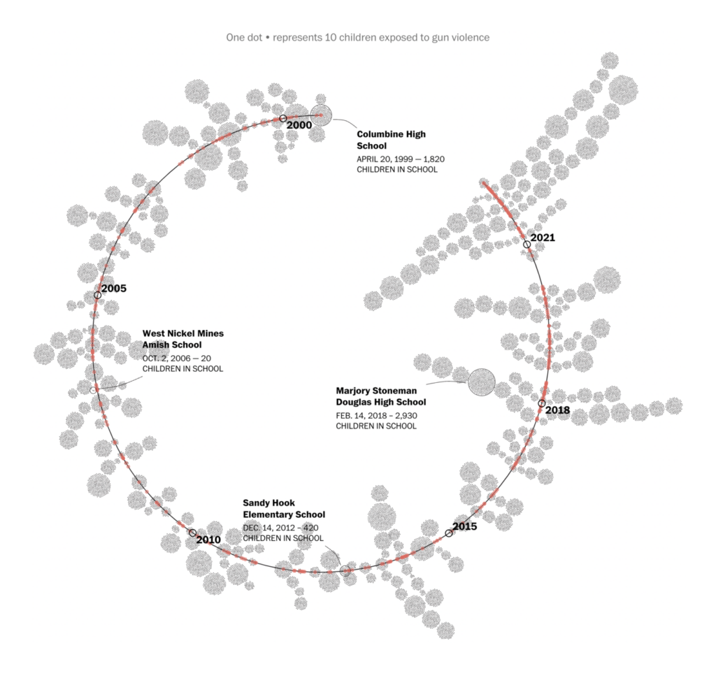
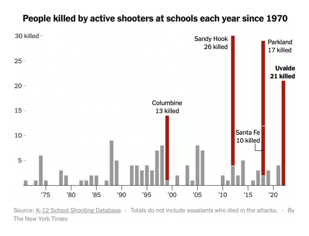
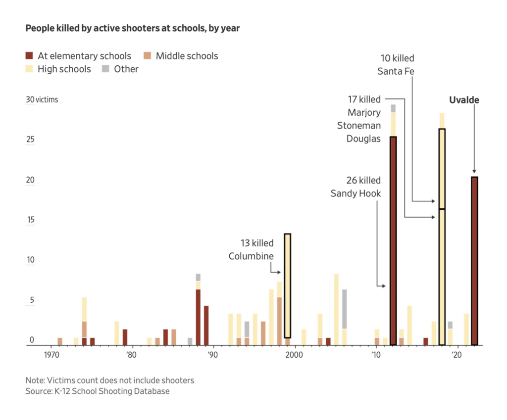
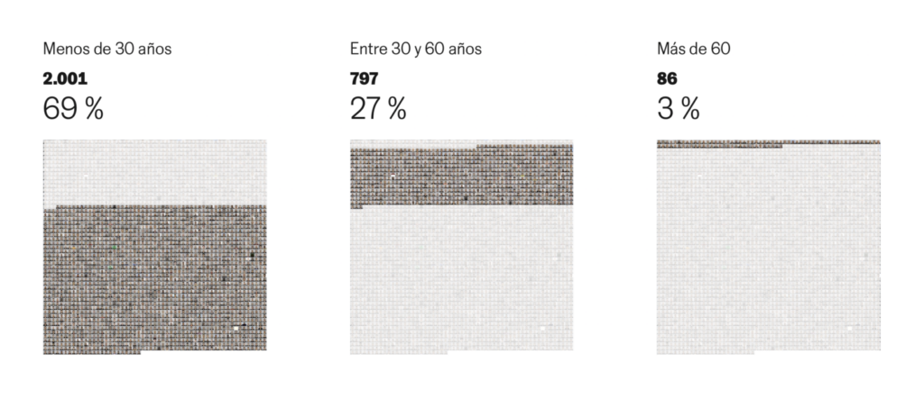
Last Tuesday, a mass shooting in Texas killed 19 elementary school students and two of their teachers:

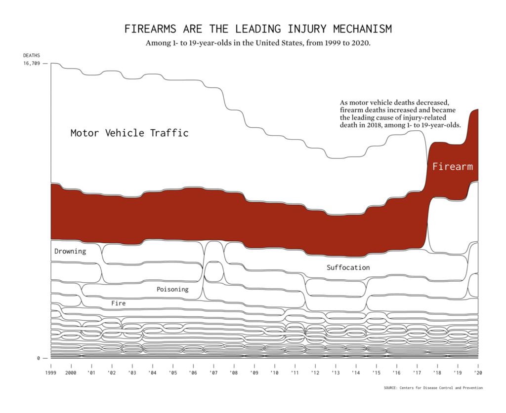
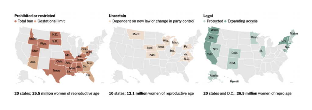
Gun violence, not limited to school shootings, is the leading cause of death for American children:


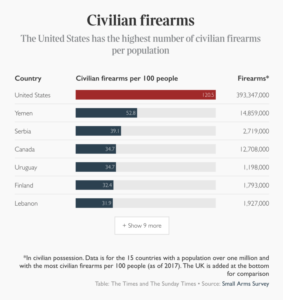
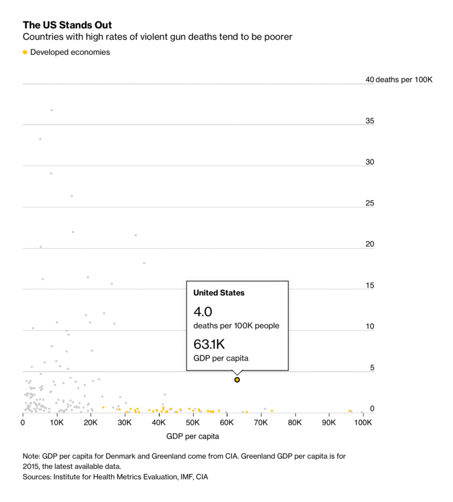
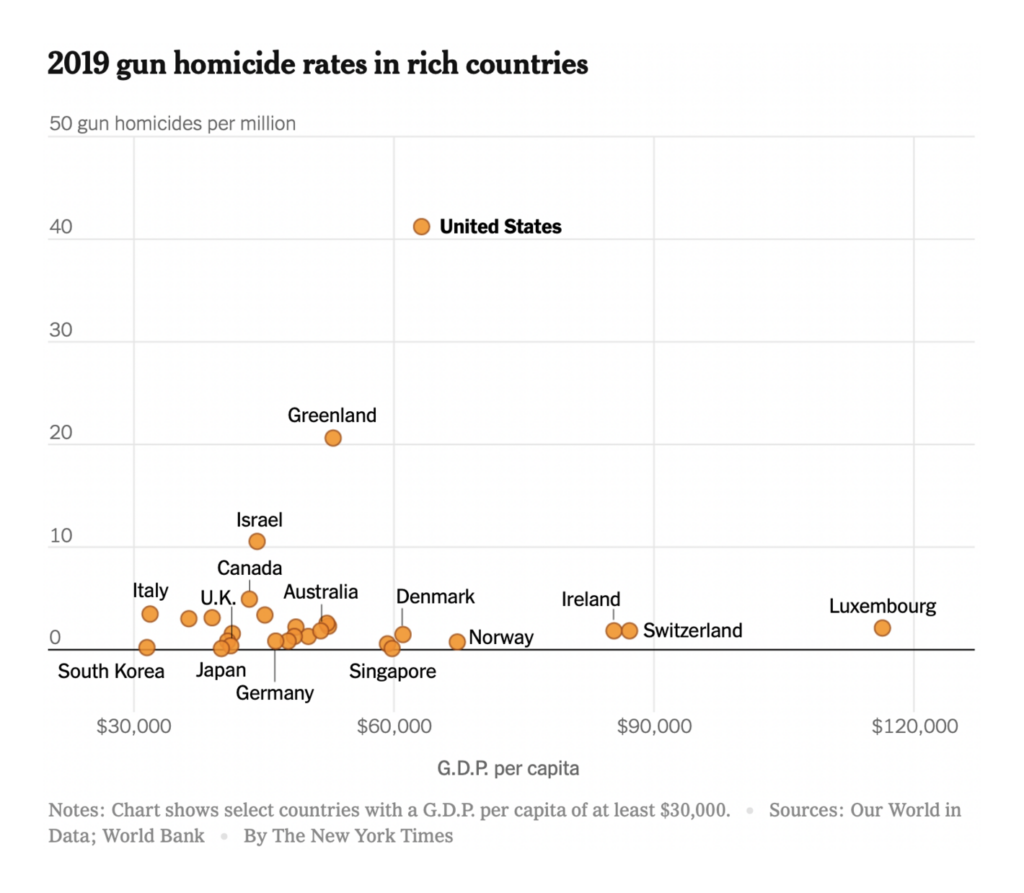
No other rich country comes close to the U.S. in gun violence, and no country on earth has more guns in civilian hands:
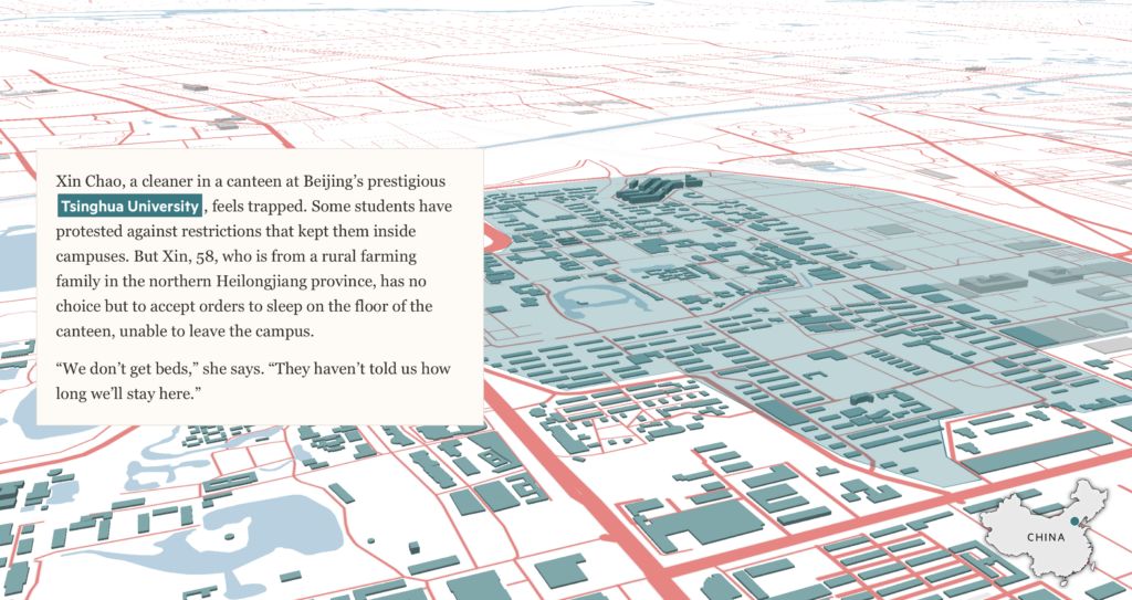
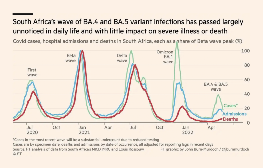
COVID visualizations covered heavy lockdowns in China and a slowing vaccine campaign in South Africa:
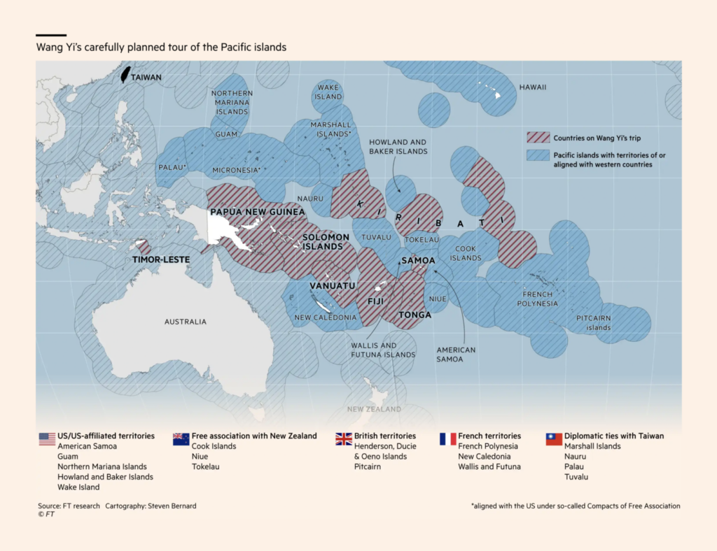
And other news from China included diplomacy in the Pacific and a massive leak of documents relating to Beijing’s genocide of the Uyghurs:
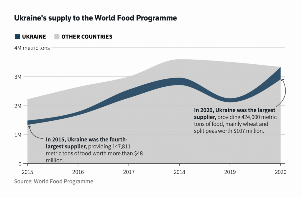
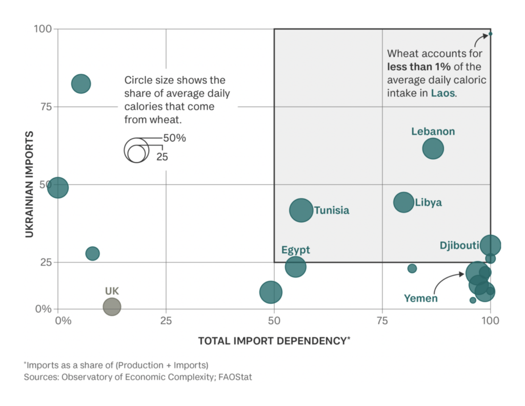
With Ukraine still at war and unable to export its wheat crop, many countries are facing a food crisis:
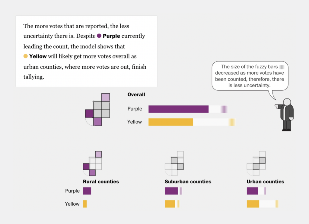
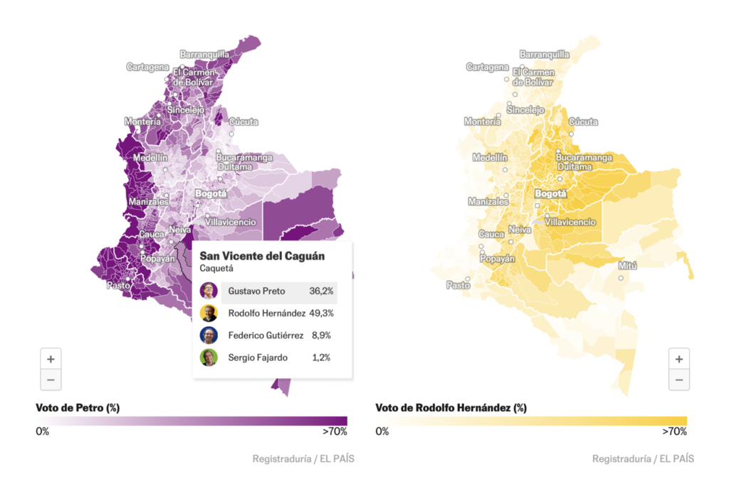
Despite their matching colors, only one of these elections really happened. The first is a model from The Washington Post, explaining how their reporters predict election outcomes; the second shows the real results of Colombia’s presidential race:
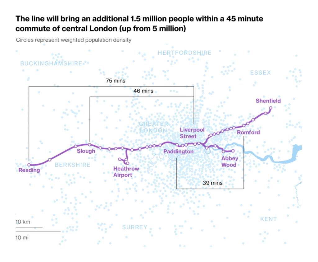
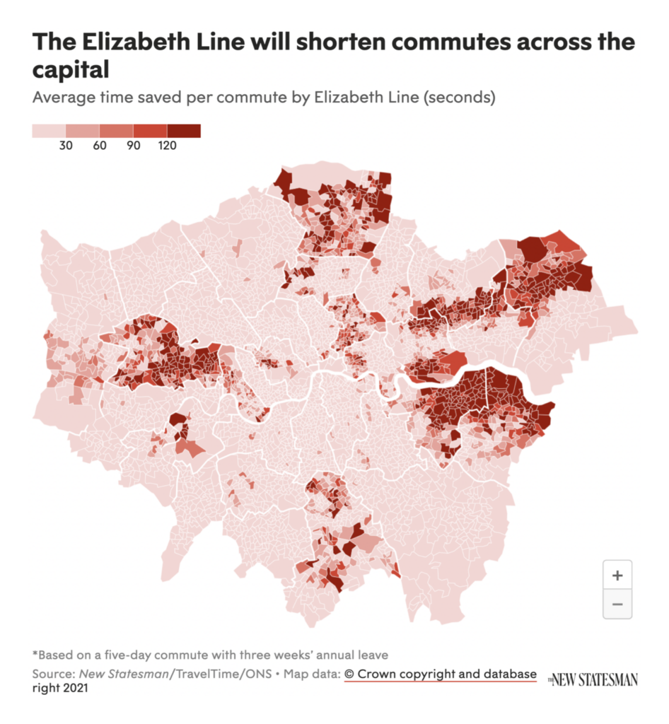
A major addition to London’s rail network, the Elizabeth line, began service this week:
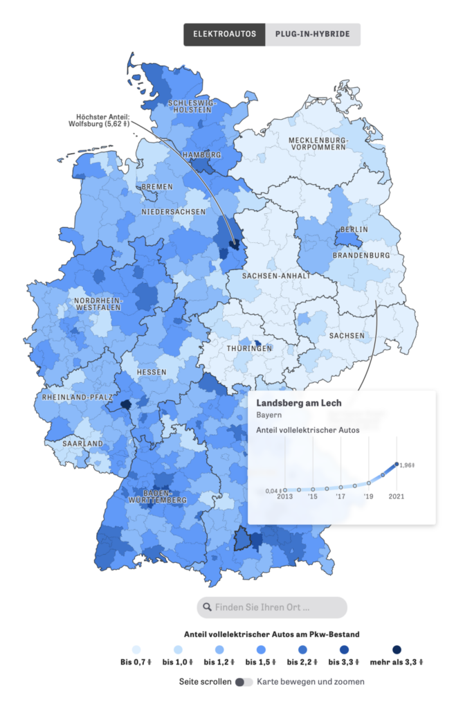
Meanwhile, non-electric cars are looking less attractive than ever:
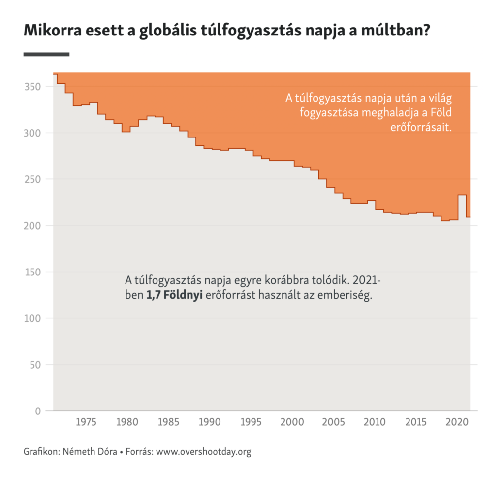
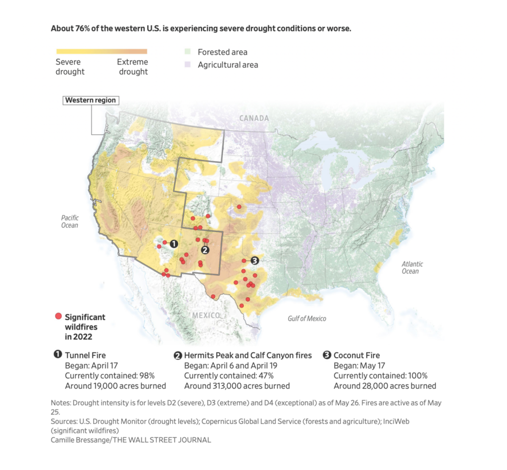
Heading into summer, climate topics this week included temperature records, “Overshoot Day,” and wildfire:

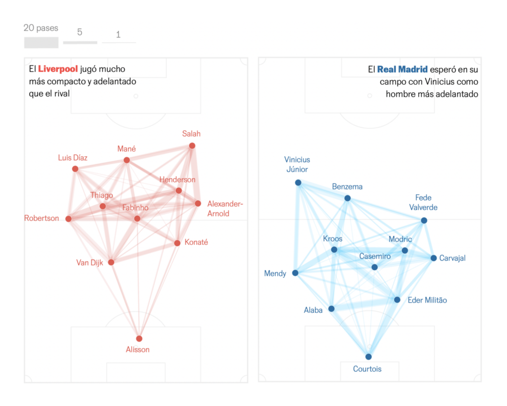
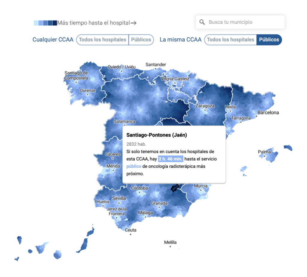
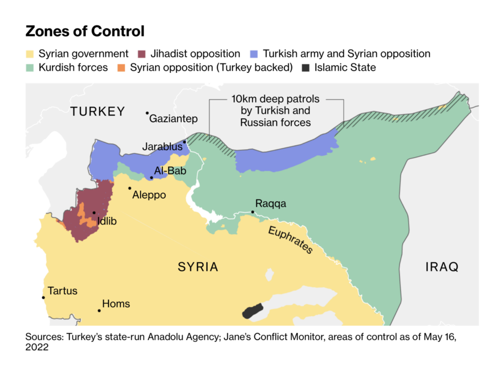
And other charts and maps covered everything from the Champions League final to hospital access in Spain to zones of control in Syria:
What else we found interesting
Applications are open for…
- A graphics and data editor at Radio Free Europe/Radio Liberty
Help us make this dispatch better! We’d love to hear which newsletters, blogs, or social media accounts we need to follow to learn about interesting projects, especially from less-covered parts of the world (Asia, South America, Africa). Write us at hello@datawrapper.de or leave a comment below.
Want the Dispatch in your inbox every Tuesday? Sign up for our Blog Update newsletter!


Comments