This article is brought to you by Datawrapper, a data visualization tool for creating charts, maps, and tables. Learn more.
Data Vis Dispatch, May 9
The best of last week’s big and small data visualizations

Welcome back to the 93rd edition of Data Vis Dispatch! Every week, we’ll be publishing a collection of the best small and large data visualizations we find, especially from news organizations — to celebrate data journalism, data visualization, simple charts, elaborate maps, and their creators.
The Dispatch will go on a break next Tuesday, so take your time with this one — recurring topics include the pandemic economic recovery and animated maps.
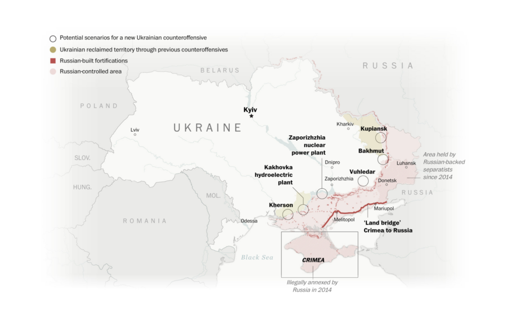
Three outstanding map animations deserved the spotlight this week:
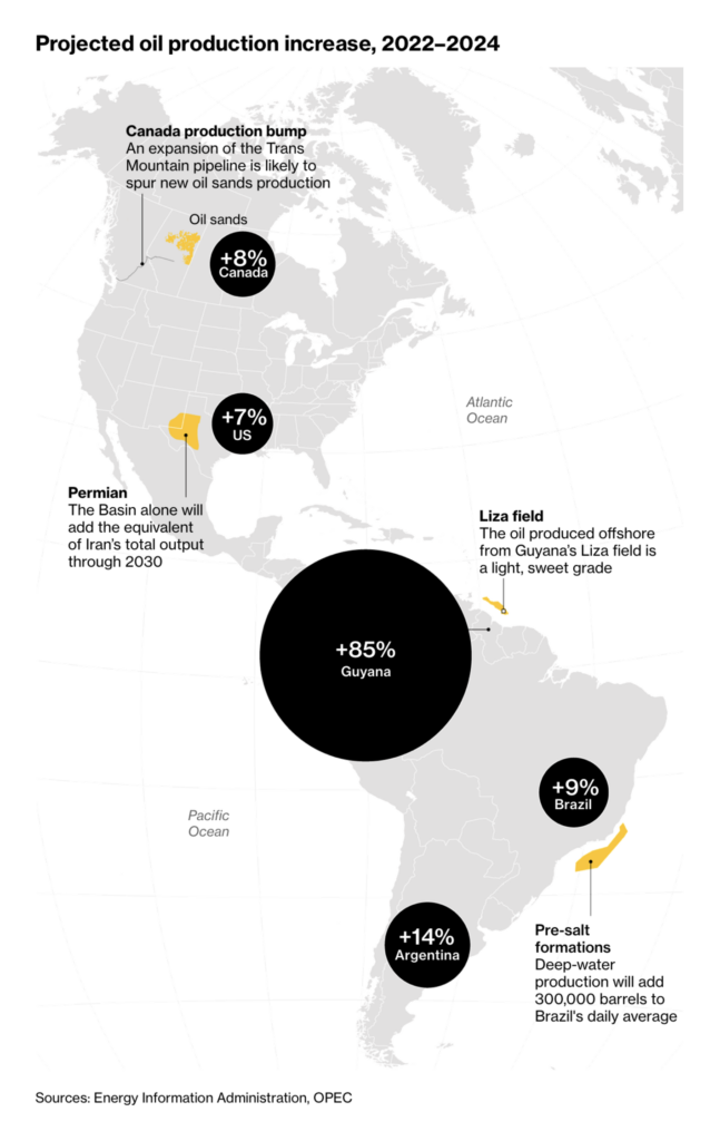
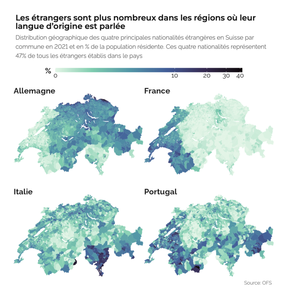
And we saw elegant static maps as well:

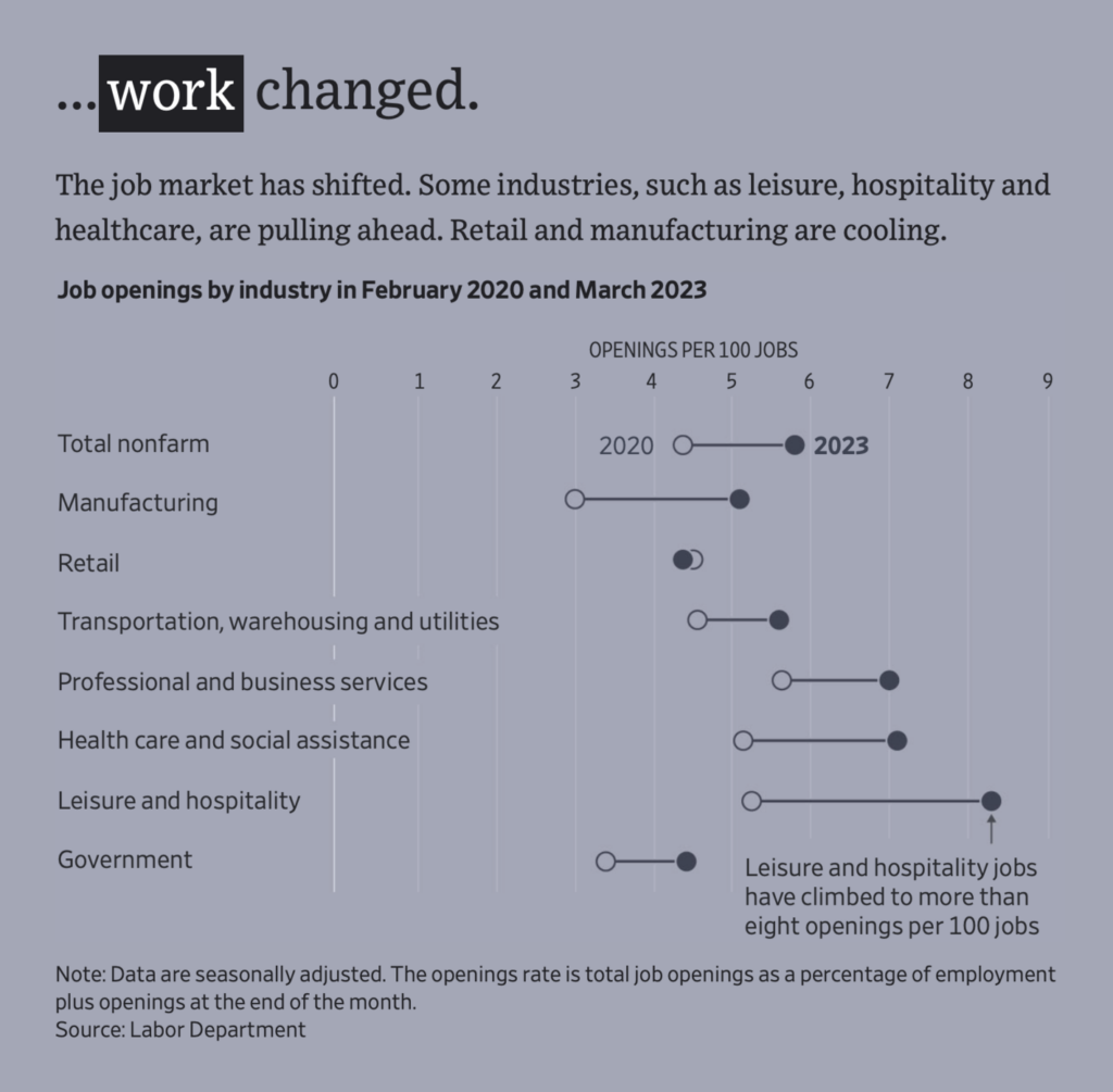
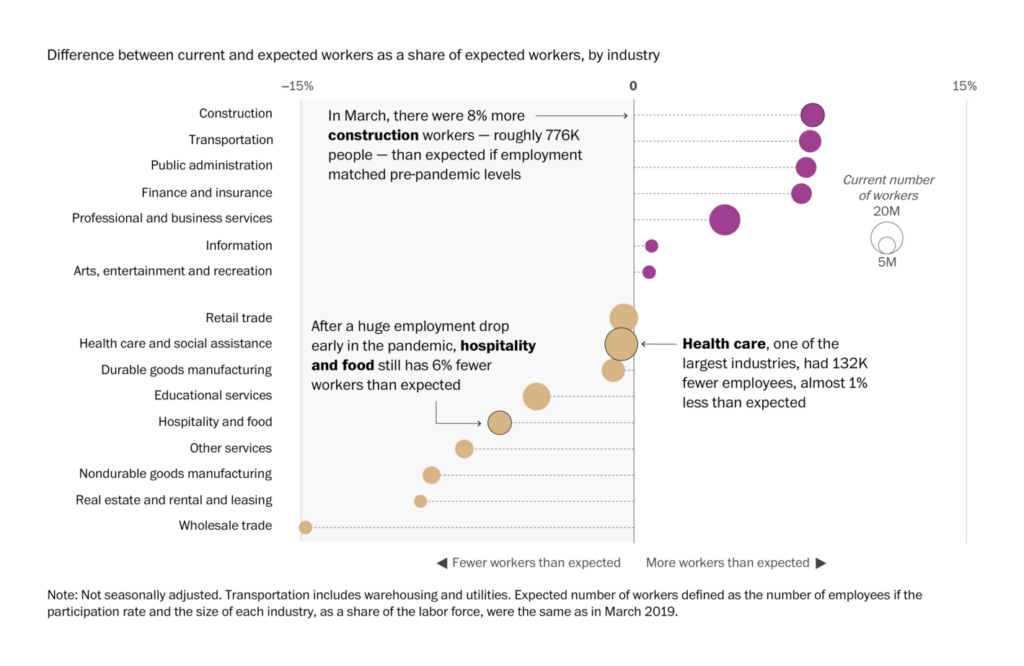
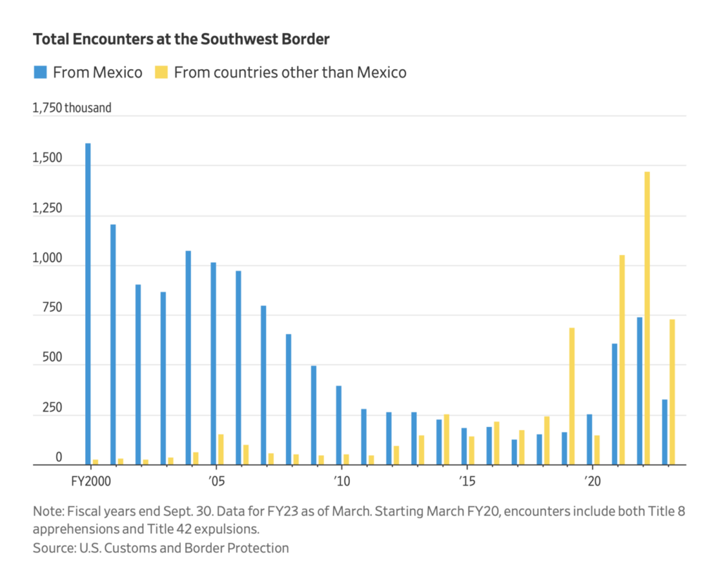
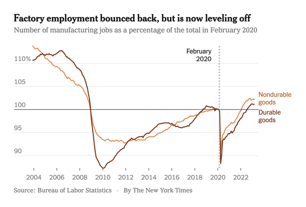
It was a week for looking back at the COVID era, and what has and hasn’t changed in the past three years:
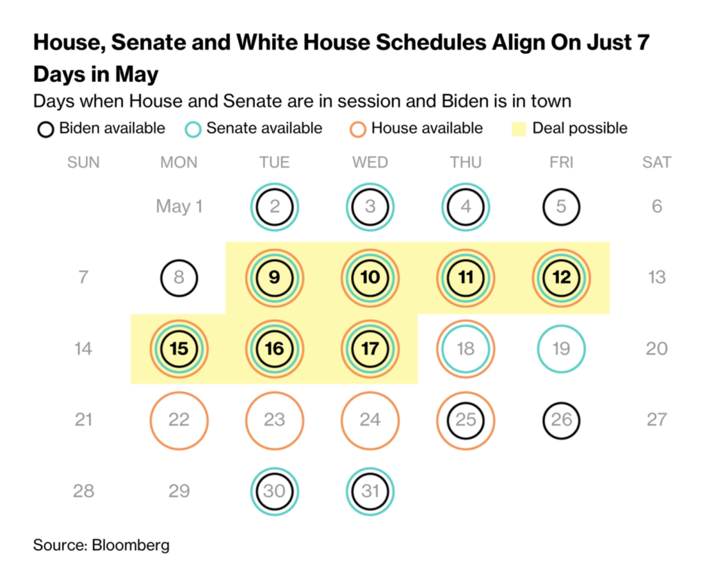
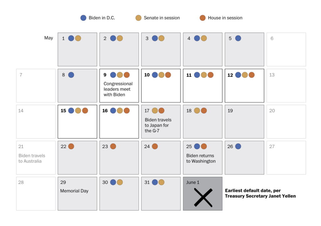
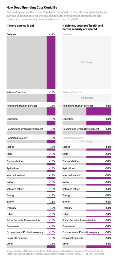
A debt ceiling standoff threatens to send the U.S. into default:
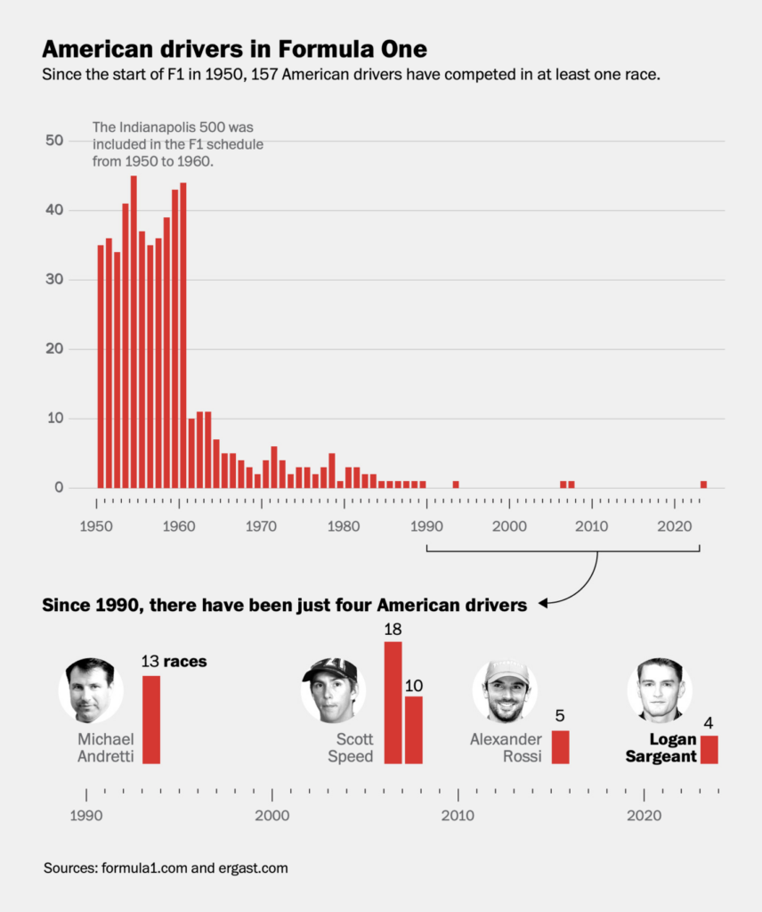
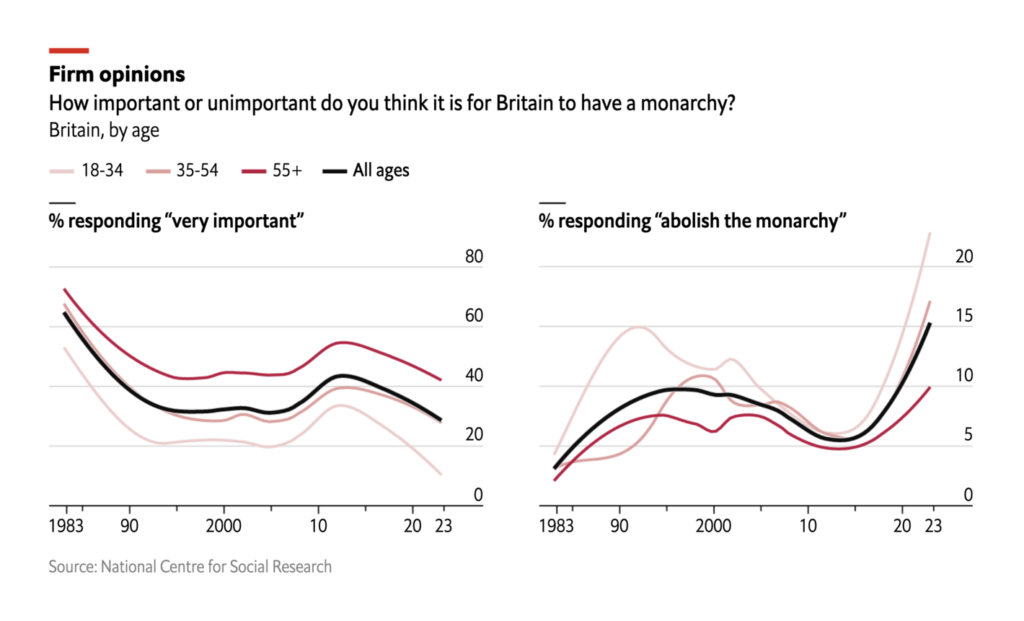
Other charts covered everything from American Formula One drivers to how the British public feels about kings:

What else we found interesting
Applications are open for…
- The Data Visualization Society’s mentorship program
- A news designer at Der Spiegel
Help us make this dispatch better! We’d love to hear which newsletters, blogs, or social media accounts we need to follow to learn about interesting projects, especially from less-covered parts of the world (Asia, South America, Africa). Write us at hello@datawrapper.de or leave a comment below.
Want the Dispatch in your inbox every Tuesday? Sign up for our Blog Update newsletter!


Comments