We want to enable everyone to create beautiful charts, maps, and tables. New to data visualization? Or do you have specific questions about us? You'll find all the answers here.
The best of last week’s big and small data visualizations
Vivien Serve
Welcome back to the 118th edition of Data Vis Dispatch! Every week, we’ll be publishing a collection of the best small and large data visualizations we find, especially from news organizations — to celebrate data journalism, data visualization, simple charts, elaborate maps, and their creators.
Recurring topics this week include the internet, artificial intelligence, and energy prices.
Let’s start with the second week of the #30DayMapChallenge. Here are our favorites for visual appeal, stunning data, creativity, or just fun — because a smile is worth a lot:
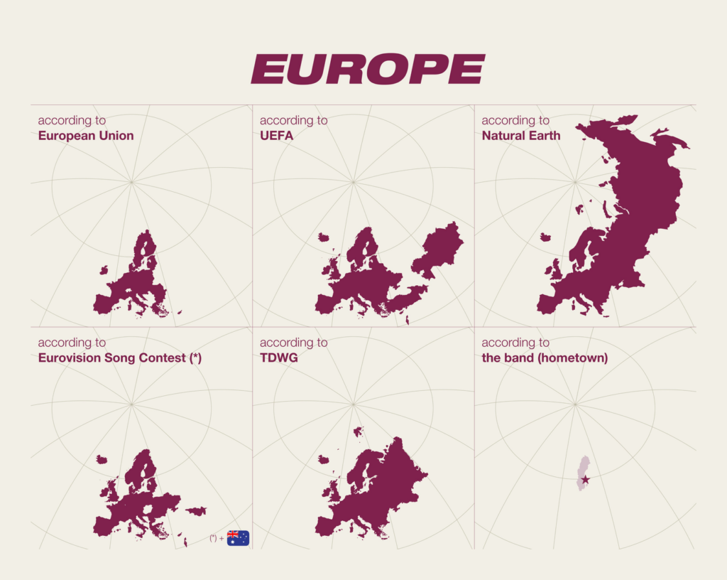
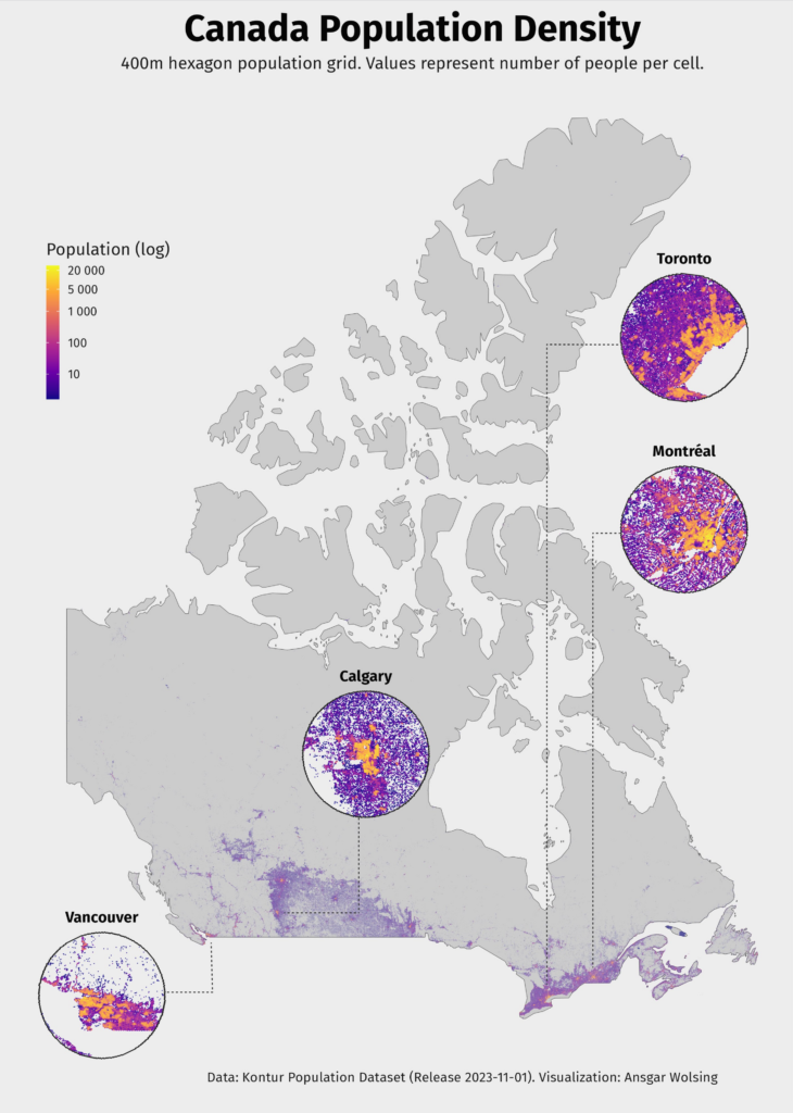
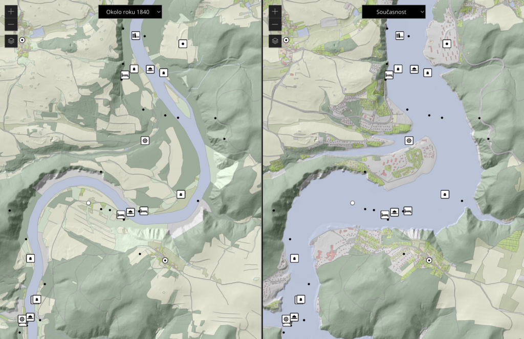
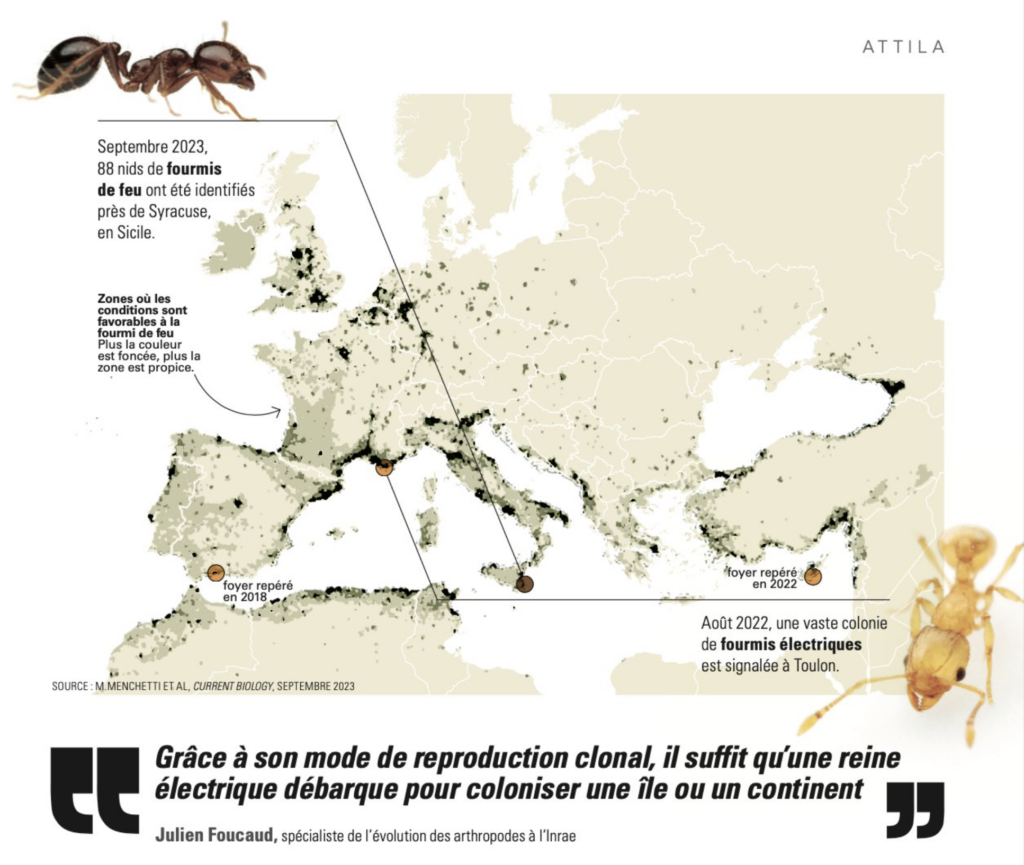
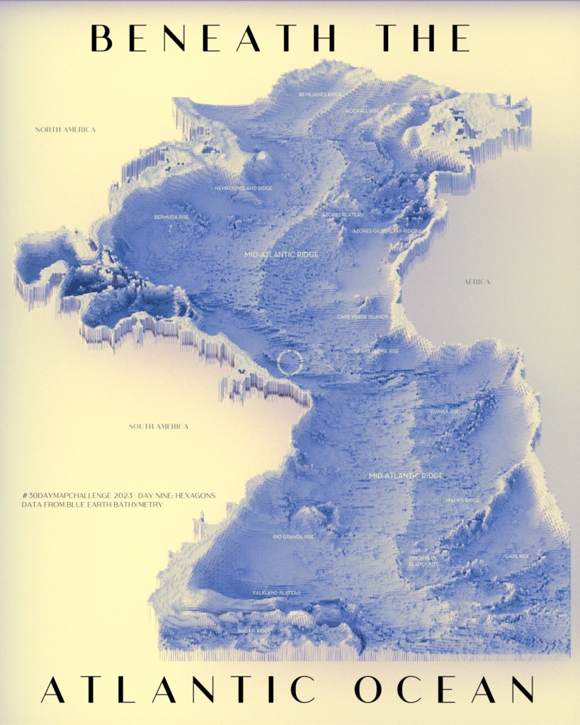
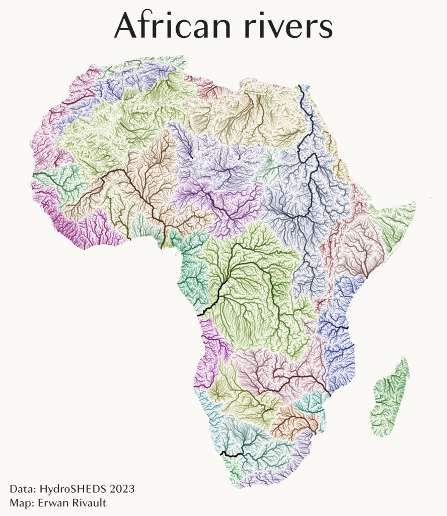
Britt Lonneville: “#30DayMapChallenge – day 14: Europe As one of my favourite profs at uni taught his puzzled freshmen: “Europe does not exist” (because there is no conclusive definition for it) So today let’s look at some official and less official interpretations of what Europe is (not),” November 14 (Tweet) Ansgar Wolsing: “The vast majority of Canada is sparsely inhabited, with most of its population south of 55 °N. This map shows population density and provides a zoomed-in view of the largest cities,” November 10 (Tweet)Geomatics CTU: “#Day11: In this app you can look back to the past and compare the historical landscape of the Vltava River valley to the present one,” November 11 (Tweet) Léa Desrayaud: “Alerte : deux calamités débarquent en Europe, la fourmi électrique et la fourmi de feu. L’occasion de relever “Europe”, le défi 14 du #30DayMapChallenge,” November 14 (Tweet)Kyle Barron: “County-to-county migration in the U.S.Made in Python with #lonboard. #30DayMapChallenge,” November 10 (Mastodon Post) Noel Peterson: “#30DayMapChallenge Day 9: ‘Hexagons,'” November 10 (Mastodon Post)Terence: “#30DayMapChallenge Day 9: Hexagons. Beneath (or bathymetry of) the Atlantic Ocean,” November 9 (Mastodon Post)Erwan Rivault: “#30DayMapChallenge Day 8: Africa All African rivers mapped by Strahler stream order and coloured by basin,” November 8 (Tweet)
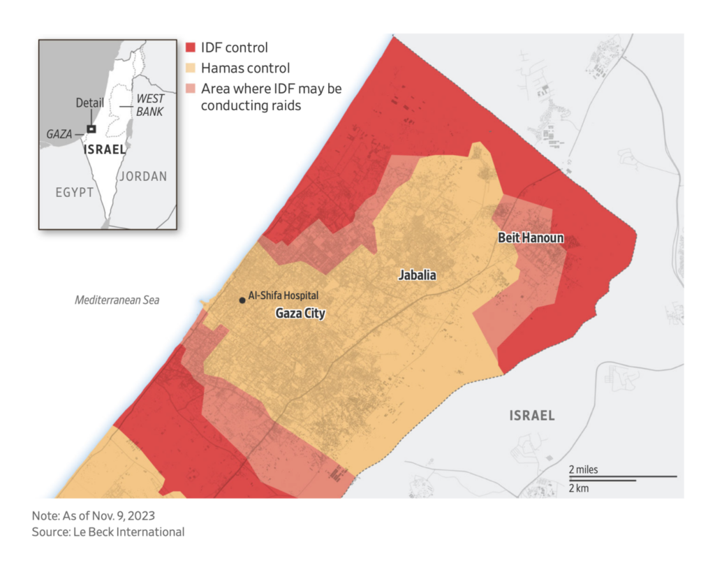
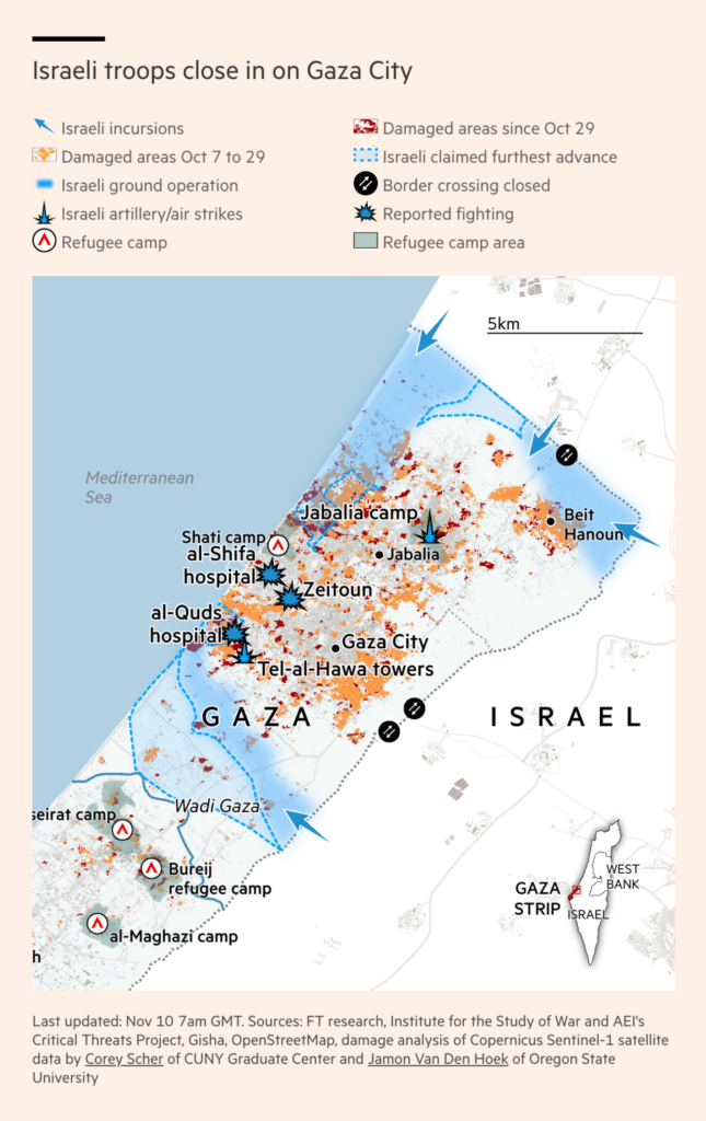
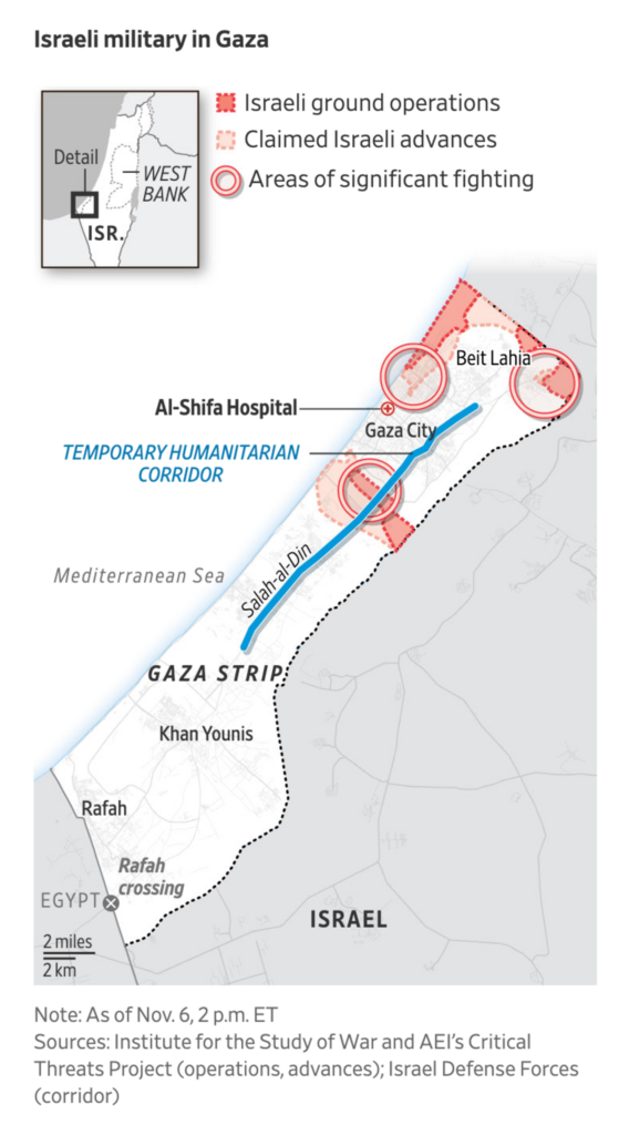
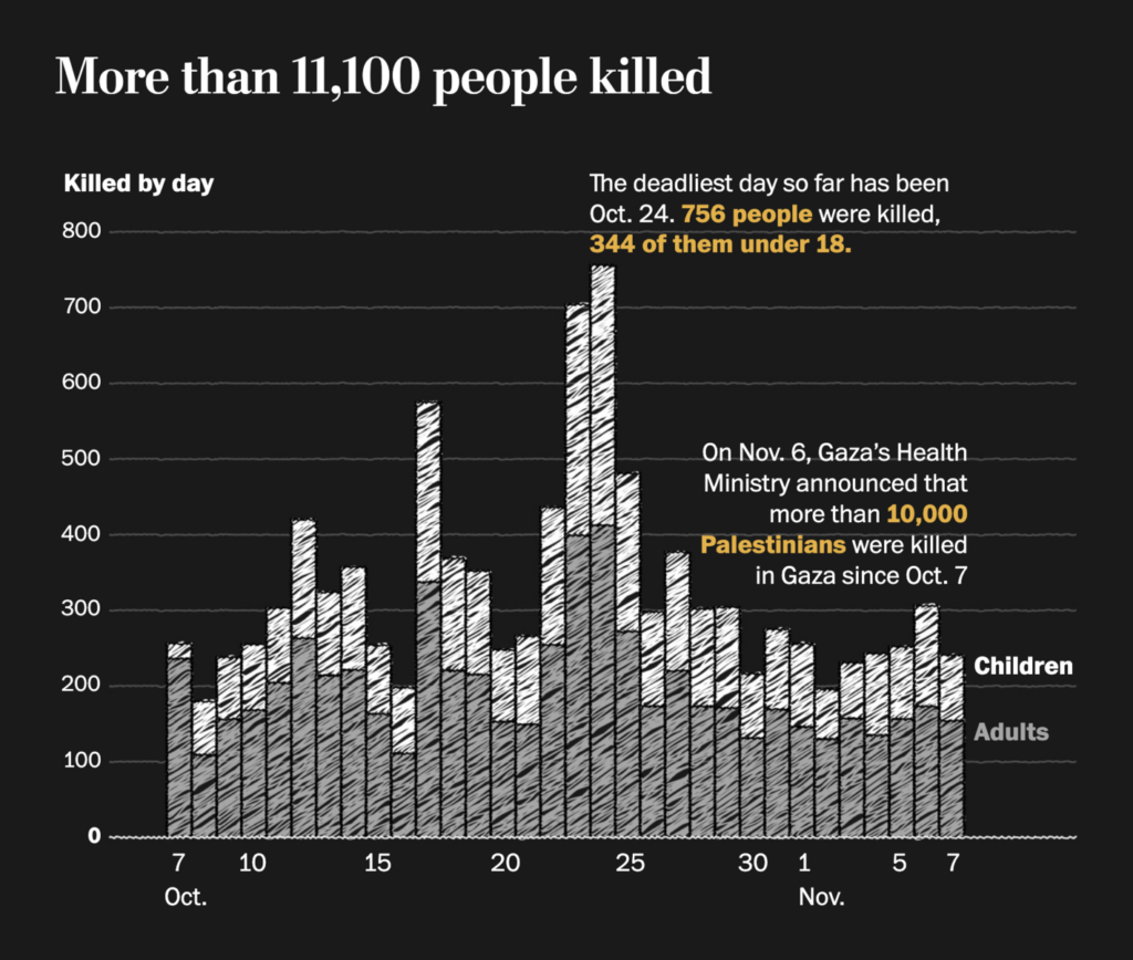
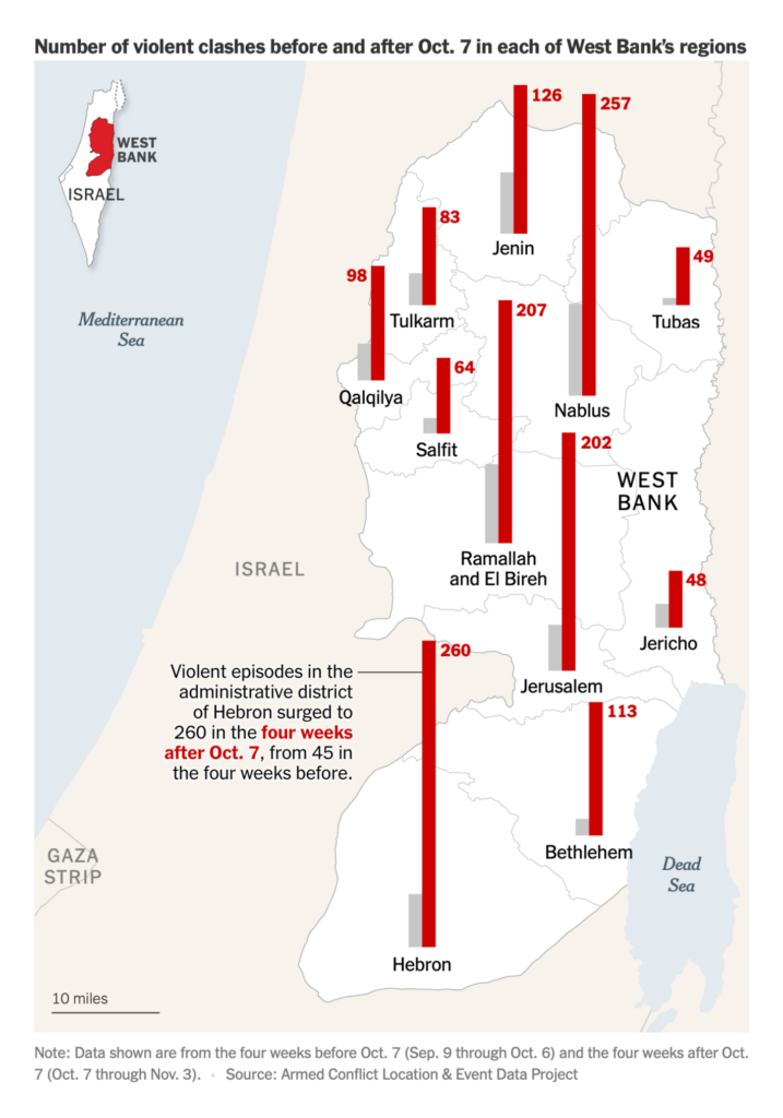
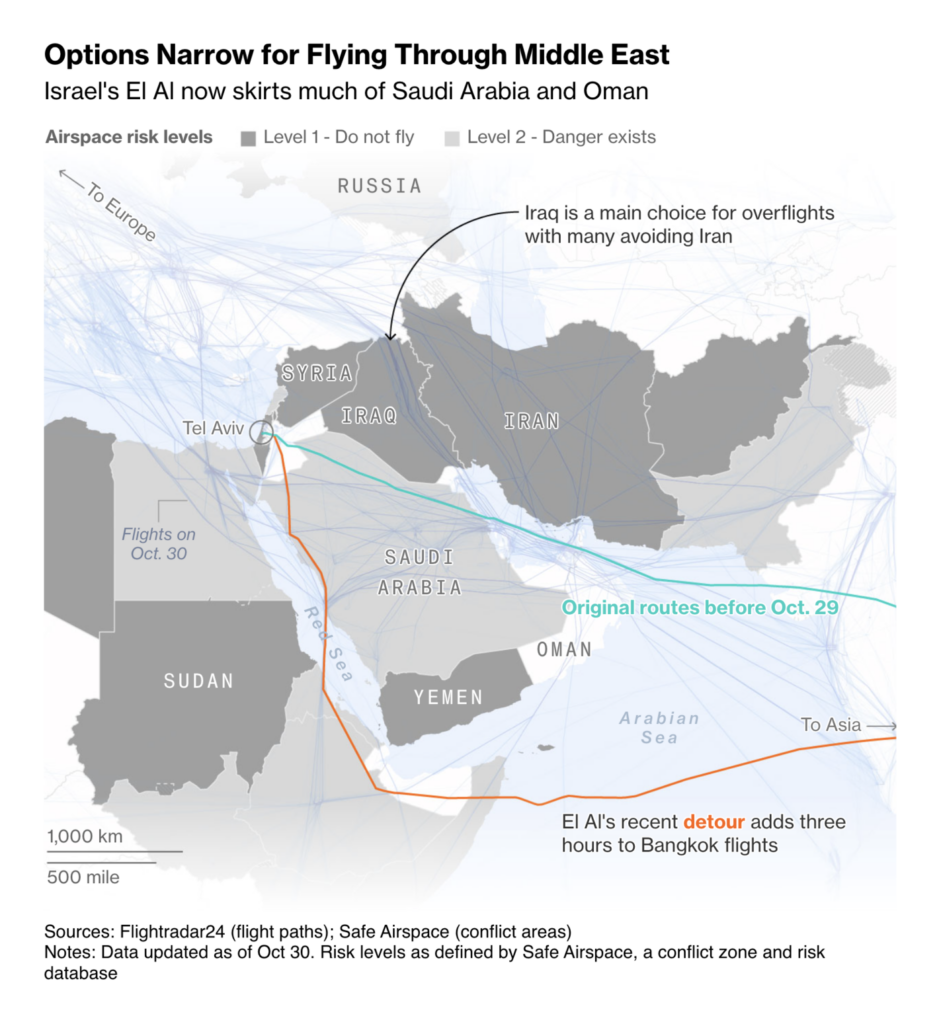
The warfare between Israel and Hamas continues. Maps this week depicted operations by the Israeli army:
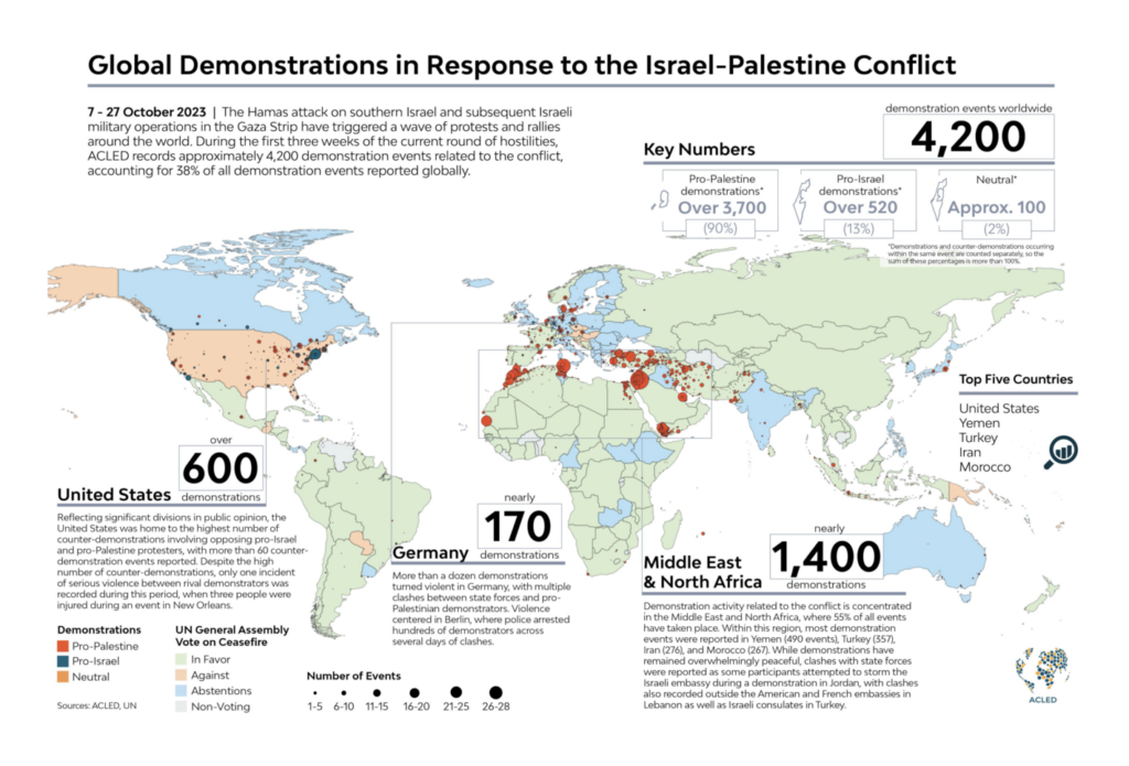
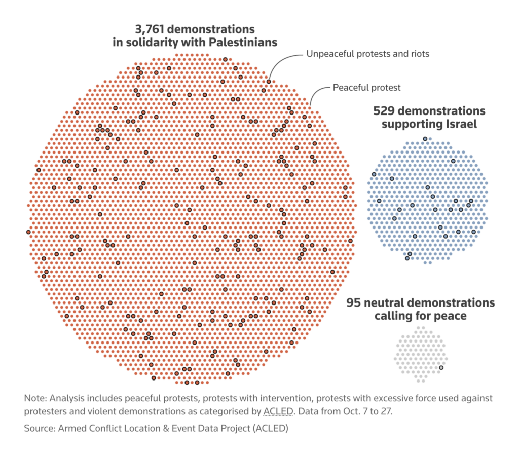
The world reacts — two visualizations show worldwide demonstrations on the conflict:
Armed Conflict Location & Event Data Project: “The latest escalation in the Israel-Palestine conflict has triggered a wave of protests and rallies around the world. So far, ACLED has recorded 4,200 demonstration events related to the conflict in 100 countries and territories, accounting for 38% of all demonstrations globally,” November 11 (Tweet)Reuters: Protests sweep around the globe as Israel’s war in Gaza grinds on, November 13
Other maps this week covered Chinese ports and Icelandic earthquakes:
The Washington Post: “A decade after announcing the Maritime Silk Road, China now owns or operates nearly 100 ports and terminals along some of the world’s most strategic waterways. A journey along this sea route illustrates some of the advantages of China’s port investments,” November 10 (Tweet, Article) Robert Hodgin: “Intense seismicity on the Reykjanes Peninsula. Here is a visualization of the last 40 days of Earthquakes in the region,” November 11 (Tweet)
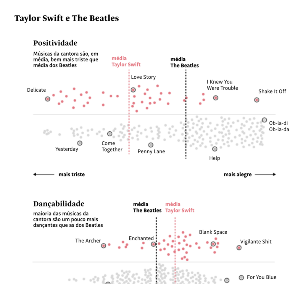
And finally, the miscellaneous charts section again includes Taylor Swift (we’re not looking for her on purpose, we promise), as well as school shootings, aid to Ukraine, sports investment in the Middle East, and bicycles in Paris:
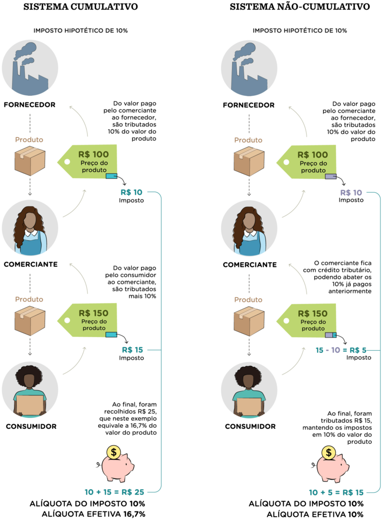
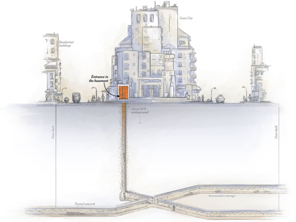
Julien Sulpis: “Little update on my #GLSL planet shader: I borrowed and adapted a few textures from the @NASA to display our home planet It’s made with ~12kB of code and should be smooth on most devices. Next steps: find more textures to display other planets,” November 8 (Tweet)Nexo Jornal: Um guia para entender a reforma tributária visualmente, November 10 The New York Times: The Tunnels of Gaza, November 10
Help us make this dispatch better! We’d love to hear which newsletters, blogs, or social media accounts we need to follow to learn about interesting projects, especially from less-covered parts of the world (Asia, South America, Africa). Write us at hello@datawrapper.de or leave a comment below.
(she/her) is a working student on Datawrapper’s Communications team. She creates the Data Vis Dispatch to keep data visualization enthusiasts up to date on exciting new projects. When she’s not working, she studies interface design, and when she’s not studying, she’s planning a festival stage or soldering light installations. Vivien lives in Potsdam.


Comments