This article is brought to you by Datawrapper, a data visualization tool for creating charts, maps, and tables. Learn more.
Data Vis Dispatch, November 15
The best of last week’s big and small data visualizations

Welcome back to the 68th edition of Data Vis Dispatch! Every week, we’ll be publishing a collection of the best small and large data visualizations we find, especially from news organizations — to celebrate data journalism, data visualization, simple charts, elaborate maps, and their creators.
Recurring topics this week include U.S. midterms (again), climate, the war in Ukraine, and the second full week of the #30DayMapChallenge.
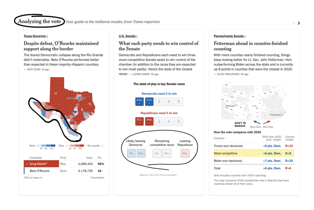
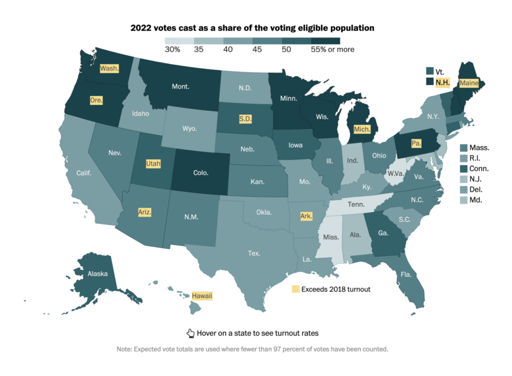
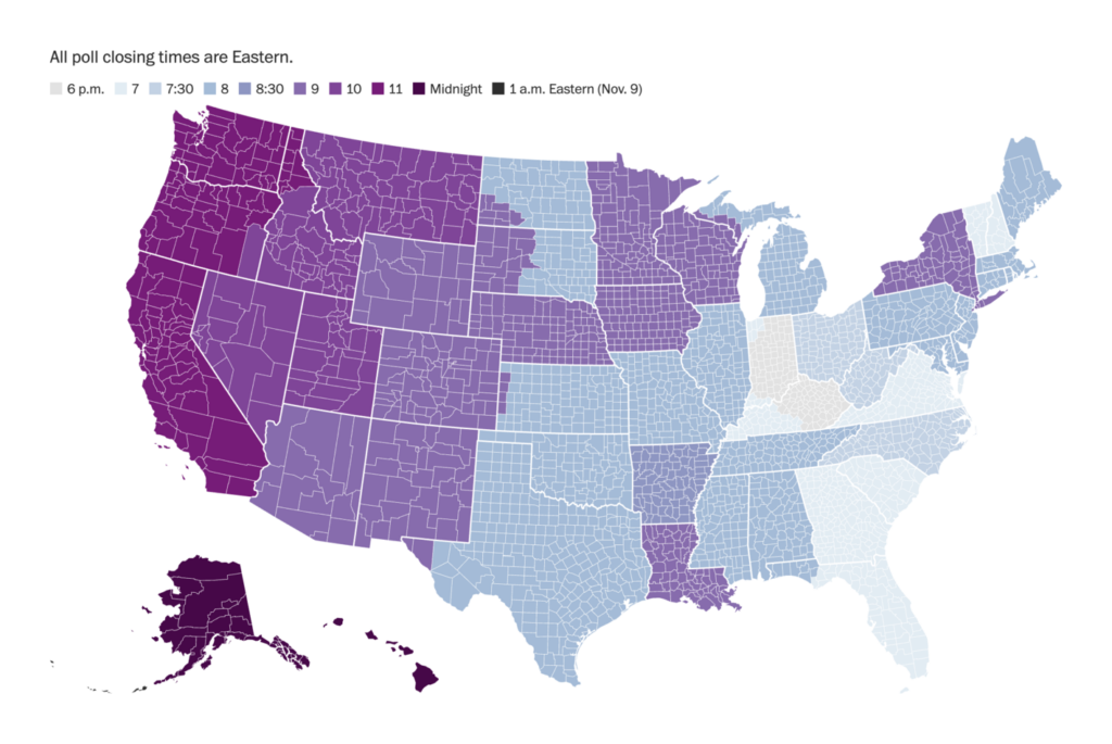
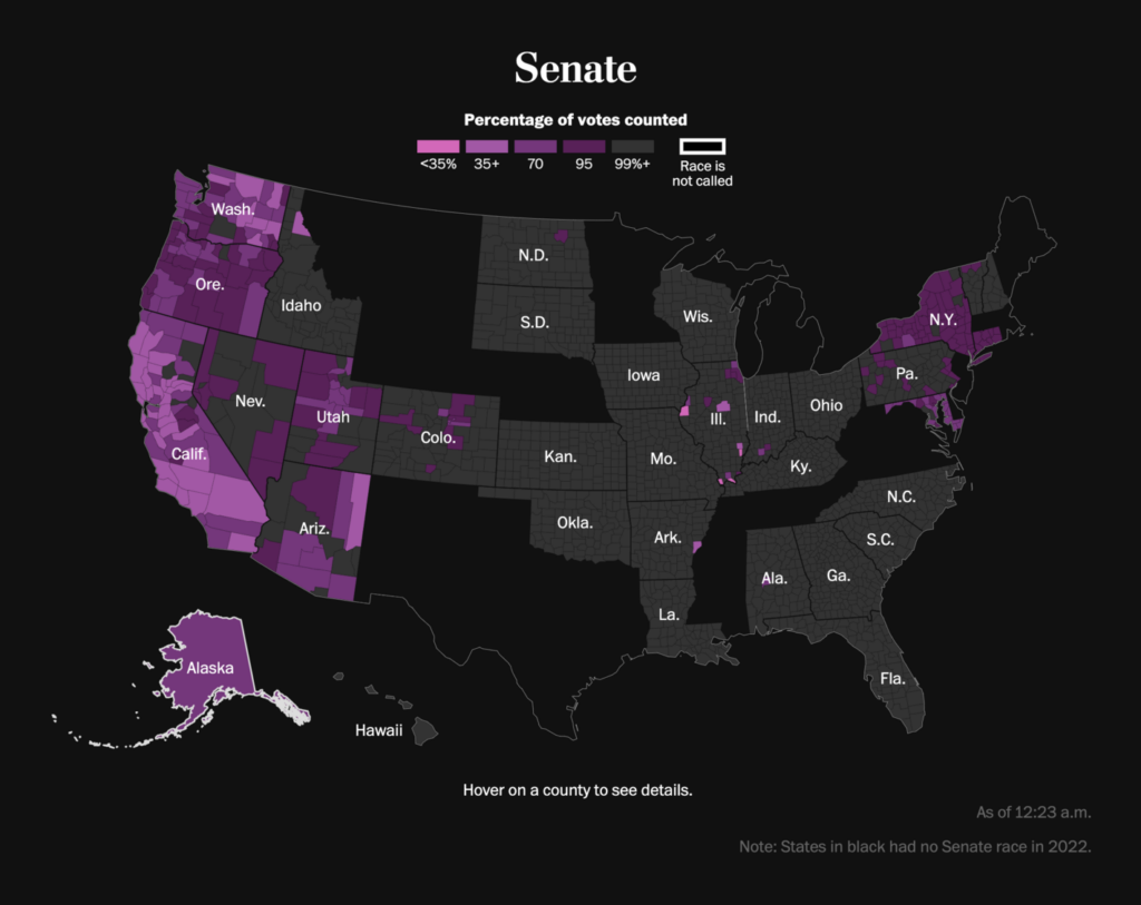
Last week, Americans cast their votes in the midterm elections and kicked off a different kind of race — the race to report on (and visualize) results as votes are being counted.
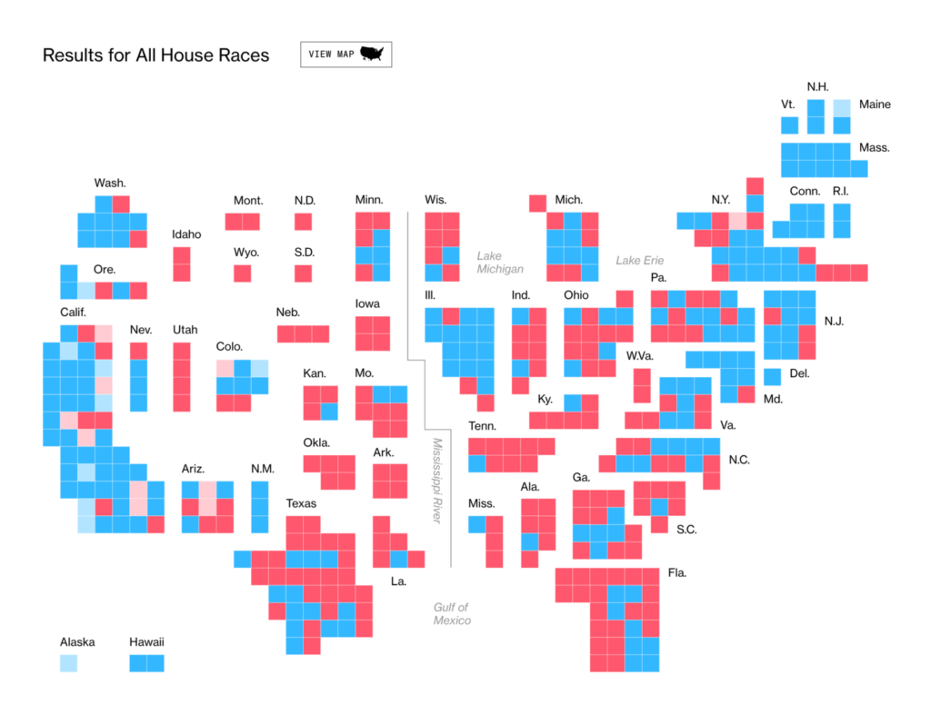
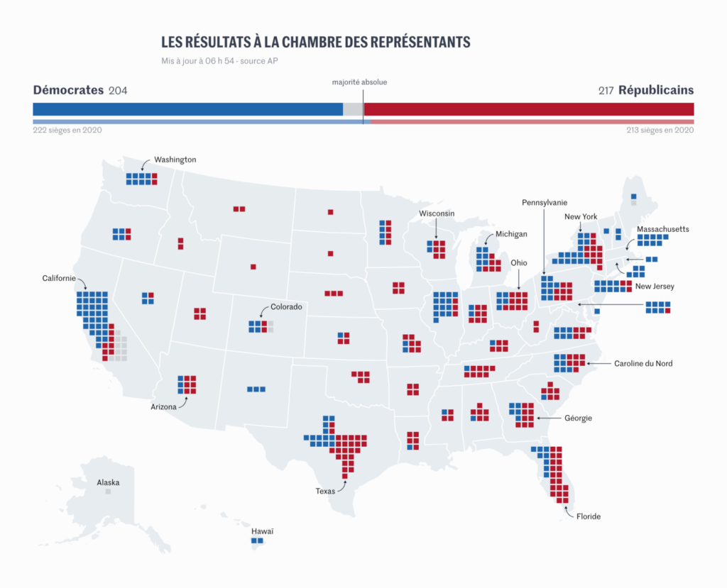
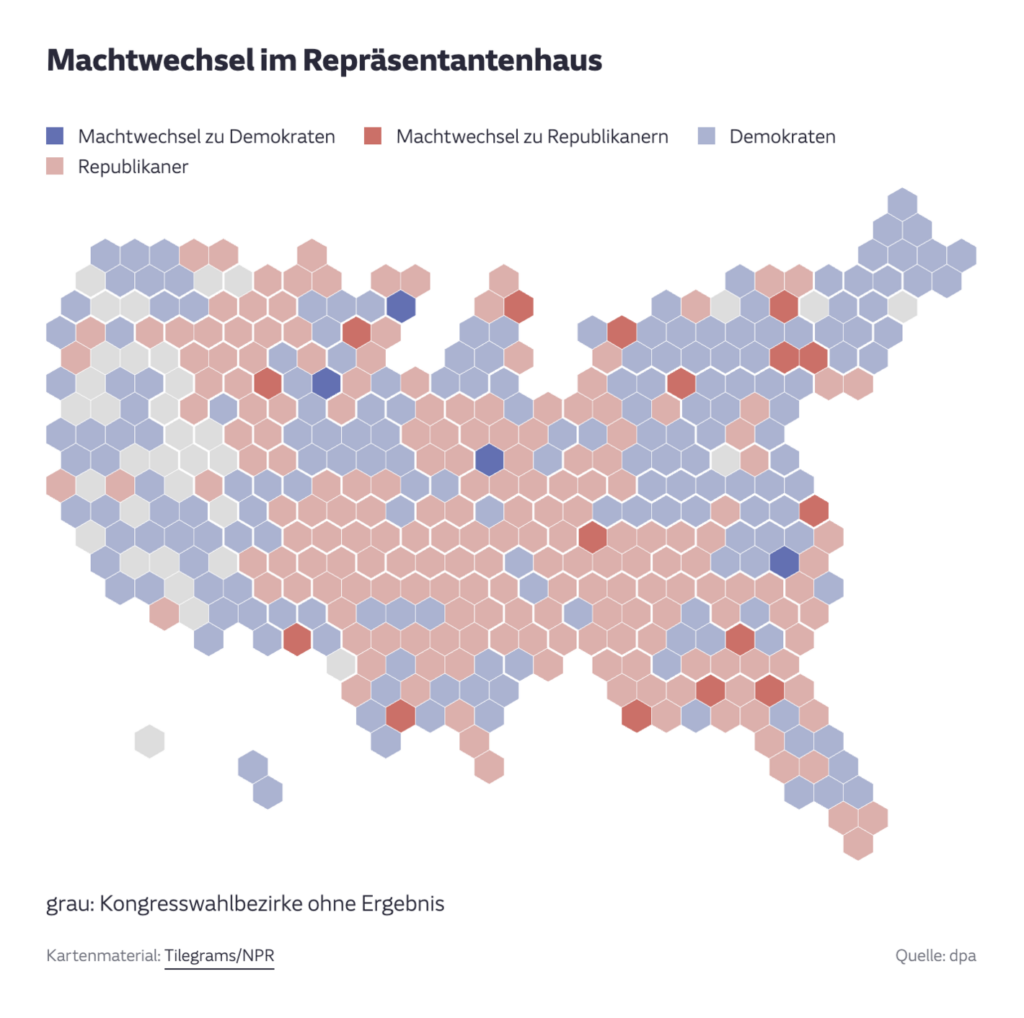
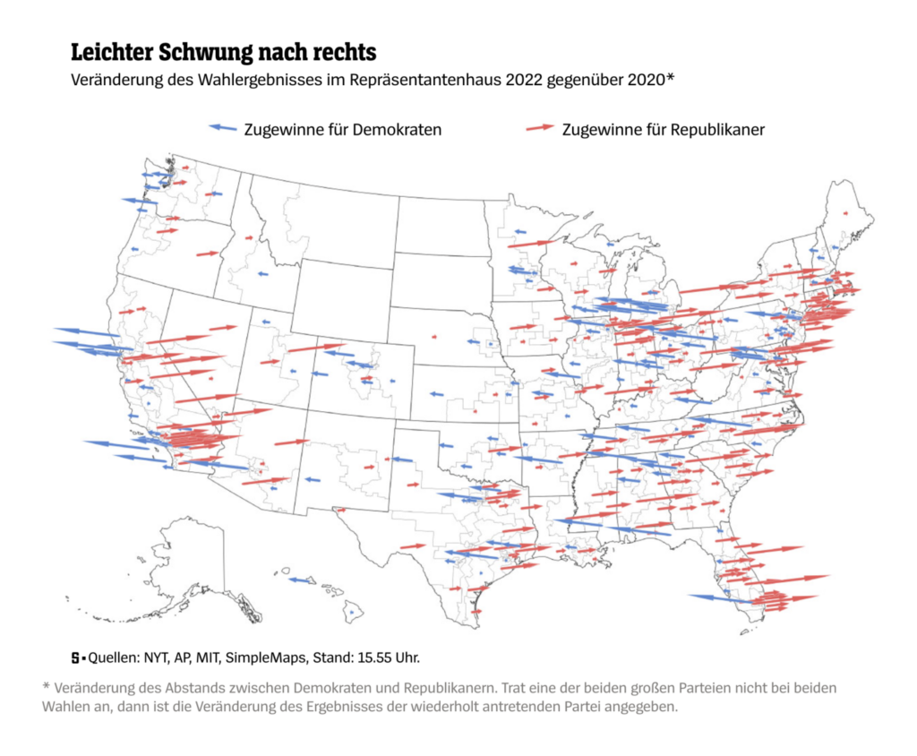
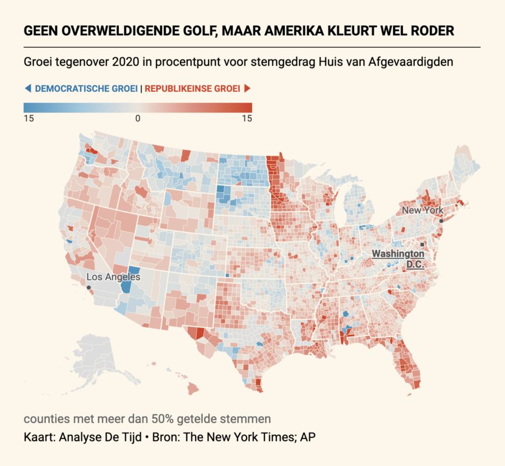
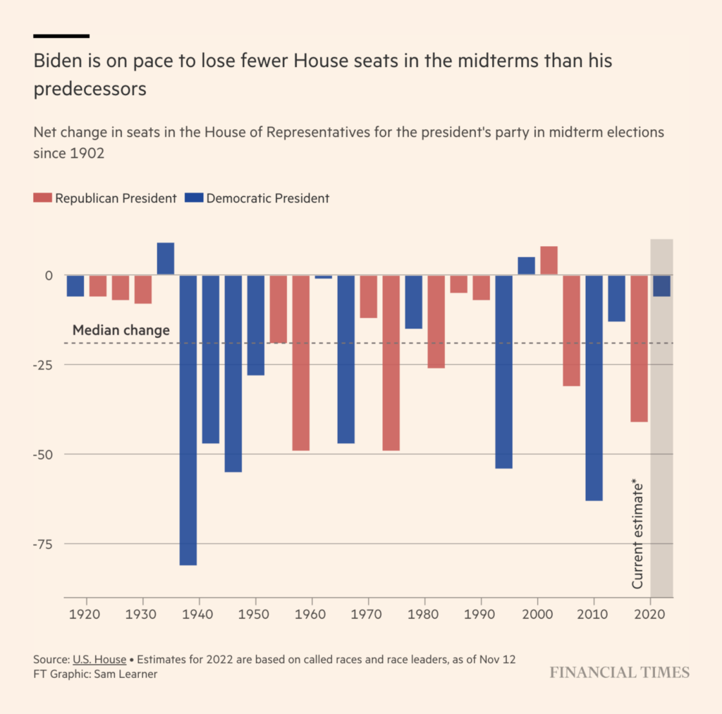
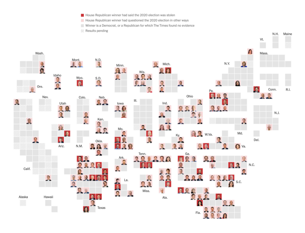
First, here’s a look at the results for the House of Representatives:

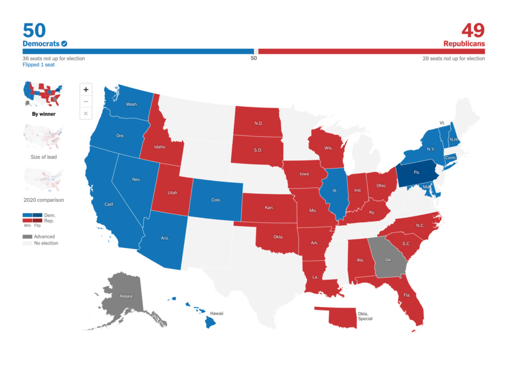
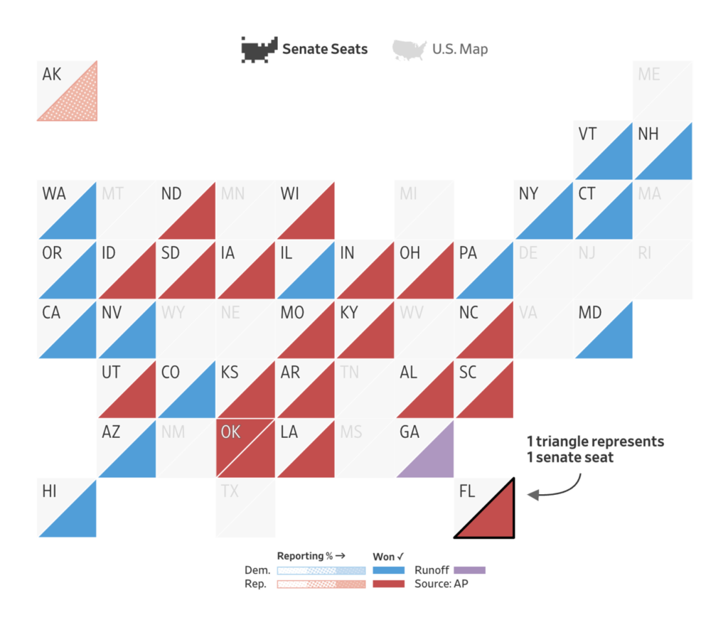
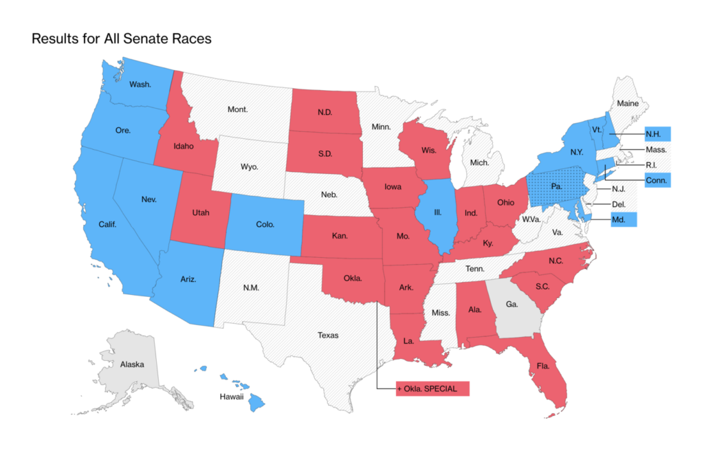
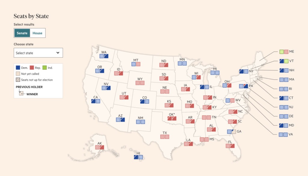
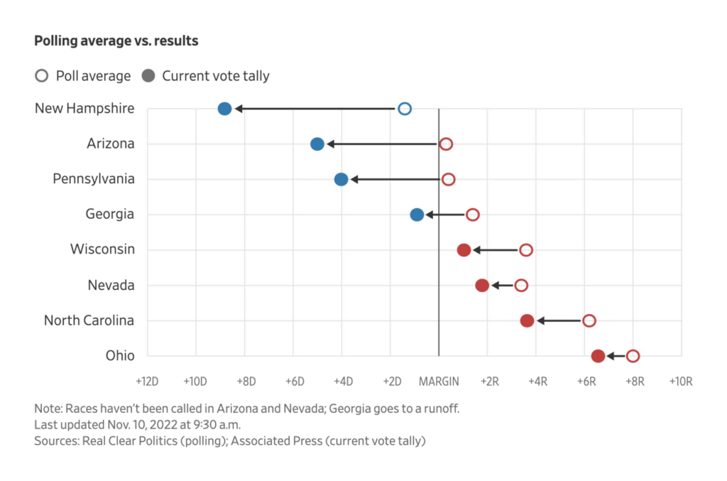
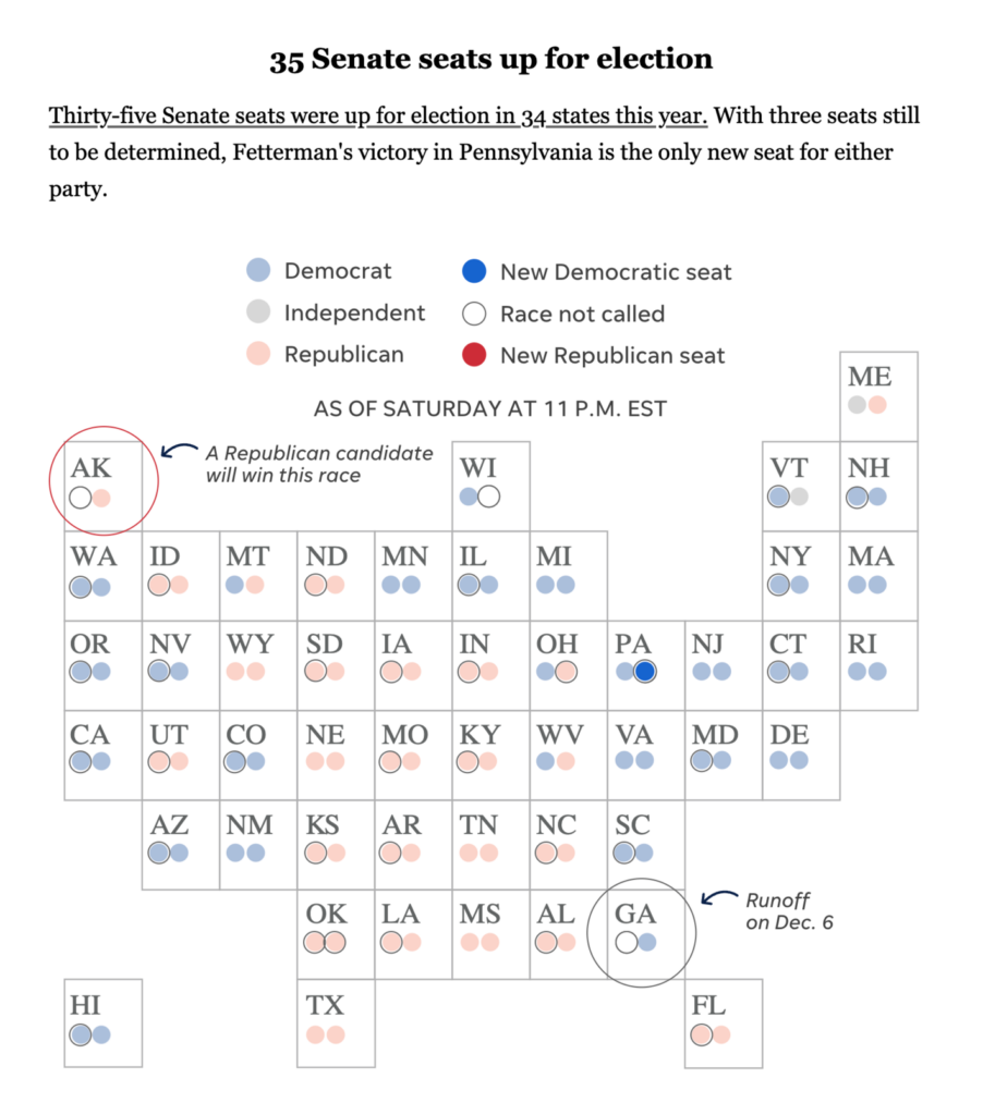
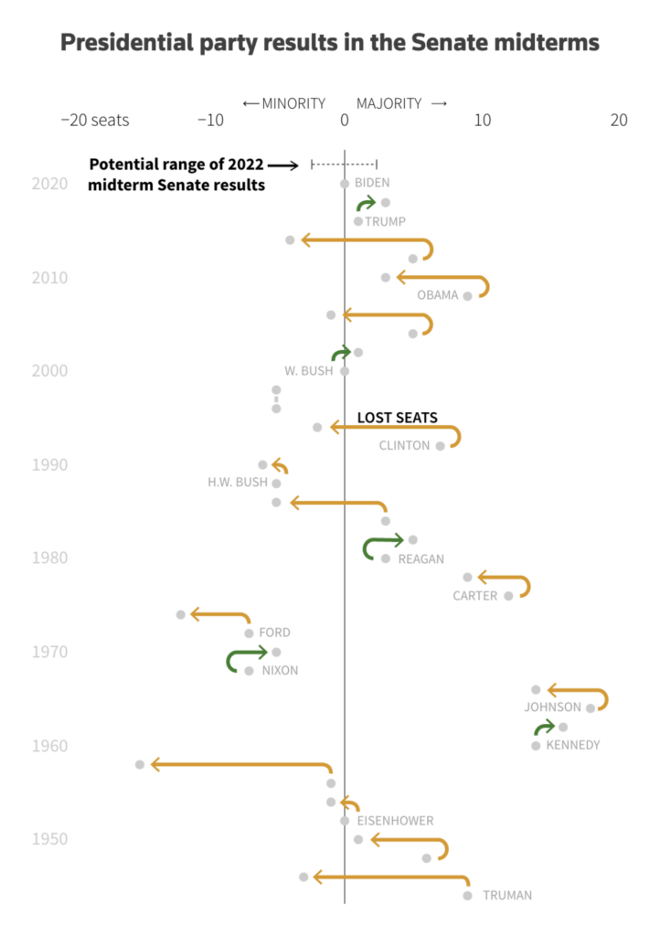
Next, a few maps showing the results for the Senate:
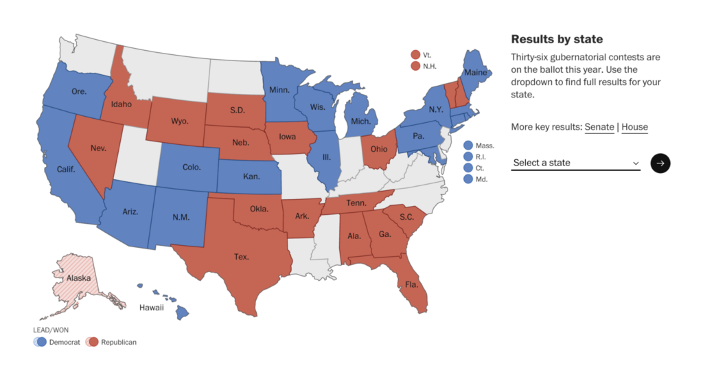
And finally, the governors‘ results by state:
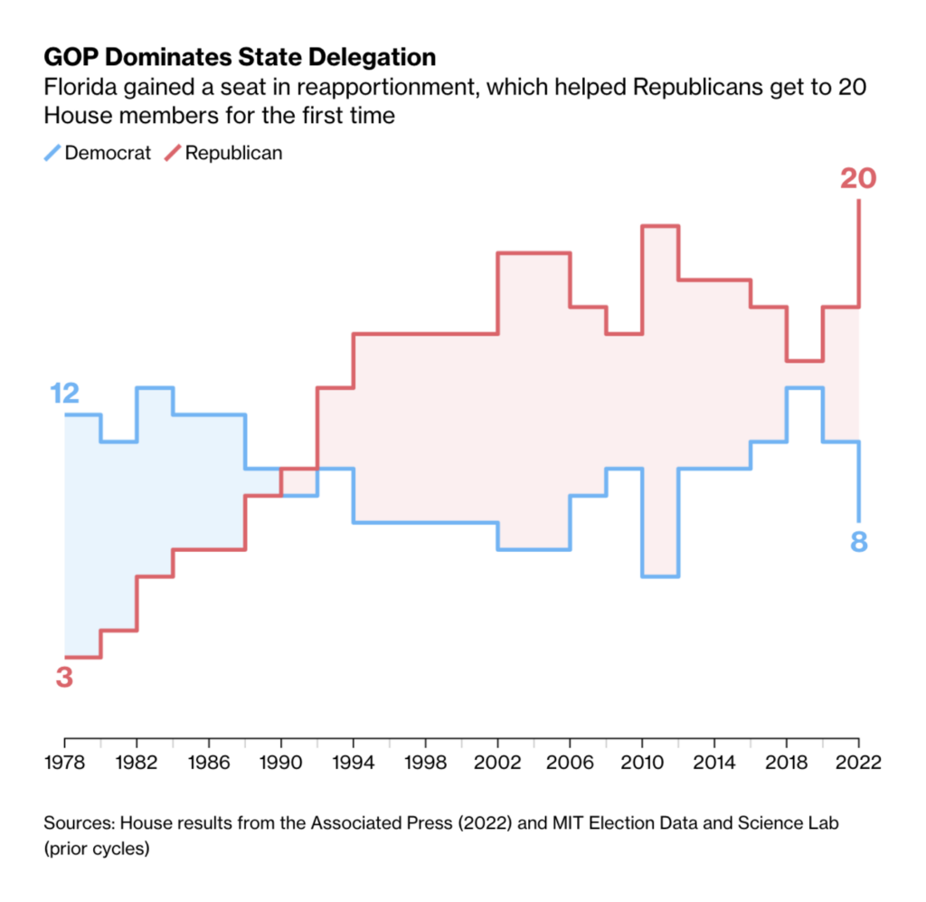
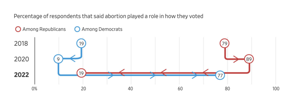
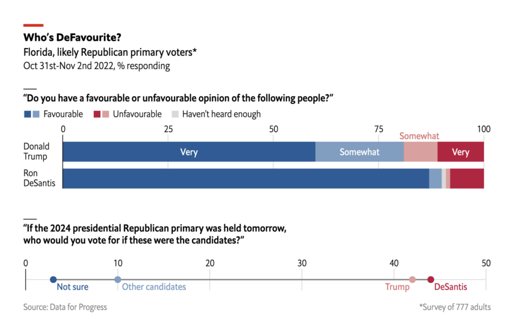
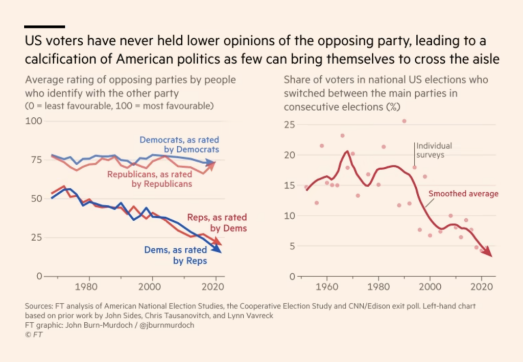
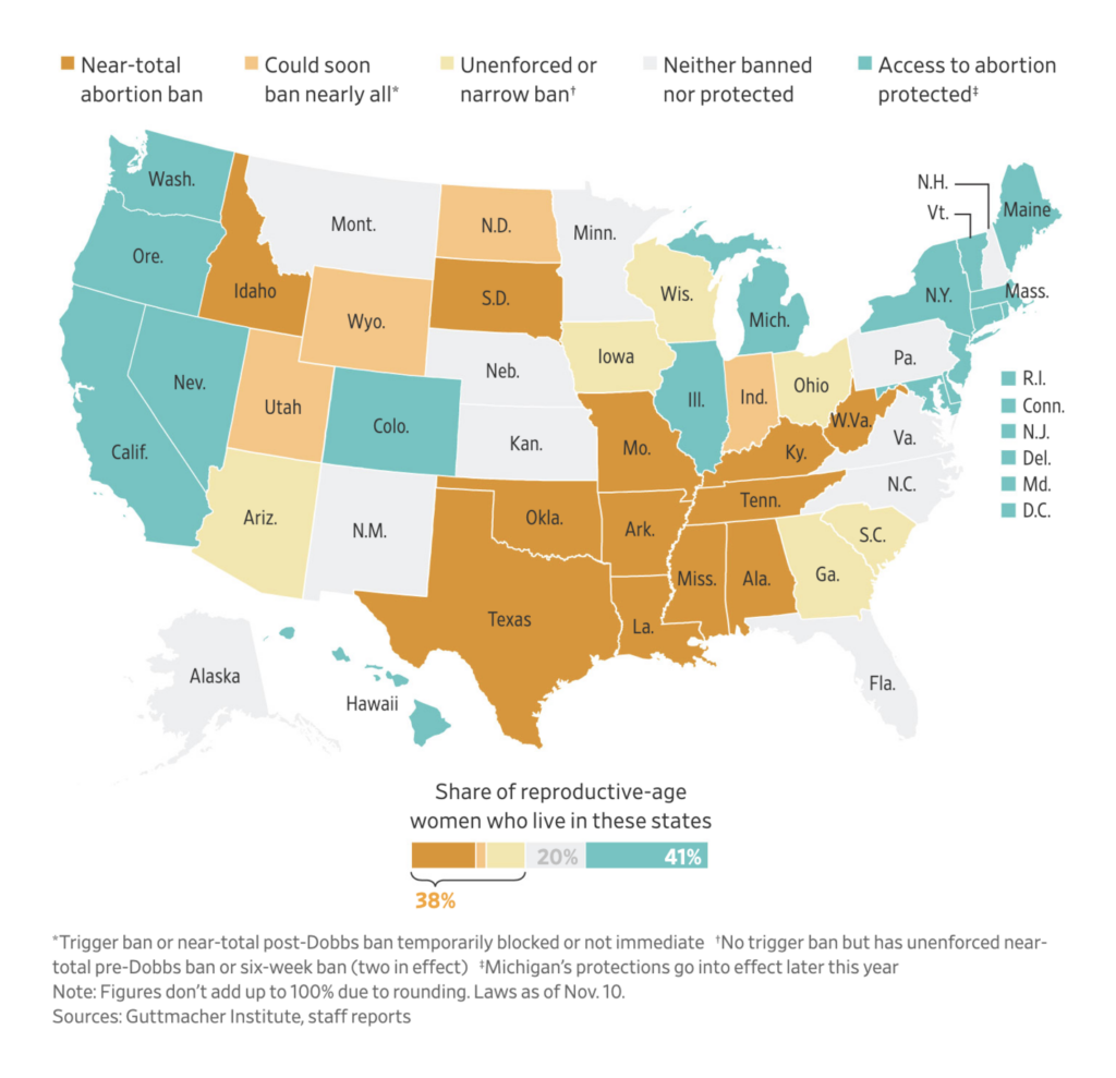
Election data visualizations also covered key political issues, historical trends, and analysis.


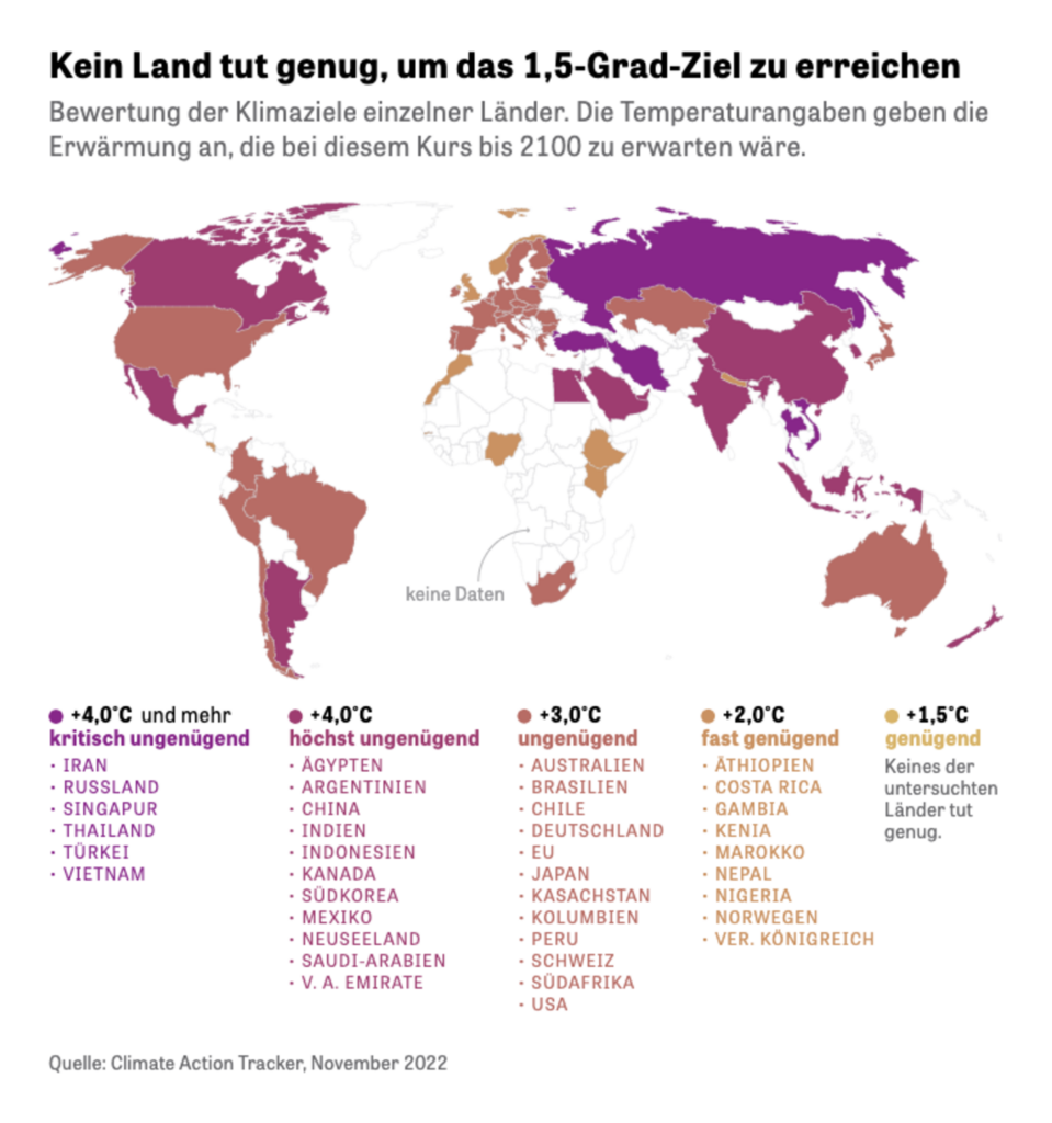
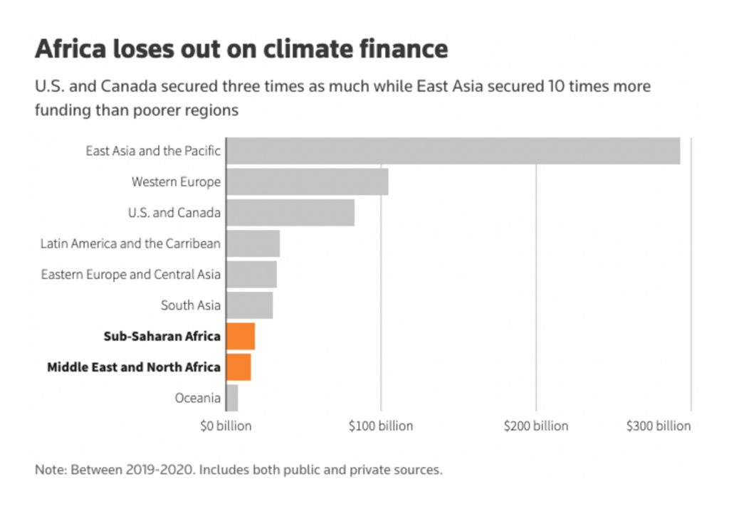
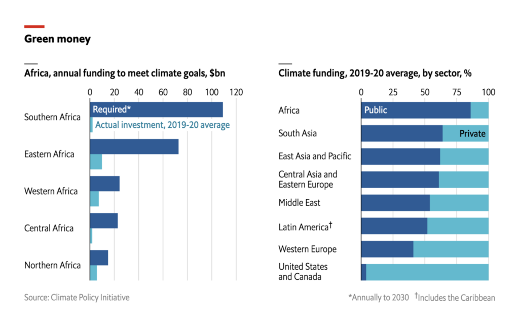
The second week of COP27, the UN’s Climate Change Conference, inspired climate-related coverage, ranging from rising temperatures and shrinking rivers to climate finance.


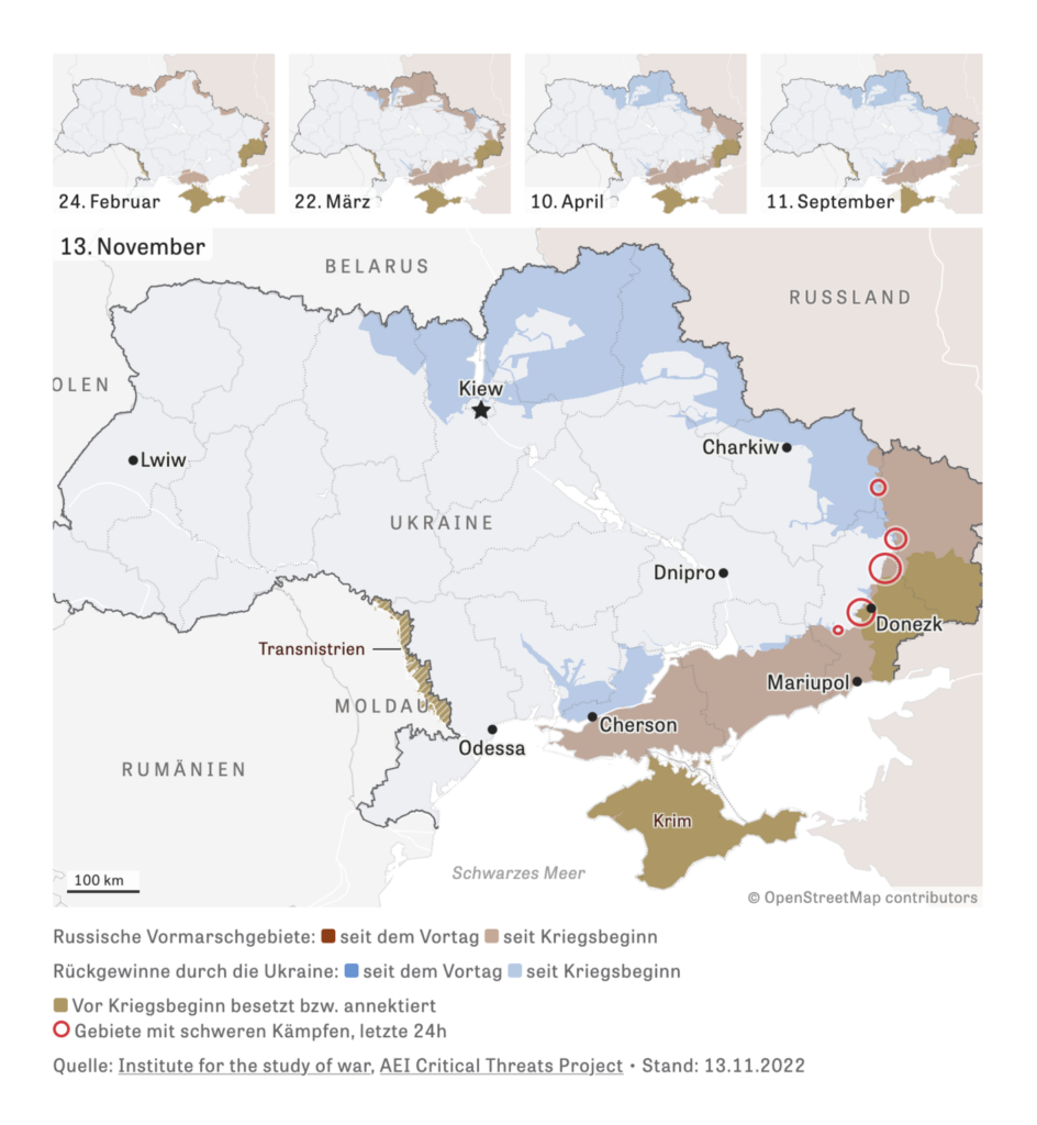
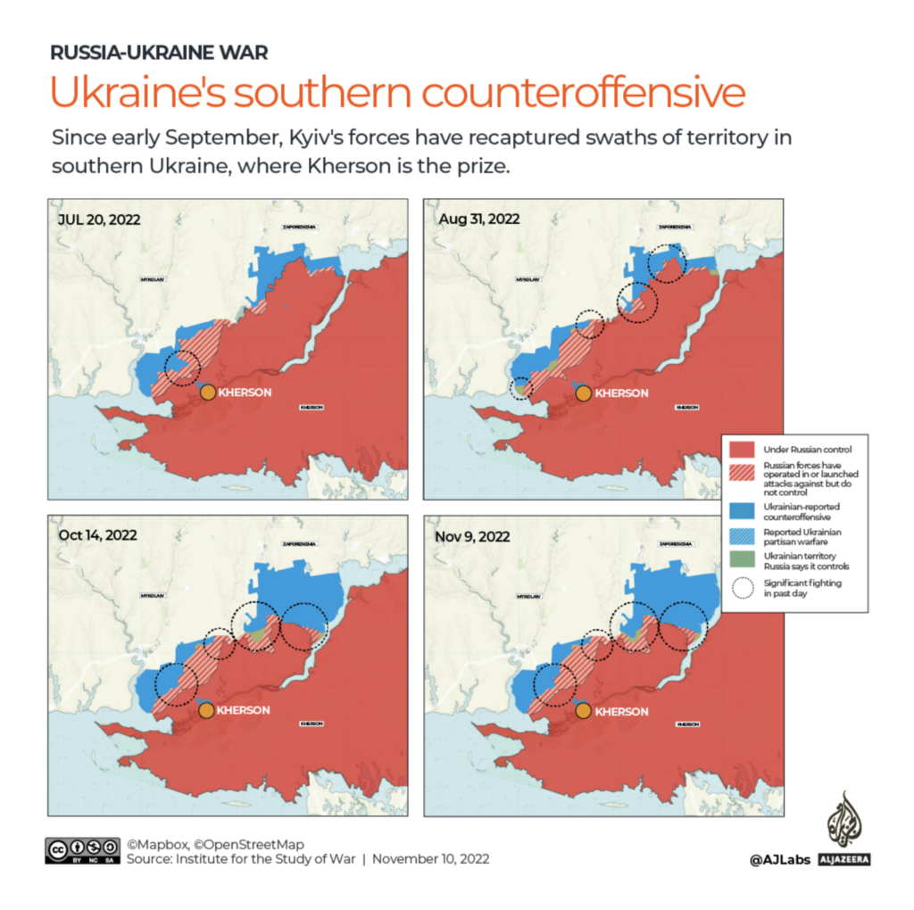
Ukraine reclaimed the city of Kherson after Russian troops had withdrawn to the other side of the Dnipro river.
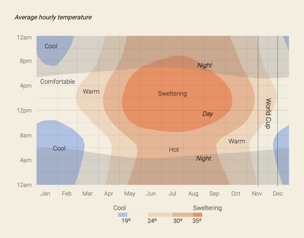
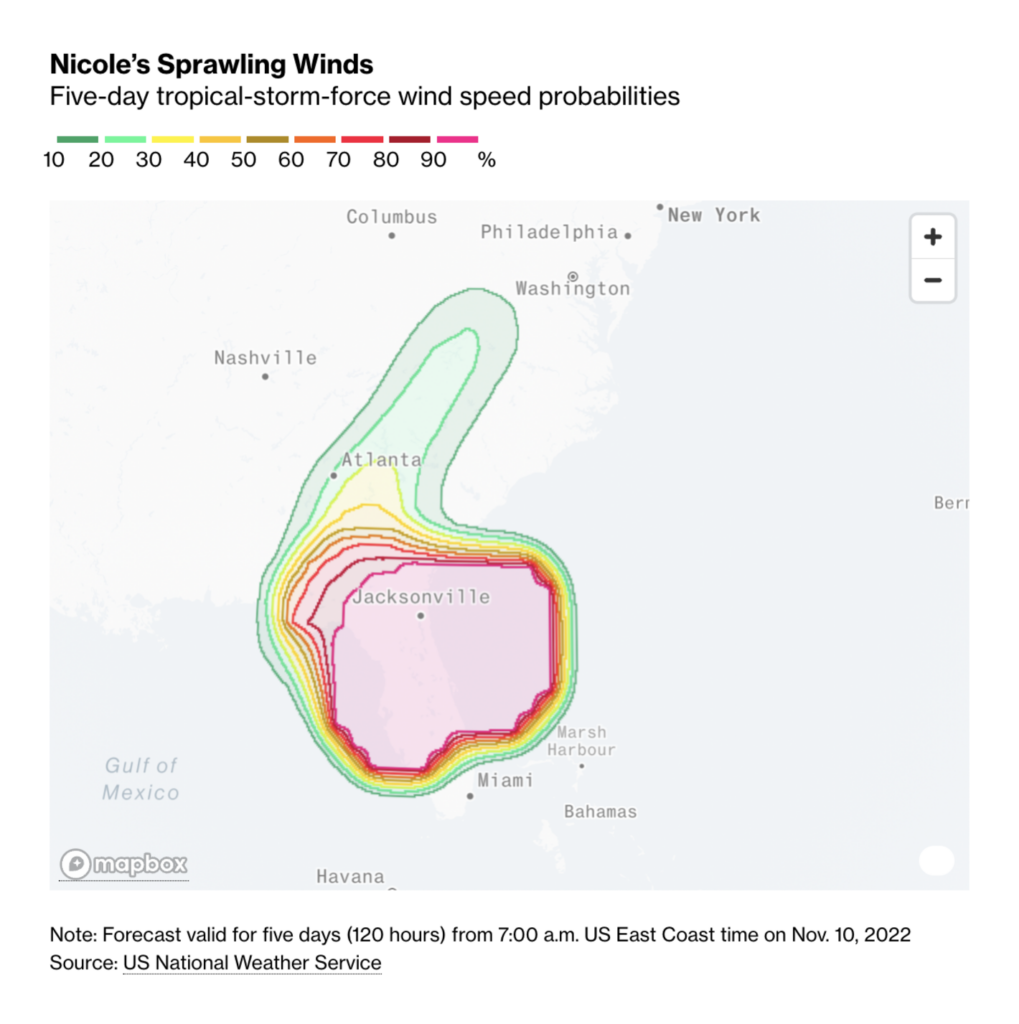
Other notable data visualizations of the week cover the weather in Qatar, trees in Nepal, and hurricanes in the U.S.
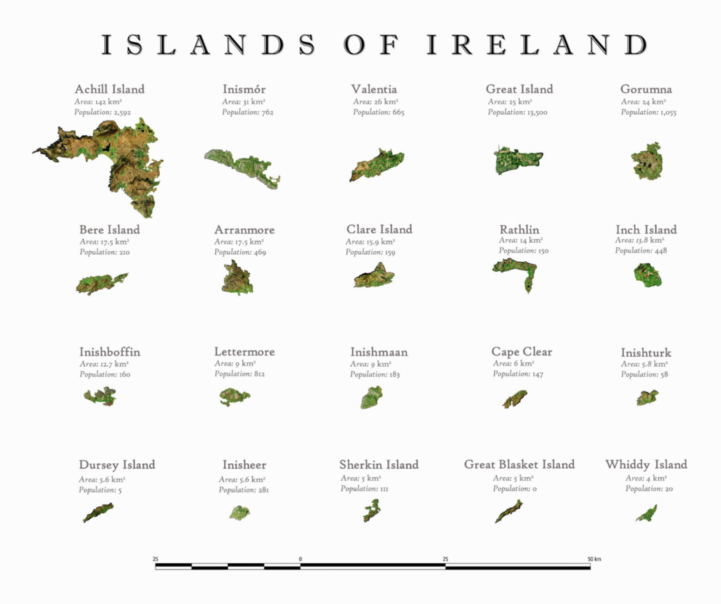
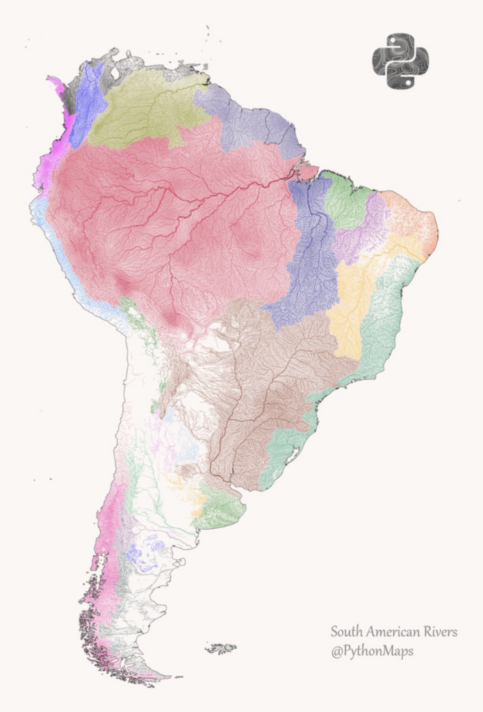
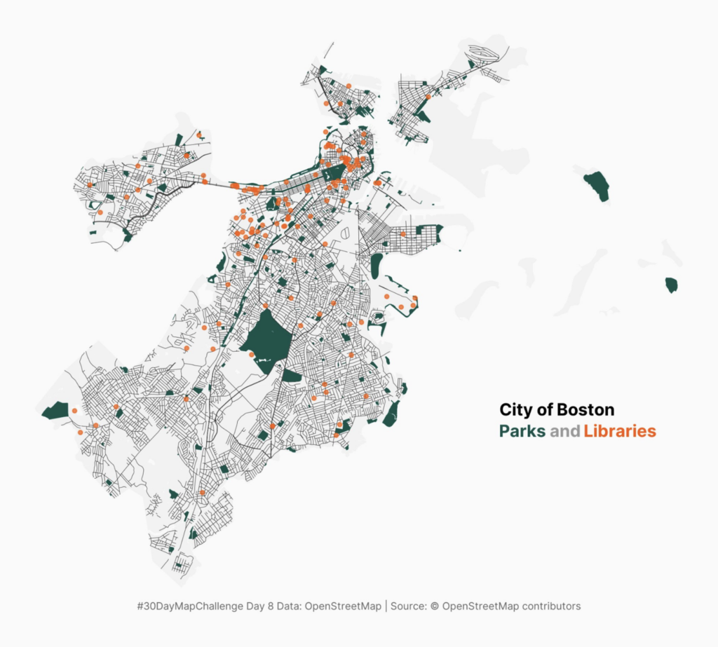
Finally, we’re back with maps from the second full week of the #30DayMapChallenge.
What else we found interesting
Applications are open for…
- Infographic designer- Illustrator – Editorial at South China Morning Post (Hong Kong)
- Senior Data Investigations Advisor at Global Witness (London)
- Visualisation Engineer at Celonis (Munich)
Help us make this dispatch better! We’d love to hear which newsletters, blogs, or social media accounts we need to follow to learn about interesting projects, especially from less-covered parts of the world (Asia, South America, Africa). Write us at hello@datawrapper.de or leave a comment below.
Want the Dispatch in your inbox every Tuesday? Sign up for our Blog Update newsletter!


Comments