Data Vis Dispatch,
November 16

The best of last week’s big and small data visualizations

Welcome back to the 22nd edition of Data Vis Dispatch! Every week, we’ll be publishing a collection of the best small and large data visualizations we find, especially from news organizations — to celebrate data journalism, data visualization, simple charts, elaborate maps, and their creators.

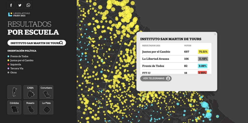
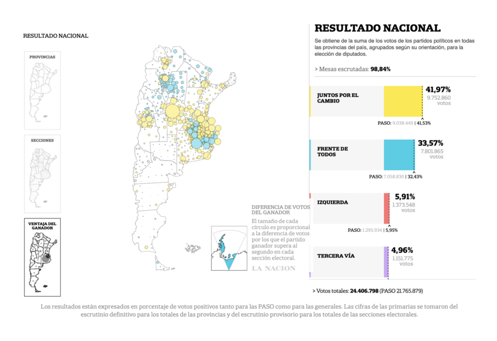
Recurring topics this week include the U.N. climate conference, Argentina’s midterm elections, and the 30 Day Map Challenge.

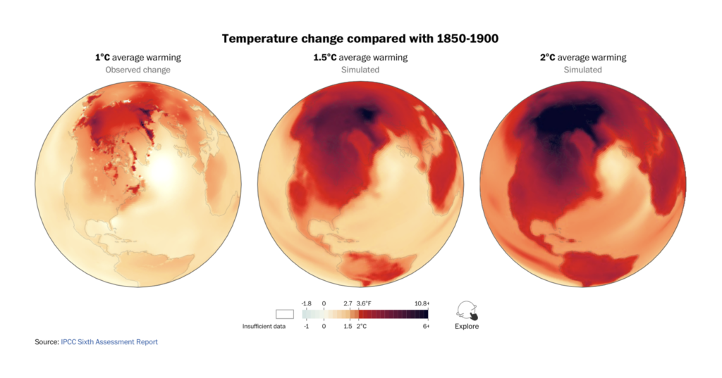
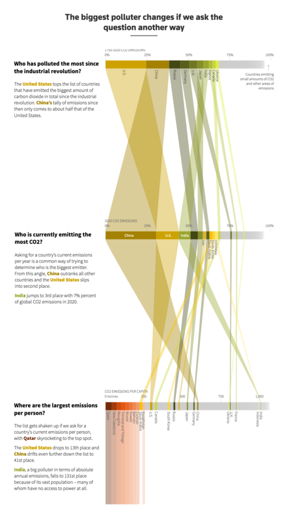
Talks concluded at the COP26 climate conference this weekend with updated goals to limit emissions and global warming. These charts compared the new promises to current trajectories and ideal outcomes:

Financial Times: Can the world ‘Keep 1.5C Alive’?, November 12
Bloomberg: World Can Only Avoid Climate Catastrophe If New Climate Promises Are Kept, November 9
Neue Zürcher Zeitung: Diese Klimamodelle – wie funktionieren die eigentlich genau? Eine Annäherung, November 12
The Washington Post: 2C or 1.5C? How global climate targets are set and what they mean, November 10

International climate agreements rely on bigger polluters taking more responsibility. But that calculation is trickier than it might sound:

Reuters: Who is the biggest polluter? Depends how you ask, November 10
Agence France-Presse: “China and the United States: current and historic carbon footprint compared,” November 16 (Tweet)
The Economist: Several rich countries have decoupled GDP growth from emissions, November 11

These maps brought it all back down to earth (and to Earth) with a closer look at a few of our biggest environmental problems:

The New York Times: What Climate Change Looks Like From Space, November 11
El País: Así afronta España el cierre del gasoducto del Magreb, November 14
The Wall Street Journal: How Much Do Electric Vehicles Cost to ‘Fill Up’ Compared With Buying Gasoline?, November 11
Bloomberg: Greece’s Popular Islands Are Crowded — With Plastic, November 10

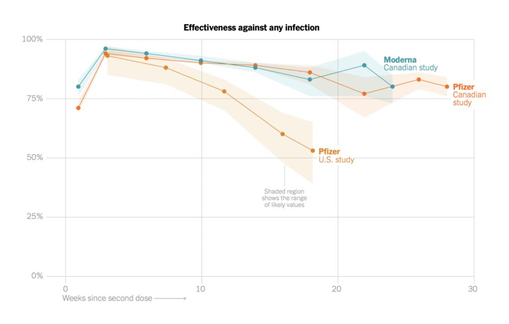
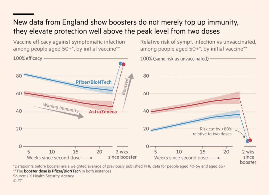
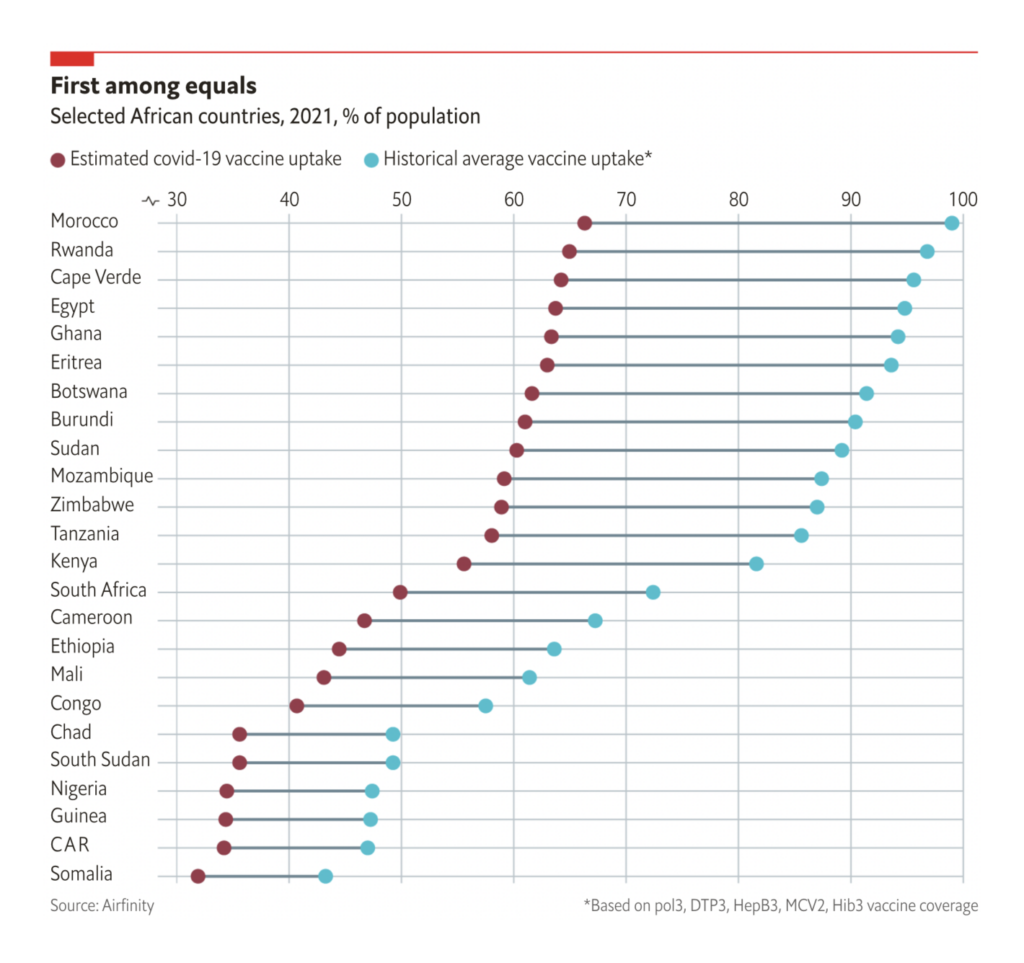
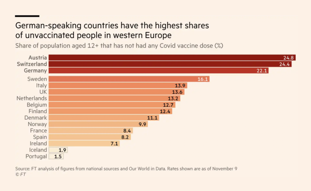
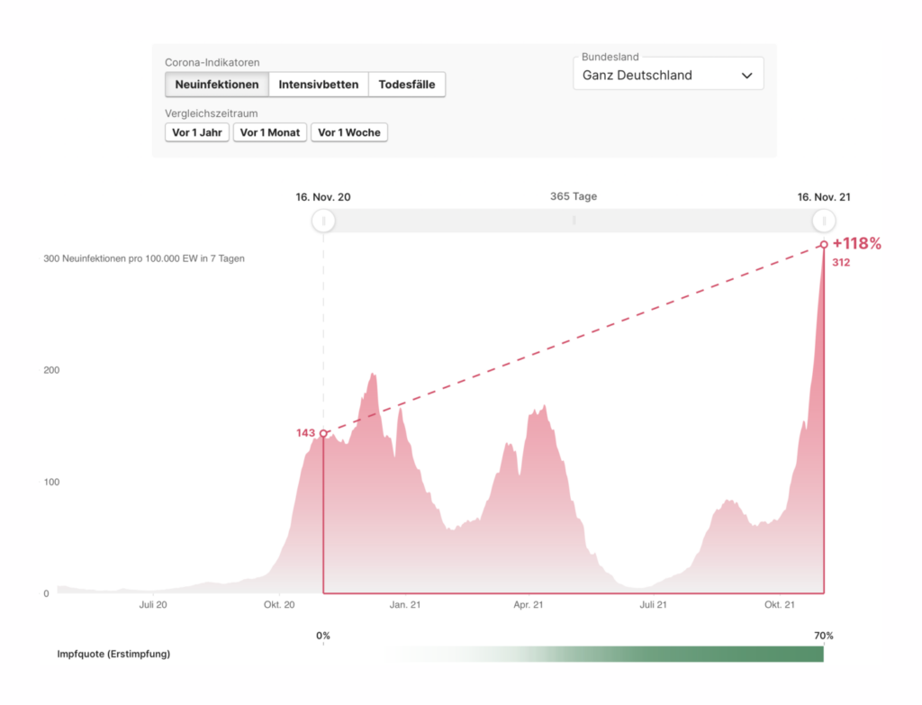
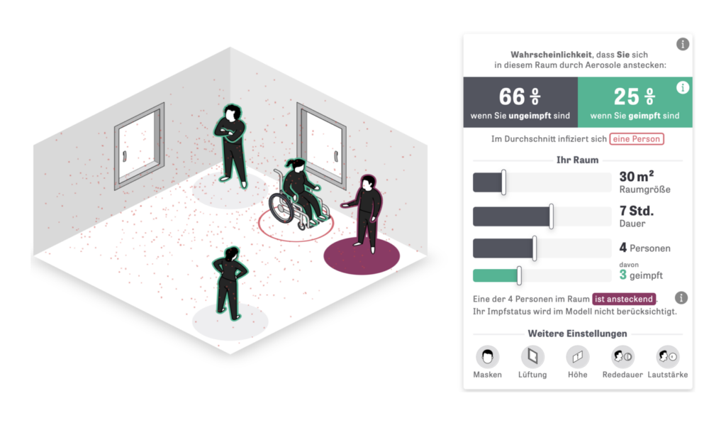
In COVID charts, let’s start with vaccination this week. Some of the news is still great — vaccines work really well, and booster doses help them work even better:

The New York Times: What We Know So Far About Waning Vaccine Effectiveness, November 11
Financial Times: UK expands Covid booster jab programme to 40 to 49-year-olds, November 15

Some of the news is getting better, as vaccination slowly picks up speed in Africa:

The Economist: Vaccines are finally arriving in Africa—but the rollout will be a challenge, November 12

And some of the news is frustrating, as countries with high vaccine availability nevertheless endure their highest-ever case rates:

Financial Times: ‘Nein Danke’: the resistance to Covid-19 vaccines in German-speaking Europe, November 11
Berliner Morgenpost: Corona-Zahlen: Wie heftig ist die vierte Welle im Zeitvergleich?, November 15
Zeit Online: So hoch ist die Ansteckungsgefahr mit Delta in Innenräumen, November 11

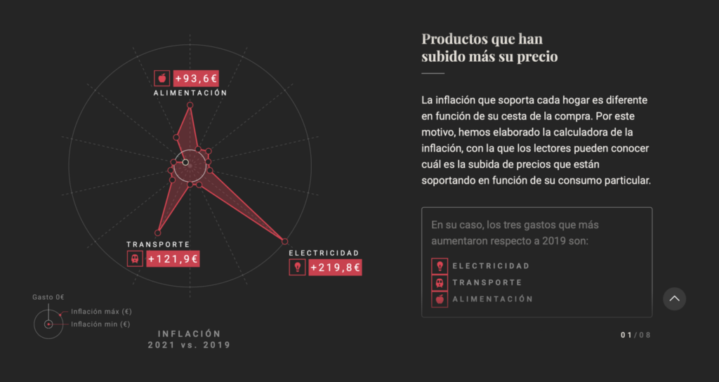
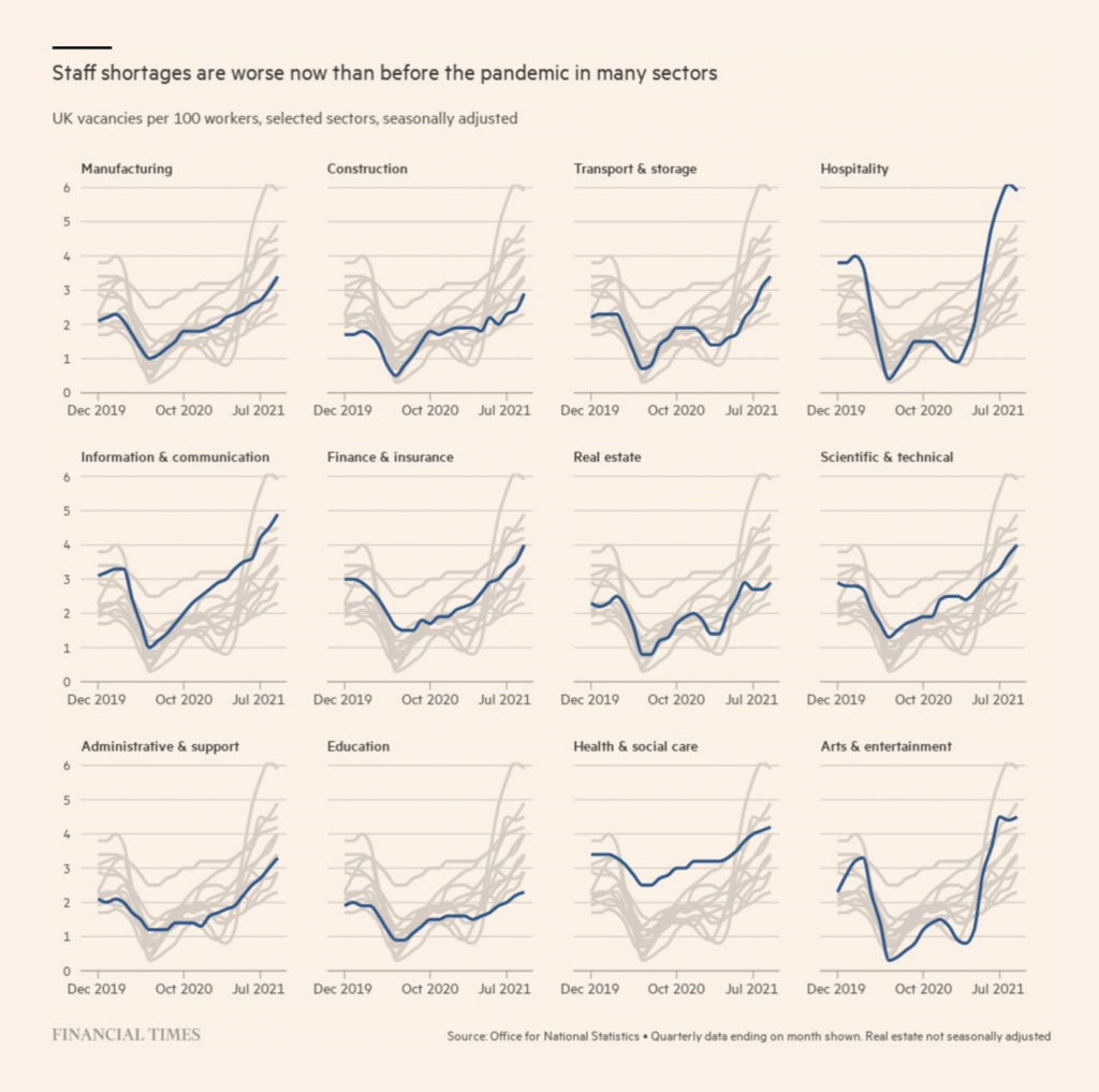
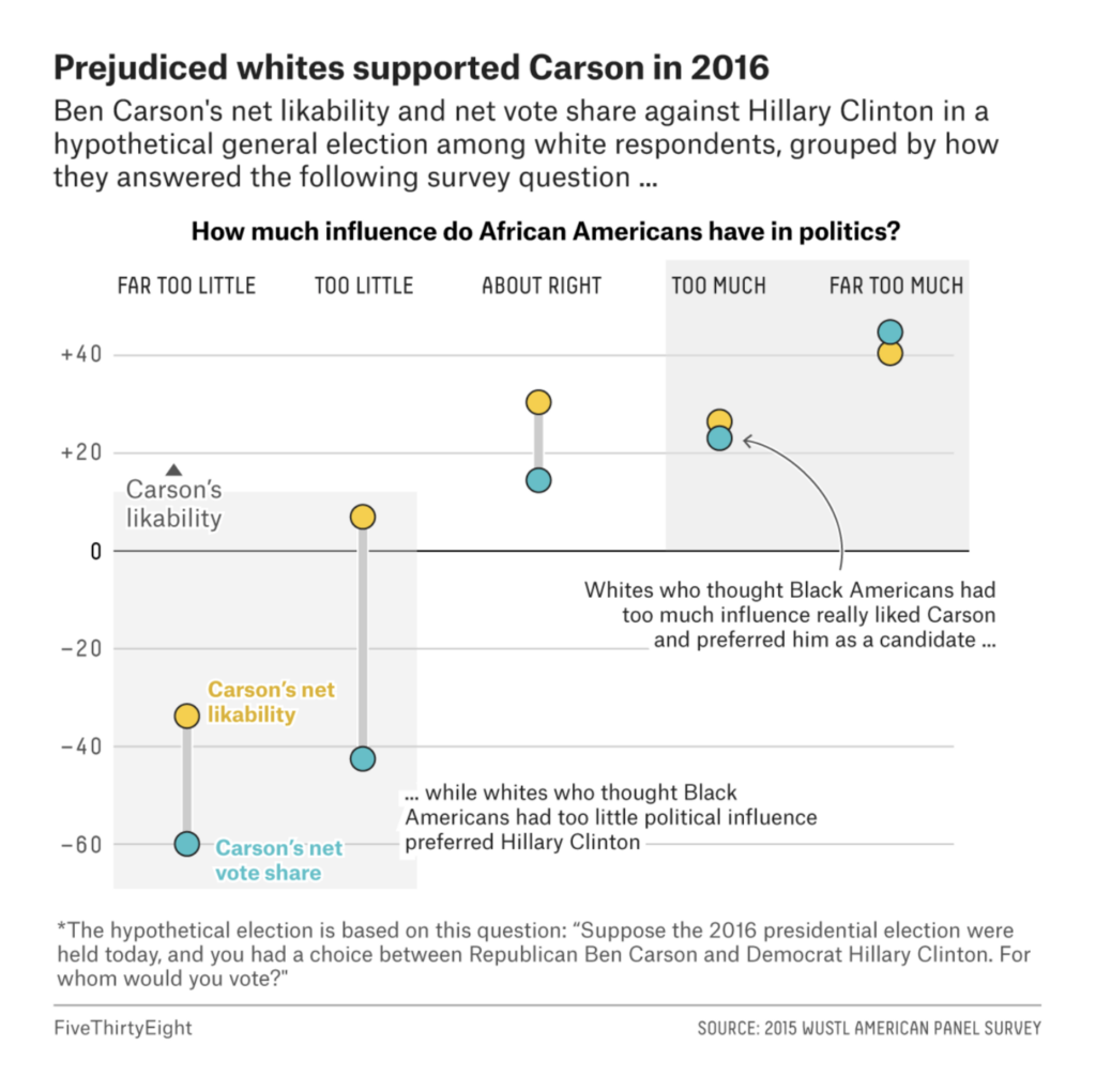
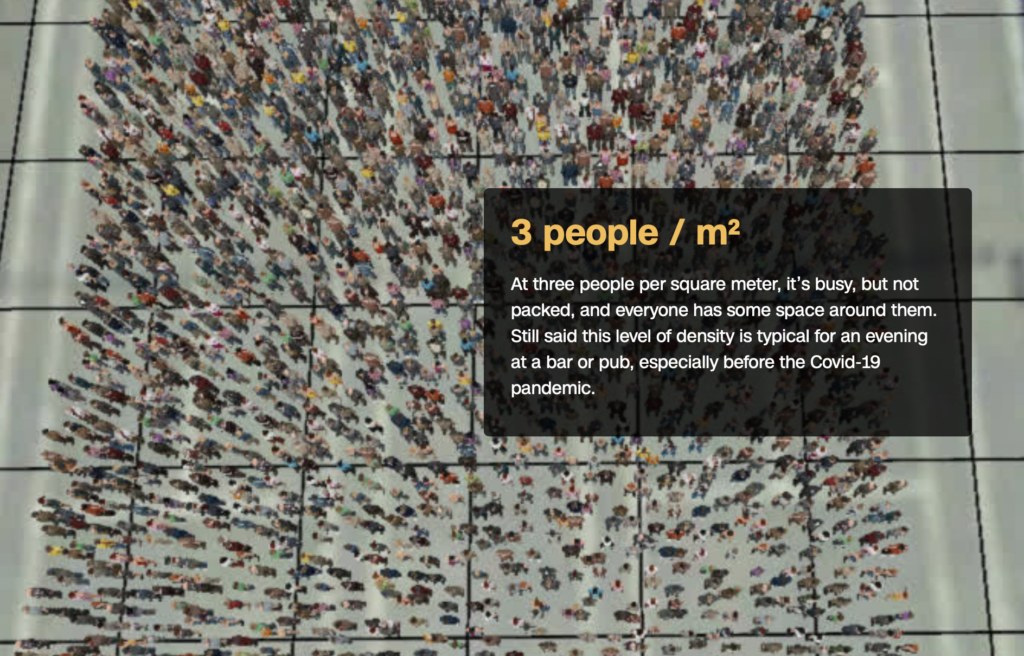
We often have a section on the pandemic-era economy and society. But in a lot of cases, not even the experts agree on how or whether a new trend is related to the pandemic. So today, let’s throw it all together in a section called “some things are just not working that great”:

The Wall Street Journal: Thanksgiving Dinner Staples Are Low in Stock Thanks to Supply-Chain Issues, Novmber 9
El Confidencial: El despertar de la inflación, November 14
Financial Times: Where are the UK’s 1m plus job vacancies concentrated?, November 11
El País: Por qué suben los precios y otras preguntas sobre el repunte de la inflación, November 12
The Wall Street Journal: The Journey of One Southwest Plane Explains the Misery of Travel Now, November 10
Financial Times: Cinema owners say simultaneous streaming has become a scourge, November 12

On to politics! Argentina held its midterm elections this weekend, and La Nación was busy visualizing the results:

La Nación: Las escuelas más extremas, candidatos con cero votos y otros hallazgos de los resultados de las PASO, November 10
La Nación: Mapa electoral:los resultados en todo el país, November 15
La Nación: Rebelión matancera. ¿Puede un asesinato derrumbar 40 años de dominio peronista en su feudo bonaerense?, November 11

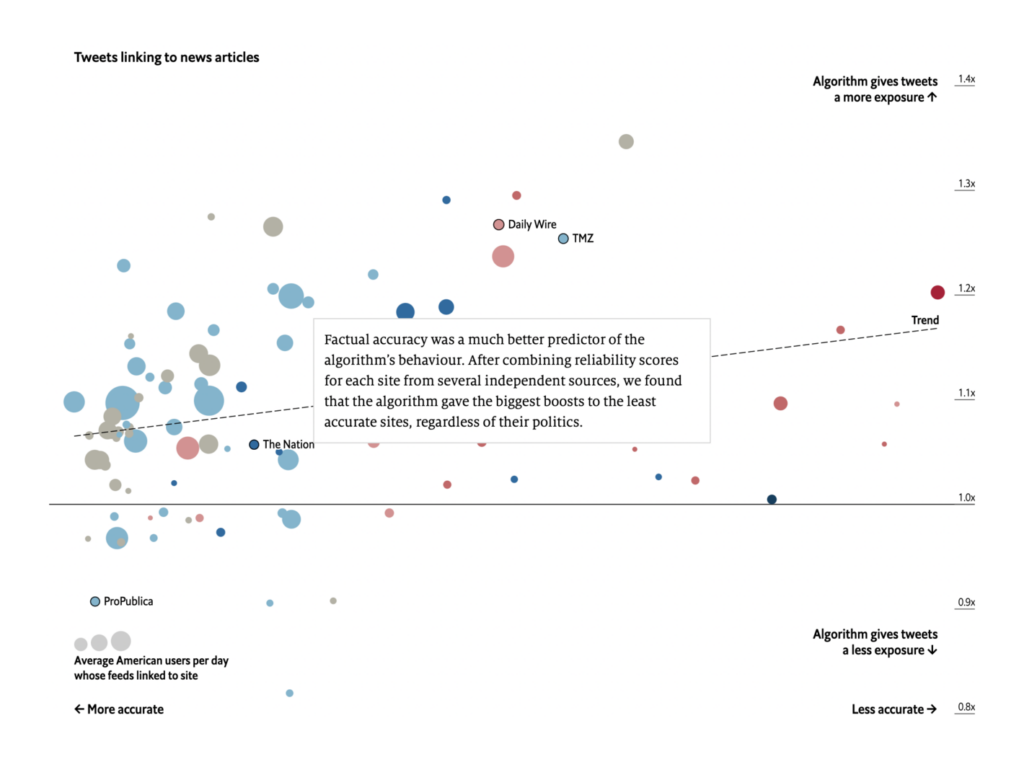
Other sources dealt with political ideology, like The Economist’s charts on how Twitter’s algorithm gives an outsized boost to right-wing and factually inaccurate sources:

The Economist: According to Twitter, Twitter’s algorithm favours conservatives, November 13
FiveThirtyEight: Why White Voters With Racist Views Often Still Support Black Republicans, November 10

The maps were flowing this week, thanks in large part to the third annual “30 Day Map Challenge.” There were maps of where people live…:

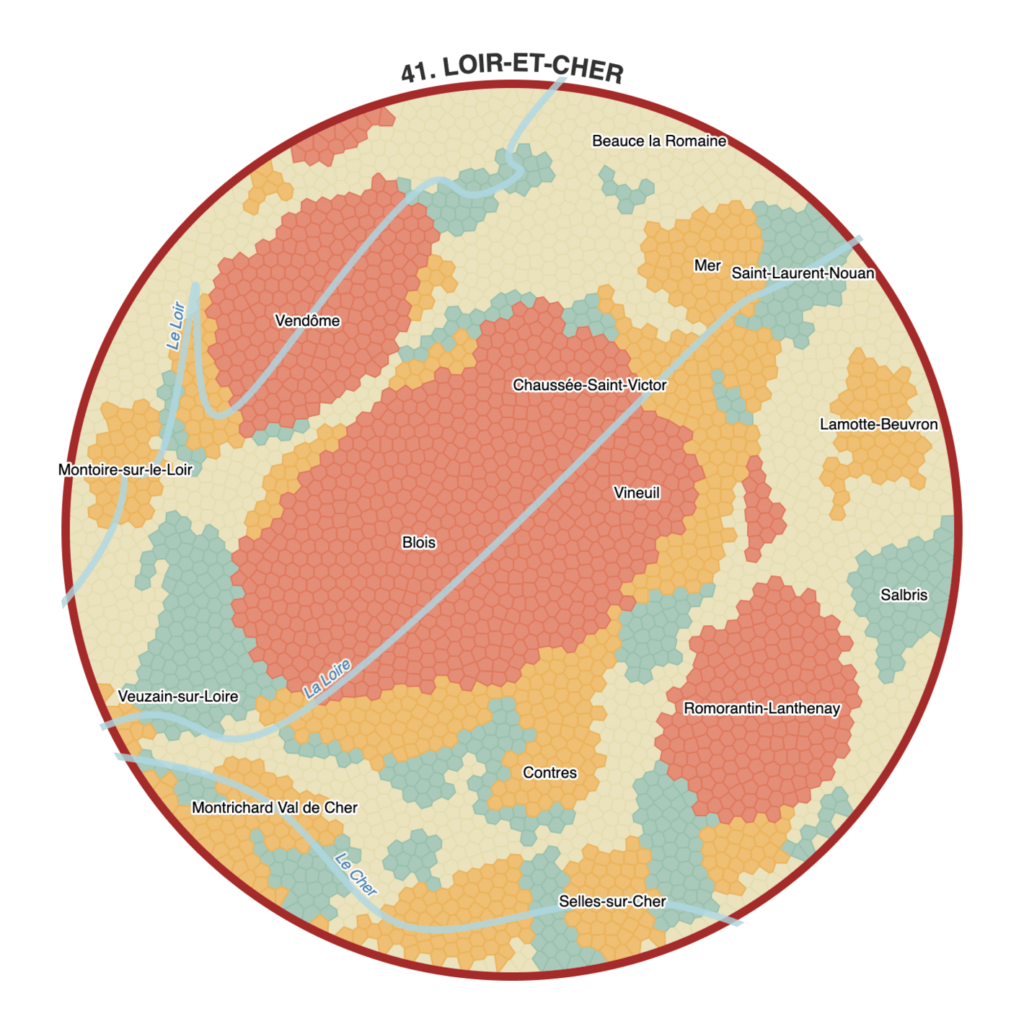
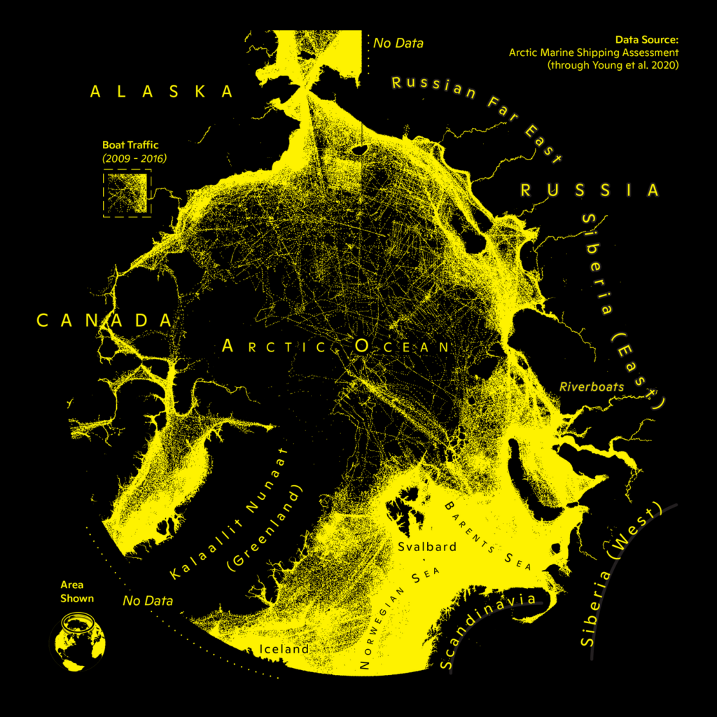
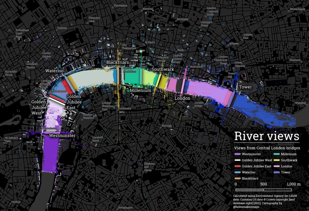
Kenneth Wong: “#Joyplot of population and elevation of #Taiwan. Most people live in the coastal cities and you rarely find people living in mountainous areas,” November 12 (Tweet)
Fil: “Day 16. Urban/Rural. An isodemographic map of Loir-et-Cher (330,000 inhabitants = 3300 cells x 100 persons). Introducing a new algo for cartograms — possibly the first use of #OptimalTransport in #cartography,” November 15 (Tweet)
The Los Angeles Times: Freeways force out residents in communities of color — again, November 11
Greg Fiske: “Data update – Indigenous Peoples of the Arctic boundary polygons,” November 12 (Tweet)

… maps of where people are going…:

Carl Churchill: “This is my favorite day of the challenge, and believe it or not this entire map is 1 dataset, and 1 color. Simply by tracking #Arctic shipping, we can see the outlines of continents and islands,” November 9 (Tweet)
El Confidencial: “Lukashenko está utilizando el Gobierno de Polonia como un tonto útil”, November 11
Civio: España, República Checa, Dinamarca y Bélgica, ‘mecas’ del turismo reproductivo, November 10
Helen McKenzie: “Views from London’s bridges,” November 10 (Tweet)

…and several creative handmade maps:

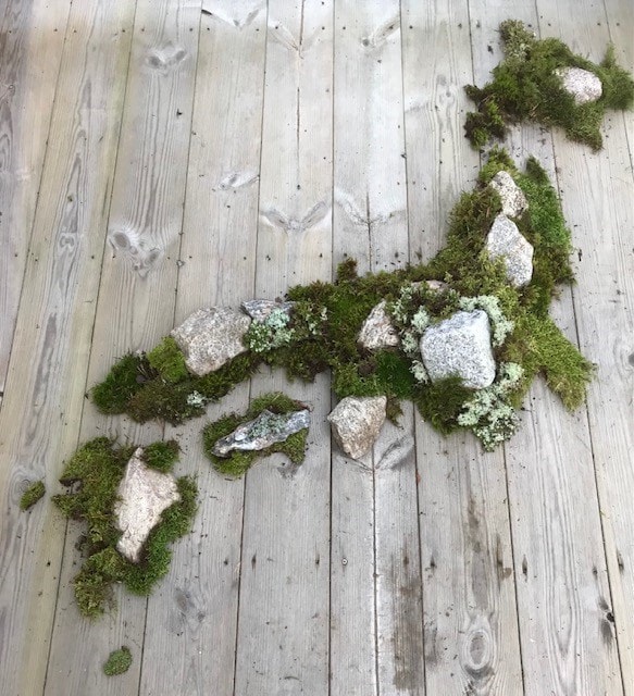
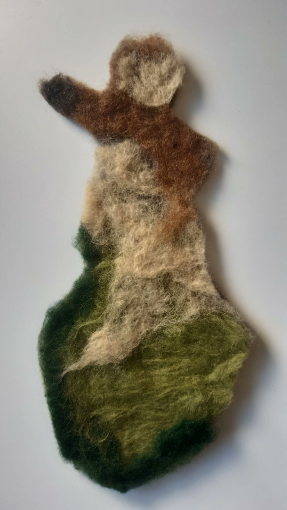
ArtisansCartographes: “Petit cube de la planète réalisé avec une tresse en papier,” November 11 (Tweet)
Jonas Nelson: “Day 15, Map made without using a computer. In 2004 I visited Japan, an amazing country, with beautiful moss gardens. I’d love to go there again. But until then, here is a map of Japan with rocks and moss from MY garden!” November 15 (Tweet)
Gispo: “Today we present to you a woollen Finland – a map made without a computer. Elevation zones have been visualized in pretty standard colours using needle felting and wet felting. This map was made by @SMultimaki. Based on datasets by @Maanmittaus,” November 15 (Tweet)

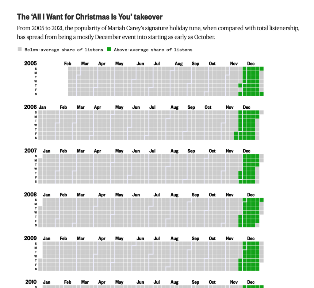
Finally, other charts covered topics from employment and gender to Christmas music creep:

FlowingData: How Much Women and Men Work, November 9
The San Francisco Chronicle: 58 people died in September in San Francisco from accidental overdoses, November 11
CNN: These are the warning signs that a crowd is dangerously dense, November 10
NBC News: These charts show the spread of Mariah Carey’s classic Christmas song, November 9

What else we found interesting

Les Echos: La régate présidentielle: épisode 2, November 10
The Wall Street Journal: How to Cut Your Home’s Carbon Footprint and Make It More Climate-Friendly, November 13
The Washington Post: How much of your life will you lose by going back to the office? Try our calculator, November 9

Help us make this dispatch better! We’d love to hear which newsletters, blogs, or social media accounts we need to follow to learn about interesting projects, especially from less-covered parts of the world (Asia, South America, Africa). Write us at hello@datawrapper.de or leave a comment below.

Comments