We want to enable everyone to create beautiful charts, maps, and tables. New to data visualization? Or do you have specific questions about us? You'll find all the answers here.
The best of last week’s big and small data visualizations
Vivien Serve
Welcome back to the 169th edition of the Data Vis Dispatch! Every week, we publish a collection of the best small and large data visualizations we find, especially from news organizations — to celebrate data journalism, data visualization, simple charts, elaborate maps, and their creators.
Recurring topics this week include surveillance, water, and Bluesky.
November’s #30DayMapChallenge continues! Prompts for the past week included world maps, “my data,” choropleths, collaborative maps, and 3D:
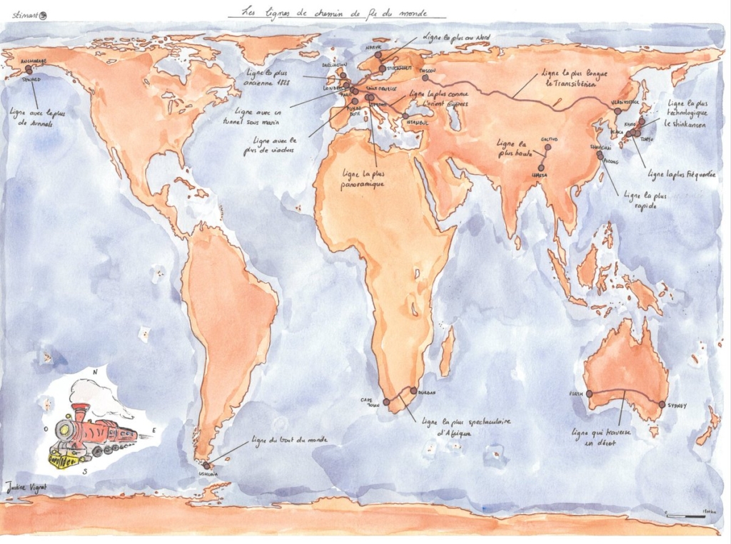
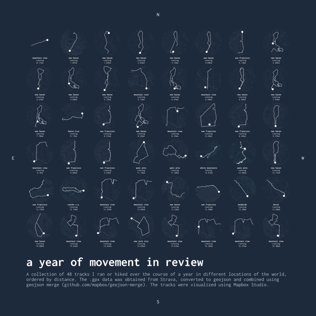
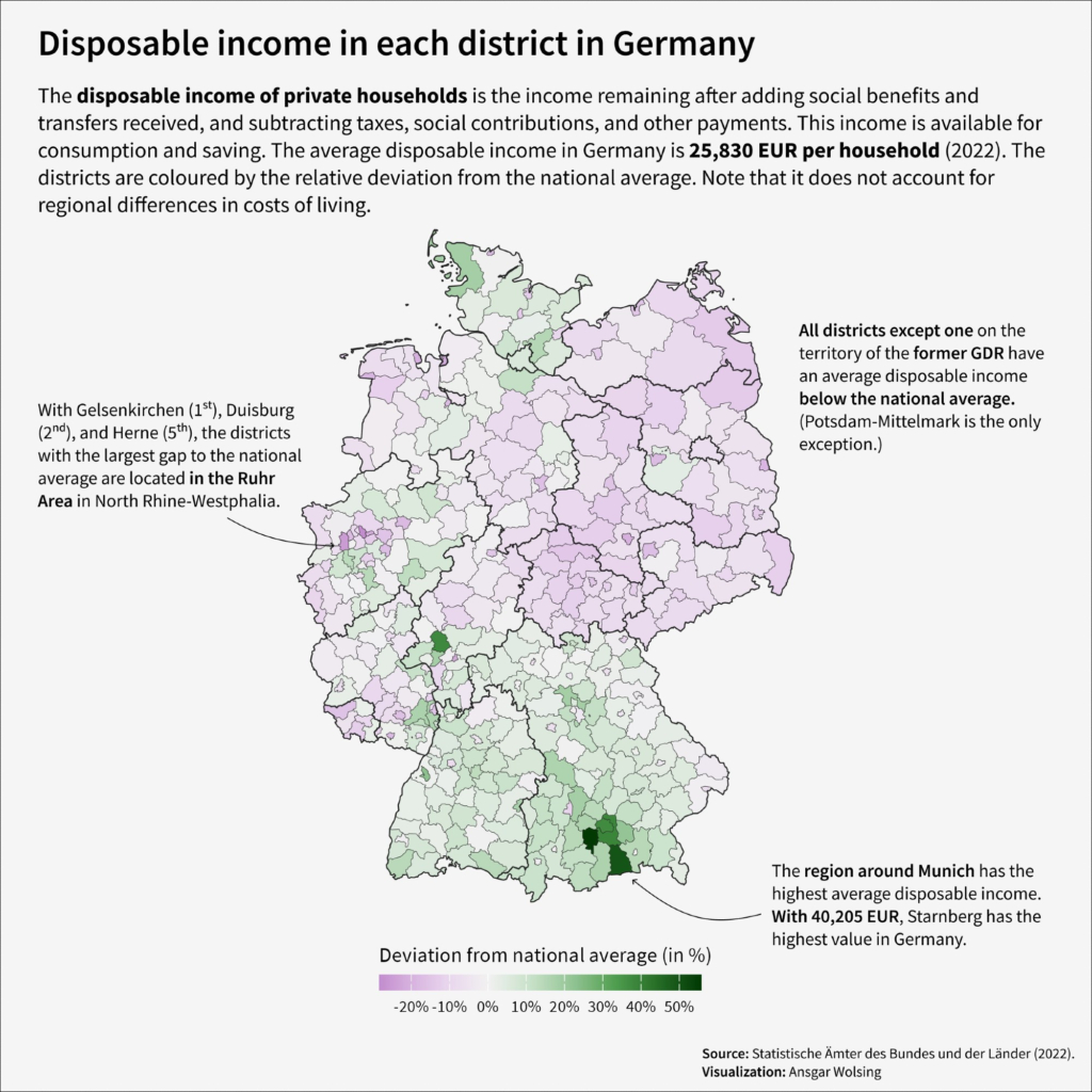
Justine Vignat: “14eme jour du #30DayMapChallenge avec comme thème : #world #map; Les lignes de train les plus longues, les plus rapides, les plus spectaculaire, les plus hautes etc.,” [14th day of the #30DayMapChallenge with the theme: #world #map; The longest, fastest, most spectacular, highest etc. train lines in the world!] (Tweet) Iva Brunec: “Day 15 of #30DayMapChallenge: My data. GPX tracks of the hikes I’ve done in 2024. #rayshader of course. + video in [thread]!” November 16 (Bluesky)Mapbox: “Day 15 — Data: My data; Mapbox map designer Mel Imfeld logged a year of her runs and hikes in a minimalistic infographic style produced in Mapbox Studio […],” November 15 (Tweet)Ansgar Wolsing: “This choropleth map shows the differences in the average disposable income of private households in the districts in Germany,” November 17 (Bluesky) AlcisGeo: “Today is day 17 of the #30DayMapChallenge and the theme is: ‘Collaborative Map’. Five members of our team took off on bicycles or running shoes to create the letters that make up ‘Alcis.’ Look at us go!” November 17 (Tweet)Alex Selby-Boothroyd: “Day 18 #30DayMapChallenge I 3D-printed John Snow’s 1854 cholera map of Soho. It took ages,” November 18 (Bluesky)
A subject that, unfortunately, requires a lot of maps these days is war:
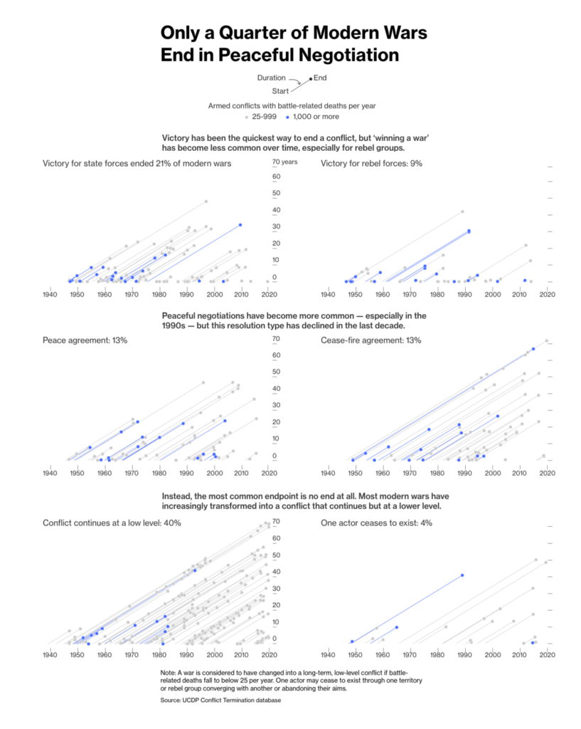
In his victory speech on November 7, Trump vowed to “end the wars.” But an analysis in Bloomberg shows that modern wars rarely come to a straightforward end:
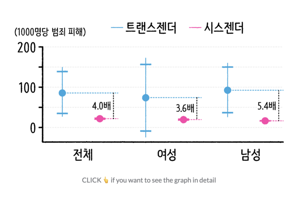
Also in surveillanceandcrime — a crowdsourced map of surveillance networks and the high number of crimes against transgender people:
Esra’a: “Dozens of entities and funders newly featured on Surveillance Watch. Thanks to everyone who supported with submissions, research and sourcing. Truly appreciate communities coming together to help build this resource,” November 14 (Mastodon, Website)SBS News: 내가 내 성별을 결정할 수 있다면? [Chart description: Violent crime victimization rates of transgender and cisgender people based on the results of the 2017 and 2018 U.S. crime victimization survey], November 15
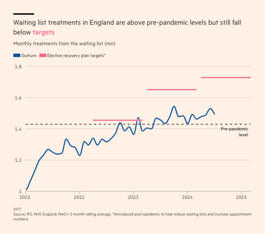
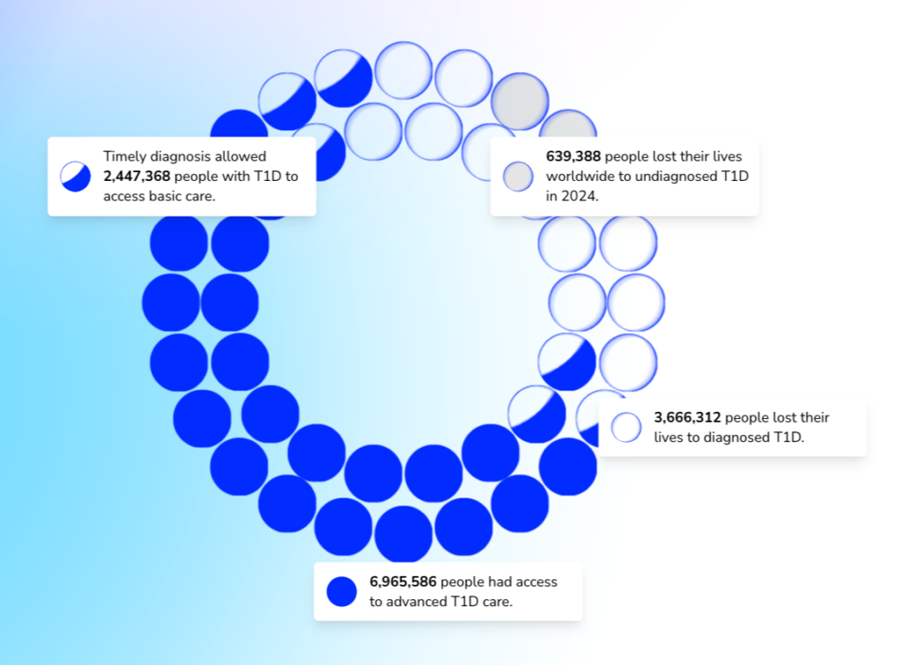
Medical treatment in the U.K. isn’t meeting targets and only half of type 1 diabetics worldwide have access to advanced care:
Financial Times: Why does the NHS have a productivity problem?, November 13CLEVER°FRANKE: “On World Diabetes Day, we’re introducing the T1D Index—a groundbreaking platform compiling global type 1 diabetes data. Created for Breakthrough T1D, it empowers healthcare professionals, researchers, and advocates with insights to drive change,” November 14 (Bluesky) Explorable Platform
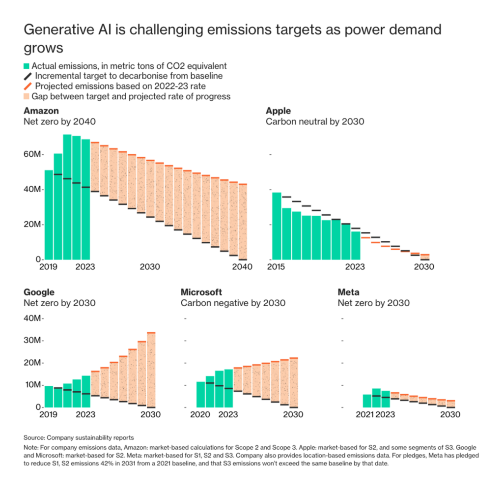
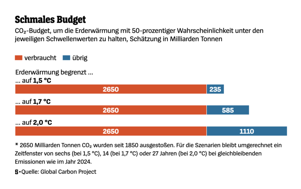
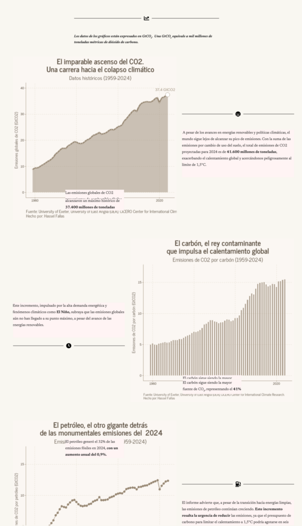
It’s been a while since we’ve dedicated a long section to climate. Let’s start with a reality check on emissions targets:
Bloomberg: “To have a chance against global warming, key economies and industries need to hit crucial emissions targets by 2030. They’re far off track,” November 12 (Tweet) Detailed AnalysisDer Spiegel: Warum die CO₂-Emissionen weiter steigen [Chart description: CO₂ budget for a 50% chance to keep global warming below the given thresholds, estimated in billion tonnes], November 13 La Data Cuenta: El planeta alejándose del límite seguro de 1,5°C [The planet is moving away from the safe limit of 1.5°C], November 13
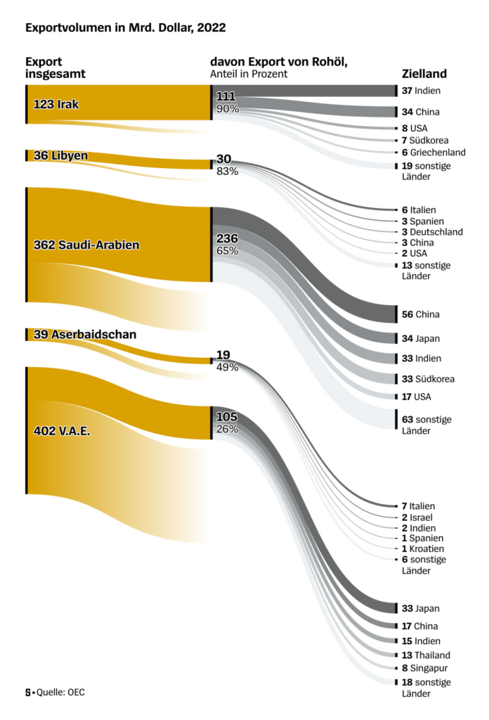
We continue with countries that may (or may not) have an interest in promoting CO₂ reduction:
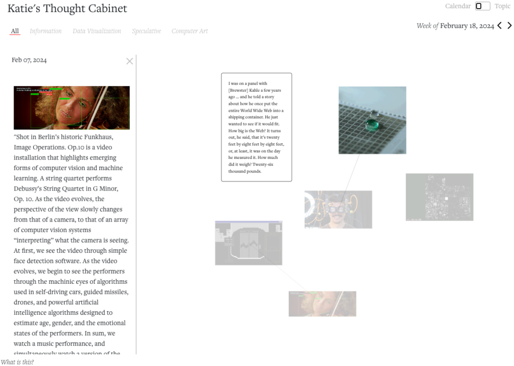
Katie Watson: “Built myself a little “thought cabinet” to collect images, text, and other inspiration. The default view organizes everything chronologically by week, using a d3 force layout. It’s been helpful for tracing the flow of ideas and what I’m paying attention to,” November 18 (Bluesky) Matt Muir: “Seeing as Bluesky is in that phase of growth where users like nothing more than talking about the platform they are currently posting on, this live feed of EVERYTHING BEING POSTED HERE RIGHT NOW AS IT HAPPENS, IN 3D, will likely appeal,” November 17 (Bluesky)
Help us make this dispatch better! We’d love to hear which newsletters, blogs, or social media accounts we need to follow to learn about interesting projects, especially from less-covered parts of the world (Asia, South America, Africa). Write us at hello@datawrapper.de or leave a comment below.
(she/her) is a working student on Datawrapper’s Communications team. She creates the Data Vis Dispatch to keep data visualization enthusiasts up to date on exciting new projects. When she’s not working, she studies interface design, and when she’s not studying, she’s planning a festival stage or soldering light installations. Vivien lives in Potsdam.


Comments