This article is brought to you by Datawrapper, a data visualization tool for creating charts, maps, and tables. Learn more.
Data Vis Dispatch,
November 2
The best of last week’s big and small data visualizations

Welcome back to the 20th edition of Data Vis Dispatch! Every week, we’ll be publishing a collection of the best small and large data visualizations we find, especially from news organizations — to celebrate data journalism, data visualization, simple charts, elaborate maps, and their creators.
Recurring topics this week include rainforests, sea ice, and the United Nations Climate Change Conference.
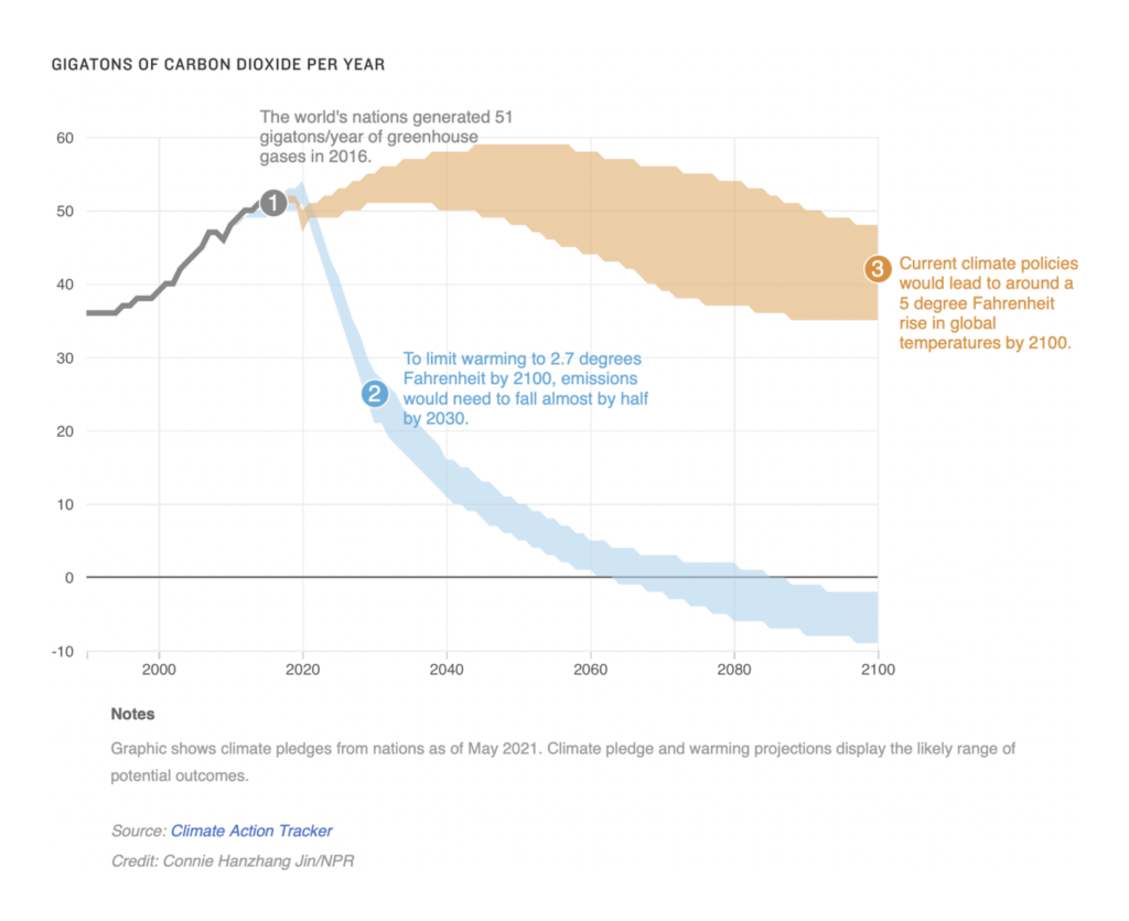
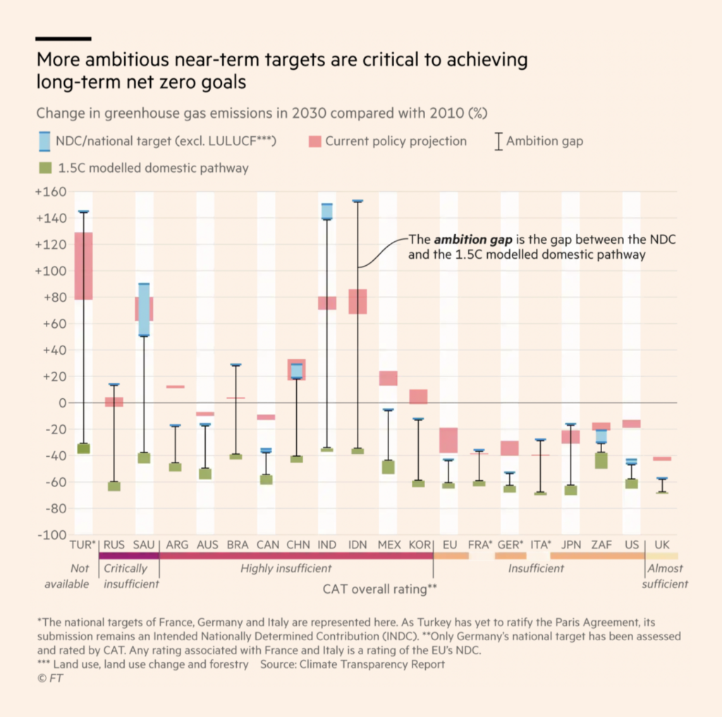
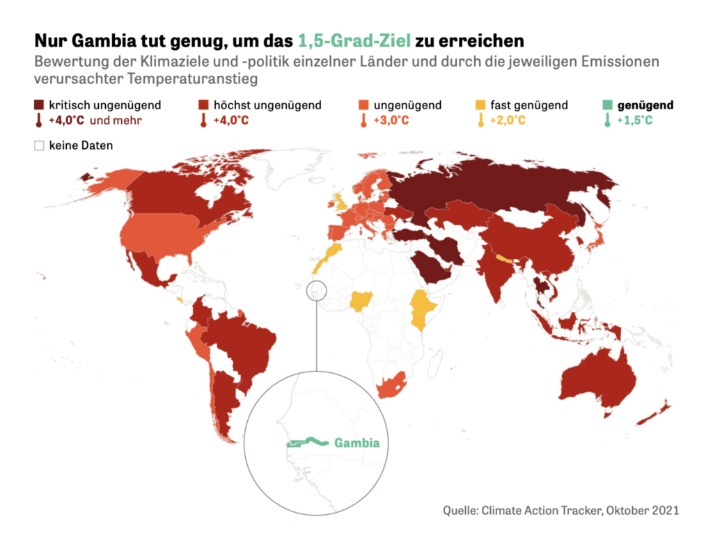
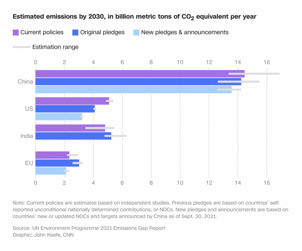
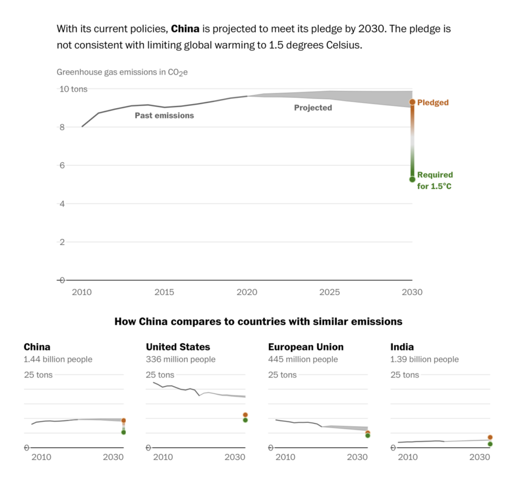
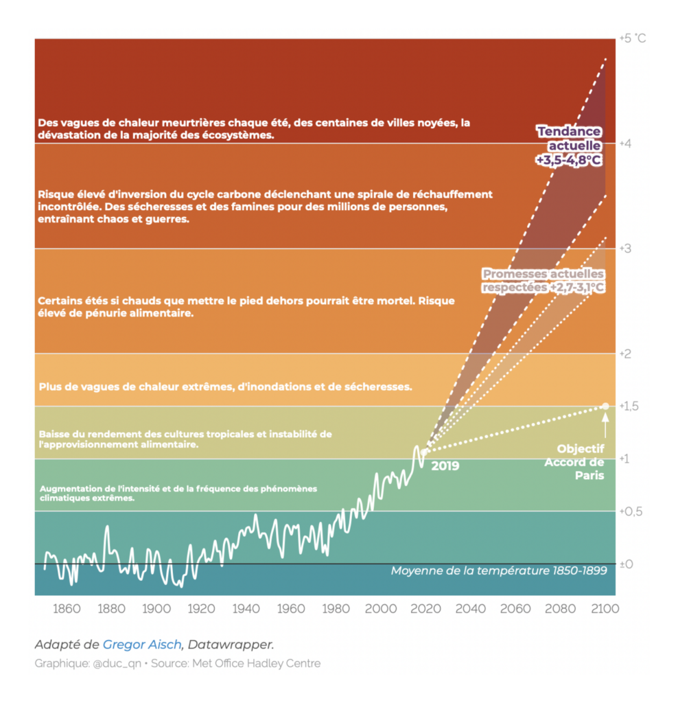
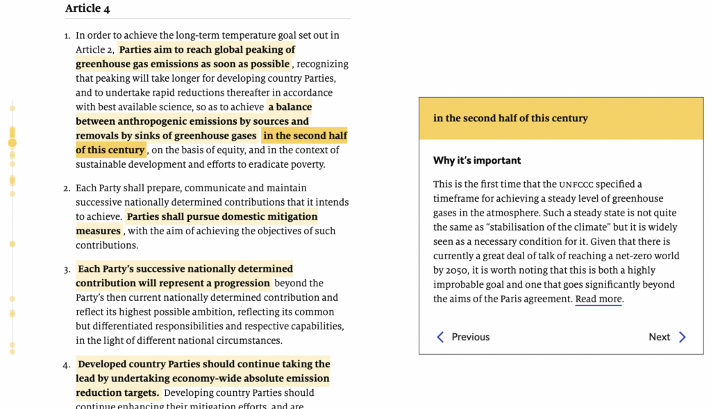
All eyes were on Glasgow this week for the start of the COP26 climate conference. For the first time since the 2015 Paris Agreement, countries will be expected to submit new, lowered national targets for greenhouse gas emissions. To show why that’s needed, these charts looked at what each country has pledged so far and how far off-track that still leaves us:

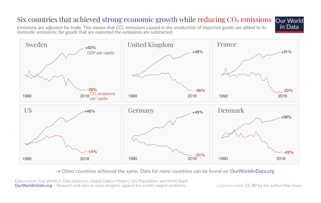
Of course, some countries bear more responsibility than others for the past and future of carbon emissions. In recent decades, developing and developed economies have followed very different paths:

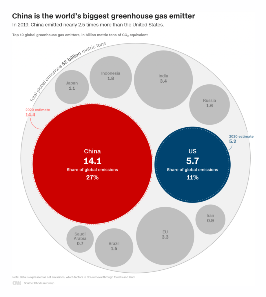

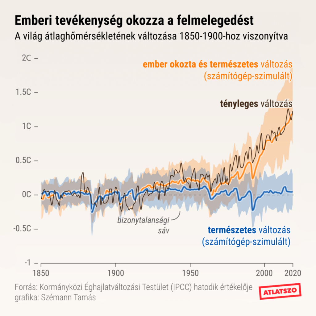
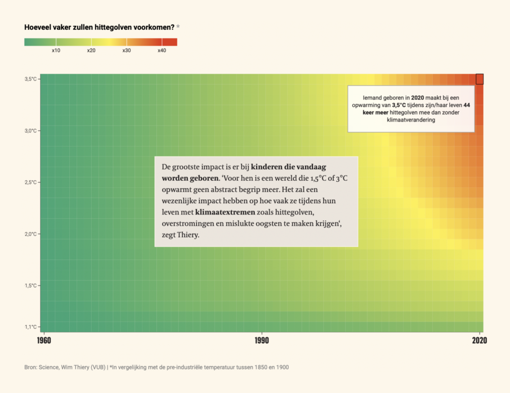
If you need a quick refresher on why this whole “emissions” thing is such serious business — these charts have you covered with the big picture and the human-sized one:

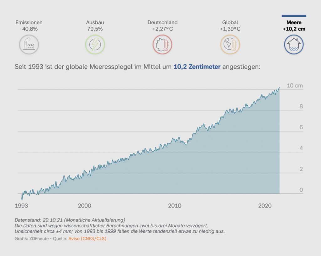
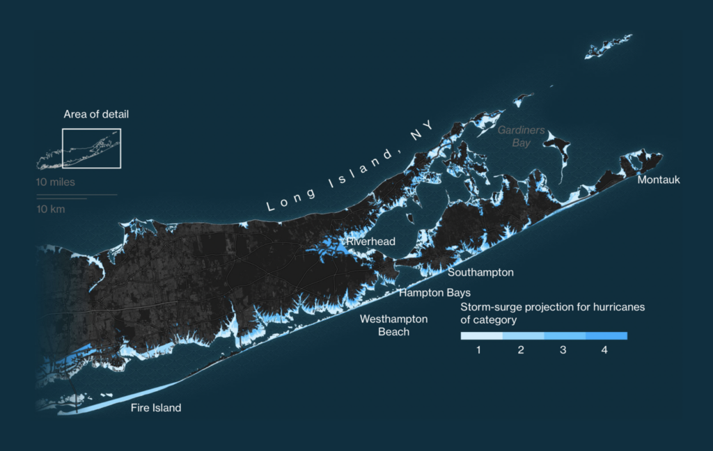
The effects of climate change are already all around us. This week the spotlight was on melting ice and rising seas:


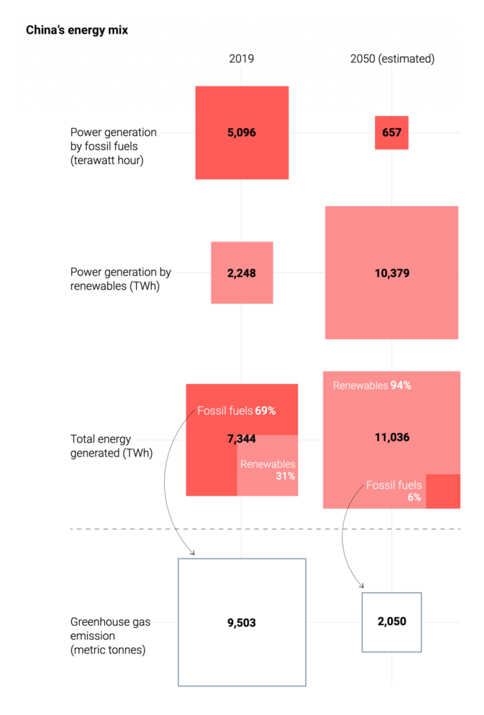
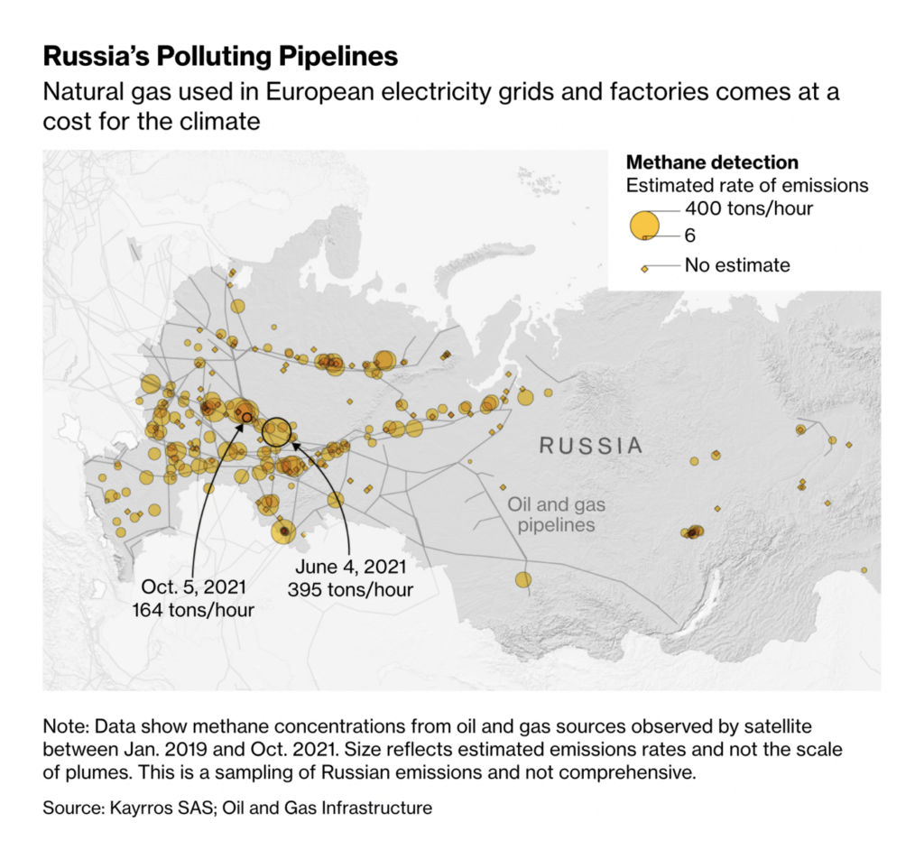
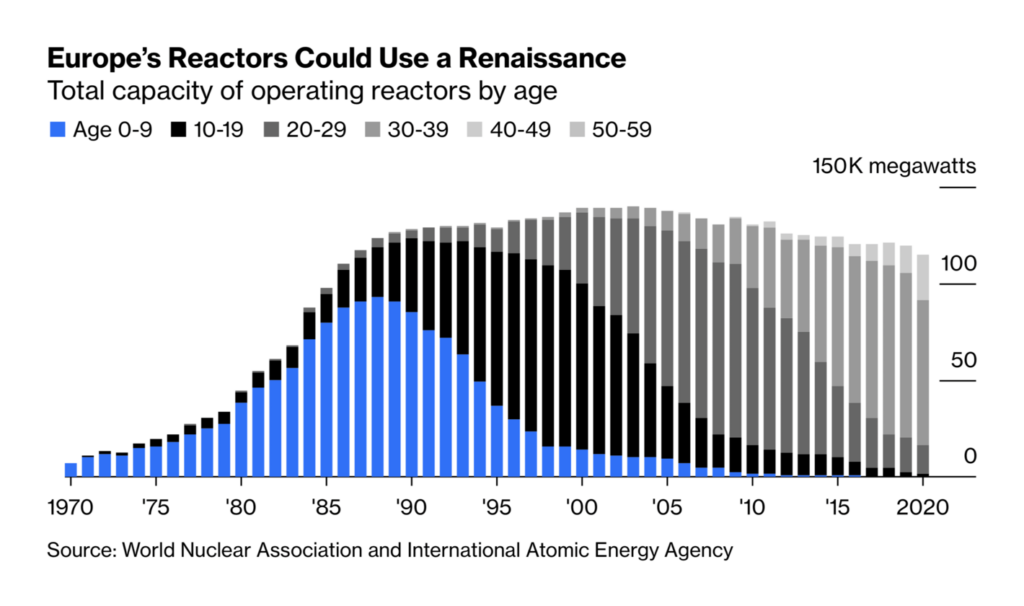
Despite all this, we haven’t collectively given up our dirtiest energy habits:
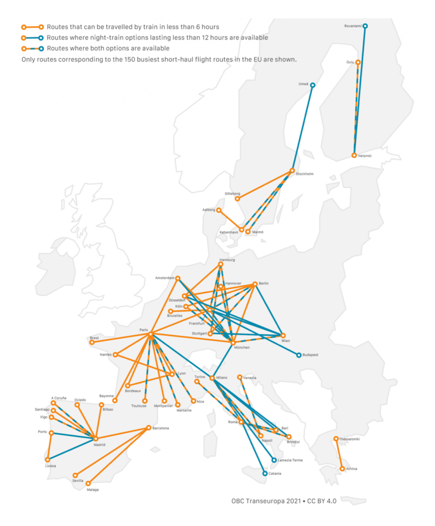
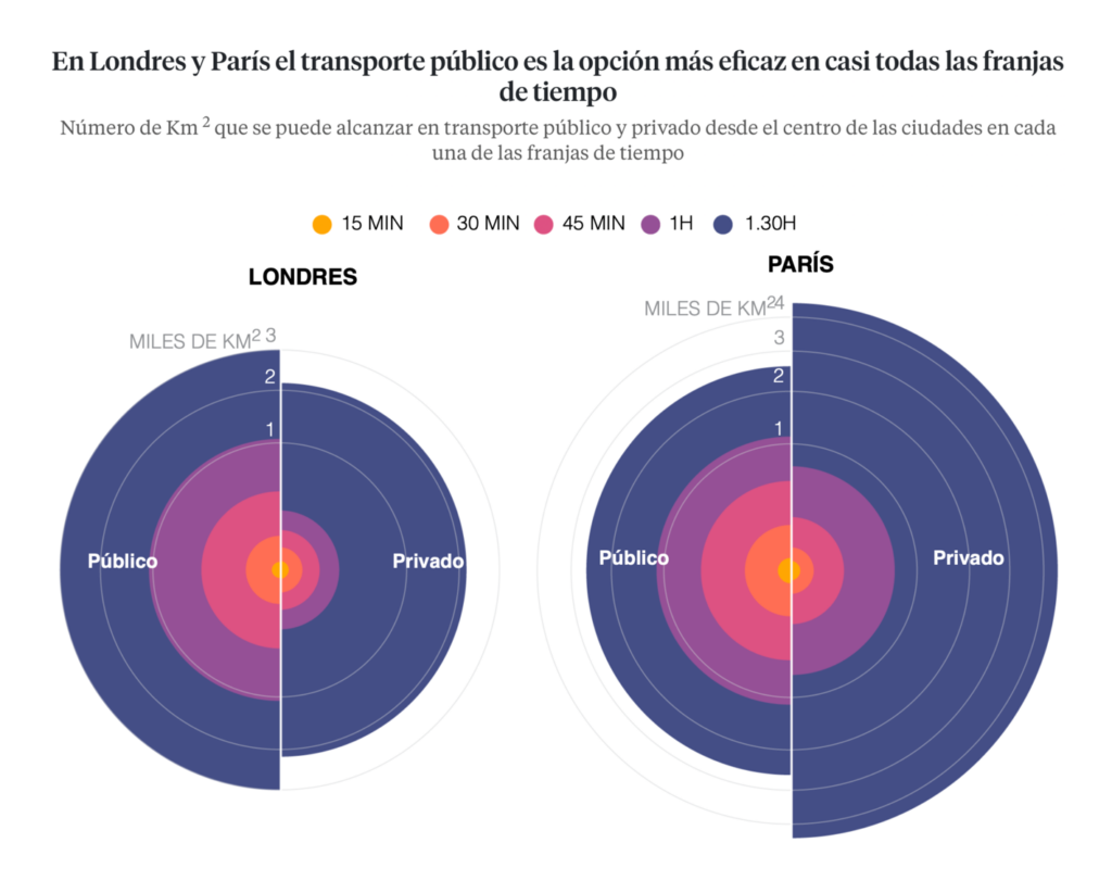
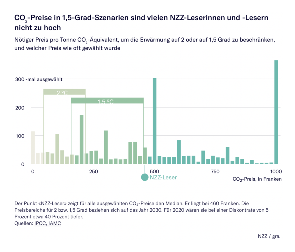
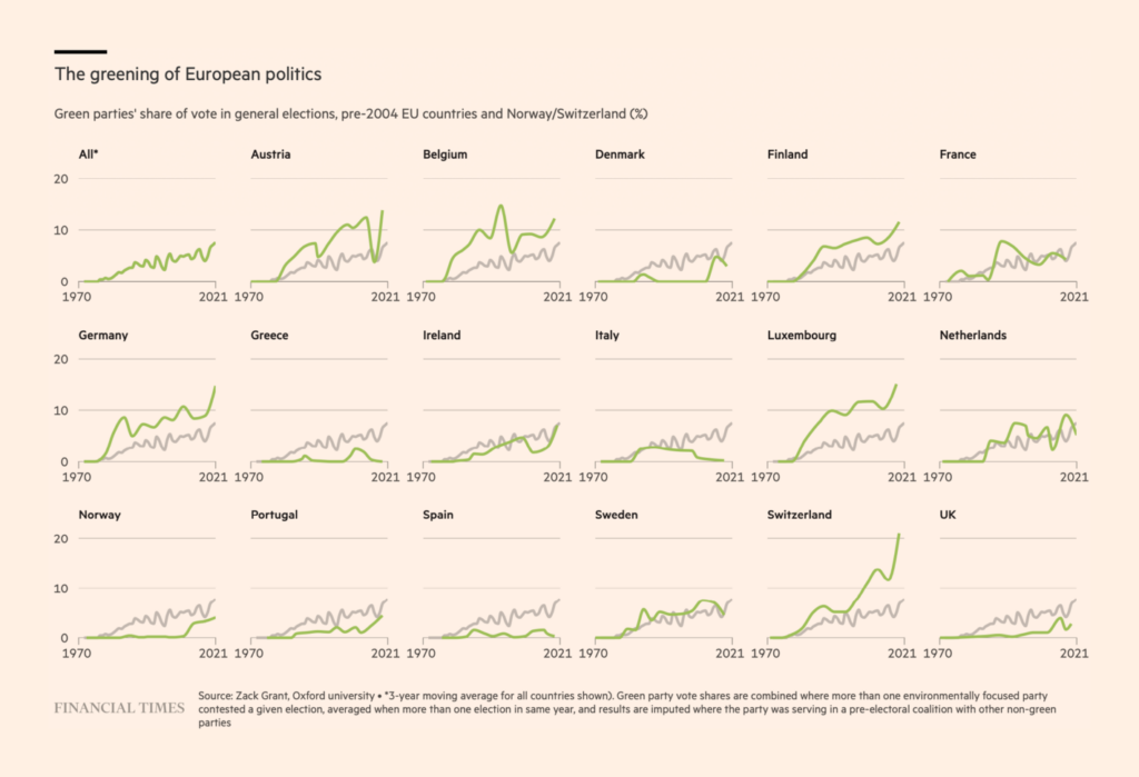
But far more charts this week focused on what the solutions could be — from efficient transit to carbon pricing to electoral change:
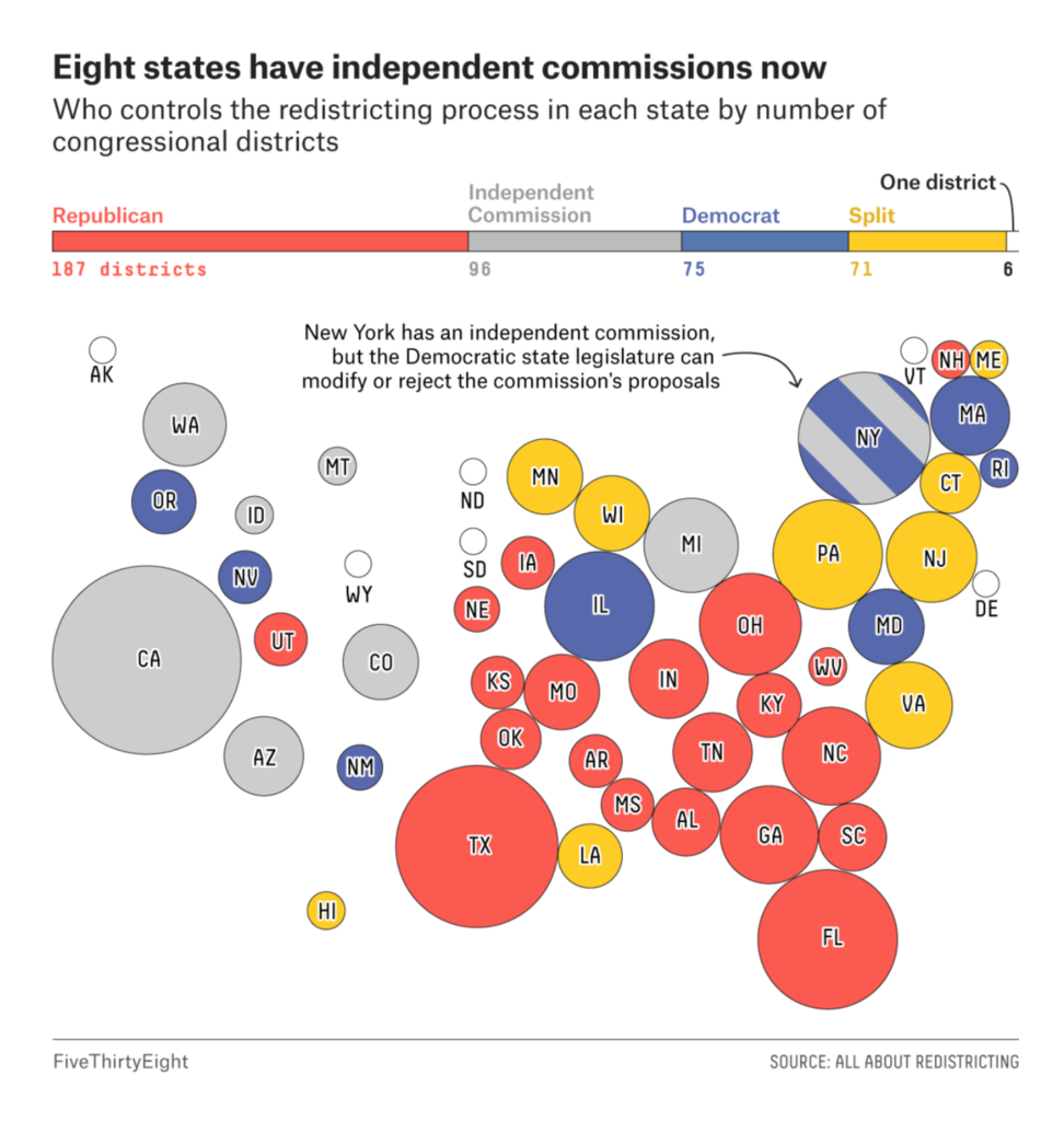
In politics, the U.S. congressional map is still in flux:

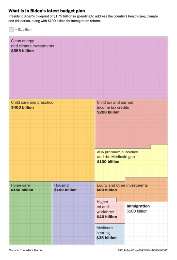
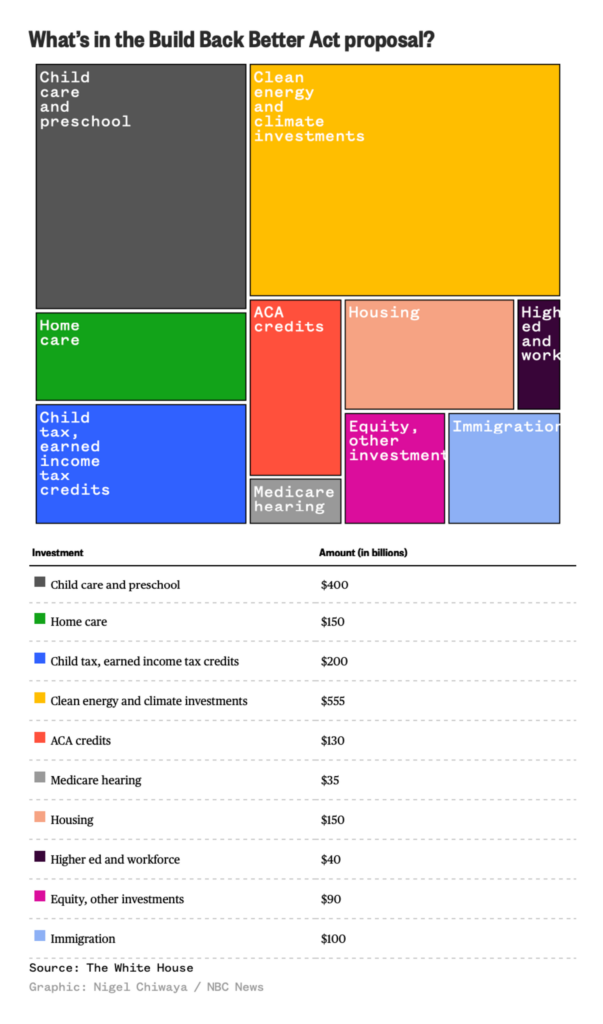
And a major spending bill is still stalled in the Senate:
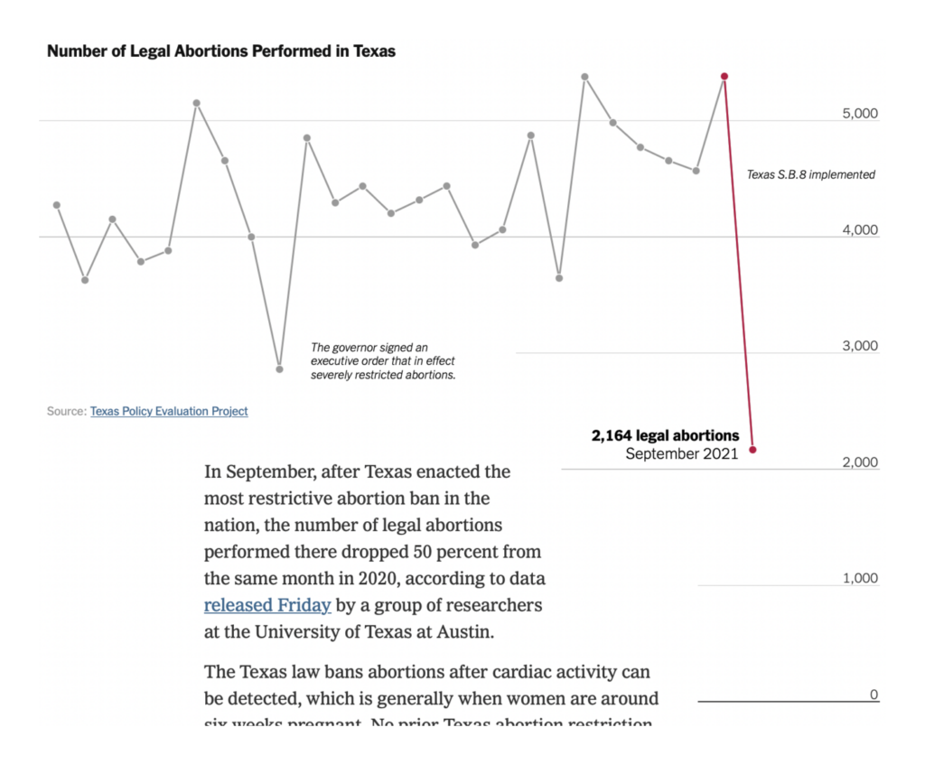
The U.S. Supreme Court is hearing arguments this week on the structure of a restrictive Texas abortion law:

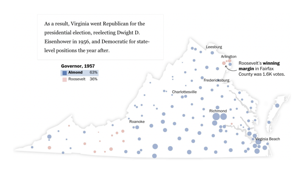
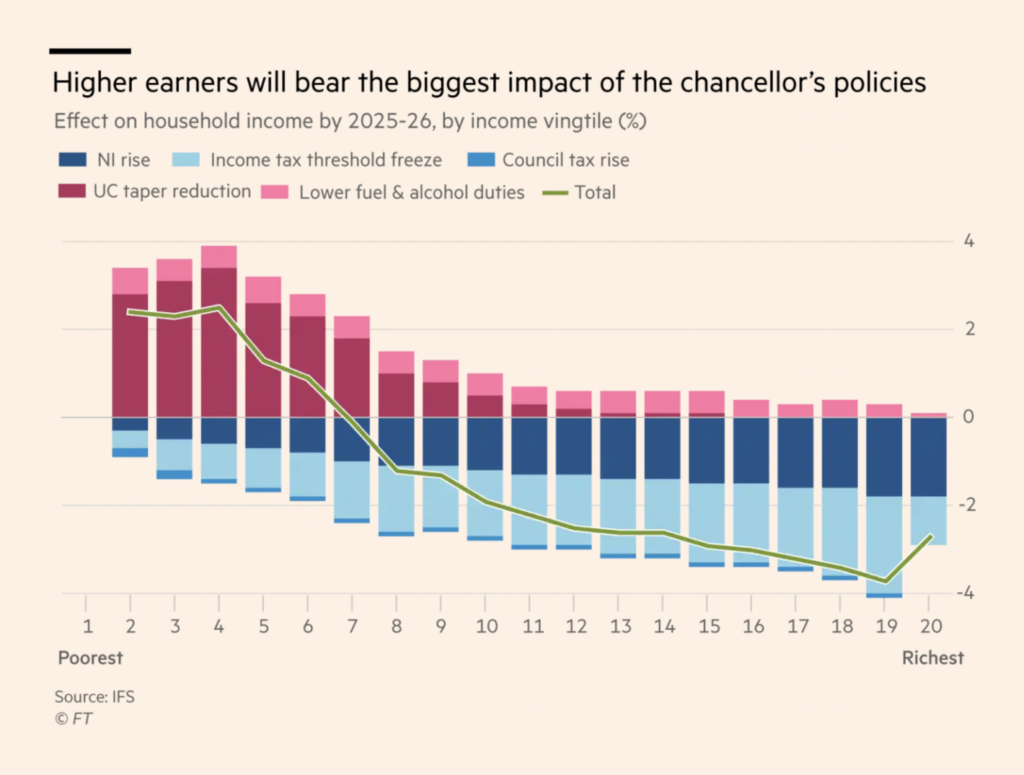
And other political charts looked at partisan history in the U.S. and budget plans in U.K.:
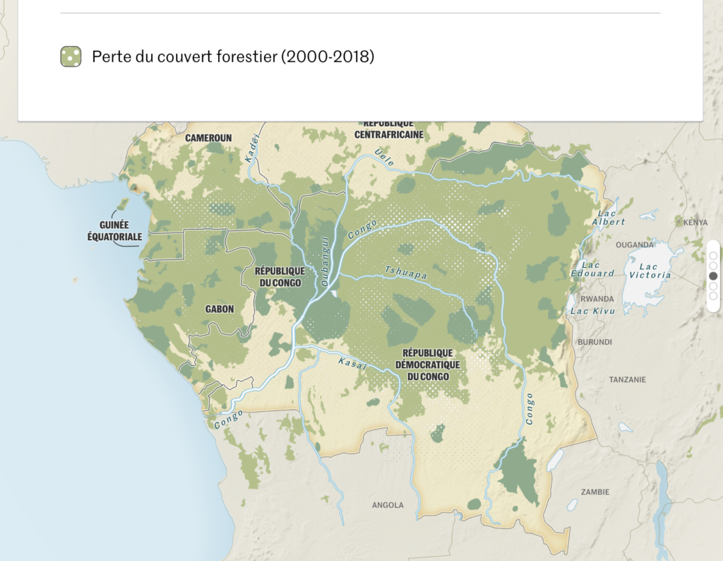
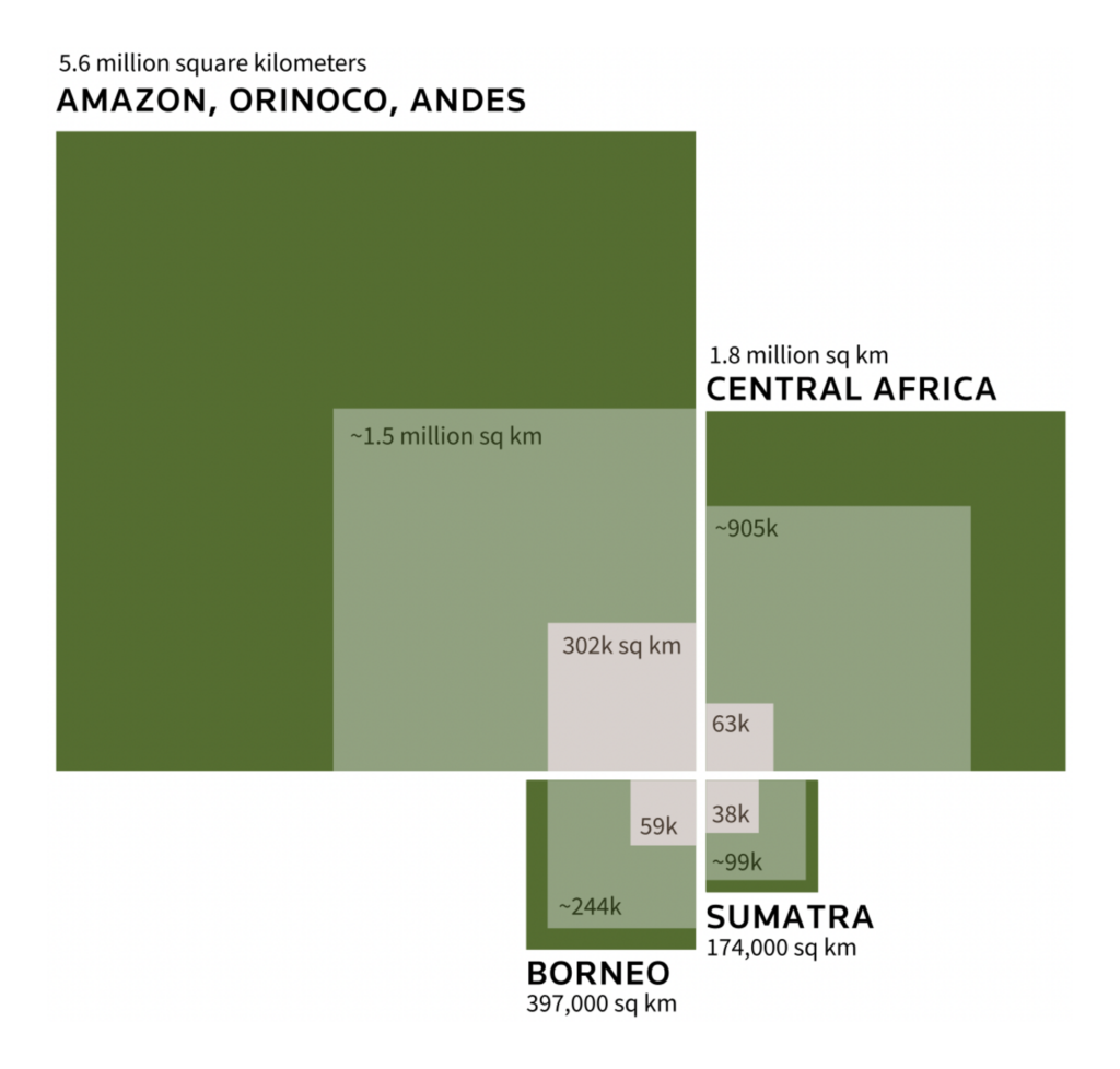
The breakout topic of the week was rainforests:
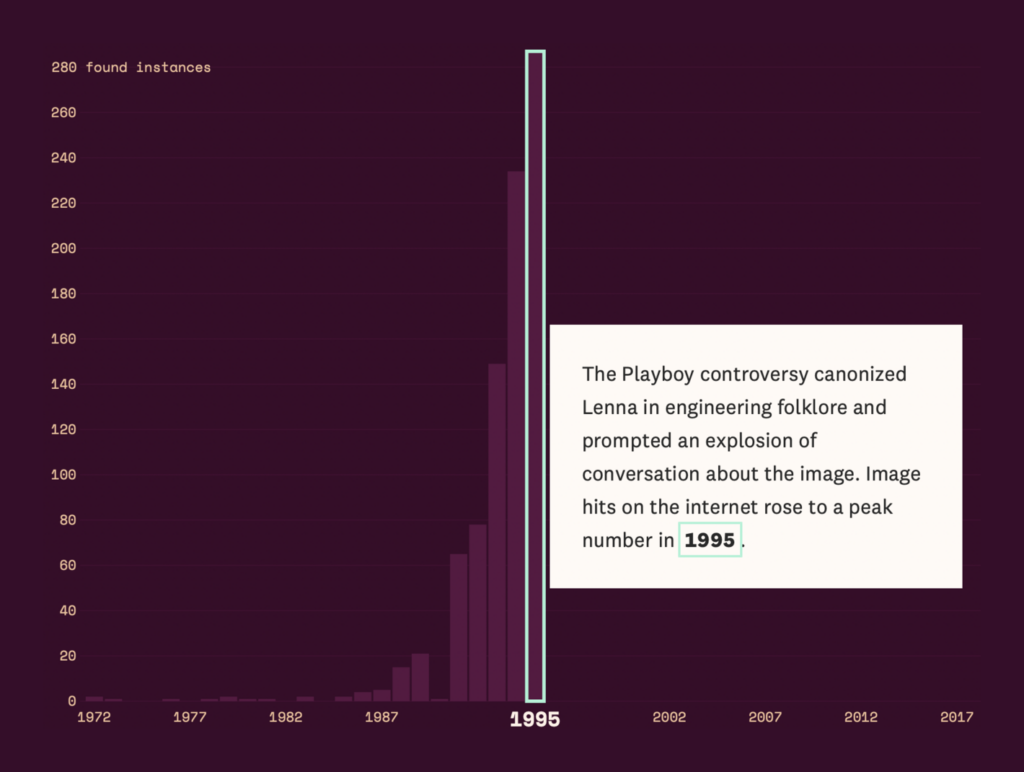
And we also had two visual stories on the internet — one very topical, one (relatively) timeless:

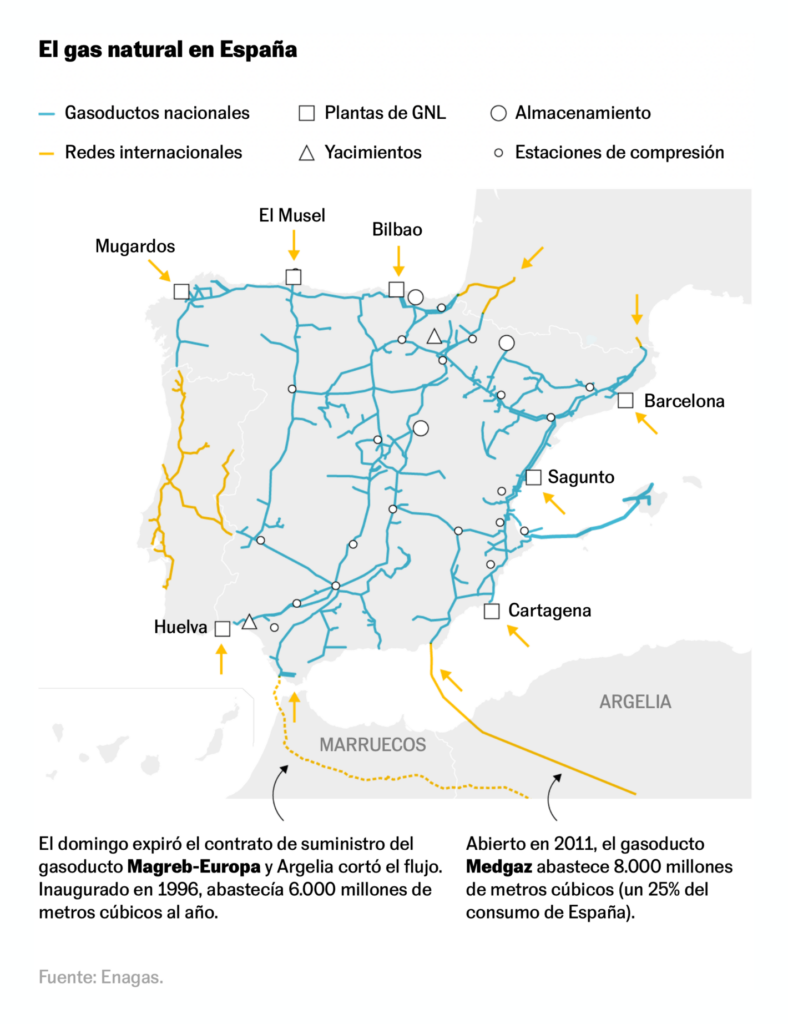
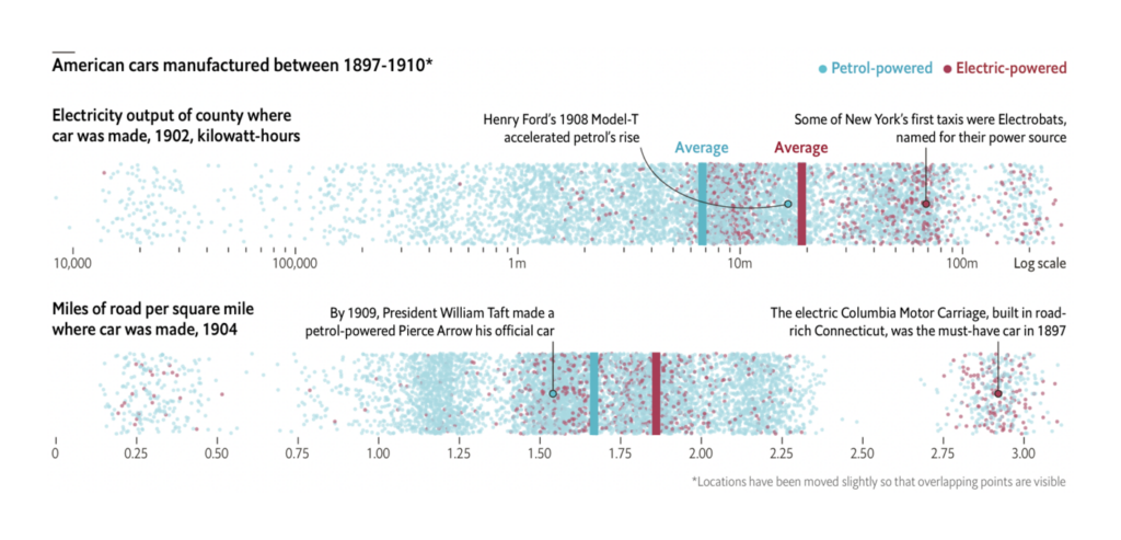
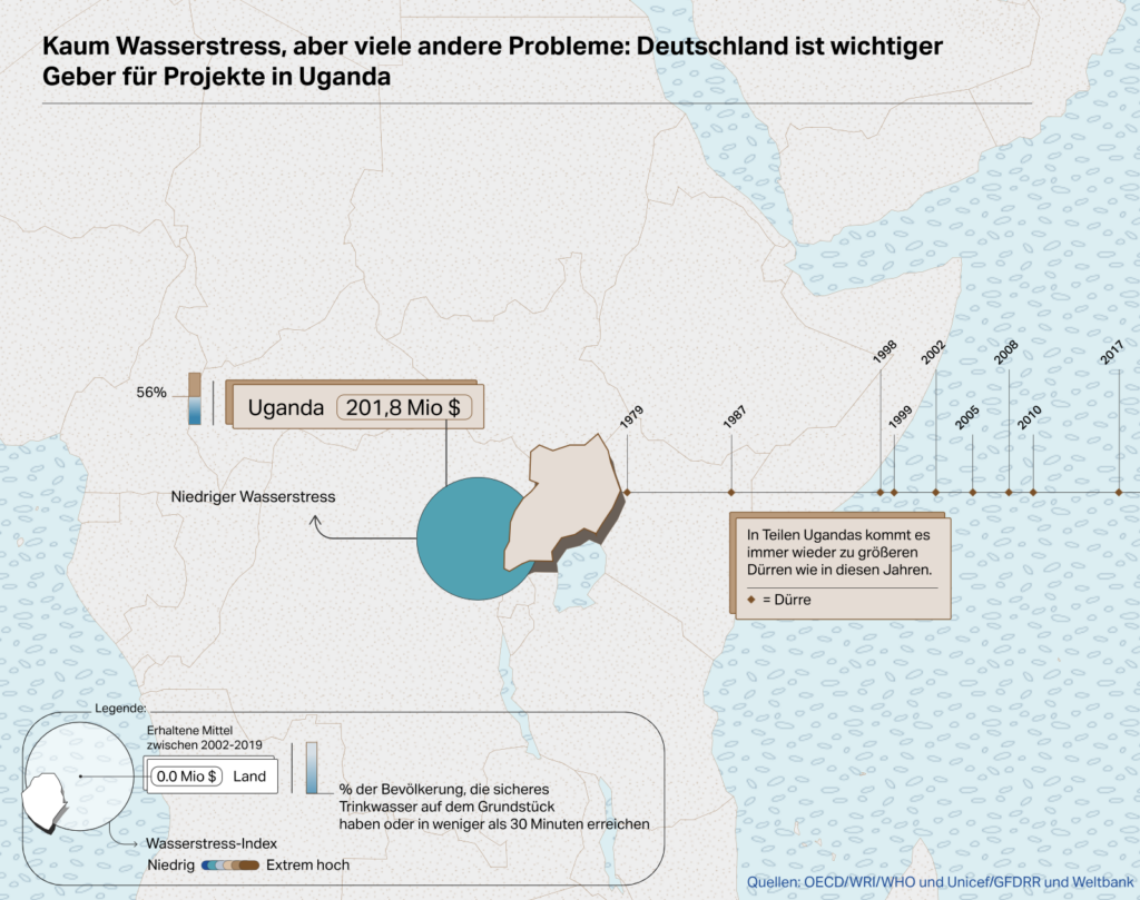
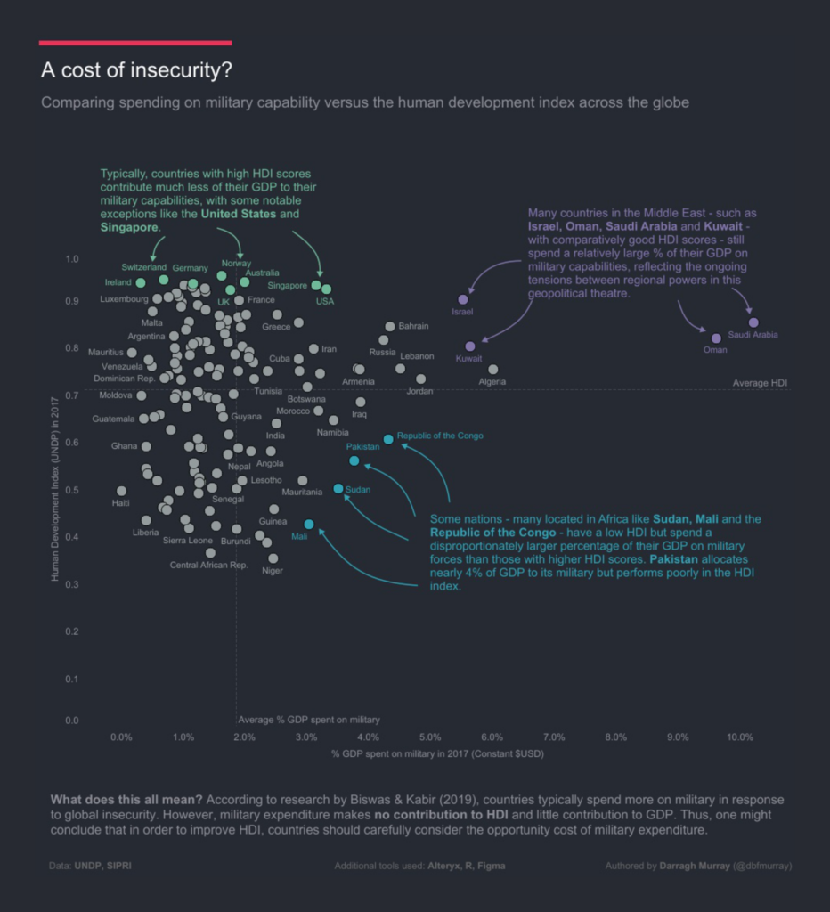
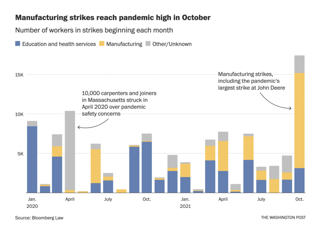
Miscellaneous topics included international affairs, manufacturing, and more:
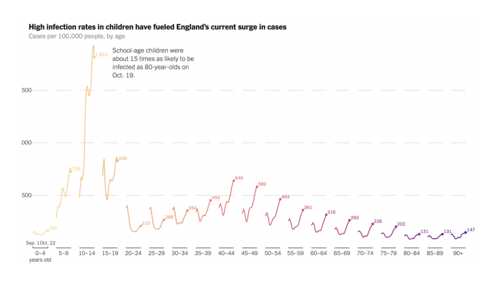
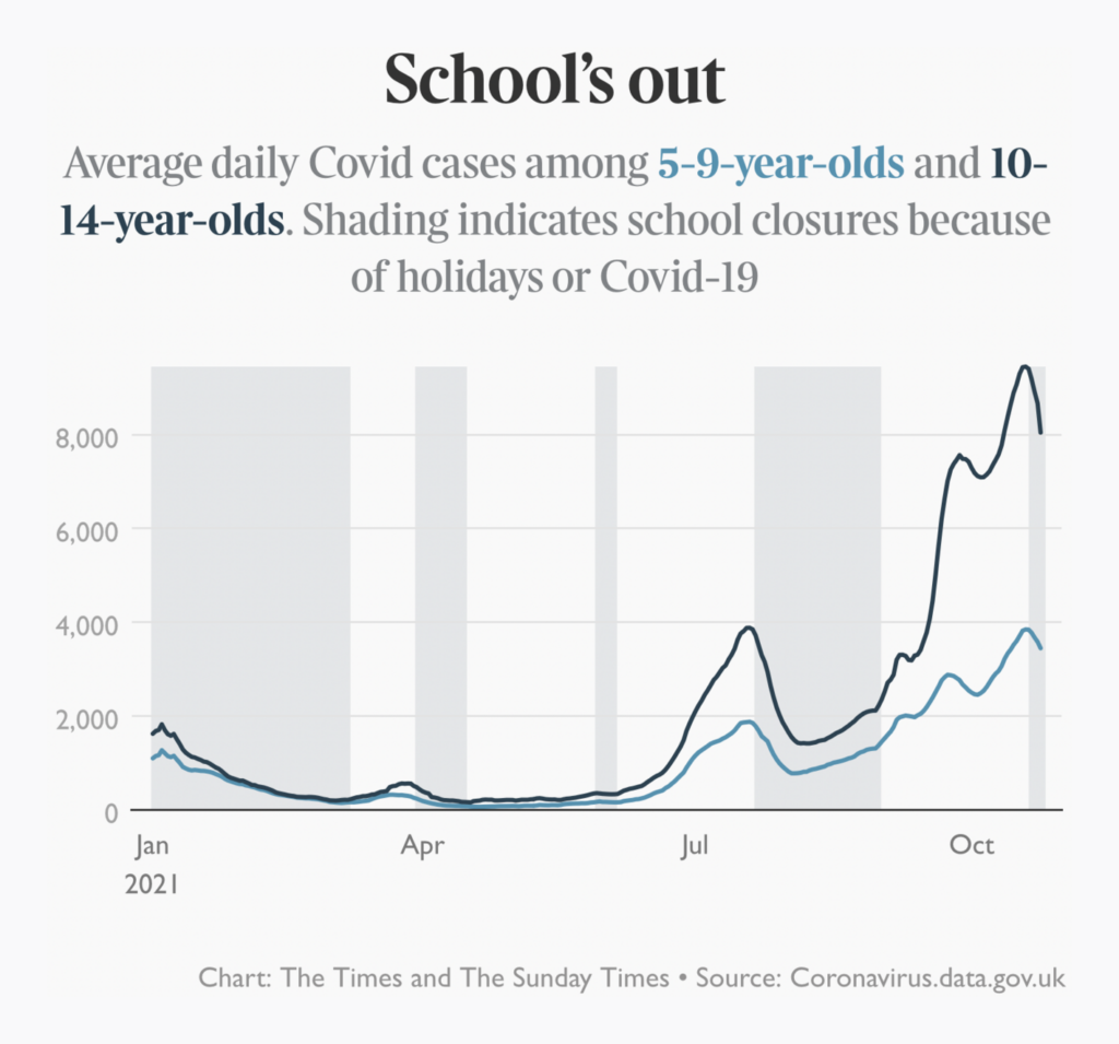
Last this week, but never least, is the pandemic. The U.K. is dealing with a surge in cases among schoolchildren:
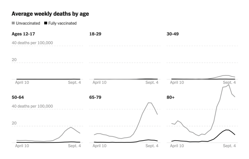
We saw the latest numbers on vaccine efficacy — plus an intriguing correlation between vaccination and non-COVID mortality:

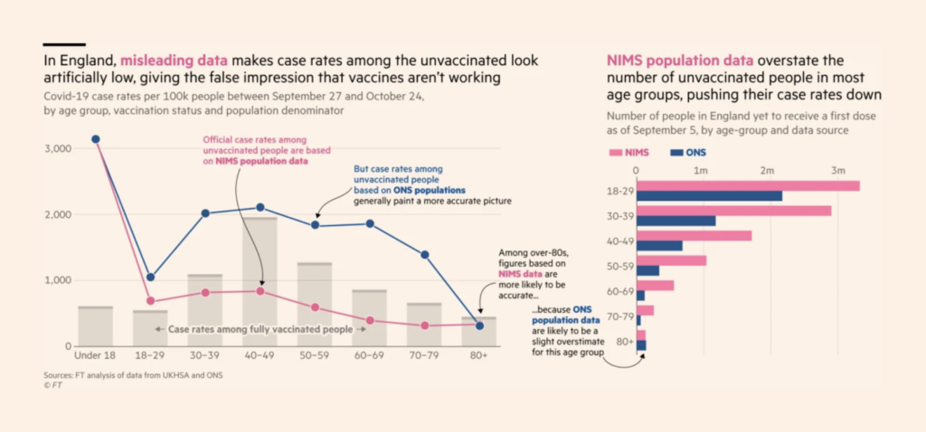

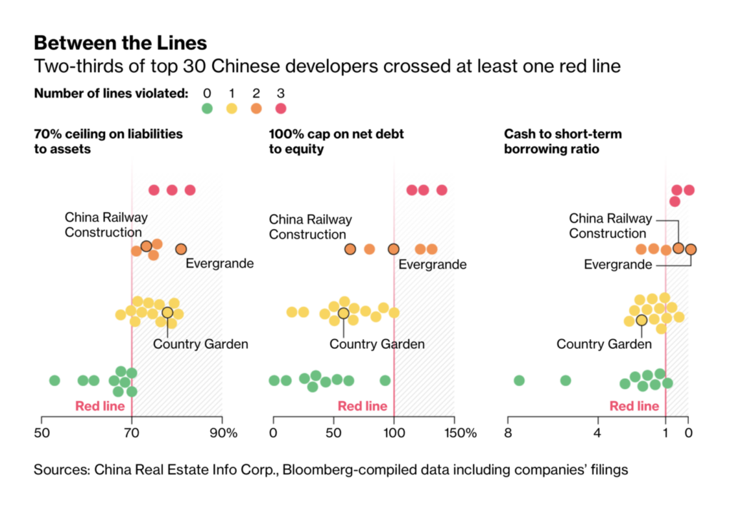
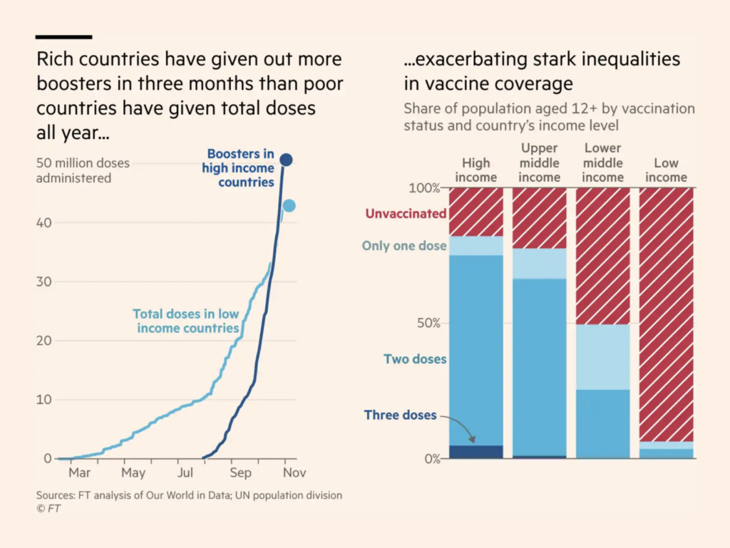
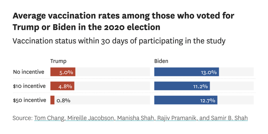
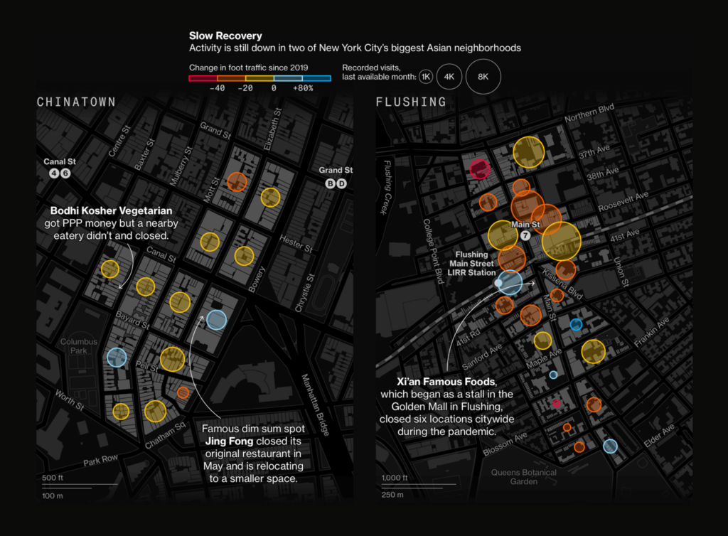
Most weeks, charts on vaccine distribution wouldn’t go in our section on the social-economic dimension of the pandemic. But this week, the distinction got pretty blurred:
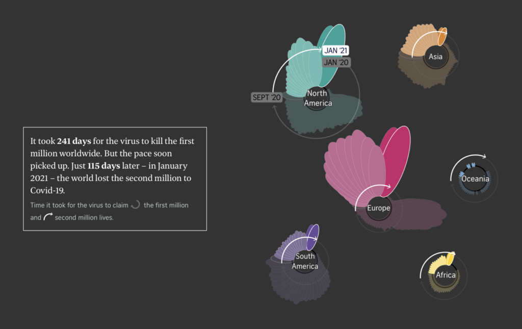
Finally, these flowers offered a painful look back at the global death toll so far:
What else we found interesting


- November 15: Online discussion on visualizing climate change, hosted by NYU and featuring Kennedy Elliot, Alberto Cairo, Rosamund Pearce, and Sara Chodosh.
- Interview on data journalism and data literacy with Julia Wolfe of FiveThirtyEight.
Help us make this dispatch better! We’d love to hear which newsletters, blogs, or social media accounts we need to follow to learn about interesting projects, especially from less-covered parts of the world (Asia, South America, Africa). Write us at hello@datawrapper.de or leave a comment below.


Comments