We want to enable everyone to create beautiful charts, maps, and tables. New to data visualization? Or do you have specific questions about us? You'll find all the answers here.
The best of last week’s big and small data visualizations
Veronika Halamková
Welcome back to the 69th edition of Data Vis Dispatch! Every week, we’ll be publishing a collection of the best small and large data visualizations we find, especially from news organizations — to celebrate data journalism, data visualization, simple charts, elaborate maps, and their creators.
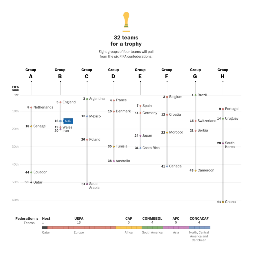
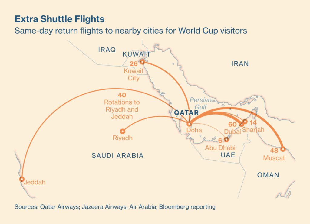
Recurring topics this week include the end of COP27, the start of the FIFA World Cup, and the crossing of the eight billion population mark.
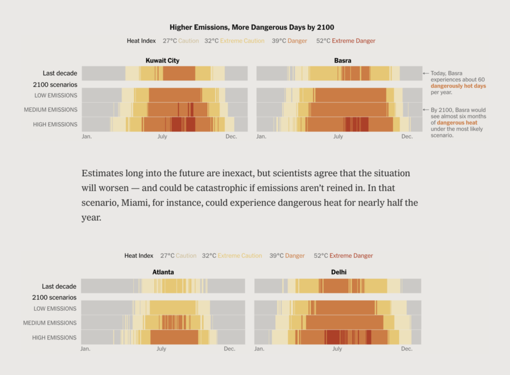
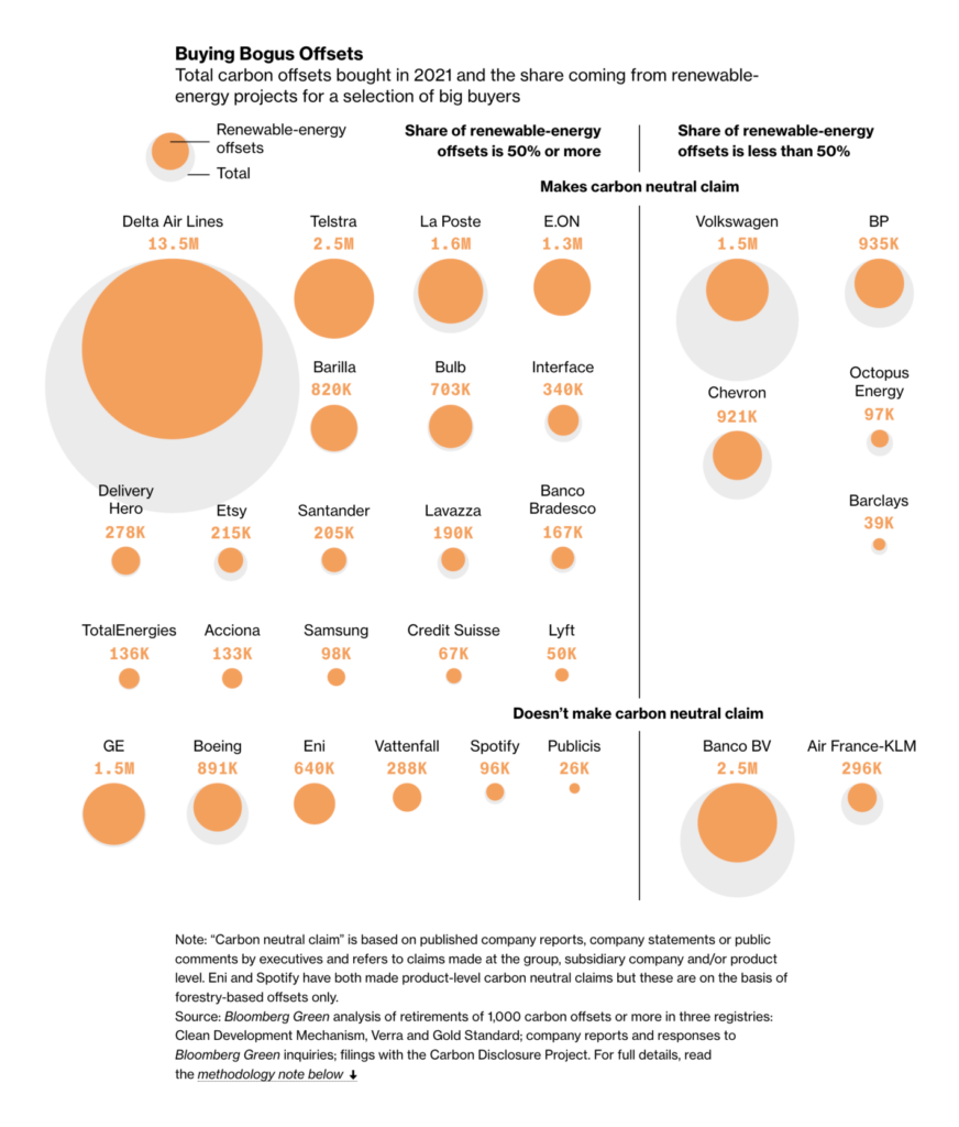
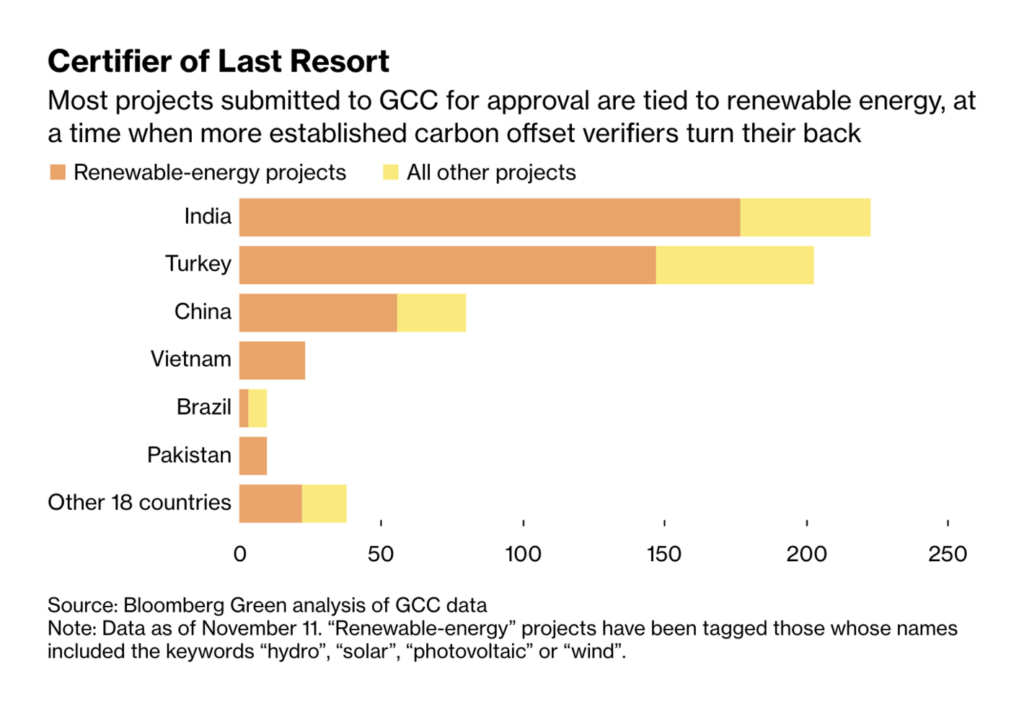
This year’s United Nations Climate Change Conference ended in Egypt last week, becoming the second-longest one to date. The attention of data journalists around the world shifted from U.S. politics back to climate. Charts covered everything from temperatures to energy and carbon offsets.
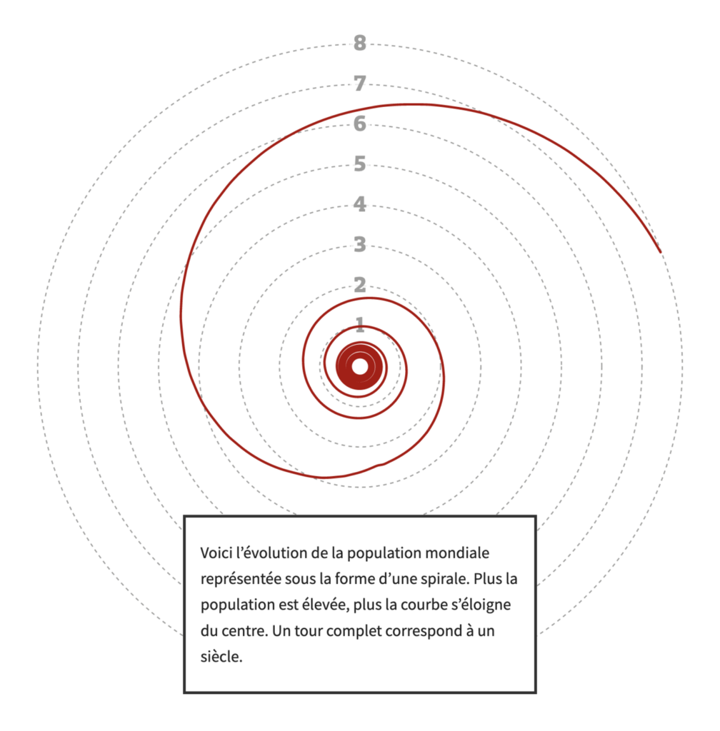
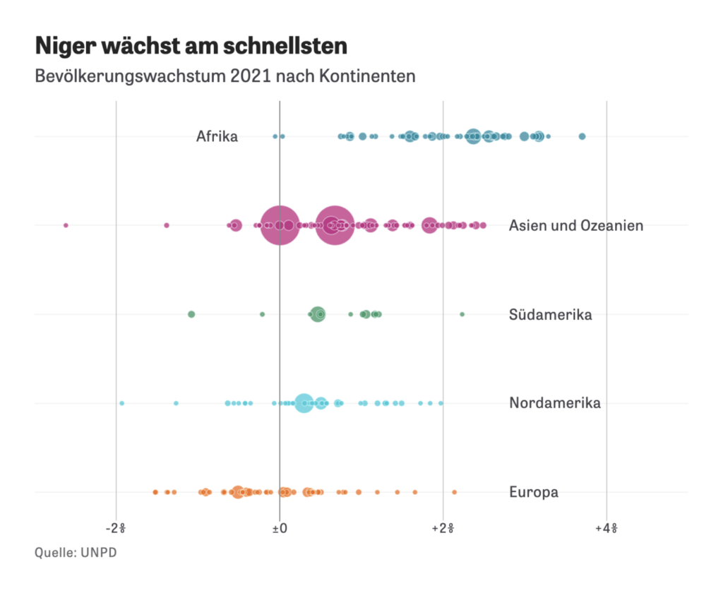
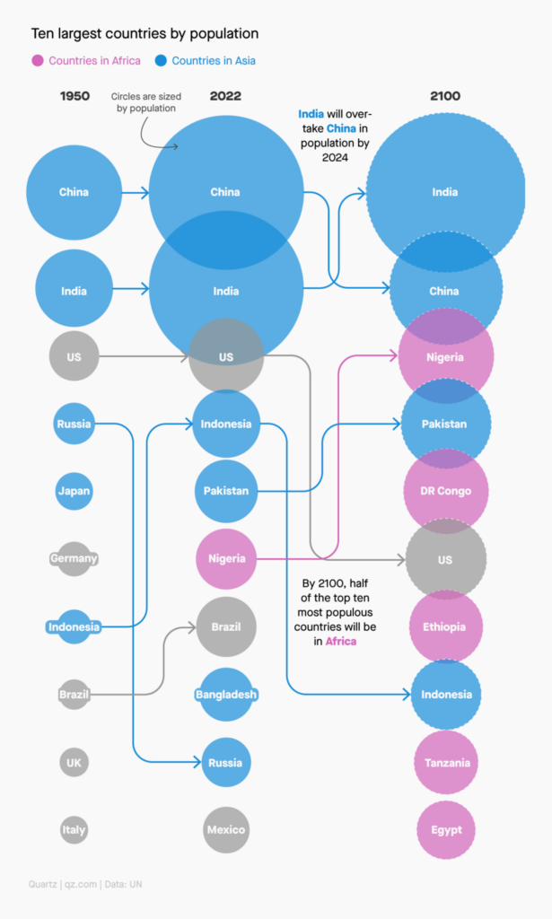
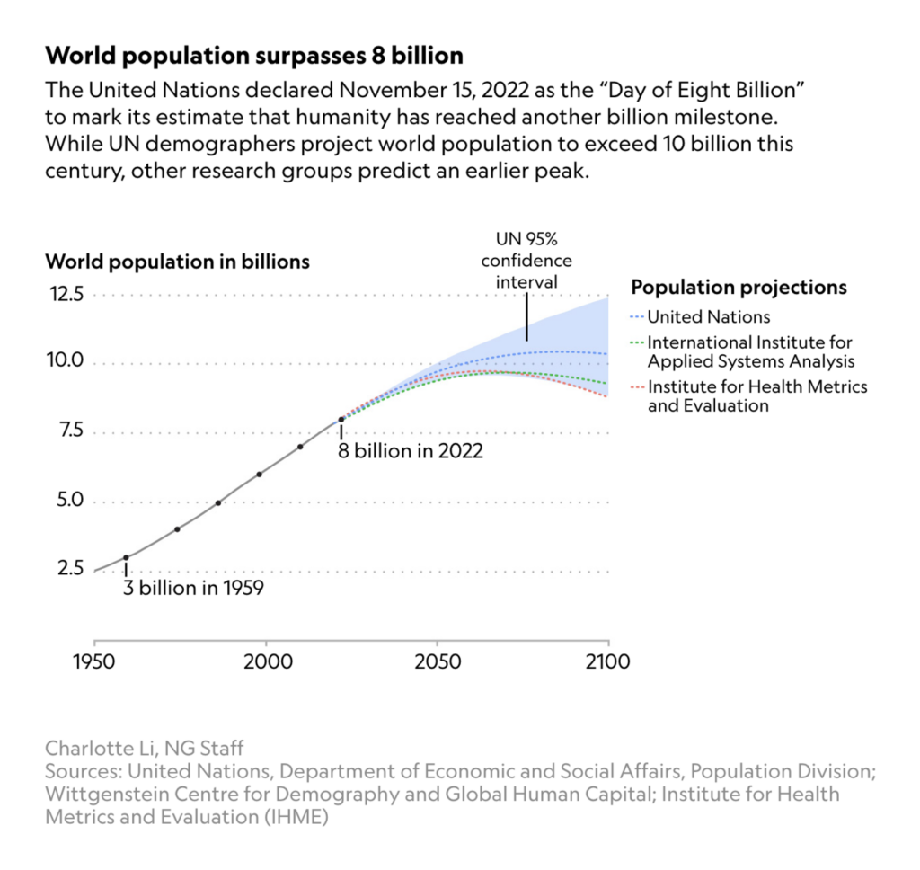
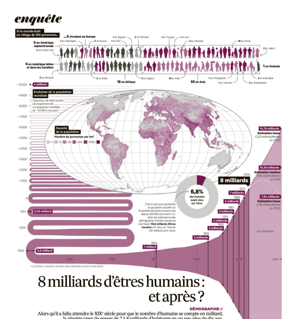
On November 15th, the world’s population passed the eight billion mark, thanks to a fourfold increase in less than 100 years. What does that look like, which countries contributed the most, and what is predicted to happen next?
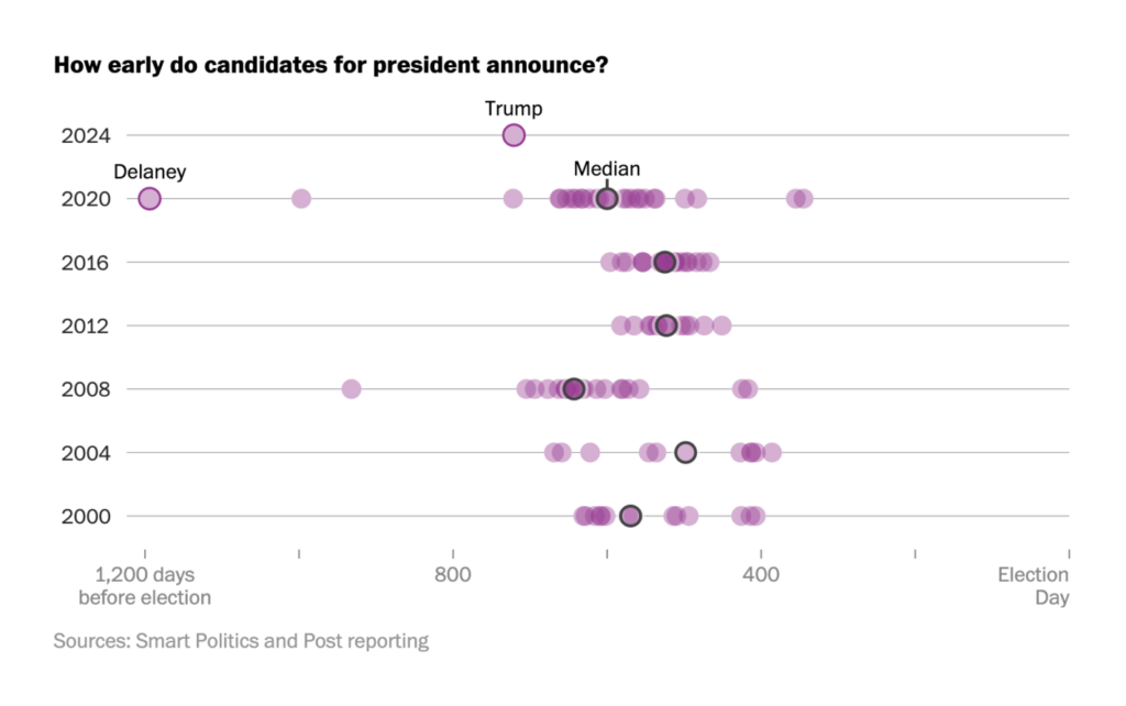
As soon as the U.S. midterm elections passed, Donald Trump announced his next run for president. The country remains politically divided over key issues.
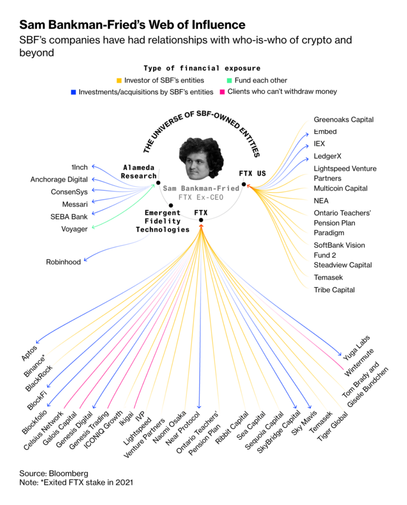
Other data visualizations of the week covered NATO’s defense spending, missiles from North Korea, evictions in Spain, and the collapse of a cryptocurrency exchange.
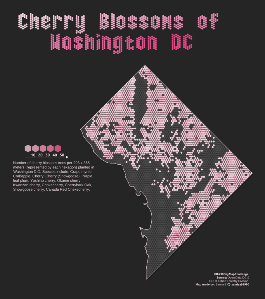
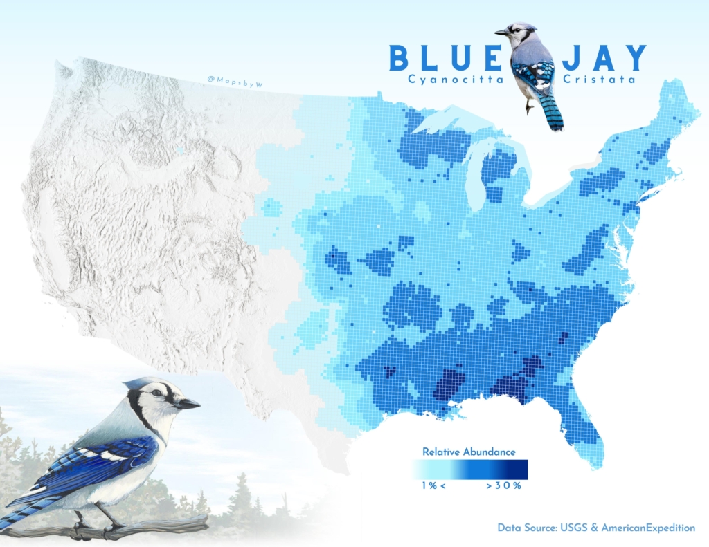
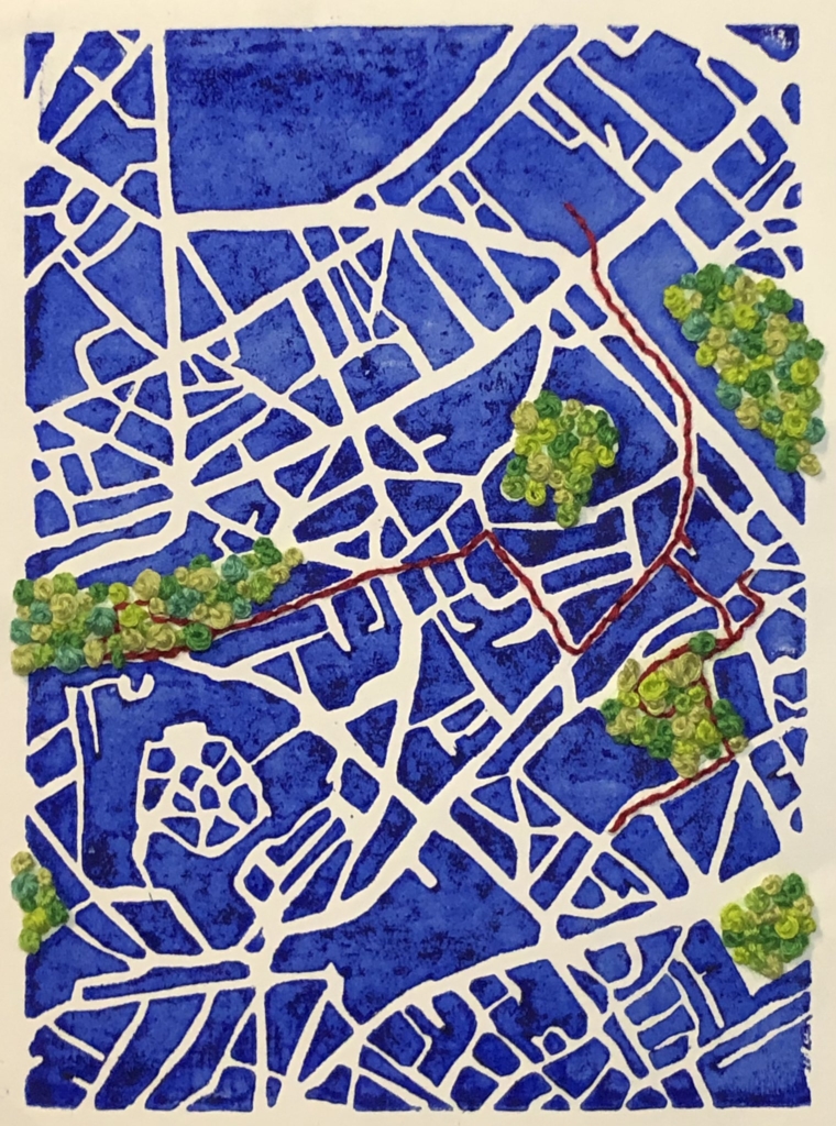
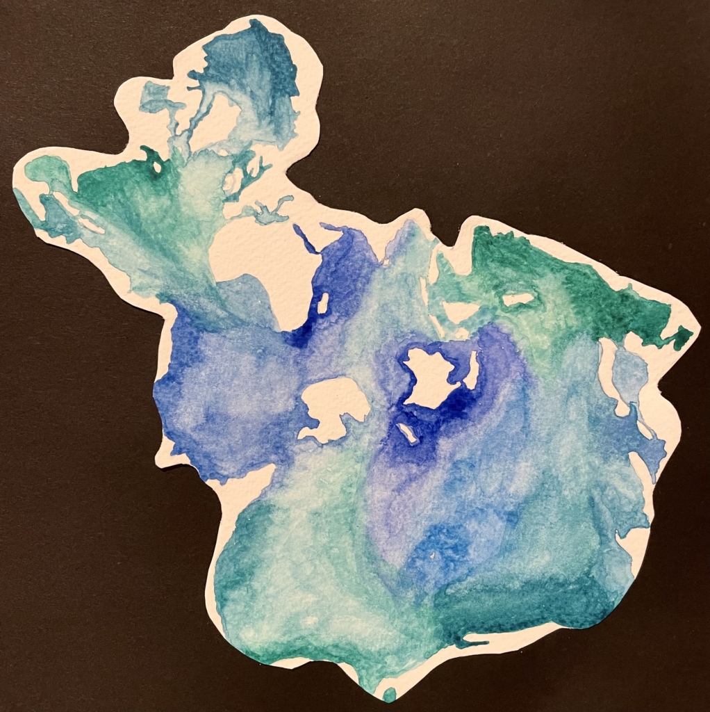
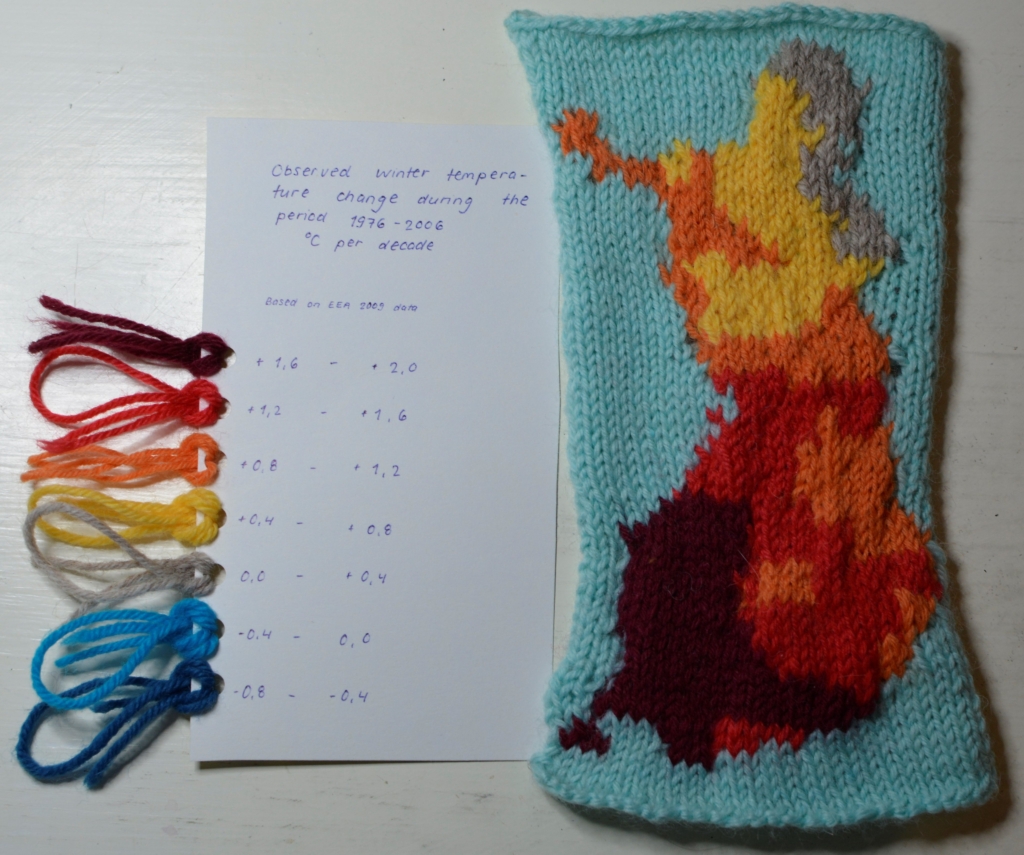
Last but not least, thethird full week of the #30DayMapChallenge brought a number of unusual maps inspired by nature and created without a computer.
Peter T Fretwell: “30DayMapChallenge day 20 Favourite: The seal tracks map is one of my favourites from the Antarctic Atlas.” November 20 (Tweet)samia: “#30DayMapChallenge Day 14: Hexagons Cherry Blossom Trees in Washington D.C. Made using #RStats DataViz #DataVisualization #maps #GIS,” November 15 (Tweet)Wanmei L: “#30daymapchallenge | Day 18: Blue #gischat,” November 18 (Tweet)Xiao Wang: “Day 18: Blue #30DayMapChallenge When map meets blue and white porcelain.” November 18 (Tweet)Abigaïl Rabinovitch: “#30DayMapChallenge – 17 Map without a computer : promenade urbaine linogravée et brodée,” November 17 (Tweet)Vanessa Tebbitt: “A map without a computer. The world’s oceans in the Spilhaus projection painted in watercolours. Day 17 #30DayMapChallenge,” November 17 (Tweet)Aalto-yliopiston geoinformatiikka: “#30DayMapChallenge 2022 day 17, A map without a computer: If the winter #temperatures keep rising the same rate, maybe in soon we won’t be needing any #woollen socks and everybody takes up #knitting #maps instead. Map art by @sinisalko @AaltoUniversity @AaltoENG,” November 17 (Tweet)
Help us make this dispatch better! We’d love to hear which newsletters, blogs, or social media accounts we need to follow to learn about interesting projects, especially from less-covered parts of the world (Asia, South America, Africa). Write us at hello@datawrapper.de or leave a comment below.
(she/her, @v_halamkova) was a data vis writer in the Communications team between 2022 and 2023. She lives in Berlin and created and wrote beautiful data visualizations. Before Datawrapper, she worked in the data team at Tortoise Media.


Comments