Data Vis Dispatch, November 22

The best of last week’s big and small data visualizations

Welcome back to the 69th edition of Data Vis Dispatch! Every week, we’ll be publishing a collection of the best small and large data visualizations we find, especially from news organizations — to celebrate data journalism, data visualization, simple charts, elaborate maps, and their creators.

Recurring topics this week include the end of COP27, the start of the FIFA World Cup, and the crossing of the eight billion population mark.

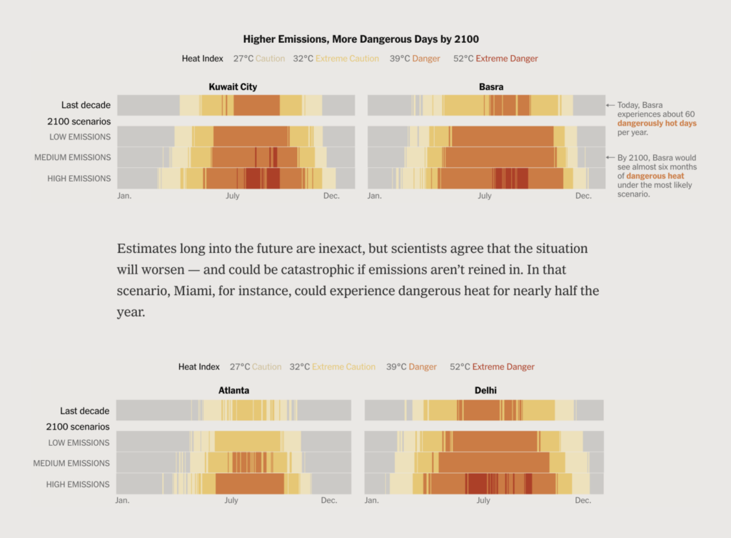
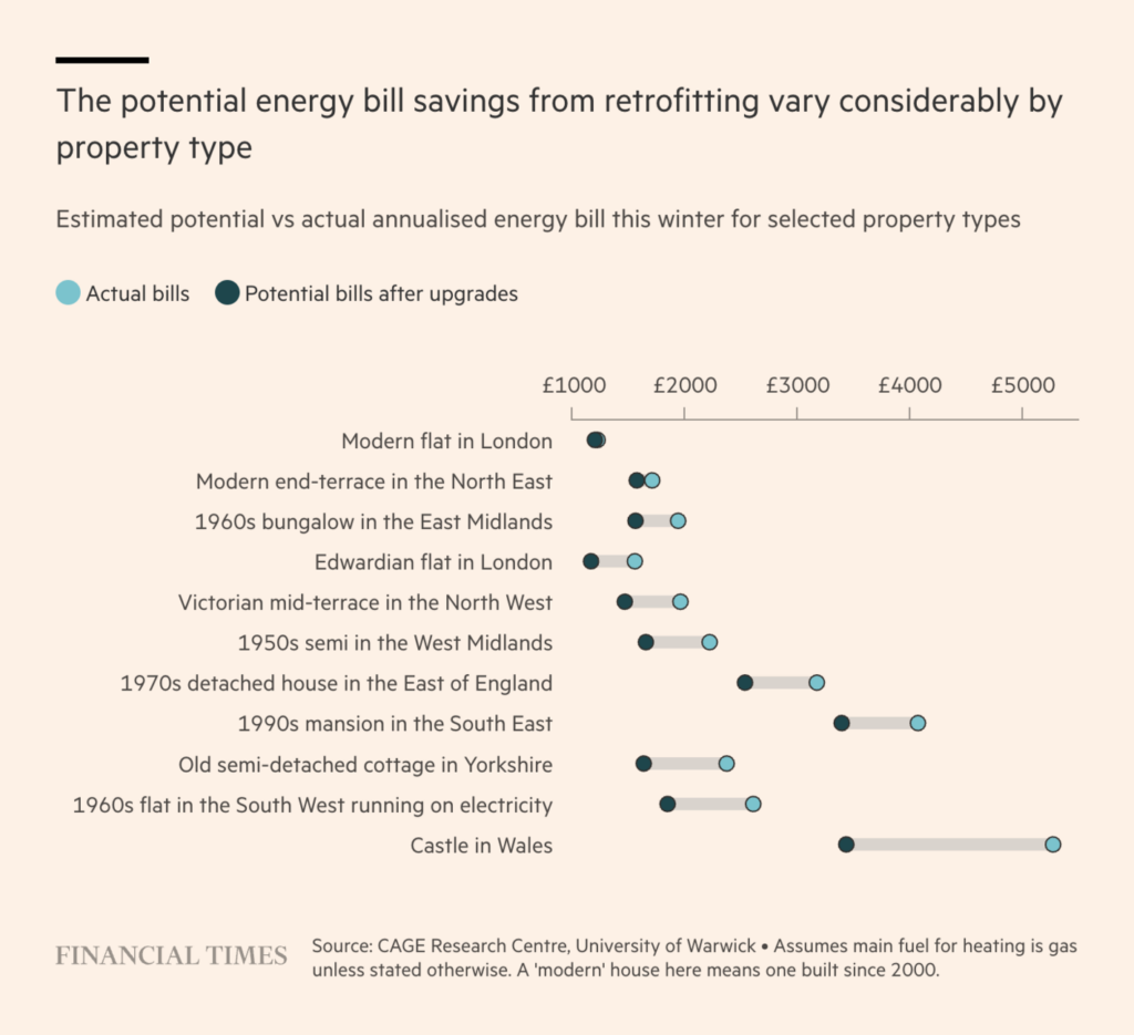
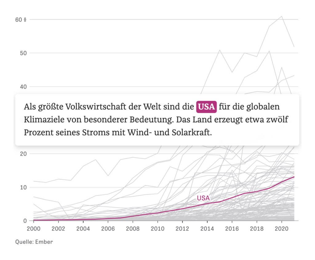
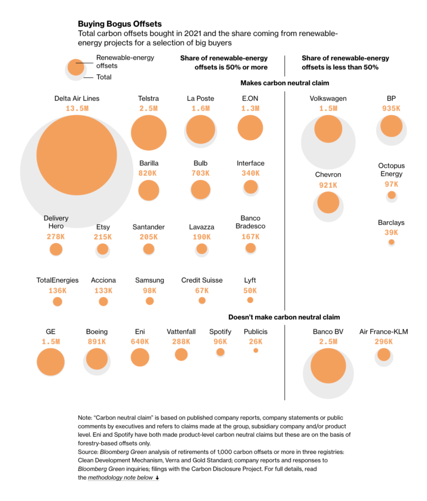
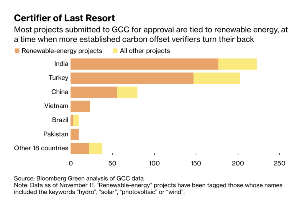
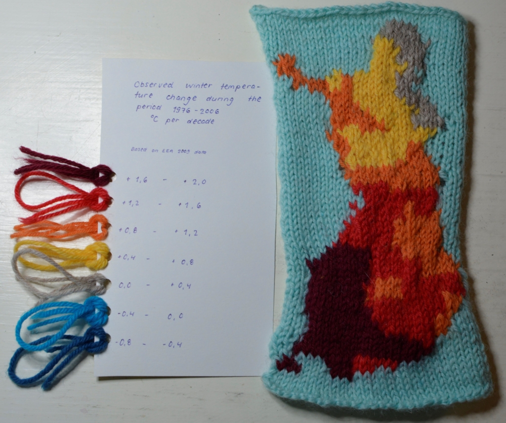
This year’s United Nations Climate Change Conference ended in Egypt last week, becoming the second-longest one to date. The attention of data journalists around the world shifted from U.S. politics back to climate. Charts covered everything from temperatures to energy and carbon offsets.

RTS: Comment le climat a changé depuis votre naissance, November 17
The New York Times: Extreme Heat Will Change Us, November 18
Süddeutsche Zeitung: „Klimahölle” oder „Wir schaffen das”?, November 18
Süddeutsche Zeitung: Was ein milder Winter für den Gasverbrauch bedeuten würde, November 15
The Financial Times: How UK households could save £10bn a year by making homes more energy efficient, November 16
ZEIT ONLINE: Die Erneuerbaren starten durch, November 20
Bloomberg: Junk Carbon Offsets Are What Make These Big Companies ‘Carbon Neutral’, November 21
Bloomberg: How the 2022 World Cup Rebuilt a Market for Dodgy Carbon Credits, November 17

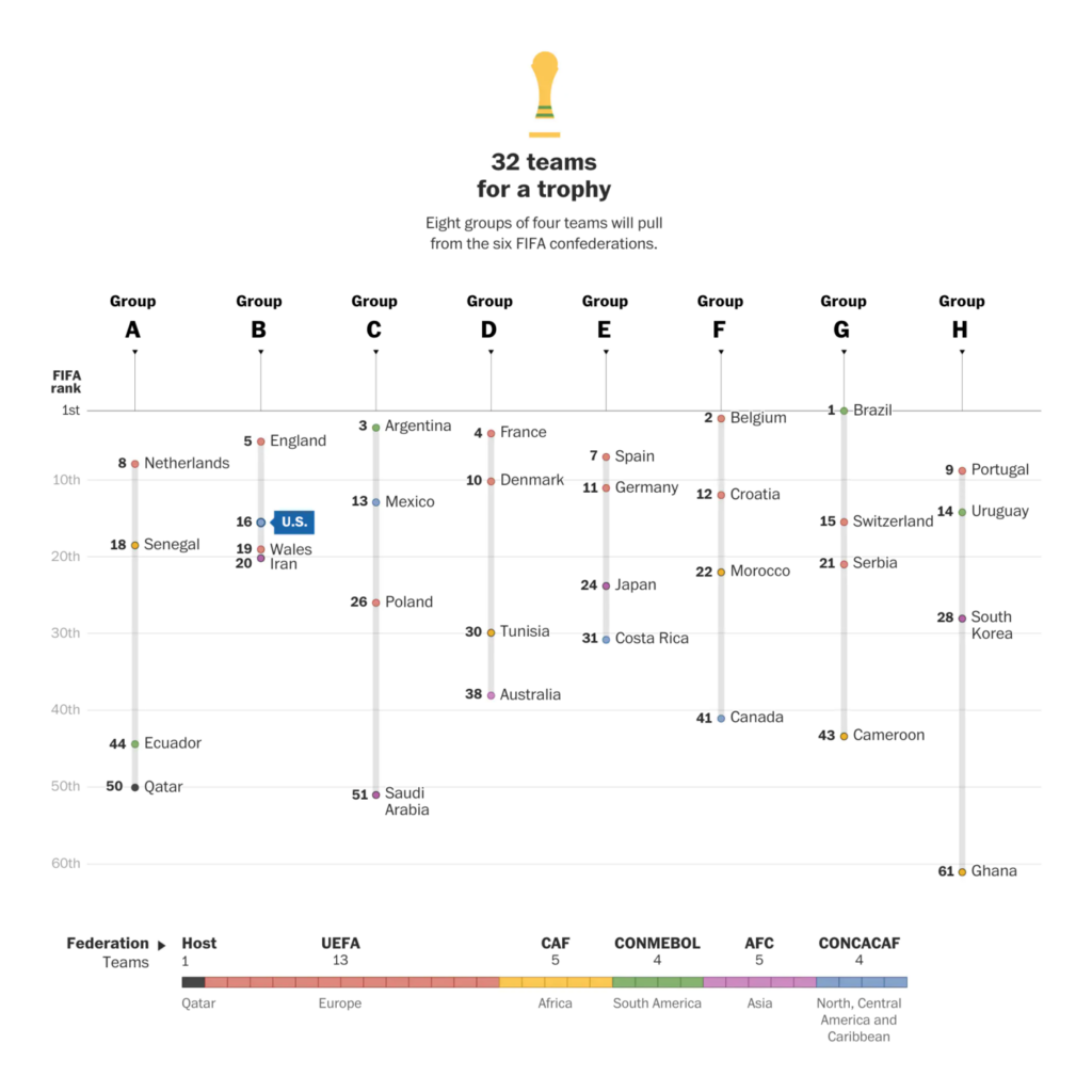
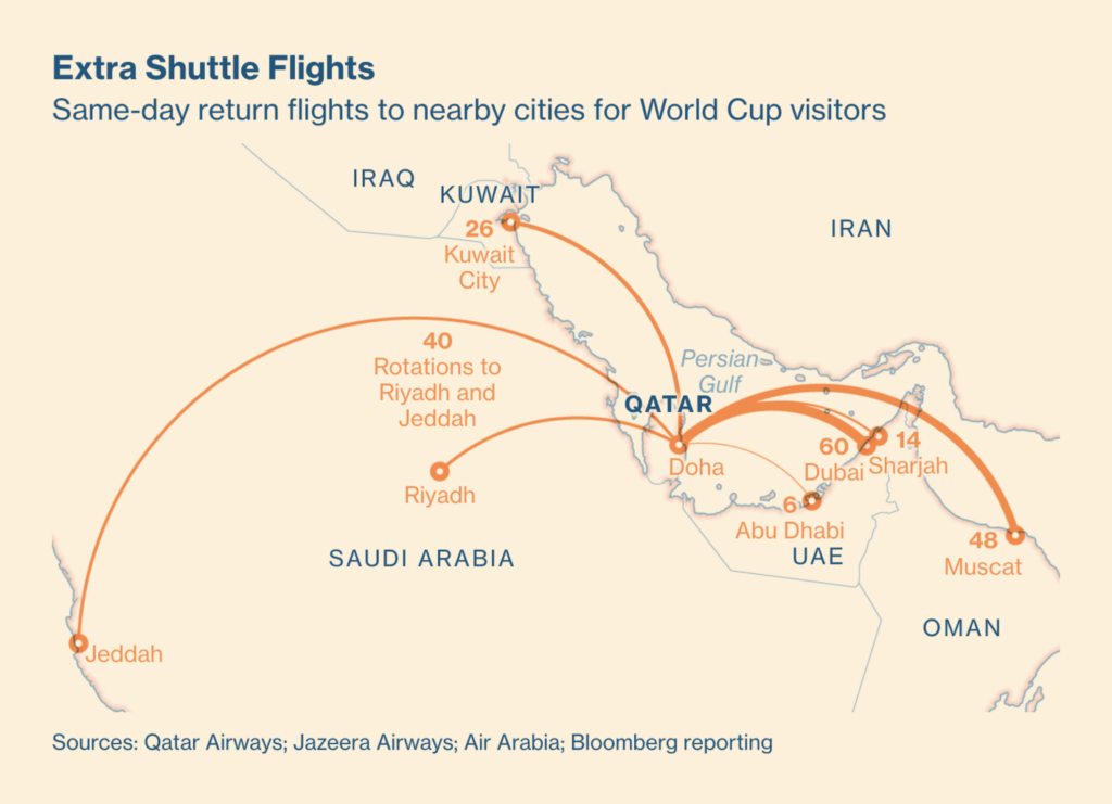
The beginning of the FIFA World Cup in Qatar sparked a lot of excitement and controversy. Newsrooms charted both sides: the sports and the costs.

Al Jazeera: World Cup Qatar 2022, November 20
The Washington Post: World Cup schedule, groups and brackets, November 16
The Economist: Is the World Cup a giant waste of money?, November 18
Bloomberg: What Qatar Built for the Most Expensive World Cup Ever, November 18

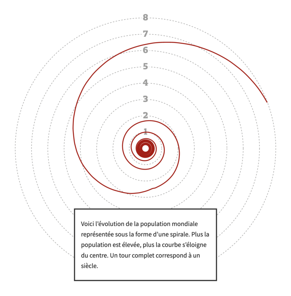
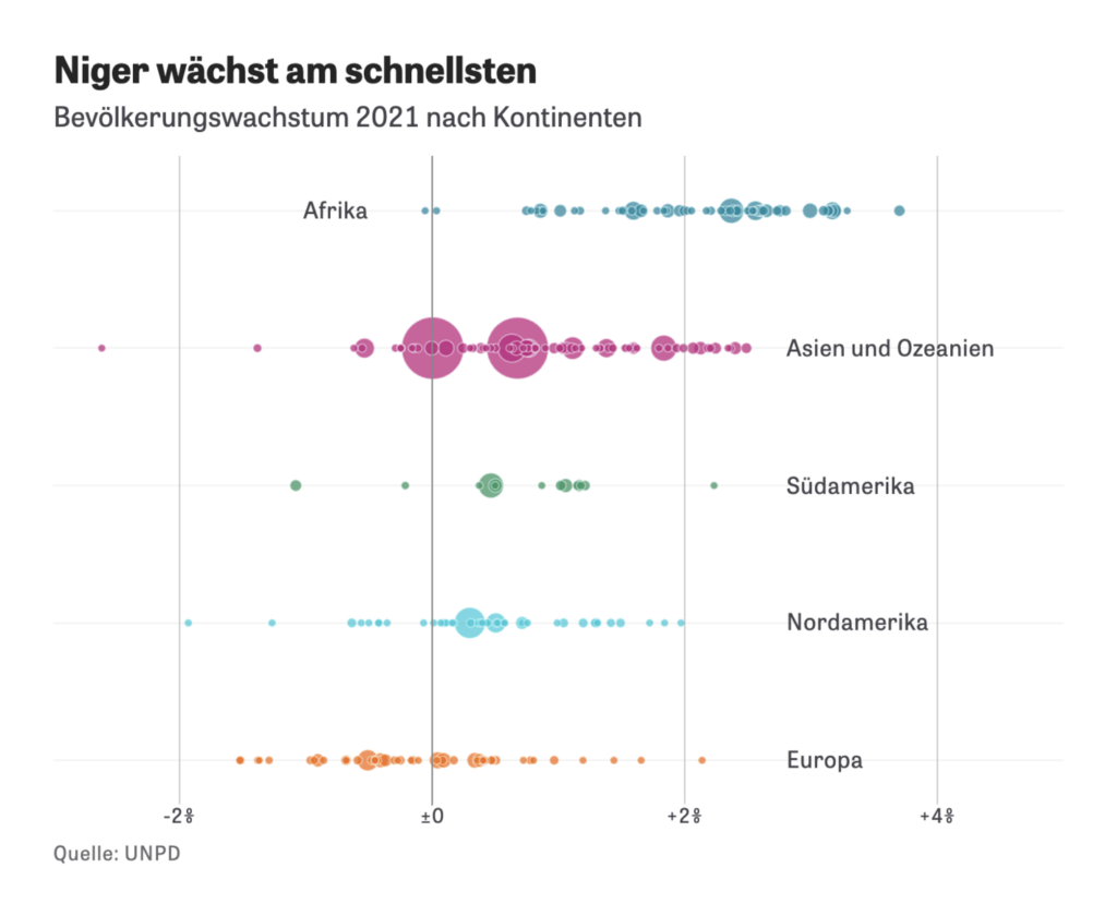
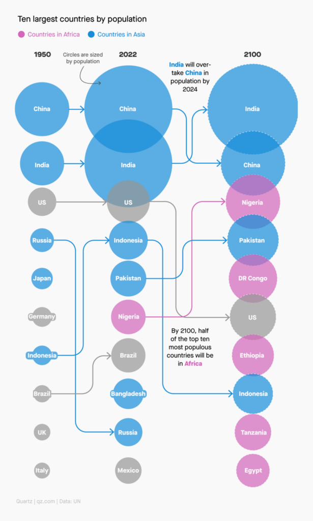
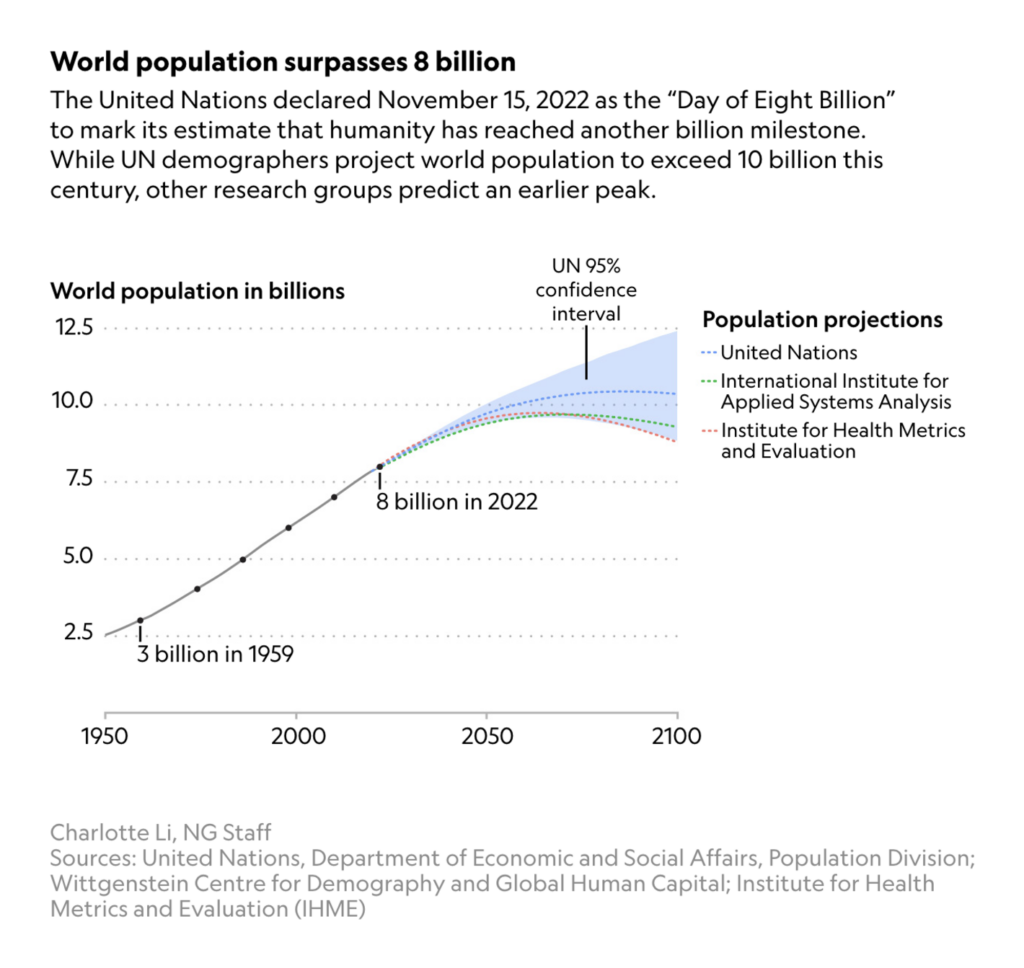
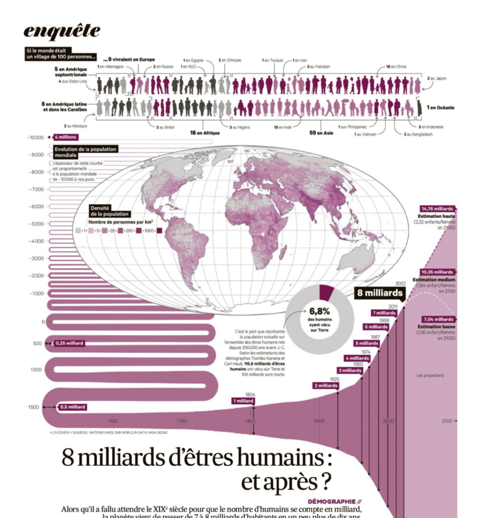
On November 15th, the world’s population passed the eight billion mark, thanks to a fourfold increase in less than 100 years. What does that look like, which countries contributed the most, and what is predicted to happen next?

Les Echos: La planète héberge 8 milliards d’êtres humains, November 15
ZEIT ONLINE: Bei zehn Milliarden ist wohl Schluss, November 15
Quartz: The world’s population just hit 8 billion⁠—and that’s okay, November 15
National Geographic: Earth now has 8 billion people—and counting. Where do we go from here?, November 14
Jules Grandin: “🌍🎱🌏 Aujourd’hui, la planète dépasse le cap symbolique des 8 milliards d’habitants Pour l’occasion, une pleine page en carte et en graphique, avec une superbe courbe boustrophédon, par @CamilleBeurton à voir et à lire dans @LesEchos du jour ⬇️,” November 15 (Tweet)
The Financial Times: World population reaches 8bn as it grows older, November 15
The Washington Post: You’re one in 8 billion, November 15

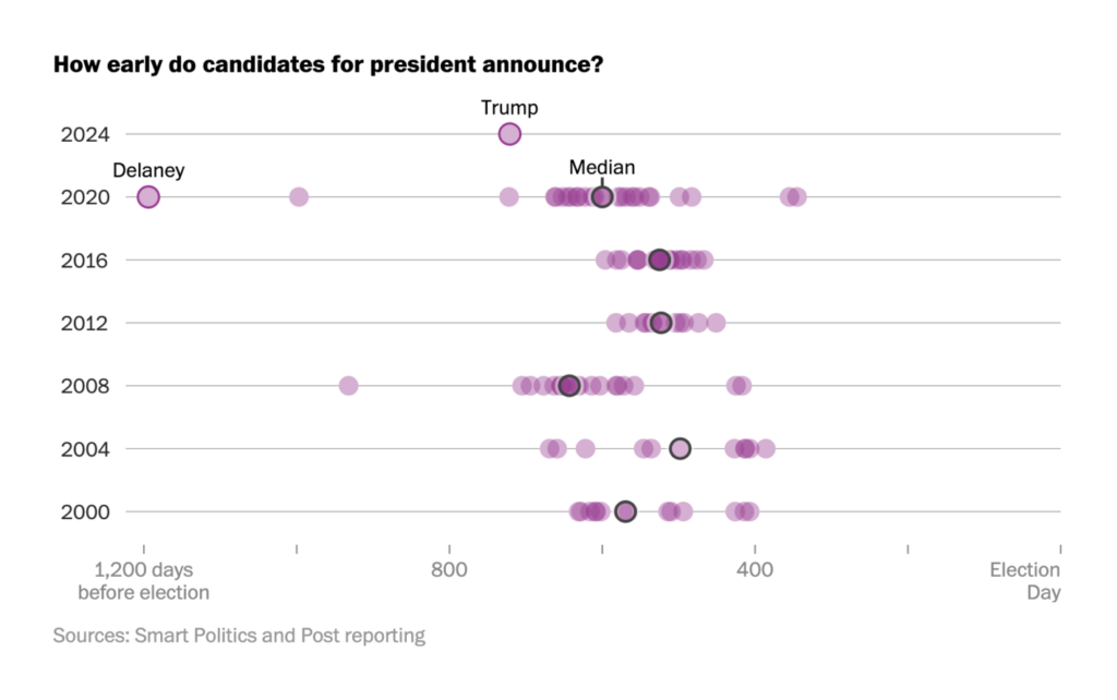
As soon as the U.S. midterm elections passed, Donald Trump announced his next run for president. The country remains politically divided over key issues.

The Washington Post: When do presidential candidates announce? Trump’s 2024 bid comes early, November 17
Los Angeles Times: Find out how your neighborhood voted for Los Angeles County sheriff, November 15
The Washington Post: There have been more than 600 mass shootings so far in 2022, November 20

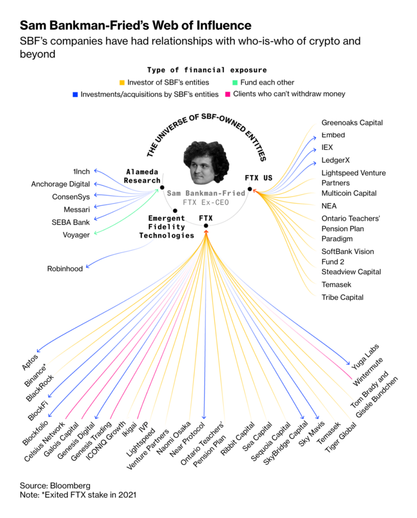
Other data visualizations of the week covered NATO’s defense spending, missiles from North Korea, evictions in Spain, and the collapse of a cryptocurrency exchange.

Reuters: Dark Arctic, November 16
elDiario: De las hipotecas abusivas al aumento del precio del alquiler: así han cambiado los desahucios en una década, November 20
Bloomberg: FTX’s New Boss Reveals Chaos Left Behind by Bankman-Fried, November 17

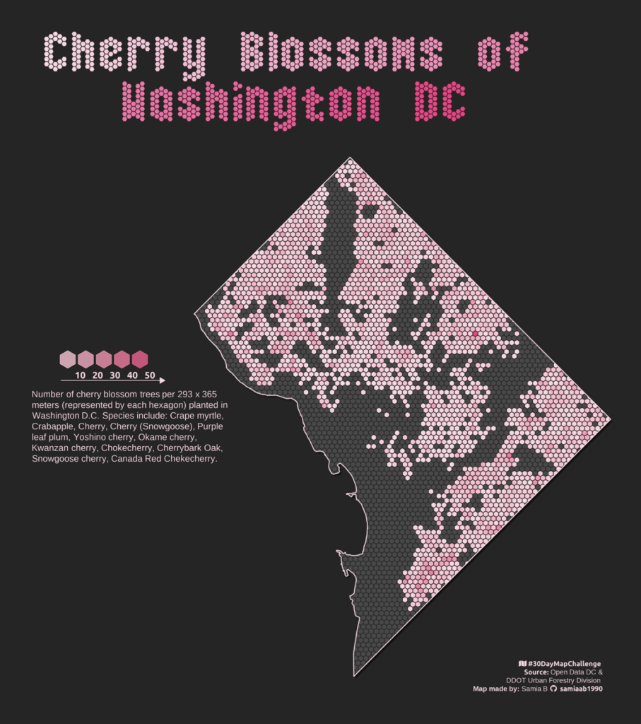
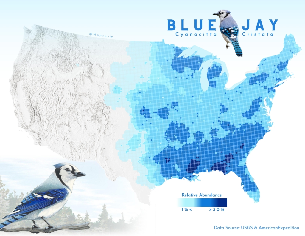
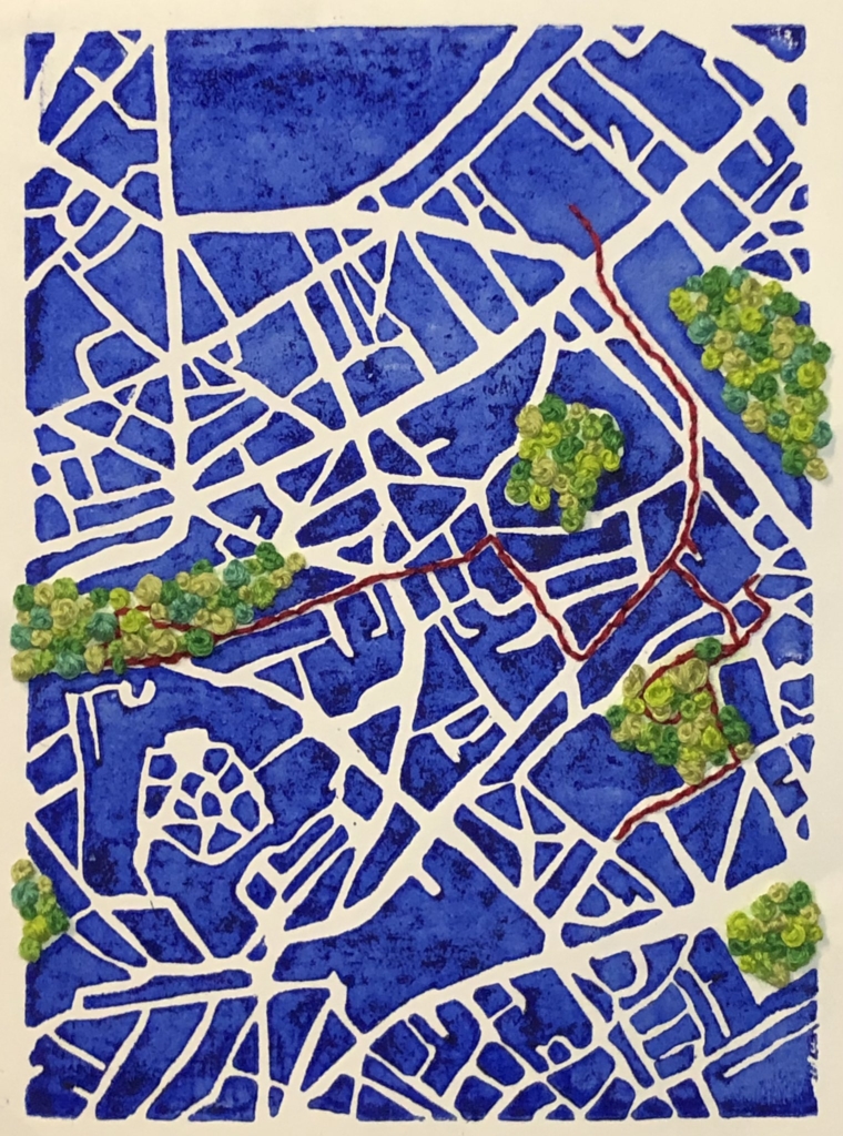
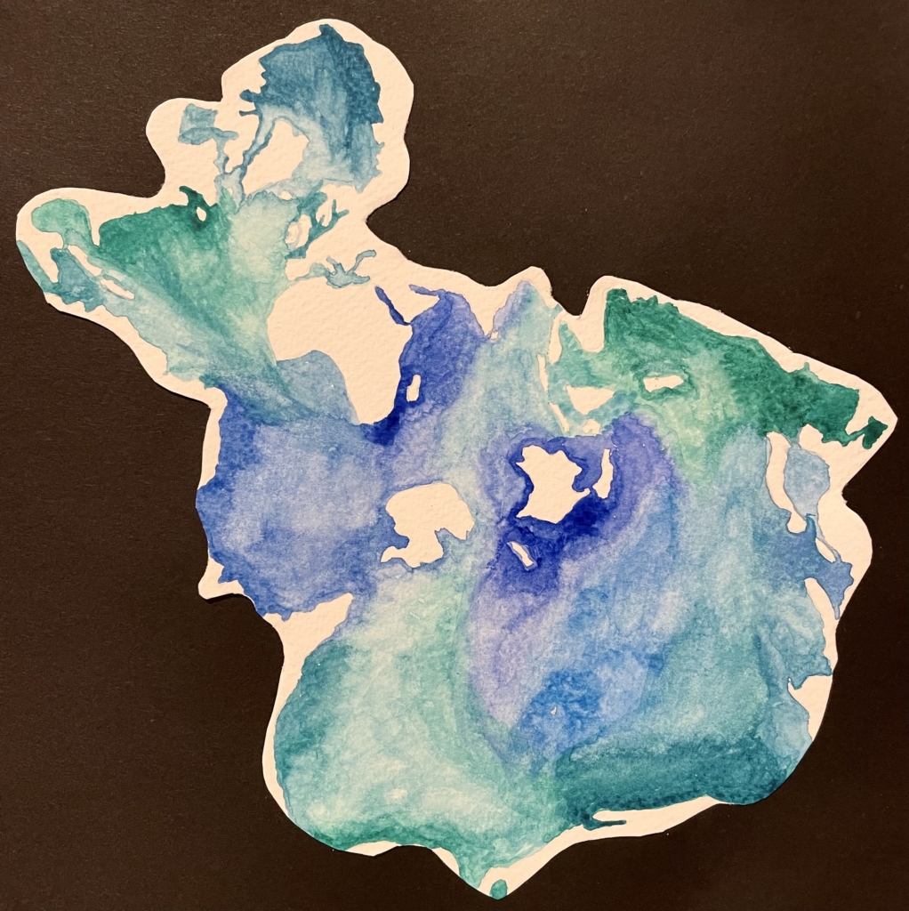
Last but not least, the third full week of the #30DayMapChallenge brought a number of unusual maps inspired by nature and created without a computer.

Peter T Fretwell: “30DayMapChallenge day 20 Favourite: The seal tracks map is one of my favourites from the Antarctic Atlas.” November 20 (Tweet)
samia: “#30DayMapChallenge Day 14: Hexagons Cherry Blossom Trees in Washington D.C. Made using #RStats DataViz #DataVisualization #maps #GIS,” November 15 (Tweet)
Wanmei L: “#30daymapchallenge | Day 18: Blue #gischat,” November 18 (Tweet)
Xiao Wang: “Day 18: Blue #30DayMapChallenge When map meets blue and white porcelain.” November 18 (Tweet)
Abigaïl Rabinovitch: “#30DayMapChallenge – 17 Map without a computer : promenade urbaine linogravée et brodée,” November 17 (Tweet)
Vanessa Tebbitt: “A map without a computer. The world’s oceans in the Spilhaus projection painted in watercolours. Day 17 #30DayMapChallenge,” November 17 (Tweet)
Aalto-yliopiston geoinformatiikka: “#30DayMapChallenge 2022 day 17, A map without a computer: If the winter #temperatures keep rising the same rate, maybe in soon we won’t be needing any #woollen socks and everybody takes up #knitting #maps instead. Map art by @sinisalko @AaltoUniversity @AaltoENG,” November 17 (Tweet)

What else we found interesting

South China Morning Post: Remembering Bruce Lee, Kung Fu legend and movie star, November 18
The New York Times: How Ukraine Blew Up a Key Russian Bridge, November 17
Straits Times: Going beyond the label: Is your eco-friendly shirt really green?, November 17
Reuters: Back to the Moon, November 16

Applications are open for…


Help us make this dispatch better! We’d love to hear which newsletters, blogs, or social media accounts we need to follow to learn about interesting projects, especially from less-covered parts of the world (Asia, South America, Africa). Write us at hello@datawrapper.de or leave a comment below.

Want the Dispatch in your inbox every Tuesday? Sign up for our Blog Update newsletter!

Comments