We want to enable everyone to create beautiful charts, maps, and tables. New to data visualization? Or do you have specific questions about us? You'll find all the answers here.
The best of last week’s big and small data visualizations
Vivien Serve
Welcome back to the 120th edition of Data Vis Dispatch! Every week, we’ll be publishing a collection of the best small and large data visualizations we find, especially from news organizations — to celebrate data journalism, data visualization, simple charts, elaborate maps, and their creators.
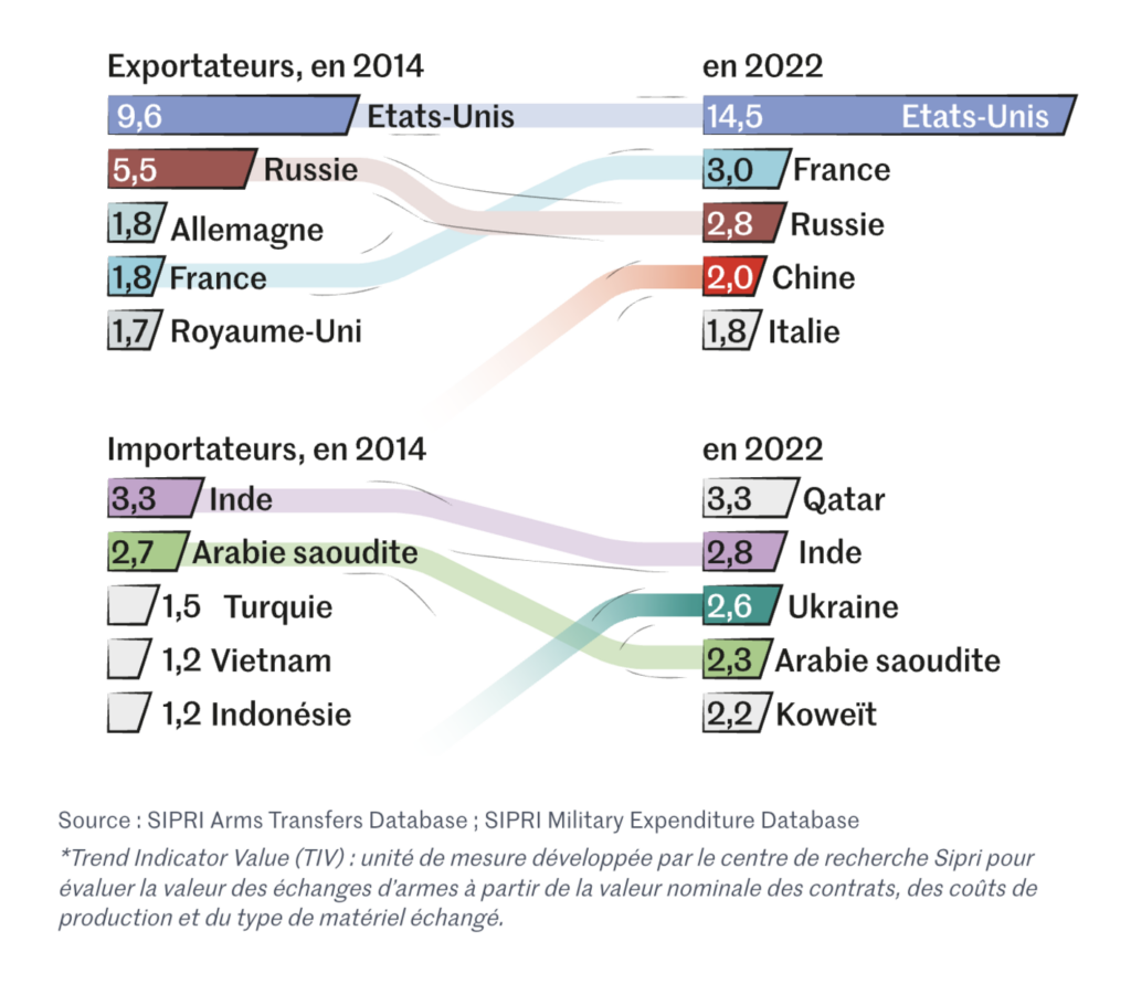
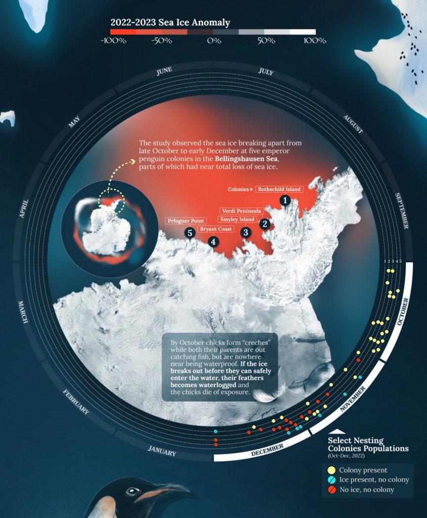
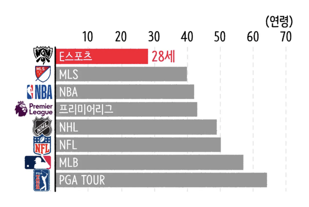
Recurring topics this week include animals in climate change, weapons, and sports.
It’s the last week of November. This means we have the pleasure of presenting our favorites from the #30DayMapChallenge for the last time:
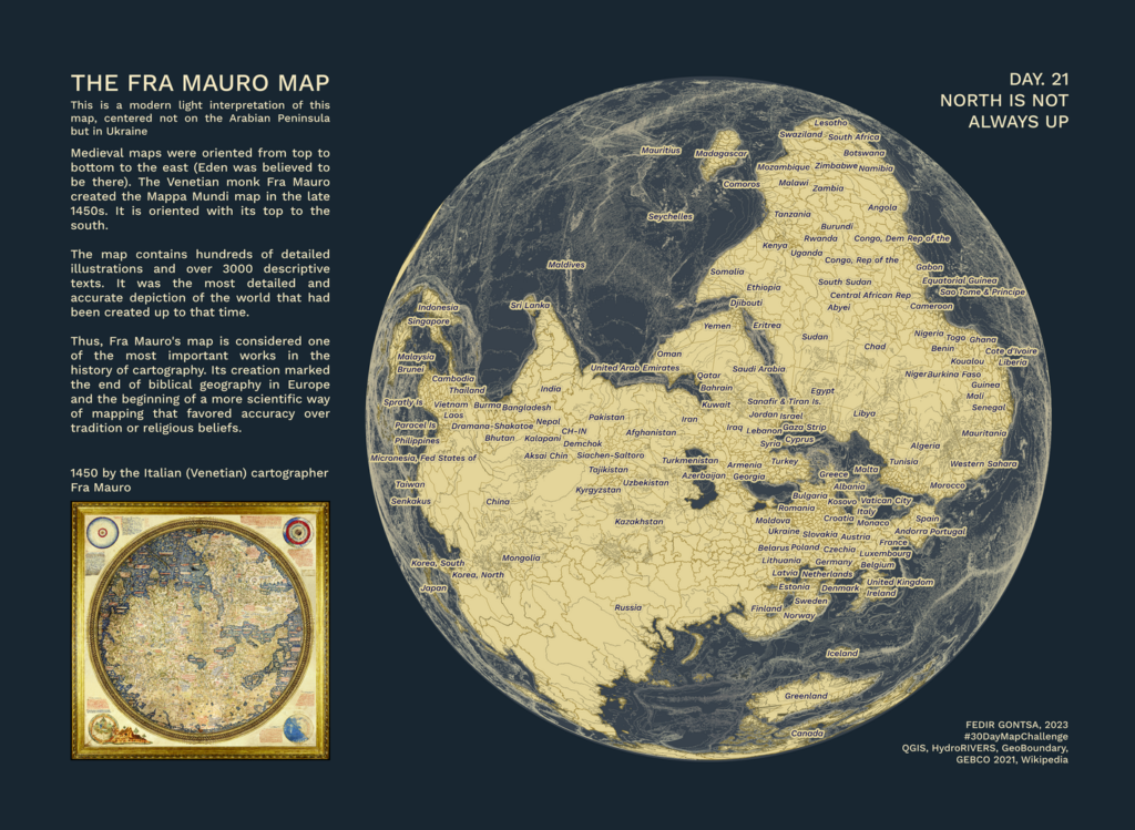
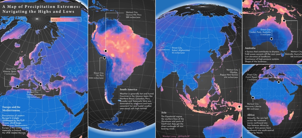
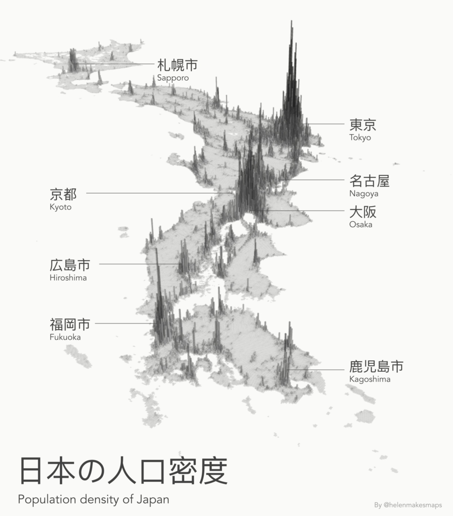
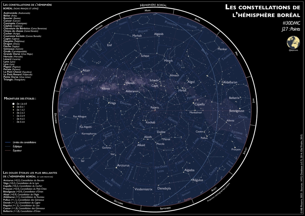
Gontsa: “Day 22: North is not always up. #30DayMapChallenge The Fra Mauro map. This is a modern light interpretation of this map, centered not on the Arabian Peninsula but in Ukraine,” November 23 (Mastodon)Wanmei Liang: “#30daymapchallenge | Day 21: Raster This gem has been sitting in my completed folder since February 2023, thought today would be the perfect day to share it with the world!,” November 21 (Tweet)Helen McKenzie: “Population density map of Japan. Created for day 24 of the #30daymapchallenge (final week!!), theme: black & white,” November 24 (Tweet)Ryan Peek: “#30DayMapChallenge has been really fun and I’m enjoying seeing all the great maps and visualizations folks are making. I’m surprised I’ve made it this far, but trying to catch up where I can! This is Day 24: Black and White. A combo of urban areas data from {tigris} and Black Marble data. Light pollution can have a big impact on migratory animals, as well as general movement through a landscape,” (Mastodon)Gaëlle Sutton: “#30DayMapChallenge Day 25: Antarctica Lieux de passages, humains et non-humains, à partir des données de Qantarctica du @NorskPolar,” November 25 (Tweet)Petra Ďuriančíková: “#30DayMapChallenge Day 26: Minimal Mount Taranaki, New Zealand as contours. Made with QGIS and Photoshop, DEM from @LINZLDS,” November 26 (Tweet)AB Pictoris: “Pour le jour 27 du #30DayMapChallenge, on a des étoiles dans les yeux Constellations du ciel boréal Sources : HYG Database, Olaf Frohn (Celestial data dispo sur Github) Réalisée avec QGIS et Illustrator,” November 27 (Tweet)
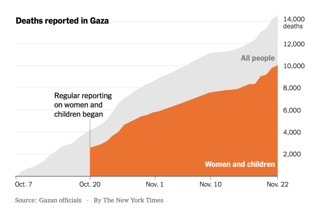
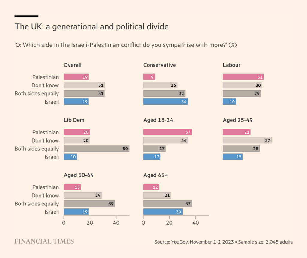
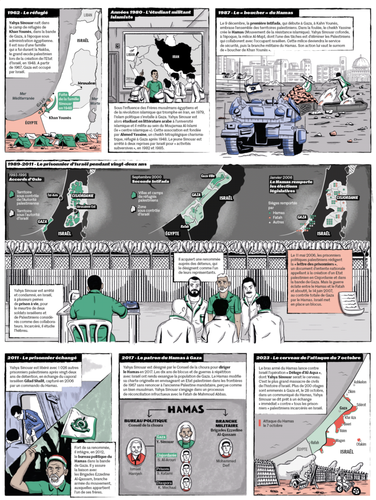
The cease-fire between Israel and Hamas continues, but the war is not over yet. We found three animated stories about Israeli military strategy, the situation in Gaza, and fake war news on X/Twitter:
In the area of climate visualizations, we found two that specifically address animals and biodiversity:
Rodolfo Almeida: “After two months of stress, it’s out! Macromicroscope is a videoinstallation addressing biodiversity through the metaphor of petri dishes. It’s my final Master’s project and I’m so proud of it,” November 23 (Tweet, Project)Planet Anomaly: The Collapse of Penguin Colonies in Antarctica, November 26
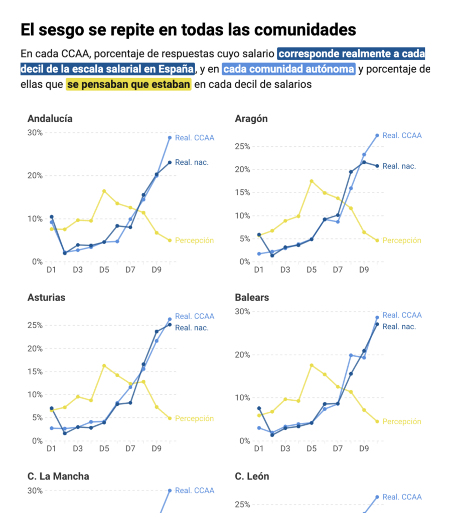
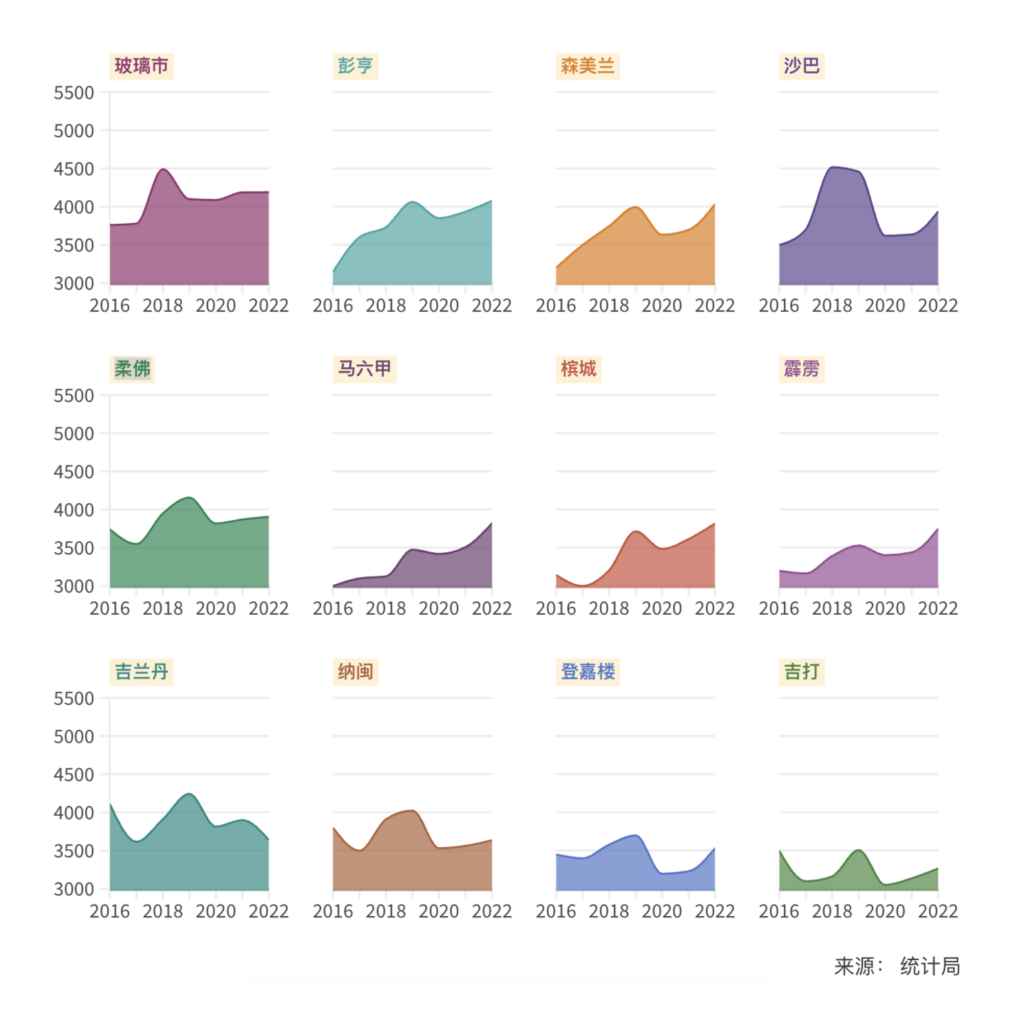
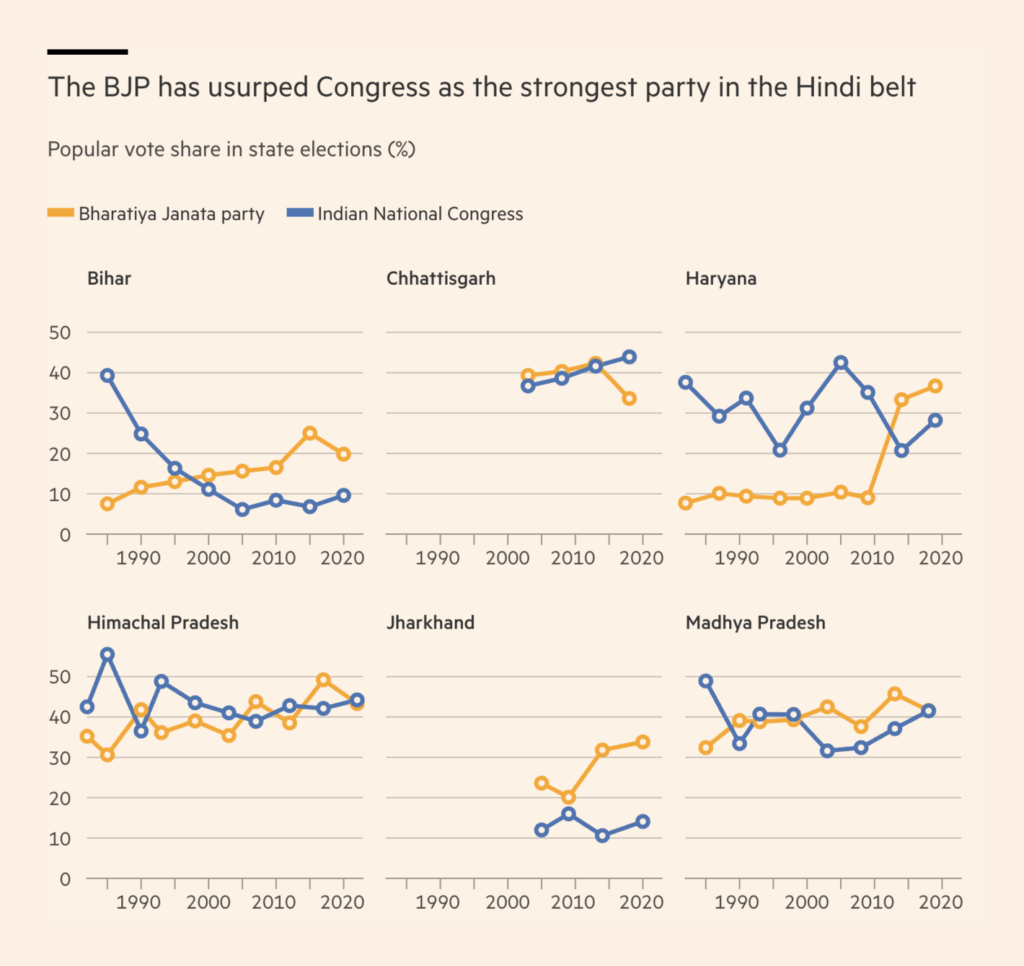
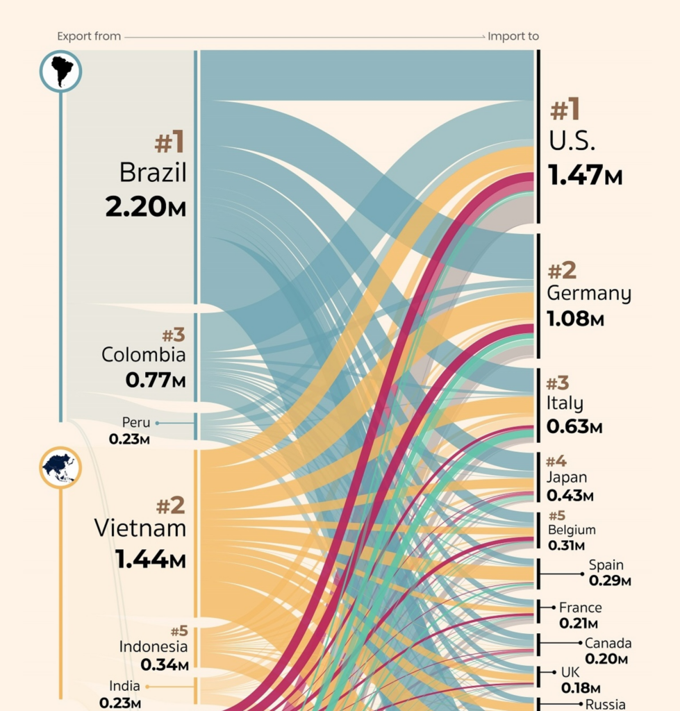
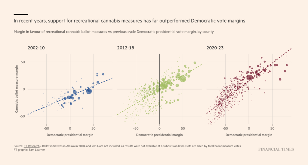
From the energies we use to the districts we live in. Several small multiples this week compared situations in different districts, from aging in the Bay Area, to salaries in Spanish communities or Malaysian states, to political trends in India:
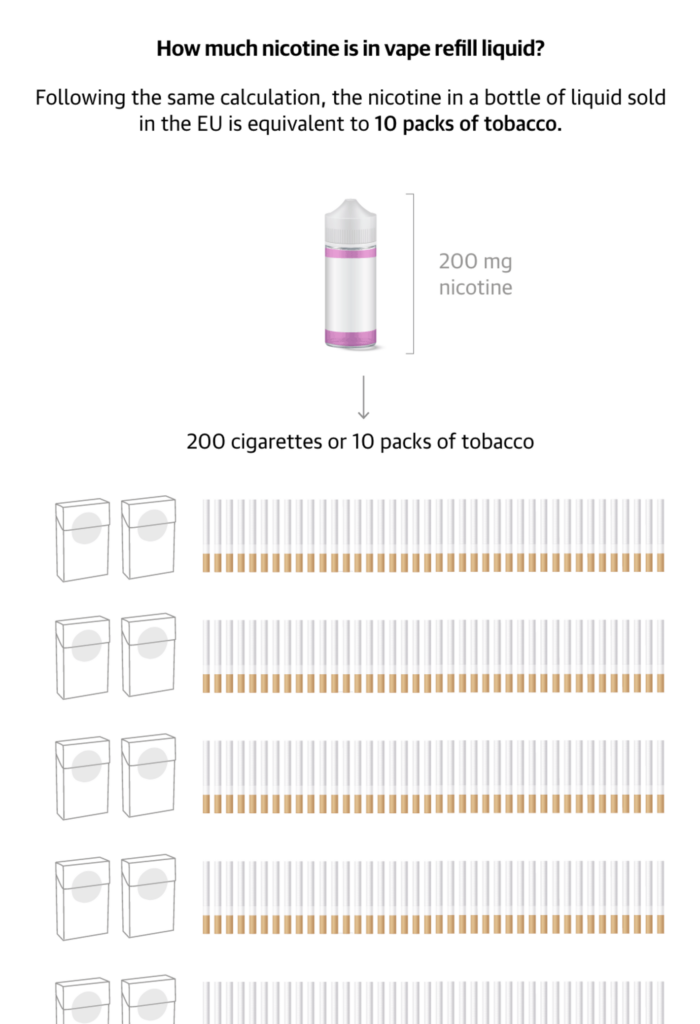
Do you also feel like everyone is getting sick these days? (Or is it just our office?) This week’s health visualizations show that the flu is on the rise in Germany, and how unhealthy vaping really is:
The days are getting cold and the stores full; wintertime means big holidays. Two charts show the rise in travel at Thanksgiving and the increase in spending at Christmas:
Help us make this dispatch better! We’d love to hear which newsletters, blogs, or social media accounts we need to follow to learn about interesting projects, especially from less-covered parts of the world (Asia, South America, Africa). Write us at hello@datawrapper.de or leave a comment below.
(she/her) is a working student on Datawrapper’s Communications team. She creates the Data Vis Dispatch to keep data visualization enthusiasts up to date on exciting new projects. When she’s not working, she studies interface design, and when she’s not studying, she’s planning a festival stage or soldering light installations. Vivien lives in Potsdam.


Comments