We want to enable everyone to create beautiful charts, maps, and tables. New to data visualization? Or do you have specific questions about us? You'll find all the answers here.
The best of last week’s big and small data visualizations
Vivien Serve
Welcome back to the 117th edition of Data Vis Dispatch! Every week, we’ll be publishing a collection of the best small and large data visualizations we find, especially from news organizations — to celebrate data journalism, data visualization, simple charts, elaborate maps, and their creators.
Recurring topics this week include dots, bars, and the start of the #30DayMapChallenge!
The #30DayMapChallenge started on November 1! Here are a few maps that particularly caught our eye:
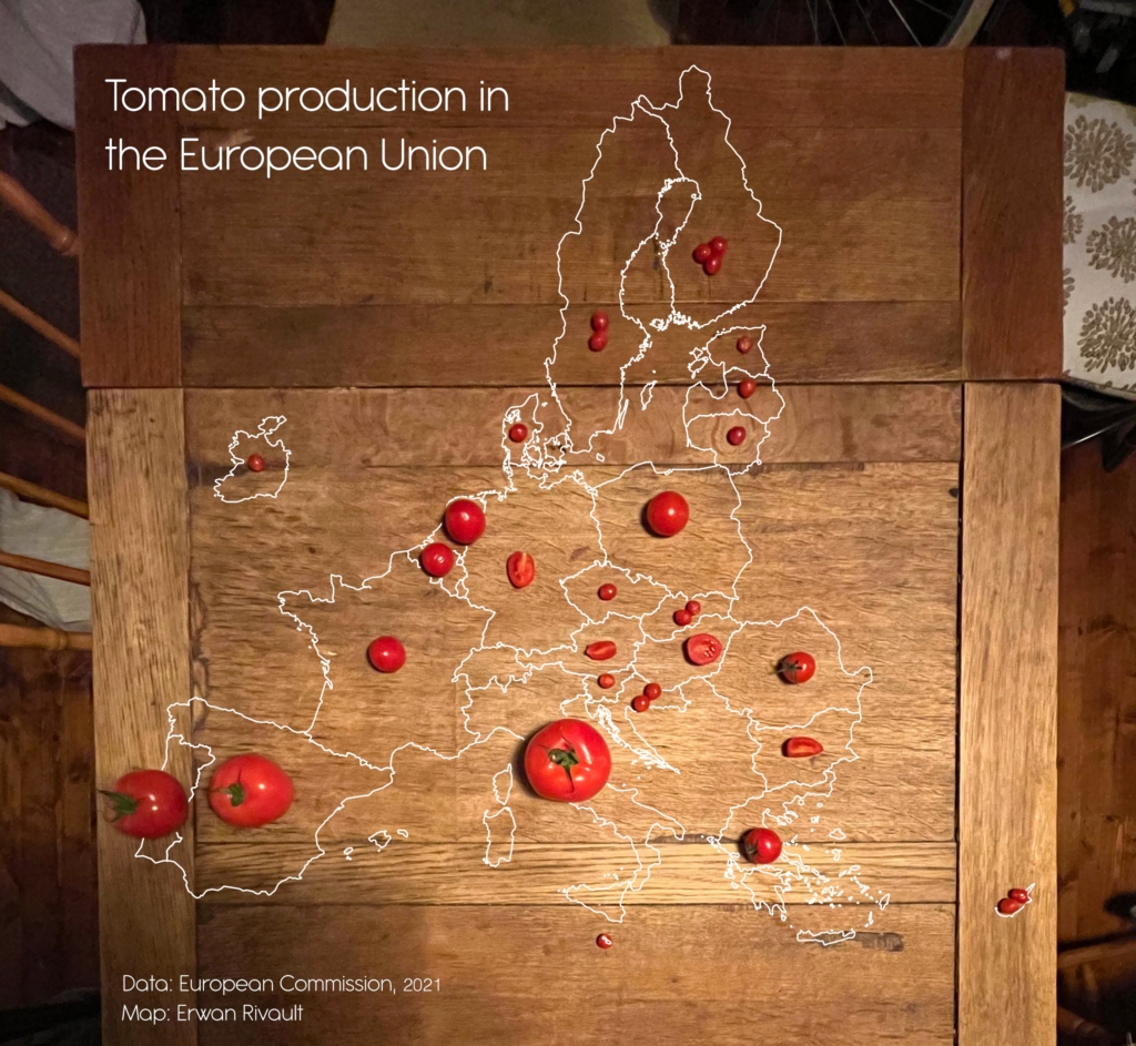
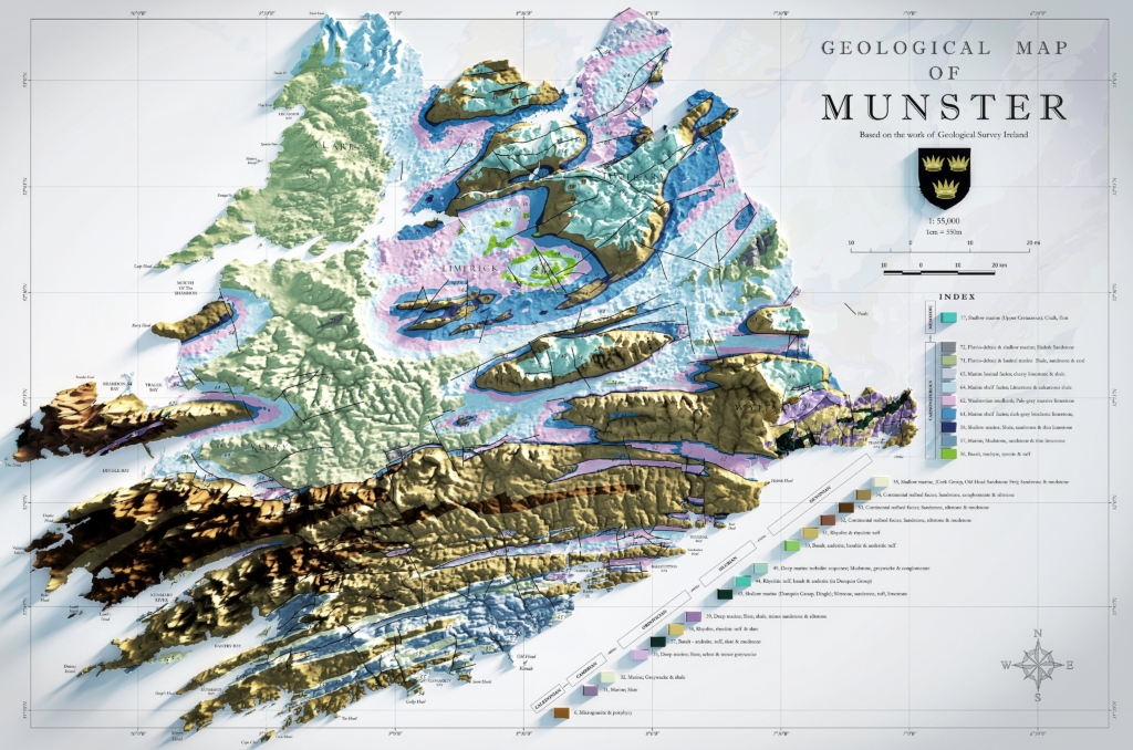
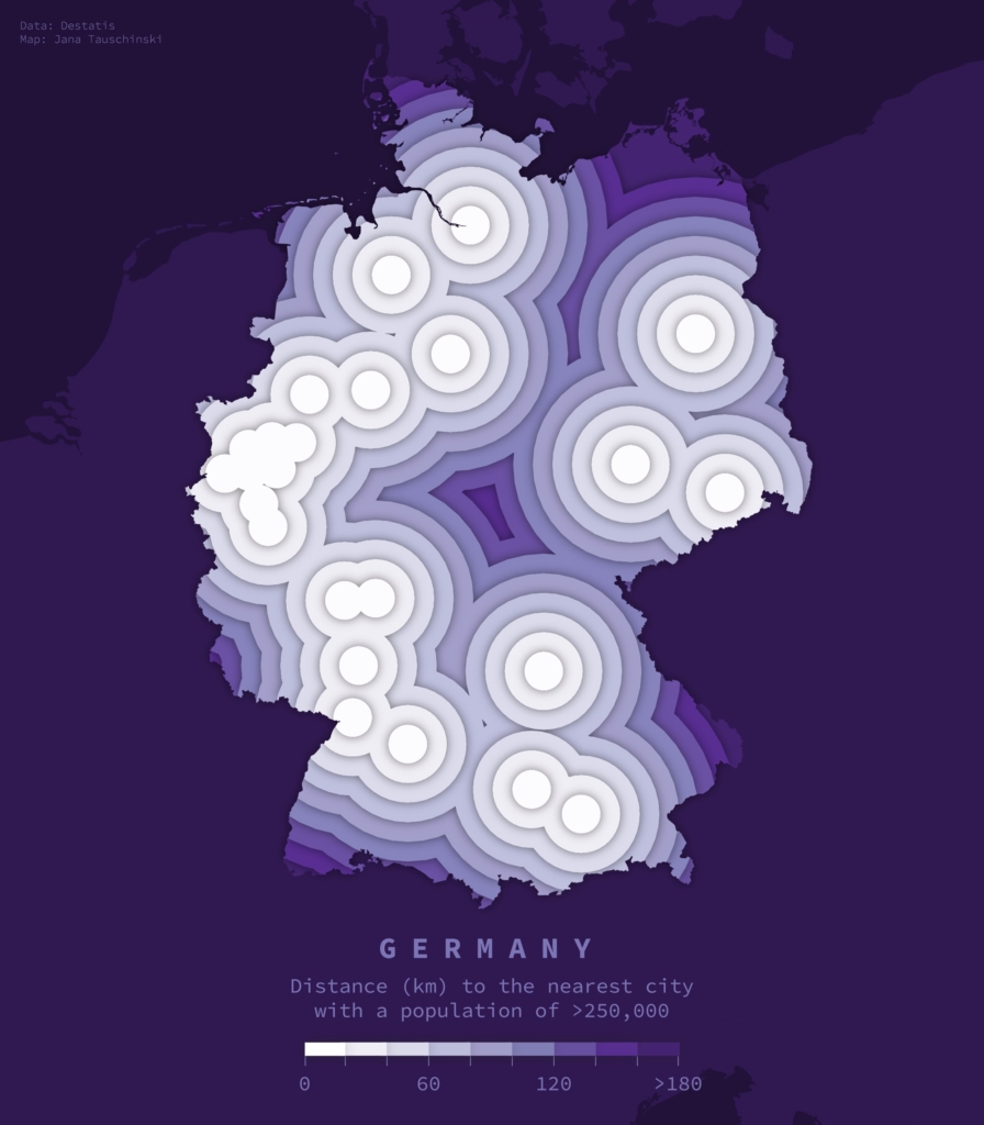
Mapologies: “Day 7 Map #7 of #30DayMapChallenge “Navigation” What if… Europe trains were a #transit #map. Based on the real ones, not the actual lines ;),” November 7 (Tweet)Benjamin Nowak: “#Day7 (navigation) of #30DayMapChallenge Northern Europe shipping routes,” November 7 (Tweet)Erwan Rivault: “Day 5: Analog map. Had to buy so many different size of tomatoes to make this work!,” November 5 (Tweet)Seán De Hoichtúin: “Day 3 – Polygons Geological Map of Munster, Ireland Created using the excellent 500k series bedrock data from @GeolSurvIE. Great source for open access data for a broad range of themes!,” November 3 (Tweet)Jana Tauschinski: “Day 3: Polygons, for yday. Distances to German cities w populations >250k,” November 4 (Tweet)
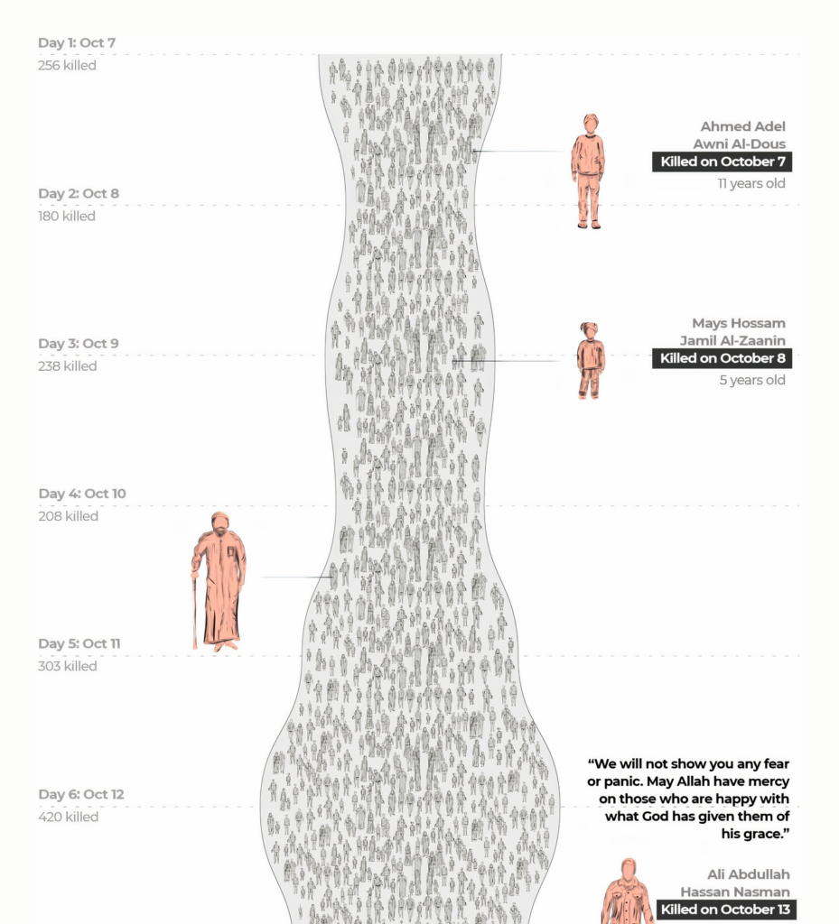
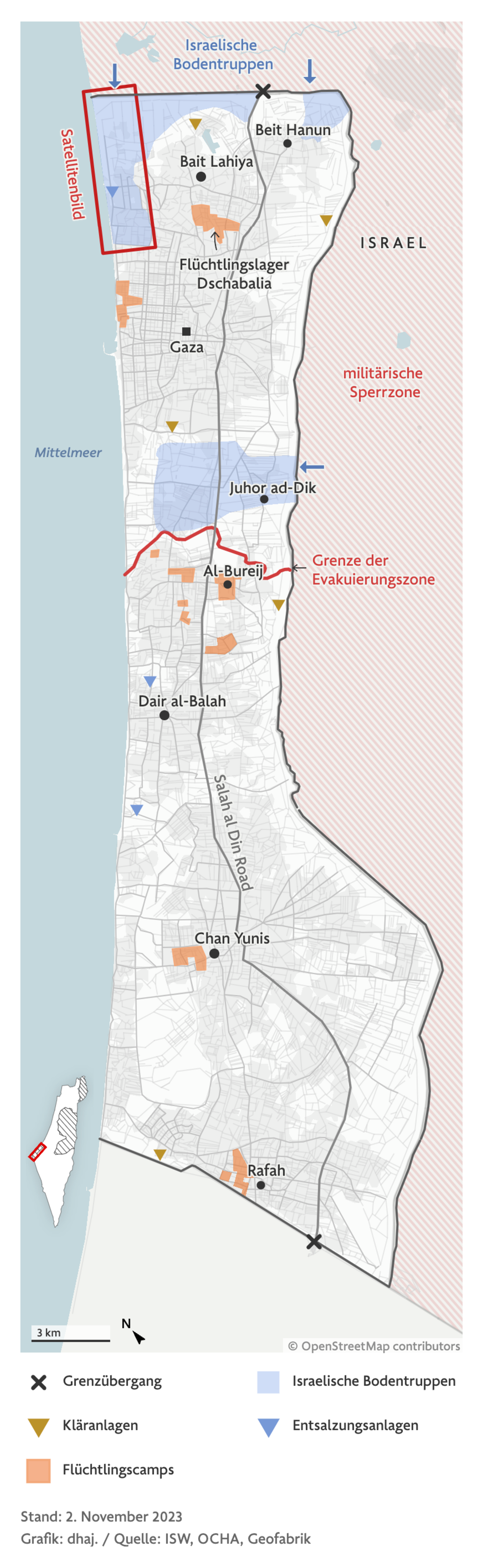
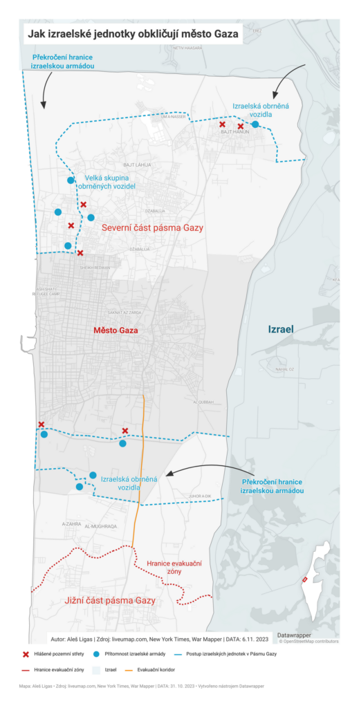
Now back to the hard topics: The Israel-Hamas war continues. This week, two animated maps provide a better understanding of the situation in Gaza:
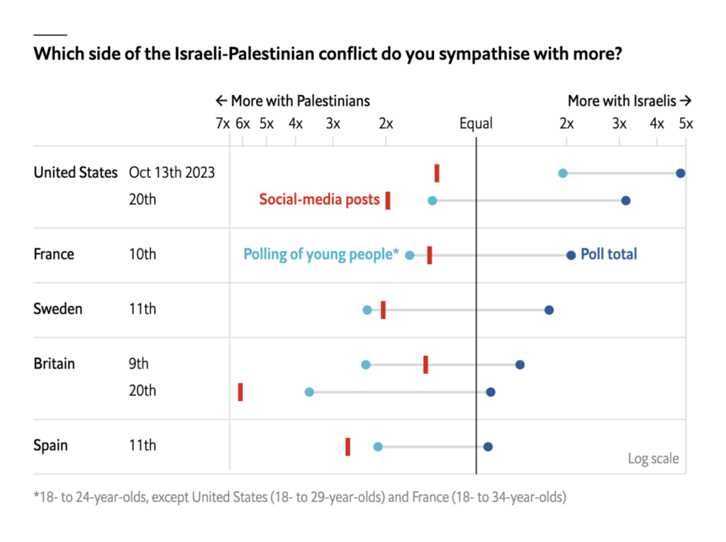
What do people around the world think about the Israeli-Palestinian conflict? The Economist team compared views on social media to what pollsters have found:
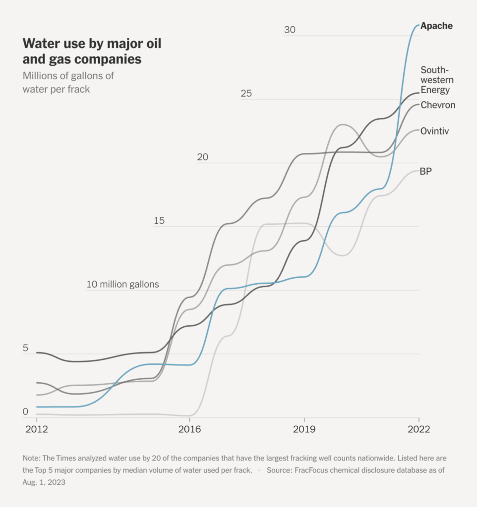
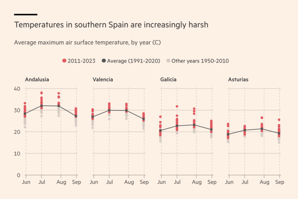
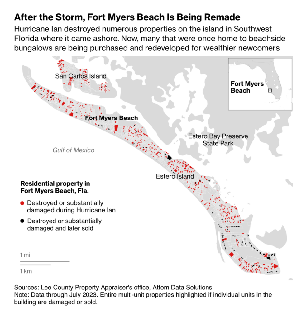
Jumping from fossil fuels to climate change is easy: Three visualizations this week tell stories about extreme weather situations (and about rich people in Florida who actually manage to benefit from them):
Let’s zoom in a little further on the financial topics. This week’s visualizations have proven how helpful circle encodings are in illustrating everything from corporate profits to employee salaries to development aid budgets:
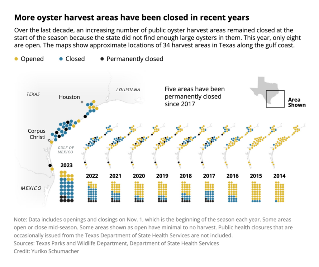
Next we have three creative visualizations of decrease and increase over time. Apparently, drugs and space junk are increasing (bad), but oyster harvesting is decreasing (good — for the oysters):
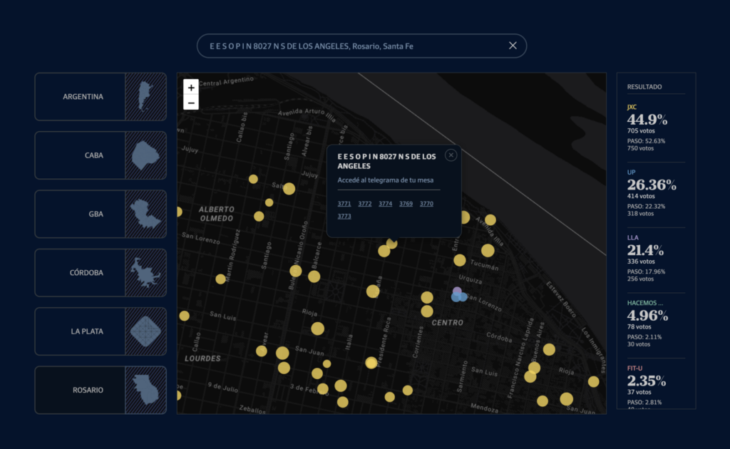
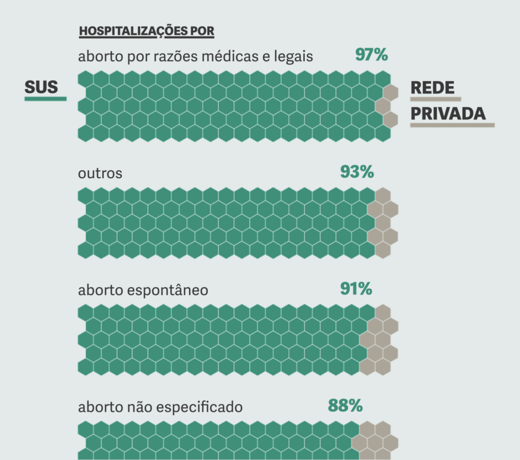
Last but not least, we find everything from granular election research to abortion in Brazil to “Should I really be putting so much money into my skincare routine?”:
Help us make this dispatch better! We’d love to hear which newsletters, blogs, or social media accounts we need to follow to learn about interesting projects, especially from less-covered parts of the world (Asia, South America, Africa). Write us at hello@datawrapper.de or leave a comment below.
(she/her) is a working student on Datawrapper’s Communications team. She creates the Data Vis Dispatch to keep data visualization enthusiasts up to date on exciting new projects. When she’s not working, she studies interface design, and when she’s not studying, she’s planning a festival stage or soldering light installations. Vivien lives in Potsdam.


Comments