Data Vis Dispatch, November 7

The best of last week’s big and small data visualizations

Welcome back to the 117th edition of Data Vis Dispatch! Every week, we’ll be publishing a collection of the best small and large data visualizations we find, especially from news organizations — to celebrate data journalism, data visualization, simple charts, elaborate maps, and their creators.

Recurring topics this week include dots, bars, and the start of the #30DayMapChallenge!

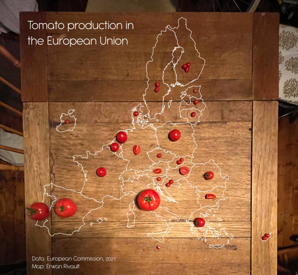
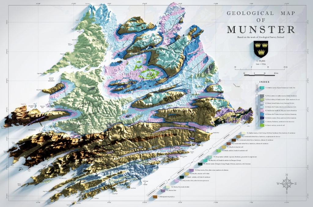
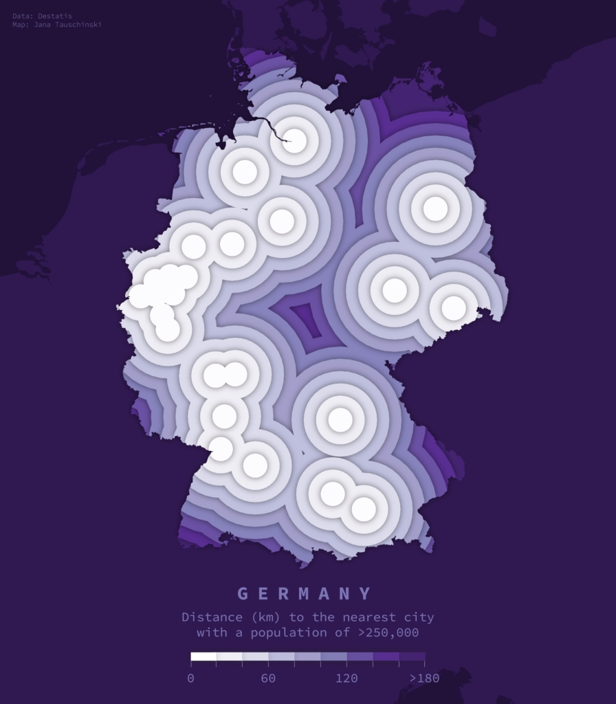
The #30DayMapChallenge started on November 1! Here are a few maps that particularly caught our eye:

Mapologies: “Day 7 Map #7 of #30DayMapChallenge “Navigation” What if… Europe trains were a #transit #map. Based on the real ones, not the actual lines ;),” November 7 (Tweet)
Benjamin Nowak: “#Day7 (navigation) of #30DayMapChallenge Northern Europe shipping routes,” November 7 (Tweet)
Erwan Rivault: “Day 5: Analog map. Had to buy so many different size of tomatoes to make this work!,” November 5 (Tweet)
Seán De Hoichtúin: “Day 3 – Polygons Geological Map of Munster, Ireland Created using the excellent 500k series bedrock data from @GeolSurvIE. Great source for open access data for a broad range of themes!,” November 3 (Tweet)
Jana Tauschinski: “Day 3: Polygons, for yday. Distances to German cities w populations >250k,” November 4 (Tweet)

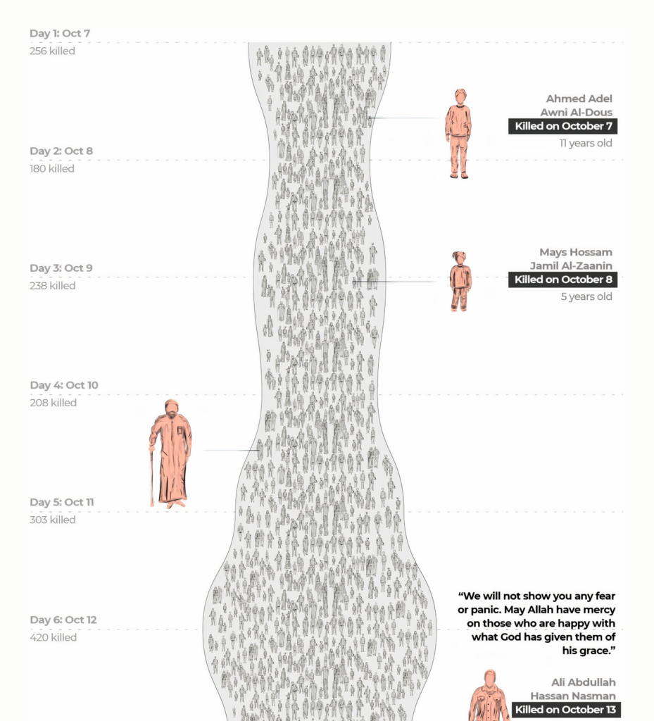
Now back to the hard topics: The Israel-Hamas war continues. This week, two animated maps provide a better understanding of the situation in Gaza:

Le Monde: Bande de Gaza : trois semaines de destructions en cartes et en images, November 4
South China Morning Post: Israel-Gaza war explained, November 3

We also noticed this visualization that focuses on the individuals killed in Gaza:

Al Jazeera: Know their names, November 1

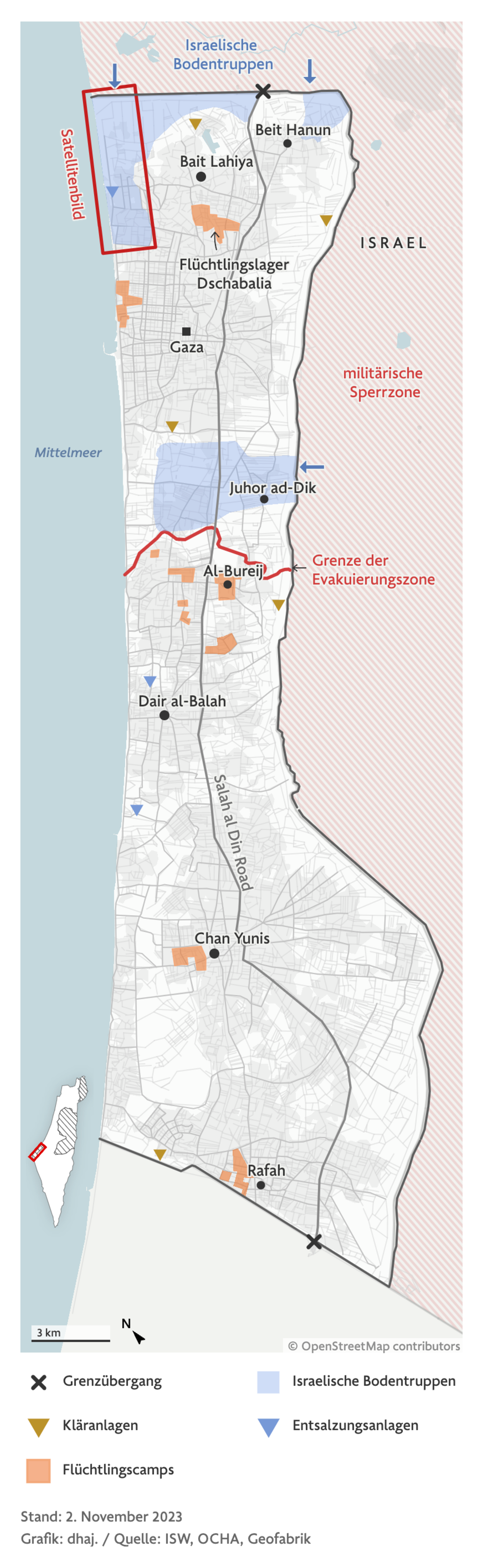
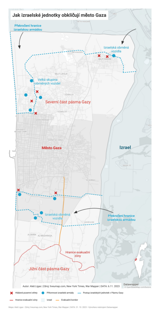
As the ground invasion has advanced into the Gaza Strip, several maps depicted Israeli troop positions:

The New York Times: Maps: Tracking the Attacks in Israel and Gaza, November 3
Frankfurter Allgemeine Zeitung: Satellitenbilder zeigen Israels Bodenoffensive, November 2
e15: Izrael a Pásmo Gazy: Mapa války a historie konfliktů, November 2

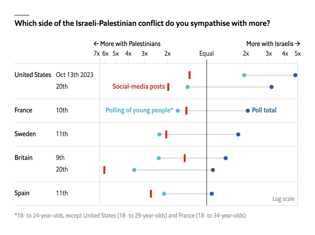
What do people around the world think about the Israeli-Palestinian conflict? The Economist team compared views on social media to what pollsters have found:

The Economist: Israel is more popular than social-media posts suggest, November 2

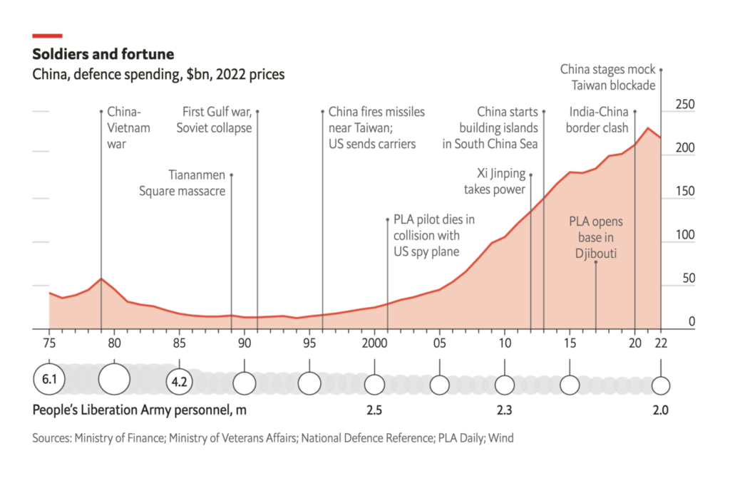
But this isn’t the only conflict situation taking place. We also saw visualizations with an eye on China’s military exercises and Taiwan:

報導者The Reporter: “#報導者開放實驗室【AI、Python與手工業,我們如何處理台灣+日本超過400張共軍軌跡圖?】本文分享用Python從爬取資料、以ChatGPT+code interpreter做資料前處理、手工描繪400多張軌跡、用ChatGPT寫一個儀表板分析資料等5大流程……轉換過的軌跡圖資檔也公開在報導者 Github,” November 1 (Tweet, Article)
The Economist: The People’s Liberation Army is not yet as formidable as the West fears, November 6

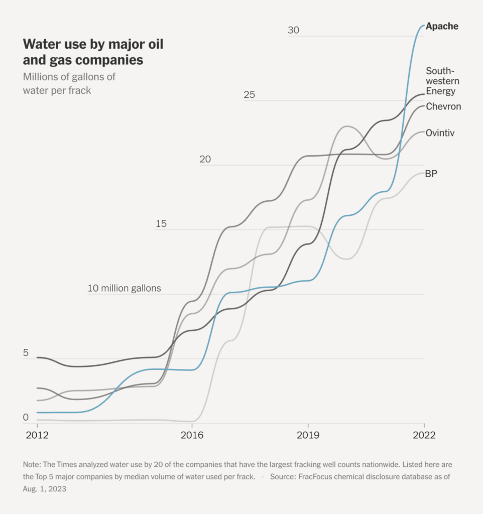
In the world of energy, we encountered two visualizations dealing with fossil fuels:

Le Monde: « Bombes carbon » : Ces projets fossiles qui condamnent les efforts pour le climat, October 31
The New York Times: ‘Monster Fracks’ Are Getting Far Bigger. And Far Thirstier, November 2

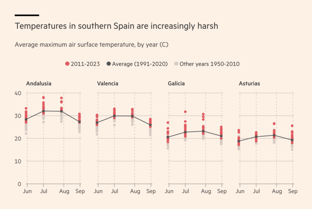
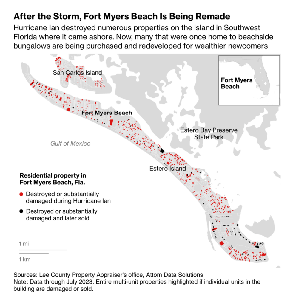
Jumping from fossil fuels to climate change is easy: Three visualizations this week tell stories about extreme weather situations (and about rich people in Florida who actually manage to benefit from them):

The New York Times: The Deadly Maui Inferno, Hour by Hour, November 1
Financial Times: Northern Spain’s cooler beaches lure tourists away from scorched south, November 3
Bloomberg: Ravaged Florida Town Becomes a Magnet for Risk-Taking Homebuyers, October 31

Let’s zoom in a little further on the financial topics. This week’s visualizations have proven how helpful circle encodings are in illustrating everything from corporate profits to employee salaries to development aid budgets:

The Wall Street Journal: Breaking Down the Best Earnings Quarter in a Year, November 5
The San Francisco Chronicle: These are the highest-paid University of California employees, November 6
아시아경제: 원조 예산 쪼개기는 어떤 문제를 가져오나, October 31

We’ve talked about circle encodings… Next cluster: bar charts:

Financial Times: Why women are at the sharp end of the rental crisis, November 1
Gazeta Wyborcza: Miasta bez ziemi. Dlaczego budowanie jest takie drogie, November 2

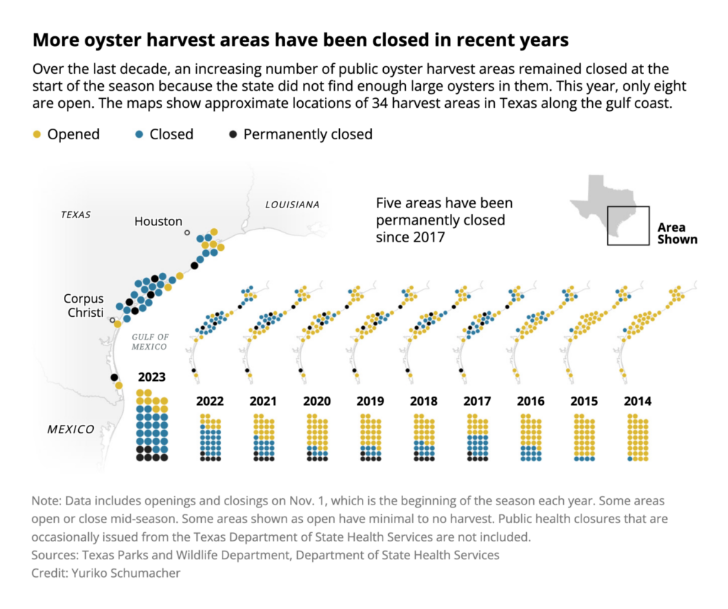
Next we have three creative visualizations of decrease and increase over time. Apparently, drugs and space junk are increasing (bad), but oyster harvesting is decreasing (good — for the oysters):

SBS News: 마약, 도대체 얼마나 늘어난 걸까?, November 1
The Washington Post: Space junk is out of control. Here’s why — and what to do about it., November 2
The Texas Tribune: Fear and worry shadow Texas oyster fishermen as another season begins with few reefs open, November 3

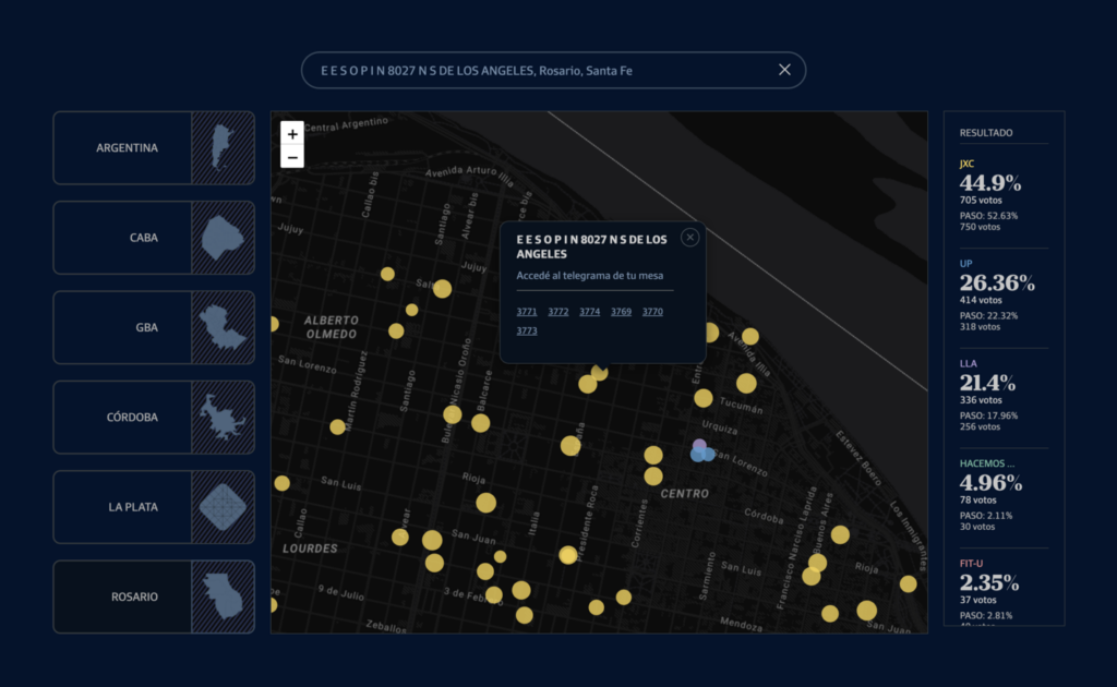
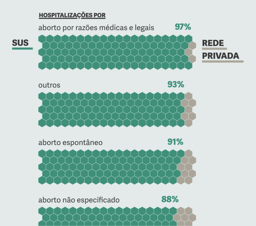
Last but not least, we find everything from granular election research to abortion in Brazil to “Should I really be putting so much money into my skincare routine?”:

La Nación: Mapa de escuelas – Conocé el resultado de las elecciones presidenciales en la mesa donde votaste, October 31
Gênero e Número: SUS atende 9 de cada 10 internações por aborto no Brasil, October 31
Süddeutsche Zeitung: Sind teure Cremes besser für die Haut?, November 3

What else we found interesting

Ana Lucía González Paz: We all carry a map inside, October 31
The Guardian: How AI chatbots like ChatGPT or Bard work – visual explainer, November 1
The Washington Post: These fake images reveal how AI amplifies our worst stereotypes, November 1

Applications are open for…


Help us make this dispatch better! We’d love to hear which newsletters, blogs, or social media accounts we need to follow to learn about interesting projects, especially from less-covered parts of the world (Asia, South America, Africa). Write us at hello@datawrapper.de or leave a comment below.

Want the Dispatch in your inbox every Tuesday? Sign up for our Blog Update newsletter!

Comments