This article is brought to you by Datawrapper, a data visualization tool for creating charts, maps, and tables. Learn more.
Data Vis Dispatch, November 8
The best of last week’s big and small data visualizations

Welcome back to the 67th edition of Data Vis Dispatch! Every week, we’ll be publishing a collection of the best small and large data visualizations we find, especially from news organizations — to celebrate data journalism, data visualization, simple charts, elaborate maps, and their creators.
Recurring topics this week include U.S. midterms, rising temperatures, and the first full week of the #30DayMapChallenge.
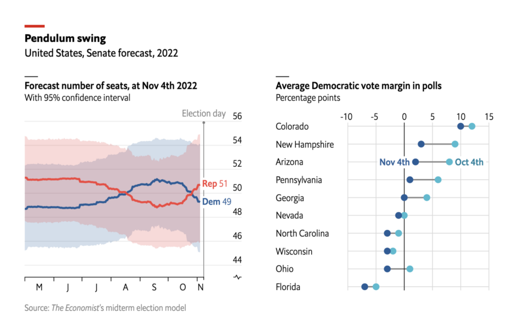
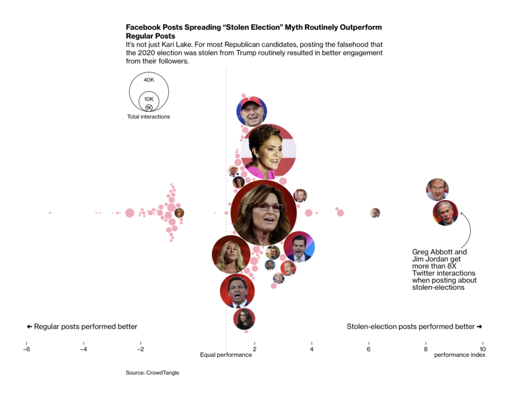
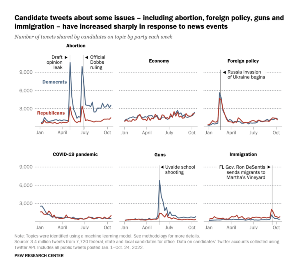
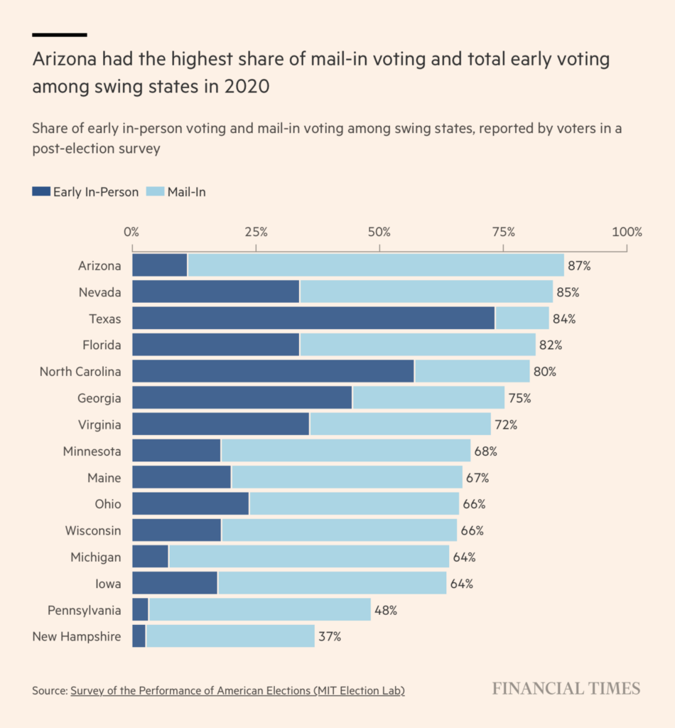
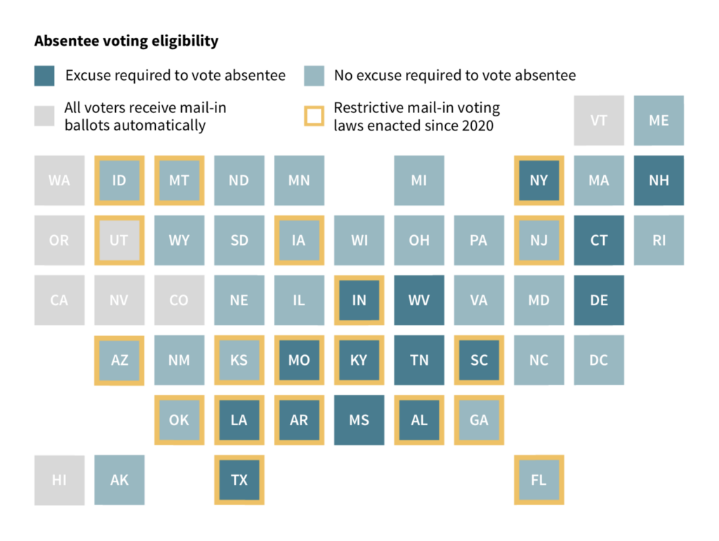
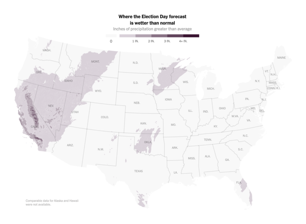
The day of the U.S. midterm elections has finally arrived, marking the end of a massive political campaign. Data journalists across newsrooms have been busy charting forecasts, political donations, social media posts, key issues, and Election Day weather.


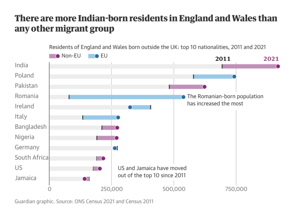
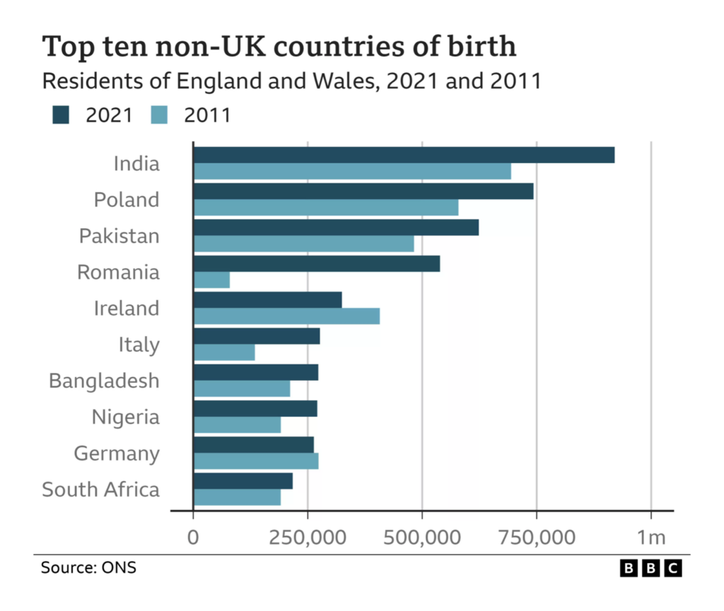
The U.K. published migration statistics from last year’s census that revealed an interesting 10-year trend.
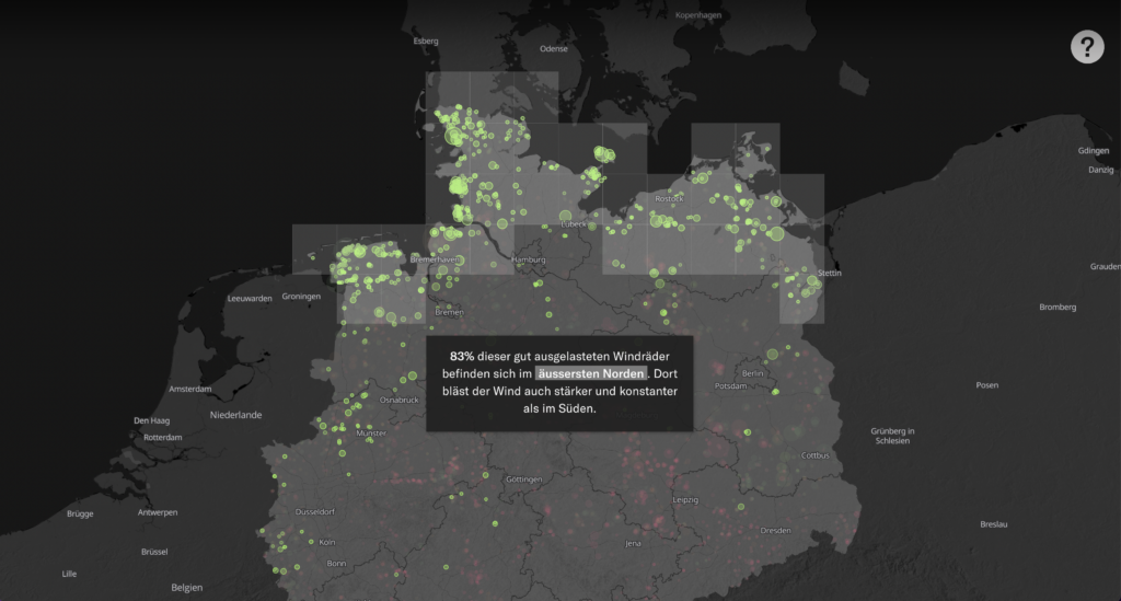
The beginning of COP27, this year’s United Nations Climate Change Conference, brought the world’s attention back to the climate — from rising temperatures to the effectiveness of renewable energy.
Ukraine is protecting its cultural heritage from the effects of the war. The country also reported a large decrease in energy production capacity since March of this year.

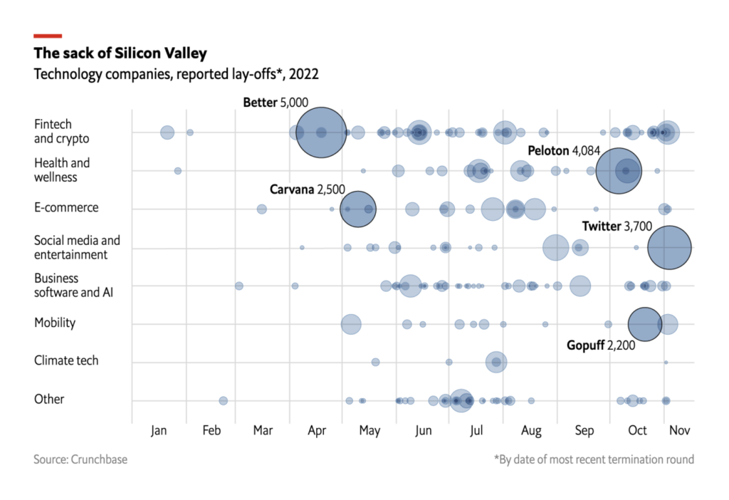
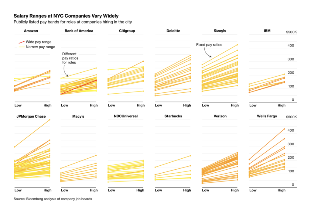
Other charts cover tech layoffs and data revealed by mandatory salary ranges for job listings in New York City.
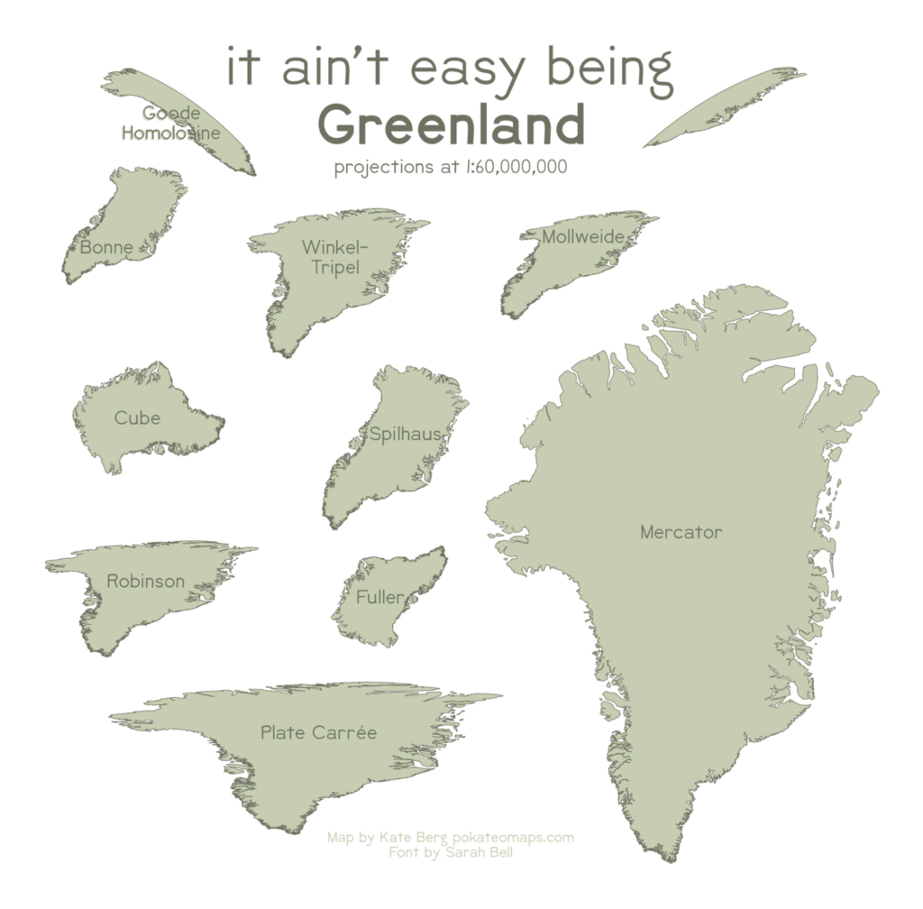
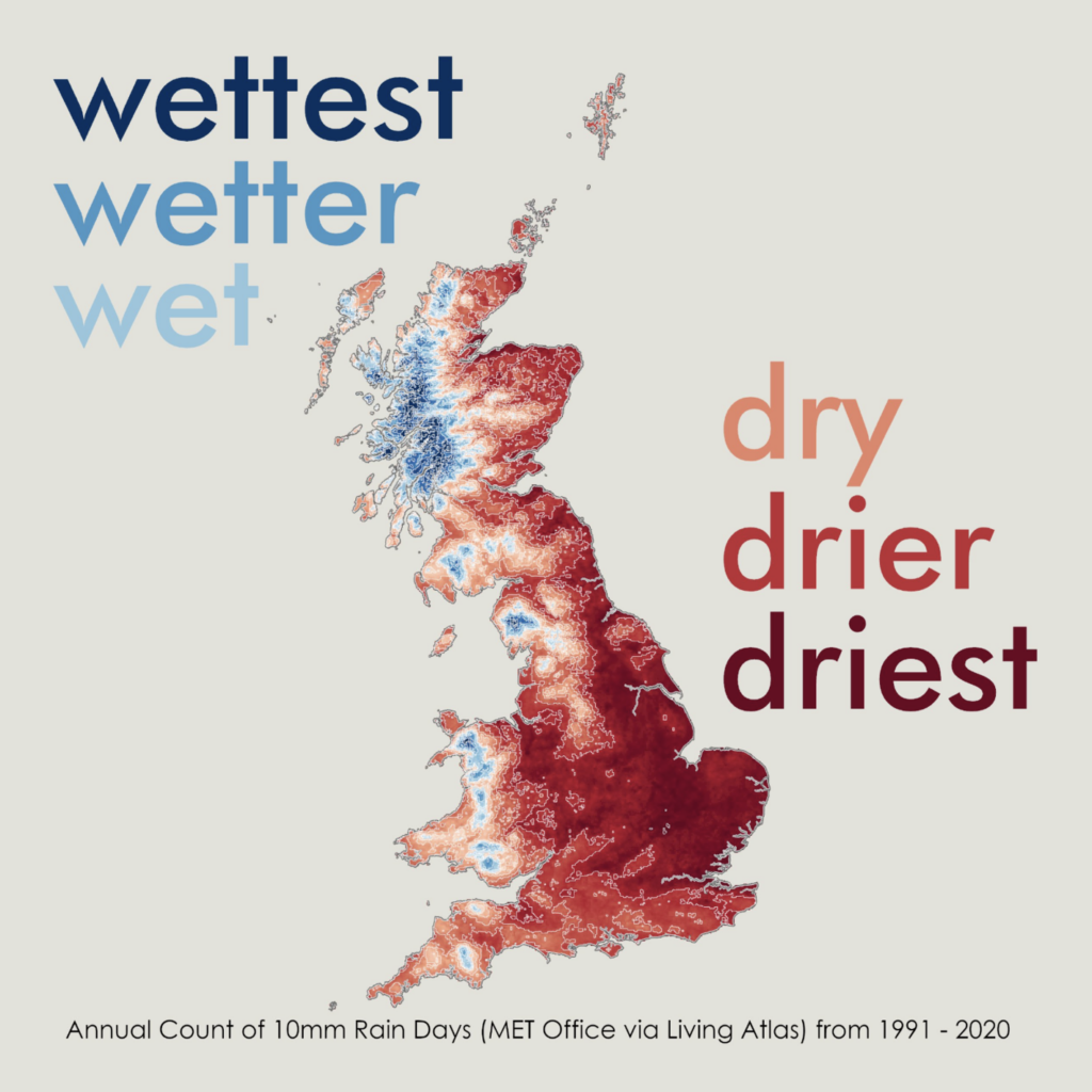
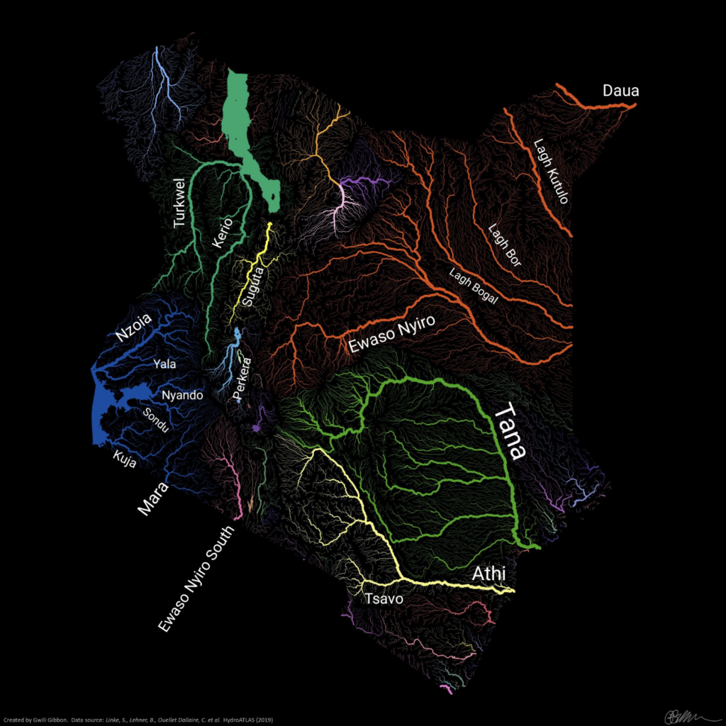
Now back to the #30DayMapChallenge and some of the most creative contributions of the week!


What else we found interesting

Help us make this dispatch better! We’d love to hear which newsletters, blogs, or social media accounts we need to follow to learn about interesting projects, especially from less-covered parts of the world (Asia, South America, Africa). Write us at hello@datawrapper.de or leave a comment below.
Want the Dispatch in your inbox every Tuesday? Sign up for our Blog Update newsletter!


Comments