Data Vis Dispatch, February 18: German election polls, corruption, and tariffs
February 18th, 2025
9 min
This article is brought to you by Datawrapper, a data visualization tool for creating charts, maps, and tables. Learn more.
The best of last week’s big and small data visualizations
Welcome back to the 21st edition of Data Vis Dispatch! Every week, we’ll be publishing a collection of the best small and large data visualizations we find, especially from news organizations — to celebrate data journalism, data visualization, simple charts, elaborate maps, and their creators.
Recurring topics this week include deforestation, cities and housing, and the Virginia governor’s race.
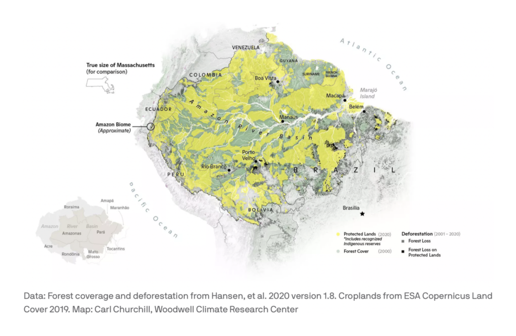
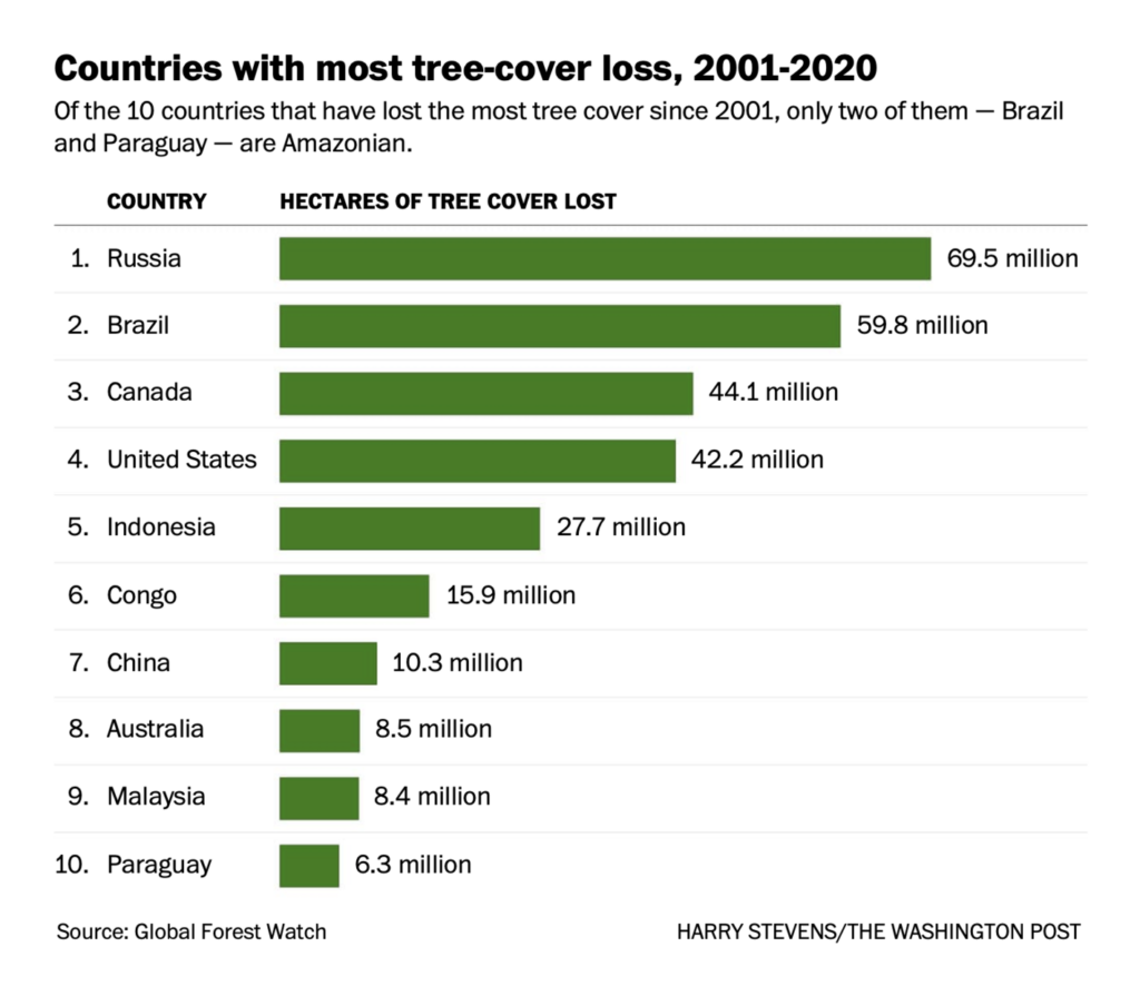
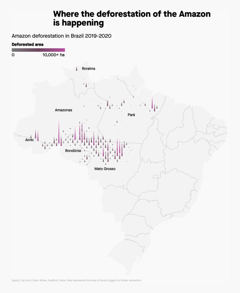
It was another big week in data vis for the climate and environment. These maps and charts put the spotlight on deforestation:

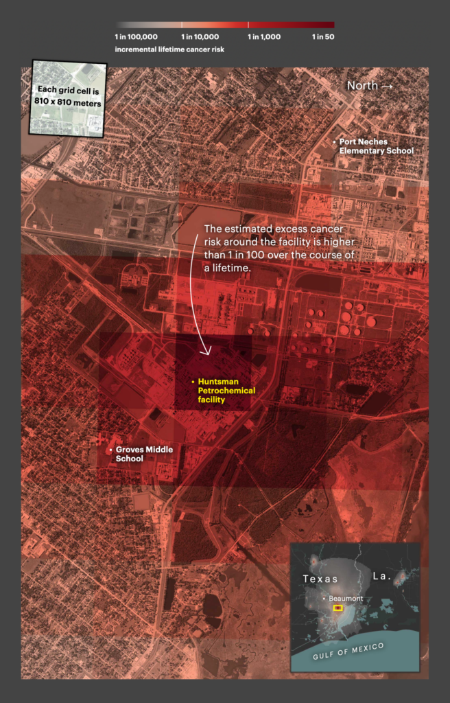
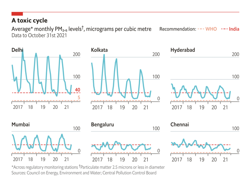
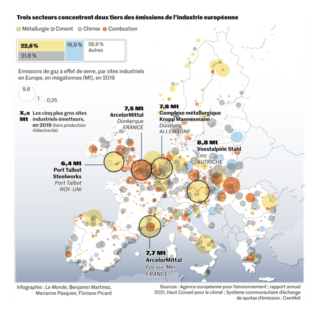
And these covered industrial pollution and emissions, starting with a major investigation from ProPublica on cancer-causing pollution in the U.S.:


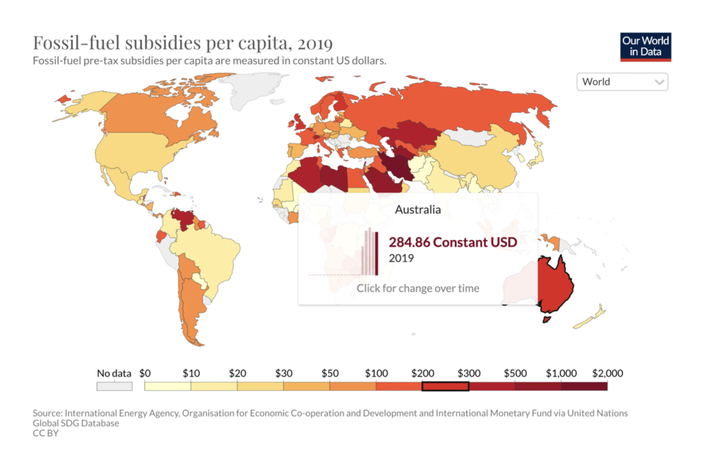
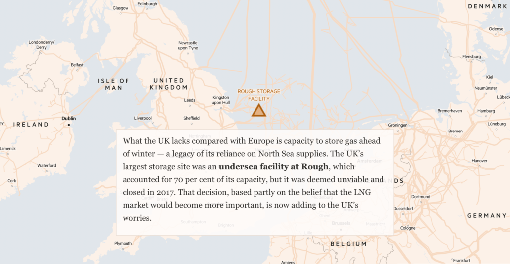
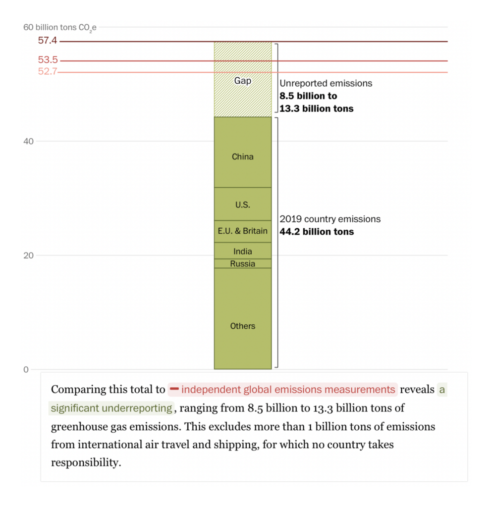
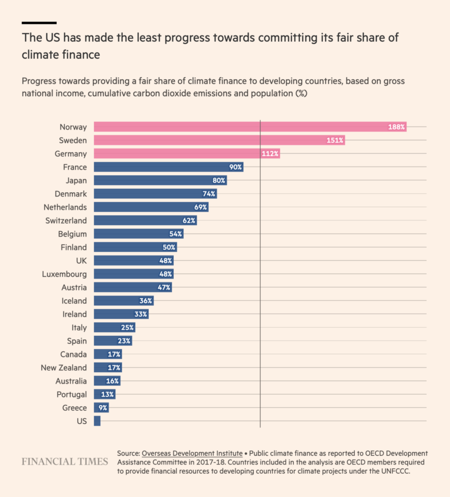
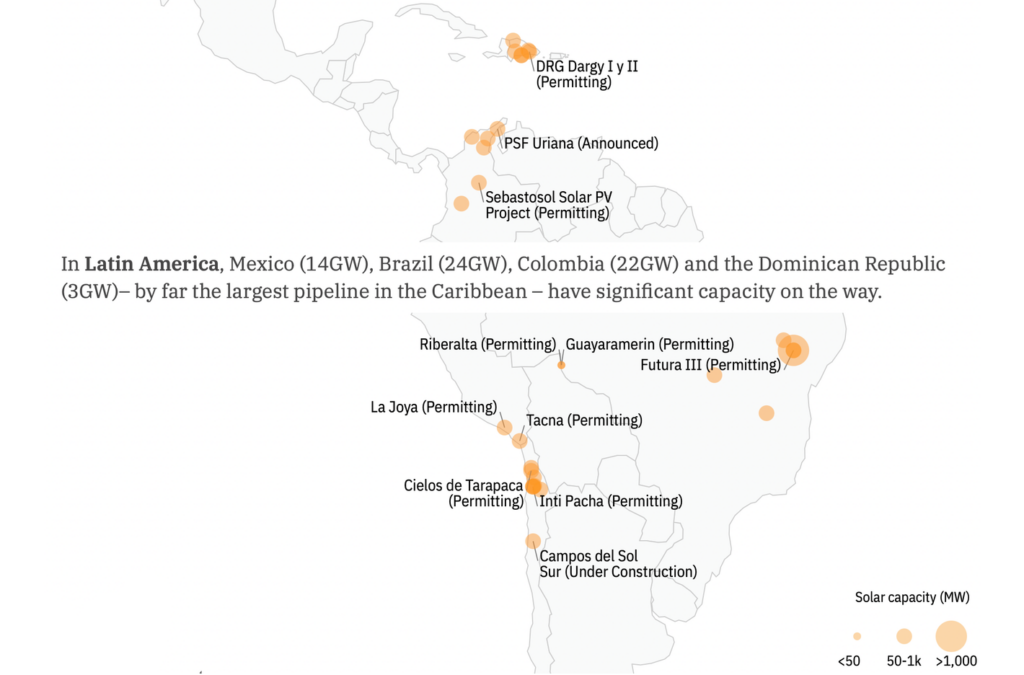
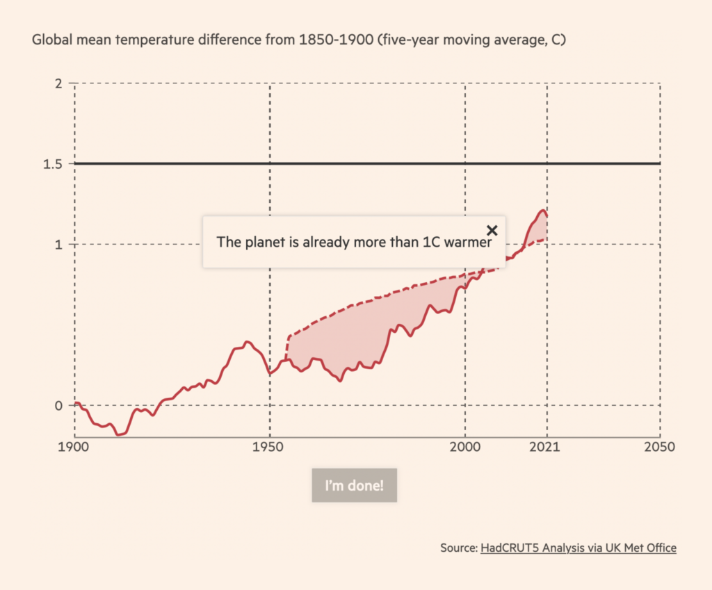
These charts looked into the fossil fuel transition — where the world stands now and where it needs to go:



This week’s COVID headline is a wave of cases in Europe that shows no signs of having peaked:
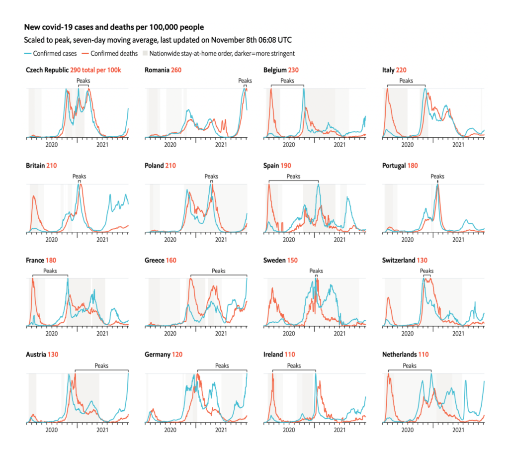
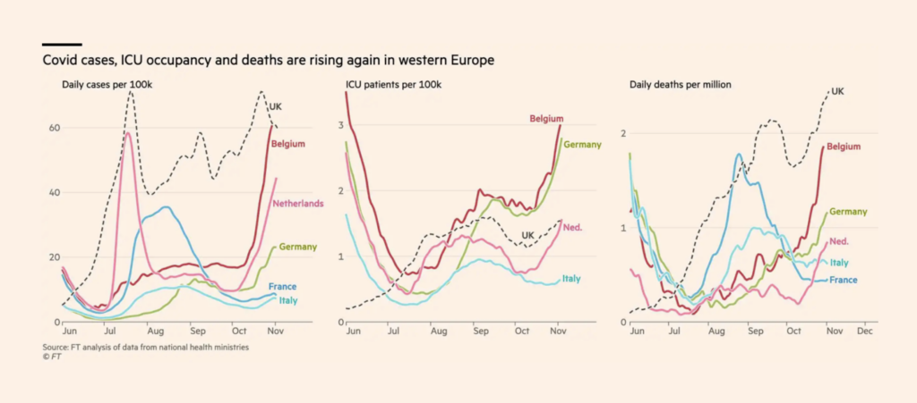
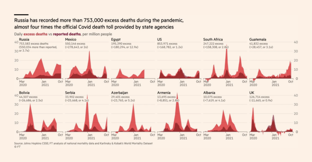
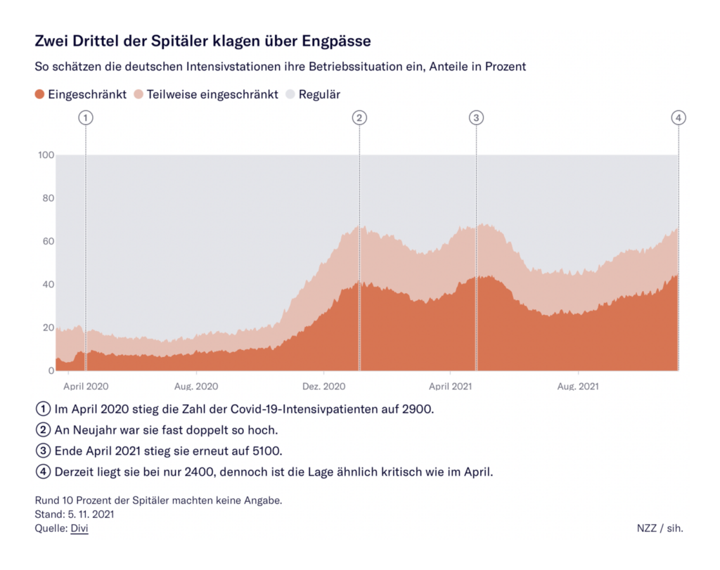
By the case numbers, many countries are right back where they were last fall. But vaccination has changed the shape of those outbreaks:
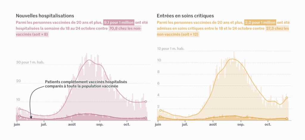

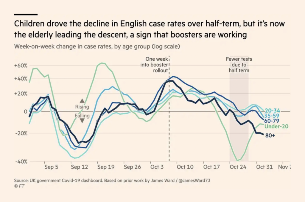
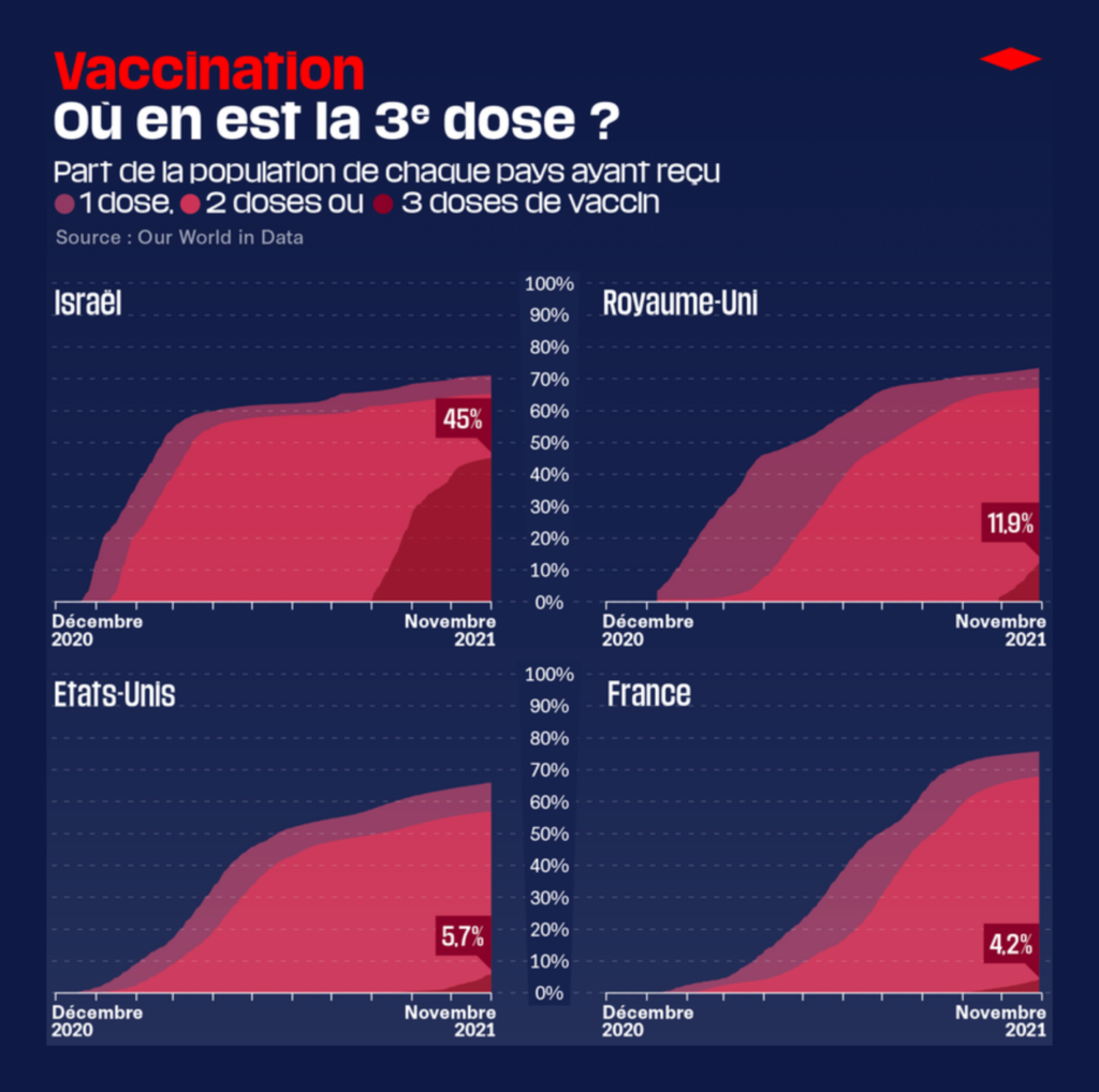
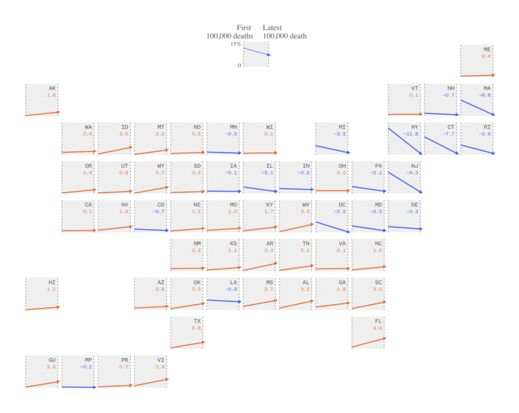
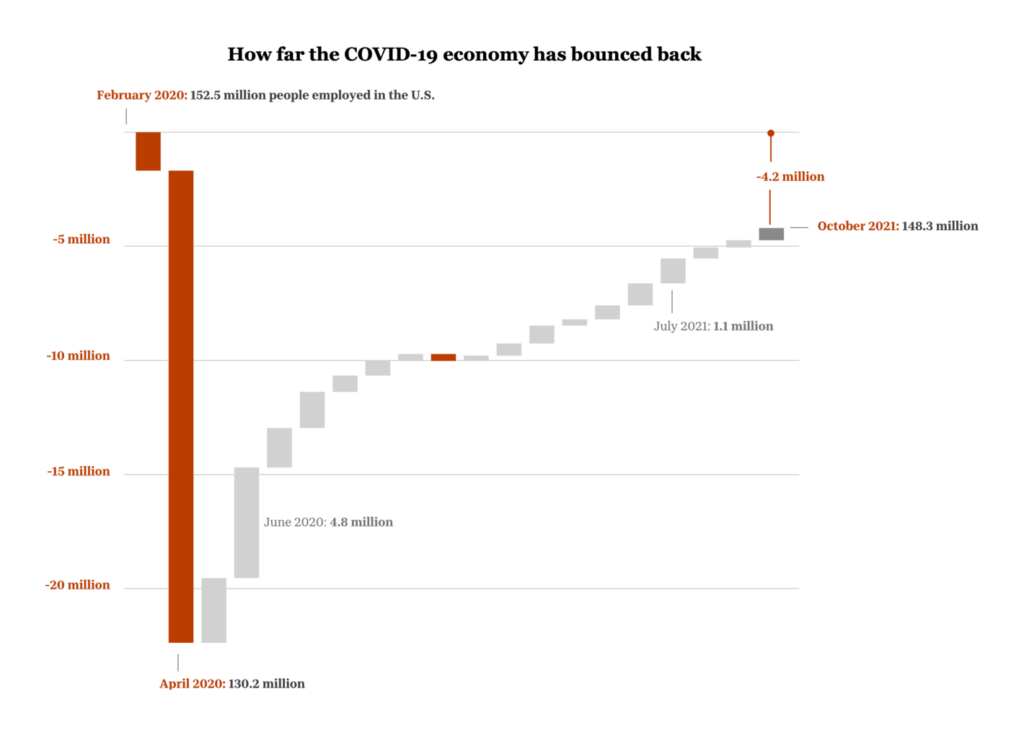
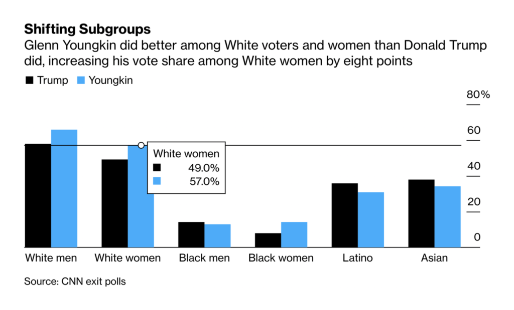
Last Tuesday was Election Day in the U.S. The race to watch was in Virginia, where Republican Glenn Youngkin was elected governor:
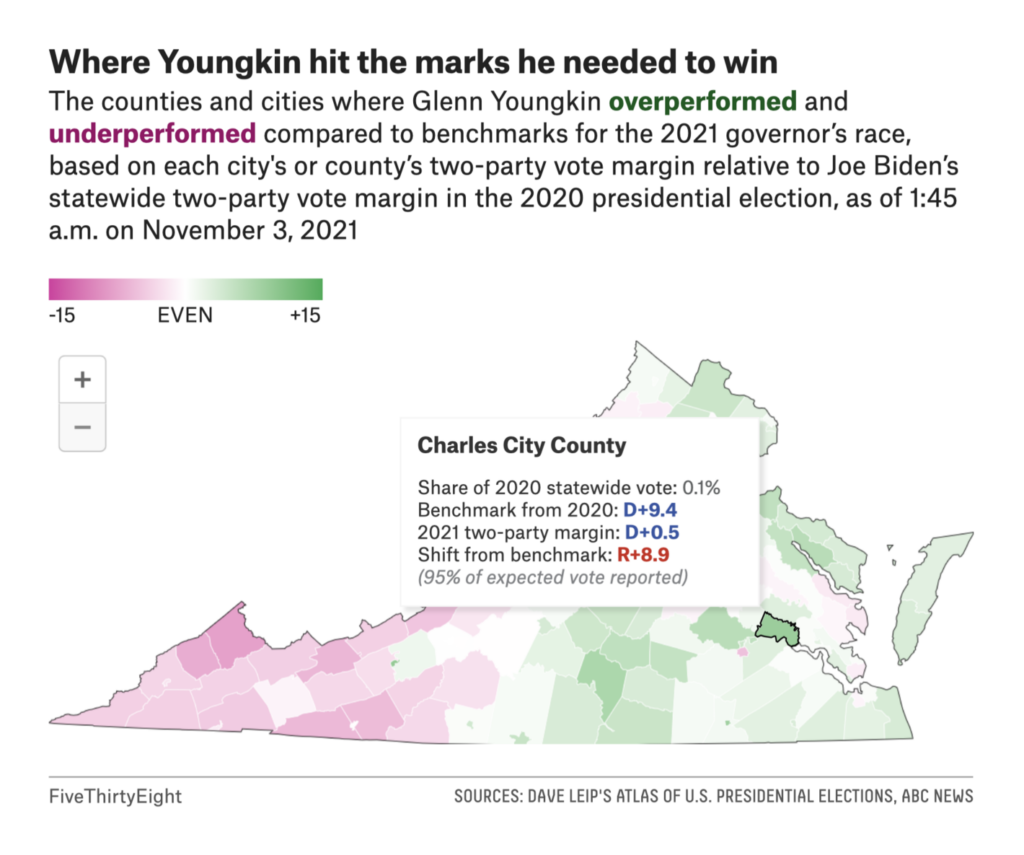

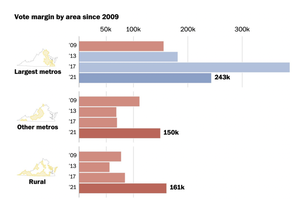
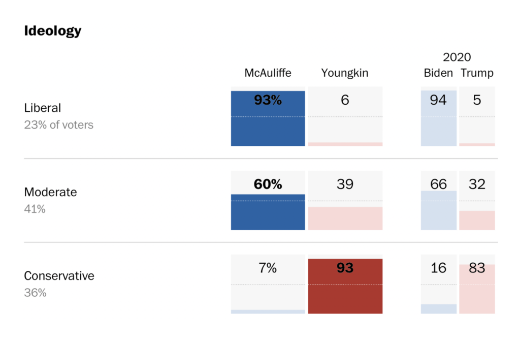
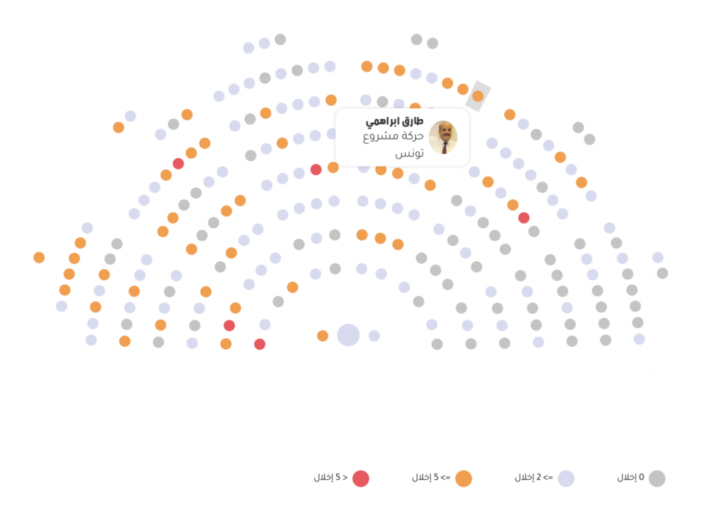
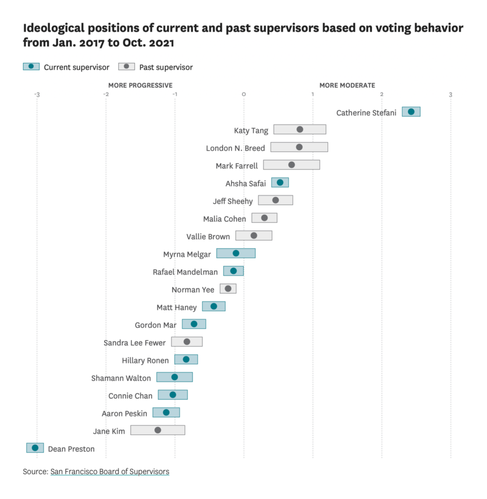
Other political charts looked at everything from campaign finance in Tunisia to media interviews in Spain:

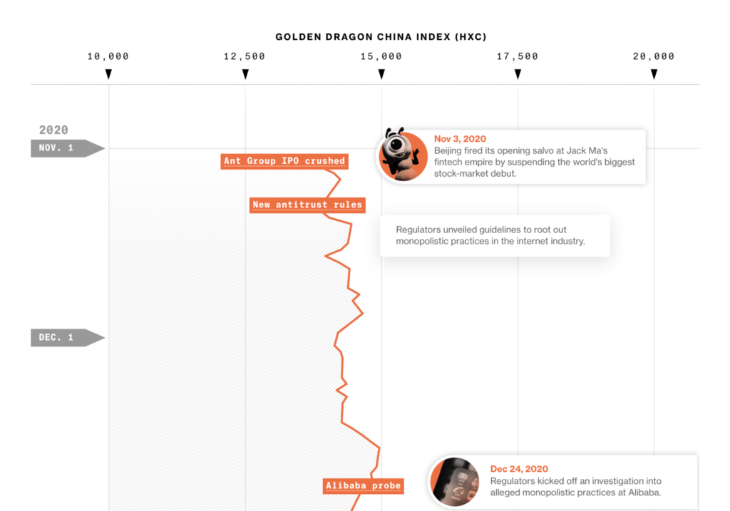
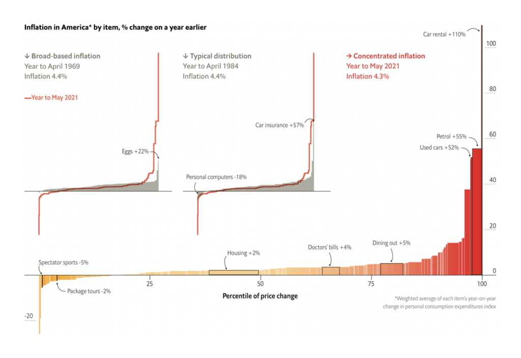
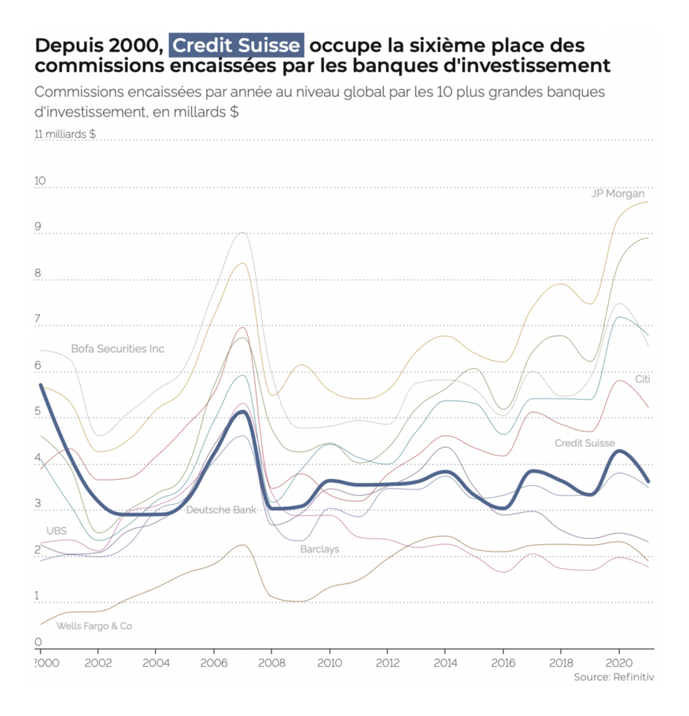
Government and business were in the news this week, with a corporate crackdown in China and plans for new taxes in the U.S.
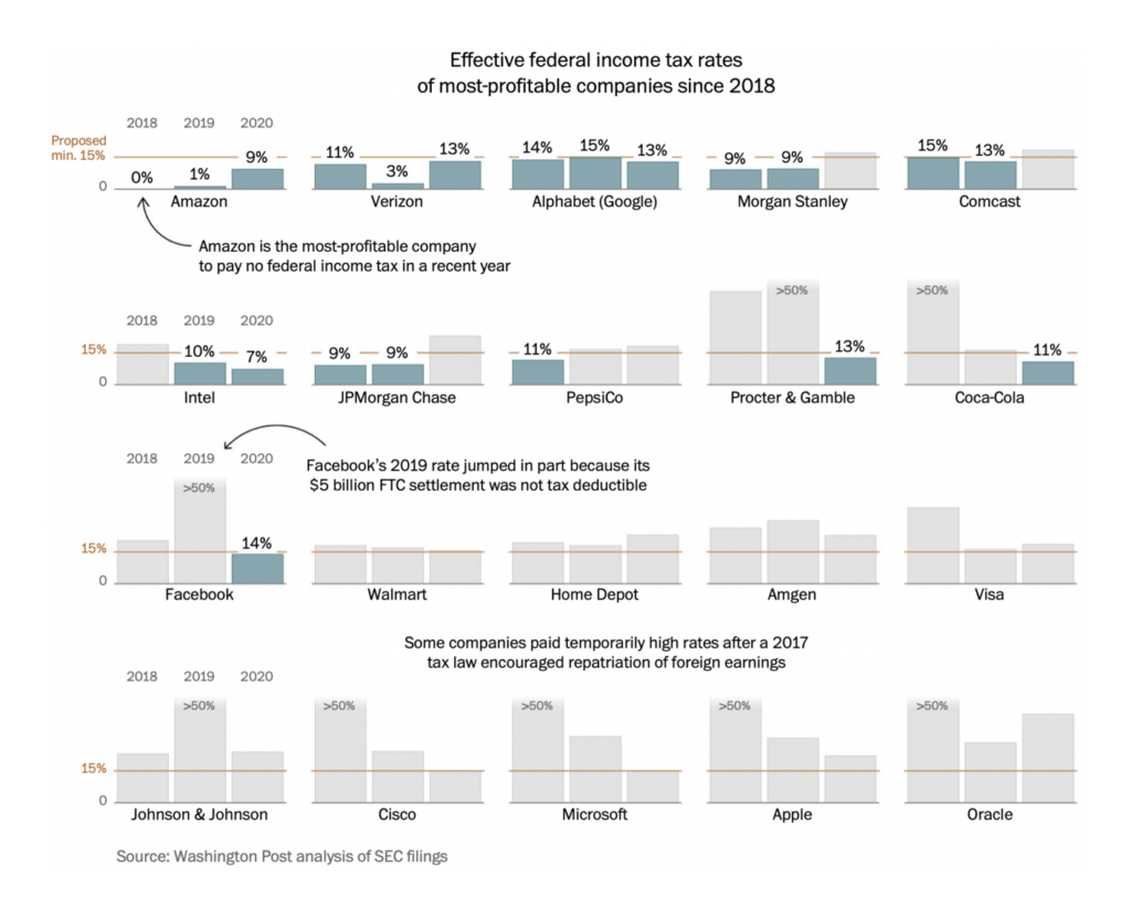
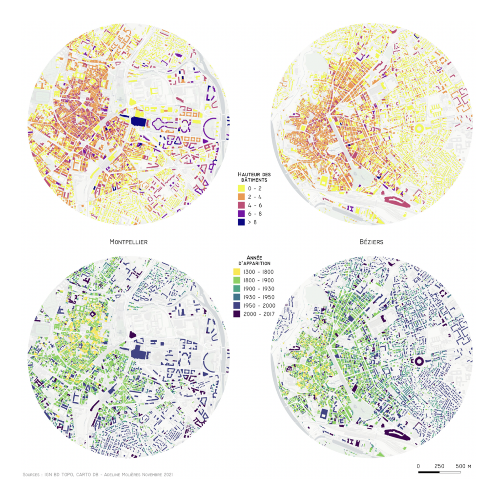
Cities and housing were hot topics as well, with a particular focus on housing prices and homelessness:
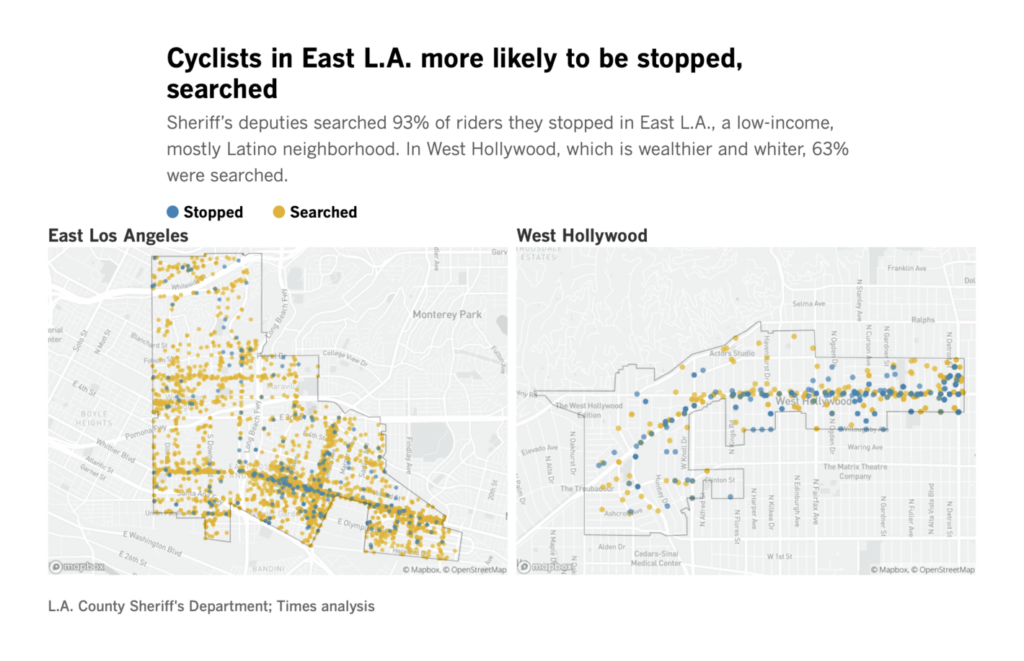
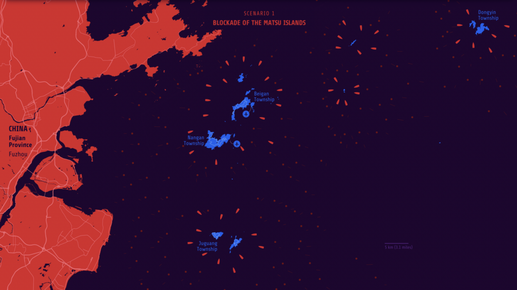
These charts visualized wars past, present, and hopefully-not-future, with a special feature from the The Courier in Dundee on the victims of WWI:


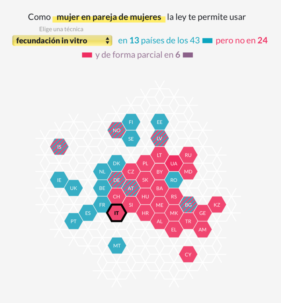
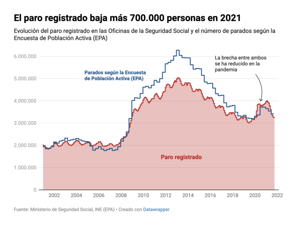
Other charts covered social and economic topics from fertility treatments to primary education to unemployment — plus a revisit to the volcanic eruption on La Palma:



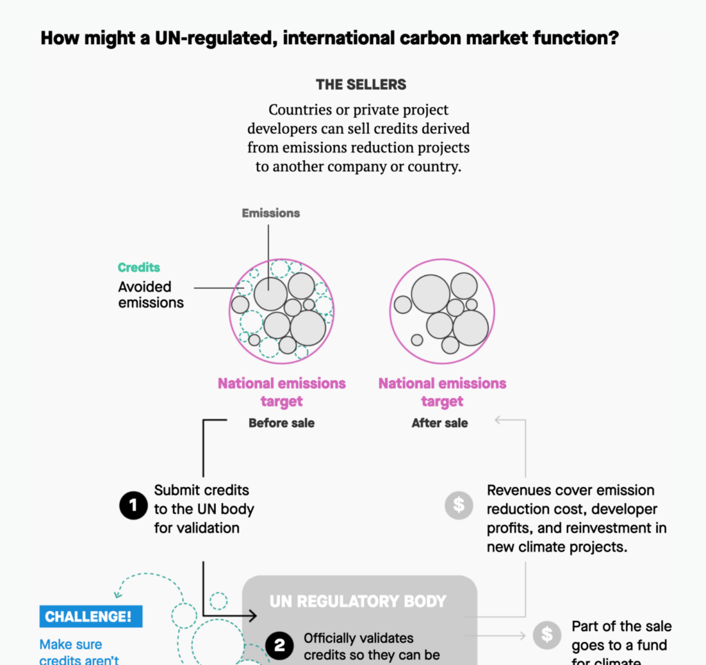

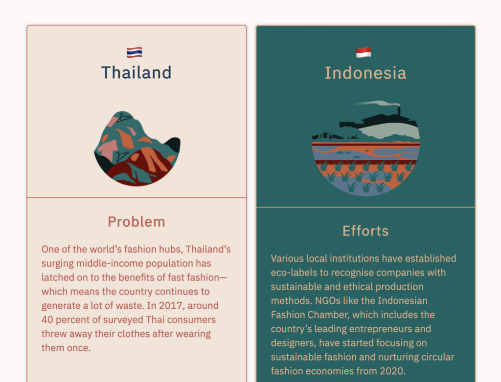

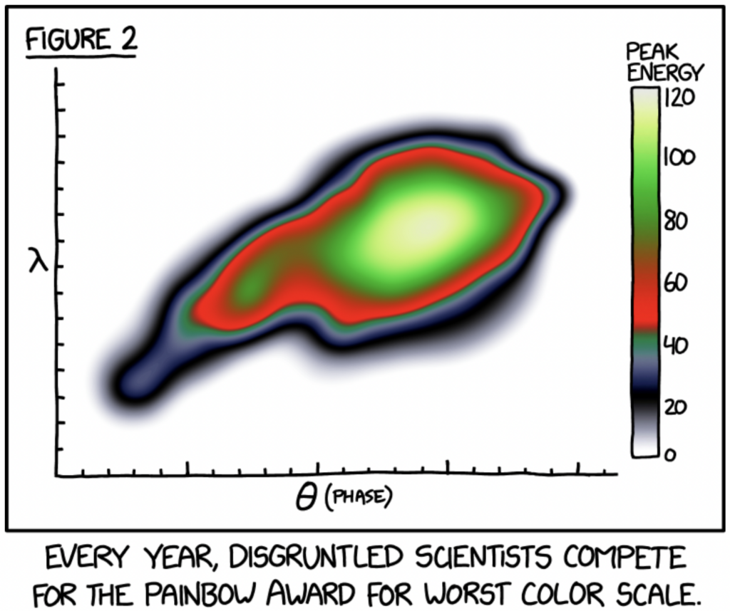
Help us make this dispatch better! We’d love to hear which newsletters, blogs, or social media accounts we need to follow to learn about interesting projects, especially from less-covered parts of the world (Asia, South America, Africa). Write us at hello@datawrapper.de or leave a comment below.
Comments