Data Vis Dispatch, October 1

The best of last week’s big and small data visualizations

Welcome back to the 162nd edition of the Data Vis Dispatch! Every week, we publish a collection of the best small and large data visualizations we find, especially from news organizations — to celebrate data journalism, data visualization, simple charts, elaborate maps, and their creators.

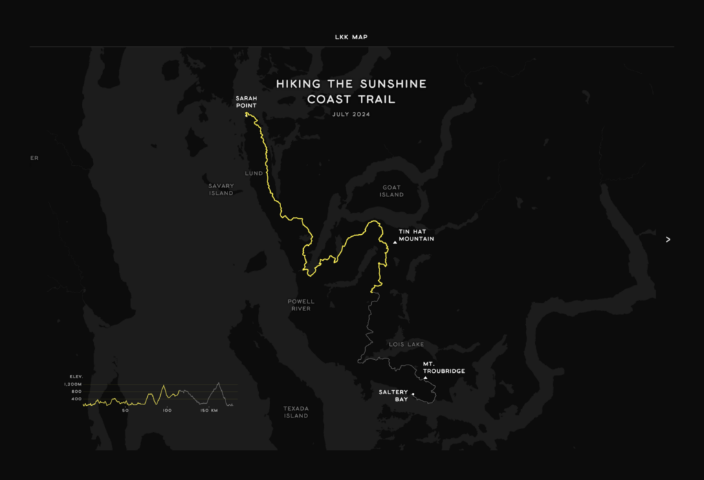
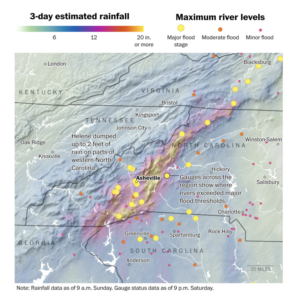
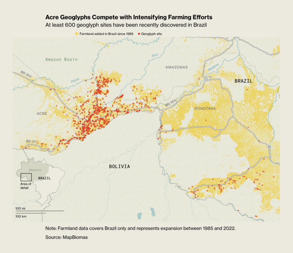
Recurring topics this week include geoglyphs, hiking trails, and Hurricane Helene.

Two interactive visualizations this week let us follow a trail — either a hike along the Sunshine Coast or the destructive path of Hurricane Helene:

LKK MAP: Hiking the Sunshine Coast Trail, September 26
The New York Times: Hurricane Helene: Mapping More Than 600 Miles of Devastation, September 29

The Category 4 Hurricane Helene was a huge topic this week. And rainfall and flooding were not just a U.S. concern:

The Washington Post: The 5 Hurricane Categories, Explained, September 25
The Washington Post: Where floods from Hurricane Helene are ravaging the North Carolina mountains, September 29
theeuropeancorrespondent: “Over 20 people have died in recent floods across Central Europe, with many more injured or displaced. These floods highlight the serious health risks of extreme weather, from waterborne diseases to exposure to toxic water […],” September (Instagram Post)

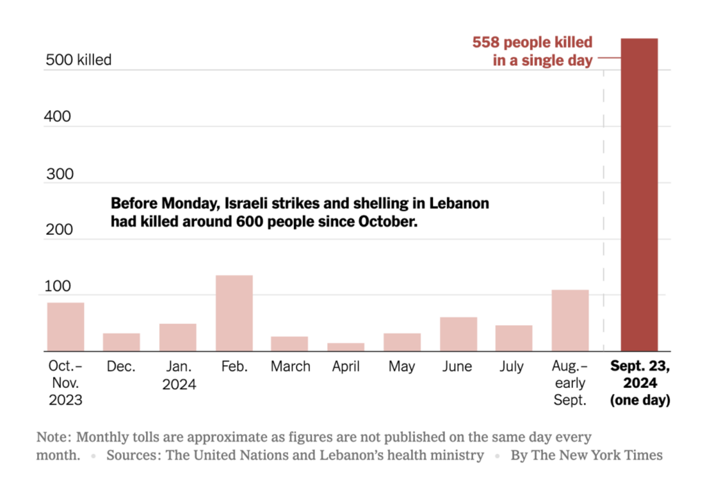
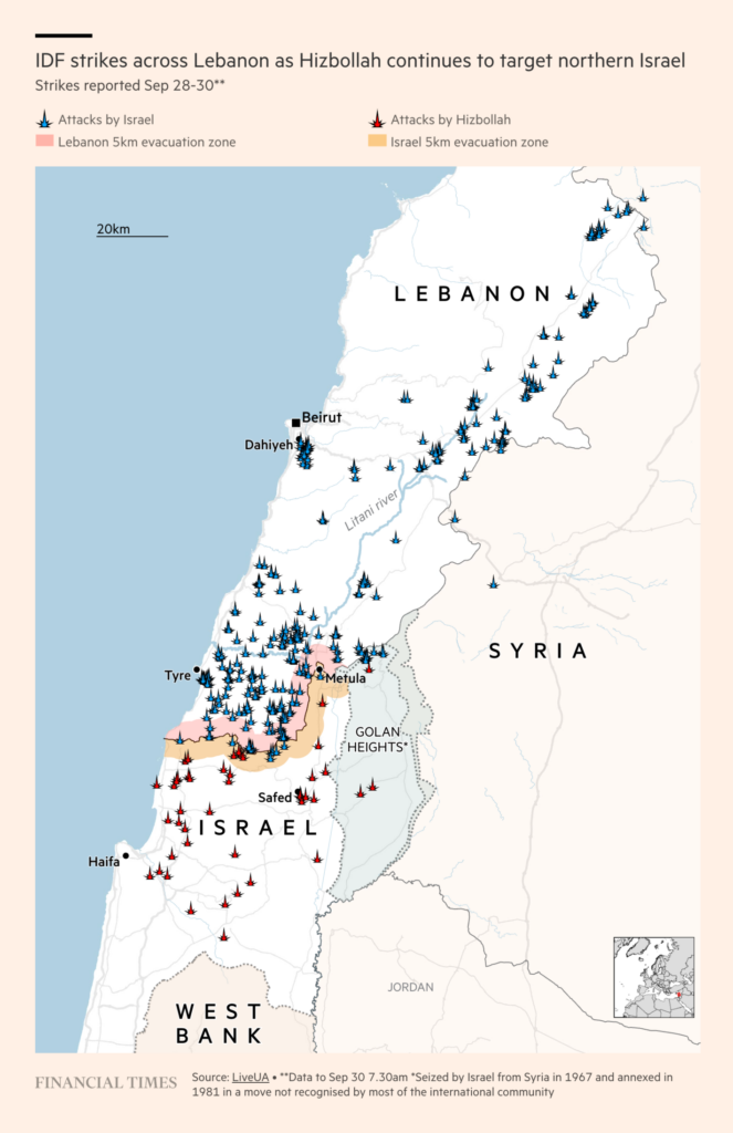
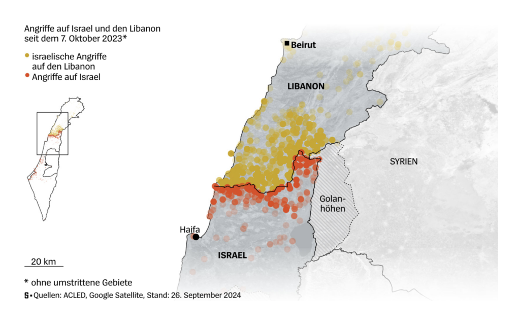
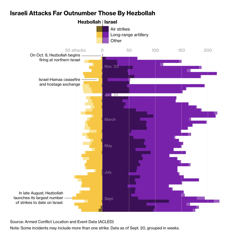
Visualizations from Lebanon and Israel increased after Israel intensified airstrikes last week, killing Hezbollah leader Hassan Nasrallah. And the war has only continued to escalate:

The New York Times: What Lebanon Looks Like After Israel’s Historic Airstrikes, September 24
Financial Times: Israel has pushed into Hizbollah’s backyard. Where will it stop?, October 1
Der Spiegel: Die Zeichen stehen auf Krieg [Chart description: Attacks on Israel and Lebanon since October 7, 2023], September 28
Bloomberg: How Israel and Hezbollah Are Slipping Closer to All-Out War, September 28

Three other visualizations tell stories of death and violence:

InSight Crime: La anatomía de la violencia en Durán [Chart title: Homicides have increased exponentially in all sectors of Durán since the beginning of the year.], September
Le Monde: Qui sont les 50 hommes jugés avec Dominique Pelicot dans le procès des viols de Mazan ? [Who are the 50 men tried with Dominique Pelicot in the Mazan rape trial?], September 28
Scientific American: Why So Many Kids Still Die in Hot Cars Every Year, September 25

With 29% of the vote, the right-wing populist FPÖ won Austria’s parliamentary election for the first time:

Neue Zürcher Zeitung: Rechtsruck in Österreich: Die FPÖ ist die grosse Siegerin der Parlamentswahl – massive Verluste für die Regierungsparteien [Chart title: Only a new black-blue coalition or a three-party alliance can achieve a stable majority], September 29
Zeit Online: Wer den Wahlsieg der Rechten ermöglicht hat [Who made the right-wing’s election victory possible], September 30

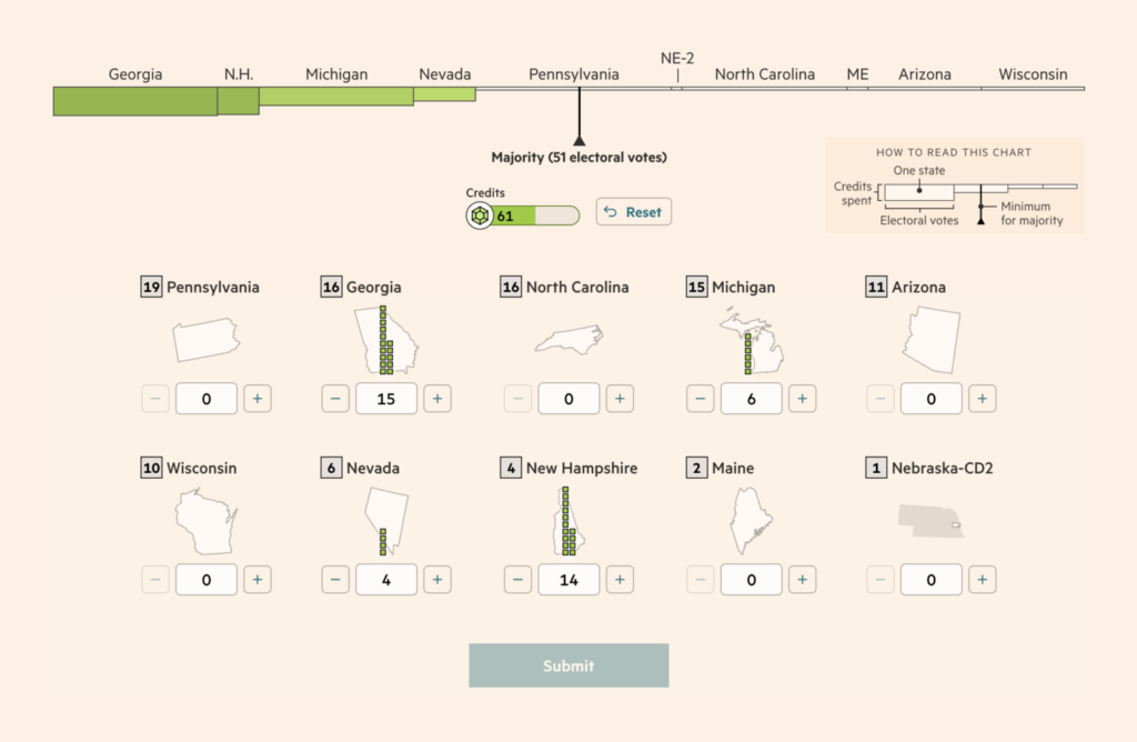
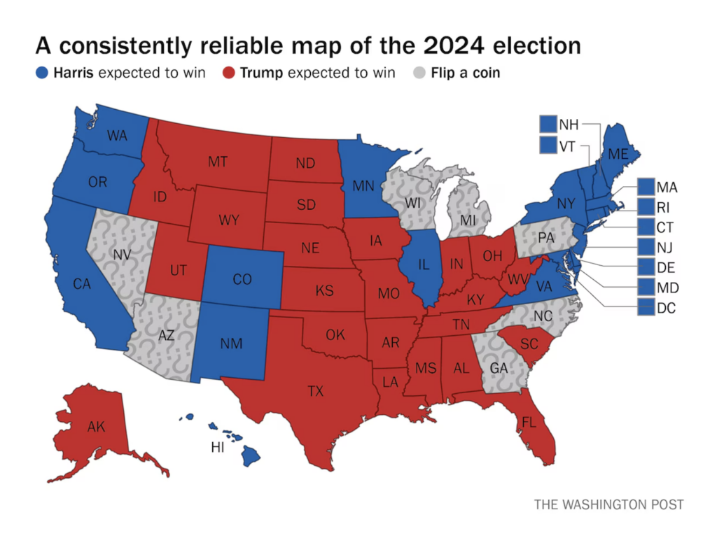
We had some fun with this week’s U.S. election charts. Two games model the contest, and the Washington Post offers an entertaining yet concise take on the polls:

Financial Times: Can you mastermind a US presidential campaign, September 25 Try it out yourself!
The New York Times: How to Win the Electoral College, September 27
The Washington Post: The most accurate map of the 2024 election you’ll see, September 27

There was also coverage of key issues in the U.S. election:

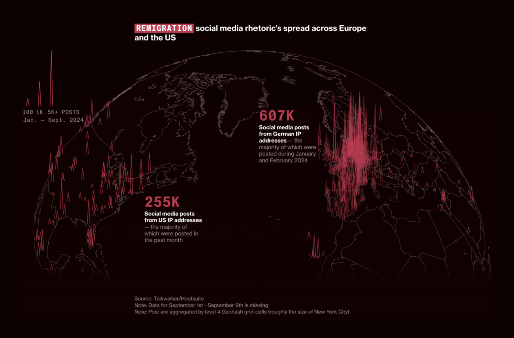
Bloomberg: “Remigration” How a White Nationalist Threat Spread From Austria to the US, September 28
Moritz Stefaner: “Excited to launch a new project today! Waves of Interest. We investigate how the Search Interest in political topics shifts across US election cycles, using @GoogleTrends data,” September 26 (Tweet, Website) Full interactive website worth exploring

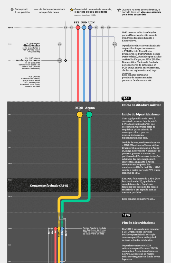
A brief look at Brazil’s upcoming elections, with this detailed analysis of the evolution of Brazilian political parties:

Nexo Jornal: A genealogia e o perfil dos partidos brasileiros [The genealogy and profile of Brazilian parties], September 25

This week’s discussions on money include the need to develop a new measure of poverty:

El País: La vivienda, imposible para los jóvenes: los precios suben el doble que sus salarios [Chart description: Change in housing prices between 2015 and 2023 and in gross salaries between 2015 and 2022], September 29
The New York Times: We Need a New Global Measure for Poverty, September 24

U.S. universities are dealing with the end of affirmative action and a student trend towards southern colleges:

Bloomberg: Black Enrollment Drops at Top Schools as Affirmative Action Axed, September 27
The Wall Street Journal: Sorry, Harvard. Everyone Wants to Go to College in the South Now, September 27

The sports of the week were baseball and math:

The Pudding: Batting by the Numbers, The Evolution of Baseball’s Perfect Lineup, September 24
Aman Bhargava: “For this week’s #tidytuesday, we’re looking at IMO scores and medals […] Everything made in R with ggplot. Progress gif & code below!” September 24 (Bluesky)

Let’s sit back and appreciate some data vis topics, starting with multiple line charts:

Gazeta Wyborcza: Unia Europejska jak “Barbieland”. Niepokojące badanie ECFR po eurowyborach [Chart description: Distrust of the European Union], September 26 Exceptional Visualization!
Ember: Coal generation in OECD countries falls below half of its peak, September 30

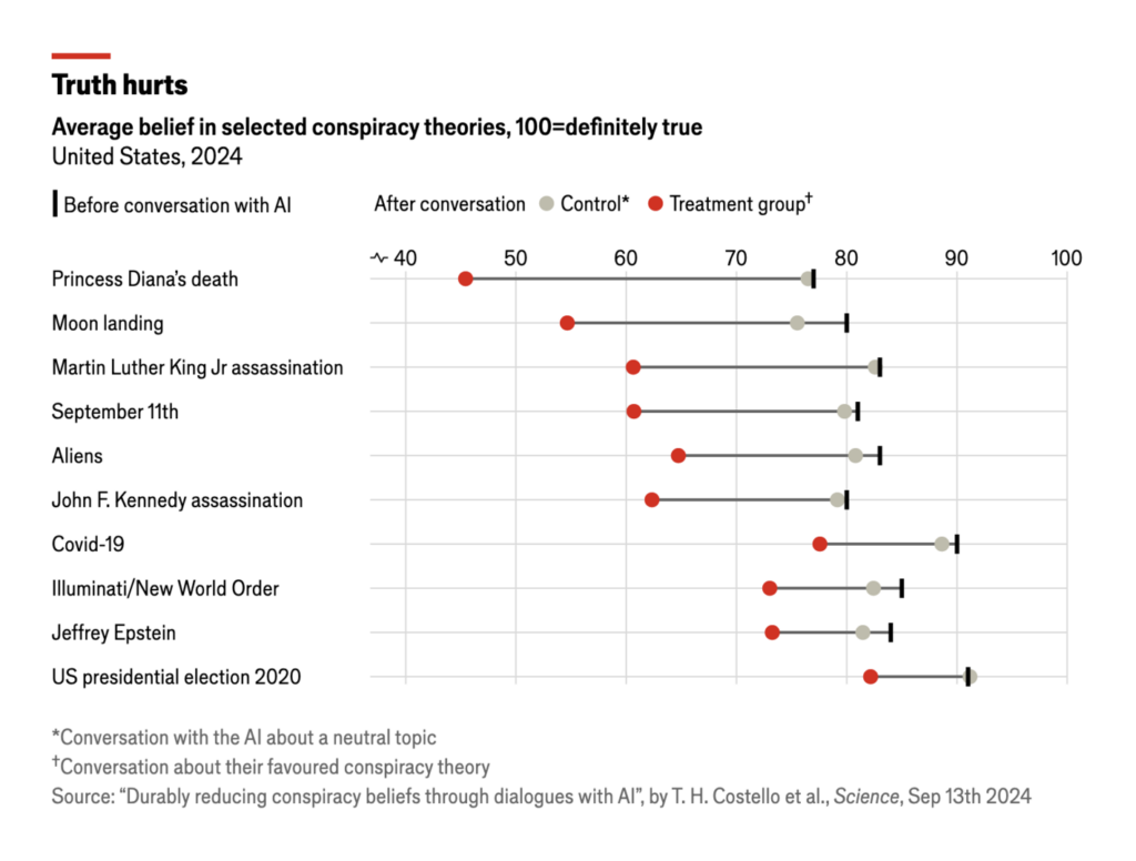
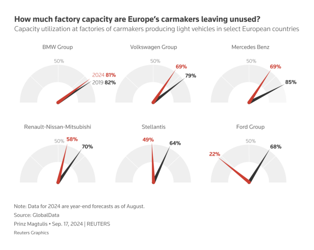
Next up, interesting color choices. These two visualizations used black and red to indicate before and after values, addressing topics like AI’s effectiveness in swaying conspiracy theorists and European car factory capacity:

The Economist: Want to win an argument? Use a chatbot, September 26
Reuters: Volkswagen’s labour clash spotlights Europe’s car factory conundrum, September 25

Finally, let’s spotlight two uniquely styled maps — one depicting geoglyphs threatened by agriculture, another illustrating grocery chain territories:

Bloomberg: The Big Take Brazil’s Farmers Are Plowing Over an Ancient Amazon Civilization, September 25
The Washington Post: Grocery chains are bigger than ever. See who runs the stores near you, September 24

What else we found interesting

South China Morning Post: In memory of Dennis Wong (1971-2024), September 30
Sonja Kuijpers | STUDIO TERP: “Like a true self reporting data illustrator I started tracking the pain in the joints of my hands […]” September 25 (Bluesky)
Rest of World: Digital Divinity, Ancient traditions meet modern technology, September 30

Applications are open for…


Help us make this dispatch better! We’d love to hear which newsletters, blogs, or social media accounts we need to follow to learn about interesting projects, especially from less-covered parts of the world (Asia, South America, Africa). Write us at hello@datawrapper.de or leave a comment below.

Want the Dispatch in your inbox every Tuesday? Sign up for our Blog Update newsletter!

Comments