This article is brought to you by Datawrapper, a data visualization tool for creating charts, maps, and tables. Learn more.
Data Vis Dispatch,
October 12
The best of last week’s big and small data visualizations

Welcome back to the 17th edition of Data Vis Dispatch! Every week, we’ll be publishing a collection of the best small and large data visualizations we find, especially from news organizations — to celebrate data journalism, data visualization, simple charts, elaborate maps, and their creators.
Recurring topics this week include the oil spill off the coast of California, methane as a cause for climate change, the volcano eruption on La Palma, and, of course, the pandemic.
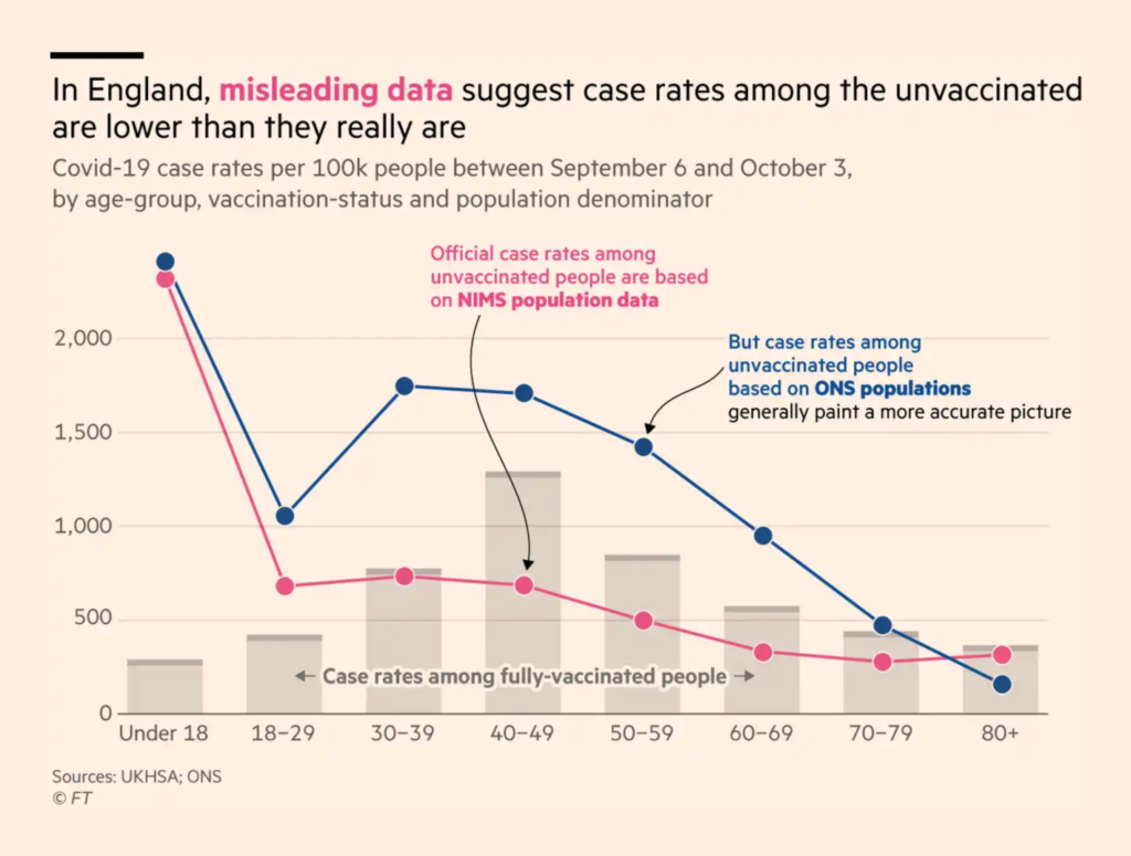
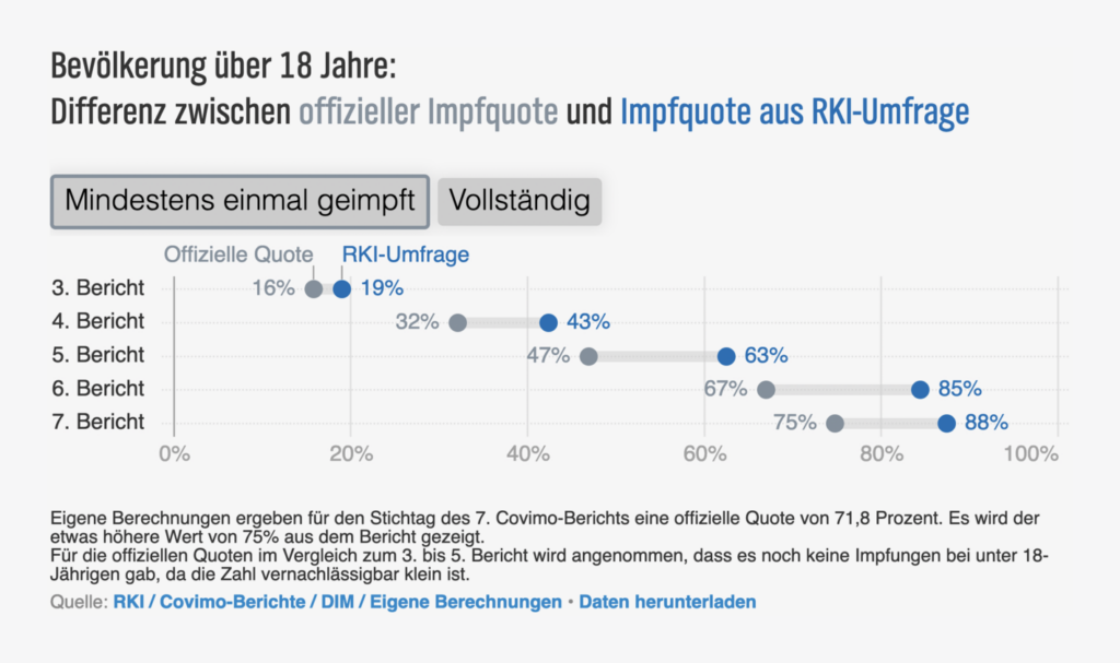
First, some Covid-19 visualizations. One of the most-discussed topics this week was the quality of vaccination data. The Financial Times calls the U.K. data misleading, while German journalists and politicians are annoyed that it’s impossible to know how many people are vaccinated after all.
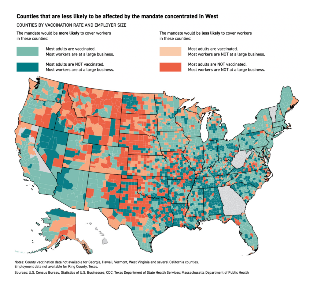
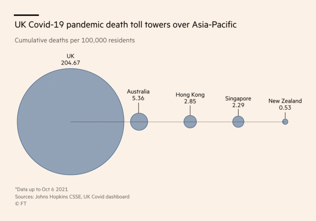
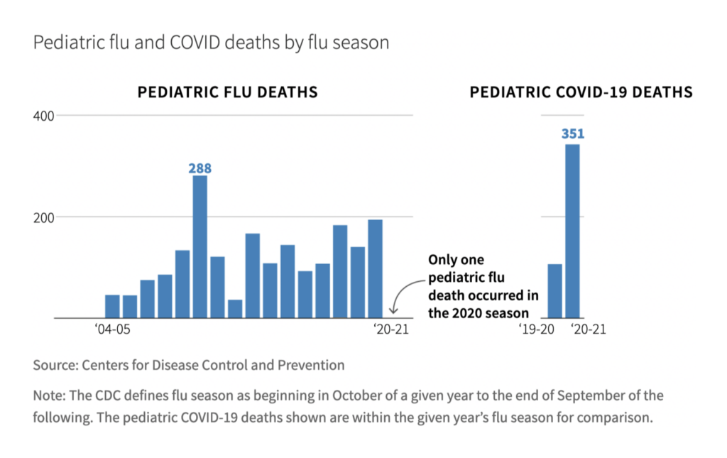
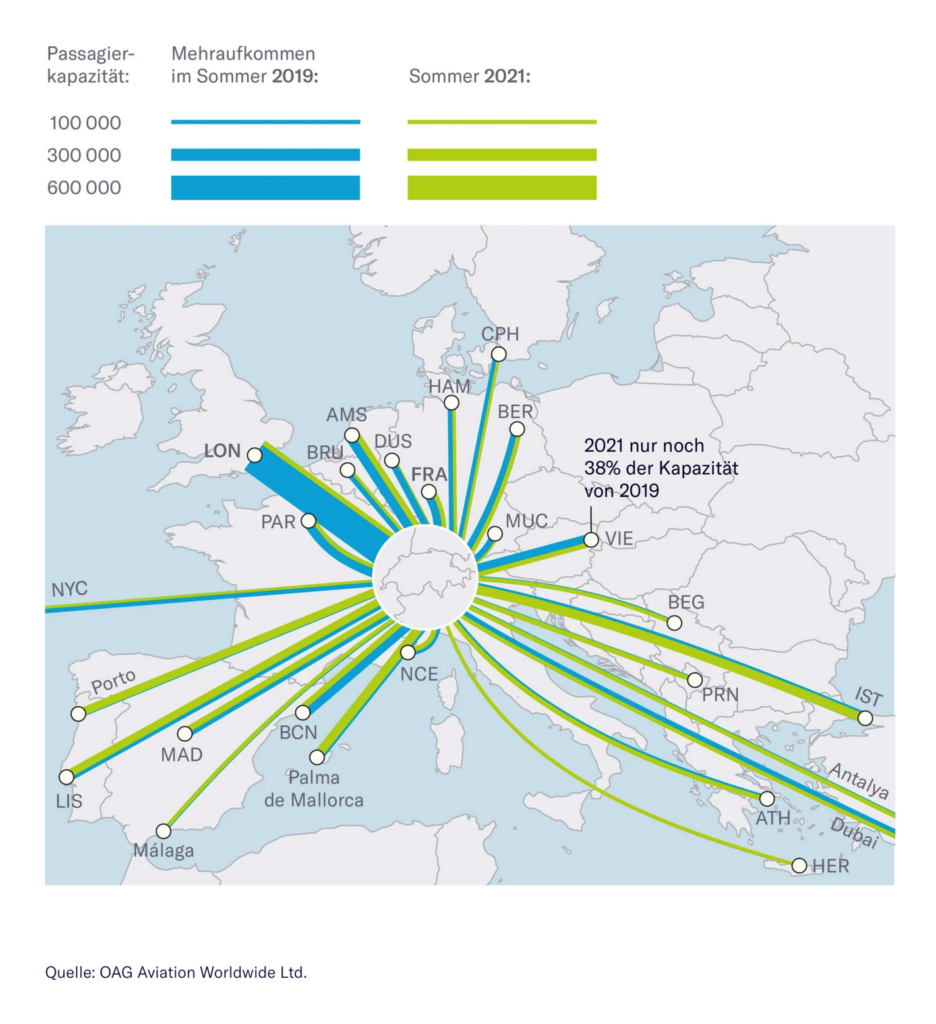
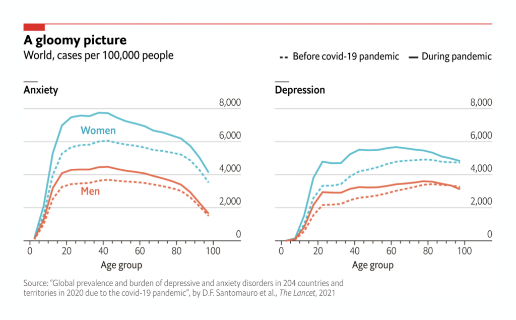
And like almost every week, journalists are visualizing the consequences of the pandemic. This time, fewer flights, more depressions:
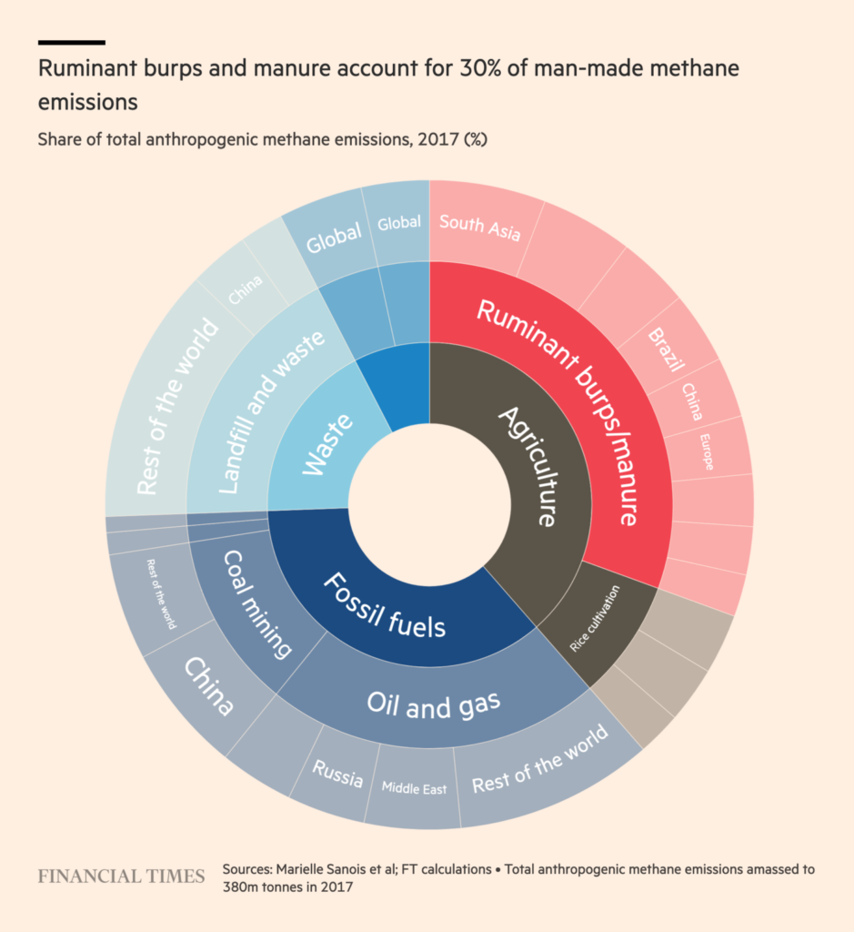
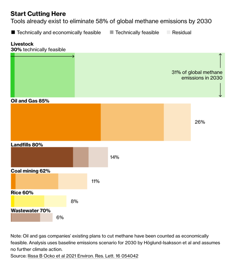
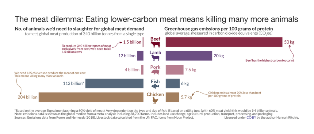
Another topic that we cover almost always in the Data Vis Dispatch: The climate. Among others, newsrooms looked at the effect of methane emissions, and how we can change farming to reduce them:
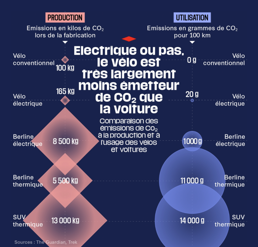
Another debated topic in the past week were our modes of transportation and how they affect the climate. The Financial Times published a whole series on electric cars:

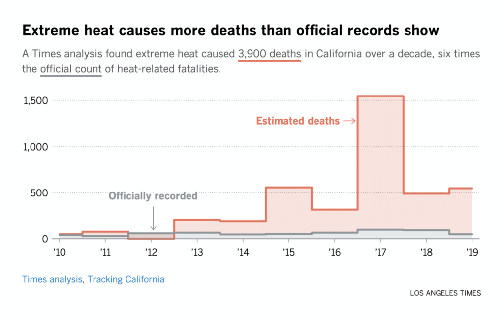
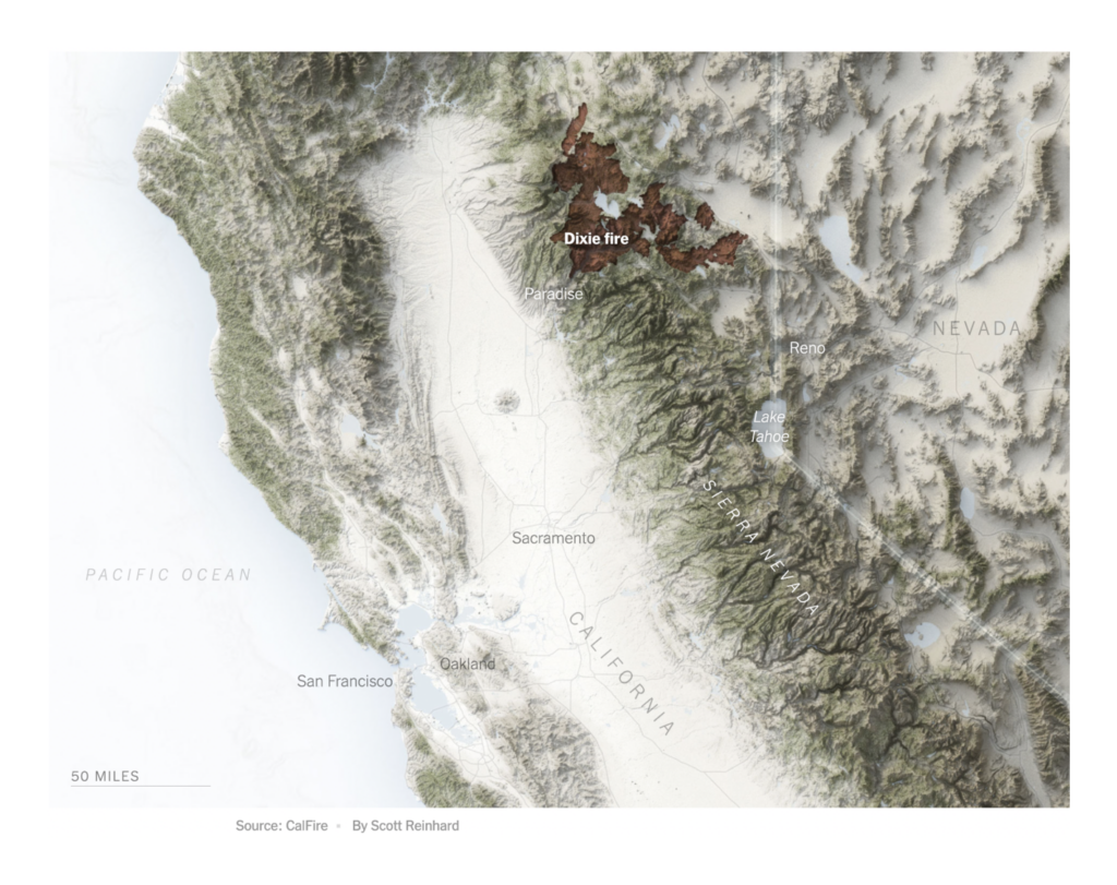
When it comes to the consequences of the climate emergency, the Los Angeles Times and the New York Times revisit the heat this summer, and the wildfire disasters:
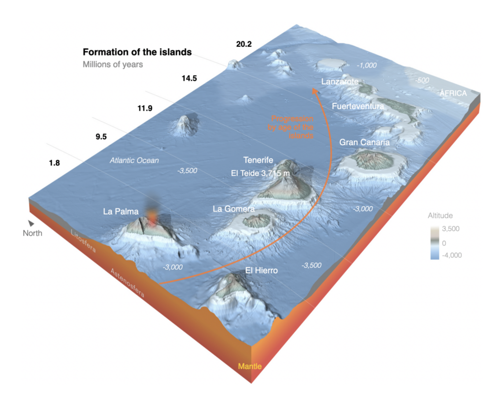
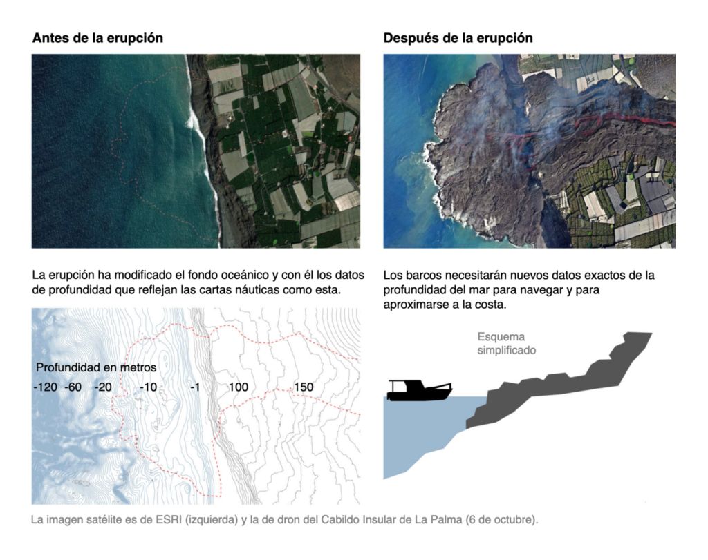
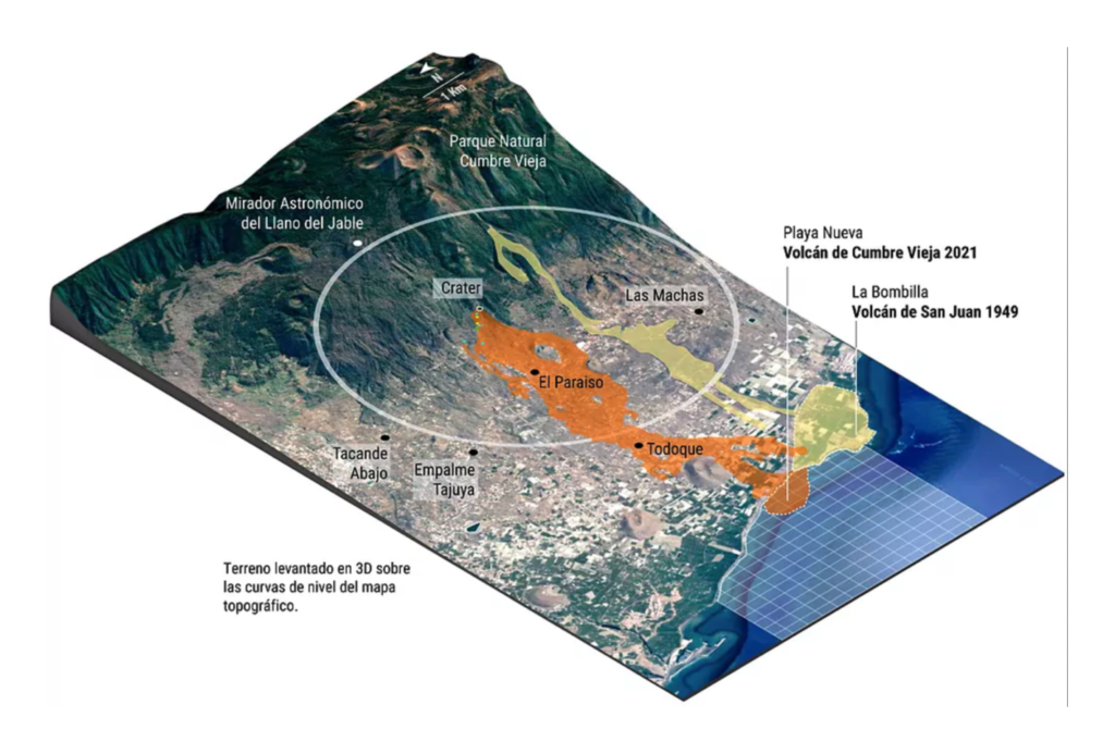
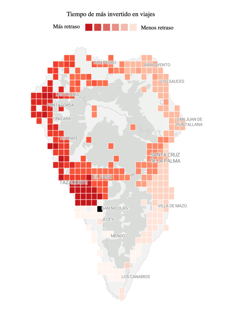
In other environmental diasters: the La Palma volcano. Since its eruption on September 19, Spanish newspapers have put out visualizations that got more elaborate with each week:
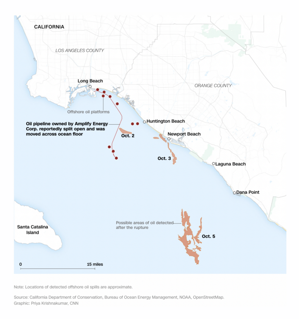
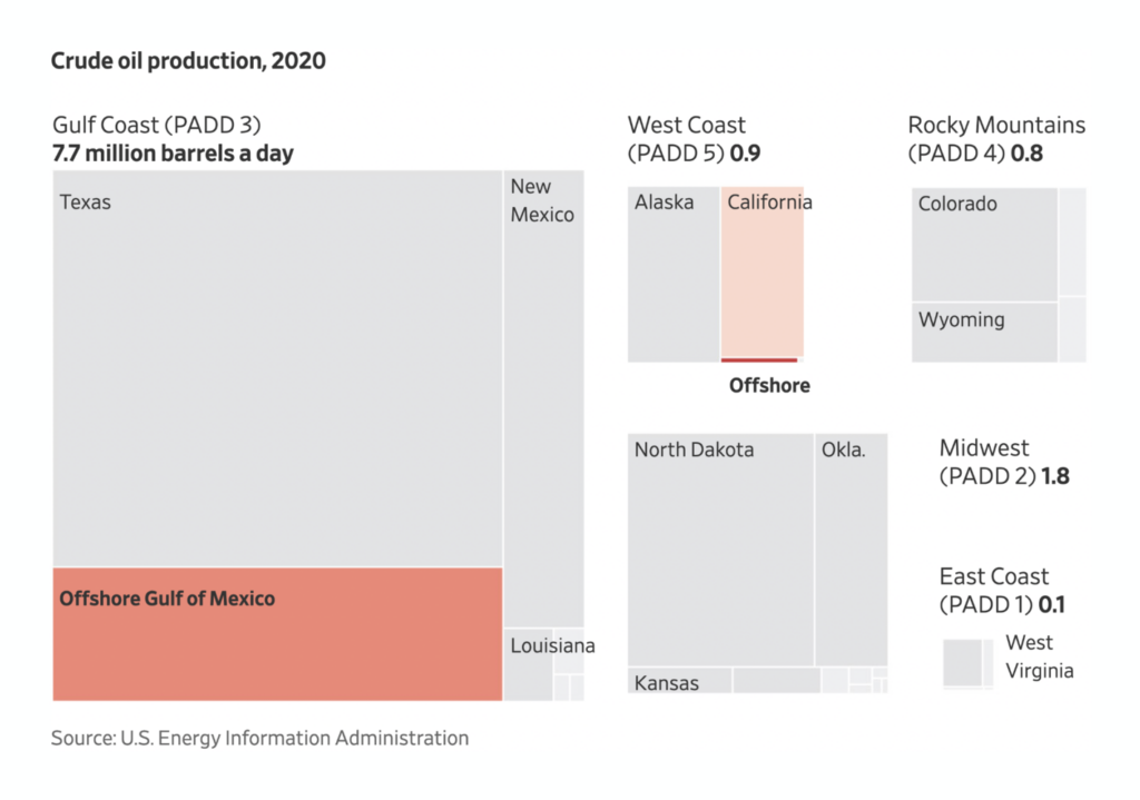
On the other side of the planet, oil is causing trouble in the form of oil spills off the coast of California:
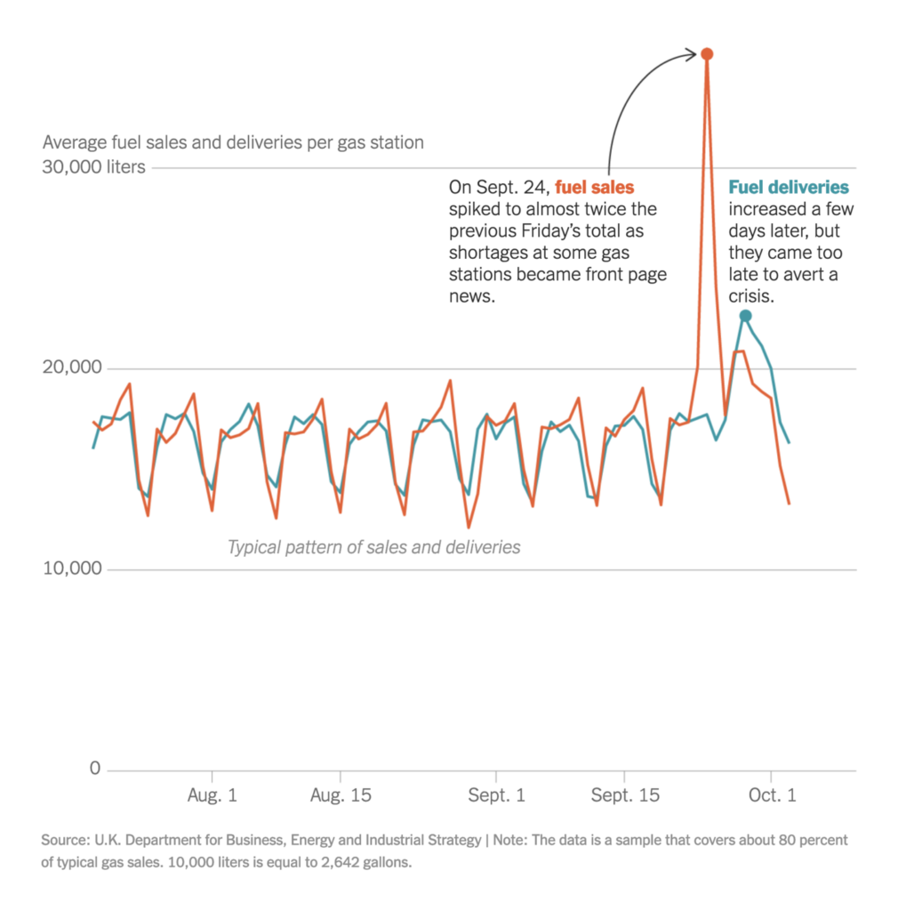
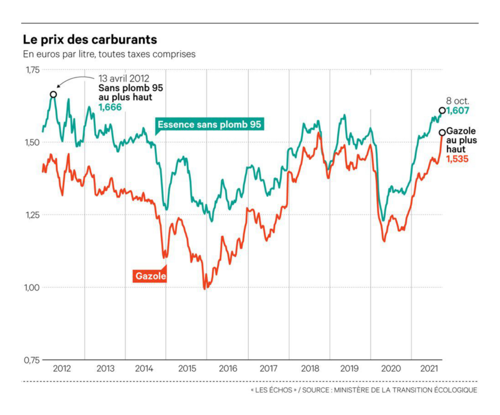
Gasoline is also a problem in the U.K. and France, where gas is either more expensive than ever or too high in demand for the available supply:
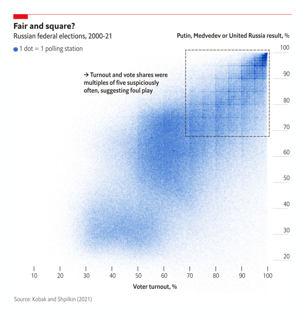
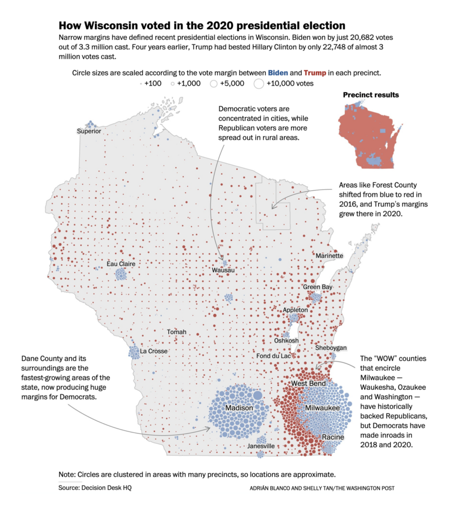
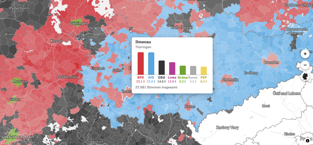
This week’s visualizations on elections show beautiful scatterplots, clustered circles, and maps in high resolution:
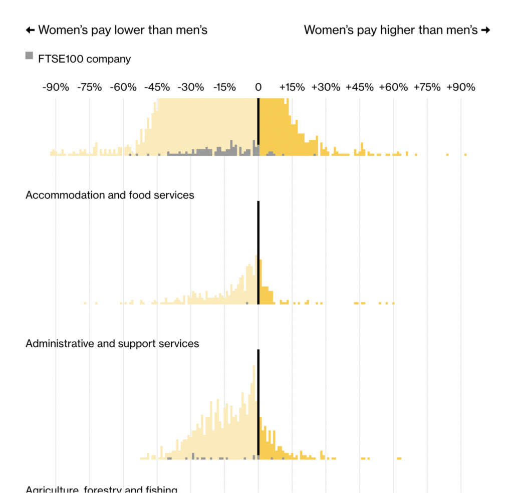
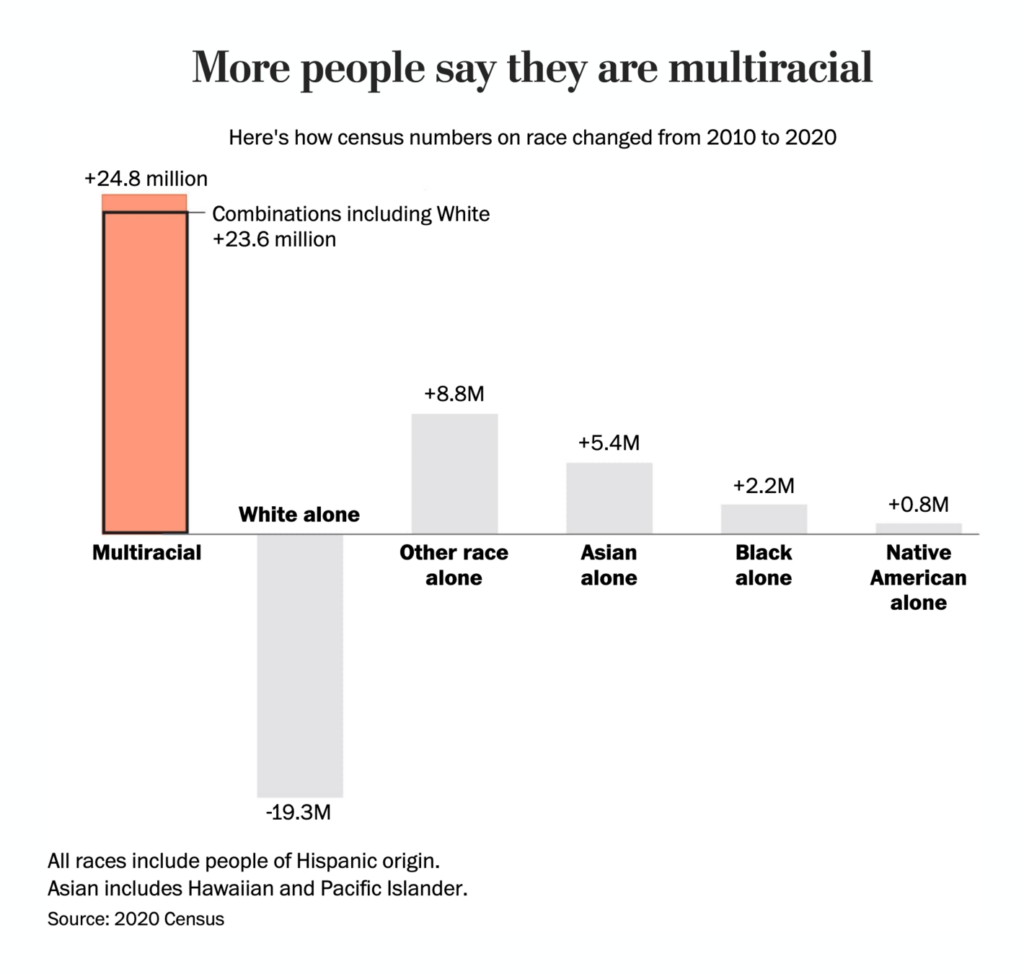
In other news that concerns society, we got new (disappointing) data on the gender gap, tax breaks where they shouldn’t be, and some encouraging data: America grows more equal (at least a little bit).

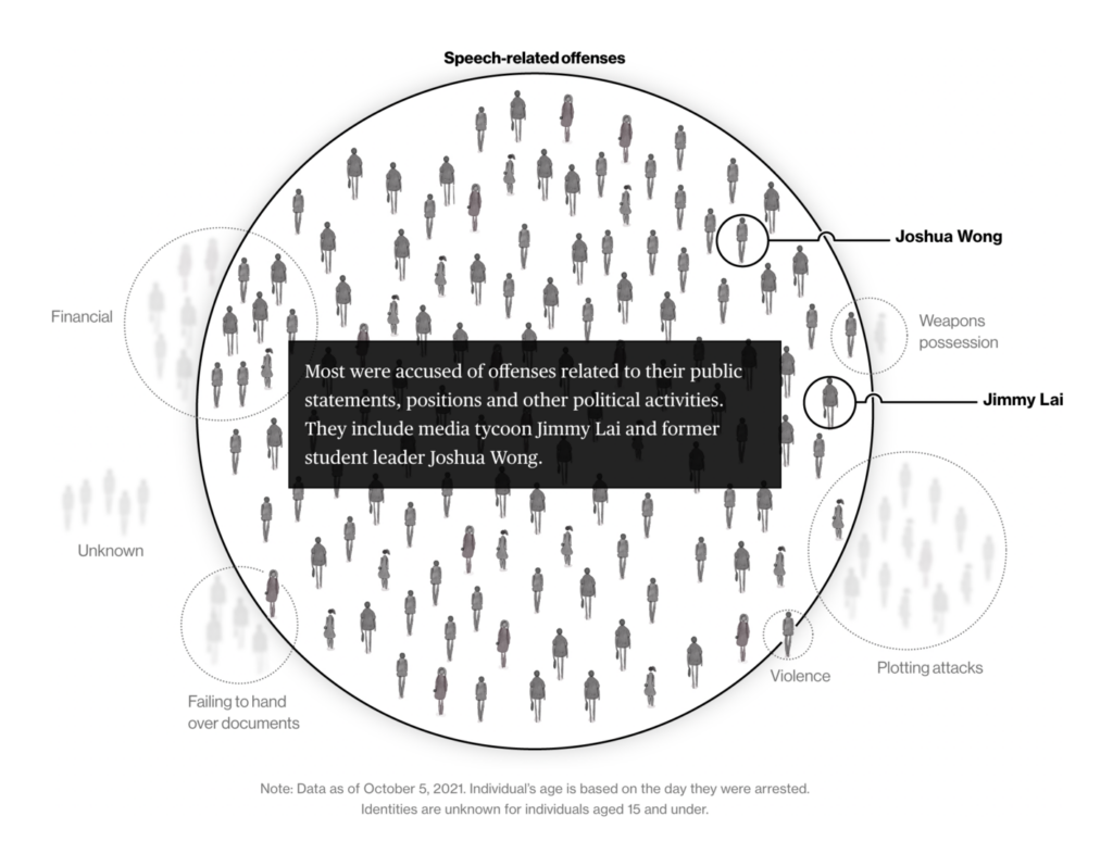


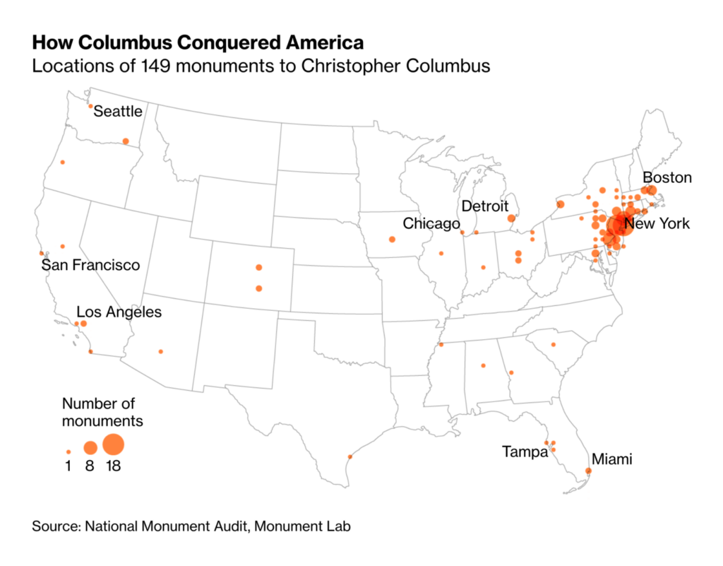
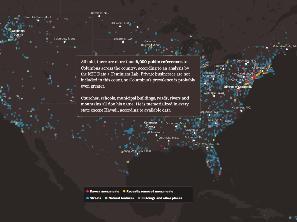
The U.S. also debates Columbus monuments and other references to him – where they still exist, and where they’re coming down:
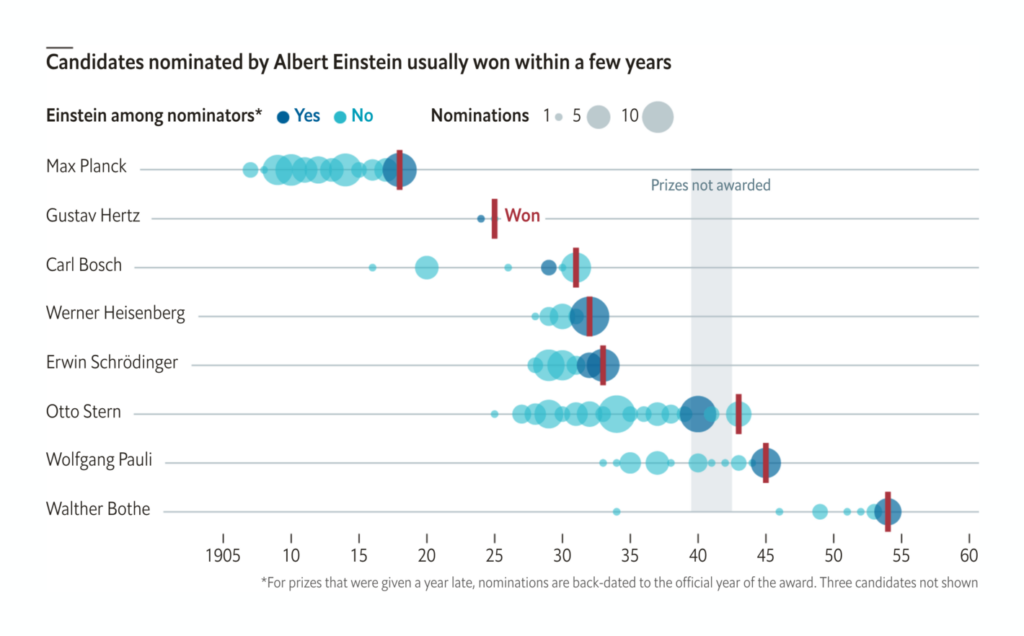
Thanks to the Economist and the Nobel ceremonies, we can show you another chart about a famous historical person, featuring Albert Einstein:
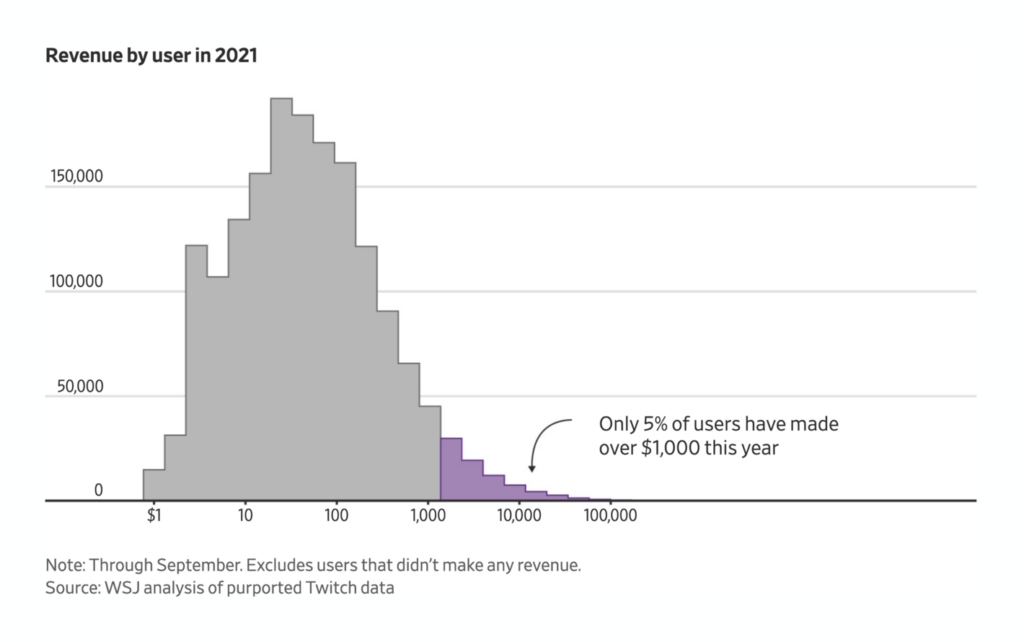
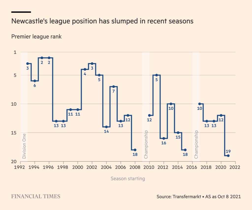
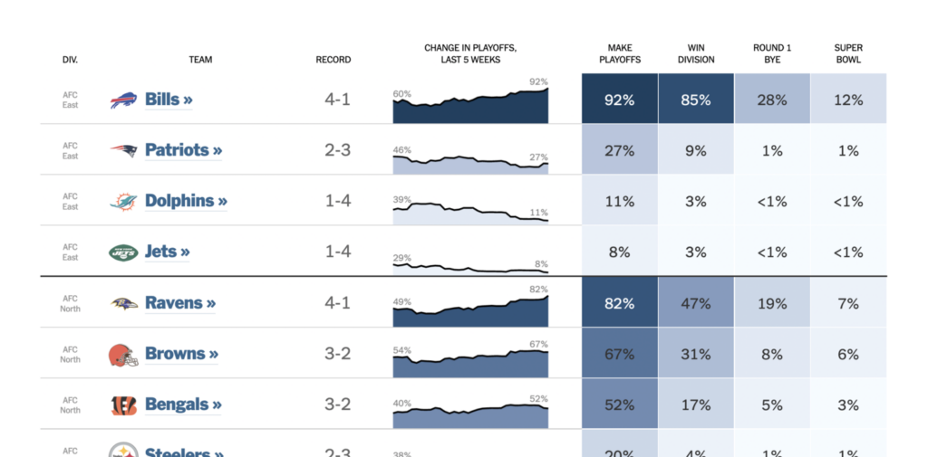
And in charts concerning sports and entertainment, we got mostly game-related ones today: Twitch users who play games and make a bit of money doing so, football (the British kind) and more football (the American kind):
What else we found interesting

- Bloomberg Graphics is looking for interns for a 12-week winter and a 10-week summer internship. Learn more here.
- Los Angeles Times is looking for spring and summer interns in the Data and Graphics Department. Apply until October 15.
- Axios is looking for a “business/financial data visualization journalist”. Learn more here.
- The Data Visualization Society’s conferencce Outlier will happen next February. Apply to become a speaker until October 17.
Help us make this dispatch better! We’d love to hear which newsletters, blogs, or social media accounts we need to follow to learn about interesting projects, especially from less-covered parts of the world (Asia, South America, Africa). Write us at hello@datawrapper.de or leave a comment below.


Comments