Data Vis Dispatch, January 14: Fire, congestion, and Greenland
January 14th, 2025
11 min
This article is brought to you by Datawrapper, a data visualization tool for creating charts, maps, and tables. Learn more.
The best of last week’s big and small data visualizations
Welcome back to the 164th edition of the Data Vis Dispatch! Every week, we publish a collection of the best small and large data visualizations we find, especially from news organizations — to celebrate data journalism, data visualization, simple charts, elaborate maps, and their creators.
Recurring topics this week include Nobel Prizes, teen pregnancy, and war.
This week marked more than one year of war in Gaza. Several visualizations looked for individual stories in the violence and destruction:
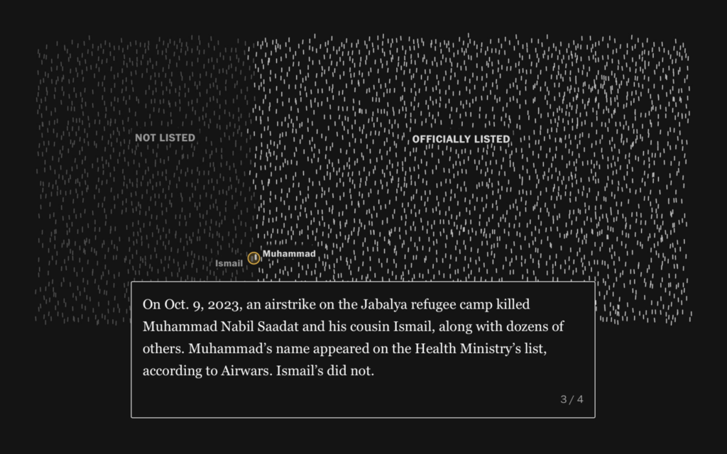

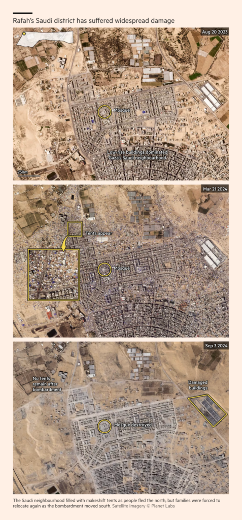


Meanwhile in recent weeks, Israel has invaded southern Lebanon and bombed even the center of Beirut:
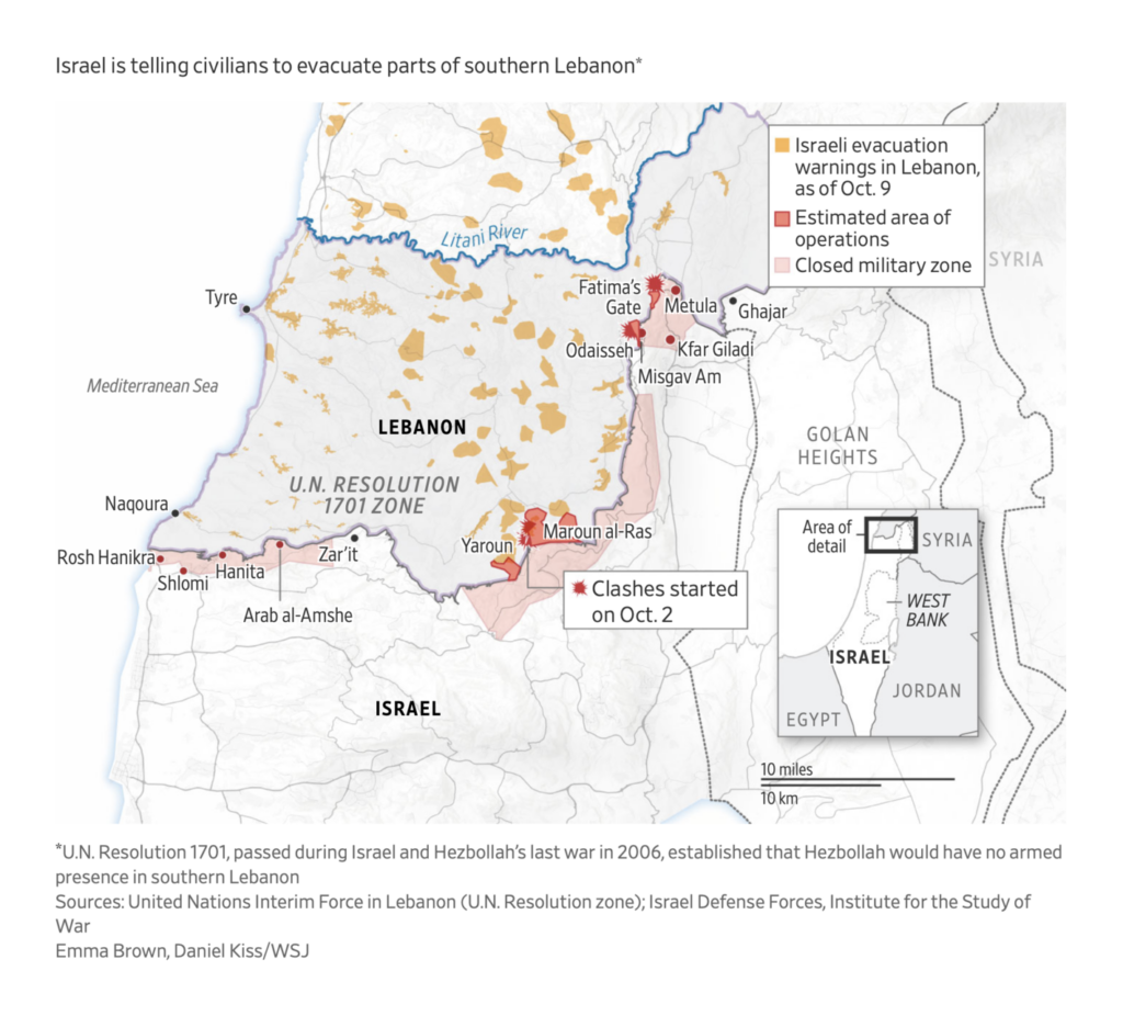
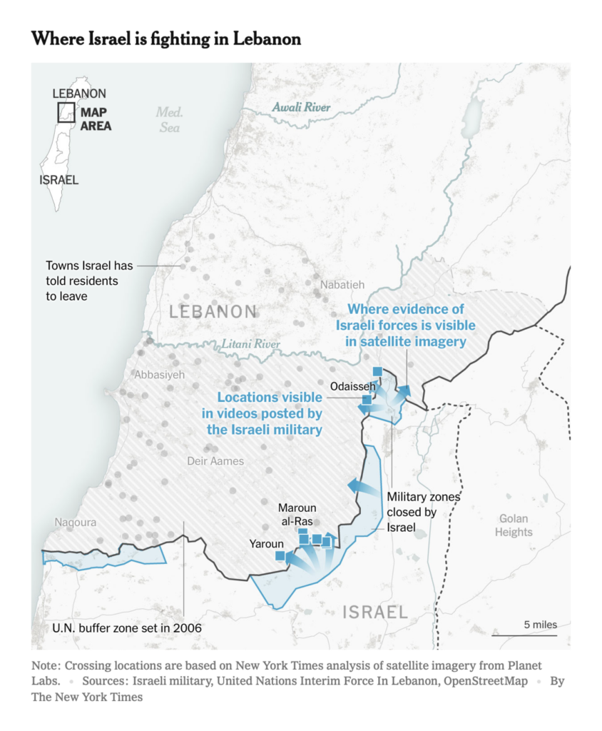
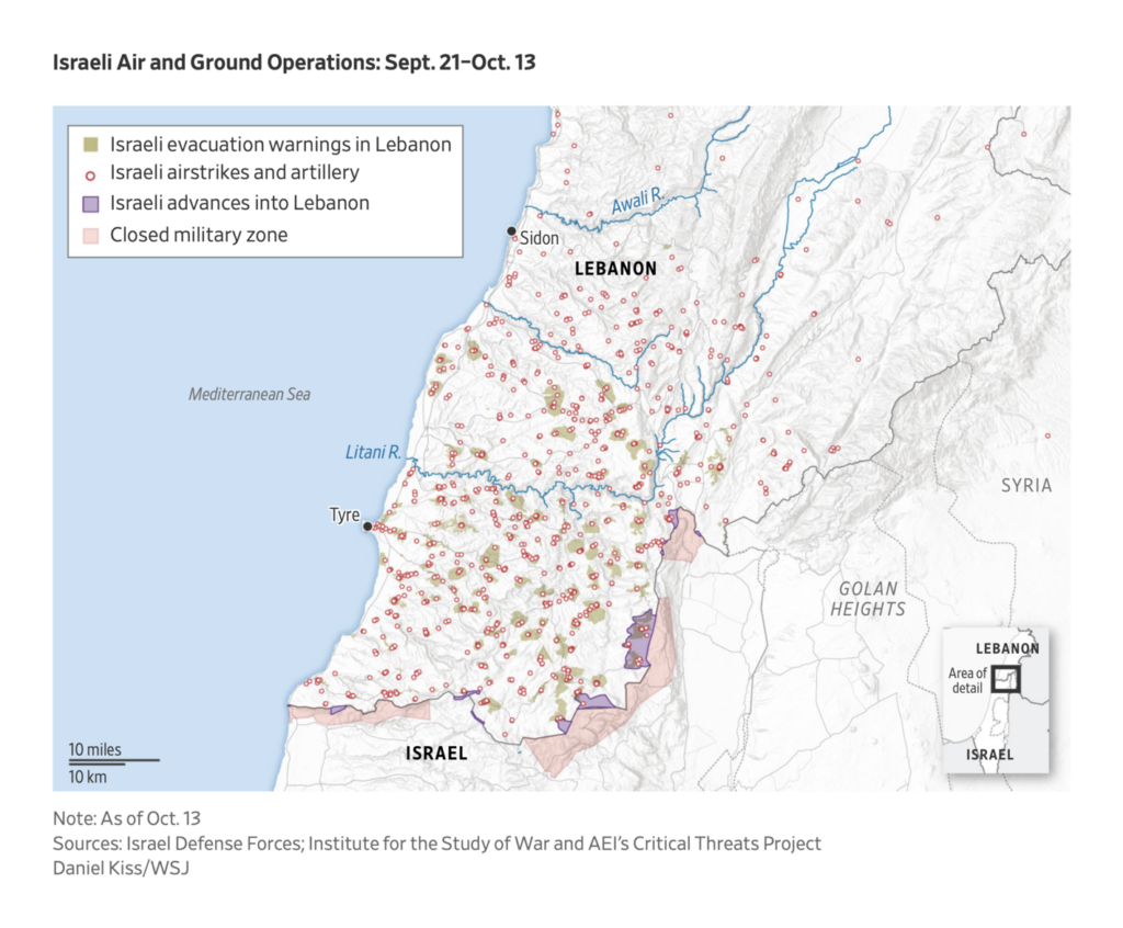
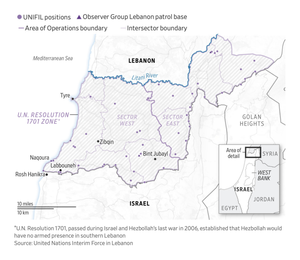
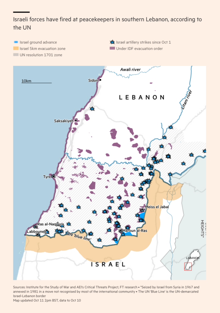
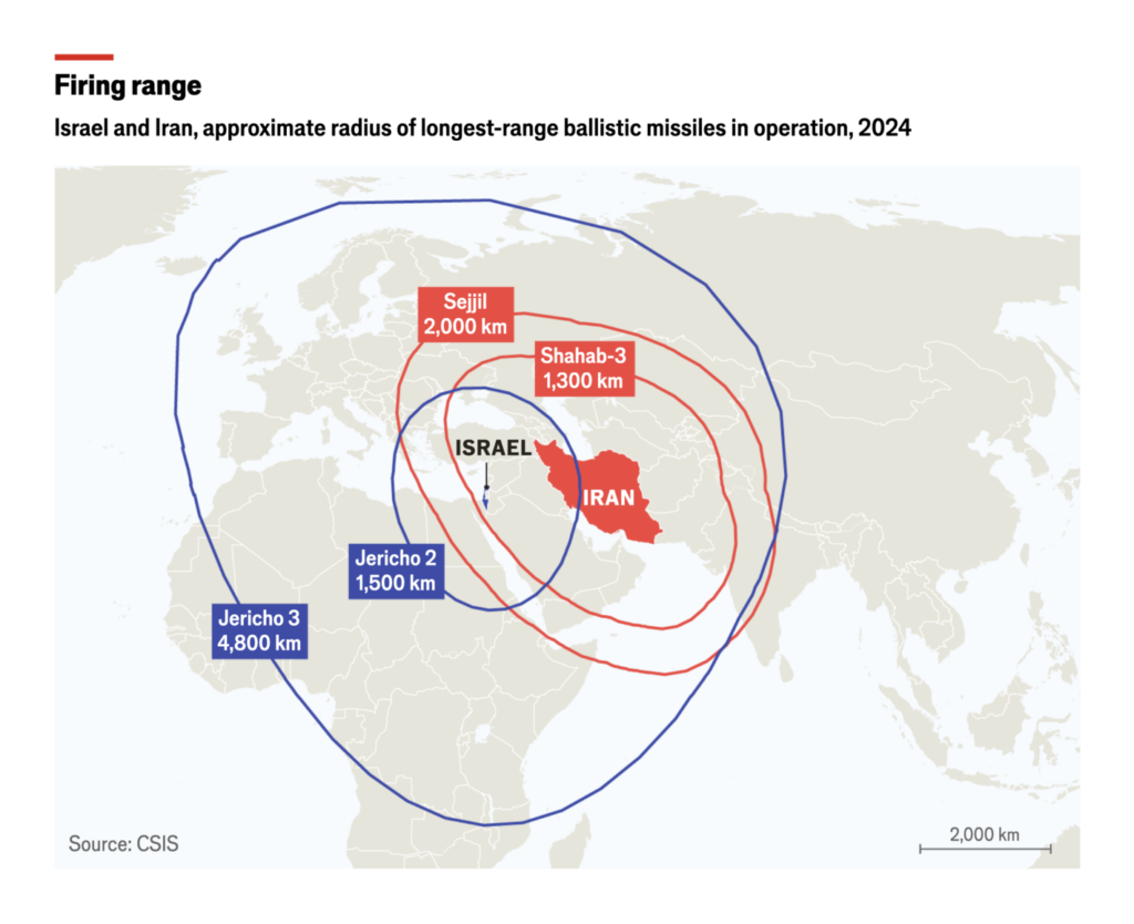
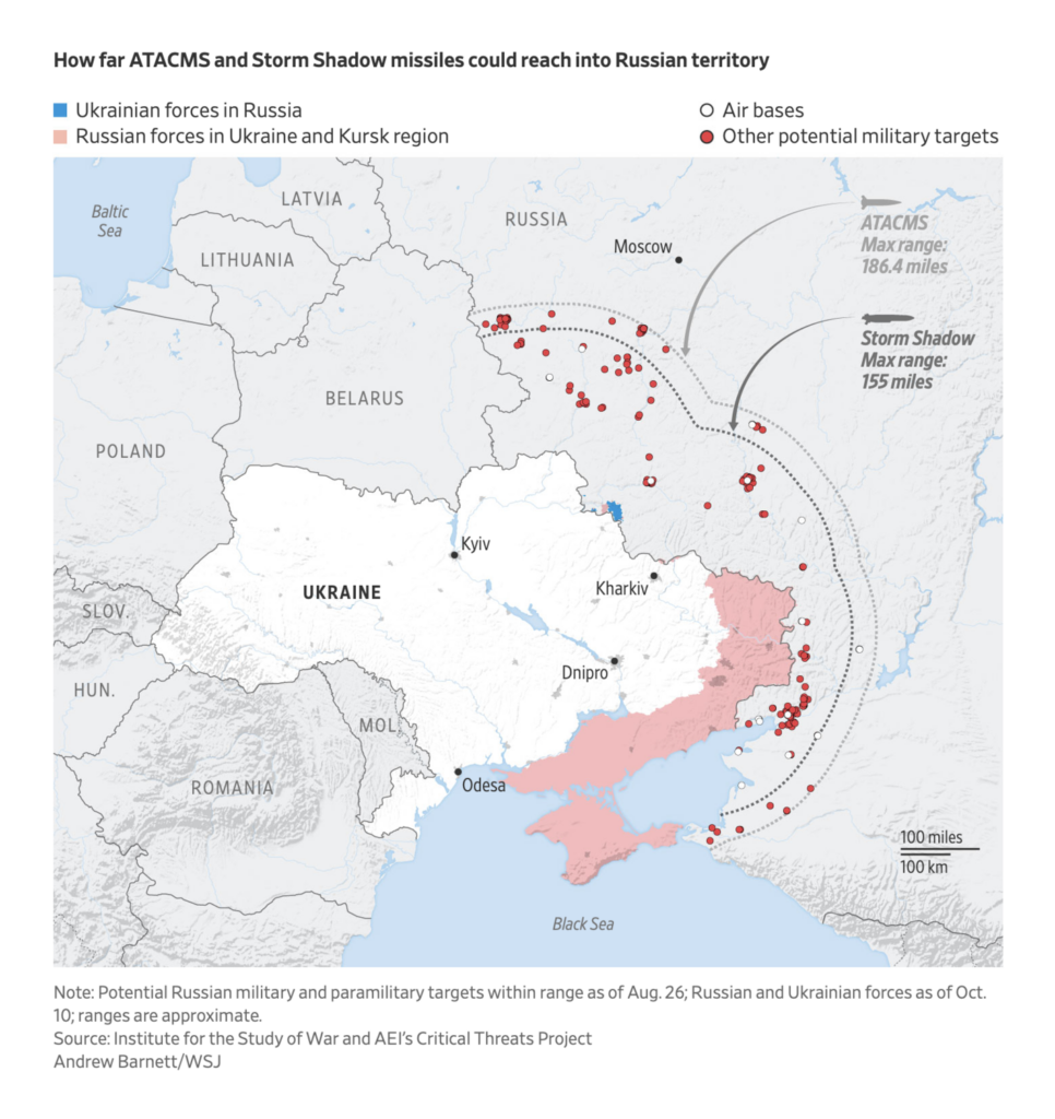
And we can’t yet expect to have seen the last round of air attacks between Iran and Israel — not to mention Russia and Ukraine:
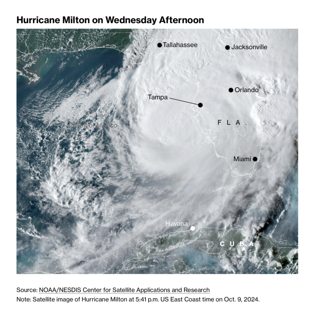
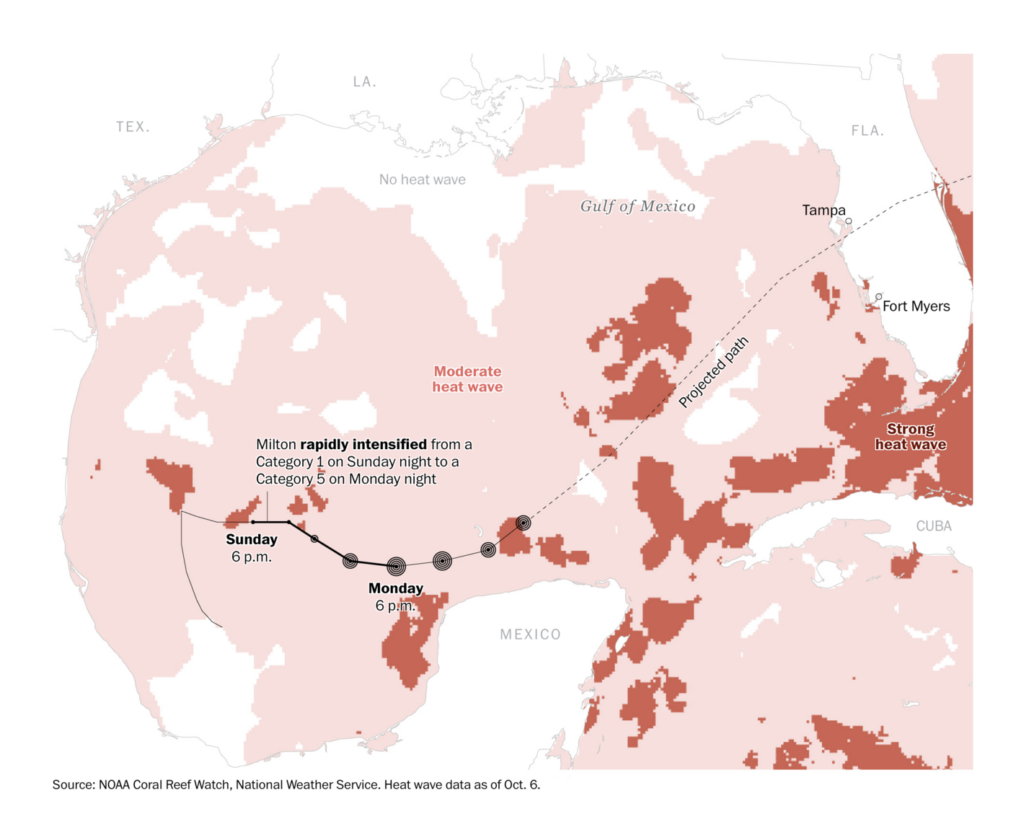
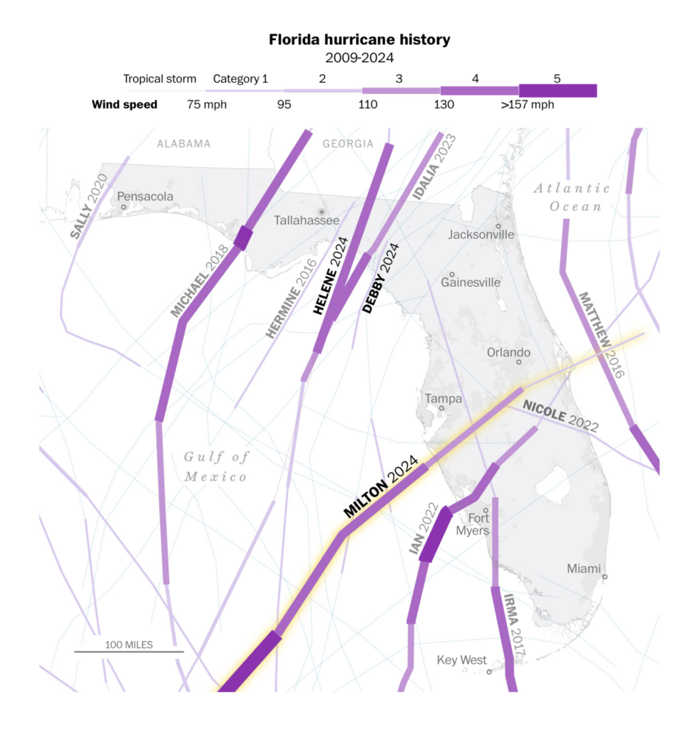
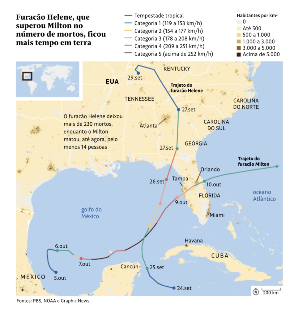
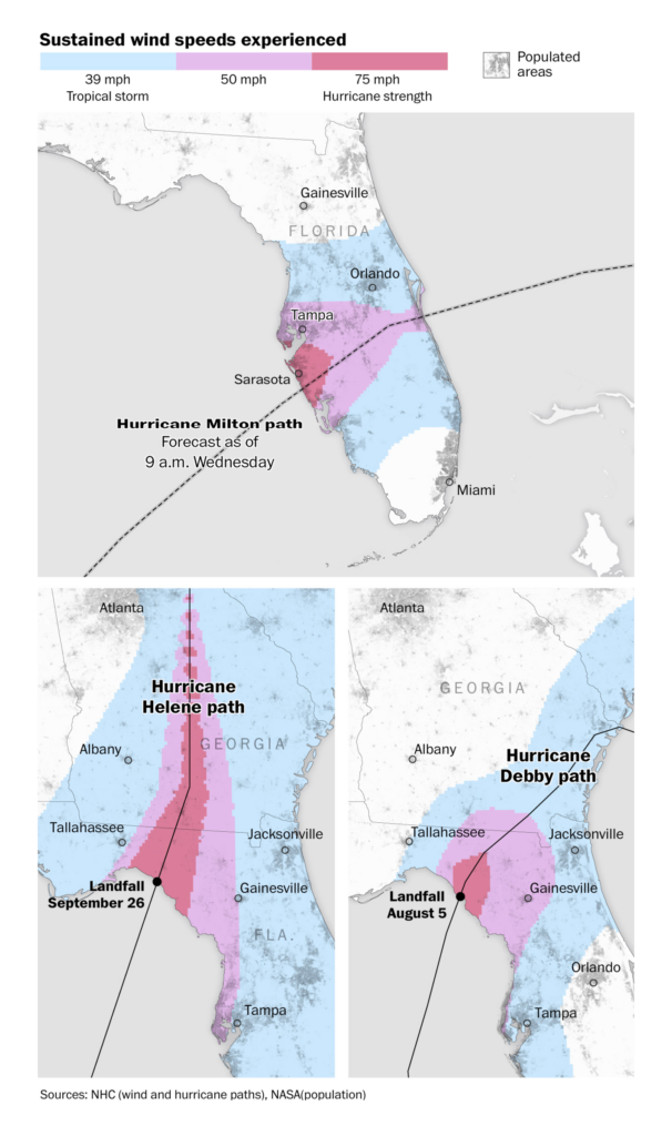
On the other side of the world, Hurricane Milton became this year’s strongest recorded storm before making landfall in Florida on Wednesday:
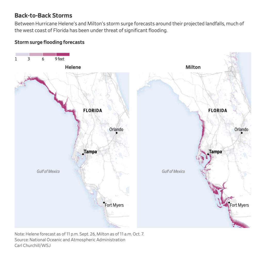
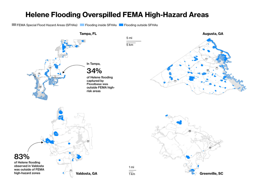
Less than two weeks had passed since the devastating Hurricane Helene, though different regions were hit hardest:
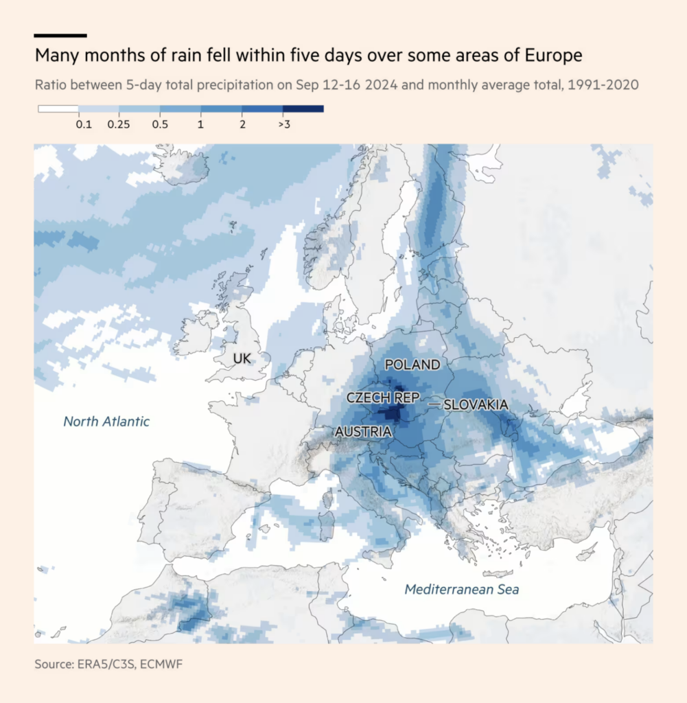
Central Europe has also experienced severe rain and flooding this fall:
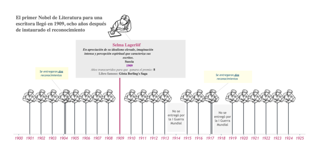
A palate cleanser in the form of Nobel Prizes — and their barely-there progress on gender parity:

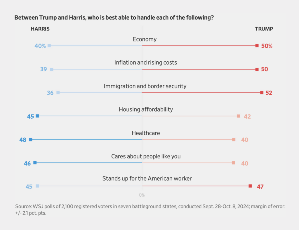
But now it’s on to the U.S. elections. The polls are bafflingly close:
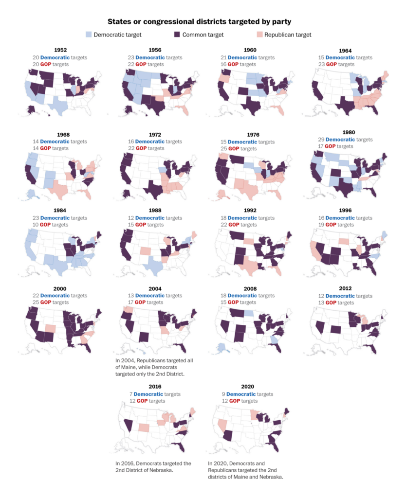
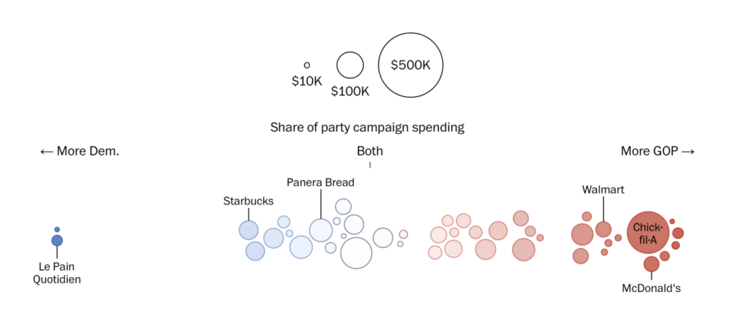
Polarization has seen large swathes of the country abandoned by one or the other major party, and a political culture divided even over lunch menus:
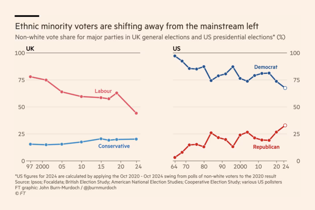
Though at least some subgroups of voters are actually growing less polarized:
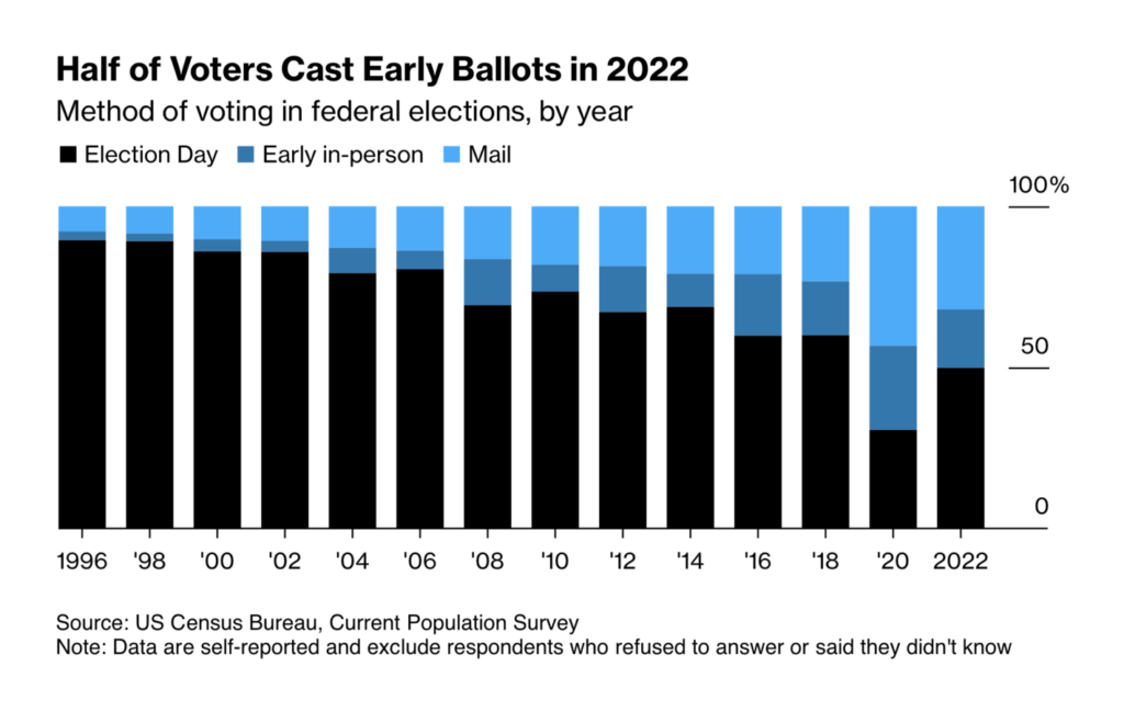
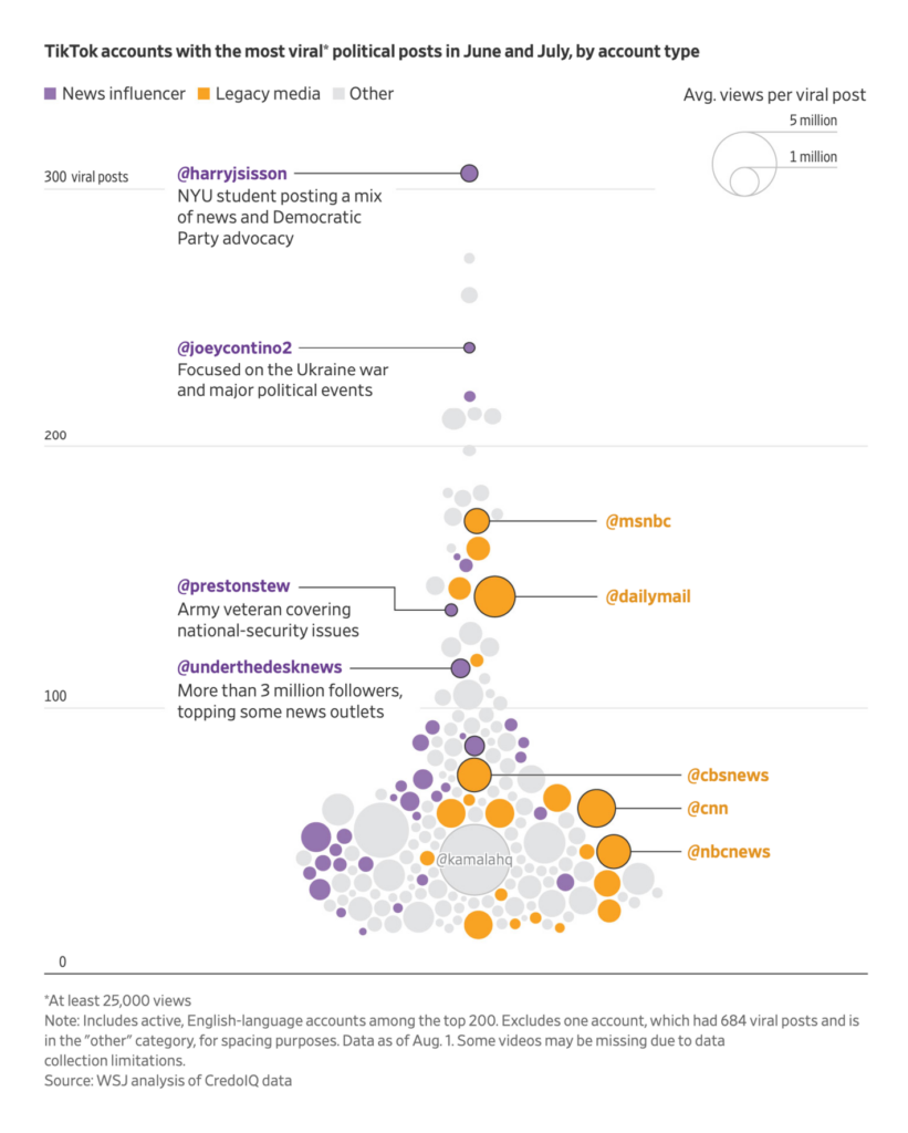
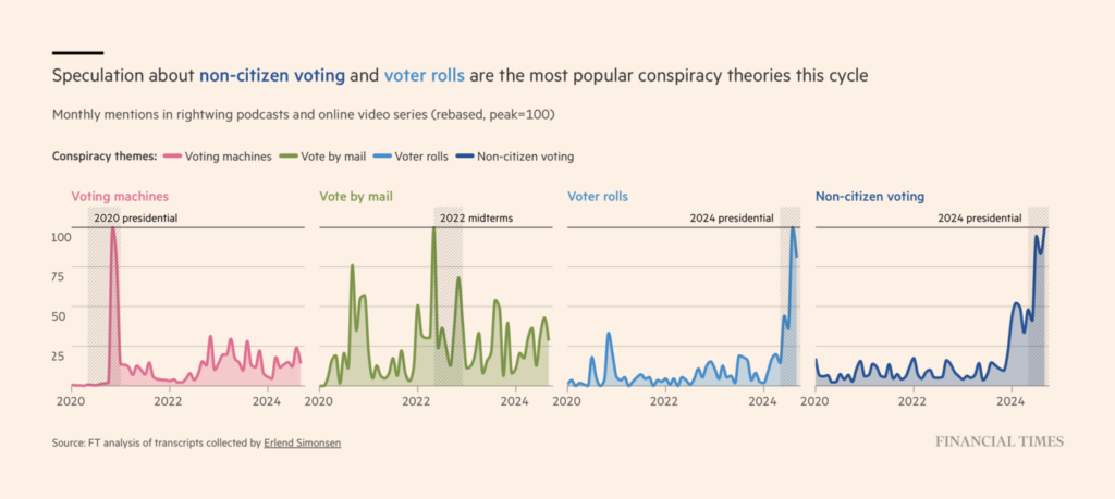
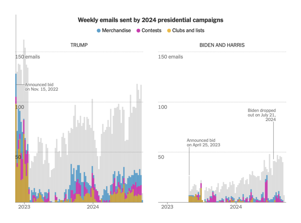
With a large proportion of expected mail ballots, the election’s outcome may take a few days to determine — and with widespread conspiracy theories, it could take even longer to be accepted:
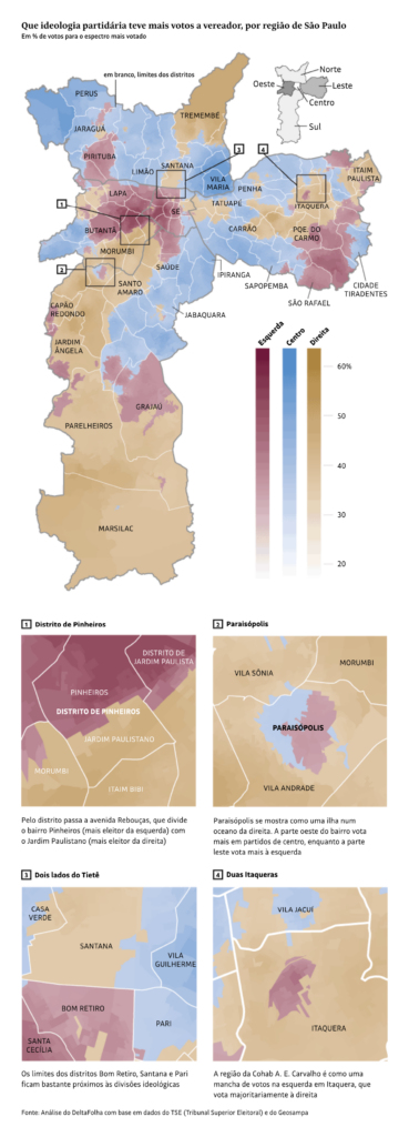
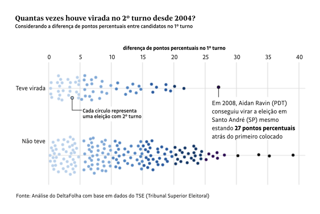
The Folha de S.Paulo was on a roll this week with charts of Brazil’s municipal elections:
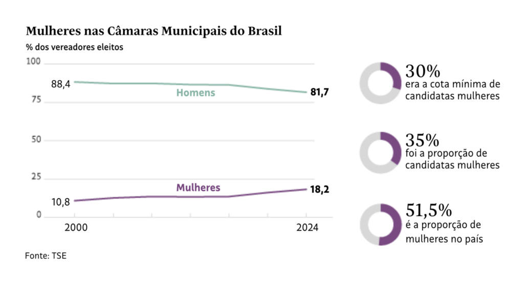
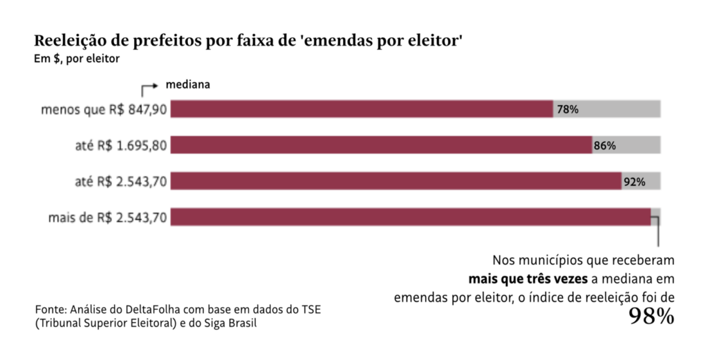
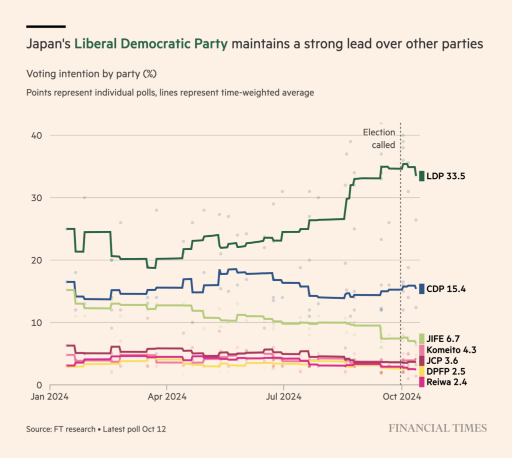
Plus a preview of the next stop on the 2024 election train:
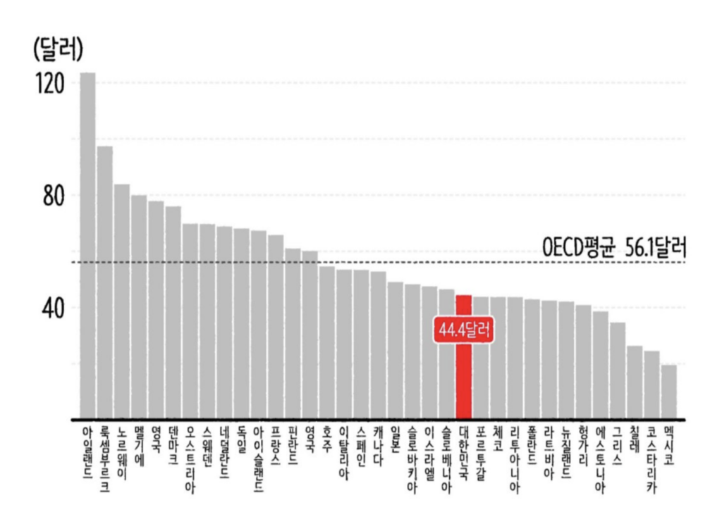
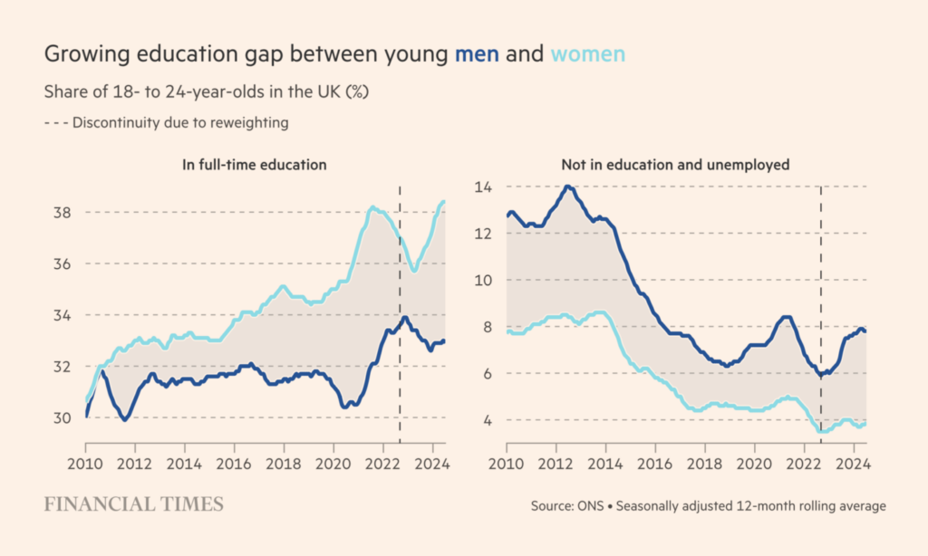
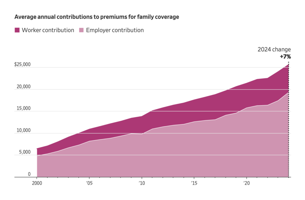
In issues that affect elections — national economic trends, youth unemployment, and the cost of living:
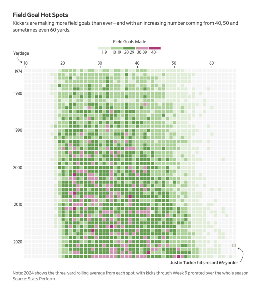
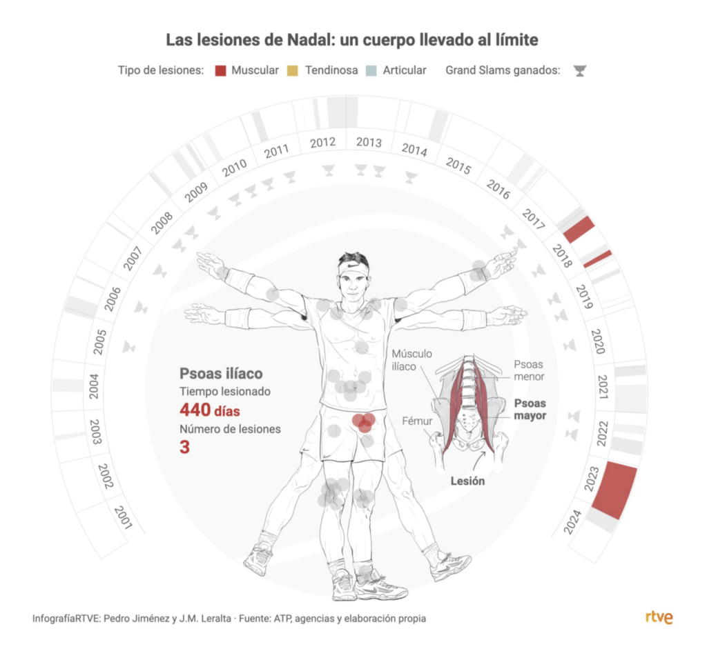
In issues that hopefully do not affect elections — longer field goals and tennis injuries:
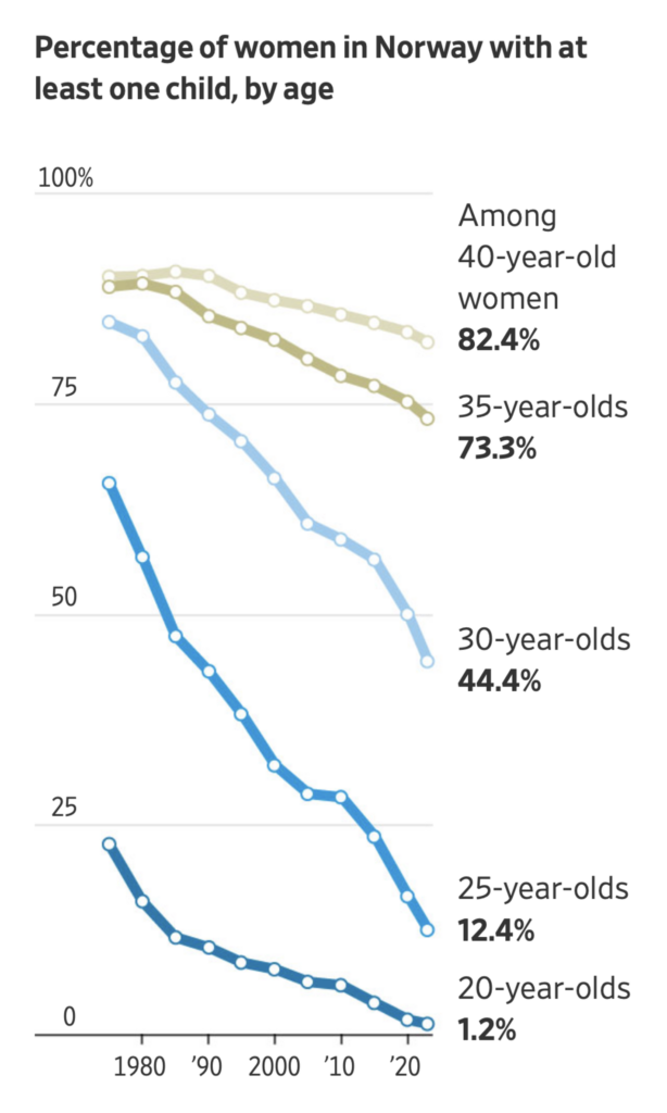
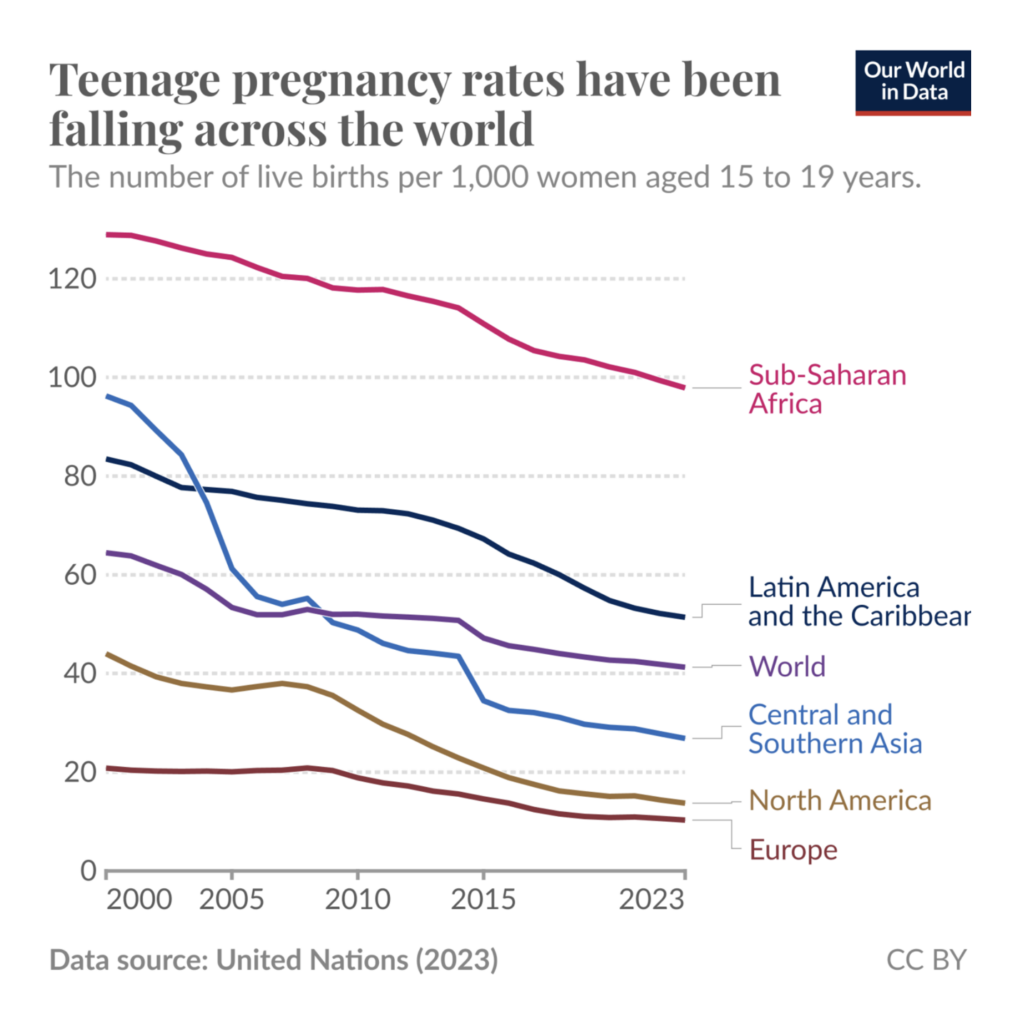
Several charts this week looked at the global trend of declining birth rates — at least some of which is due to declining teen pregnancy:
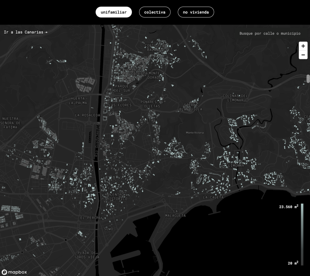
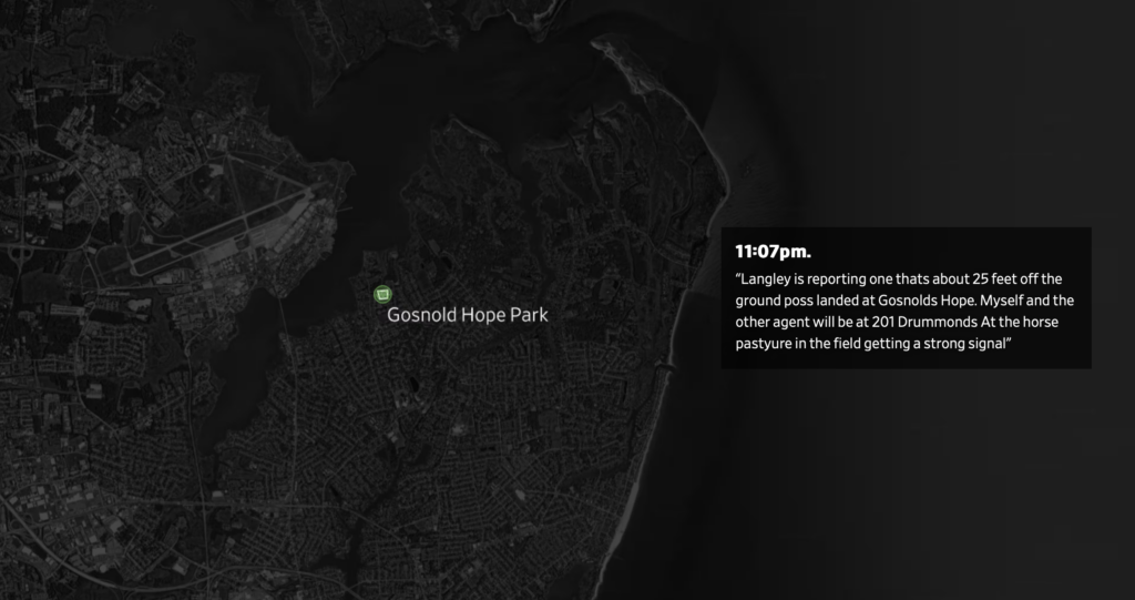
Finally, home solar panels, Singaporean playgrounds, and “mystery drones”:

Applications are open for…
Help us make this dispatch better! We’d love to hear which newsletters, blogs, or social media accounts we need to follow to learn about interesting projects, especially from less-covered parts of the world (Asia, South America, Africa). Write us at hello@datawrapper.de or leave a comment below.
Want the Dispatch in your inbox every Tuesday? Sign up for our Blog Update newsletter!
Comments