We want to enable everyone to create beautiful charts, maps, and tables. New to data visualization? Or do you have specific questions about us? You'll find all the answers here.
The best of last week’s big and small data visualizations
Vivien Serve
Welcome back to the 114th edition of Data Vis Dispatch! Every week, we’ll be publishing a collection of the best small and large data visualizations we find, especially from news organizations — to celebrate data journalism, data visualization, simple charts, elaborate maps, and their creators.
Recurring topics this week include an annular solar eclipse, elections in Poland, and the ongoing war between Israel and Hamas.
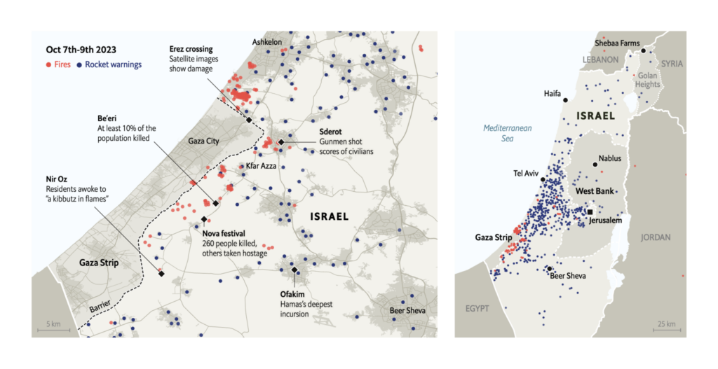
The warfare between Israel and Hamas continues. The first reports of the last week are joined by an enormous number of visualizations around the topic. Among them, more in-depth stories about the initial attacks:
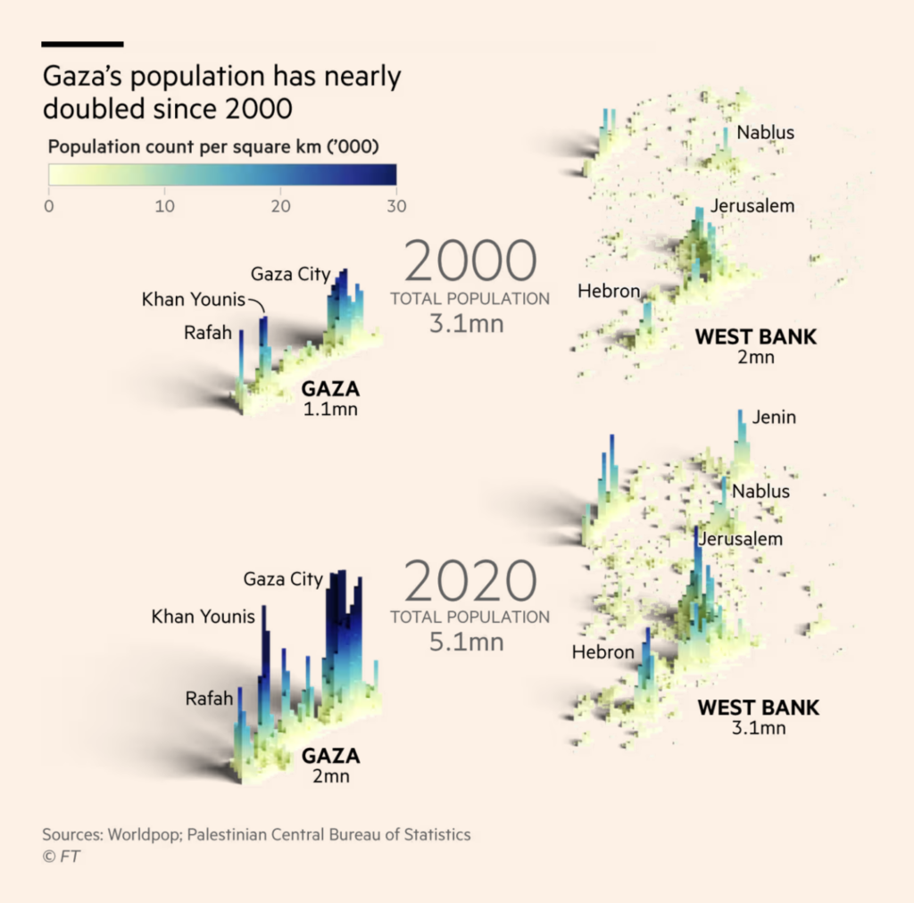
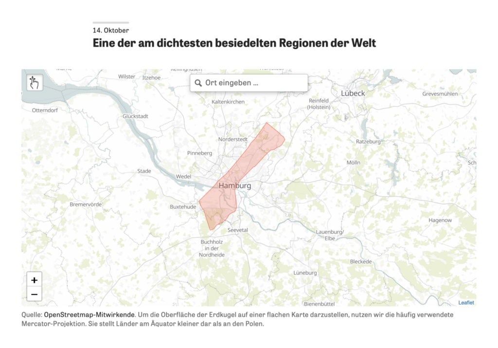
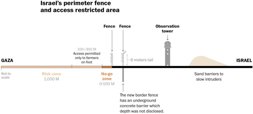
An immense number of visualizations address the question, “What’s happening in Gaza?” — from evacuation routes to humanitarian disasters and the state of infrastructure:
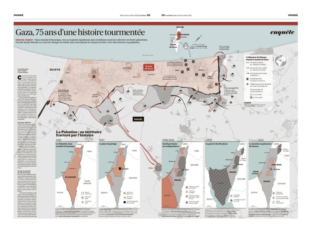
We saw visualizations that provided a broader historical look at the long-running conflict:
The Wall Street Journal: The Gaza Strip: What to Know, Maps and History, October 15 Les Echos/Jules Grandin: “Cinq jours après le début de l’attaque contre Israël, @LesEchos vous proposent de faire le point en cartes. Et pour ça : une double-page de cartographie avec Gaza représentée comme une bande, non orientée au nord. Et une frise de cartes historiques par @battailb!” October 11 (Tweet)Folha de S.Paulo: Israel e Palestina têm semana mais sangrenta do século, October 11
And others that presented a broader geographical context:
Help us make this dispatch better! We’d love to hear which newsletters, blogs, or social media accounts we need to follow to learn about interesting projects, especially from less-covered parts of the world (Asia, South America, Africa). Write us at hello@datawrapper.de or leave a comment below.
(she/her) is a working student on Datawrapper’s Communications team. She creates the Data Vis Dispatch to keep data visualization enthusiasts up to date on exciting new projects. When she’s not working, she studies interface design, and when she’s not studying, she’s planning a festival stage or soldering light installations. Vivien lives in Potsdam.


Comments