Data Vis Dispatch, October 17

The best of last week’s big and small data visualizations

Welcome back to the 114th edition of Data Vis Dispatch! Every week, we’ll be publishing a collection of the best small and large data visualizations we find, especially from news organizations — to celebrate data journalism, data visualization, simple charts, elaborate maps, and their creators.

Recurring topics this week include an annular solar eclipse, elections in Poland, and the ongoing war between Israel and Hamas.

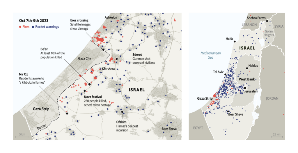
The warfare between Israel and Hamas continues. The first reports of the last week are joined by an enormous number of visualizations around the topic. Among them, more in-depth stories about the initial attacks:

Zeit Online: Hamas-Angriff auf Supernova-Festival, October 13
The New York Times: The Long Wait for Help as Massacres Unfolded in Israel, October 11

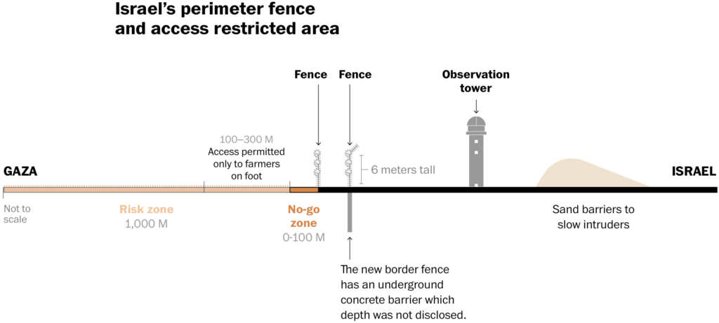
An immense number of visualizations address the question, “What’s happening in Gaza?” — from evacuation routes to humanitarian disasters and the state of infrastructure:

Financial Times: Did Israel bomb a civilian evacuation route in Gaza?, October 15
Reuters: Mapping the conflict in Israel and Gaza, October 14
The Washington Post: Israel ordered a ‘complete siege’ of Gaza. Here’s what that looks like, October 11
Le Figaro: Guerre Israël-Hamas : le terrain d’une possible offensive terrestre décrypté grâce aux cartes, October 12

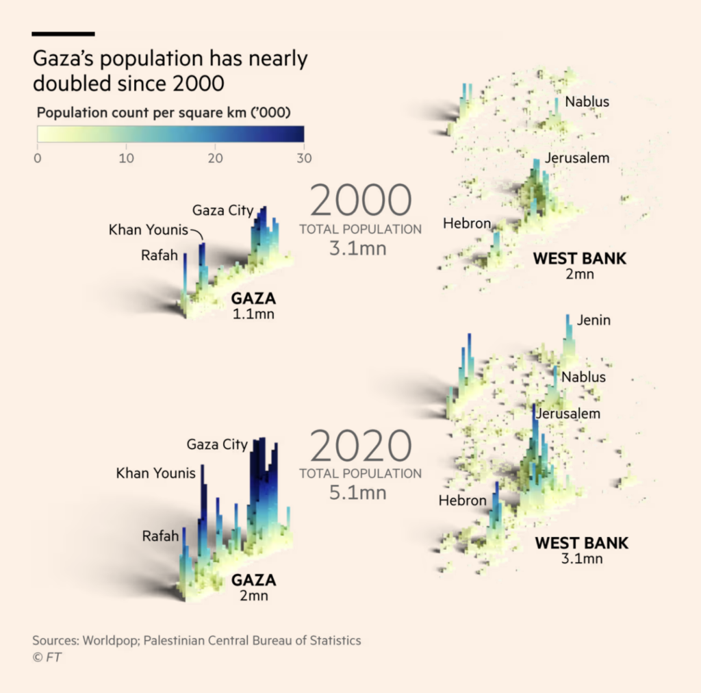
Many maps illustrated the sheer number of people living in Gaza:

Financial Times: The Gaza Strip — in charts, October 16
El País: Mapas | Tres días de bombardeos y ataques entre Israel y Gaza, October 10
Zeit Online: Aktuelle Karten und Grafiken zum Krieg in Israel, October 16

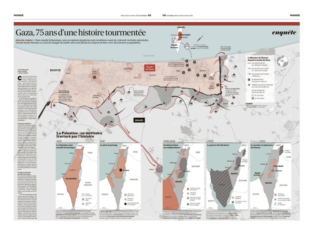
We saw visualizations that provided a broader historical look at the long-running conflict:

The Wall Street Journal: The Gaza Strip: What to Know, Maps and History, October 15
Les Echos/Jules Grandin: “Cinq jours après le début de l’attaque contre Israël, @LesEchos vous proposent de faire le point en cartes. Et pour ça : une double-page de cartographie avec Gaza représentée comme une bande, non orientée au nord. Et une frise de cartes historiques par @battailb!” October 11 (Tweet)
Folha de S.Paulo: Israel e Palestina têm semana mais sangrenta do século, October 11

And others that presented a broader geographical context:

Les Echos: Guerre Israël-Hamas : le fil des événements de dimanche, October 15
Zeit Online: Aktuelle Karten und Grafiken zum Krieg in Israel, October 16
The Economist: Hamas’s attack was the bloodiest in Israel’s history, October 12

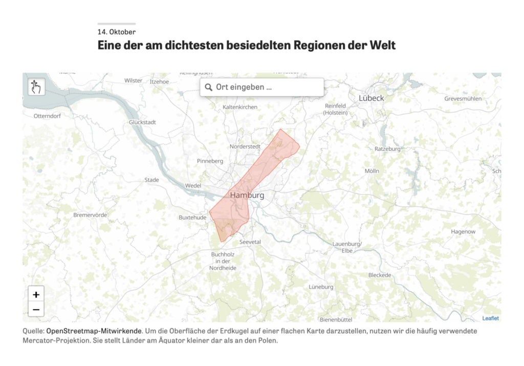
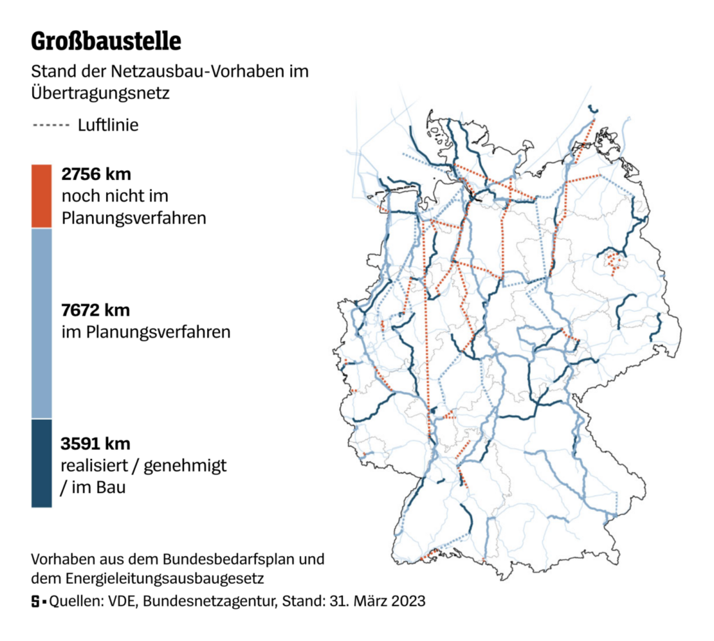
Moving on to the rest of the world, the following maps showcase infrastructural problems from the U.S. to Germany:

The Wall Street Journal: U.S. Races to Expand Michigan Locks and Secure the Supply Chain, October 15
Der Spiegel: So stark ändert sich Deutschlands Stromversorgung, October 16

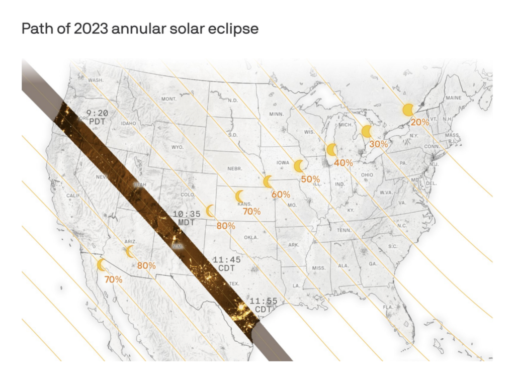
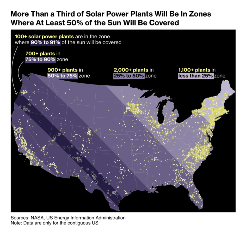
On October 14, the earth became dark for a short time. Many visualizations were dedicated to this annular solar eclipse:

Will Chase: “A map… please clap,” October 12 (Tweet)
Kenneth Field: “Just in time for tomorrow’s #AnnularEclipse in the USA here’s my map showing time of maximum eclipse, by location, and what extent you might expect to see (assuming no cloud cover). Use solar viewing glasses!!”, October 13 (Tweet)
The New York Times: Maps of the 2023 ‘Ring of Fire’ Solar Eclipse, October 11
Bloomberg: ‘Ring of Fire’ Eclipse This Weekend Will Send US Solar Power Plunging, October 12

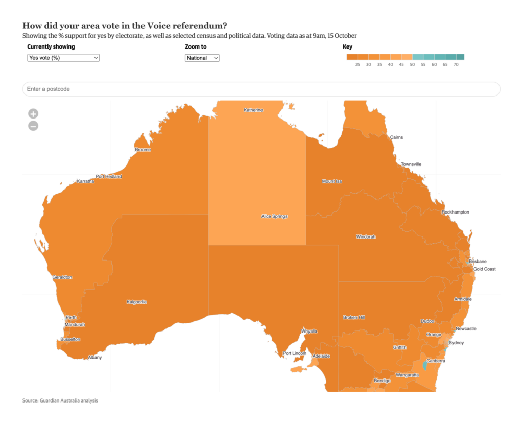
Same day, different continent: an Australian referendum ended with a vote against more political say for the indigenous population.

Darragh Murray: The Choice | A Visual History of Australian Constitutional Referendums, October 11
The Guardian: How did your electorate vote in the voice referendum? Check out our interactive map, October 14

Other visualizations we encountered from the world of politics covered the elections in Poland and Germany:

Gazeta Wyborcza: Frekwencja wyborcza z wyników late poll: mamy rekord, ponad 73 proc. Polaków poszło do wyborów, October 15
Gazeta Wyborcza: Wybory 2023: wyniki w województwach, October 15
Süddeutsche Zeitung: So haben die Münchner Nachbarschaften gewählt, October 13

There were charts and scrollytelling projects on public health, particularly on aging:

Taiwan Data Stories: More pets than children?, October 10
Reuters: In a warming world, hunger stalks Guatemala’s Mayan highlands, October 12
Financial Times: How disadvantage became deadly in America, October 13

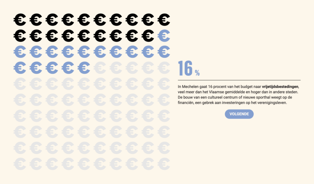
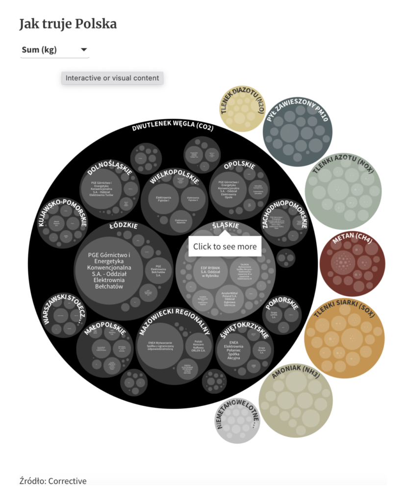
And other interactive visualizations ranged from municipal cash flow in Belgium to greenhouse gases in Poland:

De Tijd: Waar geeft uw gemeente het geld aan uit?, October 12
Gazeta Wyborcza: Utrzymywanie węgla nas zabija. I kosztuje gigantyczne pieniądze, October 13

What else we found interesting

Diario Sur: El despertar de la chinche de cama, October 15
The Washington Post: How Hamas breached Israel’s ‘Iron Wall’, October 10

Applications are open for…


Help us make this dispatch better! We’d love to hear which newsletters, blogs, or social media accounts we need to follow to learn about interesting projects, especially from less-covered parts of the world (Asia, South America, Africa). Write us at hello@datawrapper.de or leave a comment below.

Want the Dispatch in your inbox every Tuesday? Sign up for our Blog Update newsletter!

Comments