This article is brought to you by Datawrapper, a data visualization tool for creating charts, maps, and tables. Learn more.
Data Vis Dispatch,
October 19
The best of last week’s big and small data visualizations

Welcome back to the 18th edition of Data Vis Dispatch! Every week, we’ll be publishing a collection of the best small and large data visualizations we find, especially from news organizations — to celebrate data journalism, data visualization, simple charts, elaborate maps, and their creators.
Recurring topics this week include inflation, fossil fuels, and housing.
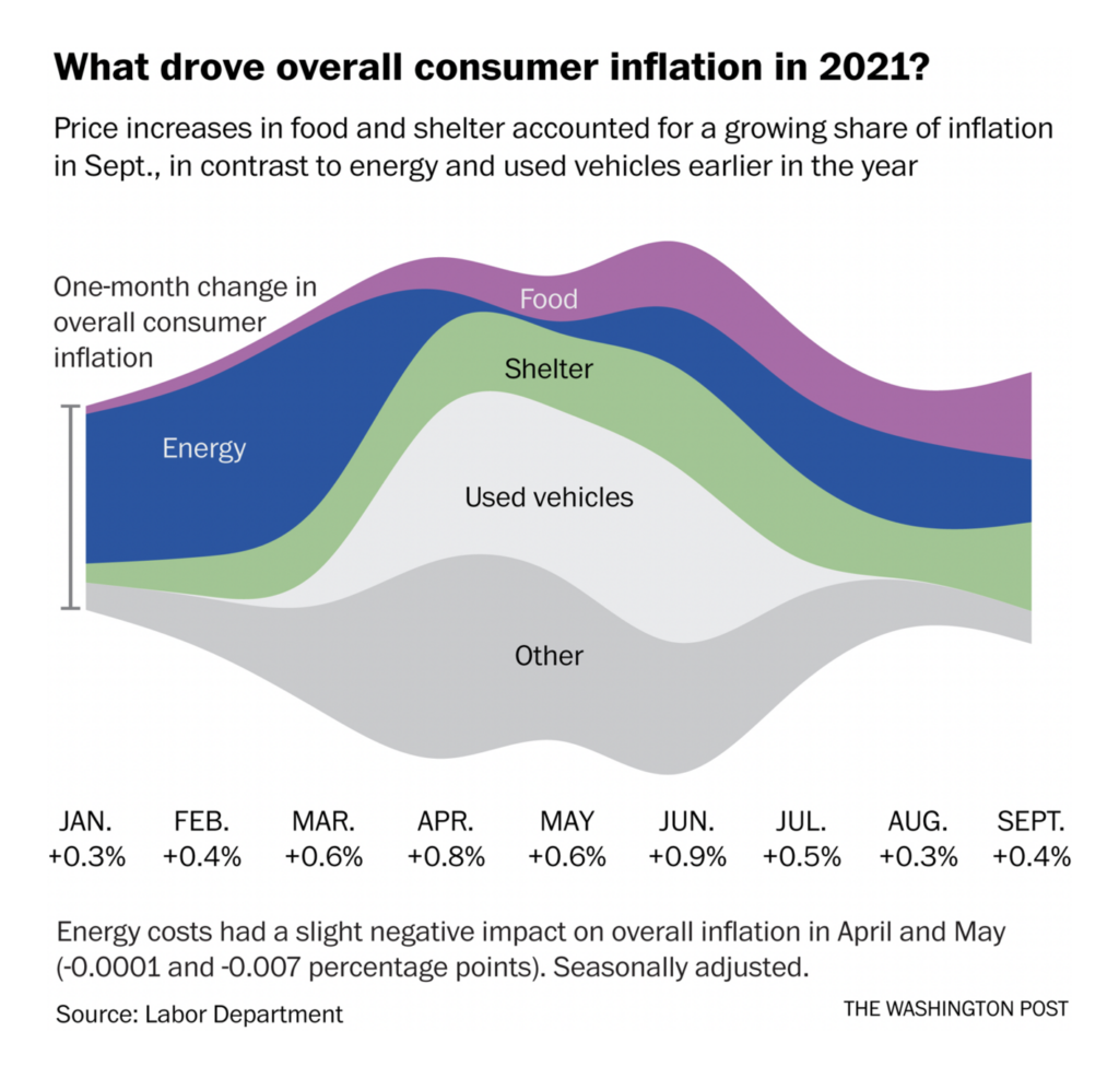
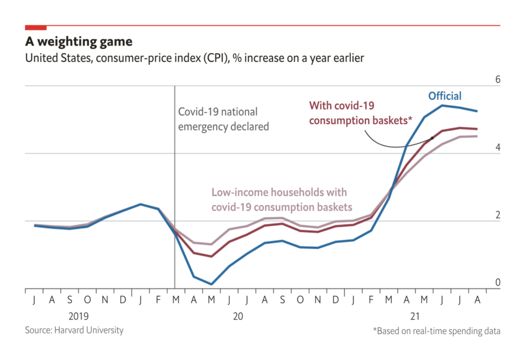
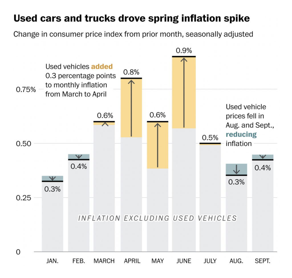
The breakout topic of the week was COVID-era inflation — what’s been driving it, how much we should worry about it, and how it relates to the ongoing pandemic:
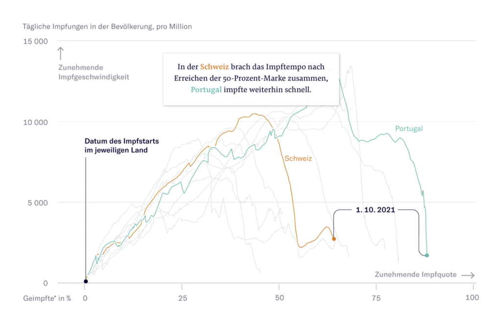
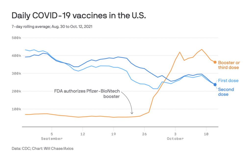
The vaccine rollout remains a hot topic:
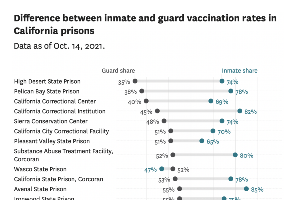
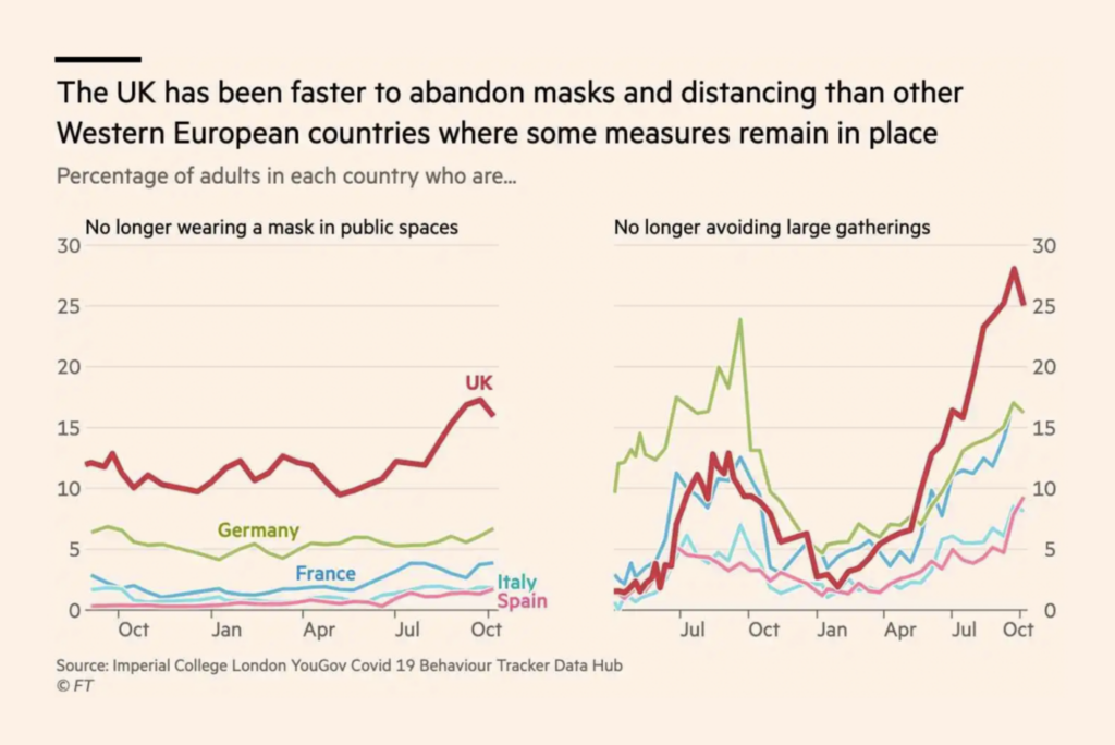
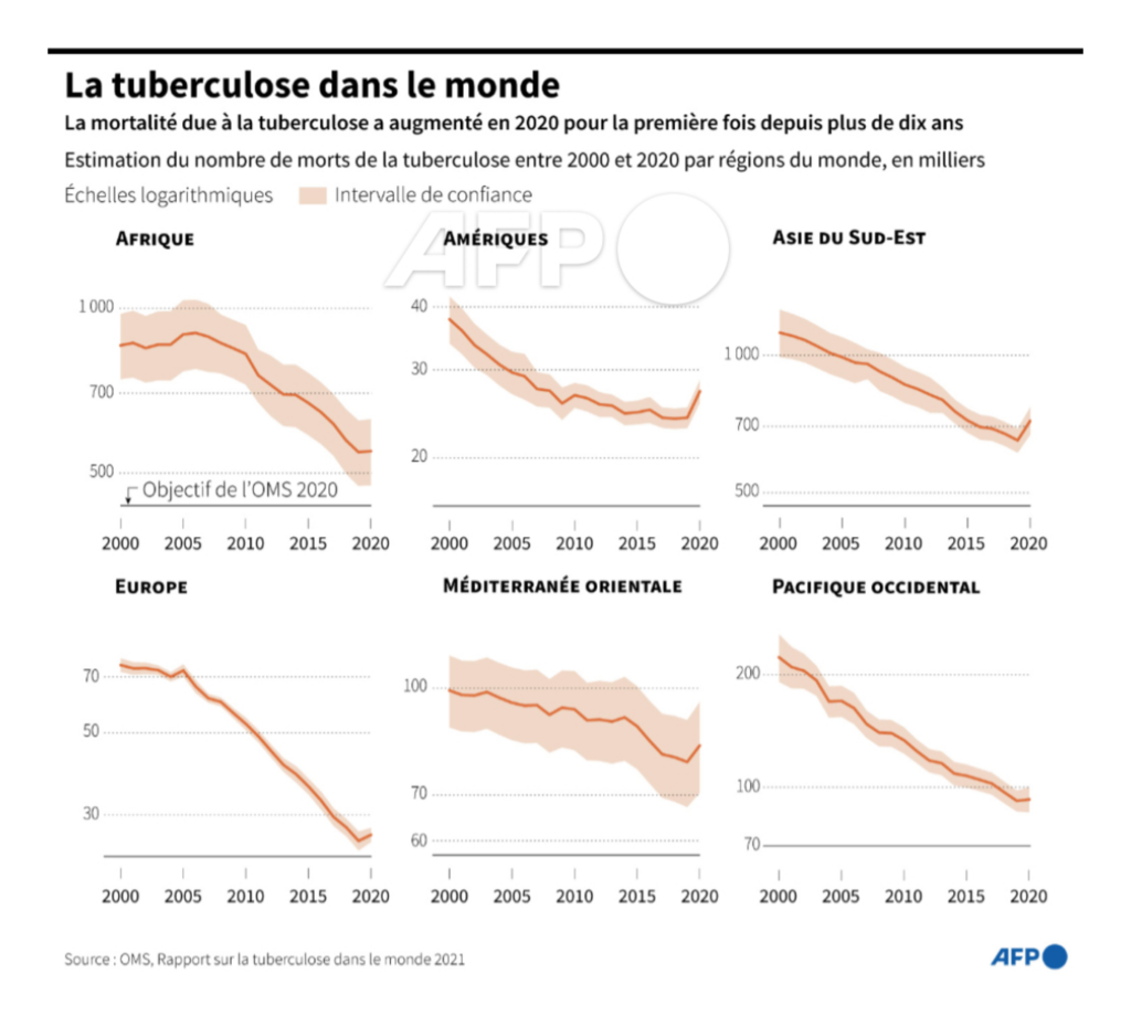
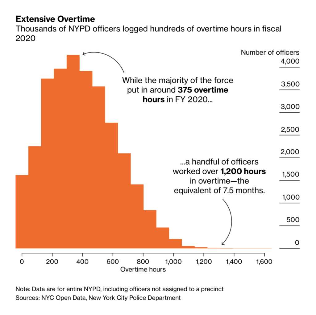
In fact, there’s not many areas of life that the pandemic hasn’t touched, from supply chains to social gatherings to long-term public health progress:
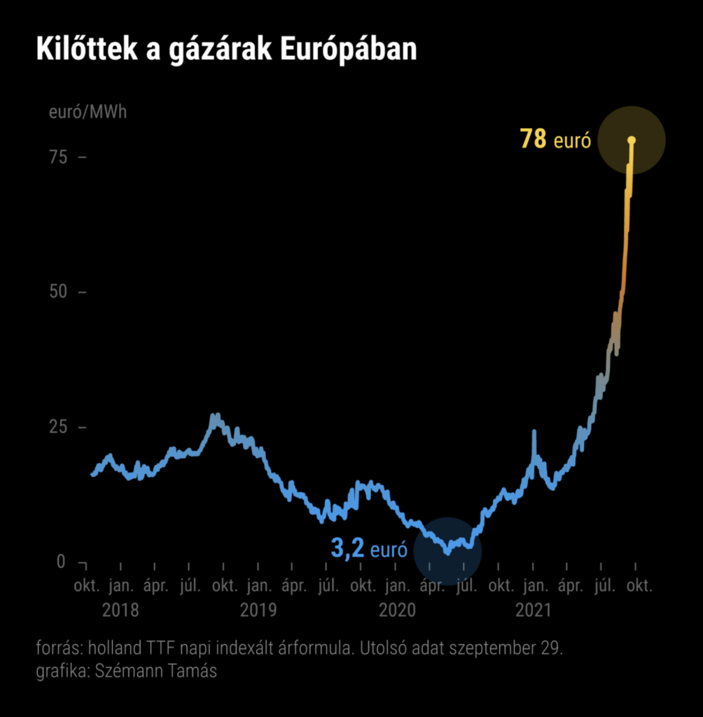
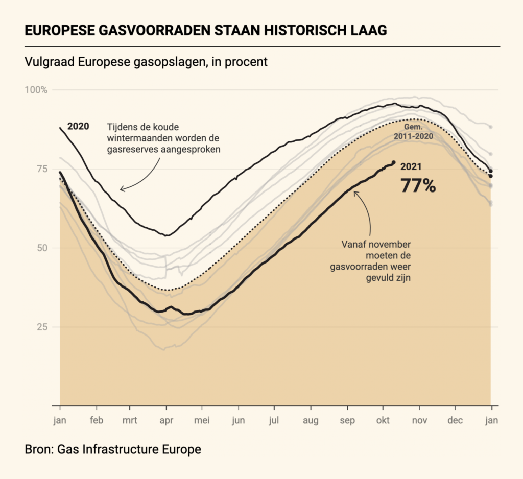
As the weather turns, Europe is getting nervous about record-high gas prices:
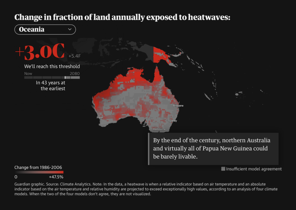
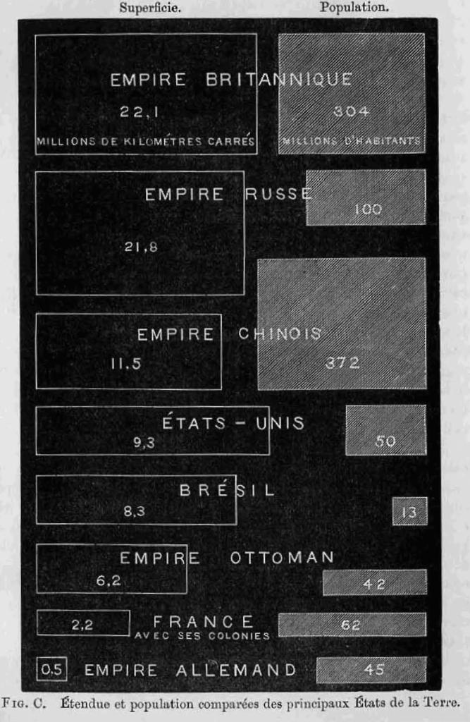
Although, speaking of fossil fuels… check out these charts and maps:
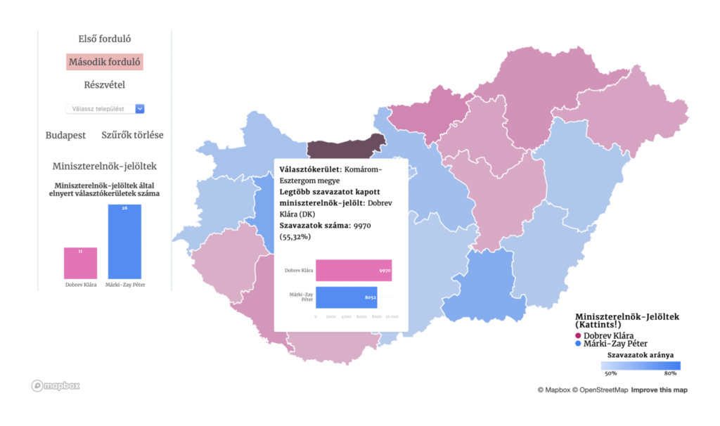
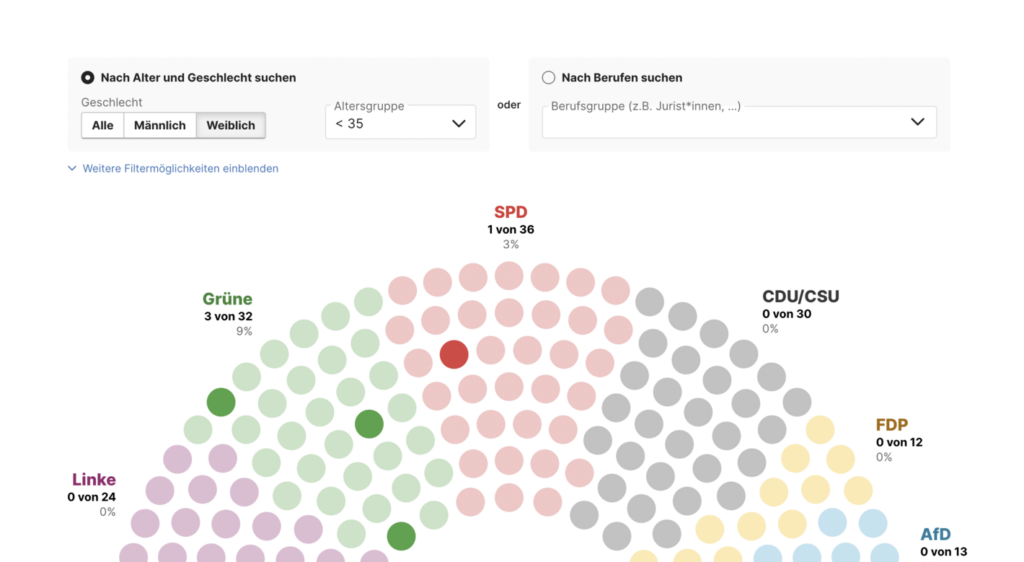
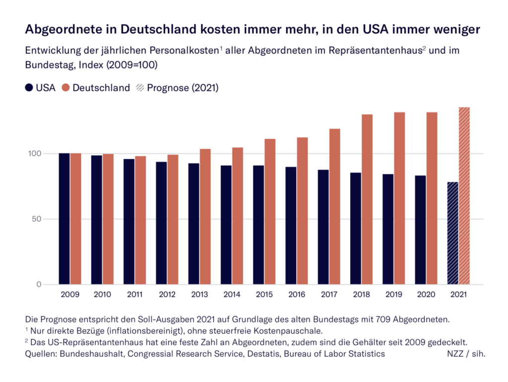
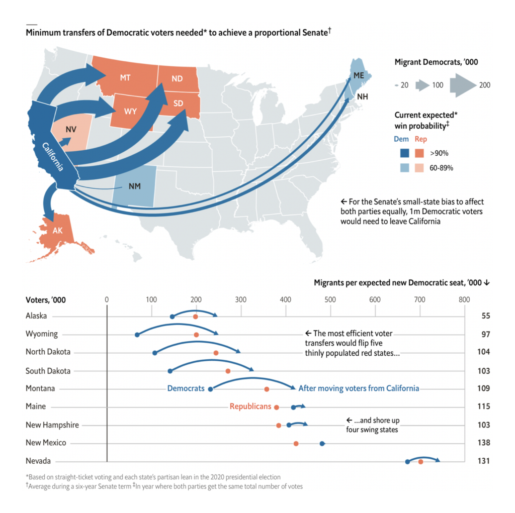
In electoral politics, this week gave us an opposition primary in Hungary, the identities and salaries of new German representatives, and a unique proposal for better voter representation in the U.S. Senate:
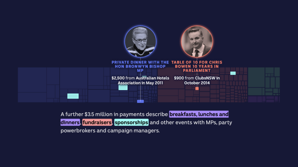
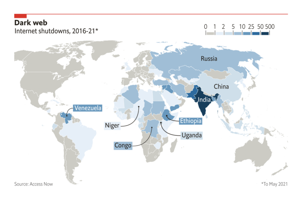
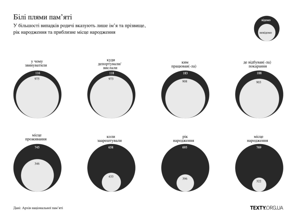
Politics isn’t all about elections though — we also saw vis on lobbying, information control, and even forced disappearances:
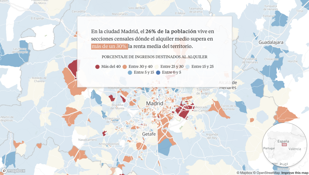
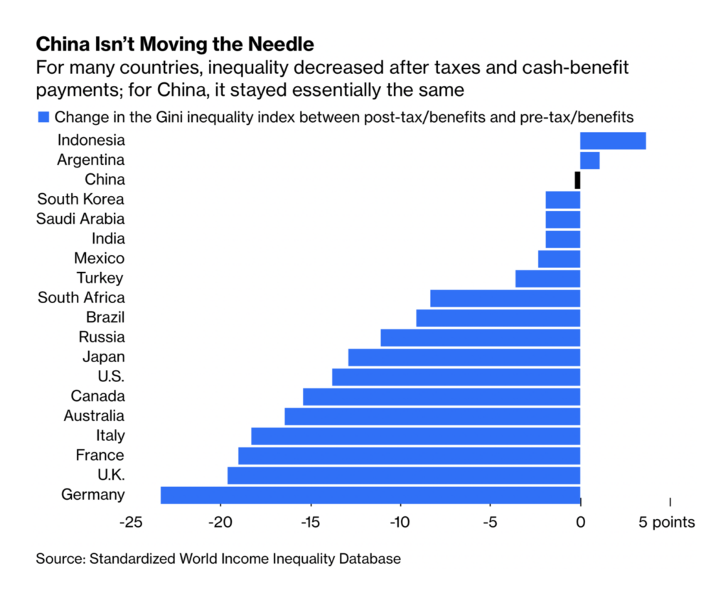
These charts looked at inequality in housing costs:
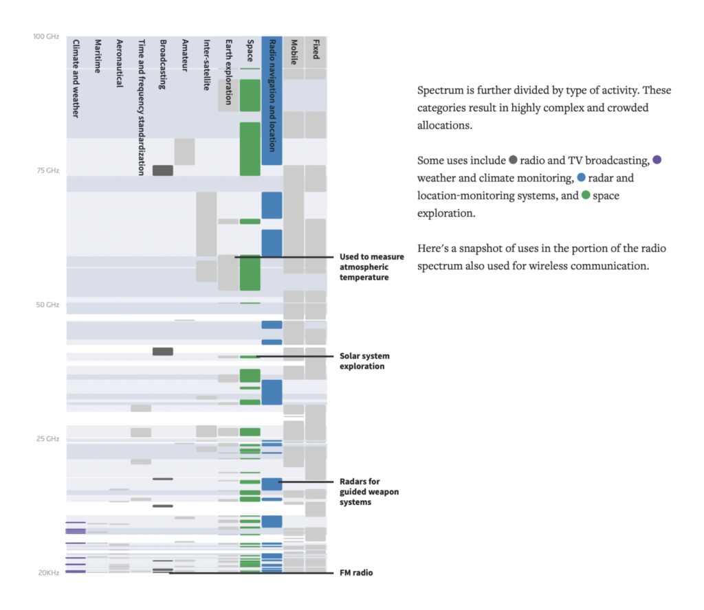
Other charts ranged from the serious (sexism in the workplace) to the obscure (radio spectrum regulation) to the lightweight (“Squid Game” viewership):

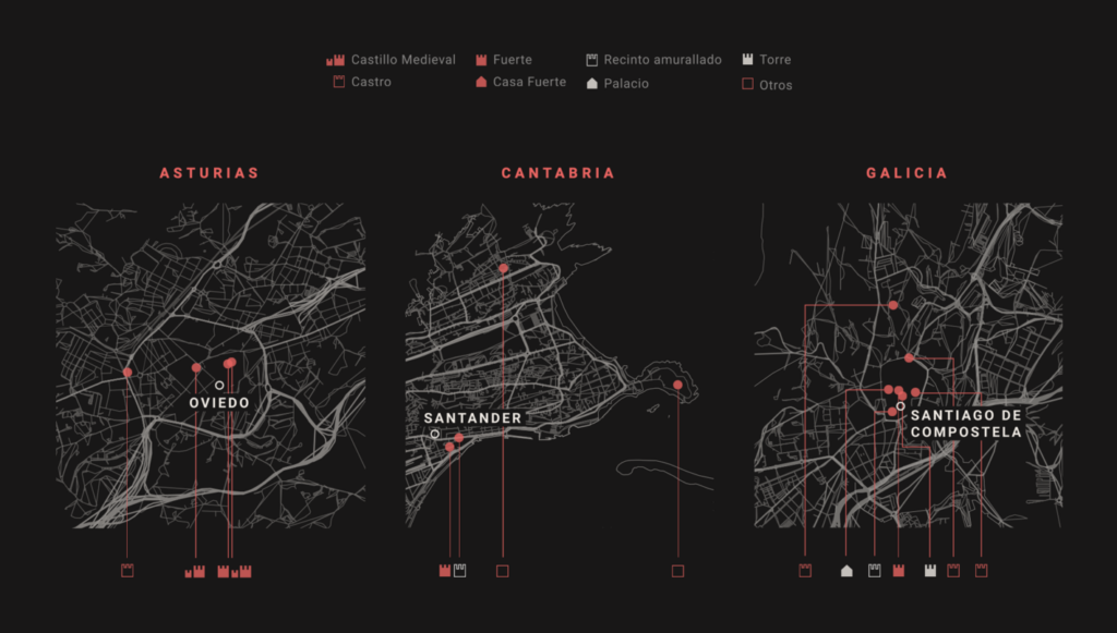
Finally, let’s end with two maps of certain buildings in Spain:

What else we found interesting


- We’ve often featured the work of the South China Morning Post infographics team — check out this in-depth interview in Nightingale on how they do it.
- Data vis and data journalism openings at Axios, Politico, and IndiaSpend, and internships at Bloomberg.
Help us make this dispatch better! We’d love to hear which newsletters, blogs, or social media accounts we need to follow to learn about interesting projects, especially from less-covered parts of the world (Asia, South America, Africa). Write us at hello@datawrapper.de or leave a comment below.


Comments