This article is brought to you by Datawrapper, a data visualization tool for creating charts, maps, and tables. Learn more.
Data Vis Dispatch, October 22
The best of last week’s big and small data visualizations

Welcome back to the 165th edition of the Data Vis Dispatch! Every week, we publish a collection of the best small and large data visualizations we find, especially from news organizations — to celebrate data journalism, data visualization, simple charts, elaborate maps, and their creators.
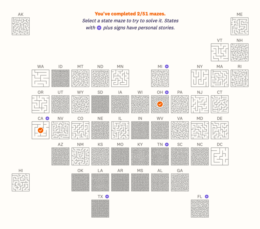
Recurring topics this week include mazes, organ donation, and Crokinole.
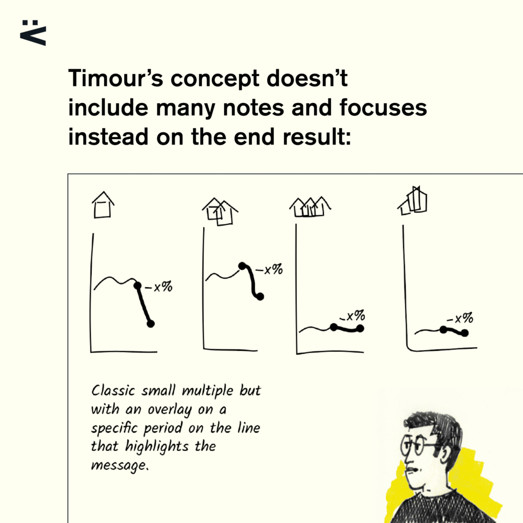
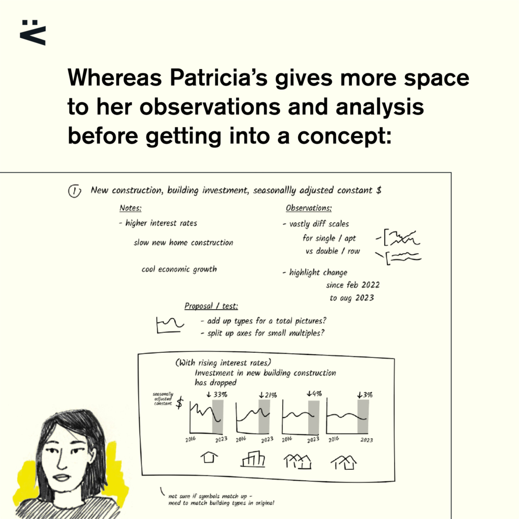
What goes through the mind of an information designer when they create a visualization? This week, Voilà caught our attention with an interesting challenge:
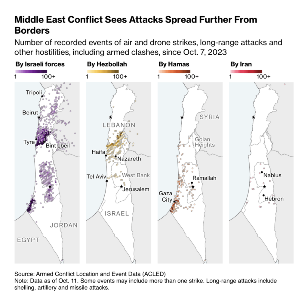
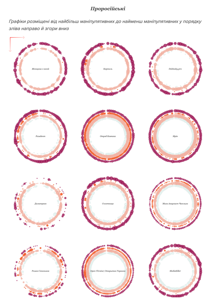
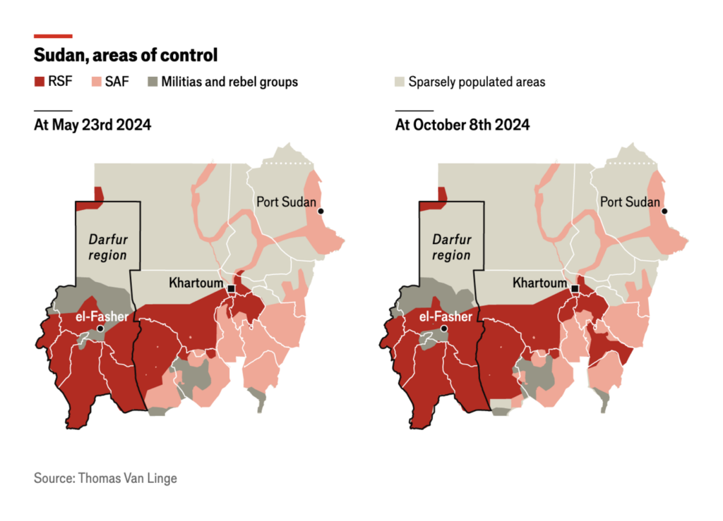
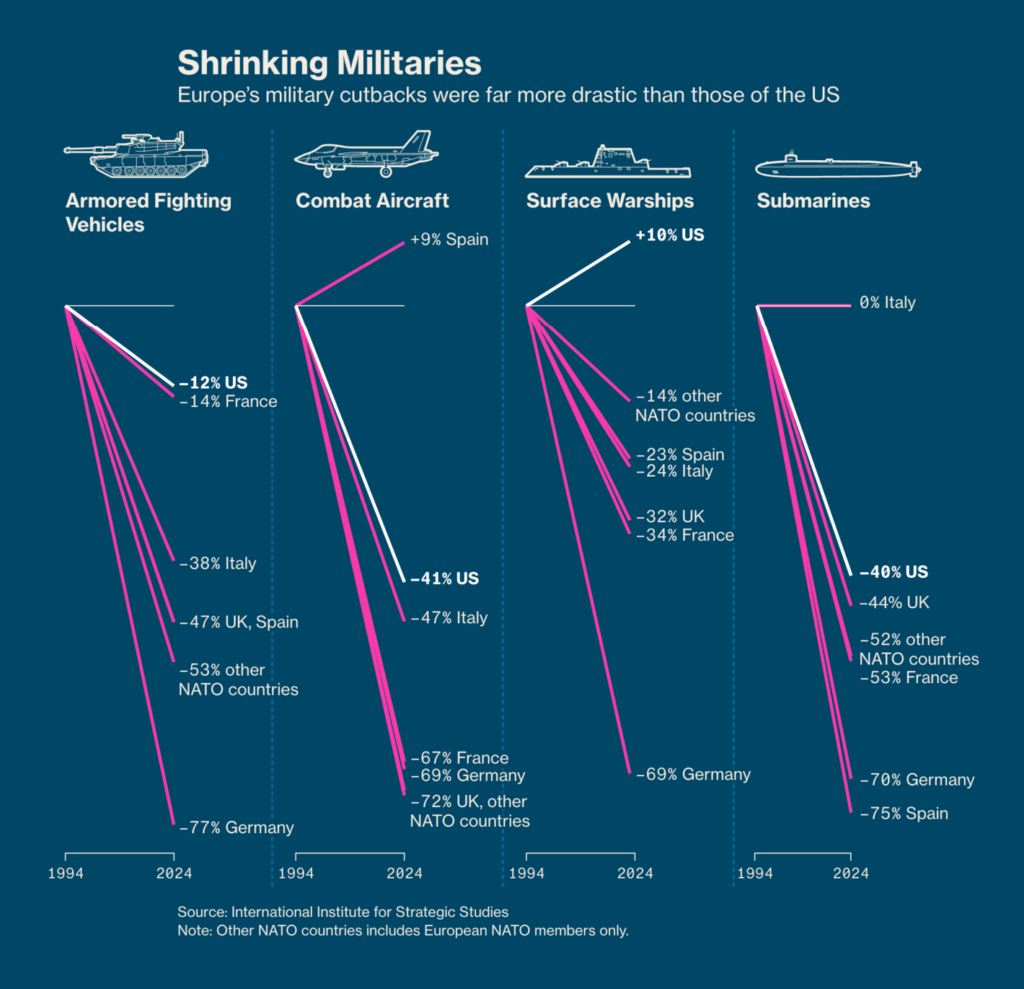
With each passing day, wars and conflicts seem only to spread. In the Middle East, Israeli airstrikes continue and the destruction in Gaza is immense. Ukraine battles pro-Russian narratives on Telegram; fighting in Sudan intensifies; European NATO members are unprepared to defend themselves:
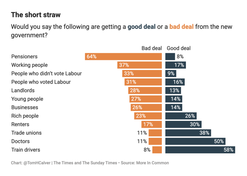
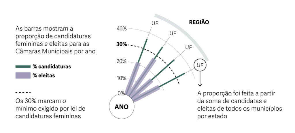
In politics, we take a look at public opinion in the U.K., where pensioners are not optimistic about the new government, and recent elections in Brazil, where women are still not winning an equal share of votes:
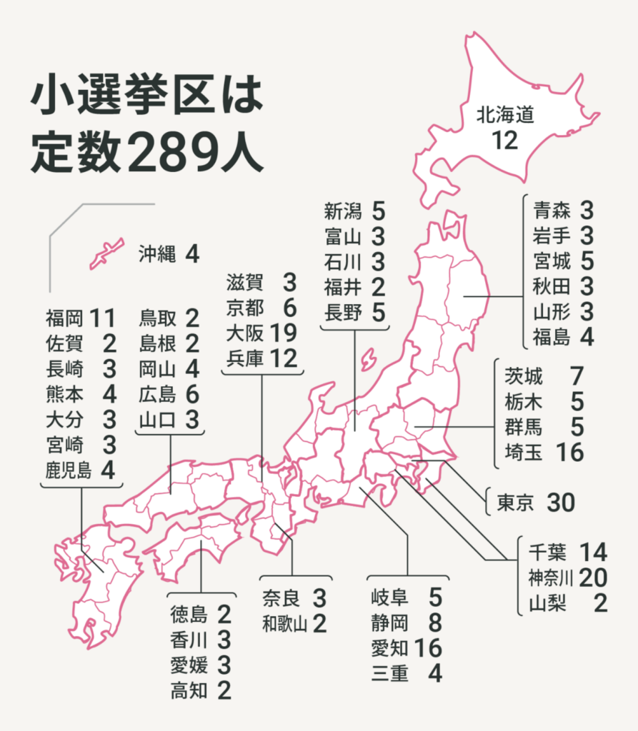
With elections just around the corner, this visualization breaks down the structure of the Japanese House of Representatives. And did you know that almost half of all elected representatives in Germany have a paid part-time job?
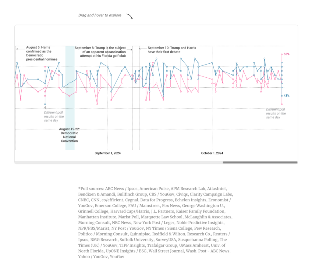
All elections this year are eclipsed by one — the race for the U.S. presidency:
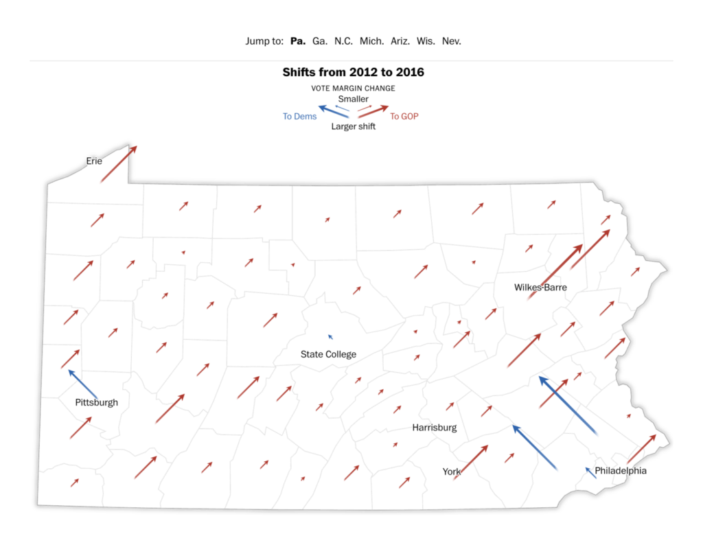
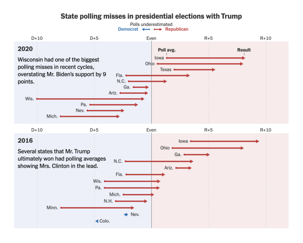
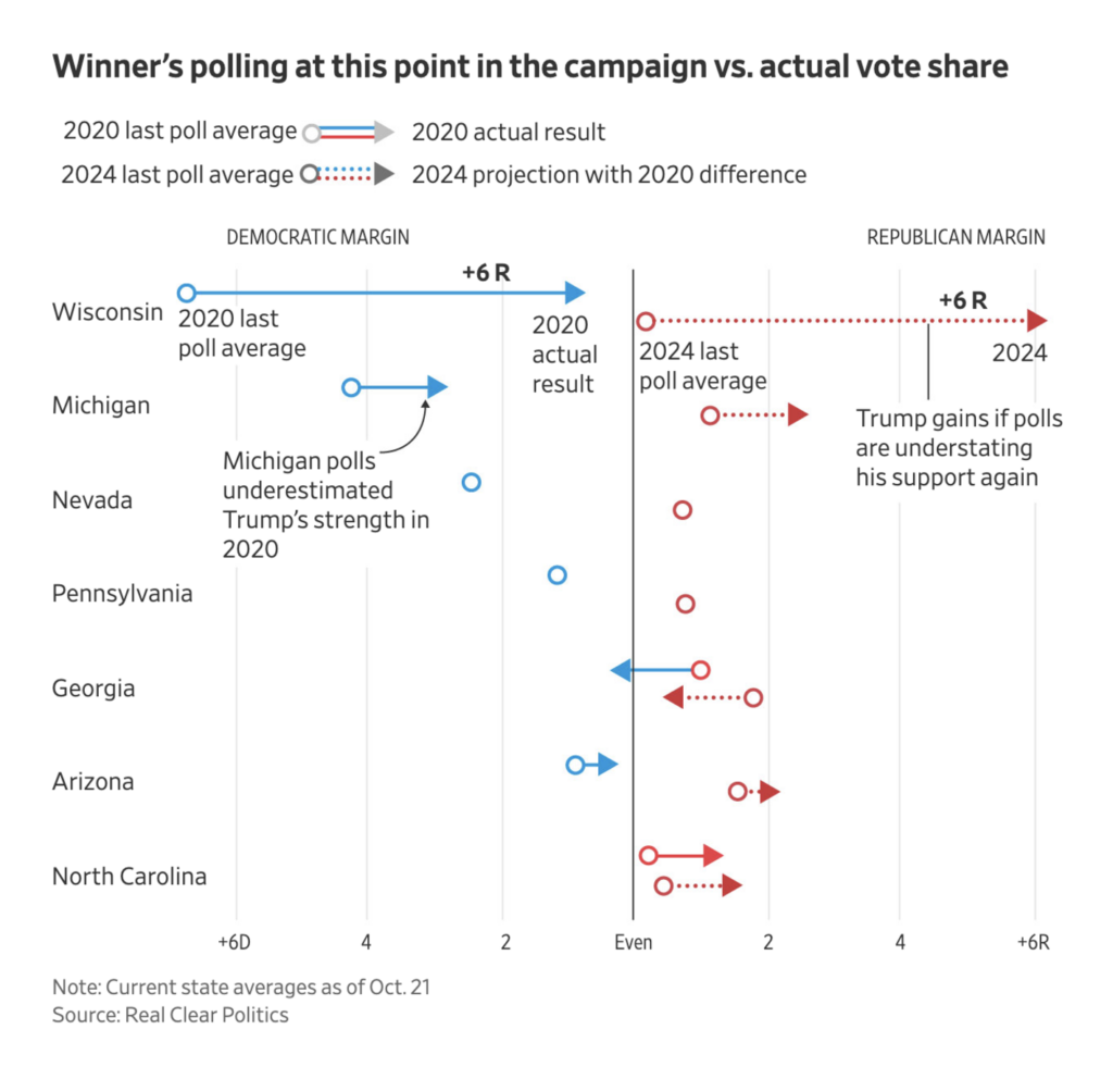
Two arrow plots focused on the history of polling errors in past elections:
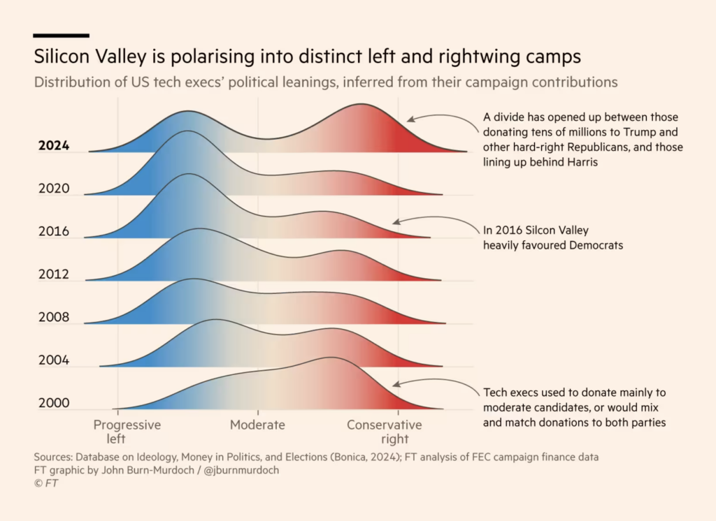
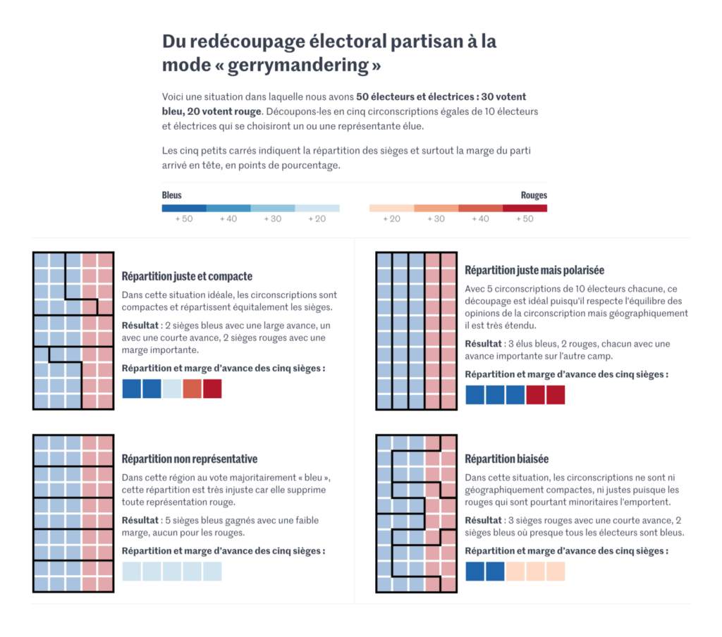
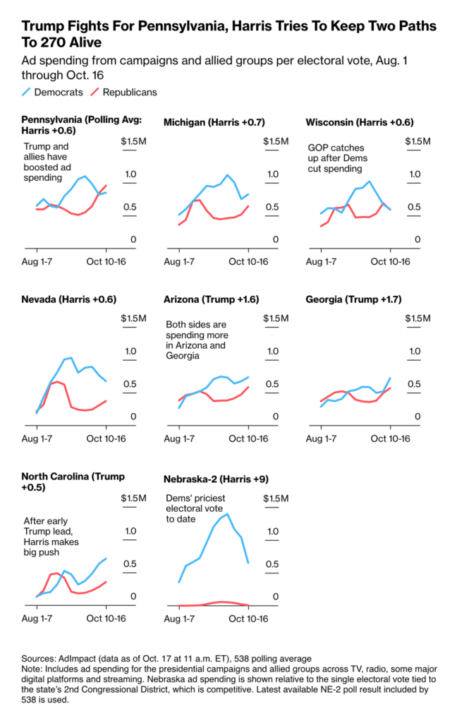
Thousands of factors could decide the tight race between Harris and Trump. Among them: Latino voters, CEOs and gerrymandering:
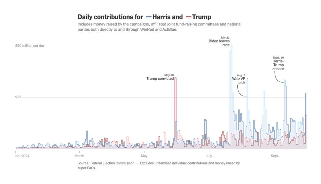
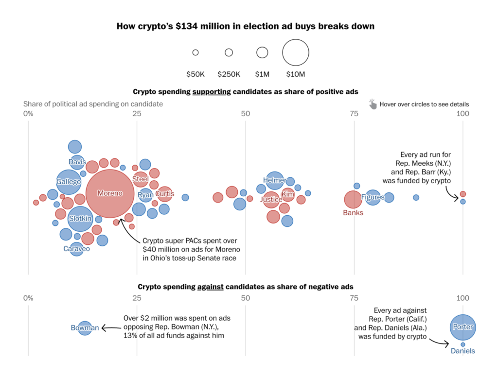
One very important factor in politics is money. Who’s collecting donations? Who’s backing candidates with cryptocurrency? And where are candidates spending what they raise?
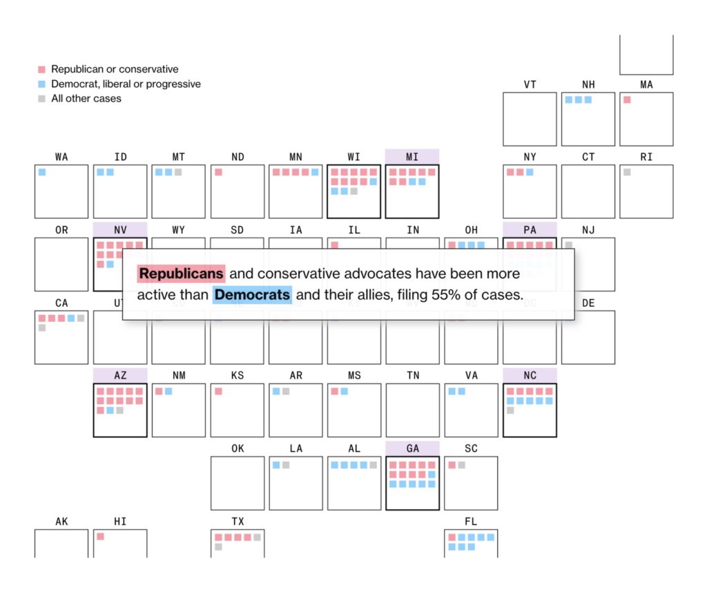
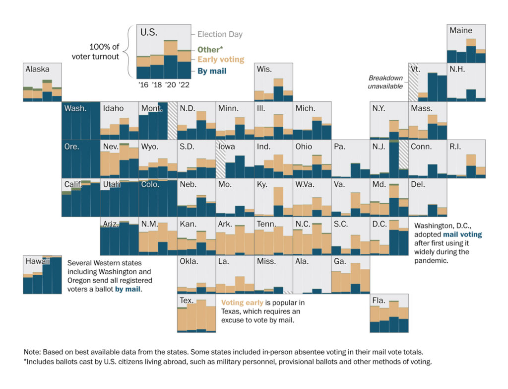
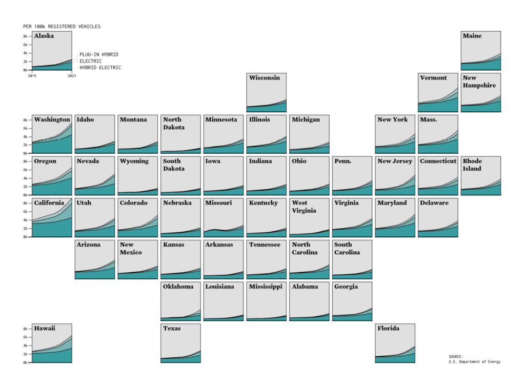
Two tilemap-style small multiples shed light on lawsuits crucial for the U.S. elections and show how residents have cast their votes since 2016:
That’s a wrap on the U.S. elections, but we’re not done with enhanced tilemaps yet:
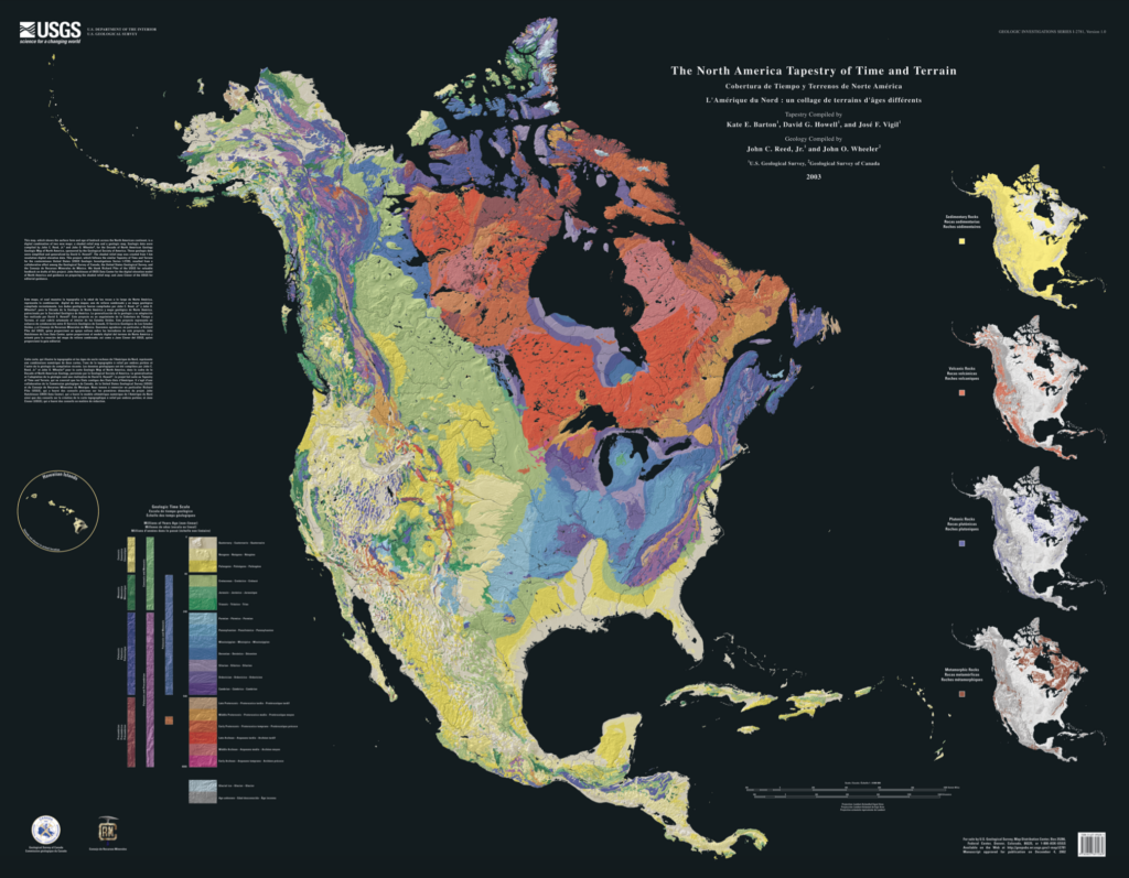
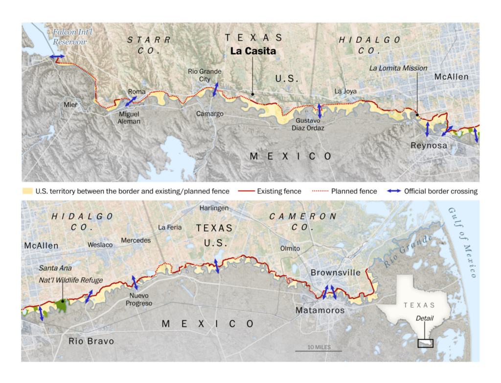
Next up, maps of the physical geography of North America, how it evolved over time, where the construction of border walls has put land in limbo, and where it’s actually feasible to live:
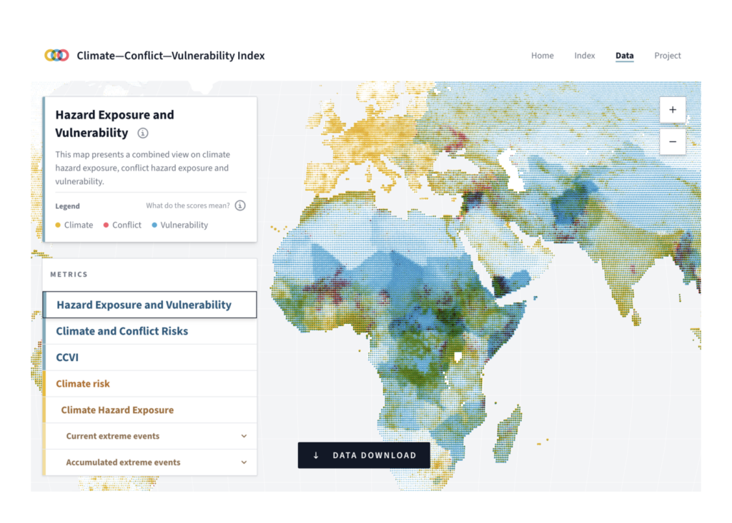
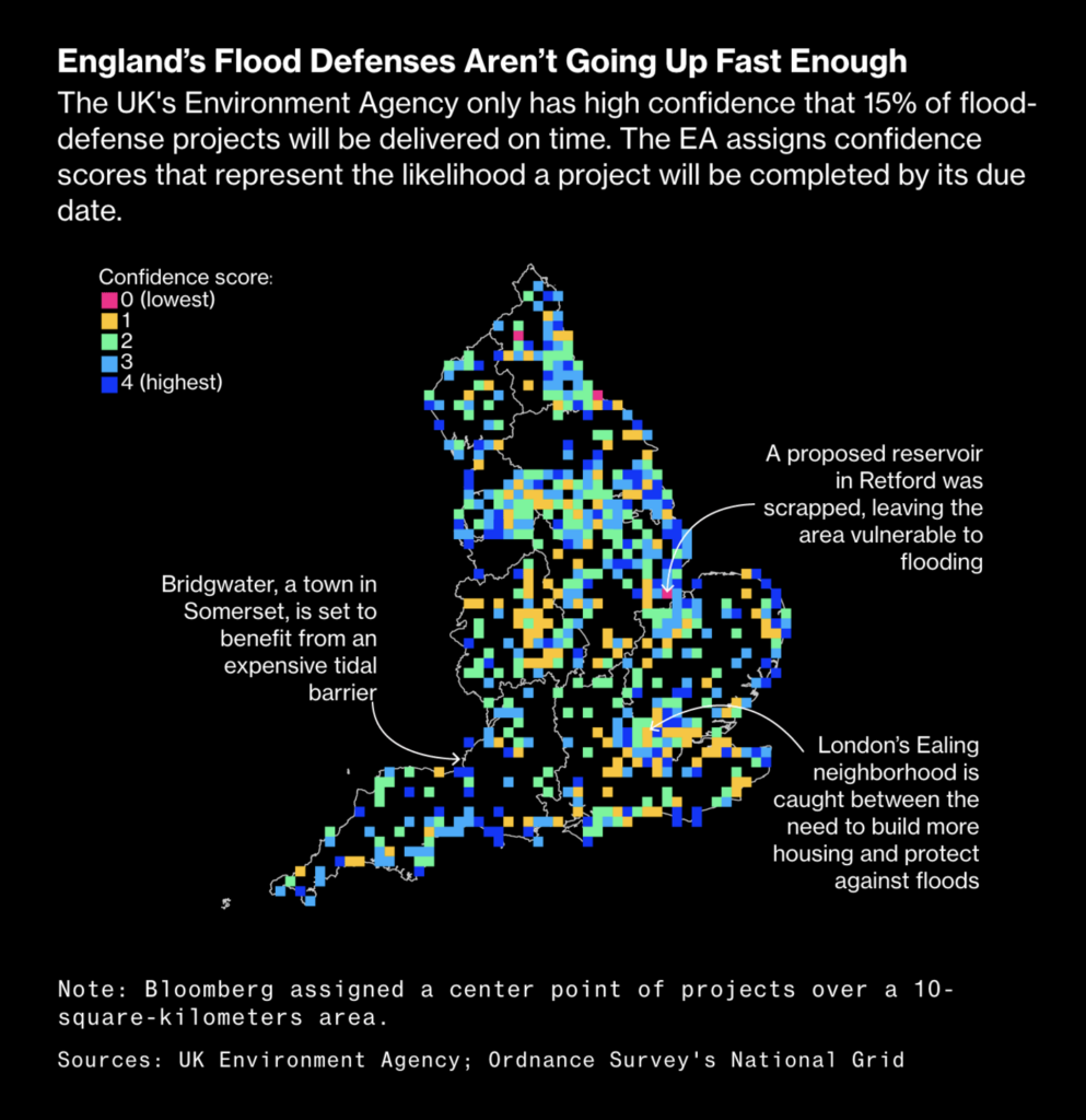
In environmental visualizations this week, the German Foreign Office released its Climate Conflict Vulnerability Index, and the U.K. government launched an insurance program to boost flood defenses:
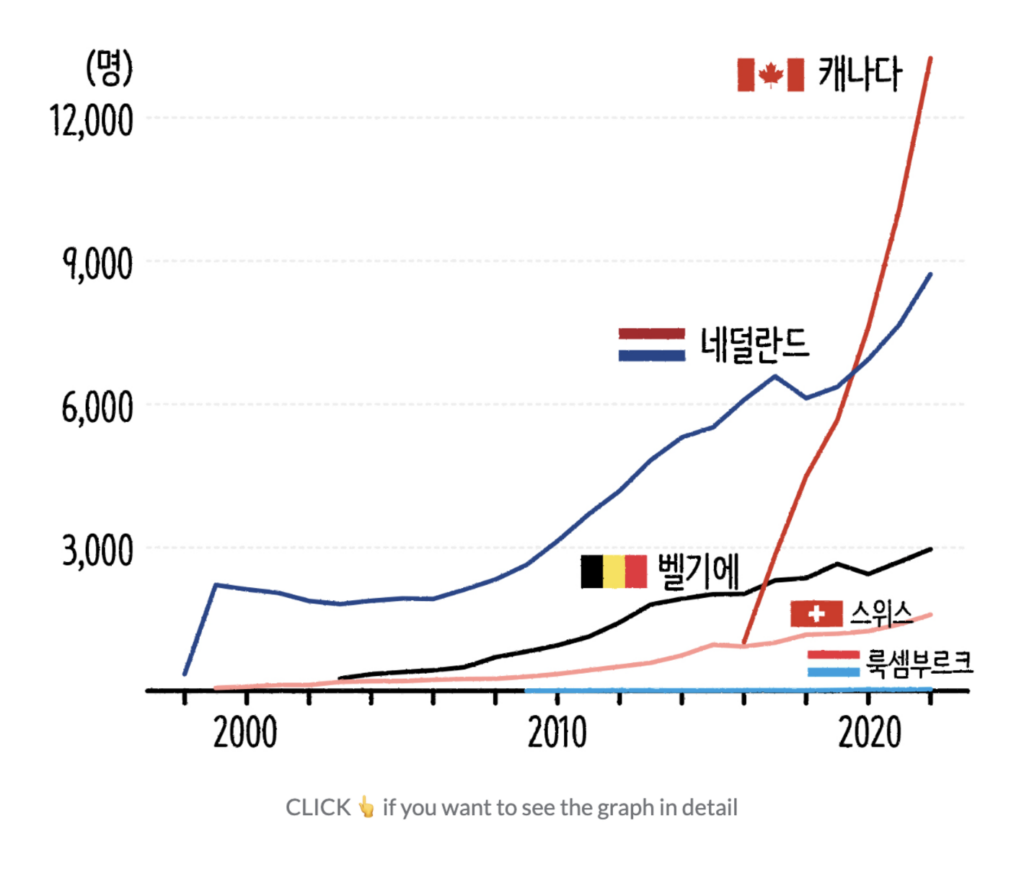
Organ donation in Germany and assisted suicide around the world — these medical topics converted into visualizations:
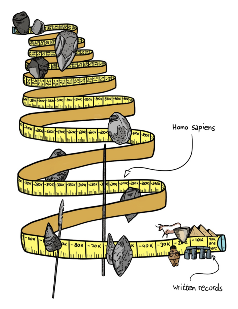
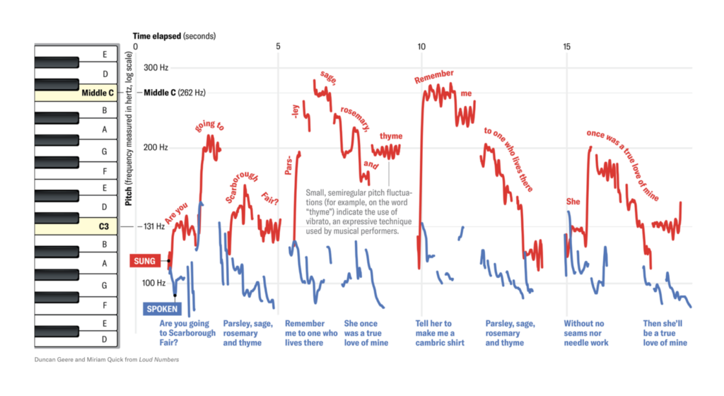
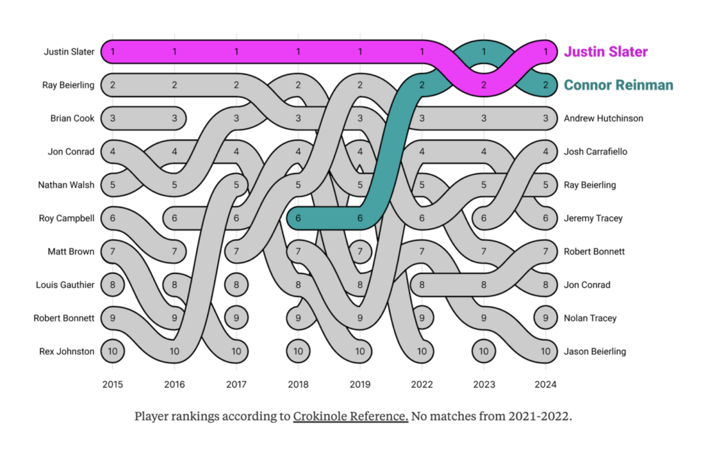
Last but not least, the (actually really long) stone age, the difference between singing and speaking, a game called Crokinole, and Nobel Prize winners:
What else we found interesting
Applications are open for…
- A visual designer and a data vis product designer, as well as a Germany-based working student in communications, right here on our team at Datawrapper! 🎉
Help us make this dispatch better! We’d love to hear which newsletters, blogs, or social media accounts we need to follow to learn about interesting projects, especially from less-covered parts of the world (Asia, South America, Africa). Write us at hello@datawrapper.de or leave a comment below.
Want the Dispatch in your inbox every Tuesday? Sign up for our Blog Update newsletter!


Comments