We want to enable everyone to create beautiful charts, maps, and tables. New to data visualization? Or do you have specific questions about us? You'll find all the answers here.
The best of last week’s big and small data visualizations
Vivien Serve
Welcome back to the 115th edition of Data Vis Dispatch! Every week, we’ll be publishing a collection of the best small and large data visualizations we find, especially from news organizations — to celebrate data journalism, data visualization, simple charts, elaborate maps, and their creators.
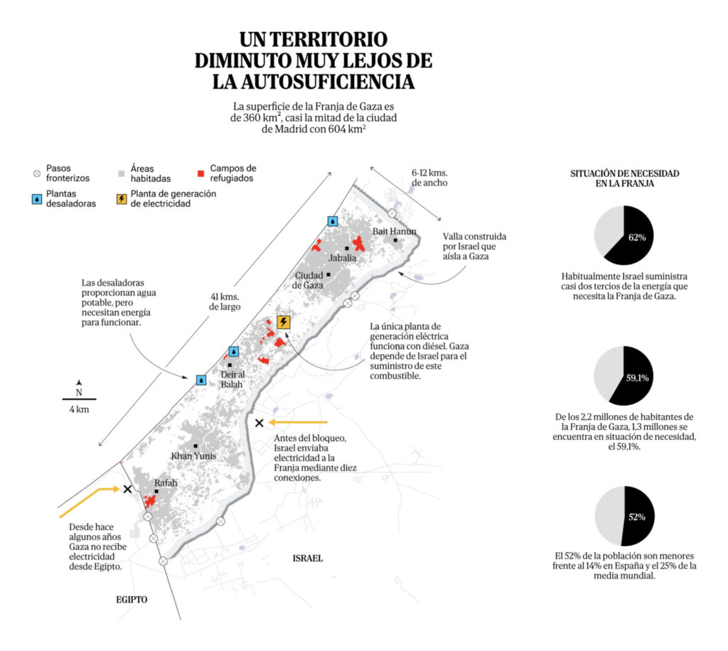
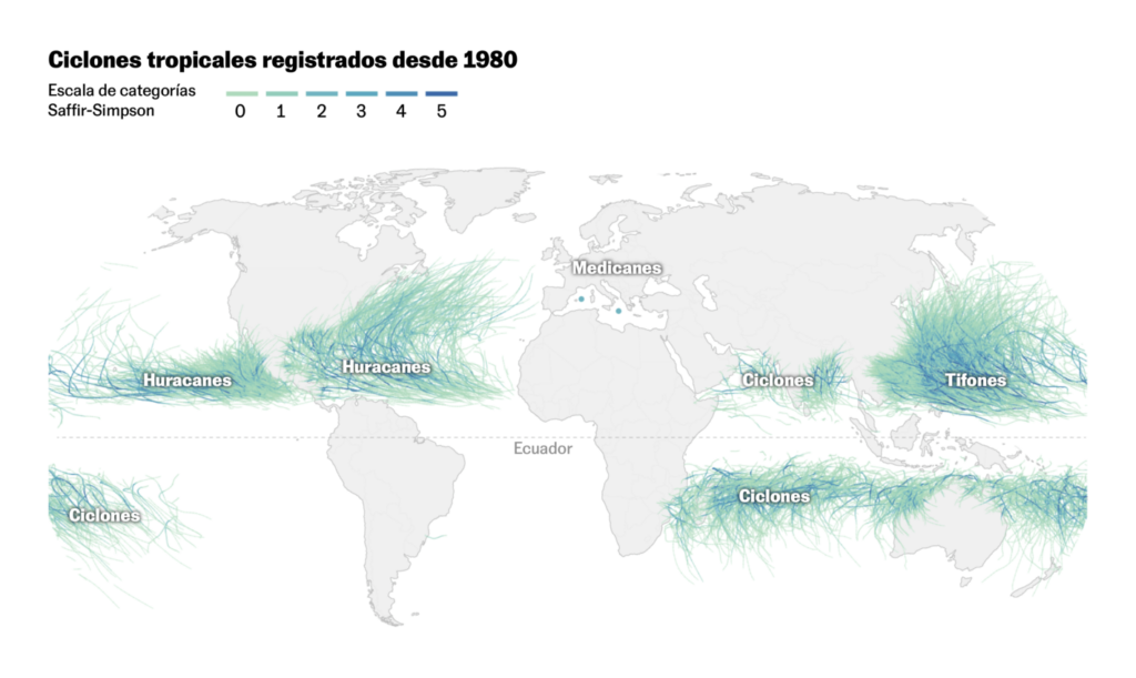
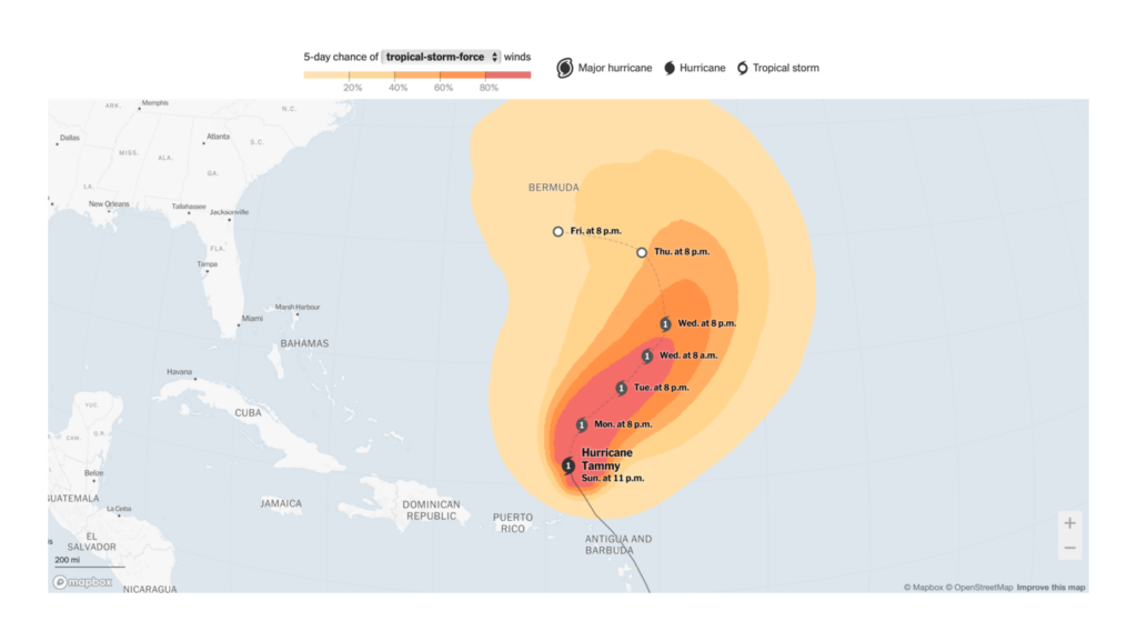
Recurring topics this week include movies and music, water and fire, and Israel and the Gaza Strip.
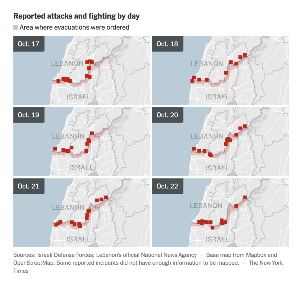
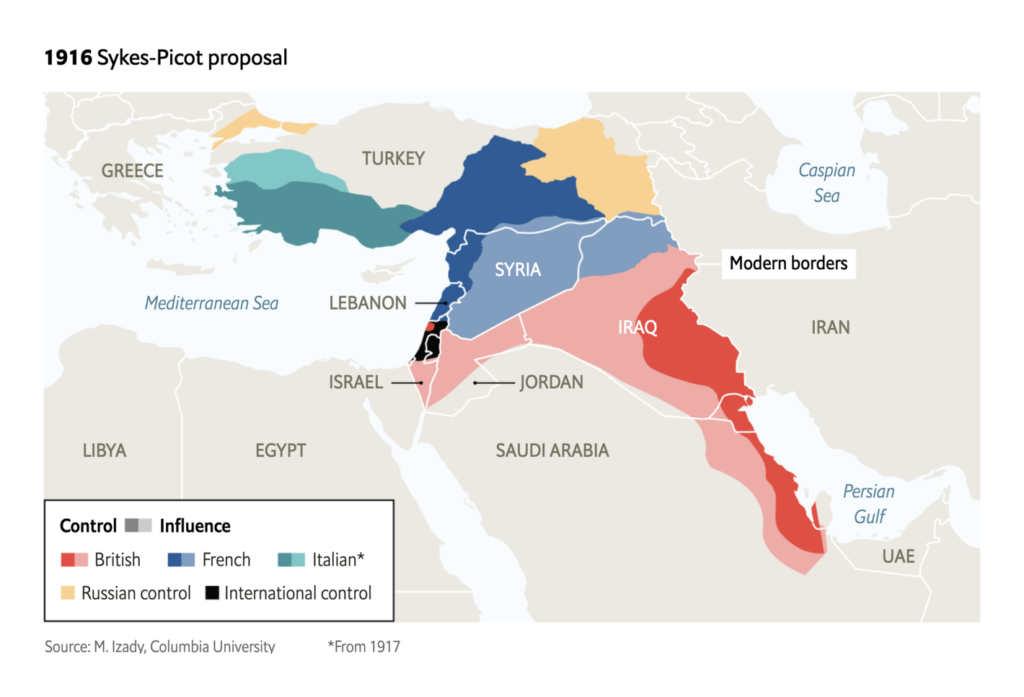
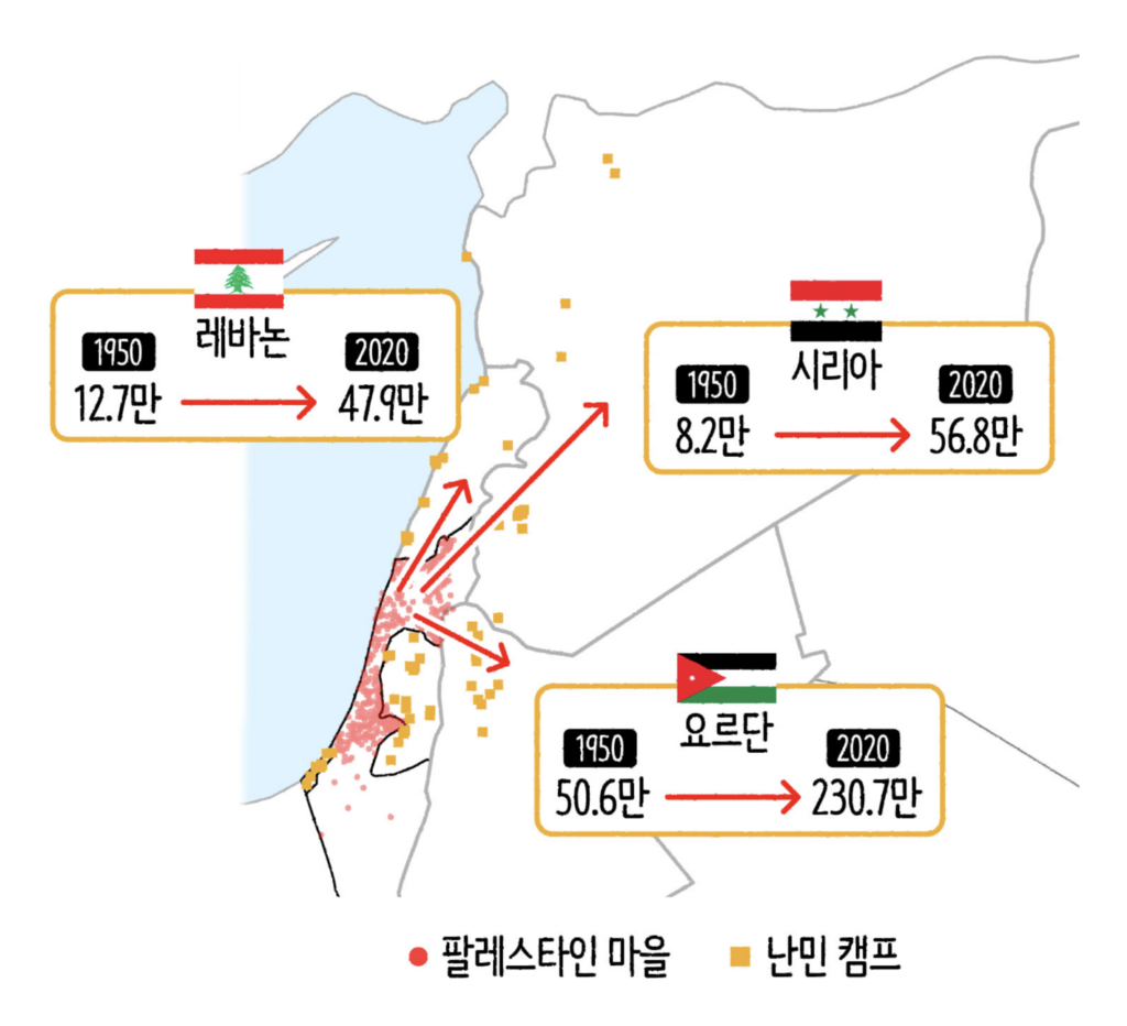
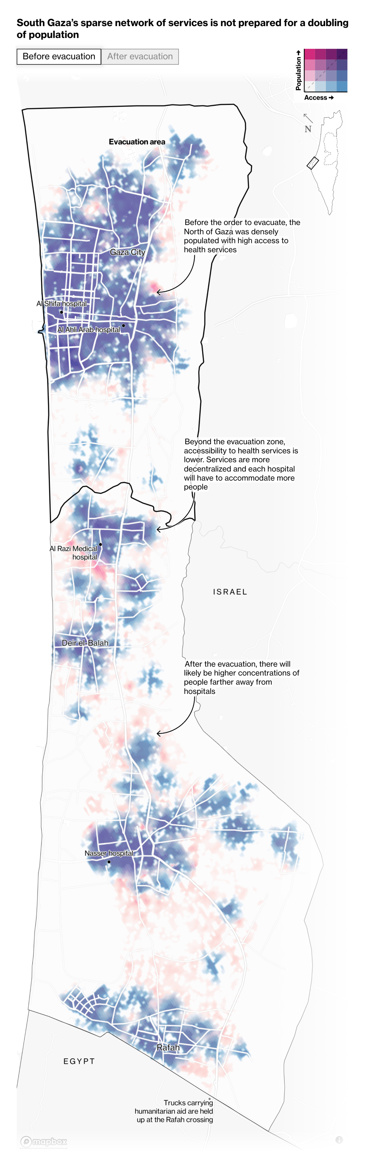
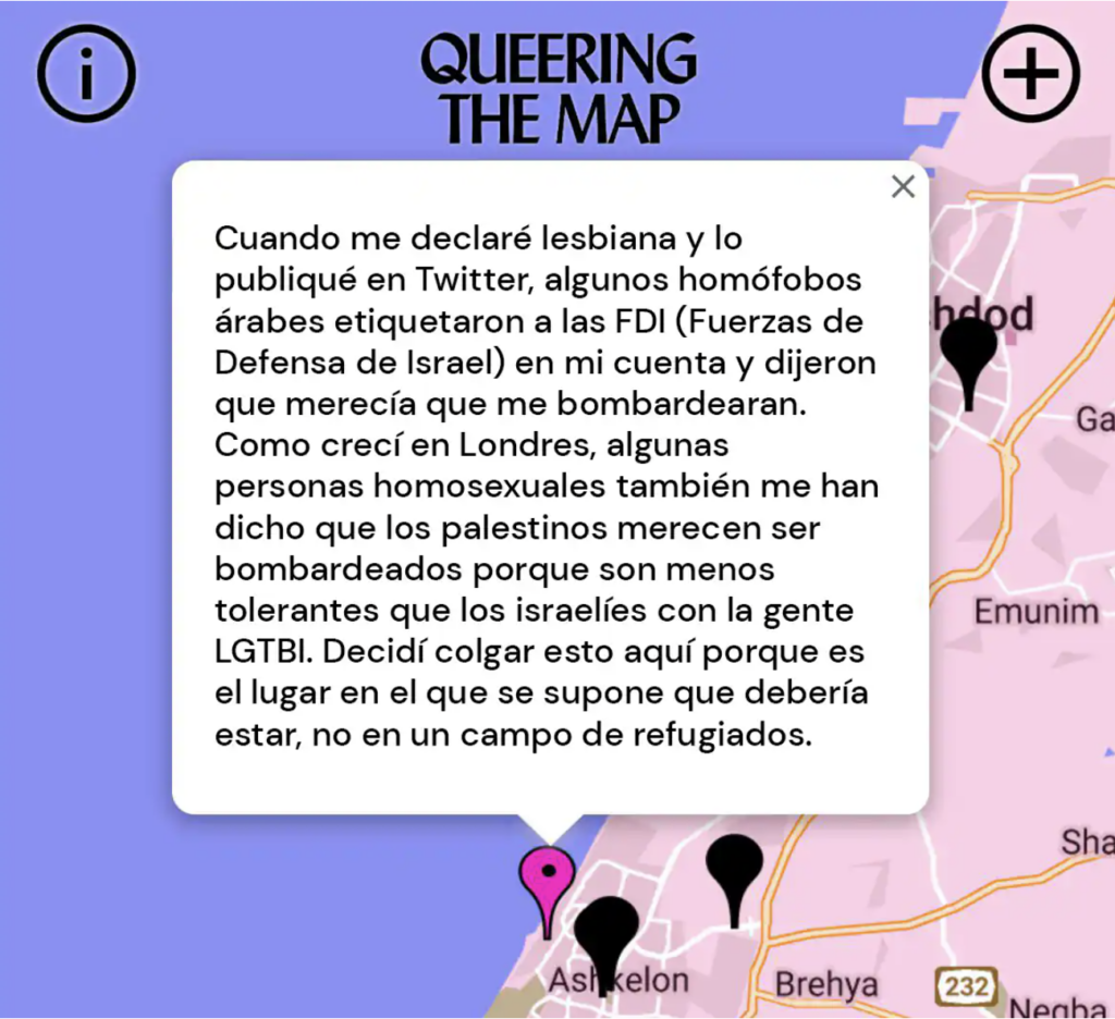
As long as the war between Israel and Hamas continues, so do the visualizations that depict it. Two scroll-based stories provide a detailed look at the current picture in the Gaza Strip:
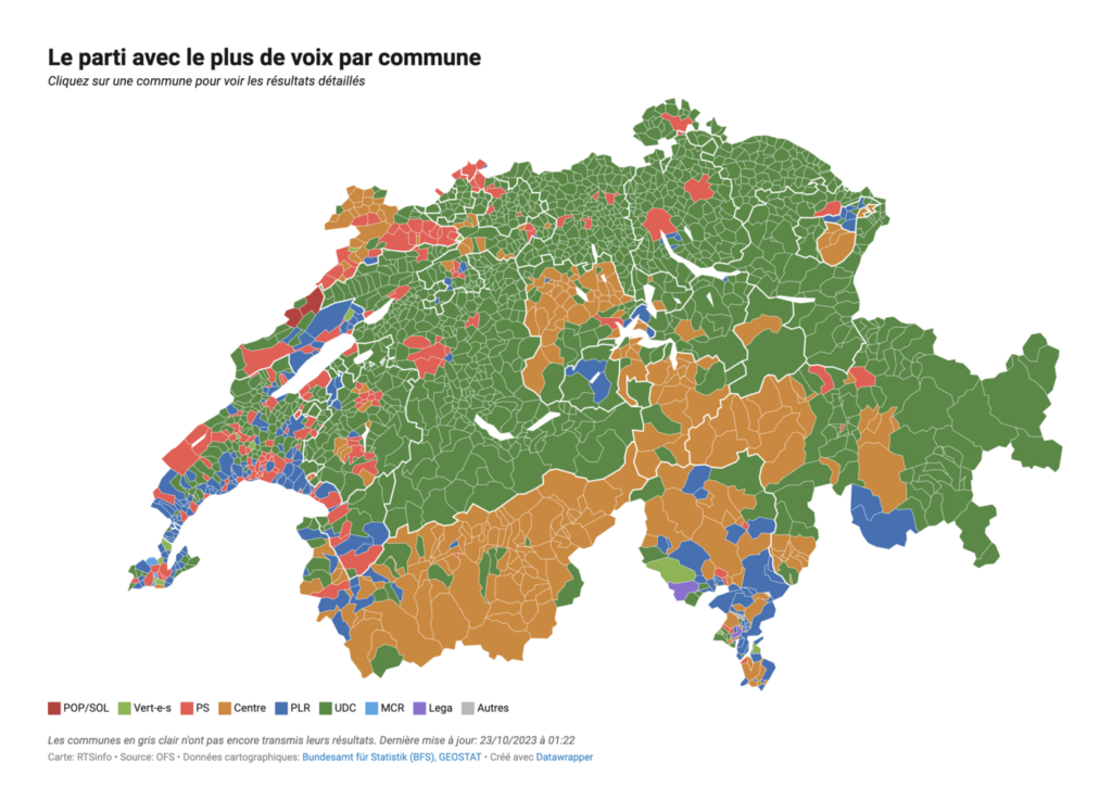
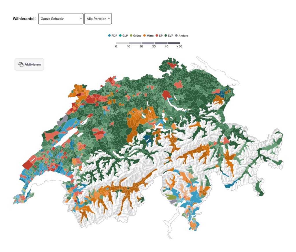
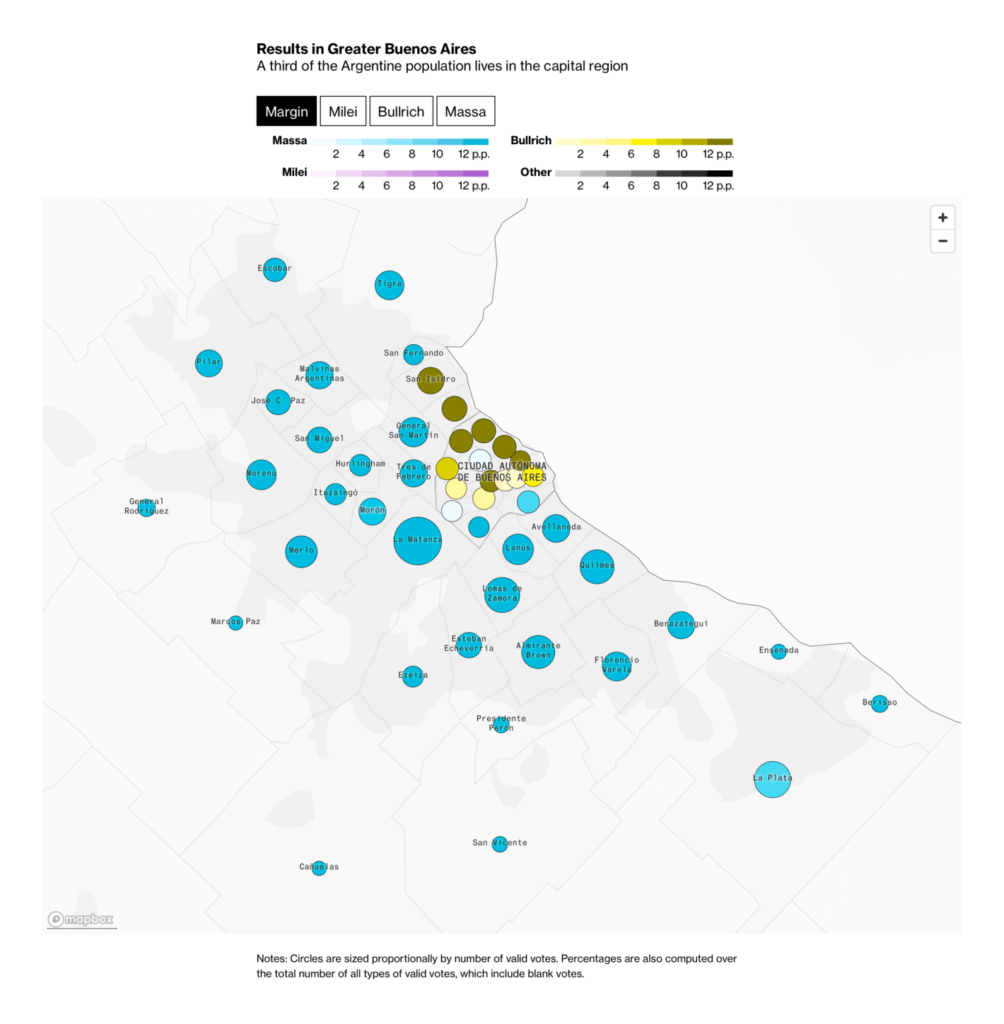
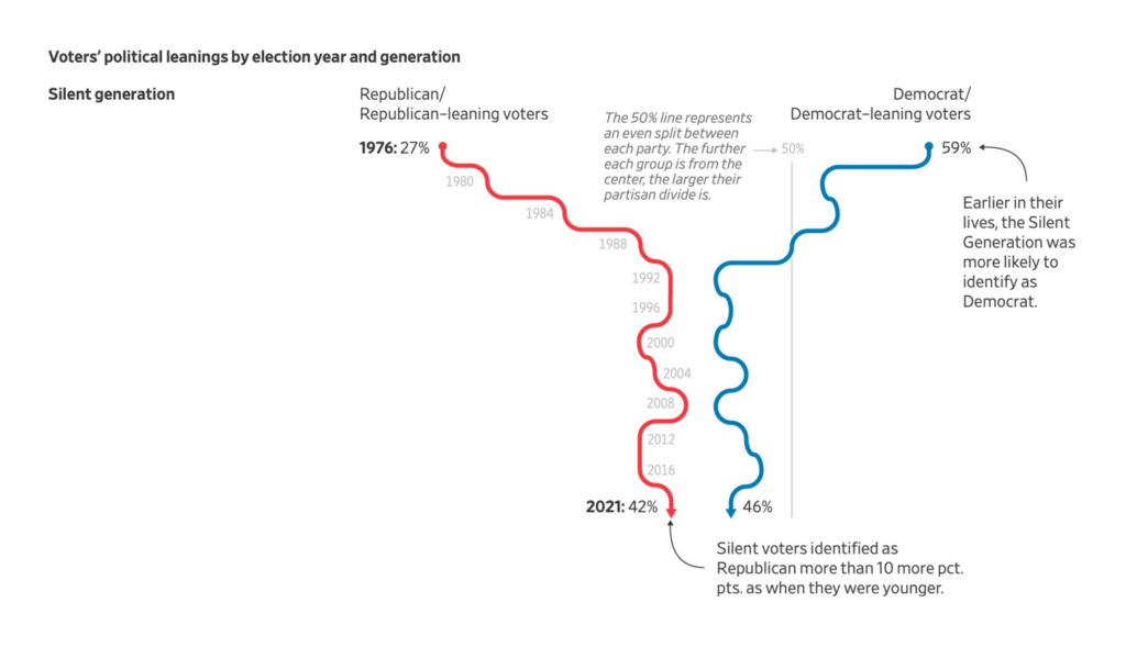
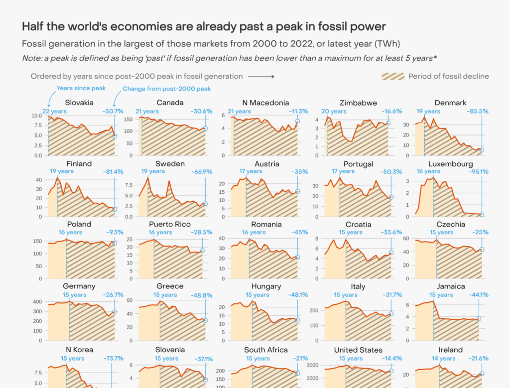
Meanwhile, voting remains a hot topic, with election maps from Switzerland and Argentina and a chart on how American voters tend to become more conservative with age:
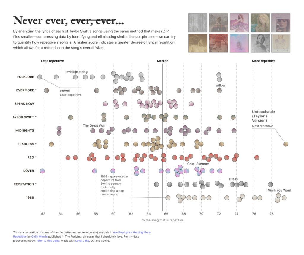
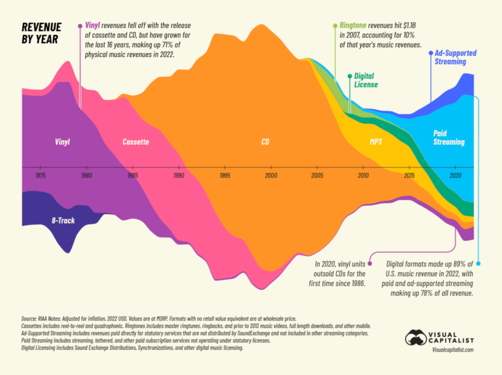
We continue with a women in music: Taylor Swift. With fall finally here, it’s the perfect time to stay at home, listen to music and watch (scary) movies — or to create a data visualization about it:
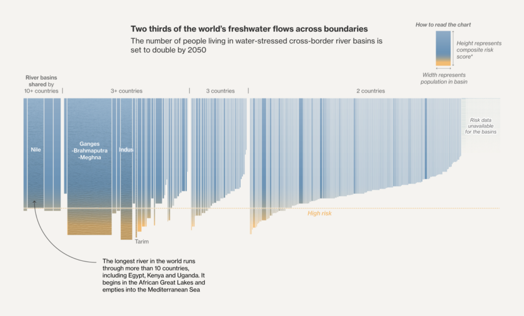
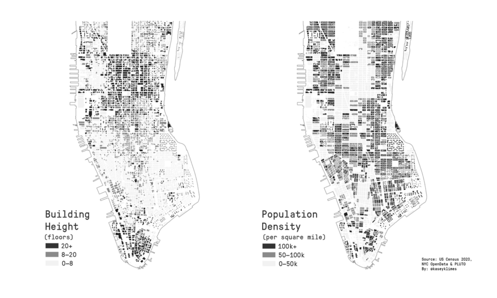
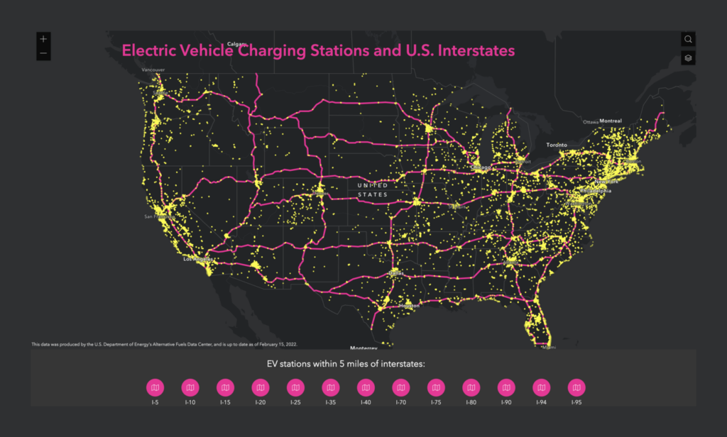
And finally, the miscellaneous. Here we have everything from housing in Manhattan to arms exports to South America to vehicle charging stations in the U.S.:
Help us make this dispatch better! We’d love to hear which newsletters, blogs, or social media accounts we need to follow to learn about interesting projects, especially from less-covered parts of the world (Asia, South America, Africa). Write us at hello@datawrapper.de or leave a comment below.
(she/her) is a working student on Datawrapper’s Communications team. She creates the Data Vis Dispatch to keep data visualization enthusiasts up to date on exciting new projects. When she’s not working, she studies interface design, and when she’s not studying, she’s planning a festival stage or soldering light installations. Vivien lives in Potsdam.


Comments