This article is brought to you by Datawrapper, a data visualization tool for creating charts, maps, and tables. Learn more.
Data Vis Dispatch, October 25
The best of last week’s big and small data visualizations

Welcome back to the 65th edition of Data Vis Dispatch! Every week, we’ll be publishing a collection of the best small and large data visualizations we find, especially from news organizations — to celebrate data journalism, data visualization, simple charts, elaborate maps, and their creators.
Recurring topics this week include the resignation of Liz Truss, inflation and food security, sports, and… Taylor Swift.
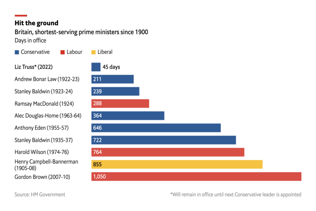
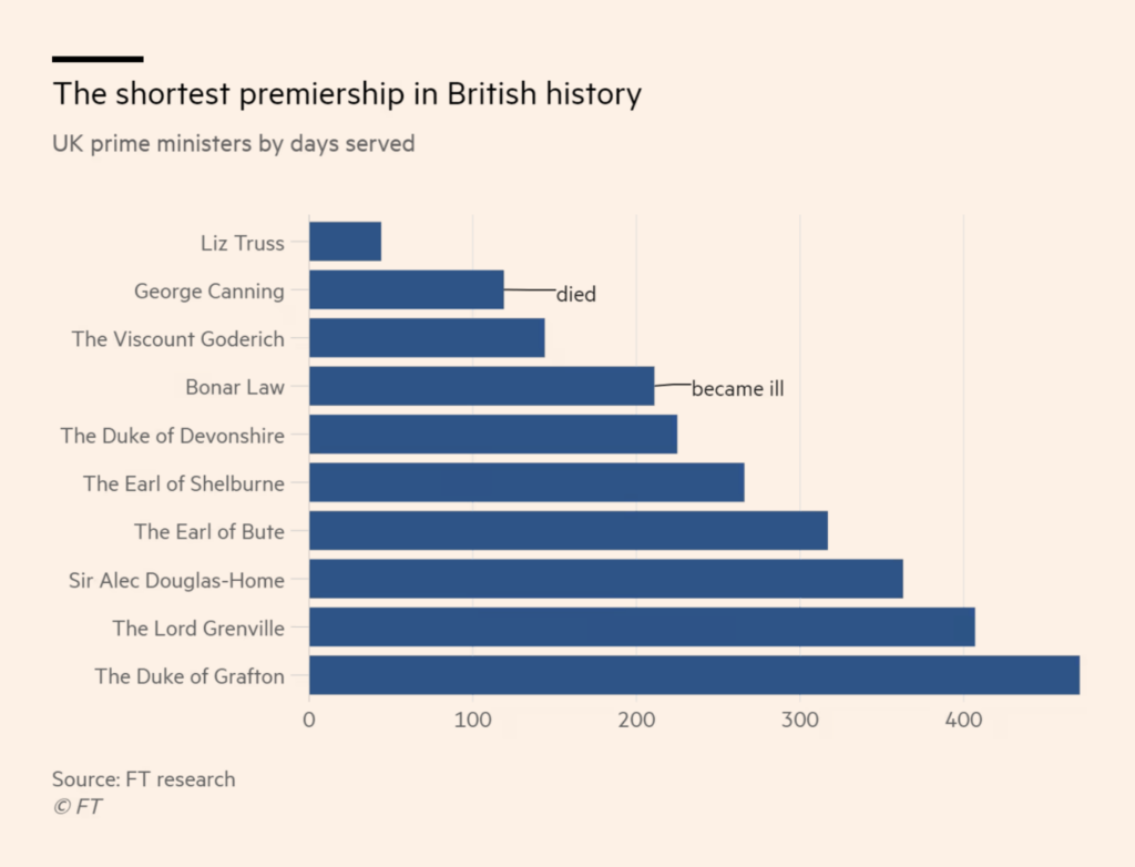
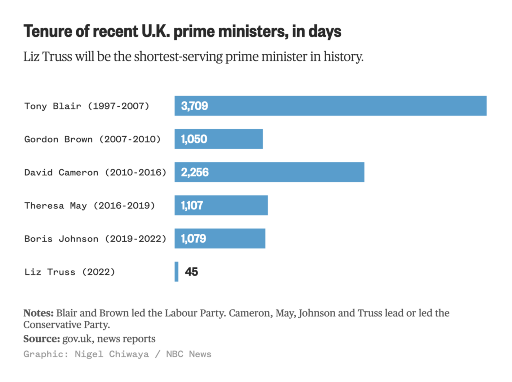
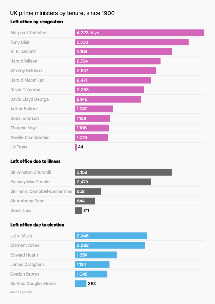
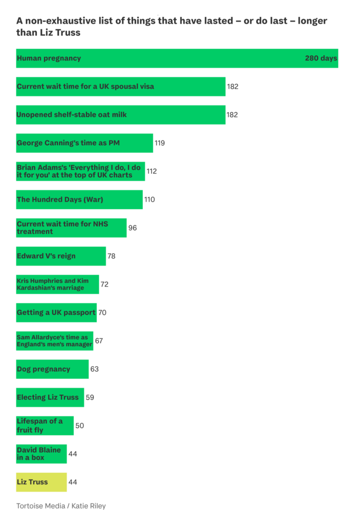
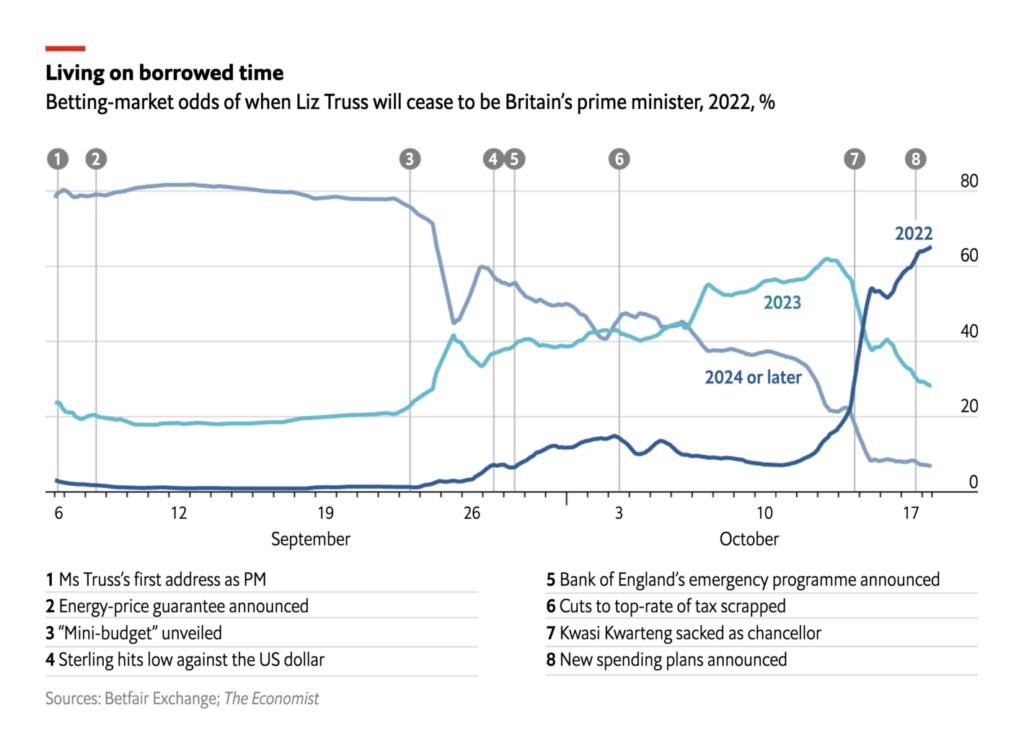
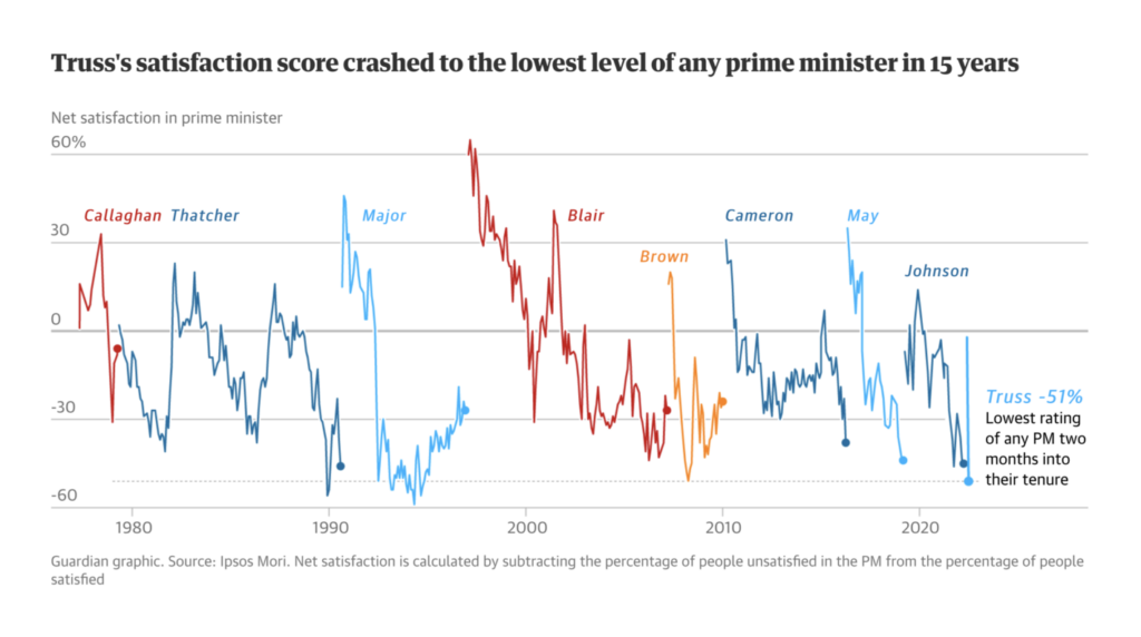
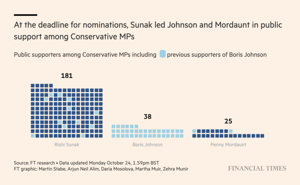
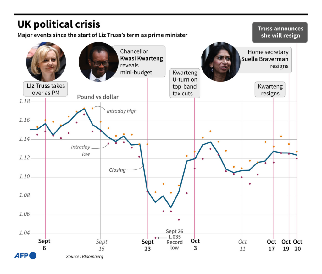
The resignation of Liz Truss as the U.K.’s prime minister on her 45th day in office was followed by a tidal wave of bar charts comparing her tenure to those of her predecessors and other notable events.
Other themes related to the changes in Downing Street included betting odds, satisfaction scores, and support for new candidates.
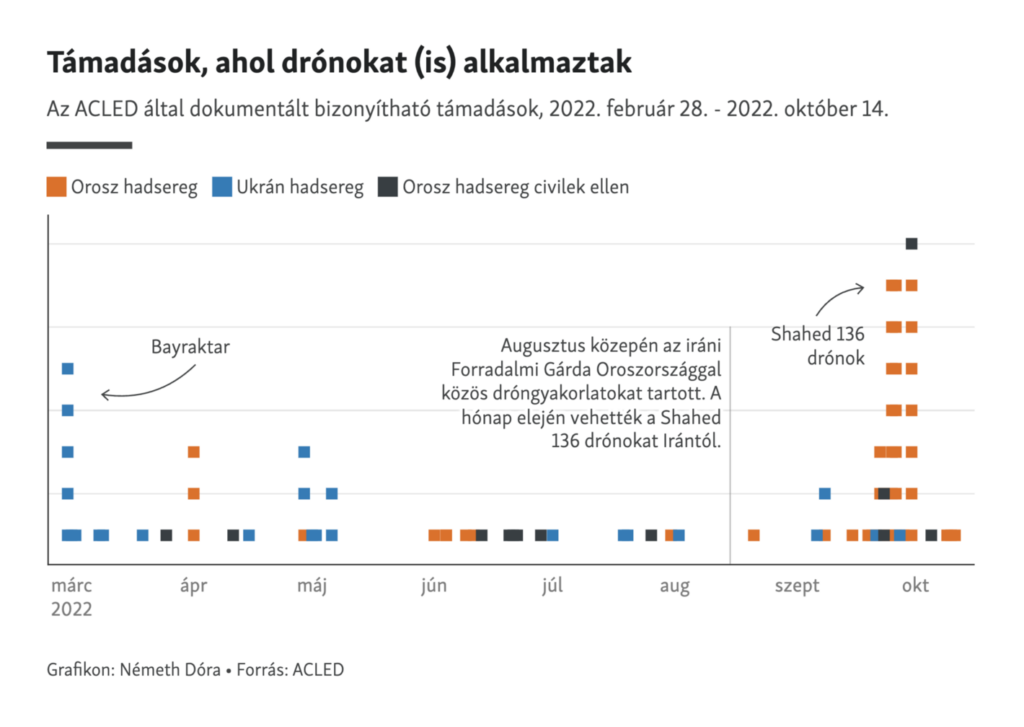
Ukrainian armed forces continued their advance against Russia and reclaimed more territory. The approaching winter will, however, make Ukraine more vulnerable to attacks on key infrastructure, with 45% of buildings connected to central heating. The number of Russian drone attacks surged in October.

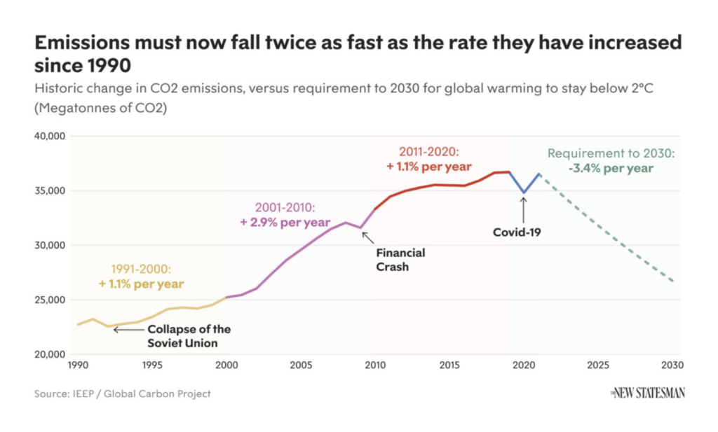
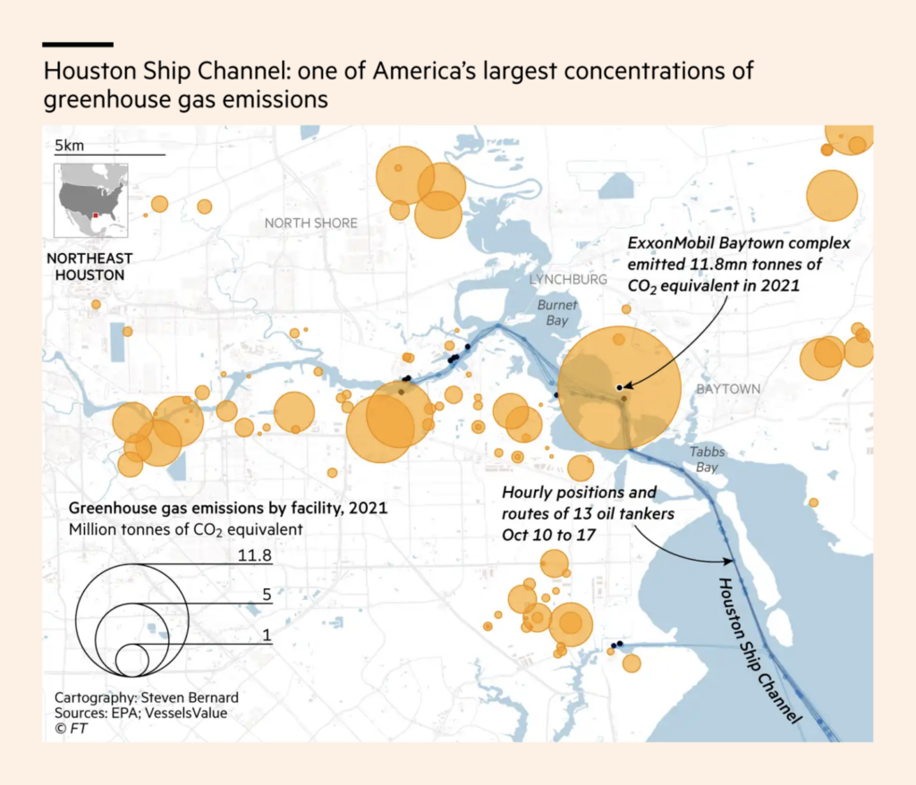
The German Foreign Office explored the data behind climate change and conflict, one of the many reasons to take a closer look at reducing greenhouse gas emissions, be it with the help of renewables or carbon capture.

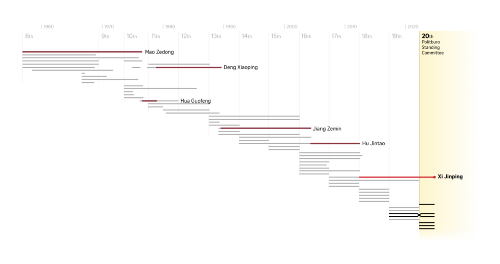
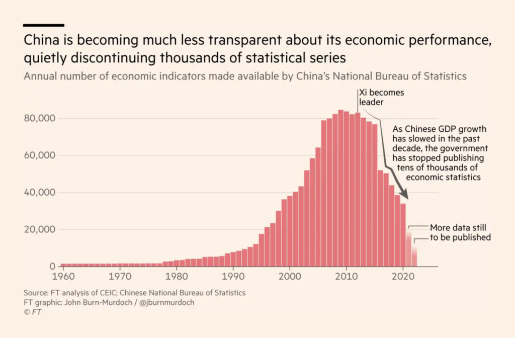
Xi Jinping secured an unprecedented third term as China’s leader, one of the seven men who will rule the country. The state of the Chinese economy is, however, becoming more of a mystery with thousands of performance indicators being discontinued in recent years.
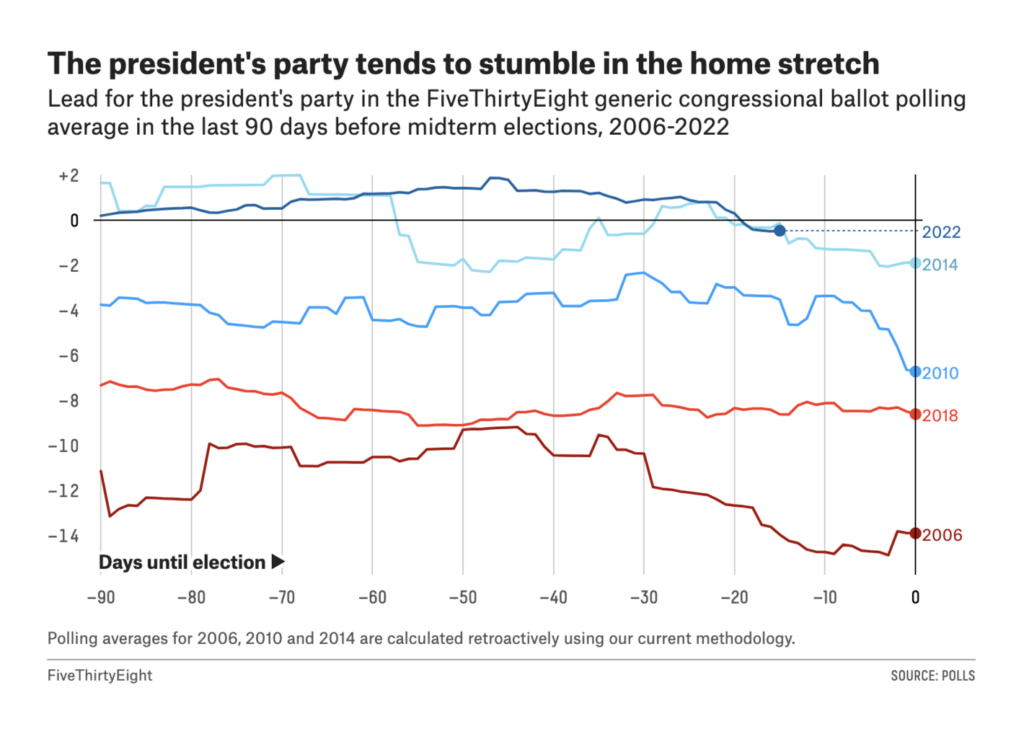
The U.S. midterm elections are around the corner — traditionally a difficult time for the president and their party.

The New York Times offers an in-depth (and interactive) look at the Biden administration’s spending and revenue — the bills that had been proposed and the ones that passed.
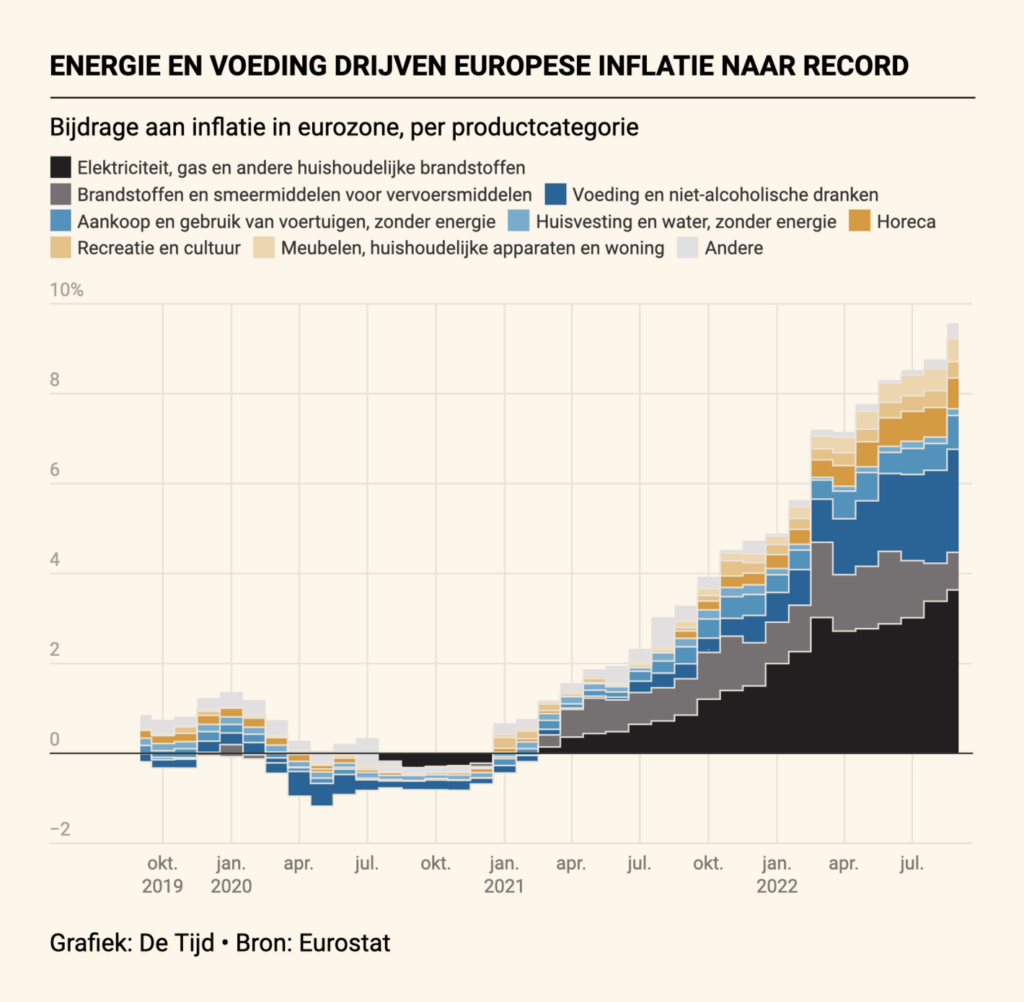
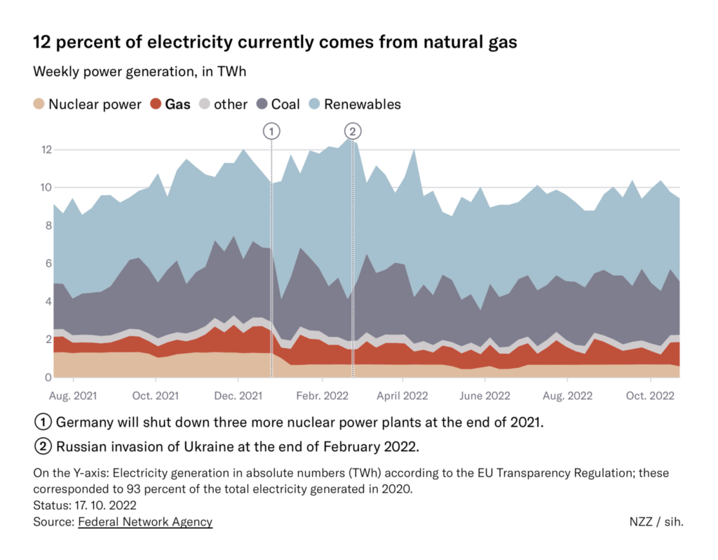
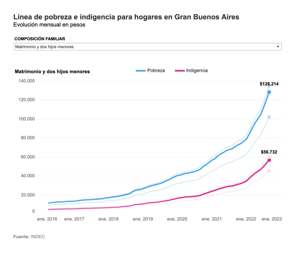
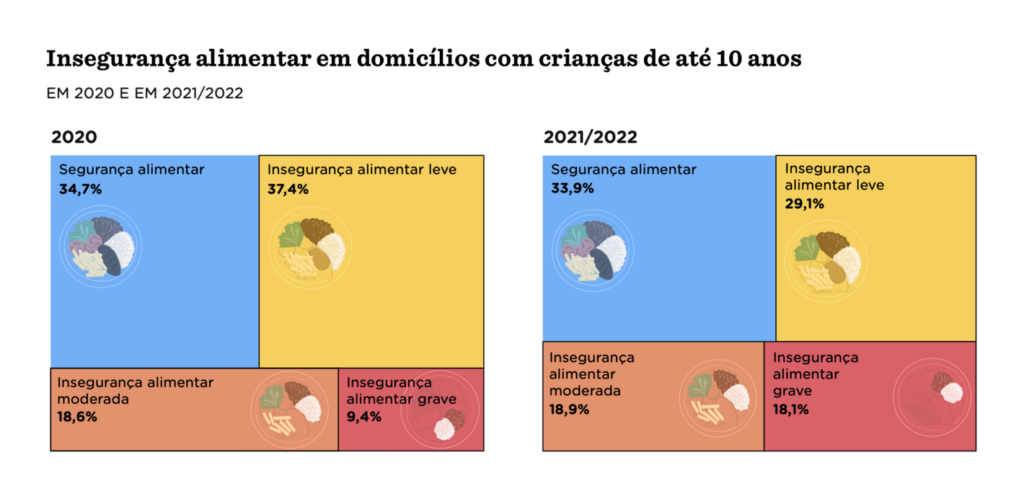
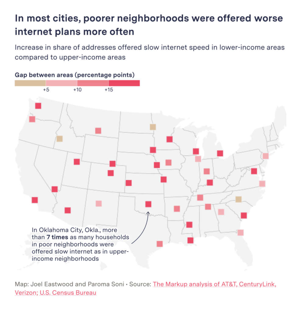
In Europe, high energy costs continued to drive inflation. In Argentina, the poverty line went up because of the rising prices of food and clothes. In Brazil, food security is a growing problem for families with small children. And in the United States, poorer neighborhoods get slower internet speeds.
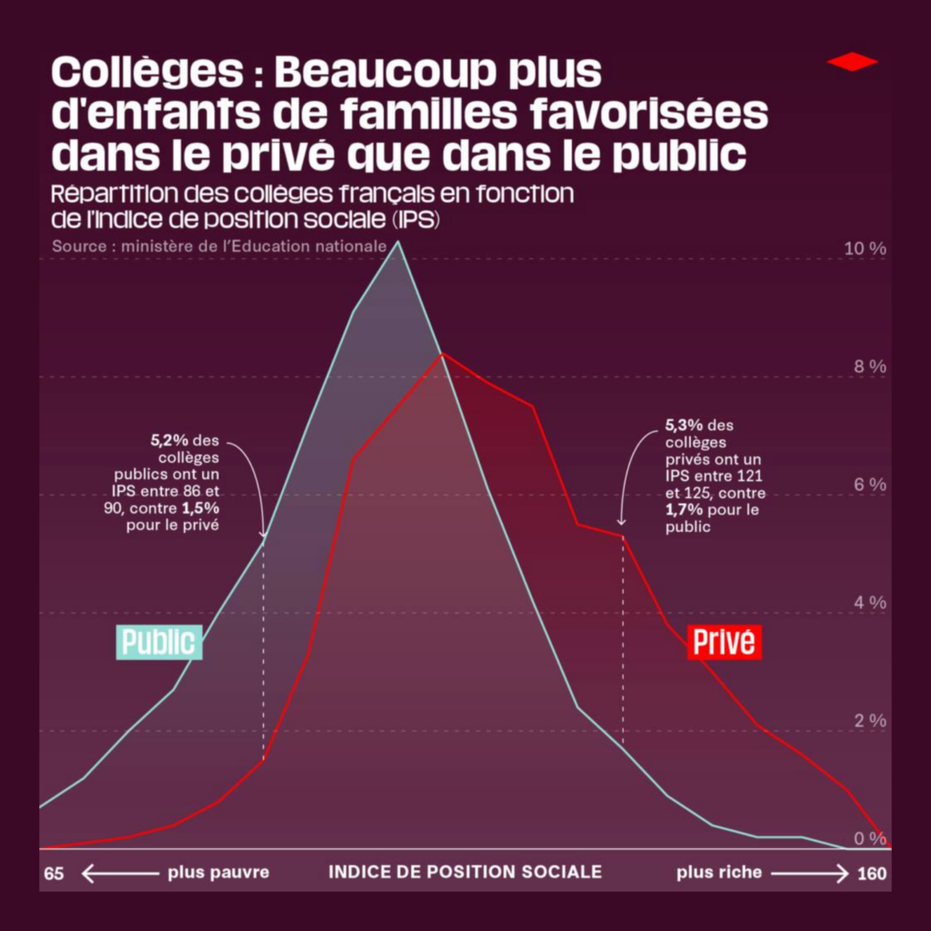
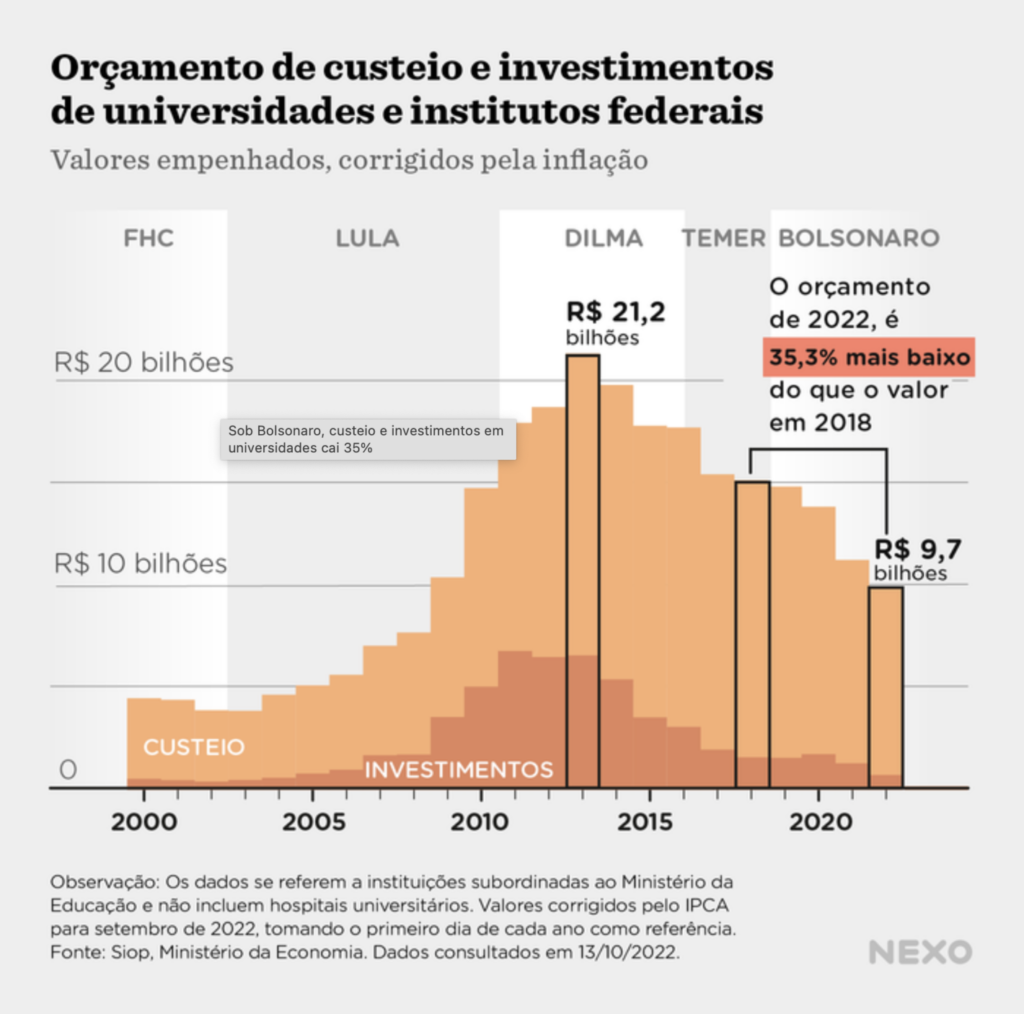
The state of university education was discussed (and visualized) in the U.S., France, and Brazil.

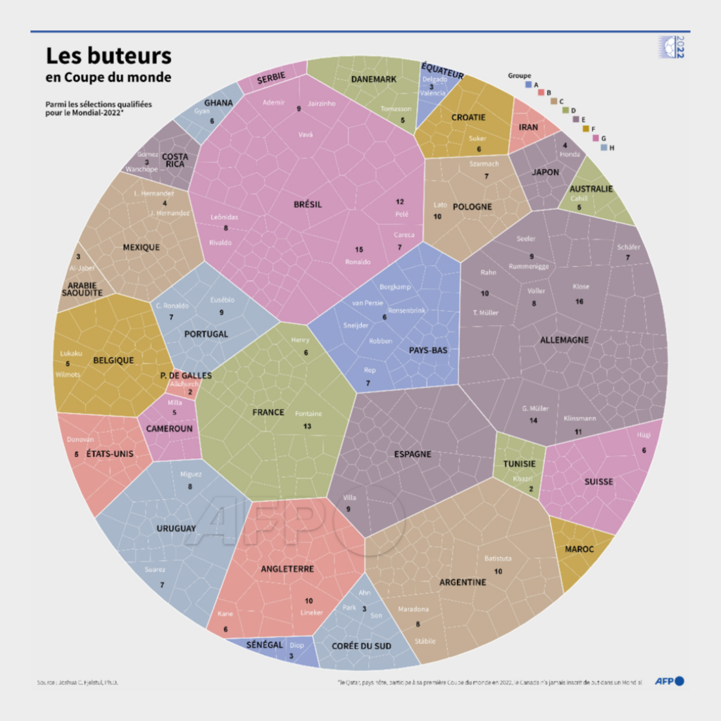
The sports enthusiasts turned their attention to the budget for the Olympics and the past and future participants of the FIFA World Cup.


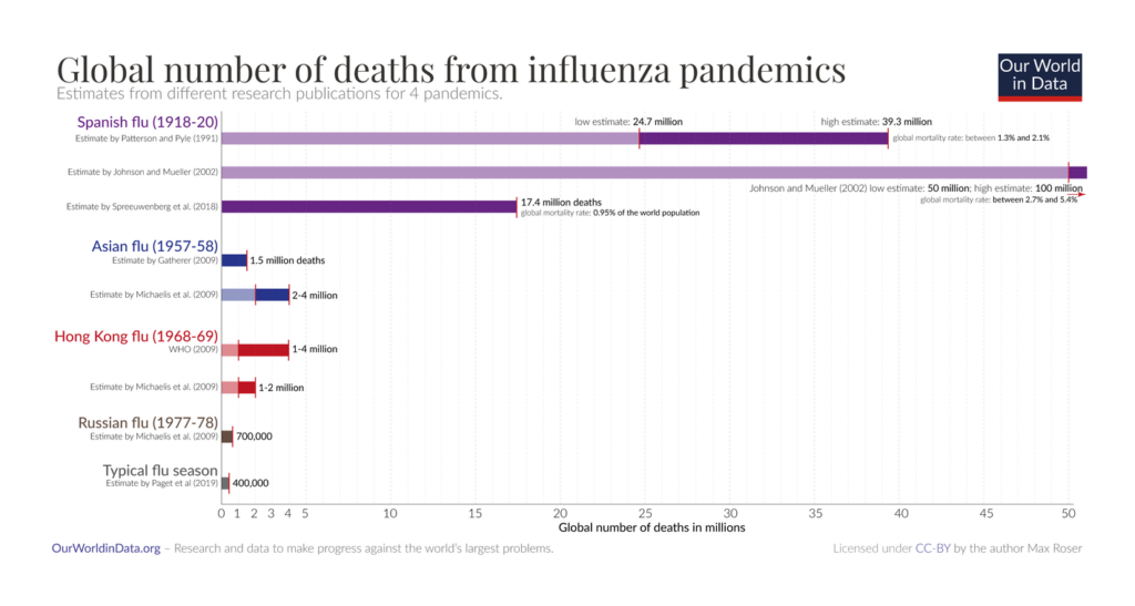
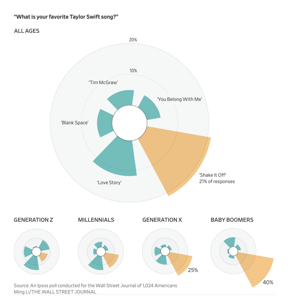
But that’s not all. Other data vis covered themes ranging from the history of the flu to common causes of data center accidents to some of the most popular songs by Taylor Swift.

What else we found interesting


Applications are open for…
- Data Visualization Developer at Reuters (Singapore)
Help us make this dispatch better! We’d love to hear which newsletters, blogs, or social media accounts we need to follow to learn about interesting projects, especially from less-covered parts of the world (Asia, South America, Africa). Write us at hello@datawrapper.de or leave a comment below.
Want the Dispatch in your inbox every Tuesday? Sign up for our Blog Update newsletter!


Comments