We want to enable everyone to create beautiful charts, maps, and tables. New to data visualization? Or do you have specific questions about us? You'll find all the answers here.
The best of last week’s big and small data visualizations
Rose Mintzer-Sweeney
Welcome back to the 19th edition of Data Vis Dispatch! Every week, we’ll be publishing a collection of the best small and large data visualizations we find, especially from news organizations — to celebrate data journalism, data visualization, simple charts, elaborate maps, and their creators.
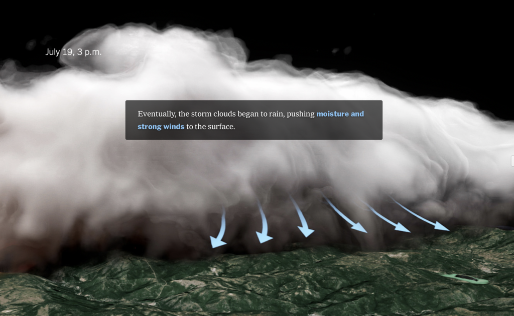
Recurring topics this week include the COP26 climate conference, U.S. politics, and sea travel.
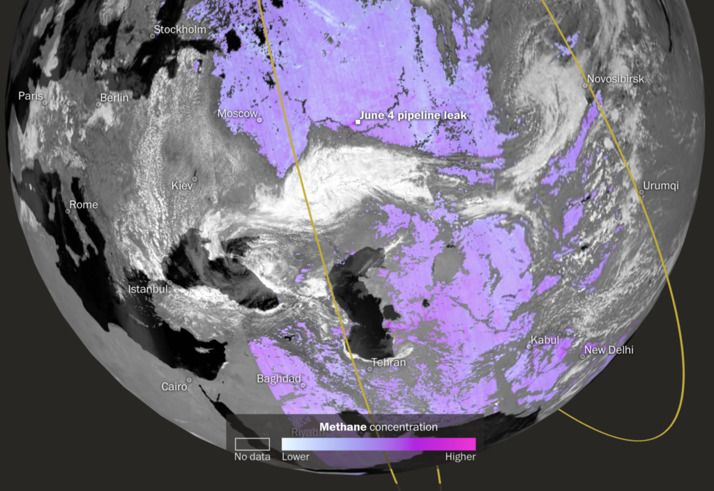
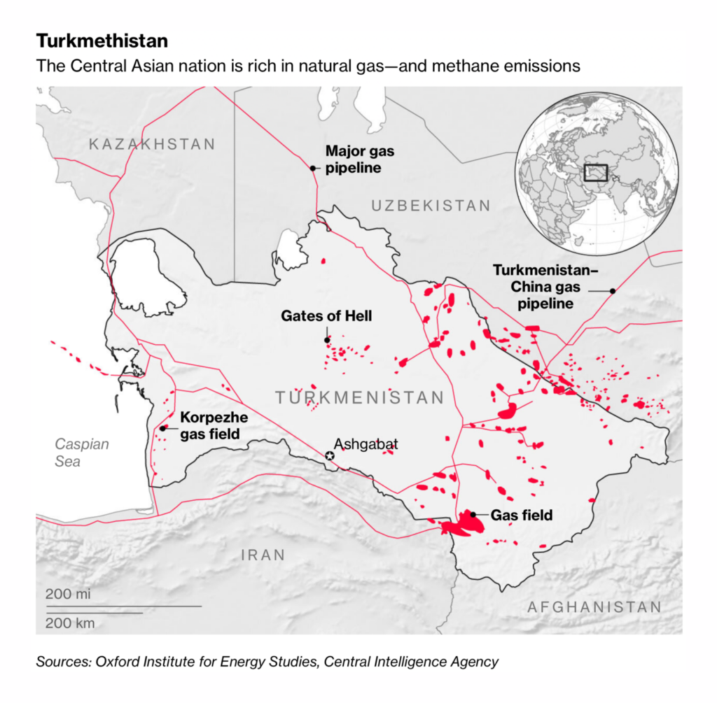
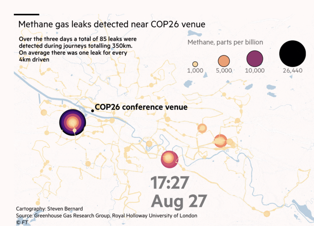
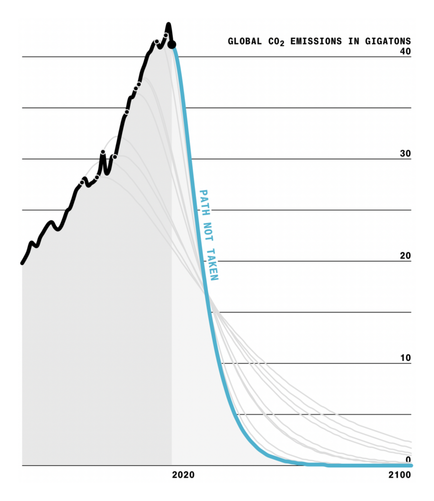
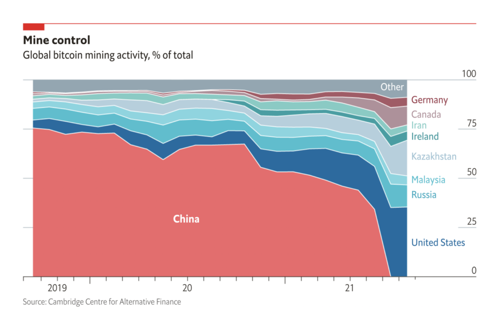
In a few days, the U.N. climate change conference, COP26, is set to begin in Glasgow. One key agenda item is limiting methane emissions — and the problem starts very close to home:
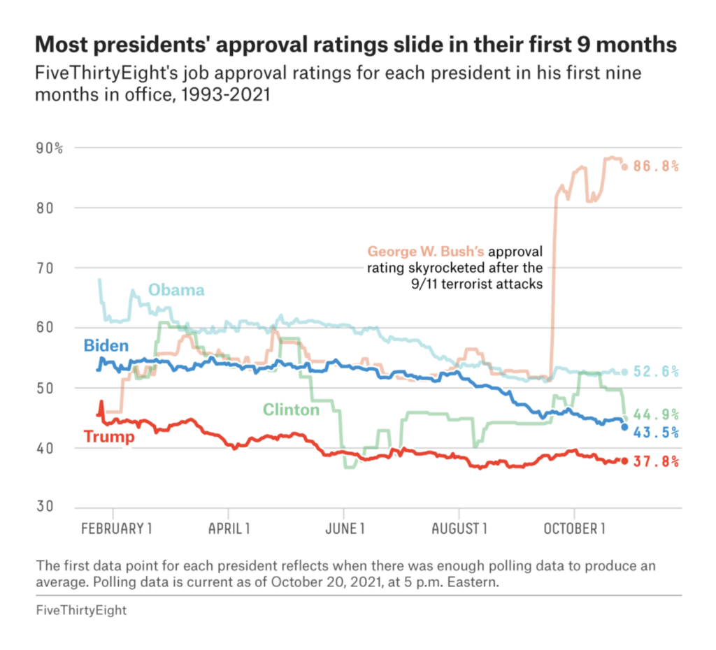
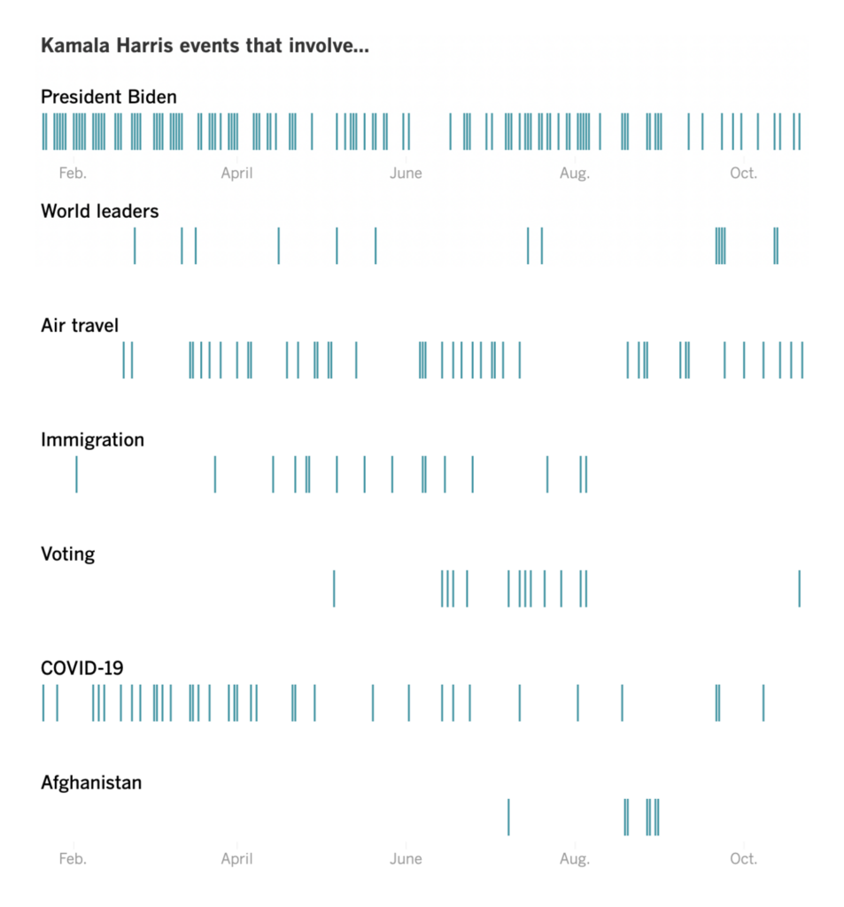
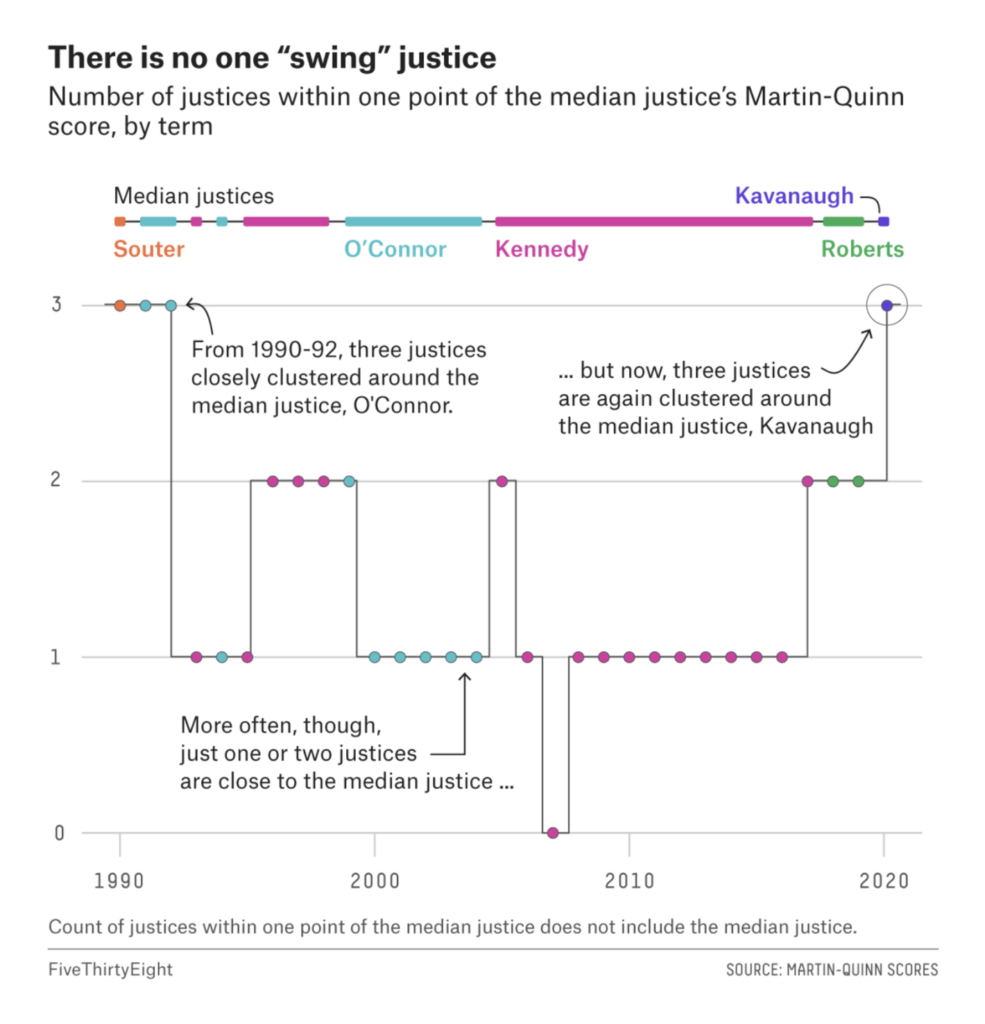
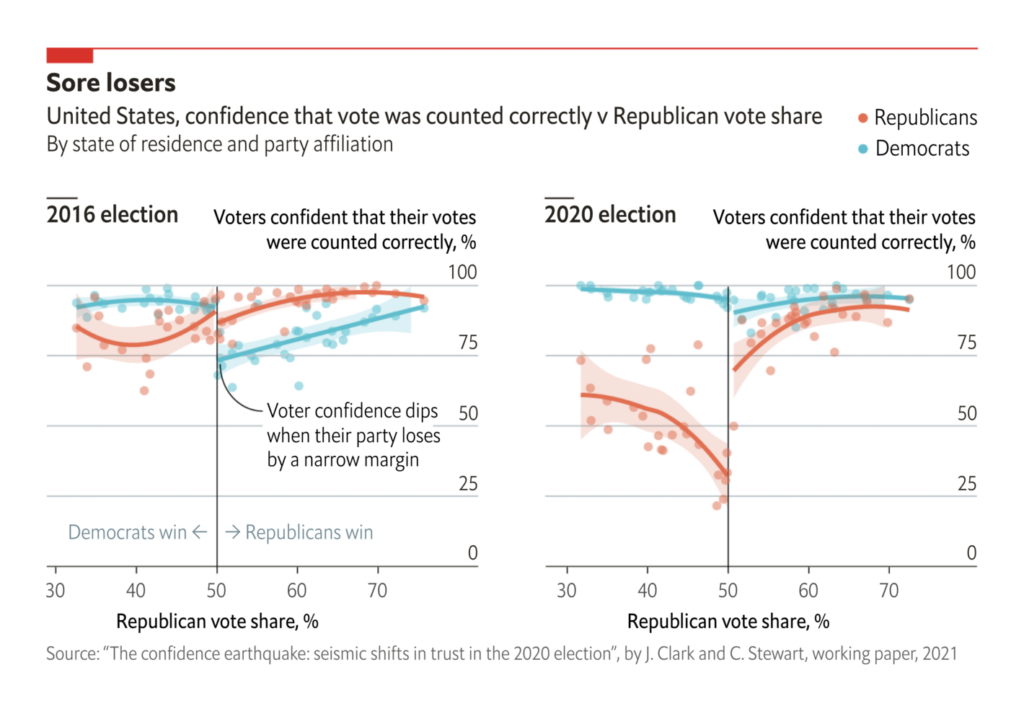
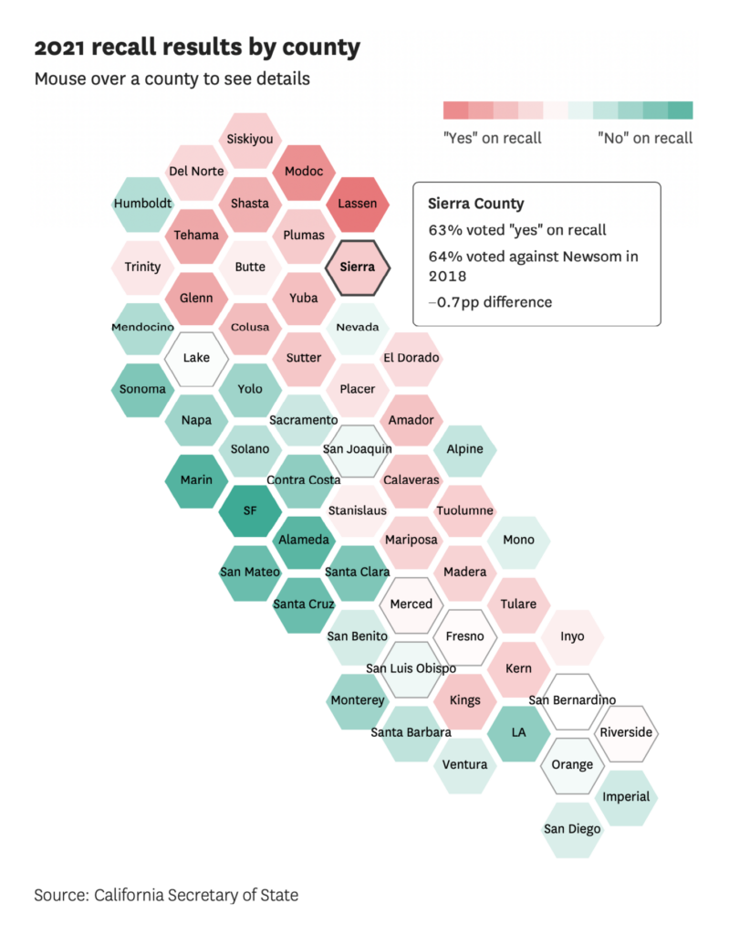
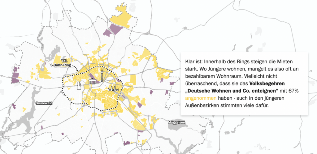
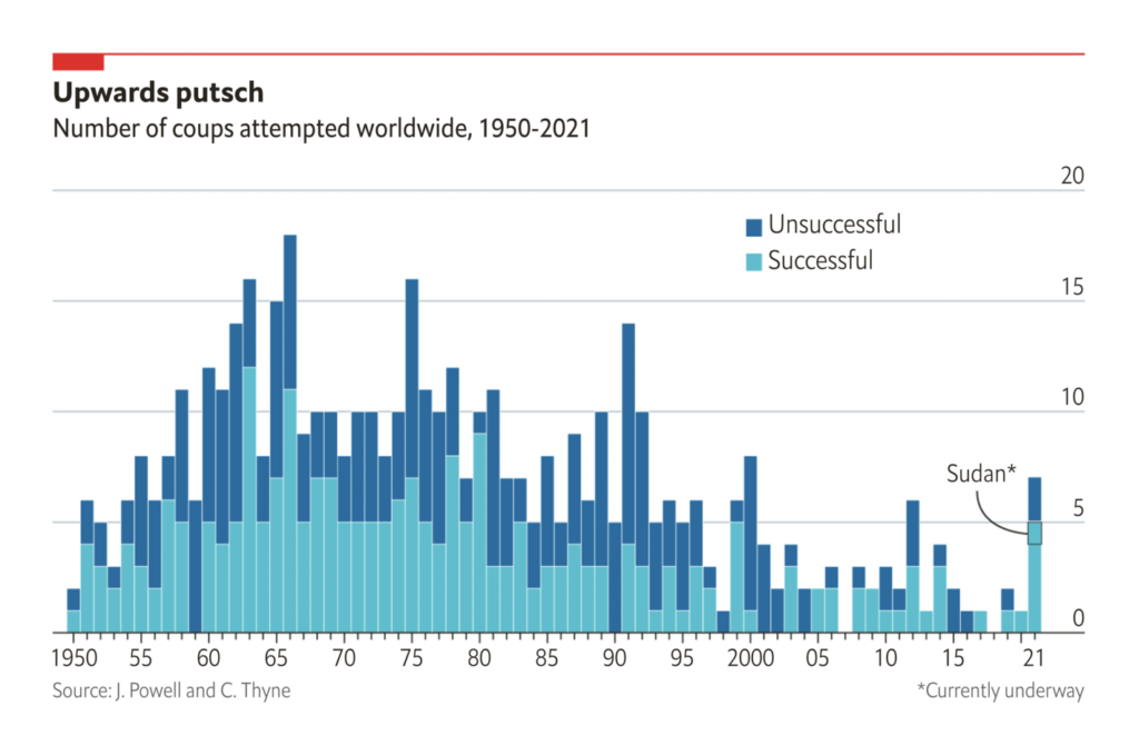
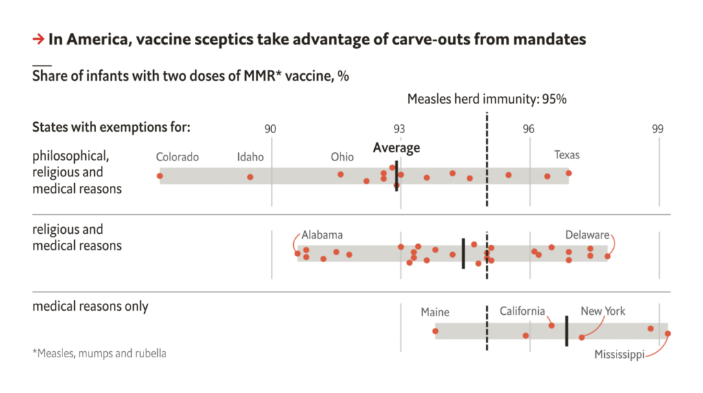
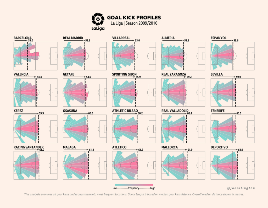
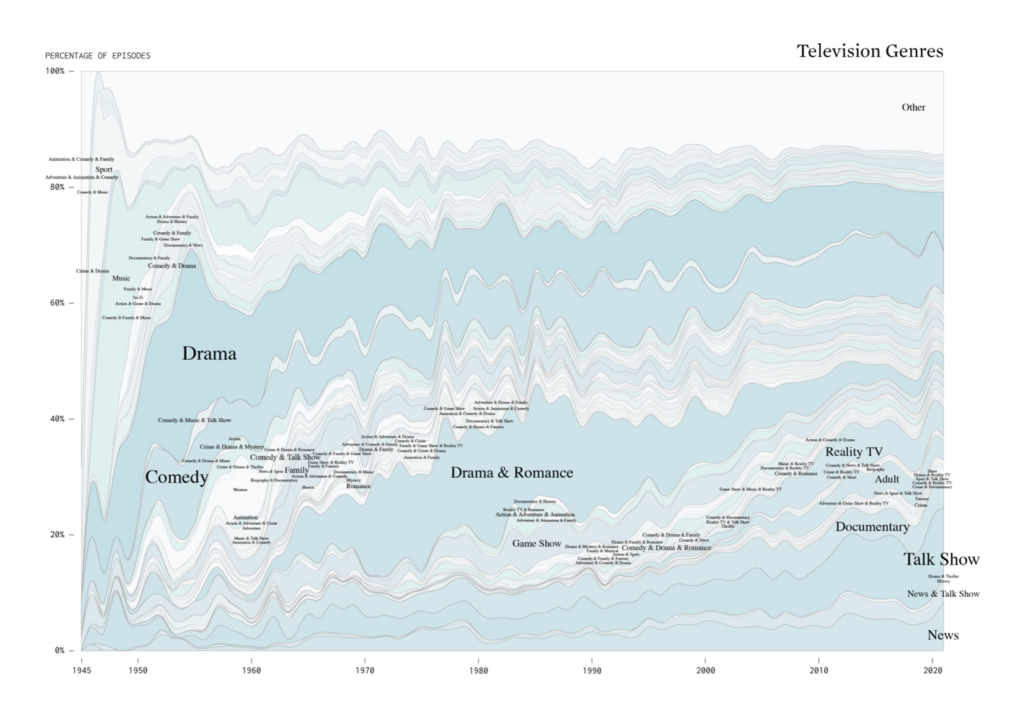
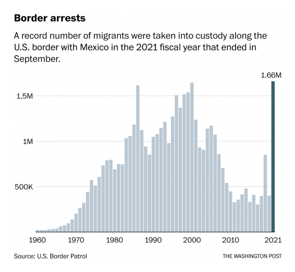
In elections, we saw Republicans losing trust in democracy, final results of the California recall, a demographic breakdown of voting behavior in Berlin — and a historical look at the alternative:
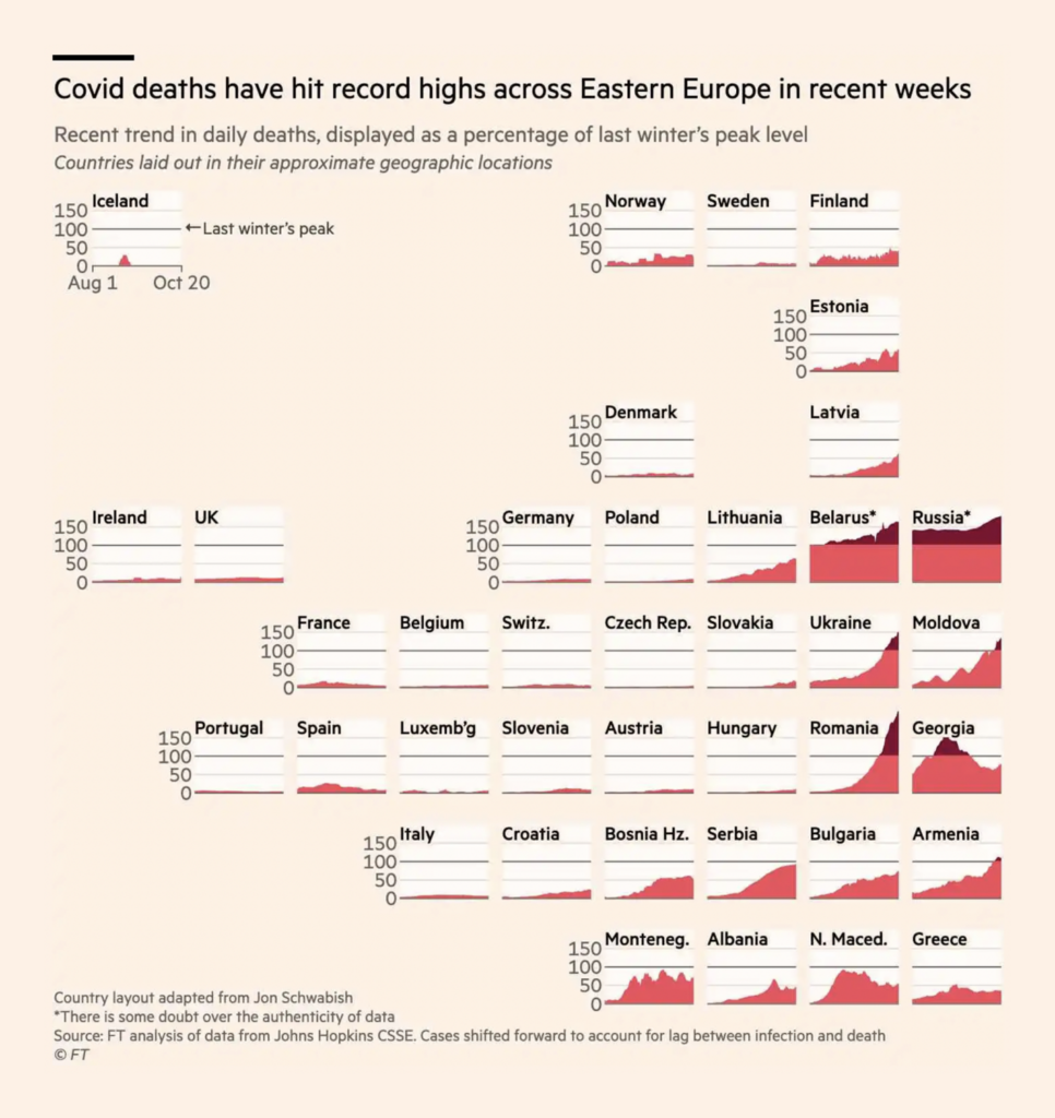
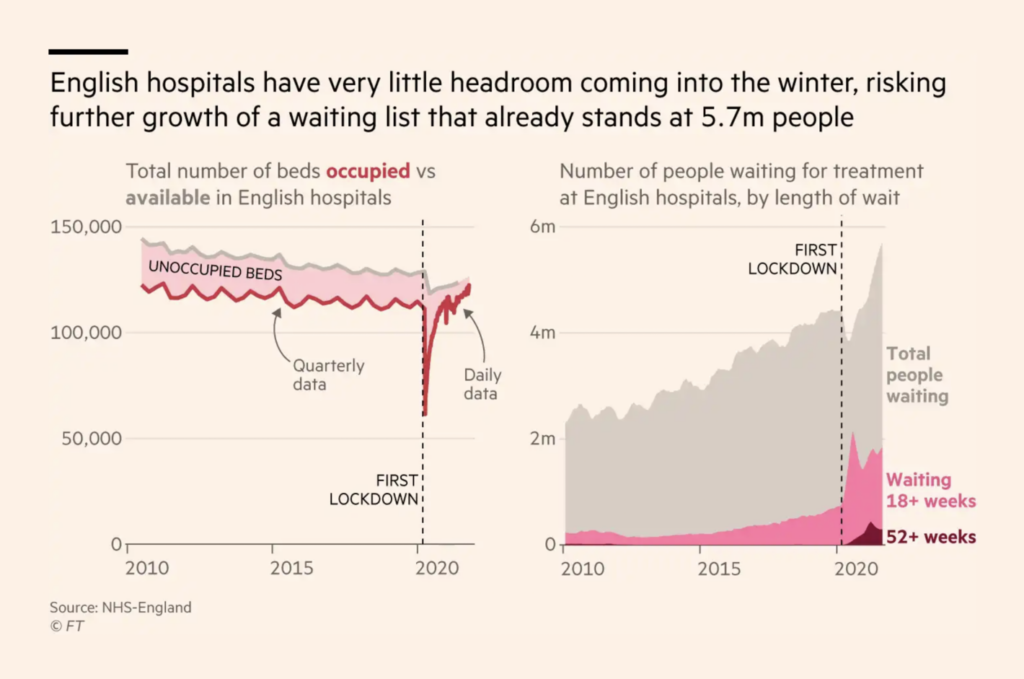
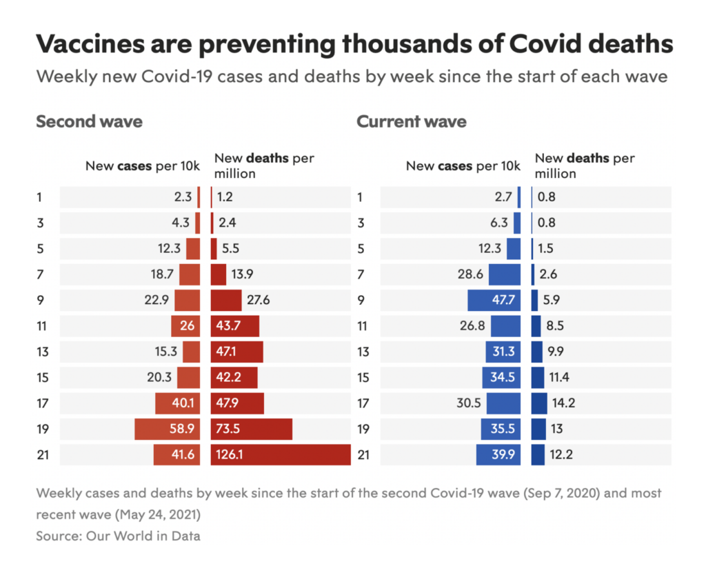
There are three topics you can always count on in a Data Vis Dispatch; we’ve covered climate and politics, which means it’s time for COVID. Everyone is trying predict how the second pandemic winter will compare to the first:
Help us make this dispatch better! We’d love to hear which newsletters, blogs, or social media accounts we need to follow to learn about interesting projects, especially from less-covered parts of the world (Asia, South America, Africa). Write us at hello@datawrapper.de or leave a comment below.
Rose Mintzer-Sweeney
(she/her, @rosemintzers) is a data vis writer on Datawrapper's communications team. She likes words, numbers, pictures, and all possible combinations of the same. Rose lives in Berlin.


Comments