We want to enable everyone to create beautiful charts, maps, and tables. New to data visualization? Or do you have specific questions about us? You'll find all the answers here.
The best of last week’s big and small data visualizations
Vivien Serve
Welcome back to the 116th edition of Data Vis Dispatch! Every week, we’ll be publishing a collection of the best small and large data visualizations we find, especially from news organizations — to celebrate data journalism, data visualization, simple charts, elaborate maps, and their creators.
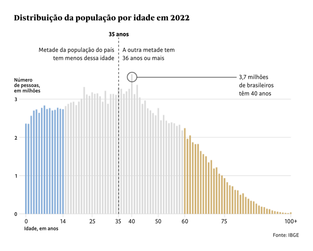
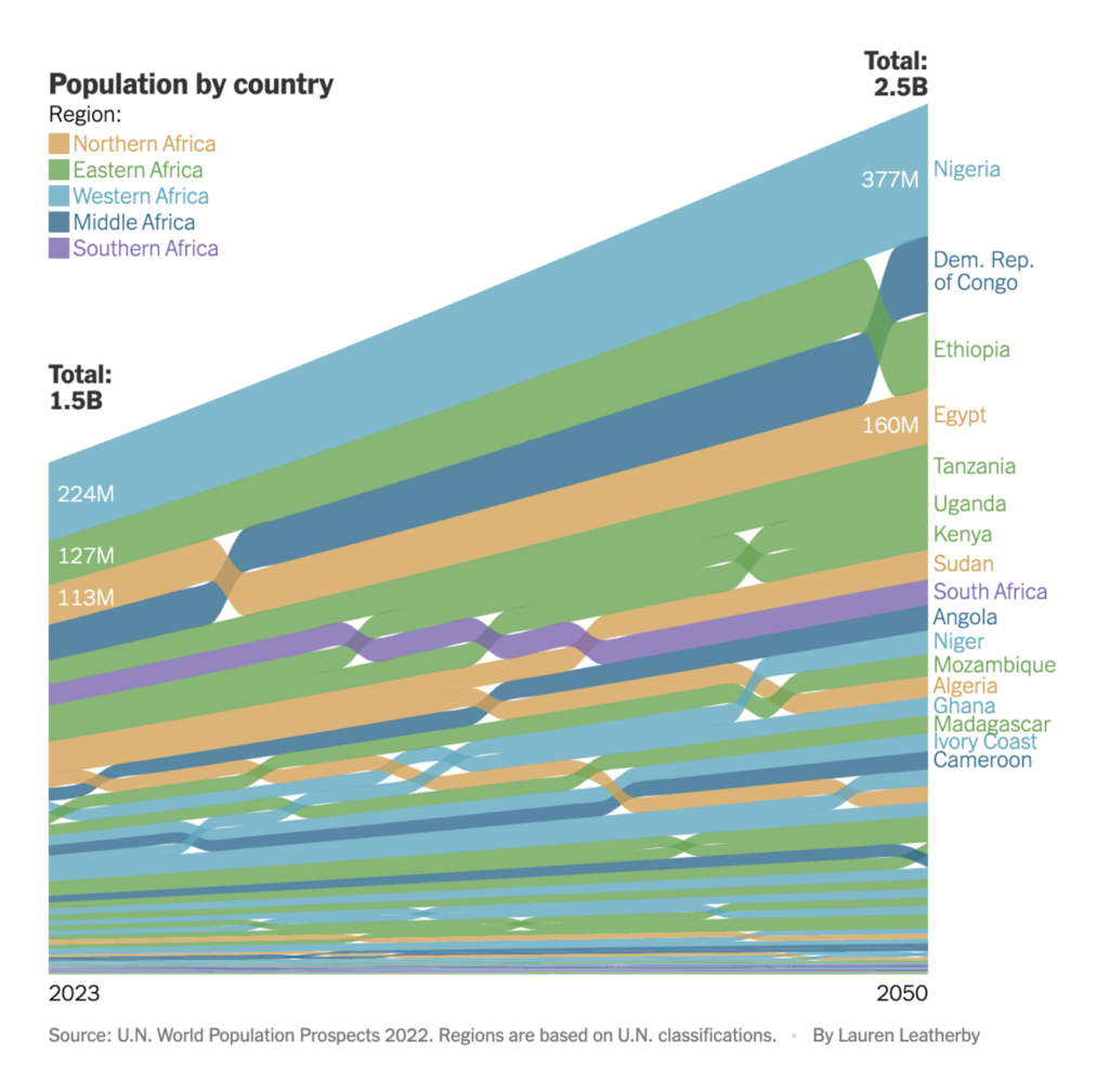
Recurring topics this week include aging populations around the world (except Africa), music and entertainment, and the ongoing war between Israel and Hamas:
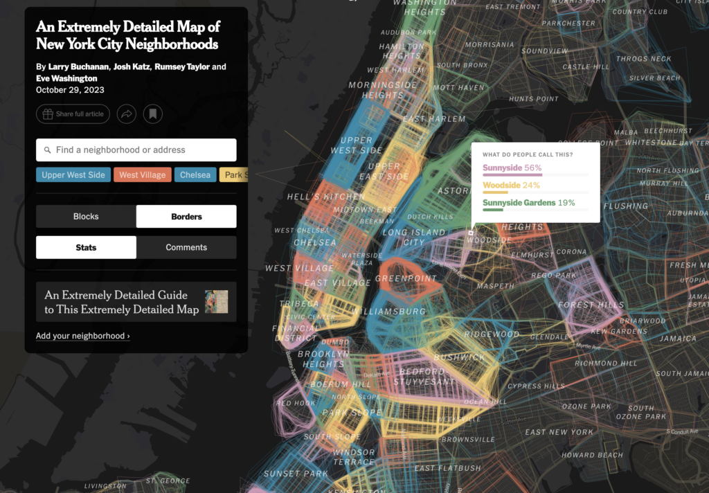
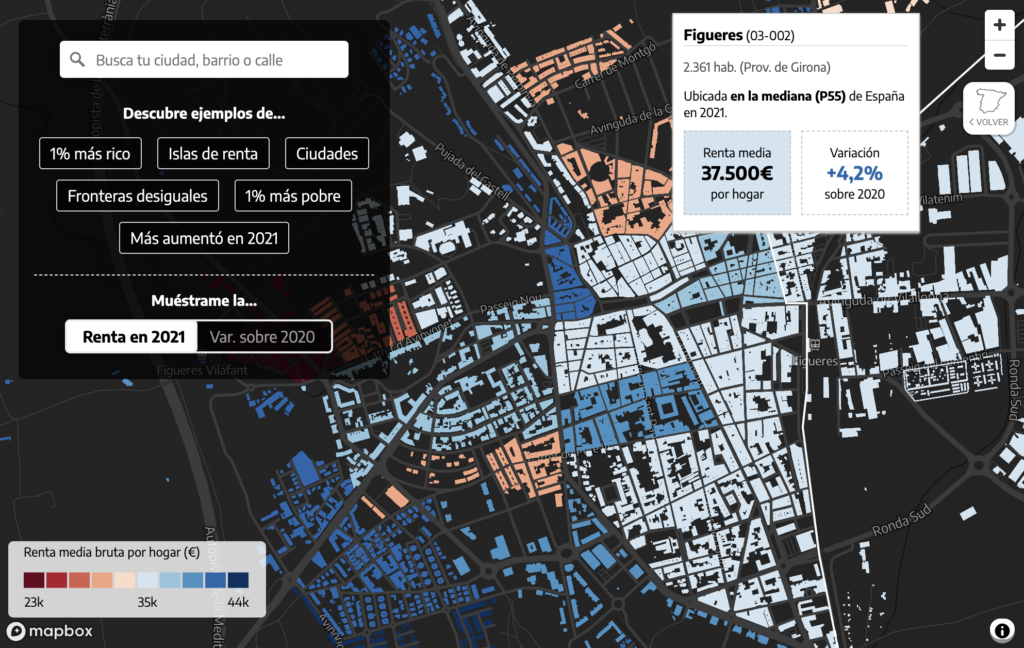
But let’s begin this Dispatch with a gentle start. What do you know about your neighbors? Two interactive maps analyze neighborhoods in detail:
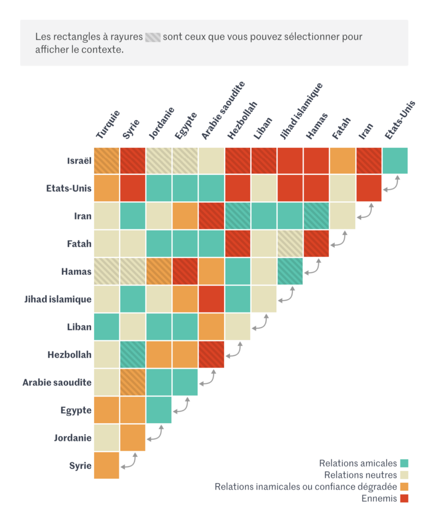
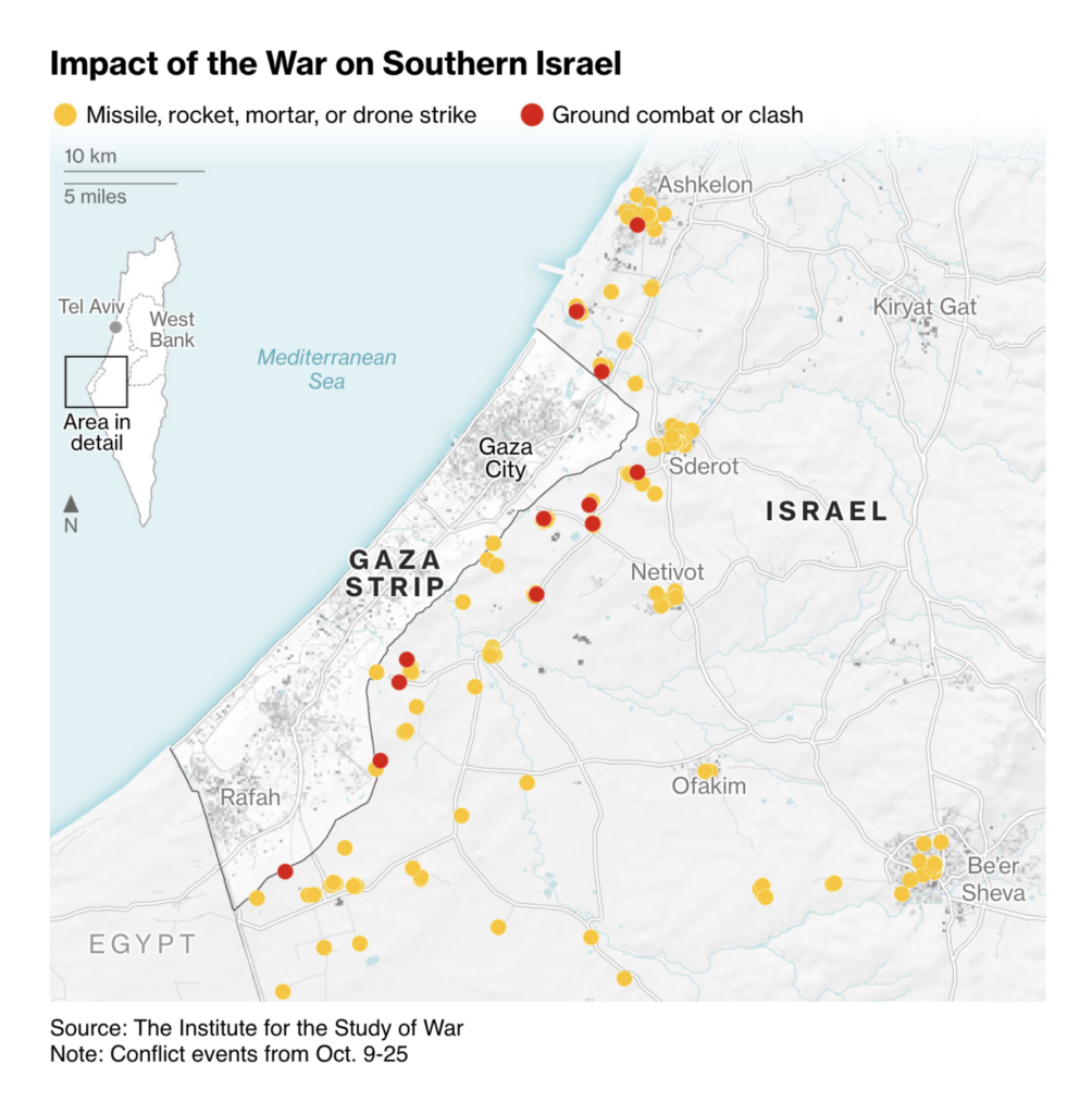
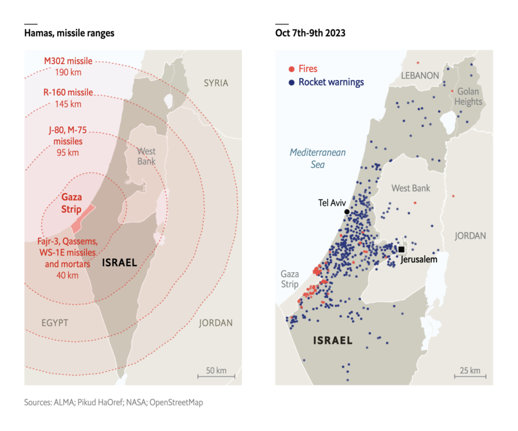
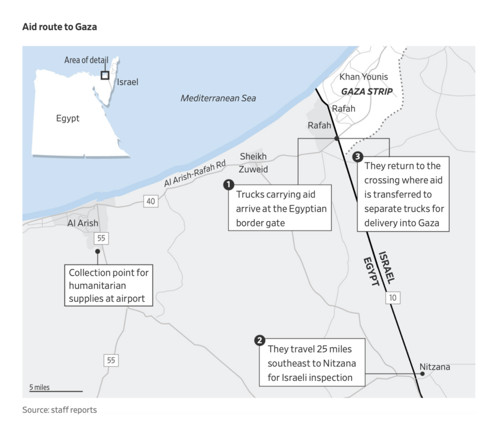
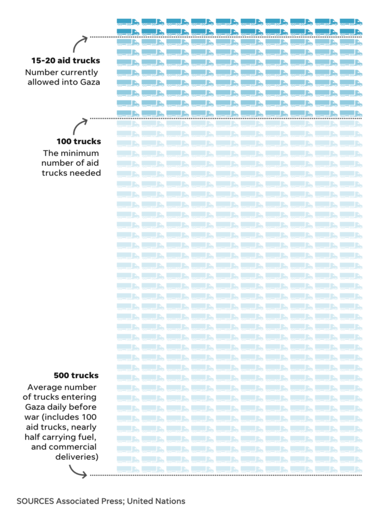
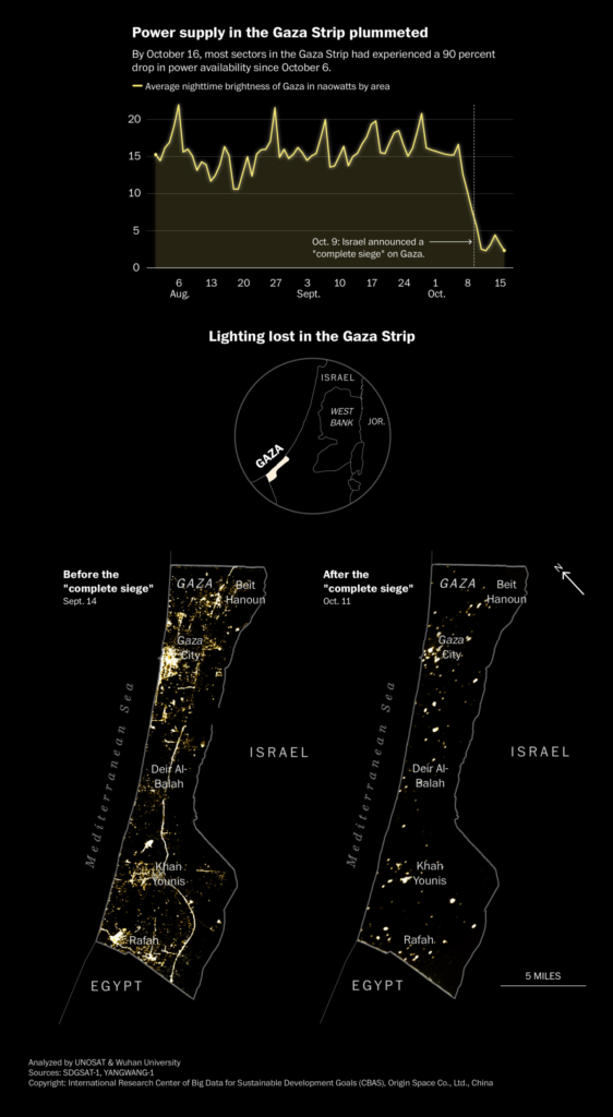
We still have a lot to report about the war between Israel and Hamas. One graphic in particular helped me to understand the international relations in this conflict:
Talking about environmental catastrophes, it’s almost inevitable to talk about climate change. And while talking about climate change, we need to talk about CO₂:
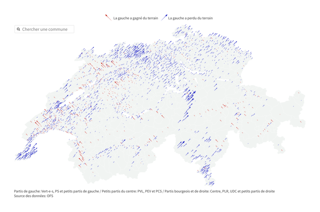
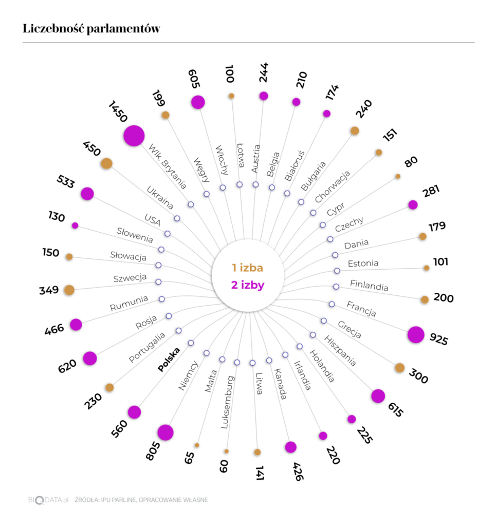
In the past two weeks we saw charts of election results in Switzerland and Poland. Now there’s been time to evaluate that data in more detail, with maps of changing voter behavior and charts about the relative size of different legislatures:
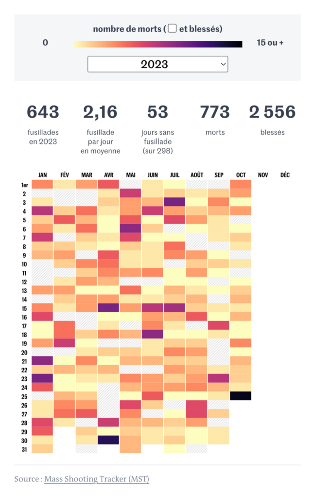
One issue in U.S. politics deserves special attention this week. After a mass shooting in Maine on October 25, several visualizations dealt with American gun laws and gun deaths:
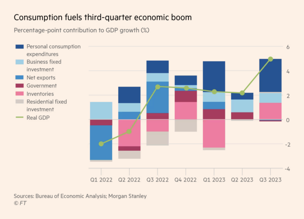
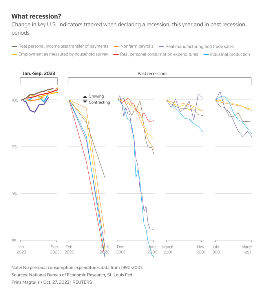
We stay in the U.S., but transition to the financial sector. Apparently, money is tight everywhere except among American consumers:
Financial Times: Why is the US economy so resilient?, October 27 Prinz Magtulis 프린즈: “What recession? A blockbuster Q3 GDP growth is just one good economic data that shows the U.S. economy is far from recession as projected by analysts this year. Key indicators tracked by @nberpubs to declare recession are on a growth path in 2023, unlike previous recessions,” October 28 (Tweet)
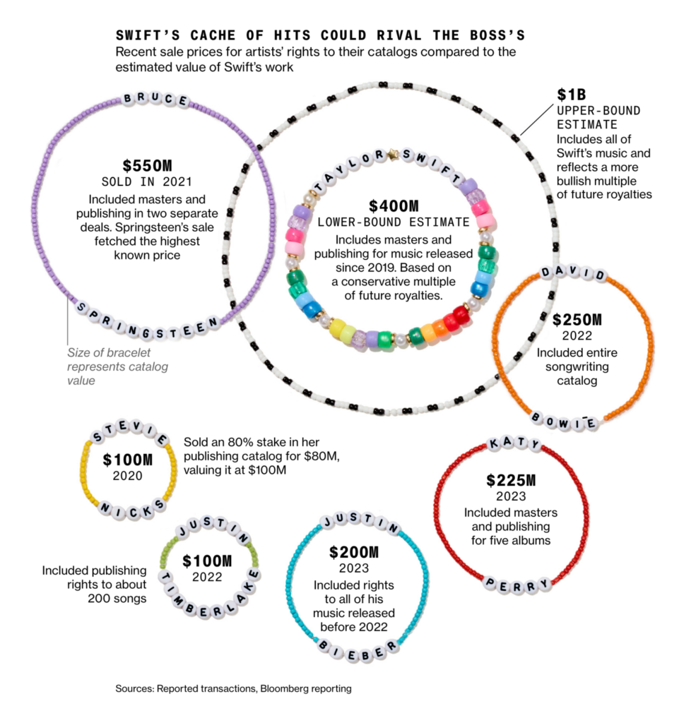
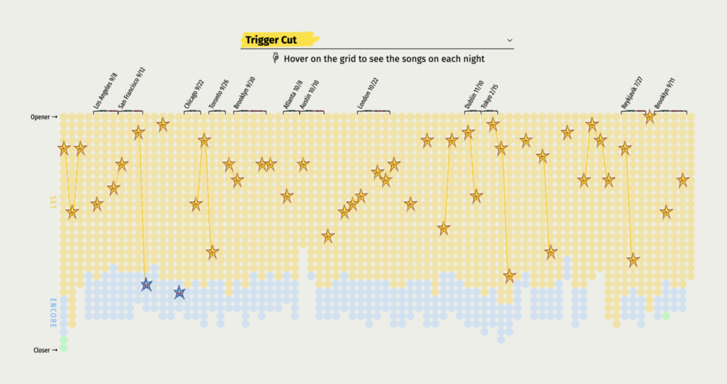
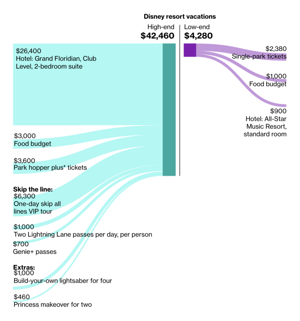
From musiccatalogs to spending in Disneyland, the next group will entertain you:
Help us make this dispatch better! We’d love to hear which newsletters, blogs, or social media accounts we need to follow to learn about interesting projects, especially from less-covered parts of the world (Asia, South America, Africa). Write us at hello@datawrapper.de or leave a comment below.
(she/her) is a working student on Datawrapper’s Communications team. She creates the Data Vis Dispatch to keep data visualization enthusiasts up to date on exciting new projects. When she’s not working, she studies interface design, and when she’s not studying, she’s planning a festival stage or soldering light installations. Vivien lives in Potsdam.


Comments