This article is brought to you by Datawrapper, a data visualization tool for creating charts, maps, and tables. Learn more.
Data Vis Dispatch, October 4
The best of last week’s big and small data visualizations


Welcome back to the 62nd edition of Data Vis Dispatch! Every week, we’ll be publishing a collection of the best small and large data visualizations we find, especially from news organizations — to celebrate data journalism, data visualization, simple charts, elaborate maps, and their creators.
After our late-summer break, we’re returning to regular weekly Dispatches! You can expect the next edition next Tuesday, October 11.
Recurring topics this week include Hurricane Ian, advances in Ukraine, and emotions.
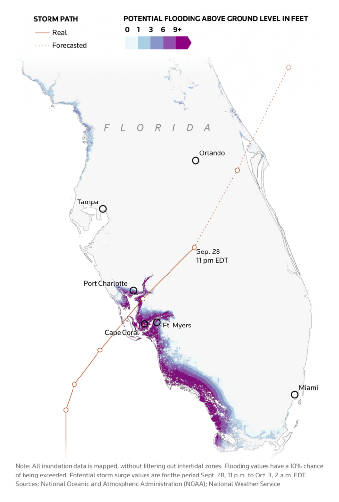
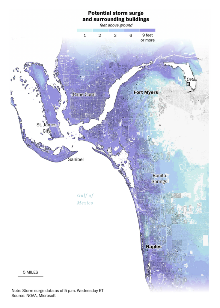
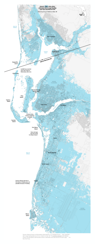
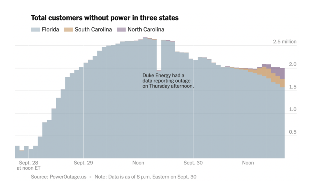
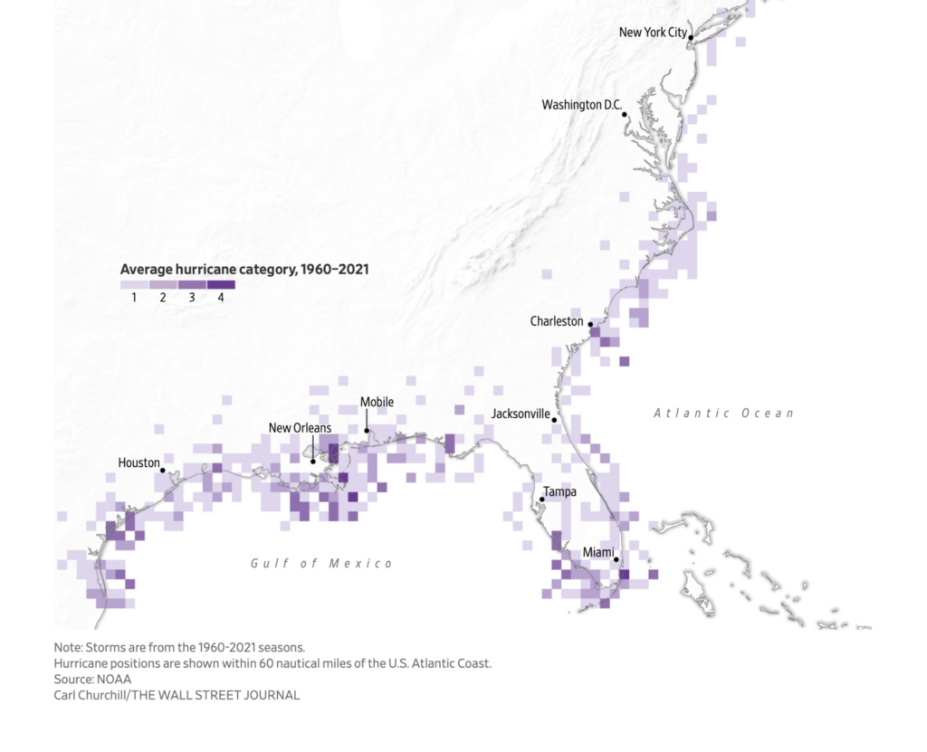
Florida and the Southeastern United States were hit hard by Hurricane Ian last week:

We also got some background on where and why hurricanes form:

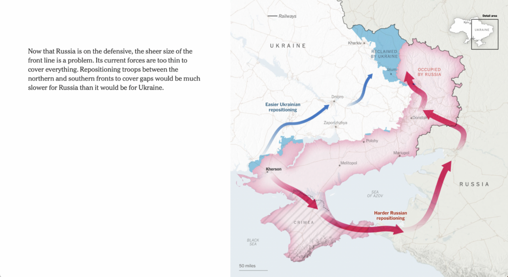
The other big map news of the moment is Ukraine’s hugely successful counteroffensive in its northeast and Russia’s subsequent decision to mobilize reservists:

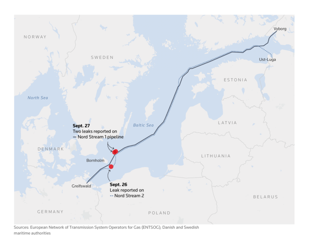
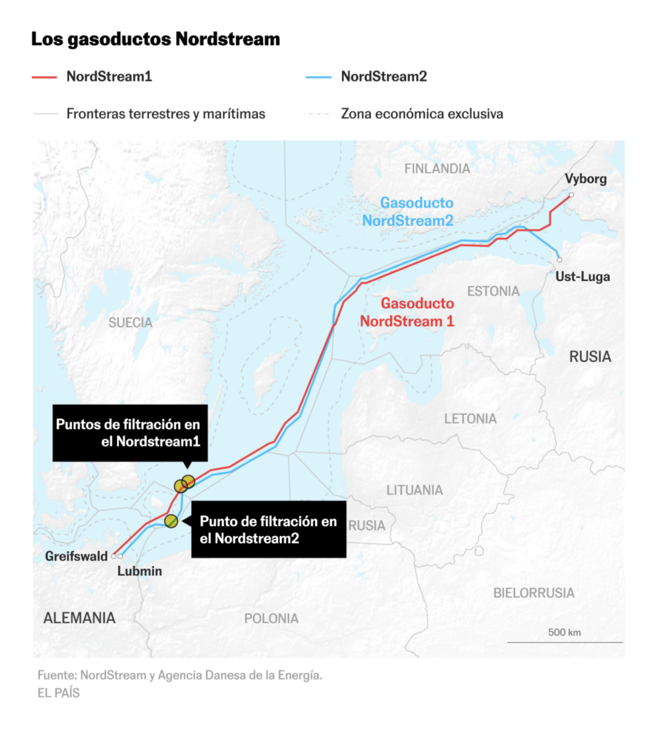
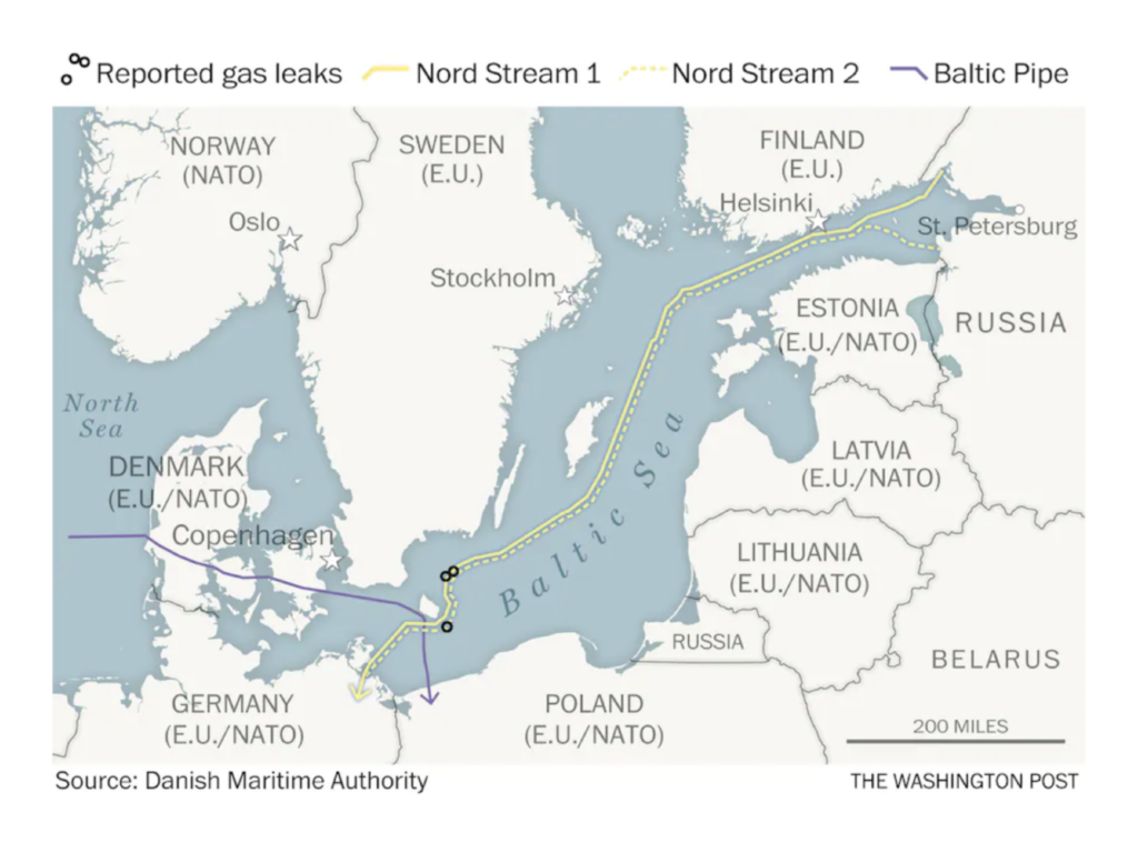
Meanwhile, two Russian gas pipelines in the Baltic have sprung mysterious leaks:
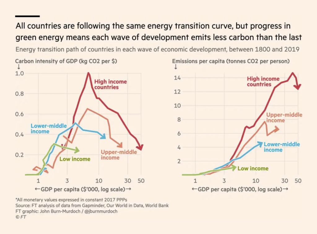
When it comes to fossil fuels in general, it’s had to draw firm lines between war, politics, and climate:

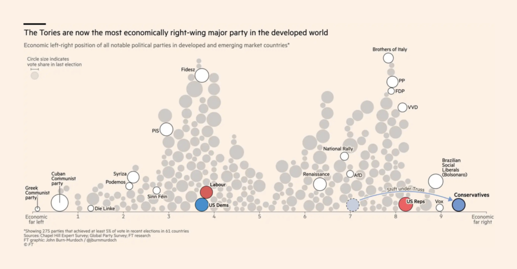
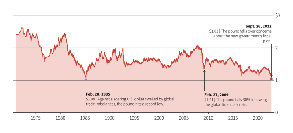
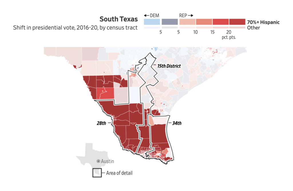
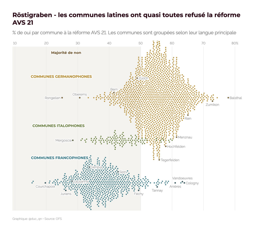
In clear-cut politics we had elections in Italy, hard-line economic policy in the U.K., and demographic splits in the U.S. and Switzerland:

Several great animations deserve highlighting this week:
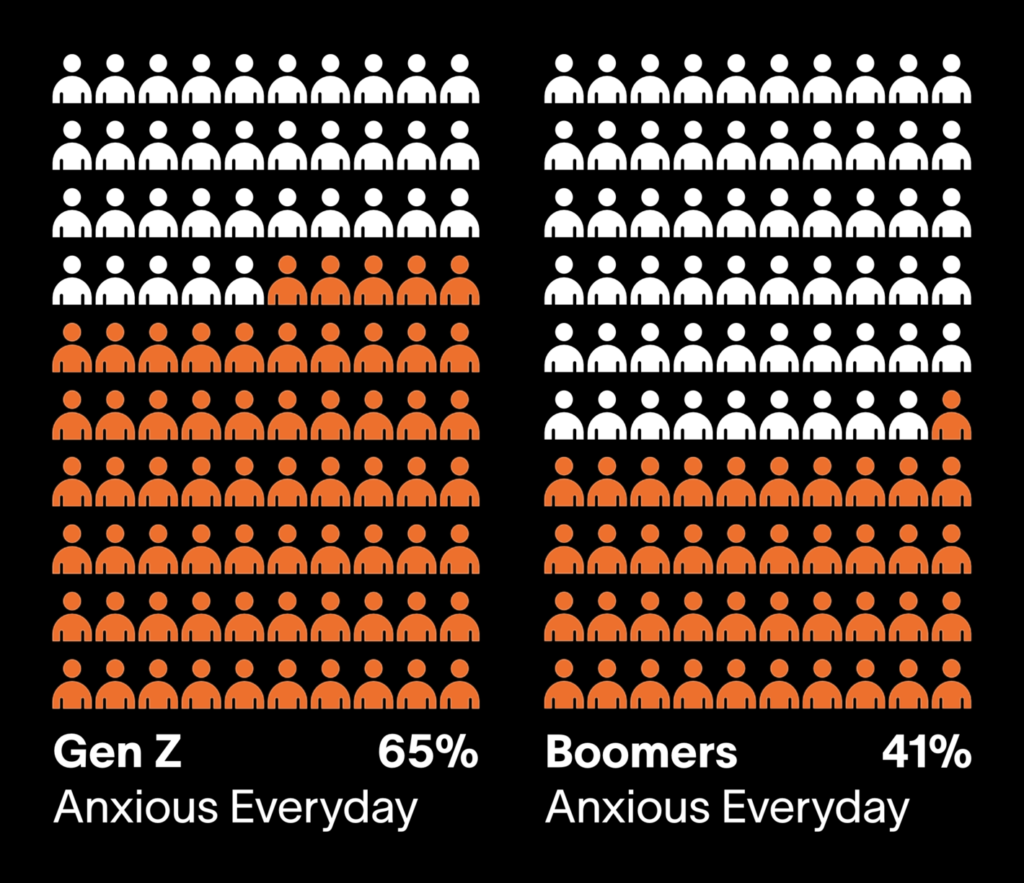
Loneliness and anxiety on the rise, over the years and over the generations:

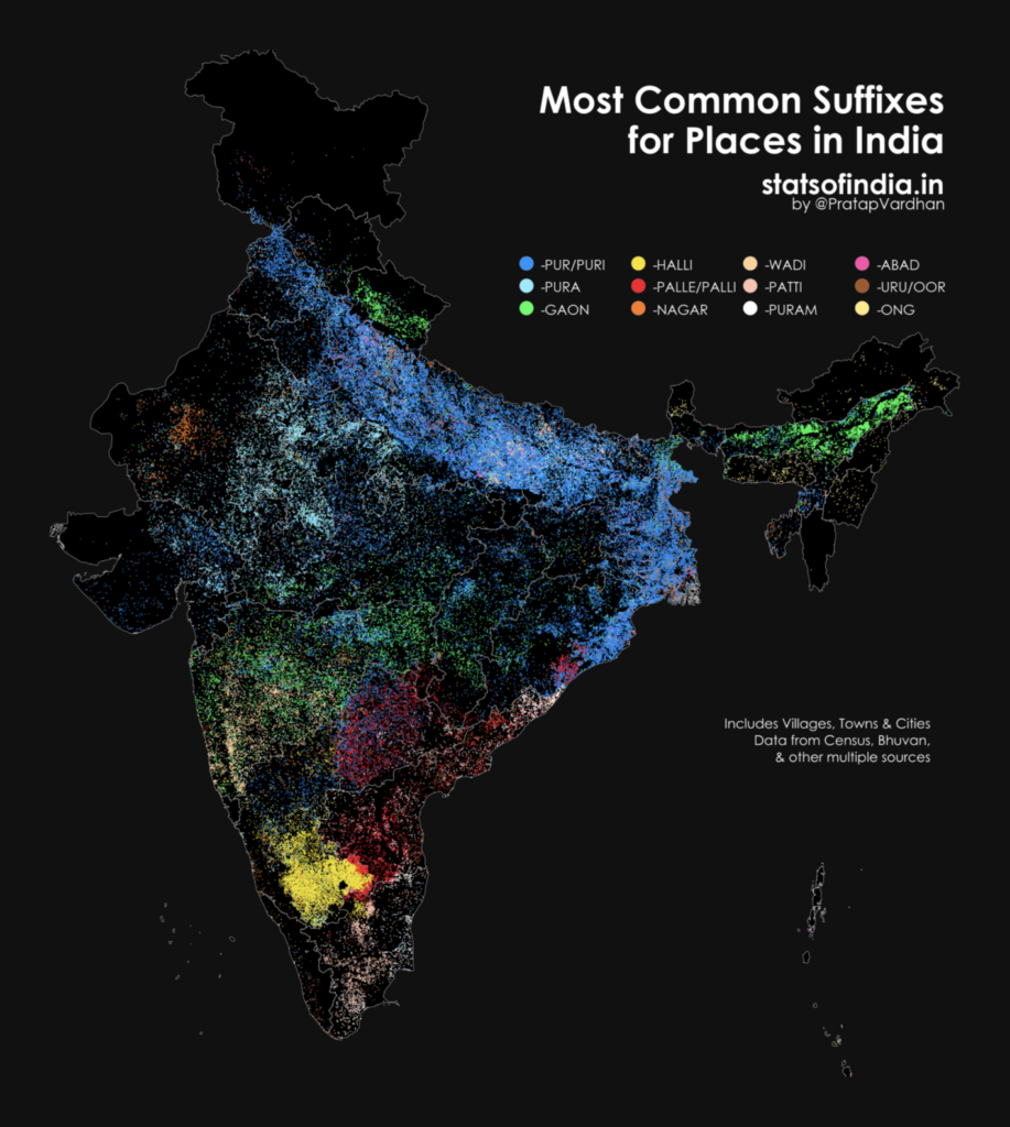
Other great charts and maps covered everything from place names in India to train travel in South Africa:


What else we found interesting

Applications are open for…
- A Senior Data Visualization Engineer at Our World in Data
- A Visual Storytelling Reporter at the Financial Times
Help us make this dispatch better! We’d love to hear which newsletters, blogs, or social media accounts we need to follow to learn about interesting projects, especially from less-covered parts of the world (Asia, South America, Africa). Write us at hello@datawrapper.de or leave a comment below.
Want the Dispatch in your inbox every Tuesday? Sign up for our Blog Update newsletter!


Comments