We want to enable everyone to create beautiful charts, maps, and tables. New to data visualization? Or do you have specific questions about us? You'll find all the answers here.
The best of last week’s big and small data visualizations
Vivien Serve
Welcome back to the 159th edition of the Data Vis Dispatch! Every week, we publish a collection of the best small and large data visualizations we find, especially from news organizations — to celebrate data journalism, data visualization, simple charts, elaborate maps, and their creators.
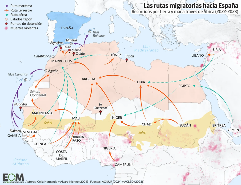
Recurring topics this week include student discrimination, migration, and pesky animals.
We love to start the Dispatch with something fun. Today, visualizations that take their subjects very literally:
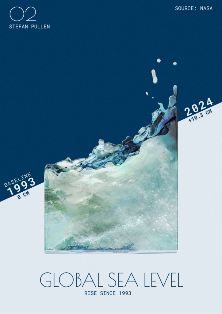
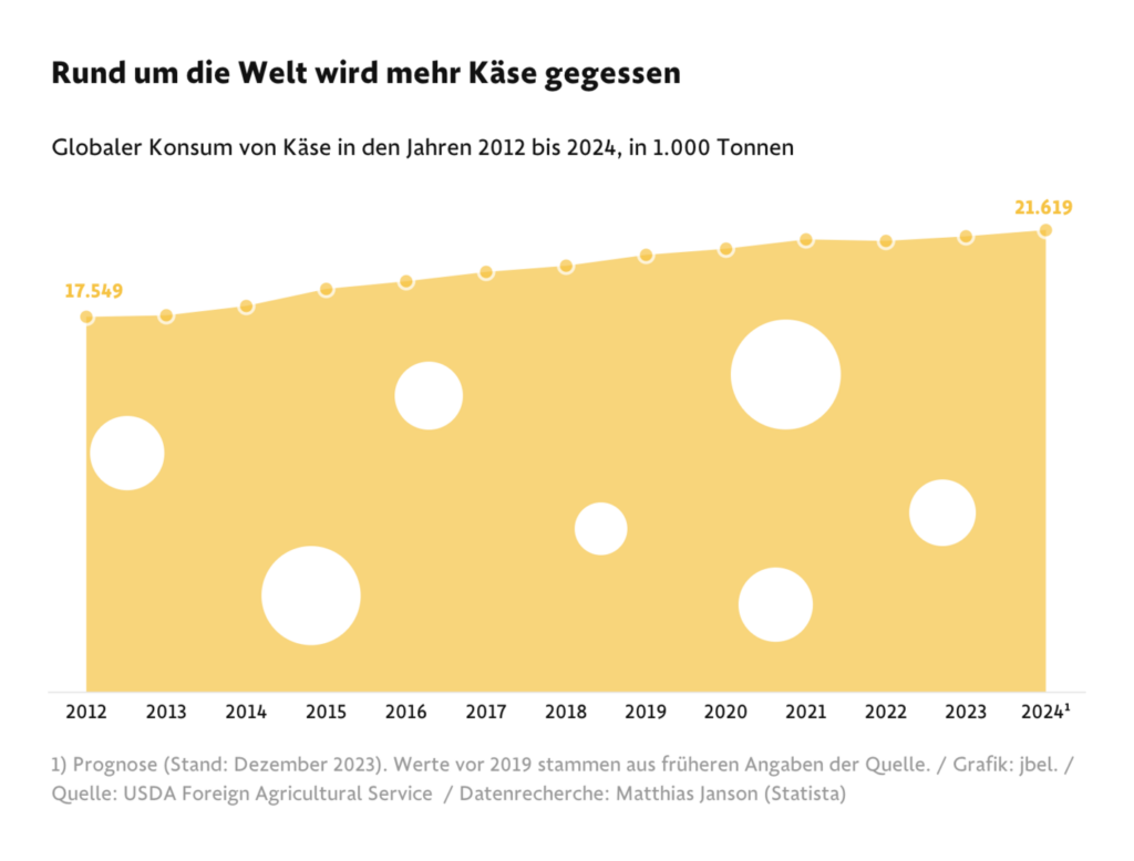
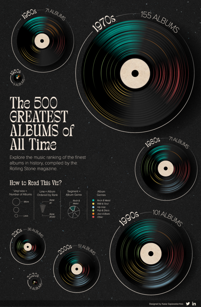
Stefan Pullen: “This is the second chart I’ve created a four-part series on a subject that’s particularly important to me: the impact of global warming on our planet […],” September 9 (LinkedIn)Frankfurter Allgemeine Zeitung: Die Deutschen essen am liebsten Gouda [Germans prefer to eat Gouda], September 7 Kev Flerlage: “Check out this RIDICULOUSLY COOL viz from Kasia Gasiewska Holc. Insane that she did this all in Tableau!” September 9 (Bluesky Post)
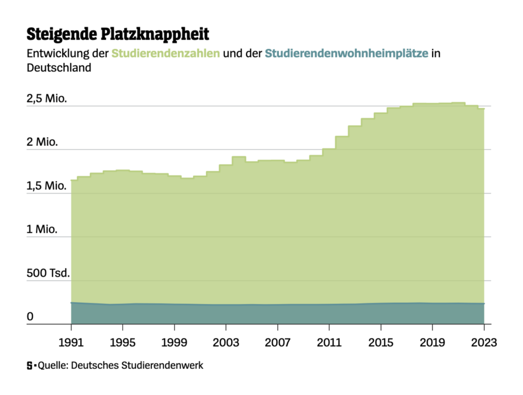
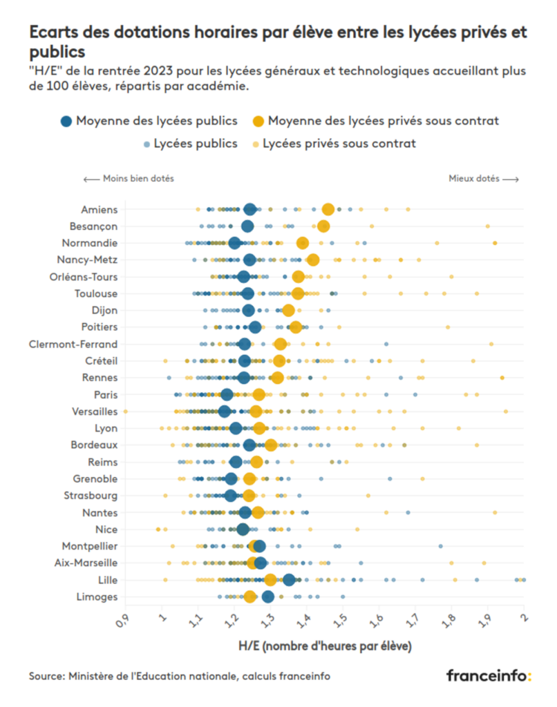
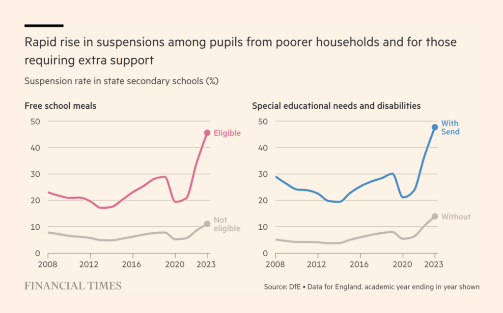
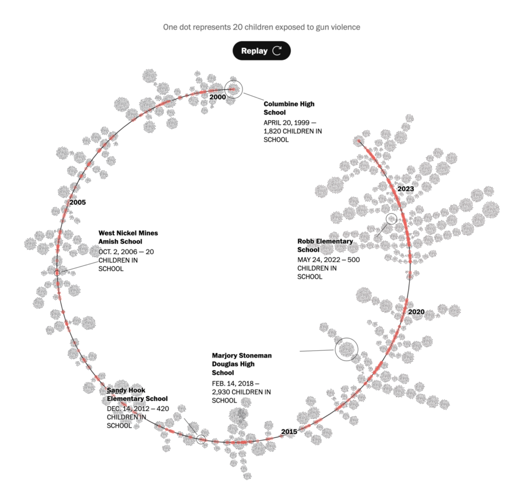
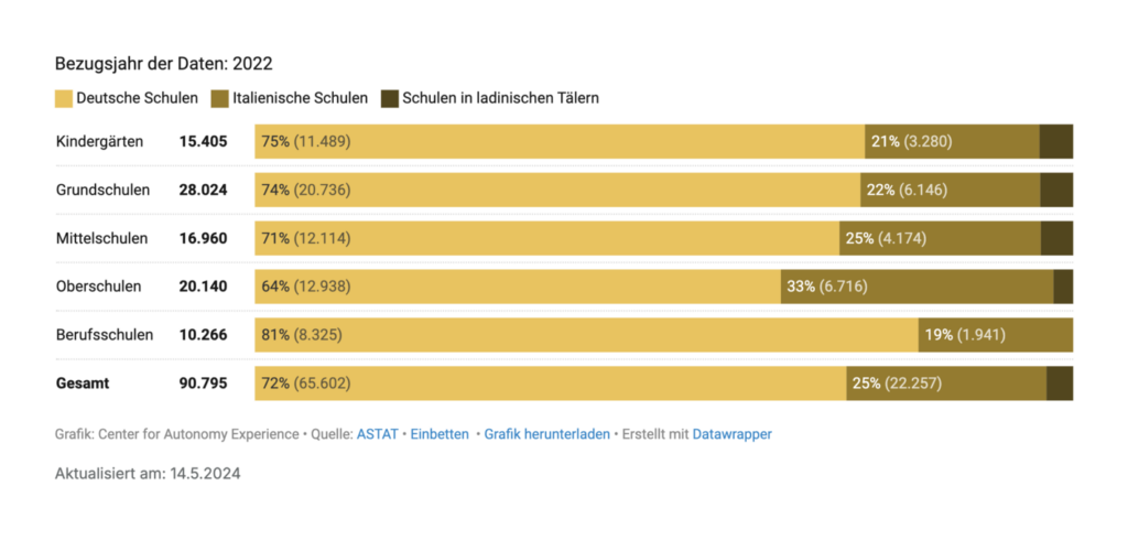
We turn from light-hearted topics to the serious challenges faced by students, from housing shortages and discrimination to gun violence:
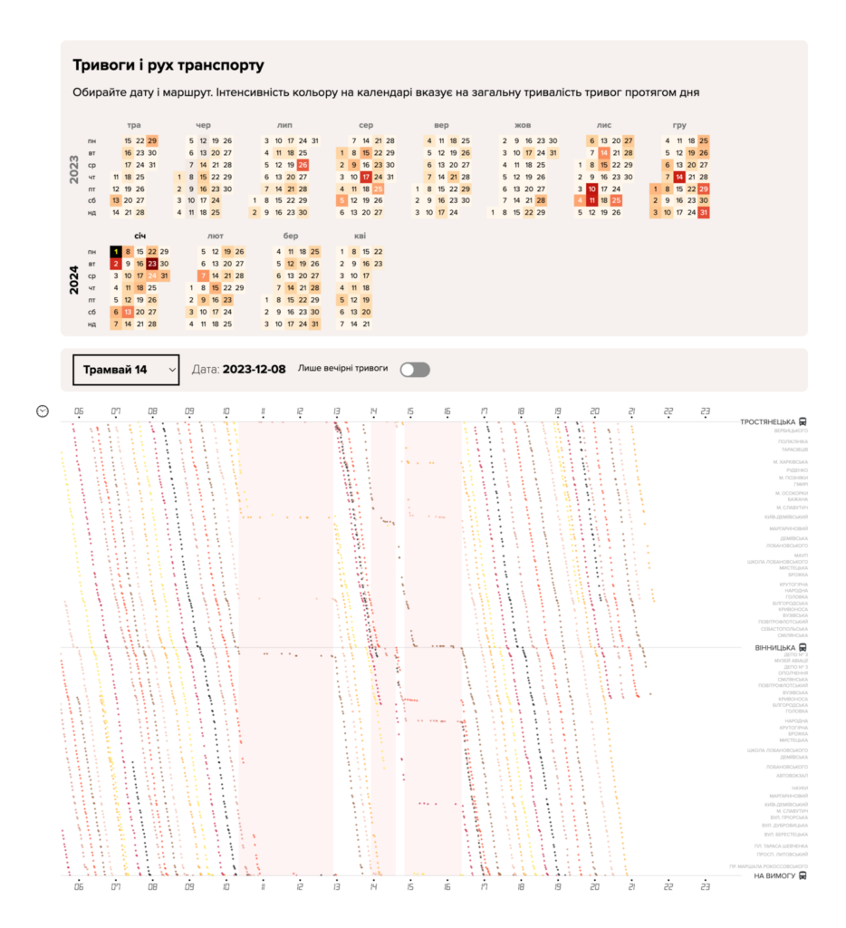
This week’s war-related visualizations didn’t look directly at troop movements or casualties, but at delayed buses in Kyiv due to air strikes and surging sales of local soda due to boycotts over Coke and Pepsi’s ties to Israel:
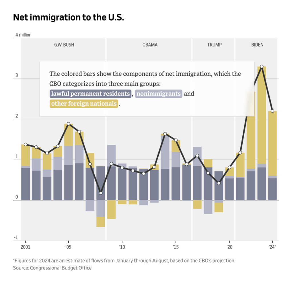
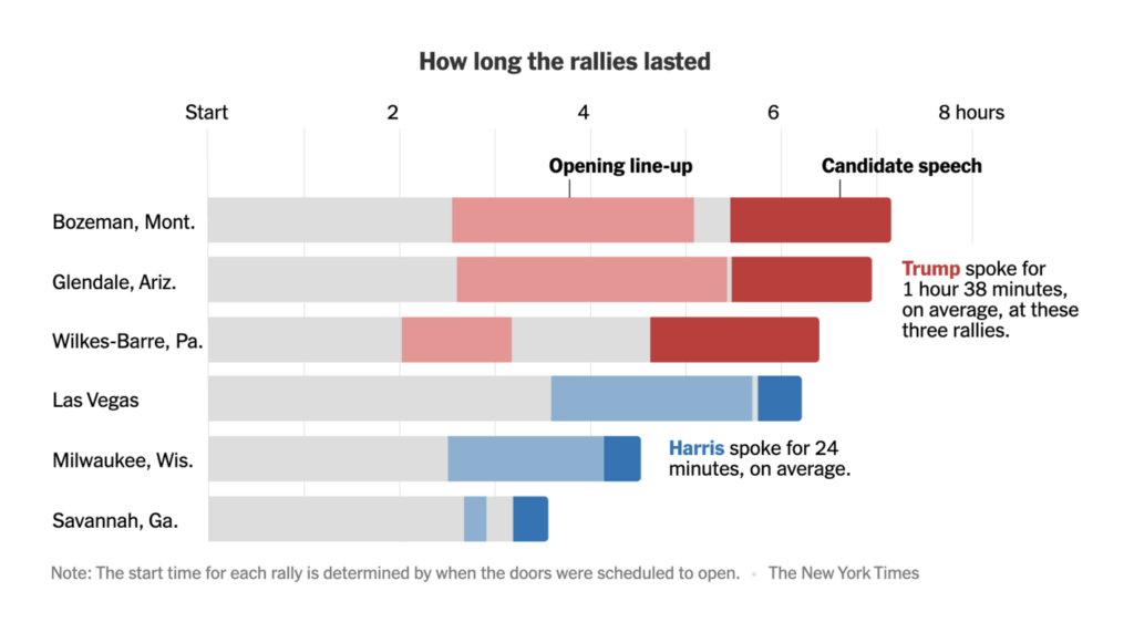
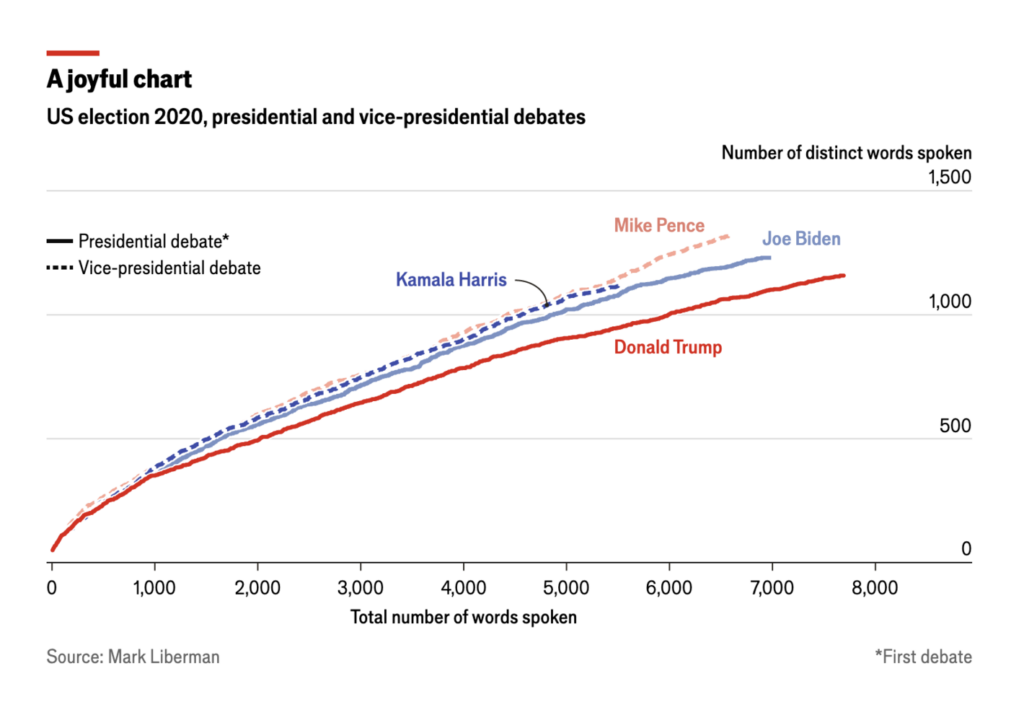
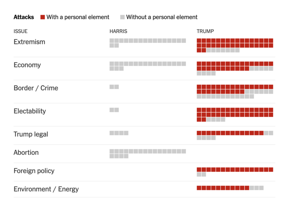
Immigration is also a major topic in the U.S. presidential election. Ahead of today’s debate, we’ve seen detailed analyses of the candidates’ words and speaking styles:
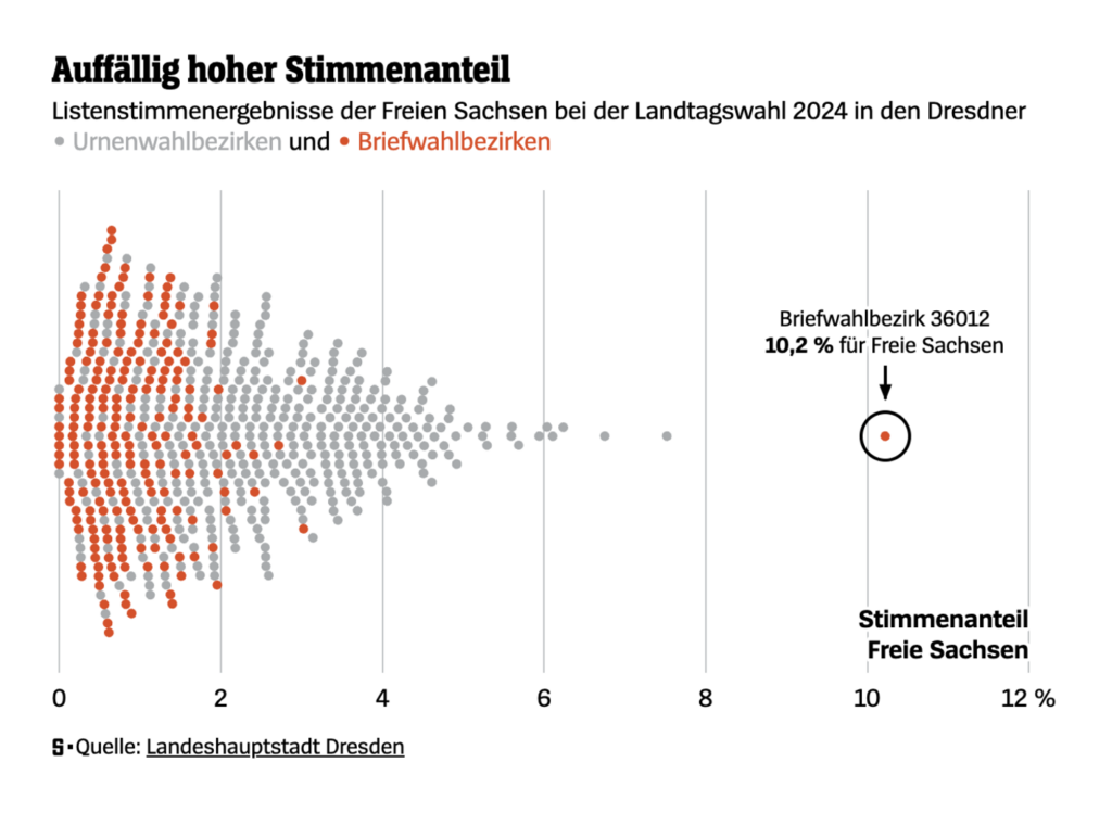
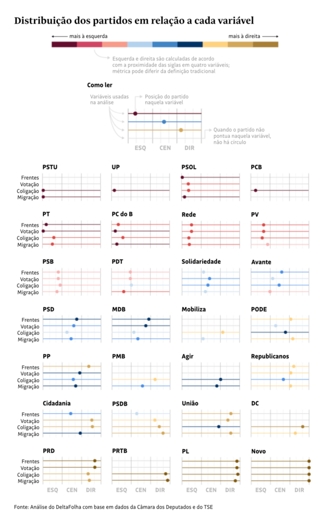
Irregularities in the postal vote during state elections in Saxony, Germany, lead to charges of electoral fraud against the far-right party “Freie Sachsen.” Meanwhile, Folha de S.Paulo ranks Brazil’s political parties on a spectrum from left to right:
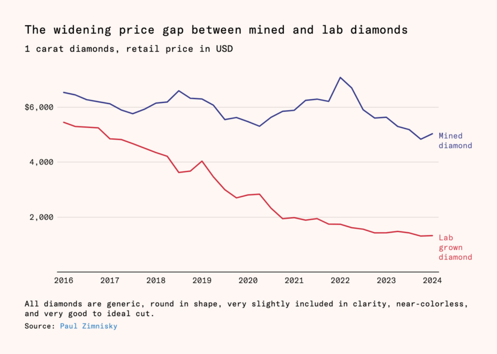
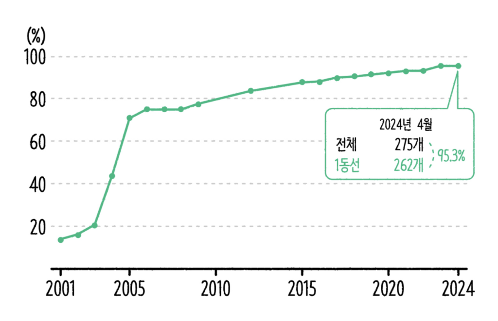
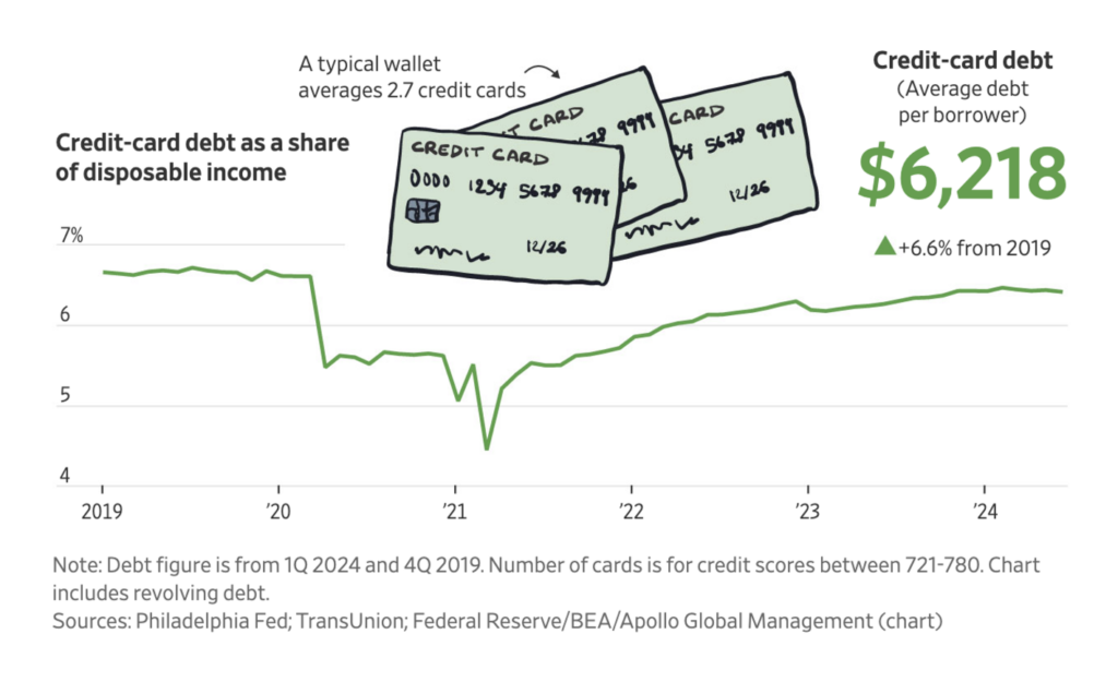
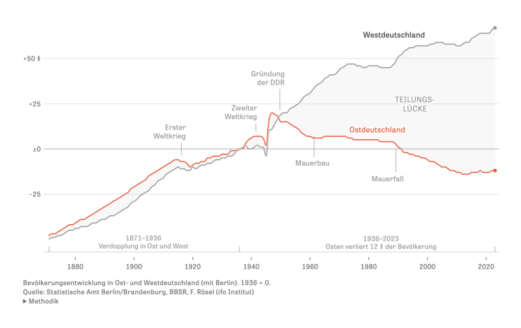
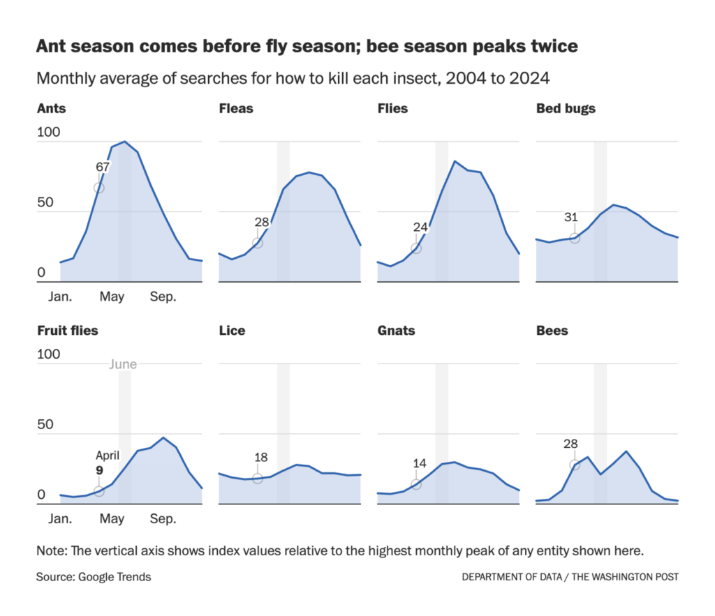
We always appreciate a well-crafted line chart. This week’s batch shows cheaper lab-grown diamonds, improved accessibility in Seoul subway stations, rising credit card debt in America, depopulation in the former East Germany, and people googling “how to kill [insert despised insect here]”:
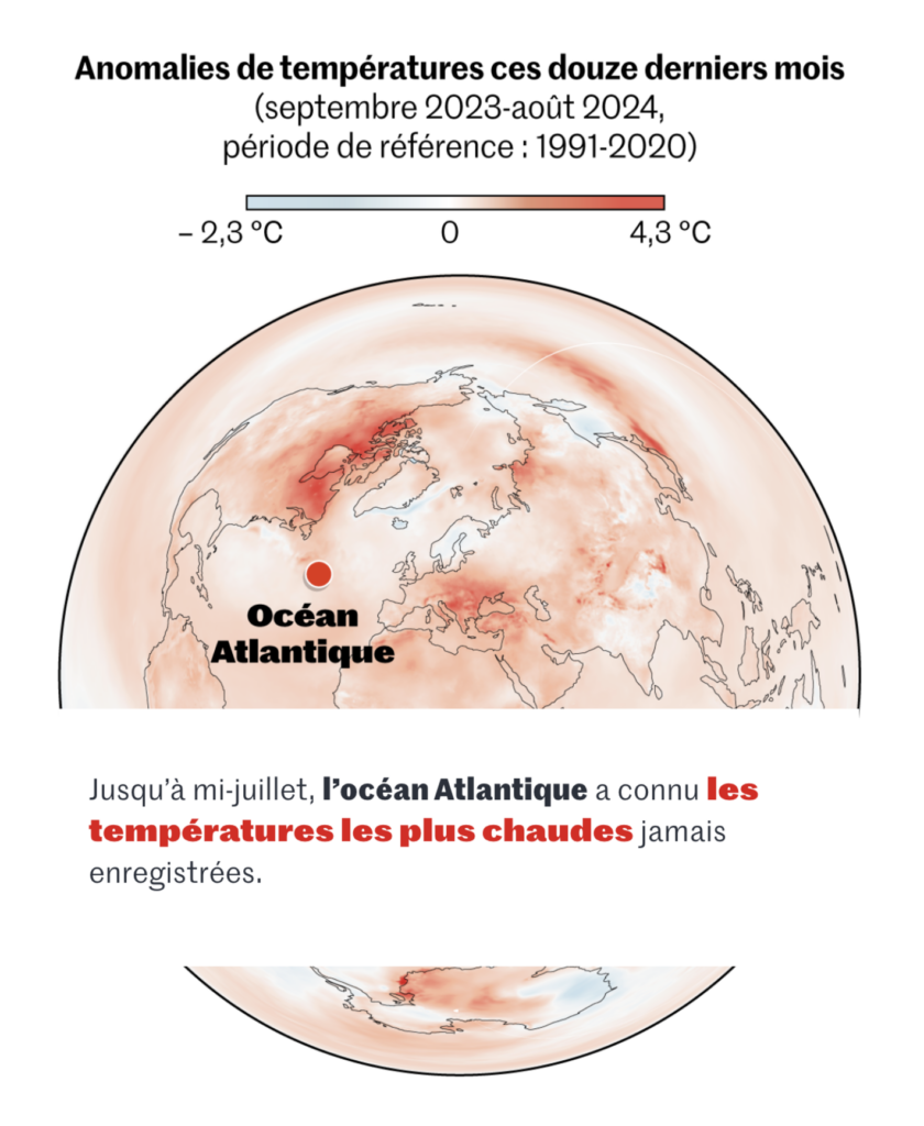
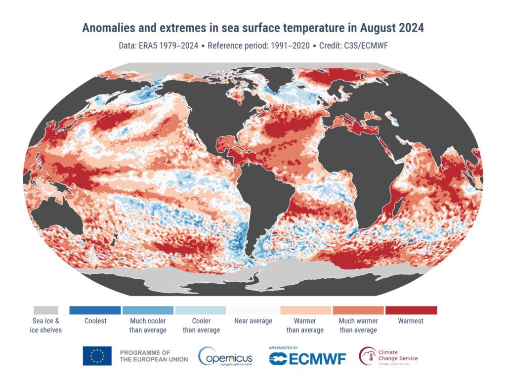
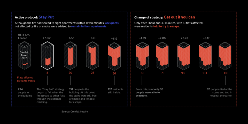
The next category is red. What does it stand for? Temperature anomalies, rising water temperatures, plastic burning outdoors, and fire hazards due to flammable cladding:
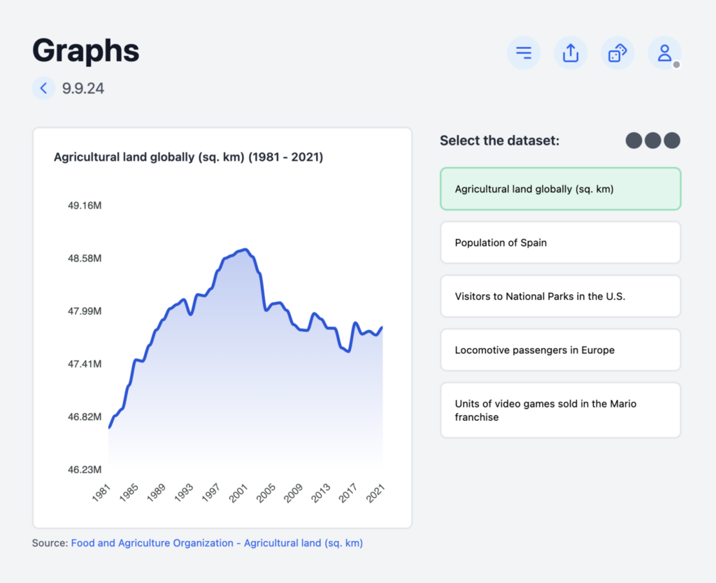
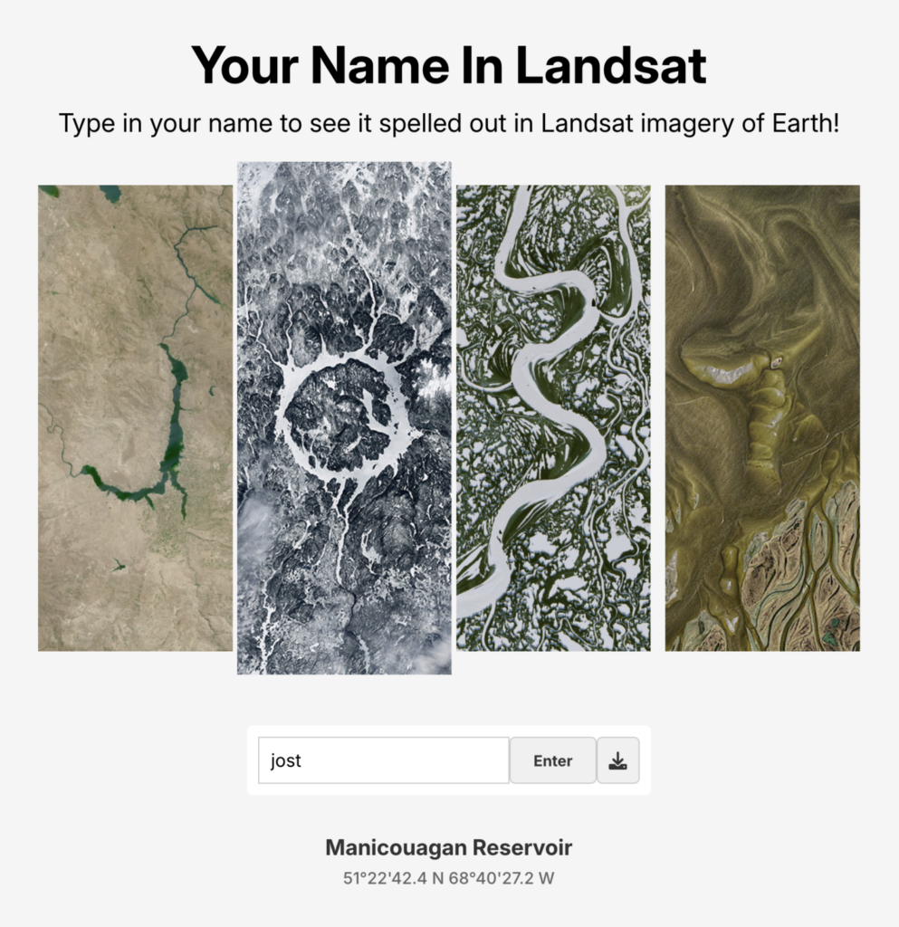
Dominik Moritz: “A daily game like wordle but for charts,” September 3 (Mastodon, Game)Michael Ovaska: “not how I imagined myself in satellite,” September 9 (Tweet, Website)
Help us make this dispatch better! We’d love to hear which newsletters, blogs, or social media accounts we need to follow to learn about interesting projects, especially from less-covered parts of the world (Asia, South America, Africa). Write us at hello@datawrapper.de or leave a comment below.
(she/her) is a working student on Datawrapper’s Communications team. She creates the Data Vis Dispatch to keep data visualization enthusiasts up to date on exciting new projects. When she’s not working, she studies interface design, and when she’s not studying, she’s planning a festival stage or soldering light installations. Vivien lives in Potsdam.


Comments