We want to enable everyone to create beautiful charts, maps, and tables. New to data visualization? Or do you have specific questions about us? You'll find all the answers here.
The best of last week’s big and small data visualizations
Rose Mintzer-Sweeney
Lisa Charlotte Muth
Welcome back to the 13th edition of Data Vis Dispatch! Every week, we’ll be publishing a collection of the best small and large data visualizations we find, especially from news organizations — to celebrate data journalism, data visualization, simple charts, elaborate maps, and their creators.
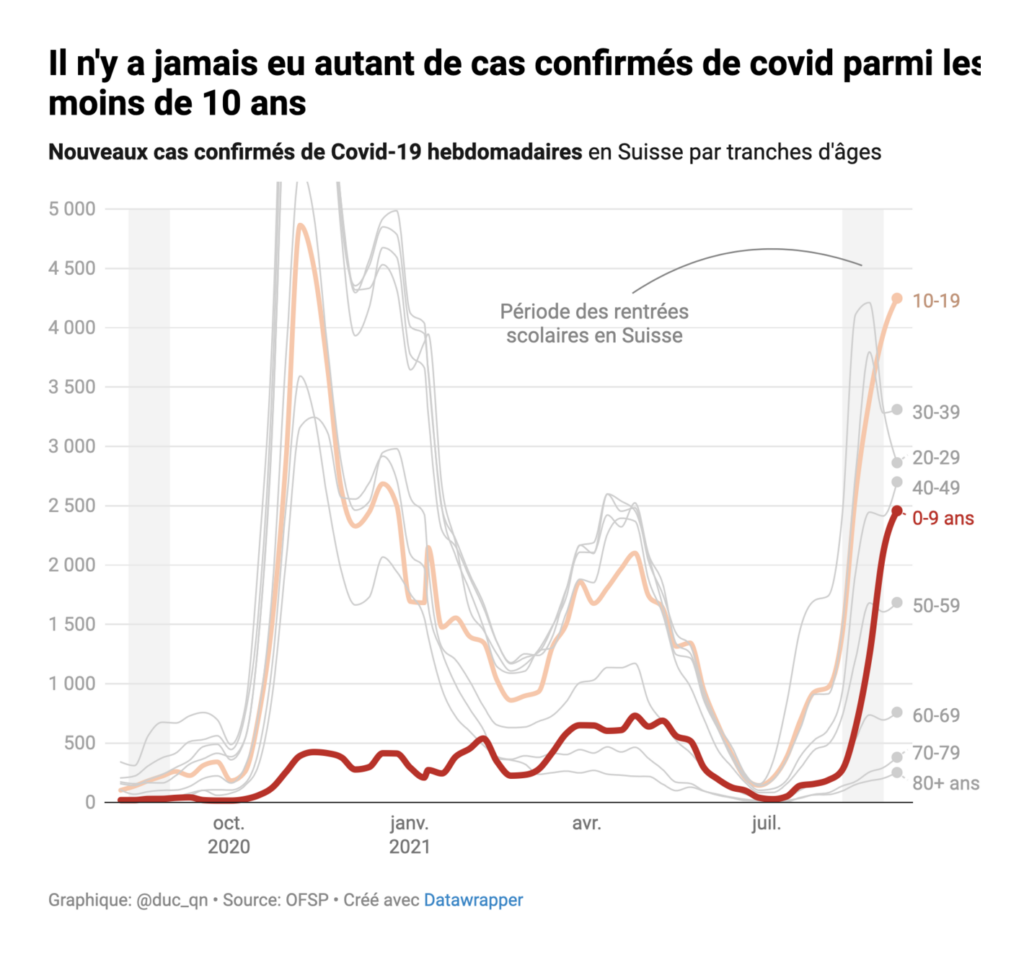
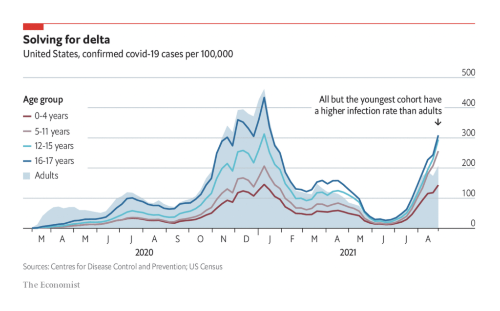
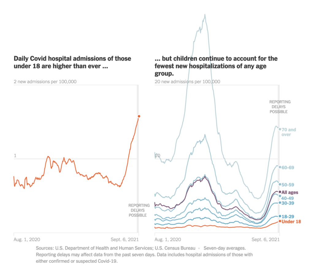
Recurring topics this week include elections, COVID in children, and long-term climate data.
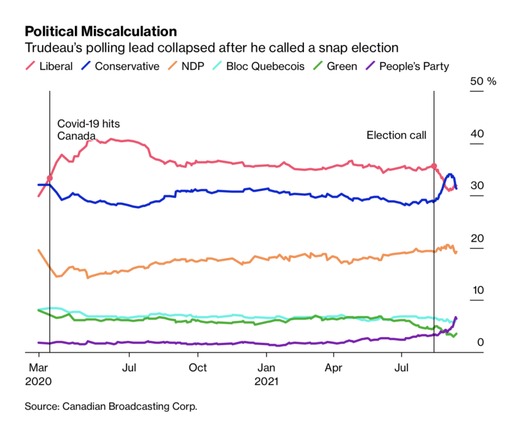
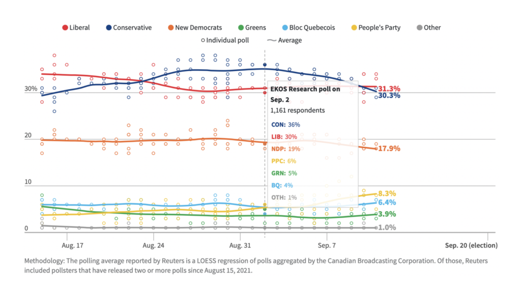
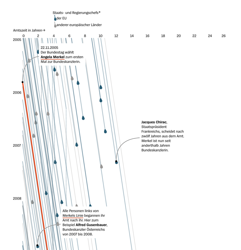
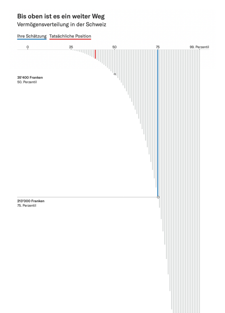
Elections were in the air this week. Across Canada, Germany, and Argentina, the news doesn’t look good for ruling parties:
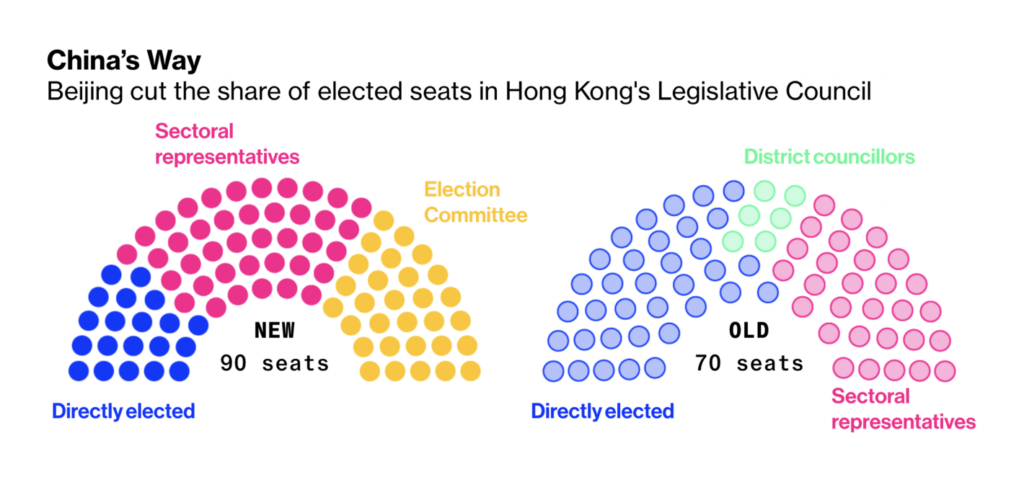
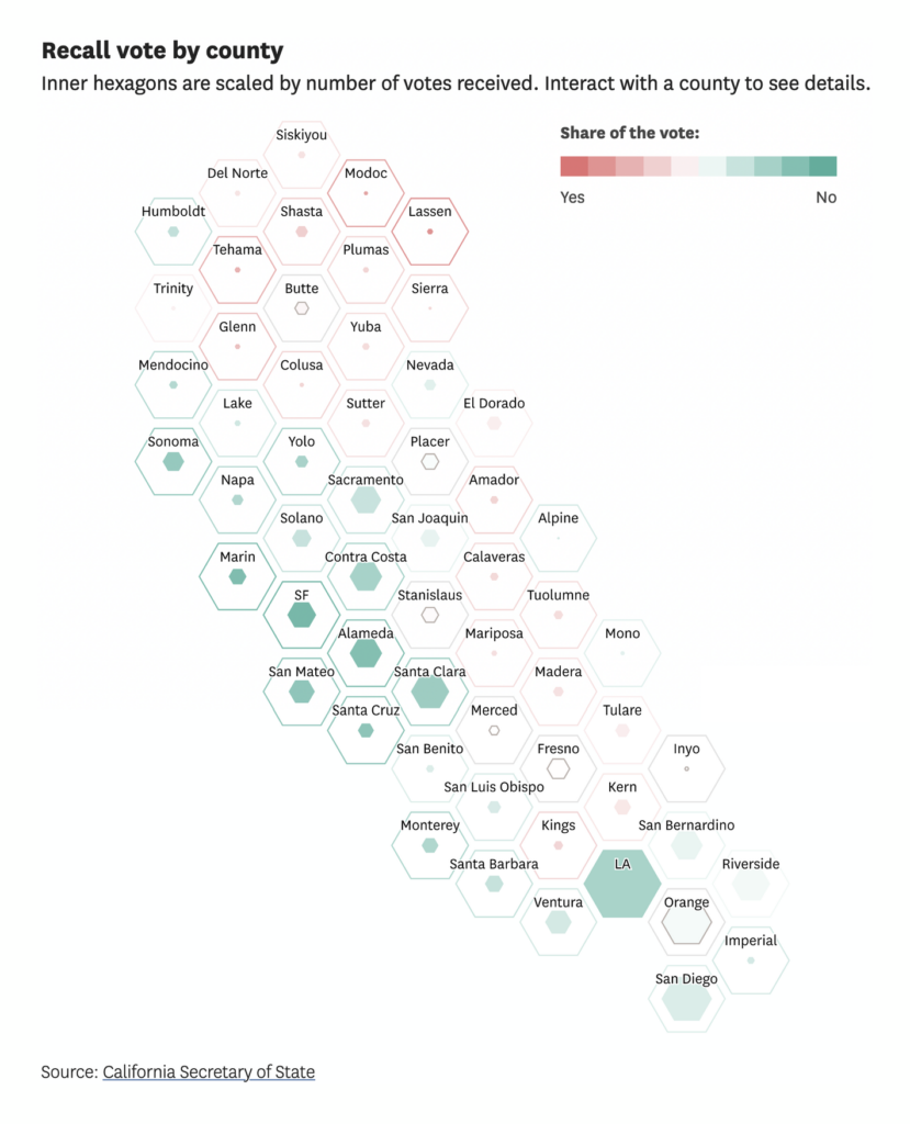
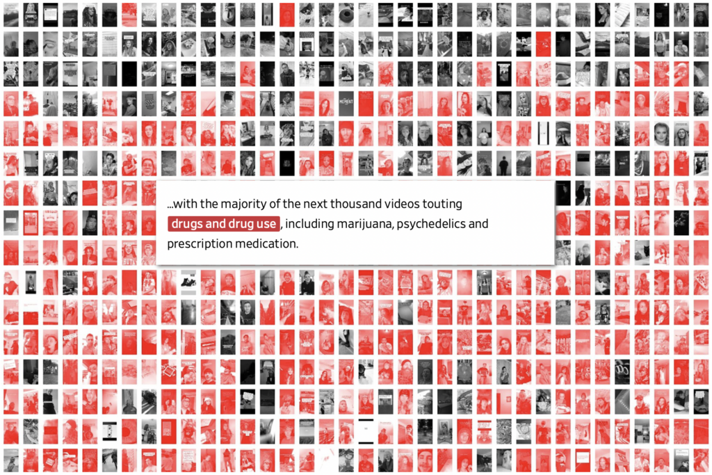
Meanwhile, Hong Kong’s legislature is being gutted by Beijing, the governor of California faces a recall vote, and the New York Times imagines an America with six major parties:
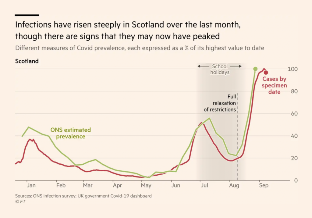
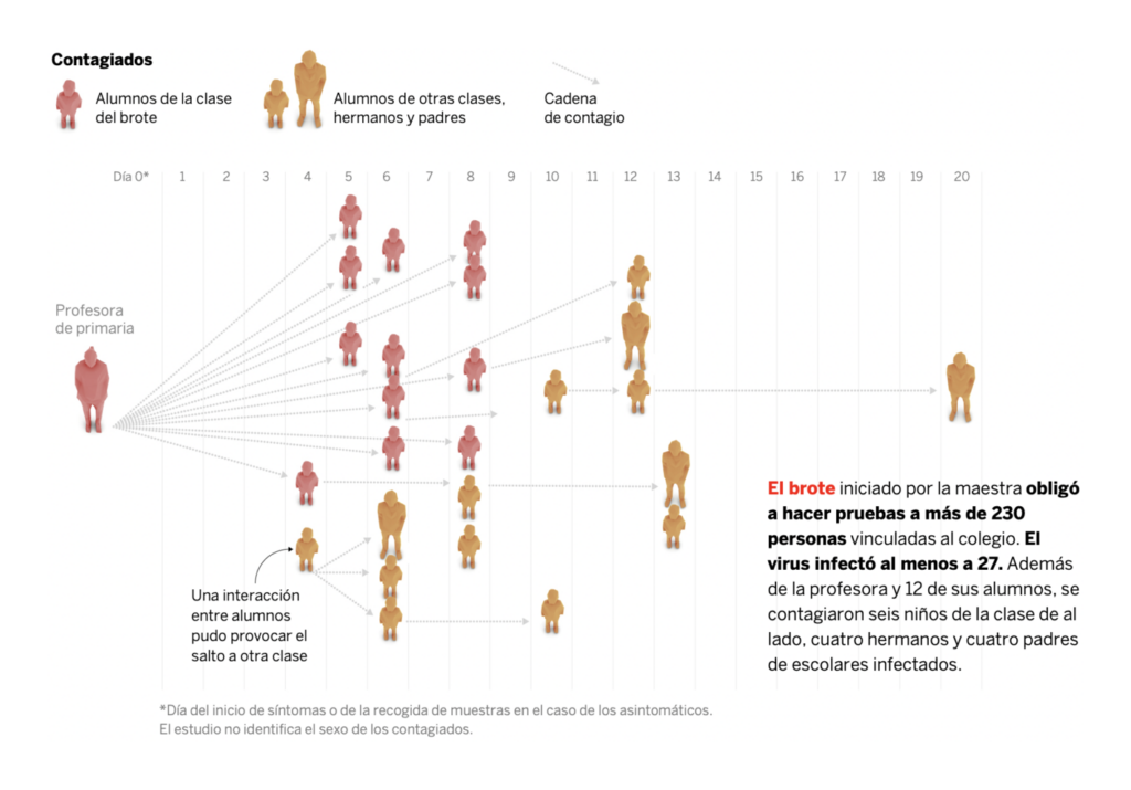
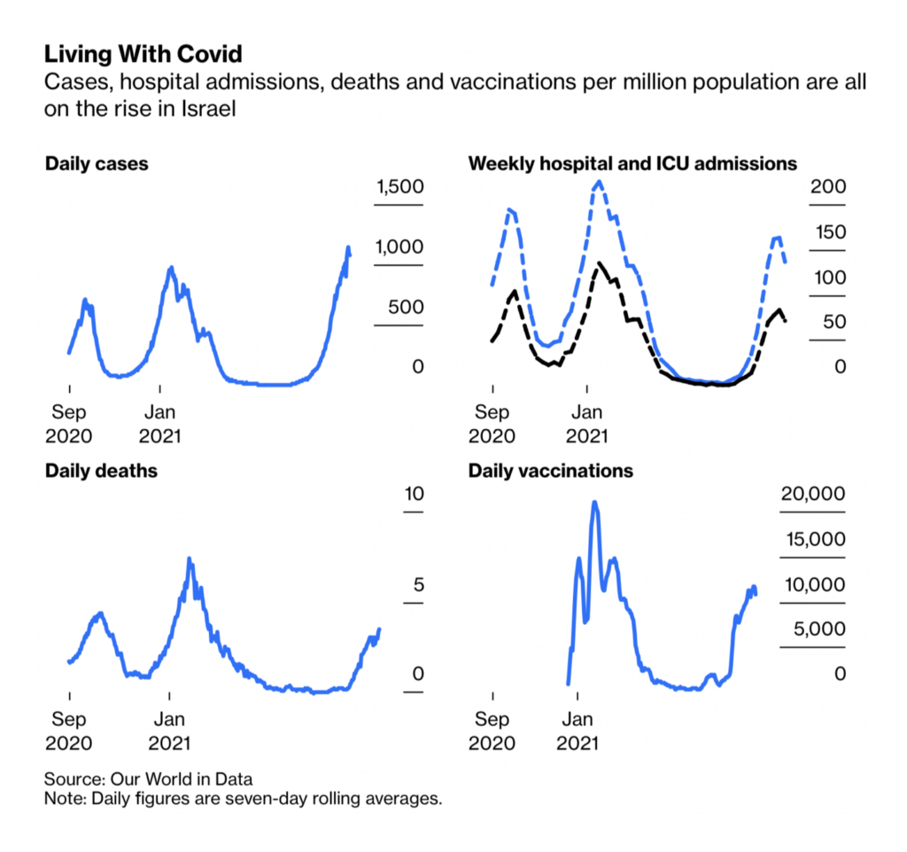
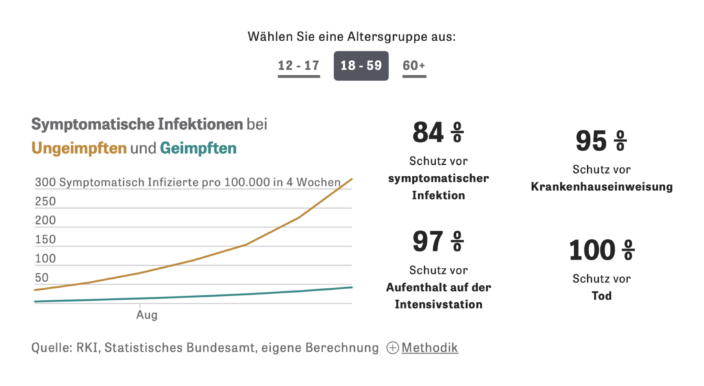
But cases and hospitalizations are up among all age groups. The good news? Vaccines are still highly effective, and “health passport” programs to promote them haven’t hurt the return of business and tourism:
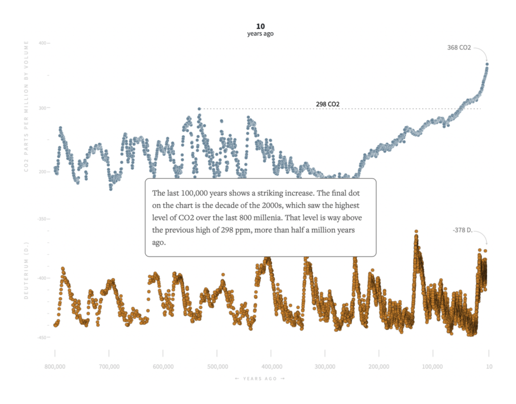
On the subject of climate, there’s less good news to offer. Long-term warming isn’t just making our present summers hotter — it’s hiding the evidence by melting the ice cores that scientists use to study prehistoric temperatures:
The environmental consequences include drought and flood:
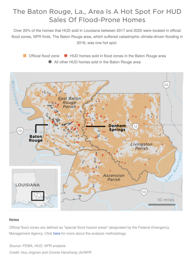
Dominique Royé: “¿Cuándo hubo «sequías optimista» o periodos húmedos en España peninsular y las Islas Baleares entre 1961-2020? ¿Cuáles fueron los más intensos y de mayor extensión? Entre 1961 y 2020, el periodo más grave en España fue en 1969 cubriendo el 84% del territorio,” September 12 (Tweet)Zeit Online: Dernau danach, September 7NPR: The Federal Government Sells Flood-Prone Homes To Often Unsuspecting Buyers, NPR Finds, September 13
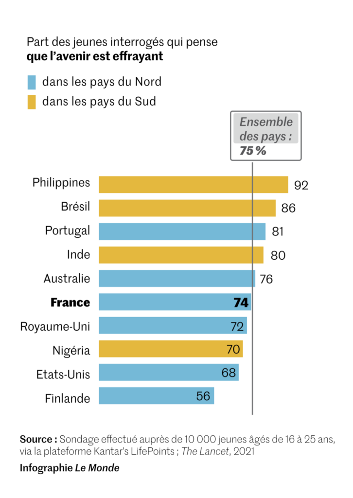
And the psychological effects are heavy as well:
Audrey Garric: “Quelques infographies pour ceux qui veulent voir les chiffres de cette étude, basée sur un sondage réalisé en mai et juin auprès de 10 000 jeunes de 16-25 ans de 10 pays, Nord et Sud. Les Français sont moins pessimistes mais plus critiques vis-à-vis du gouvernement,” September 14 (Tweet)
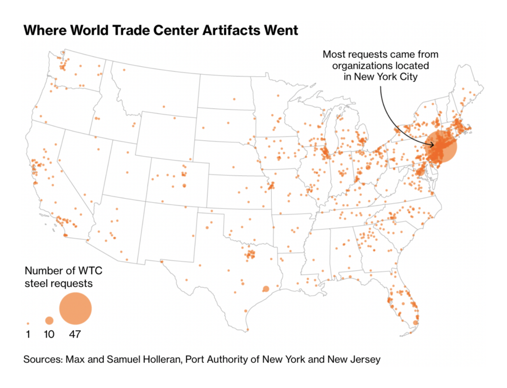
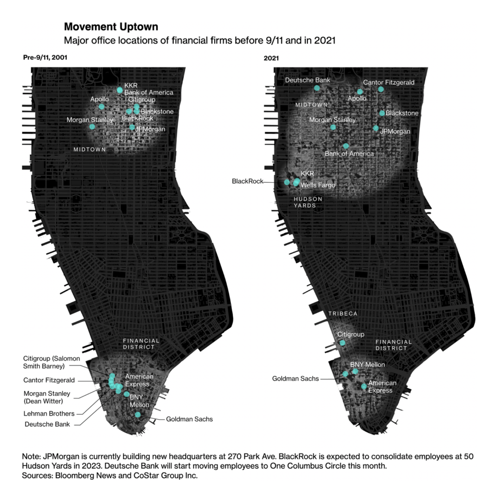
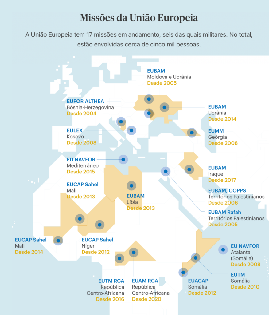
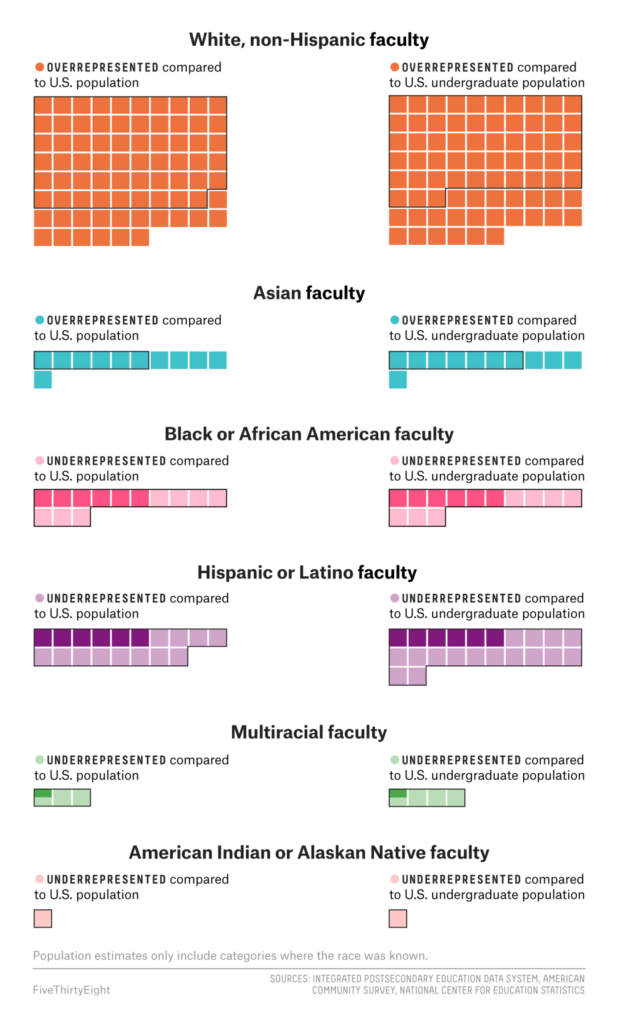
Other maps this week showed us the afterlives of the World Trade Center buildings, international missions of the European Union, a territorial dispute over rare earths mining, and racial inequalities in urban planning:
If you work in data visualization (or do it as a hobby!), be sure to take this “state of the industry” survey from the Data Visualization Society.
Help us make this dispatch better! We’d love to hear which newsletters, blogs, or social media accounts we need to follow to learn about interesting projects, especially from less-covered parts of the world (Asia, South America, Africa). Write us at hello@datawrapper.de or leave a comment below.
Rose Mintzer-Sweeney
(she/her, @rosemintzers) is a data vis writer on Datawrapper's communications team. She likes words, numbers, pictures, and all possible combinations of the same. Rose lives in Berlin.
Lisa Charlotte Muth
(she/her, @lisacmuth, @lisacmuth@vis.social) is Datawrapper’s head of communications. She writes about best practices in data visualization and thinks of new ways to excite you about charts and maps. Lisa lives in Berlin.


Comments