

Data Vis Dispatch, February 18: German election polls, corruption, and tariffs
February 18th, 2025
9 min
This article is brought to you by Datawrapper, a data visualization tool for creating charts, maps, and tables. Learn more.
The best of last week’s big and small data visualizations
Welcome back to the 111th edition of Data Vis Dispatch! Every week, we’ll be publishing a collection of the best small and large data visualizations we find, especially from news organizations — to celebrate data journalism, data visualization, simple charts, elaborate maps, and their creators.
Recurring topics this week include the cost of war, urban heat, and catastrophic flooding in Libya.
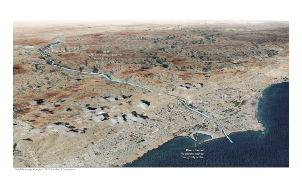
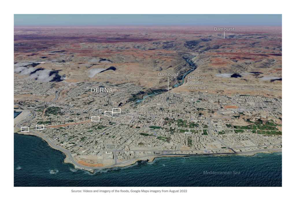
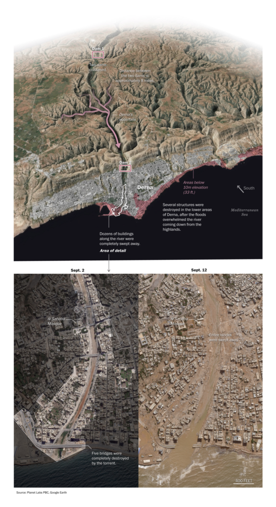
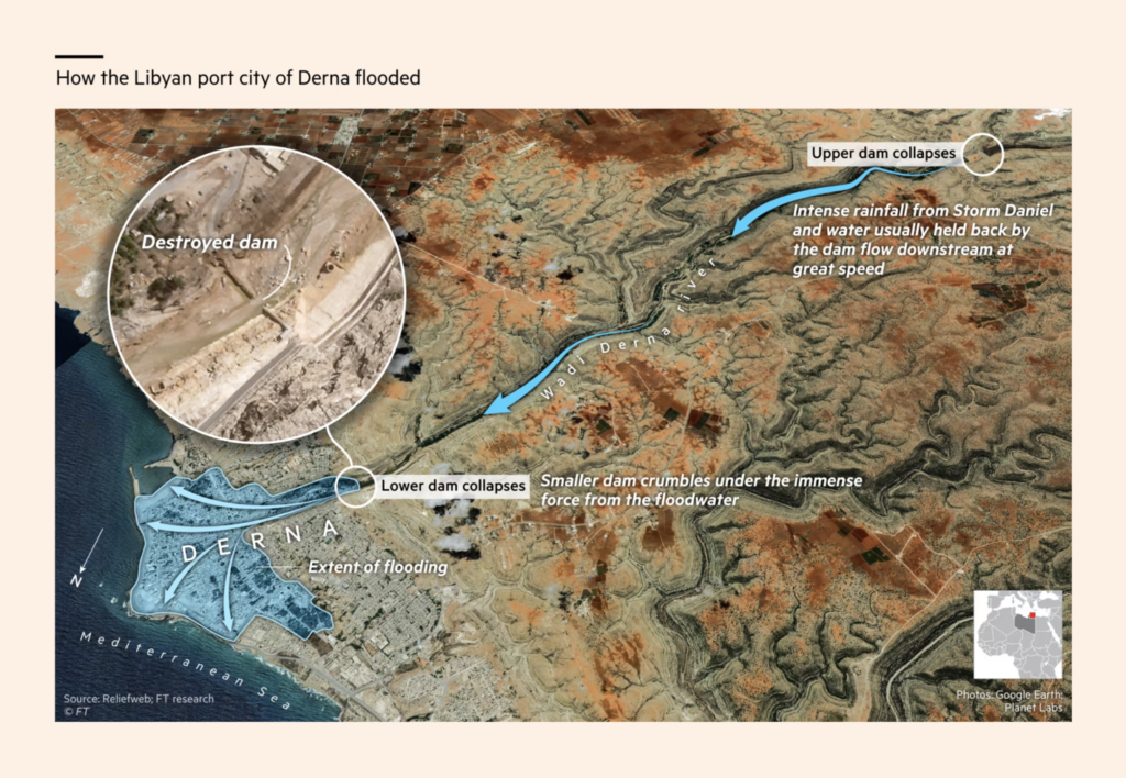
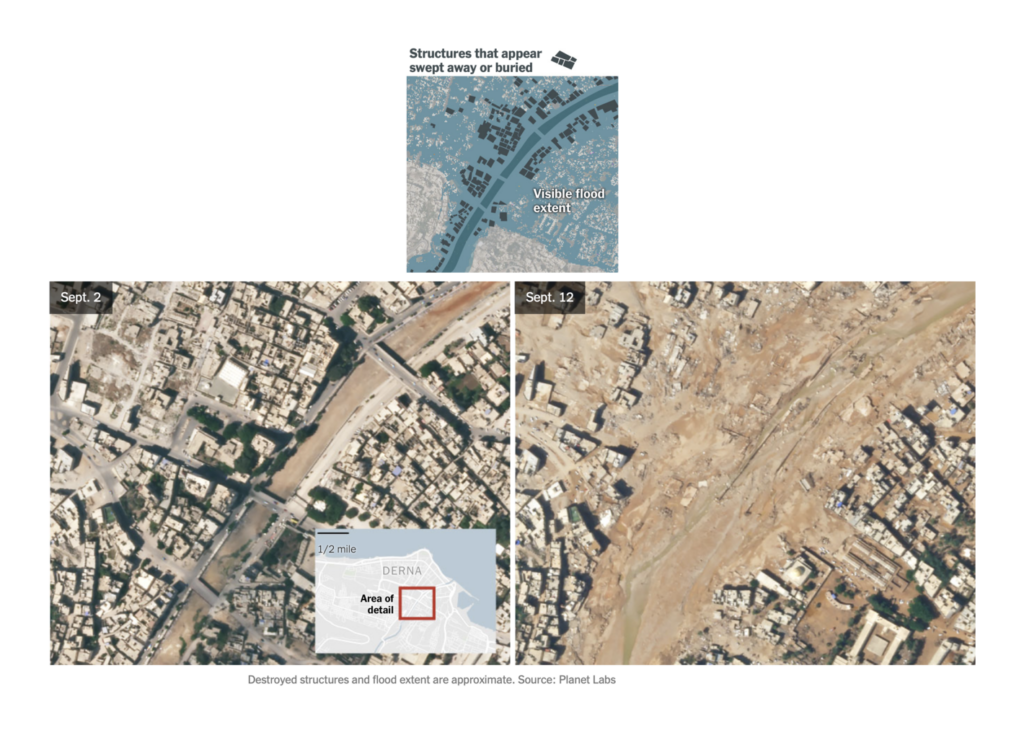
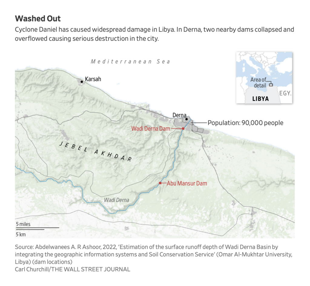
The Libyan city of Derna was devastated by floods last week after two dams collapsed during a massive storm. We saw many visualizations incorporate satellite imagery to explain the disaster:
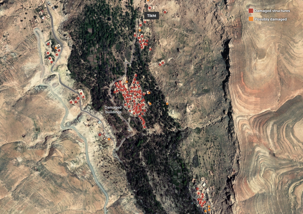
There was similar imagery of the destruction in Morocco following the previous week’s earthquake:
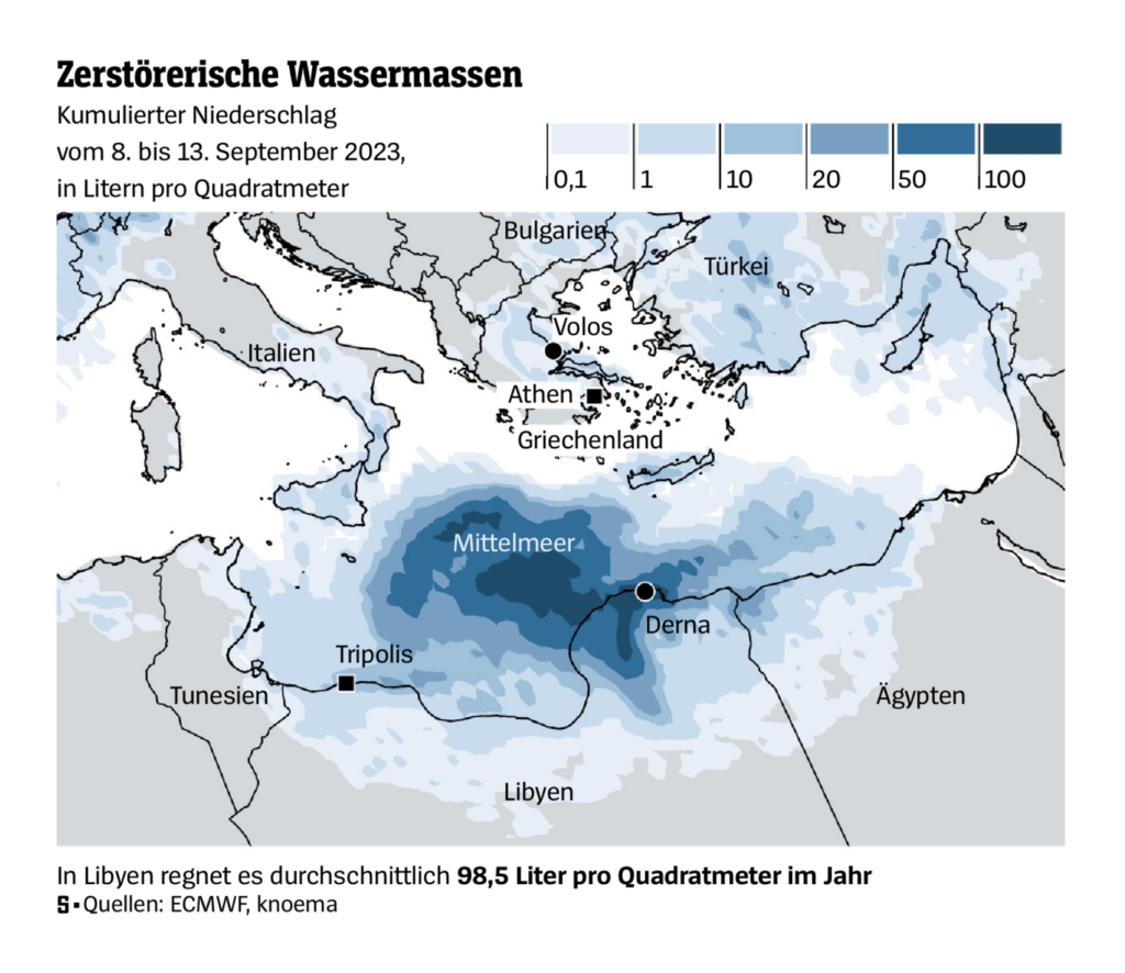
The dam collapses in Derna were a result of Storm Daniel, which had already caused major flooding in Greece, Turkey, and Bulgaria:
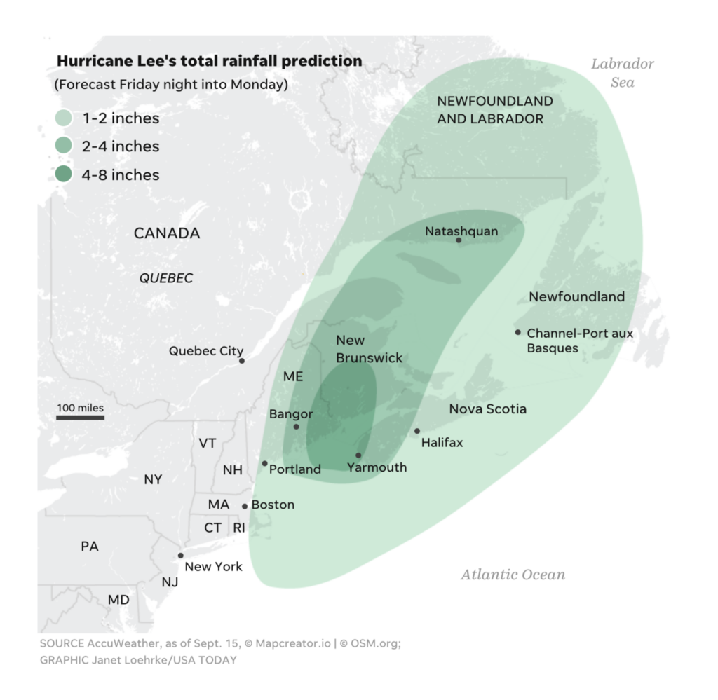
We also saw visualizations from the Atlantic hurricane season:
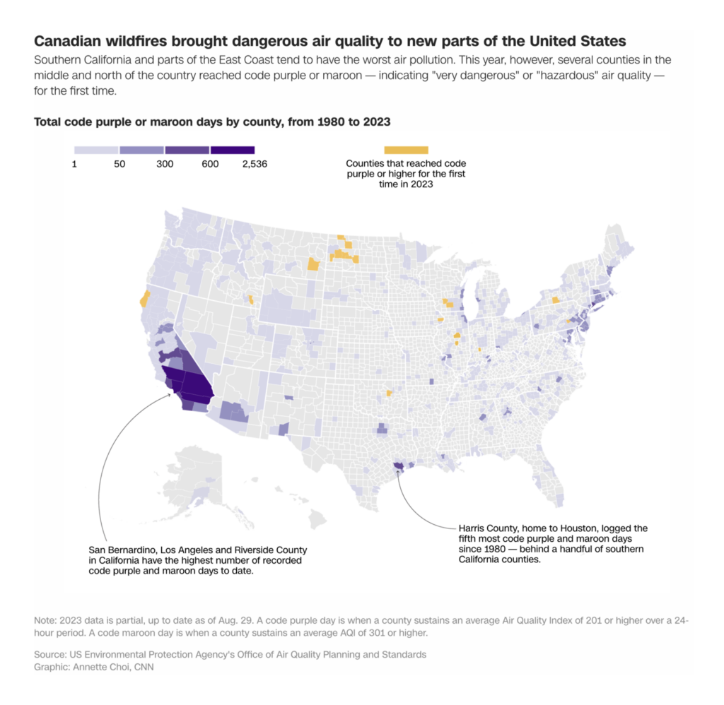
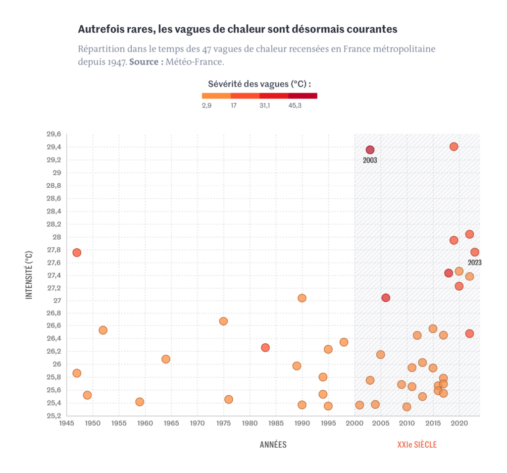
And charts and maps of the usual droughts, wildfires, and heat waves:
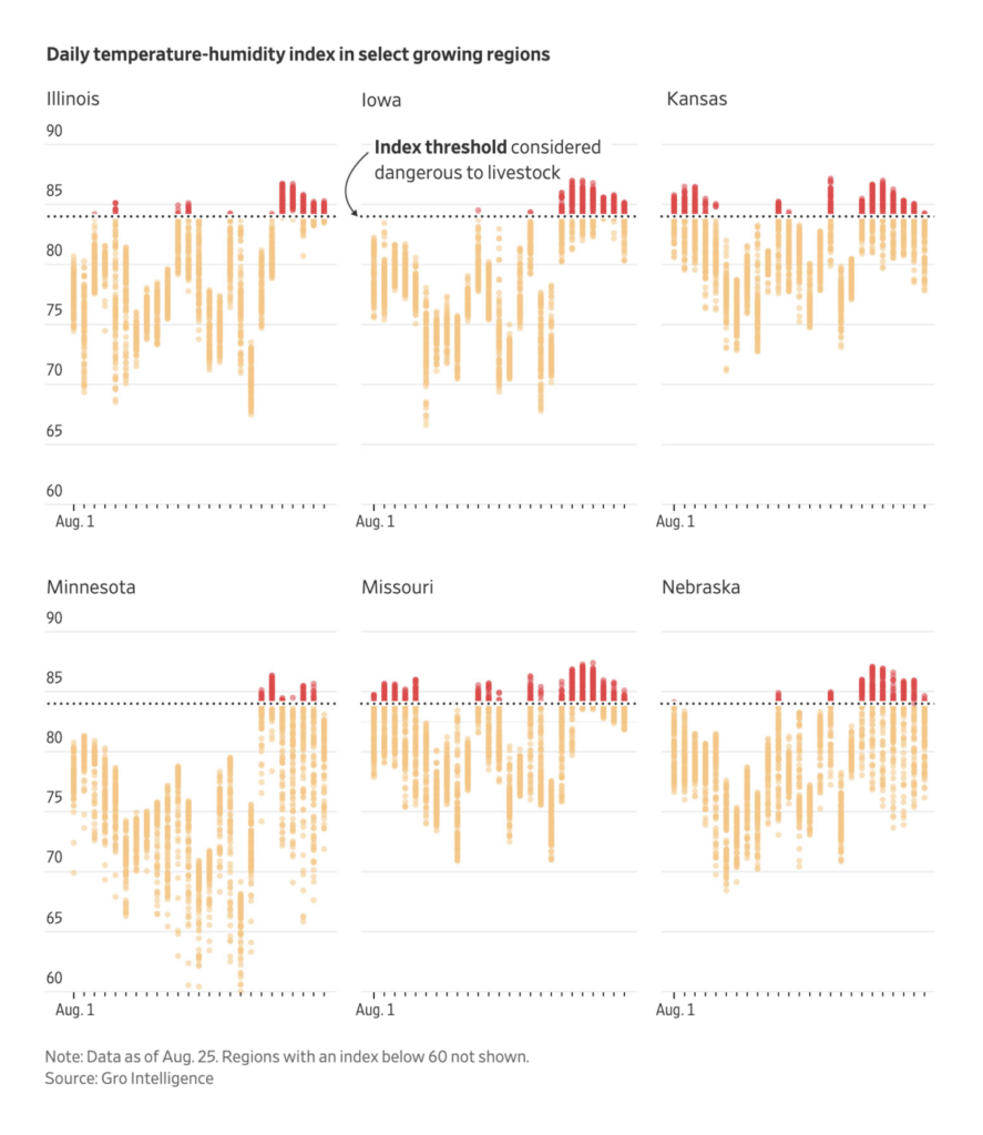
Two beautiful illustrated stories focused specifically on the problems of urban heat:
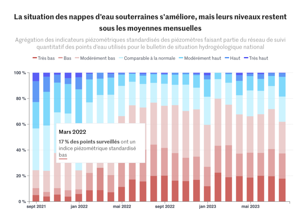
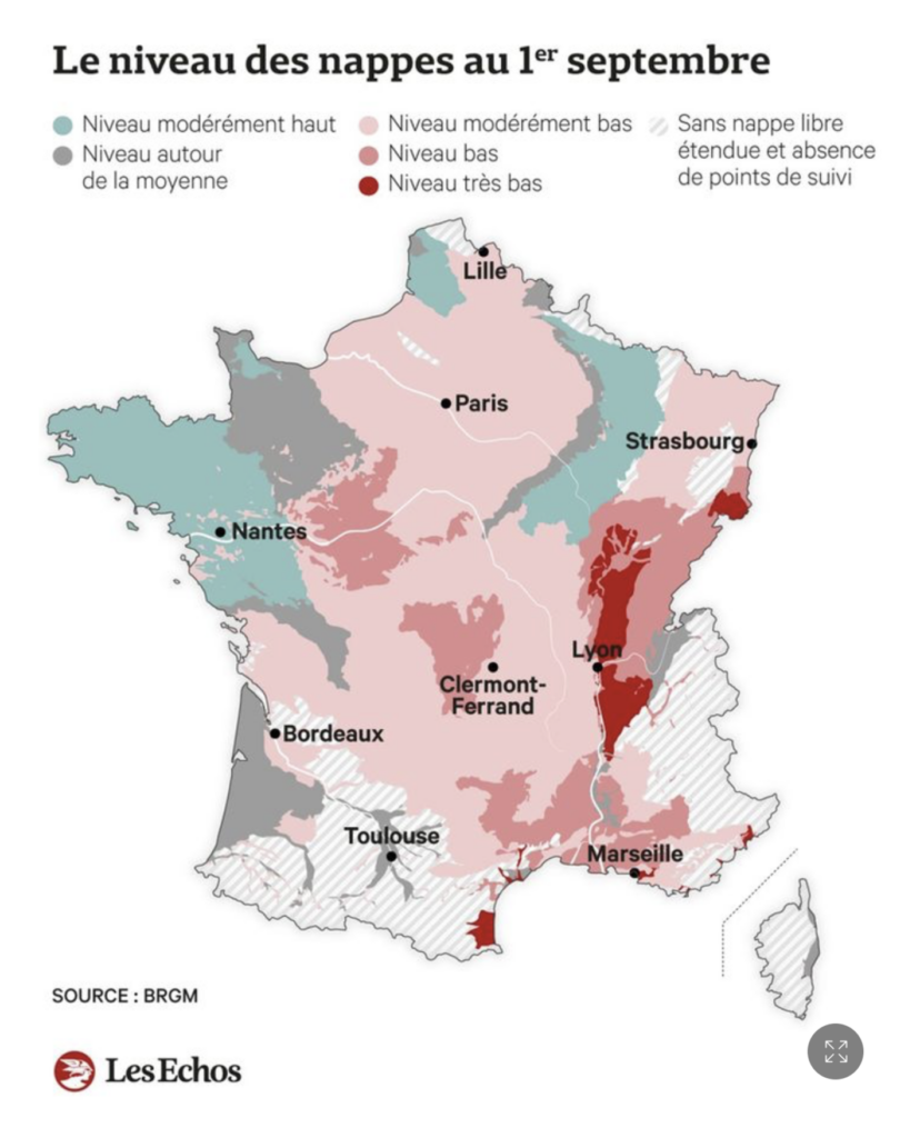
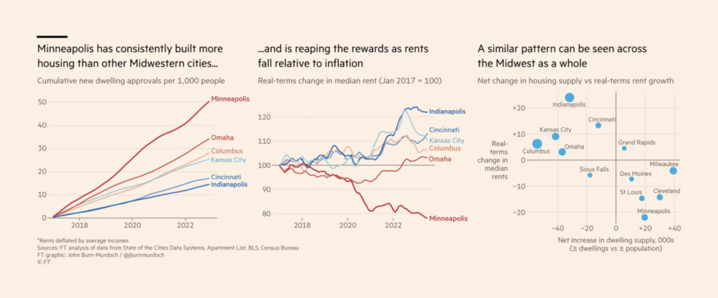
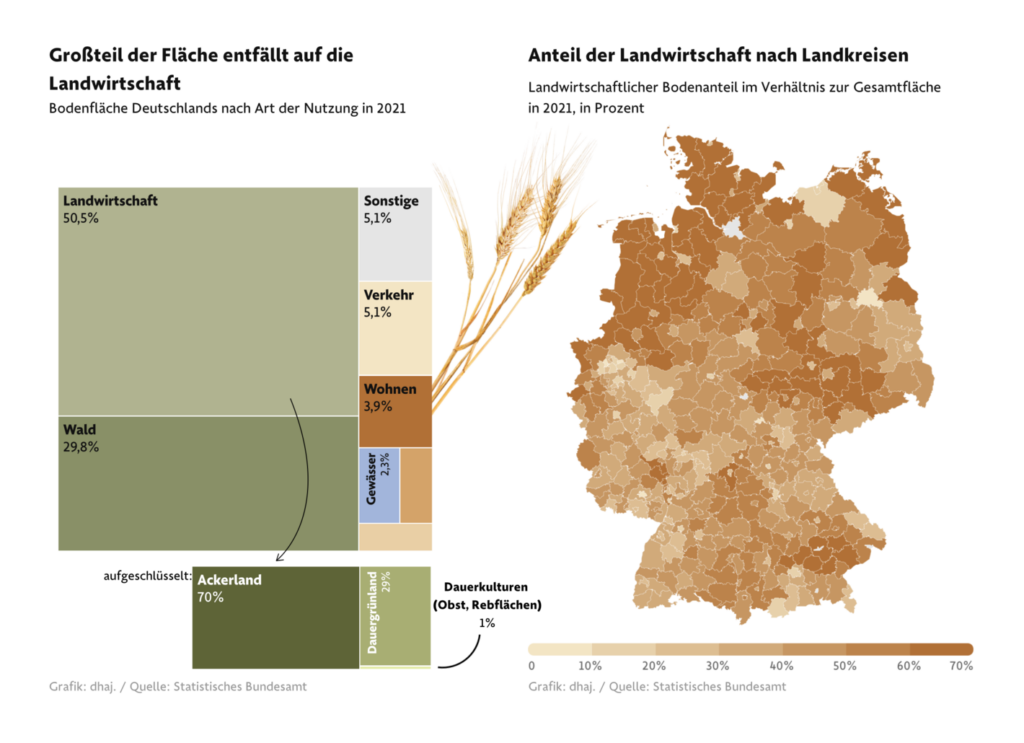
And these visualizations covered housing and land use:
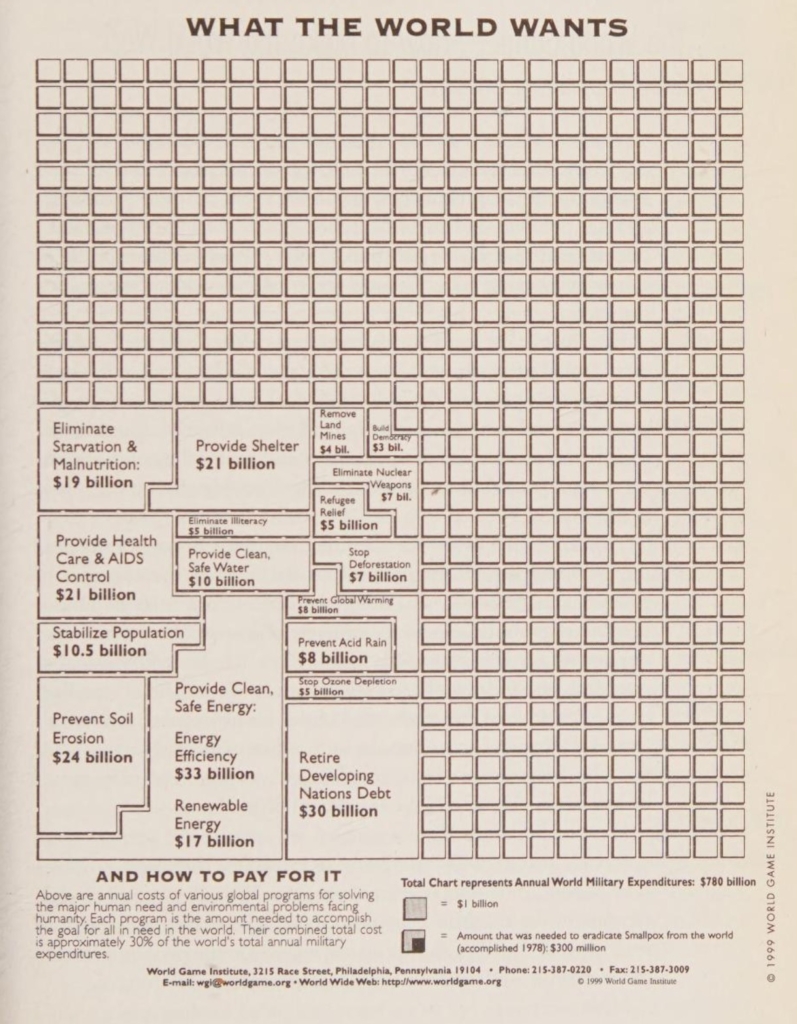
On war and what we could have instead:
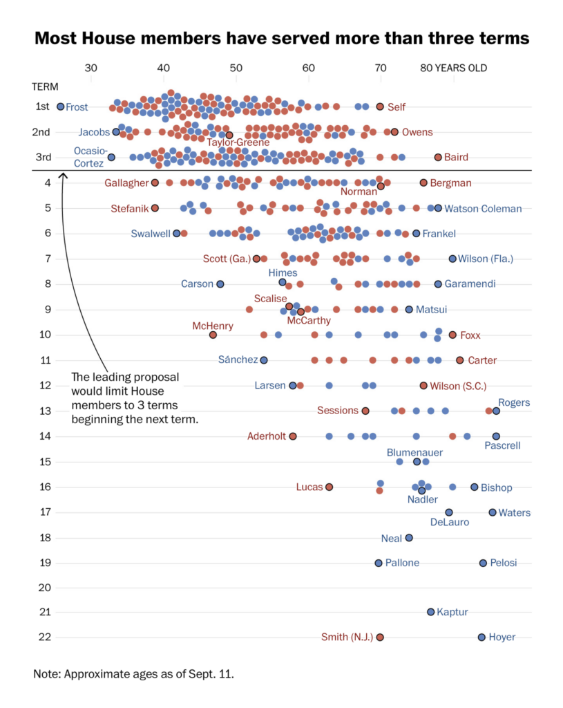
And on politics:
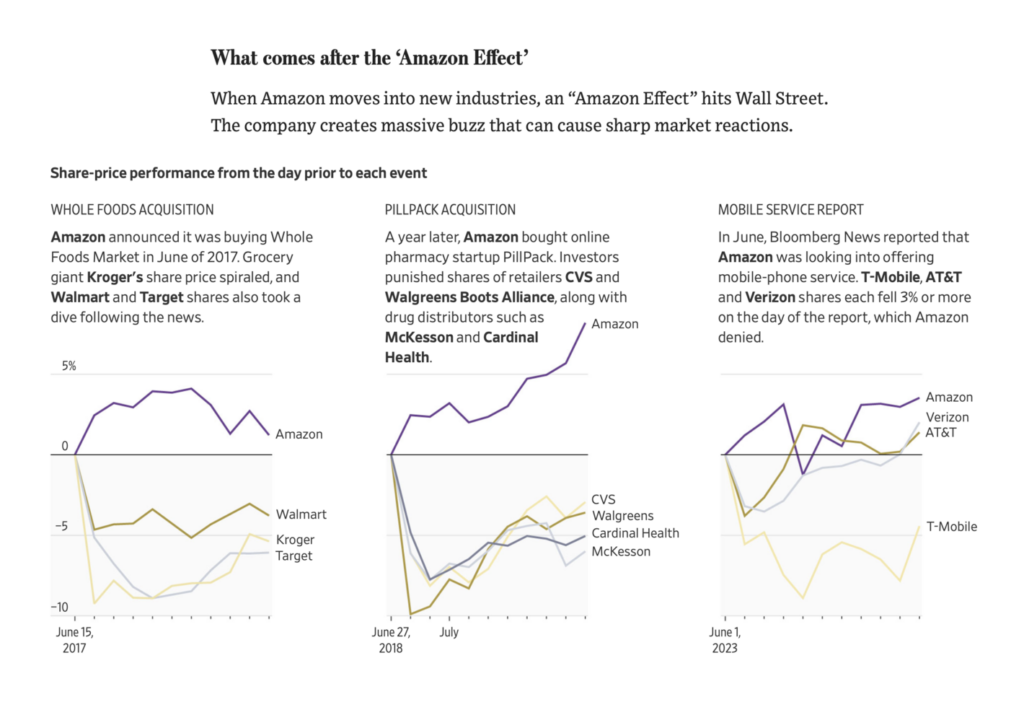
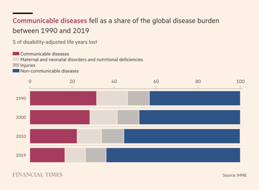
Other charts covered everything from Amazon’s next big thing to recent developments (well, not that recent) in infectious disease:

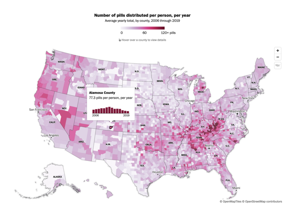
And the final category is… pink:
Applications are open for…
Help us make this dispatch better! We’d love to hear which newsletters, blogs, or social media accounts we need to follow to learn about interesting projects, especially from less-covered parts of the world (Asia, South America, Africa). Write us at hello@datawrapper.de or leave a comment below.
Want the Dispatch in your inbox every Tuesday? Sign up for our Blog Update newsletter!


Comments