Data Vis Dispatch,
September 20

The best of last week’s big and small data visualizations

Welcome back to the 61st edition of Data Vis Dispatch! (Usually) every week, we’ll be publishing a collection of the best small and large data visualizations we find, especially from news organizations — to celebrate data journalism, data visualization, simple charts, elaborate maps, and their creators.

Until the end of September, we’re taking a little late-summer break and publishing the Dispatch only every other Tuesday. You can expect the next Dispatch on October 4th.

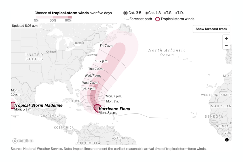
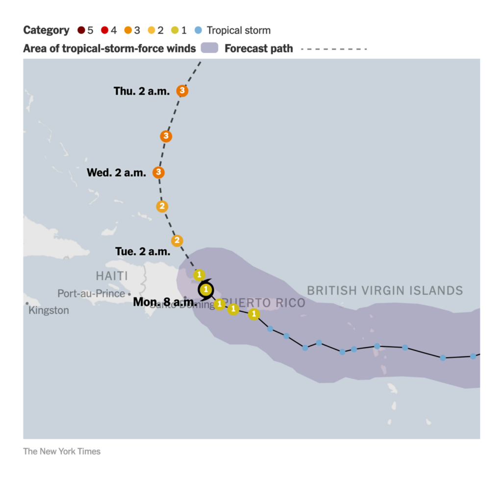
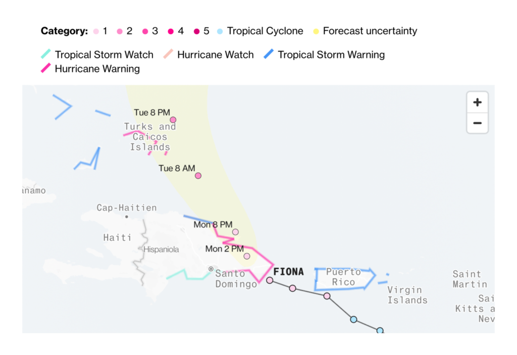
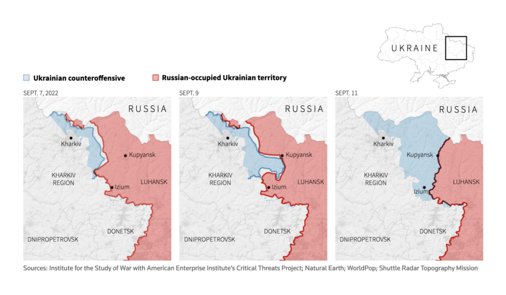
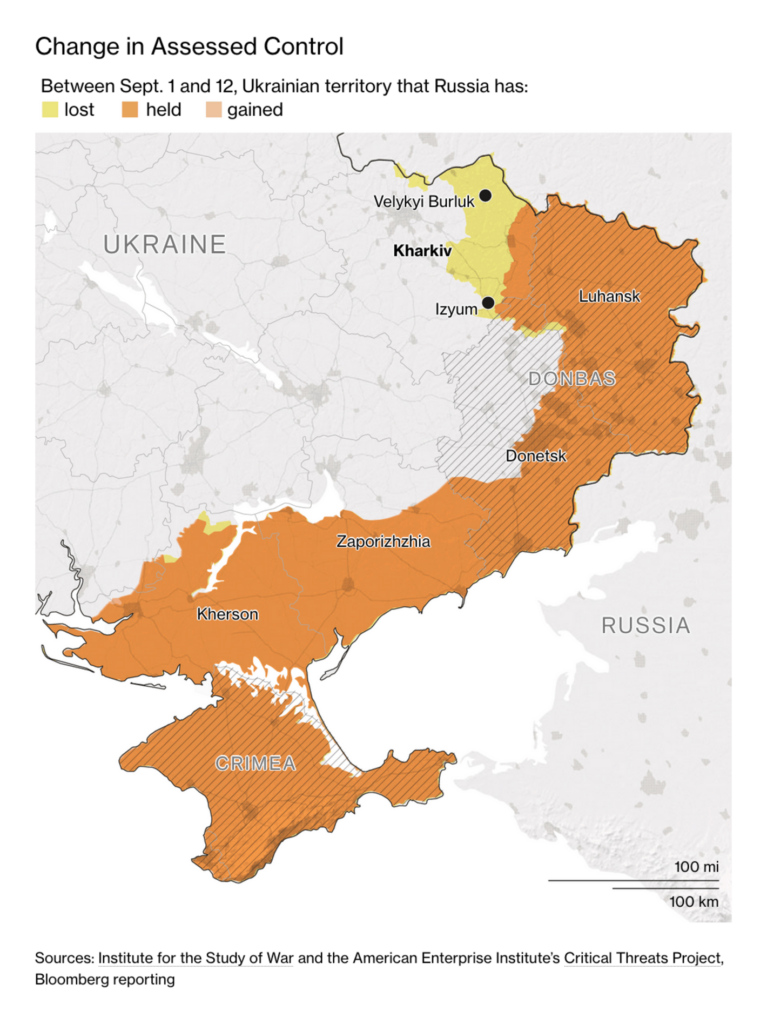
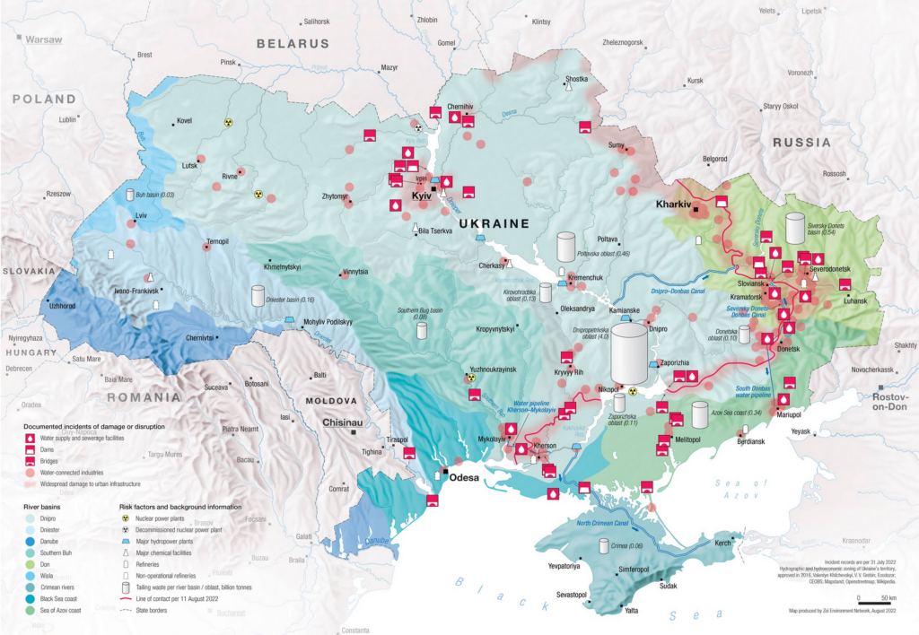
Without further ado, here’s the best from last week (and a bit from the week before). Recurring topics include the Queen’s death, the hurricane over Puerto Rico, territory gains of Ukraine, and the climate.

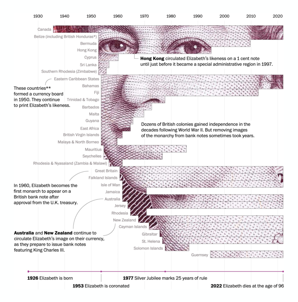
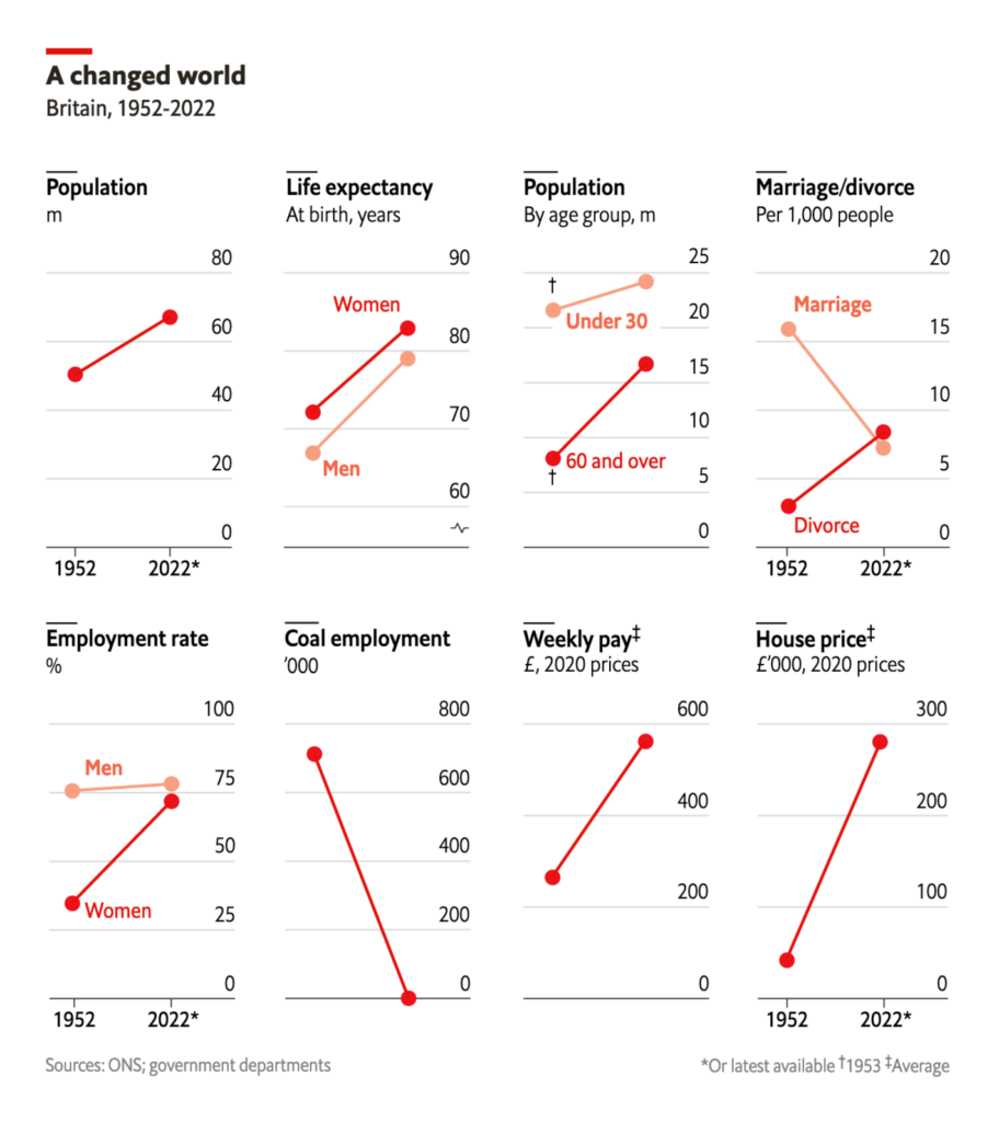
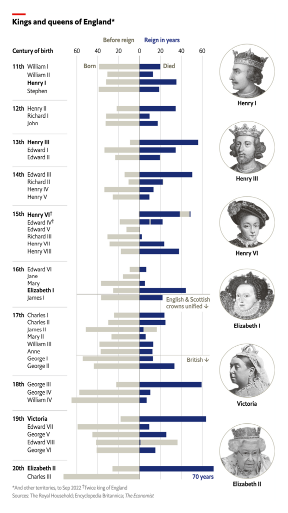
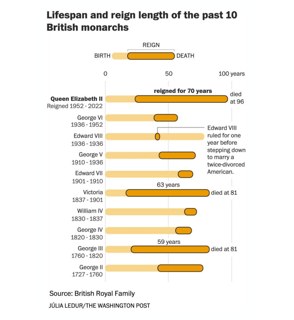
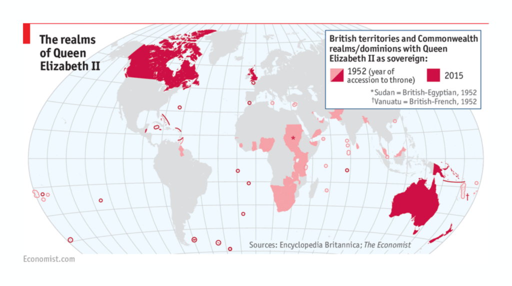
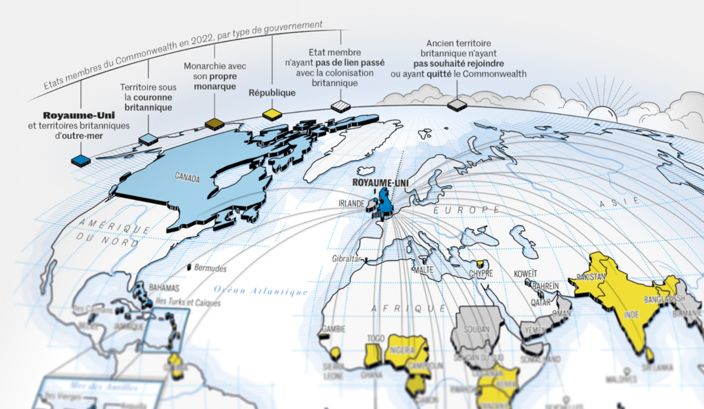
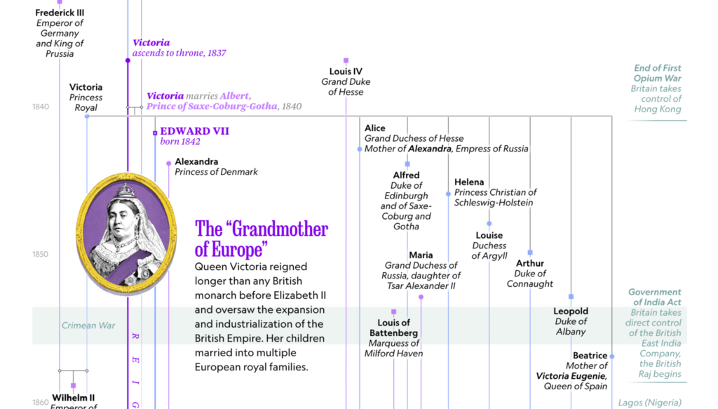
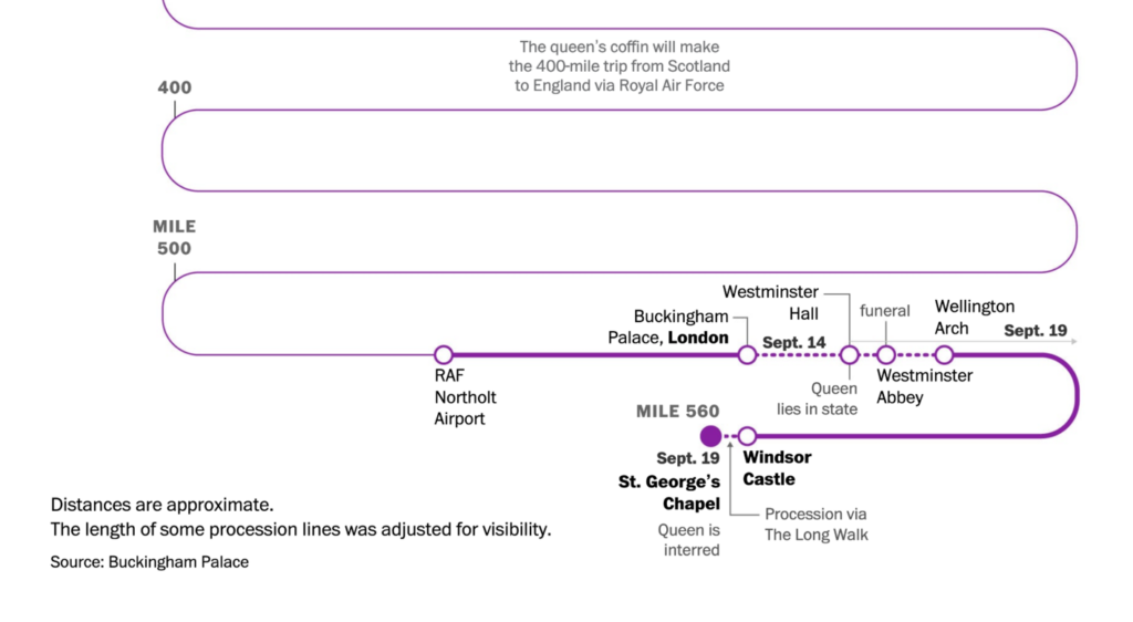
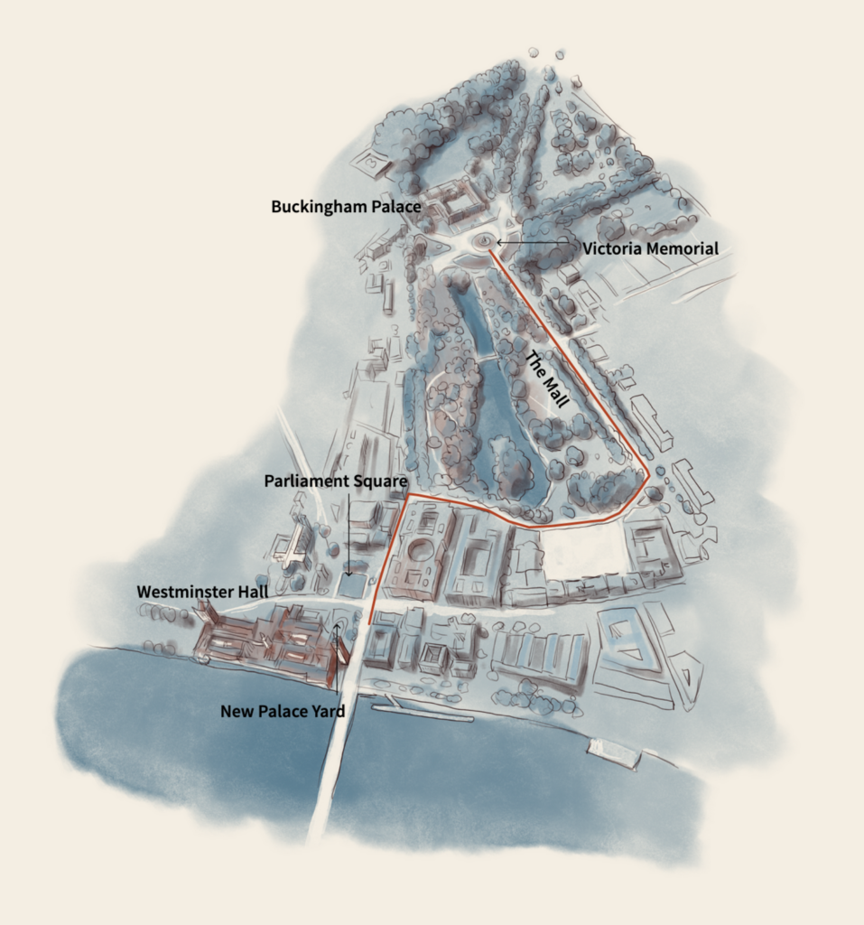
The biggest news event in the past two weeks was undoubtedly the Queen’s death. Lots of newsrooms created visualizations to illustrate how enormously long her reign of 70 years was. (Here are more from Le Monde and AFP News.)

The Washington Post: Where Queen Elizabeth II’s face appeared on bank notes worldwide, September 15
The Economist: How Britain has changed since Elizabeth II was crowned in 1953, September 8
The Economist: Britain’s longest-serving ruler strengthened the monarchy, September 8
The Washington Post: Queen Elizabeth II reigned for 70 years, longer than any other British monarch, September 8
The Economist: Longest to reign over them, September 12
Le Monde: Le Commonwealth, de George V à Charles III, September 16 (Tweet)
National Geographic: The evolution of monarchy, September 8

Lots of people wanted to show tribute and queued up for the Lying-in-State for up to 24 hours:

Gov.uk: Her Majesty The Queen’s Lying-in-State at the Palace of Westminster (Houses of Parliament), September 12
USA Today: Illustrated scenes from the streets of London as the queen is laid to rest, September 18

The Queen herself took quite a journey for her funeral procession, and many newsrooms mapped where she was and when:

The Washington Post: The queen’s final journey: Mapping the plans for the coming days, September 9
The Washington Post: Understanding the symbolism in the queen’s funeral processions, September 14
USA Today: Your guide to Queen Elizabeth II’s carefully planned funeral events, through Sept. 19, September 12
Reuters: Days of mourning for Queen Elizabeth, September 12

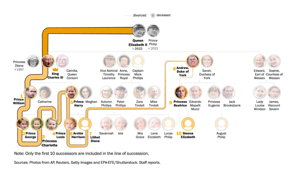
So who’s next in line? Many people wondered, and Amy O’Kruk from NBC collected how different newsrooms visualized the British line of succession in this Twitter thread. Here are two of them:

The Washington Post: Queen Elizabeth II’s line of succession, visualized, September 8
The Guardian: Royal family’s new line of succession after Queen’s death, September 12

In more recent news, Hurricane Fiona passed Puerto Rico and the Dominican Republic, leading to flash floods and a power outage in Puerto Rico:

The Washington Post: Hurricane Fiona tracker: Map and projected storm path, September 18
The New York Times: Map: Tracking Hurricane Fiona, September 15
Bloomberg: Tracking Fiona’s Latest Path, September 18

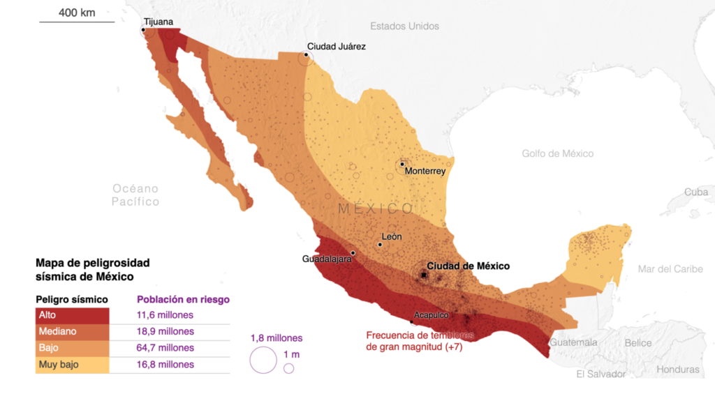
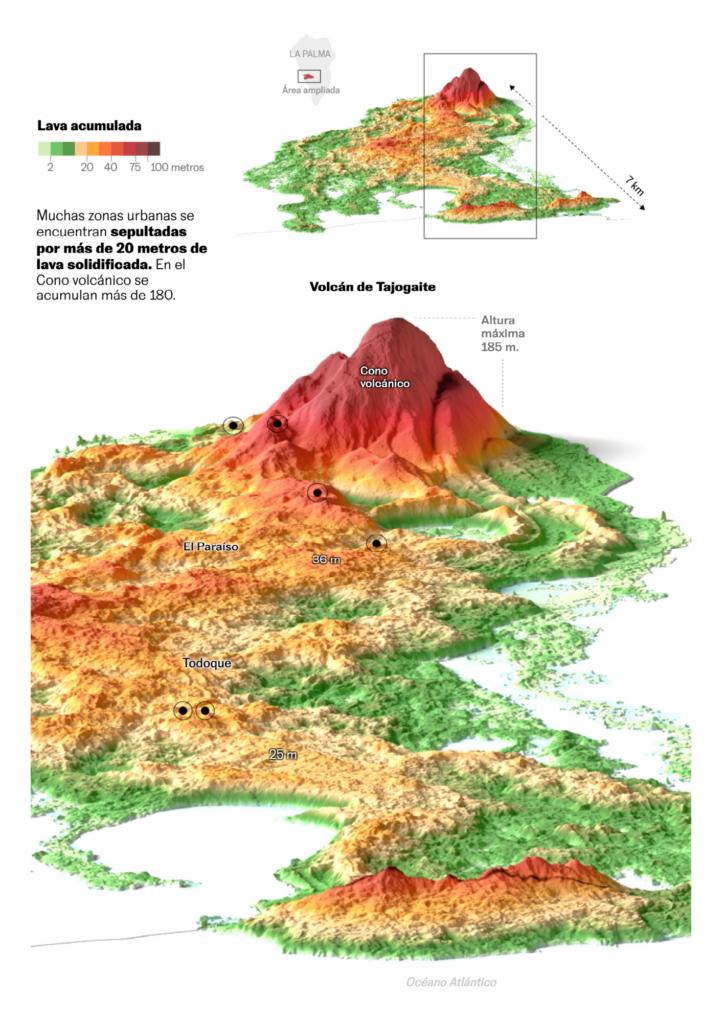
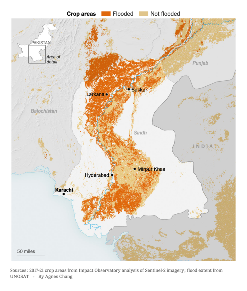
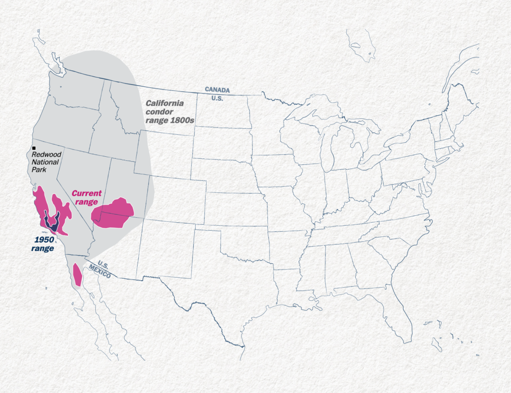
Other big environmental disruptions reported about were earthquakes in Mexico, the volcanic eruption on La Palma a year ago and the current floods in Pakistan:

El País: México tiembla todos los días y muchas veces: ¿dónde son más frecuentes los epicentros?, Setember 20
El País: Cuevas y túneles impenetrables en la zona arrasada por el volcán de La Palma, September 18
The New York Times: ‘Very Dire’: Devastated by Floods, Pakistan Faces Looming Food Crisis, September 11

News organizations also focused on long-term climate-related events, thanks to a new study:

Financial Times: The ancient subarctic forests at risk from climate change and war, September 11
The Guardian: World on brink of five ‘disastrous’ climate tipping points, study finds, September 8
Financial Times: Climate graphic of the week: Record ice sheet melt in September as emissions rise, September 16
Les Echos: En dix ans, 225 millions de personnes sont devenues réfugiées climatiques, September 19
The New York Times: As Wildfires Grow, Millions of Homes Are Being Built in Harm’s Way, September 9
Reuters: Why Arctic fires are releasing more carbon than ever, September 8
Le Temps: Climat: «Nous allons dans la mauvaise direction», estime l’OMM, September 13
The New York Times: The Elusive Future of San Francisco’s Fog, September 14

We’ve also seen quite a few summaries of that hot, dry summer in the northern hemisphere – and projections of where we’re heading:

Bloomberg: The World Has a $1 Trillion La Nina Problem, September 16
ZEIT Online: So stark ist Ihre Region von Dürre betroffen, September 18
The Washington Post: Maps show where extreme heat shattered 7,000 records this summer, September 13
Axios: Mapped: America’s extreme summer weather of 2022, September 15

In the Russia-Ukraine war, Ukraine gained back a surprisingly big region in only a few days:

ZEIT Online: Plötzlich steckt Russland in der Defensive, September 15
The Washington Post: These maps show Ukraine’s latest victories against Russia, September 12
The New York Times: Maps: Tracking the Russian Invasion of Ukraine, September 12
USA Today: Ukraine retakes more territory in a week than Russia captured in months, September 13
Reuters: Ukraine makes surprising gains in swift counteroffensive, September 12
Bloomberg: A Visual Guide to the Russian Invasion of Ukraine, September 13

Other visualizations about the Ukraine showed data on orphans and disruption to water infrastructure:

Reuters: Emptying Ukraine’s Orphanages, September 9
The Economist: Ukraine is riddled with unexploded bombs, September 16
Conflict and Environment Observatory: Ukraine conflict environmental briefing: Water, September 15

Related to both the war and climate, energy dependency is still a big topic for European countries:

Financial Times: Europe sounds ‘full mobilisation’ after Kremlin shuts key gas pipeline, September 9
The New York Times: Europe Is Sacrificing Its Ancient Forests for Energy, September 7
ZEIT Online: Ist das gerecht?, September 7
elDiario.es: Radiografía de la producción eléctrica en España: el uso de gas se dispara y las renovables se consolidan, September 15
Le Monde: A l’approche de l’hiver, la bataille mondiale pour le GNL est engagée, September 16

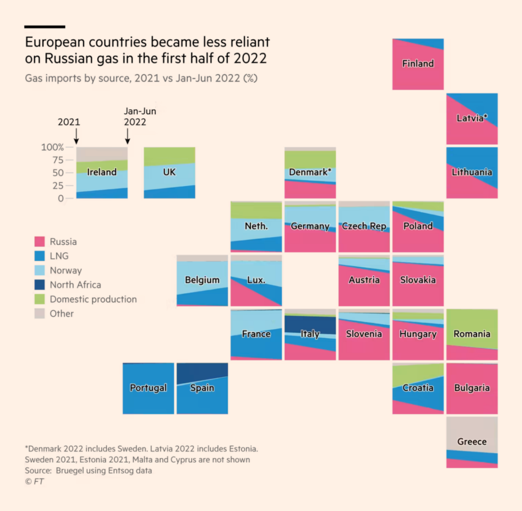
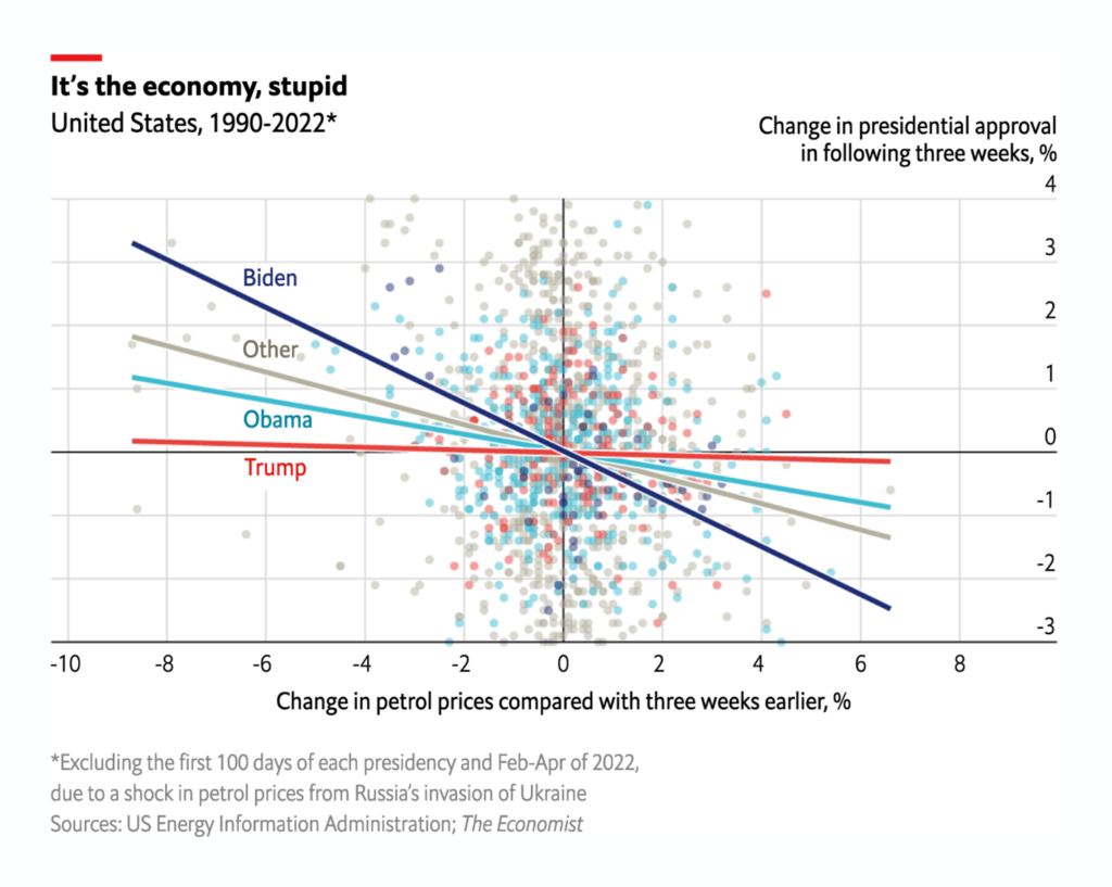
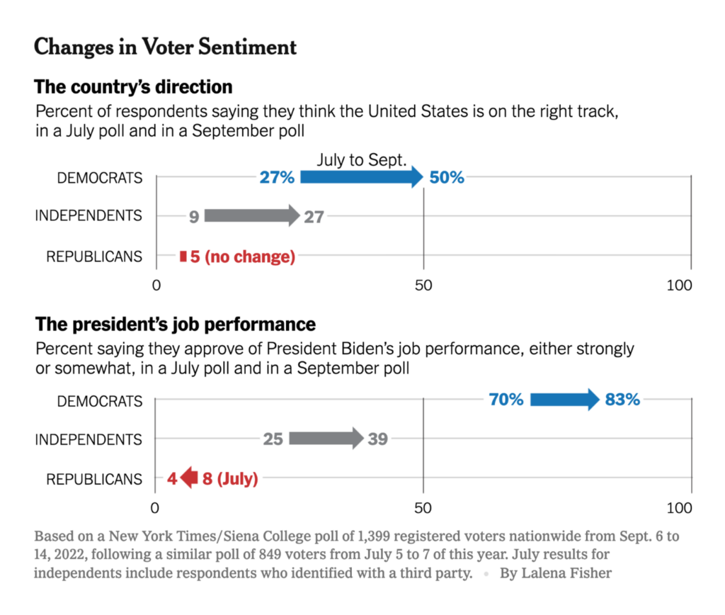
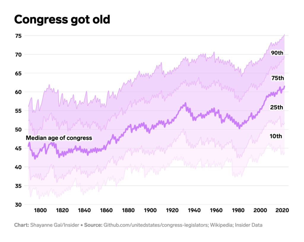
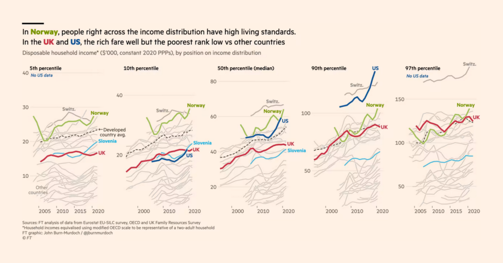
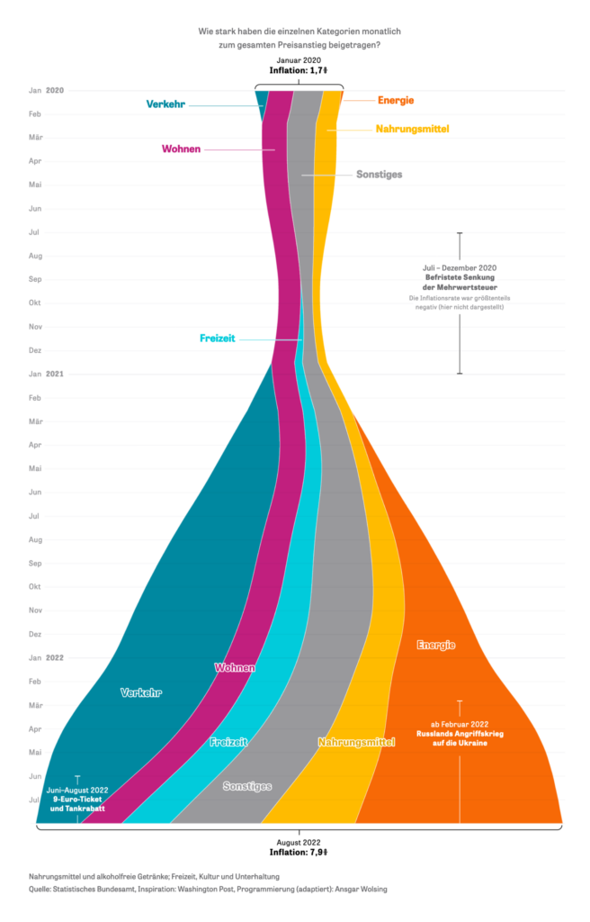
From gas prices to U.S. politics – The Economist shows that it might be related. Besides that, the U.S. is heading toward a midterm election, and we’ve seen a number of charts about Congress:

The Economist: The falling cost of petrol is good news for Joe Biden, September 16
The New York Times: Stock Trades Reported by Nearly a Fifth of Congress Show Possible Conflicts, September 13
The New York Times: Democrats Buoyed by Abortion and Trump, Times/Siena Poll Finds, September 16
Business Insider: The oldest government in history, September 13
Los Angeles Times: Track the money flowing into the California governor’s race, September 19
The New York Times: How Poverty Programs Aided Children From One Generation to the Next, September 12
The New York Times: Expanded Safety Net Drives Sharp Drop in Child Poverty, September 11

The New York Times: How a Proposed 15-Week Abortion Ban Compares With State Laws, September 13

In this week’s category of “other problems the U.S. has“: inequality, Chicago’s segregation, and an overview of the U.S.-American economy:

Financial Times: Britain and the US are poor societies with some very rich people, September 16
The New York Times: Mr. Biden, Tear Down This Highway, September 8
The New York Times: In Hasidic Enclaves, Failing Private Schools Flush With Public Money, September 11
Bloomberg: Chicago’s Decades of Segregation Feed South and West Side Hardships, September 14
The New York Times: How Is the Economy Doing?, September 13

Apropos economy – two German newsrooms visualized the current inflation:

ZEIT Online: Vom Tropfen zum Wasserfall, September 19
Berliner Morgenpost: Wieviel ist mein Einkommen noch wert?, September 16

…while Politico looked closely on checks written for Covid research:

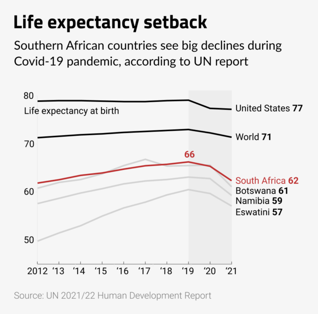
Politico: 6 charts that show how money and influence shaped the world’s Covid plan, September 14
The Outlier Africa: “#OurWorldinCharts’ Chart of the day: Before 2019 life expectancies in many of these countries seemed to be on the rise, but since Covid-19 they have declined. As of 2021, South Africa’s life expectancy is 62, nine years less than the world average,” September 13 (Tweet)

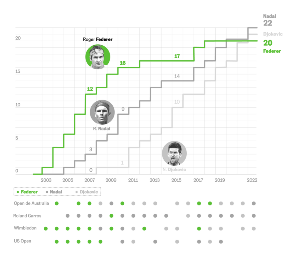
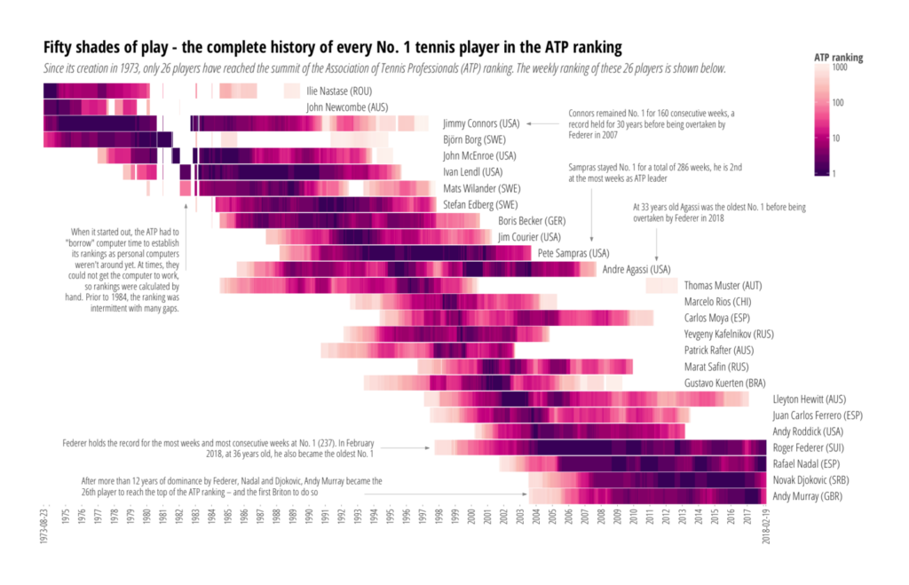
In better news: Because Roger Federer announced his retirement from professional tennis, we got a sports category again:

El País: Roger Federer: los títulos y las victorias del tenista que rompió el techo de su deporte, September 15
SWI: The complete history of every No. 1 male tennis player, September 6
De Tijd: Vuelta-stunt Evenepoel markeert machtsgreep jonge wielergarde, September 11

In our “everything else” category, graphics reporters visualized data beautifully on art, birds, warehouses, and parking cars:

Radio France: Alaska, un réchauffement climatique et militaire : tout comprendre en une carte, September 10
The Washington Post: ​​States with the worst brain drain — and more!, September 9
The Straits Times: The Great Singapore Run, September 9
Axios: The staggering lack of female artists in America’s museums, September 10
Sierra: Is There a Mega Warehouse Near You?, September 17
El Mundo: El colapso alcanza a la Diada: de los discursos inflamados a la división en la calle, 10 años en 4 gráficos, September 10
The Economist: Global living standards are moving in the wrong direction, September 8
The Washington Post: Flight of the Condors, September 15
Hans Hack: “Mehr als 40 Freiwillige haben im vergangenen Jahr auf einem Luftbild von Berlin Autos markiert. Wie viele parken? Wie viele fahren? Ich habe nun eine Karte gebaut, die die Ergebnisse zeigt,” September 20 (Tweet)

What else we found interesting

NZZ: Das Ende der Anonymität: Wie eine Suchmaschine für Gesichter unser Leben verändern könnte, September 10
Miṣr. al-Jihāz al-Markazī lil-Taʻbiʼah al-ʻĀmmah wa-al-Iḥṣāʼ: “The relative distribution of foreign trade for some countries in the world in 1964”, 1967 (via Jason Forrest, Tweet)

Applications are open for…


Help us make this dispatch better! We’d love to hear which newsletters, blogs, or social media accounts we need to follow to learn about interesting projects, especially from less-covered parts of the world (Asia, South America, Africa). Write us at hello@datawrapper.de or leave a comment below.

Want the Dispatch in your inbox every Tuesday? Sign up for our Blog Update newsletter!

The next Data Vis Dispatch will come out on October 4 (curated by Rose again!).

Comments