We want to enable everyone to create beautiful charts, maps, and tables. New to data visualization? Or do you have specific questions about us? You'll find all the answers here.
The best of last week’s big and small data visualizations
Rose Mintzer-Sweeney
Lisa Charlotte Muth
Welcome back to the 14th edition of Data Vis Dispatch! Every week, we’ll be publishing a collection of the best small and large data visualizations we find, especially from news organizations — to celebrate data journalism, data visualization, simple charts, elaborate maps, and their creators.
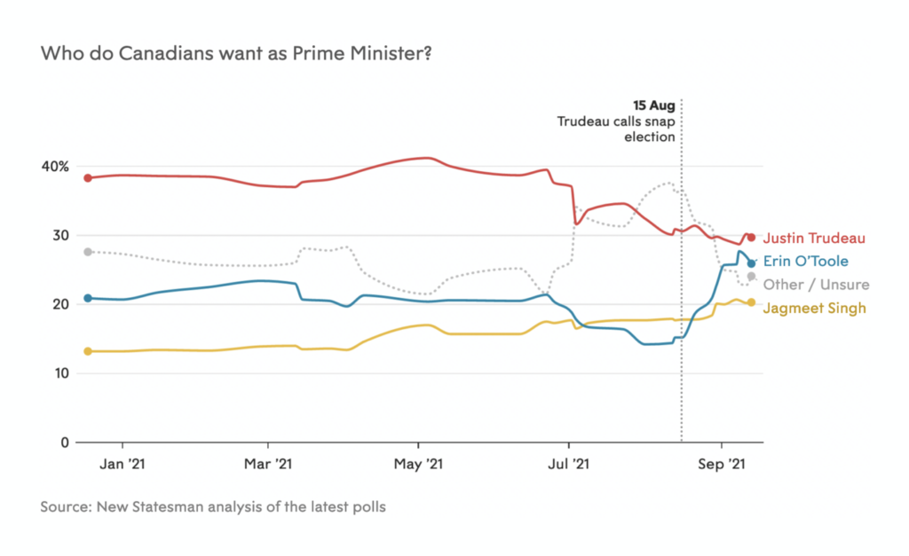
Recurring topics this week include the earthquakes and volcano eruption on La Palma, wildfires in the U.S., the elections in Canada and Germany — and, yes, COVID-19.
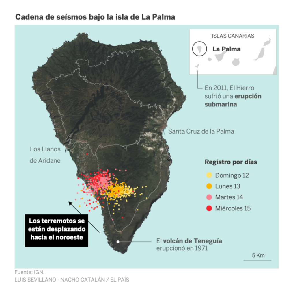
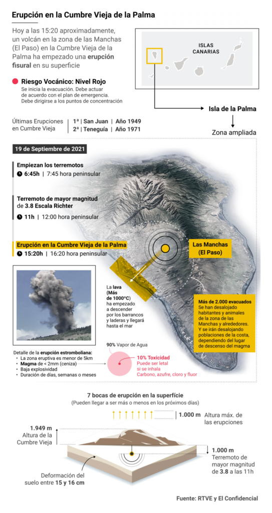
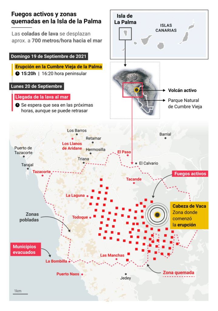
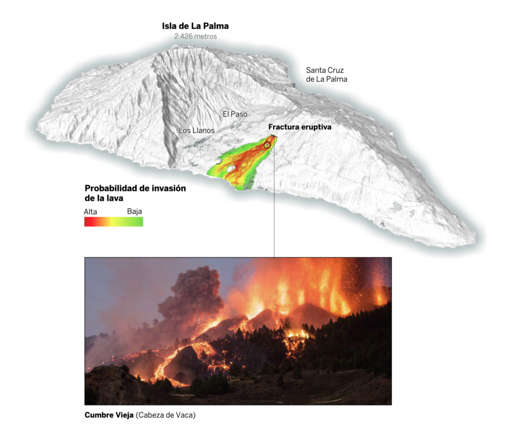
First, the earthquakes and then volcanic eruption on the Spanish Canary Island of La Palma. Thousands of people had to evacuate, and Spanish newspapers reported on the event with lots of maps:
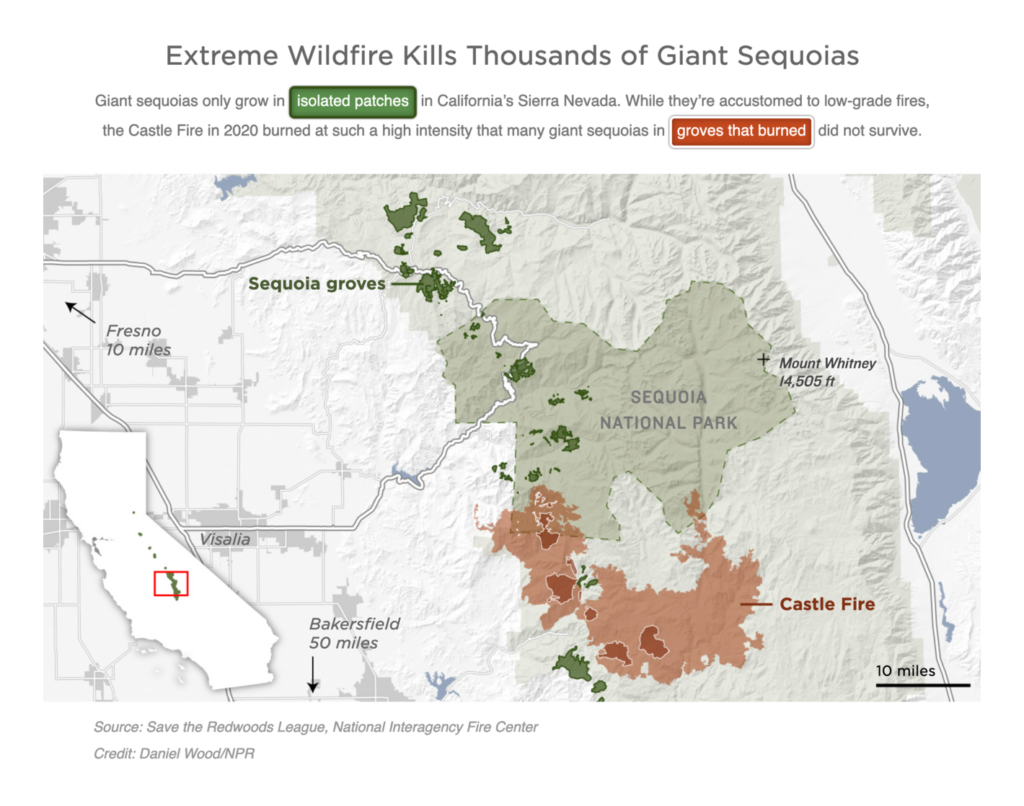
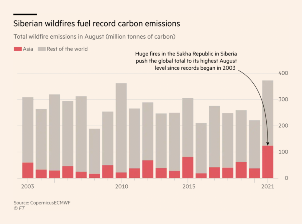
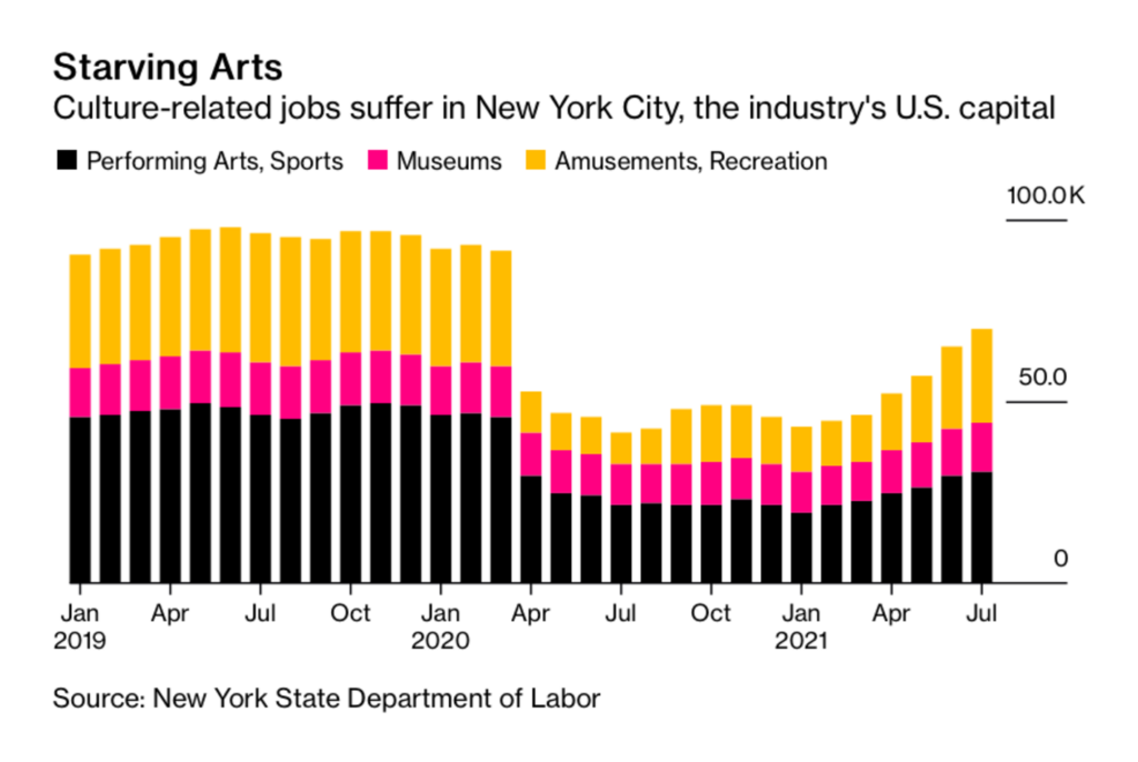
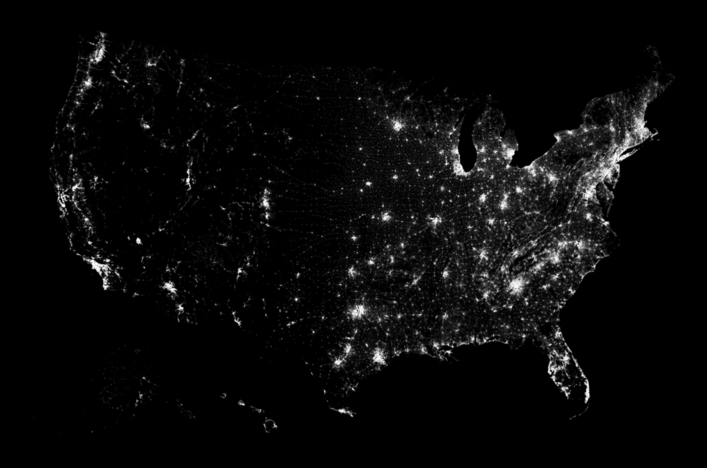
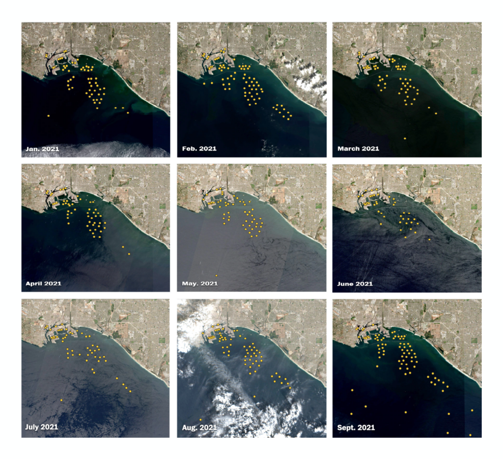
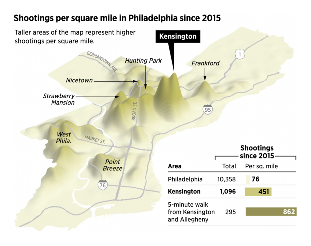
Environmental disasters are happening all over the world. In the U.S., the wildfires continue, killing (or about to kill) some of the oldest trees in the world:
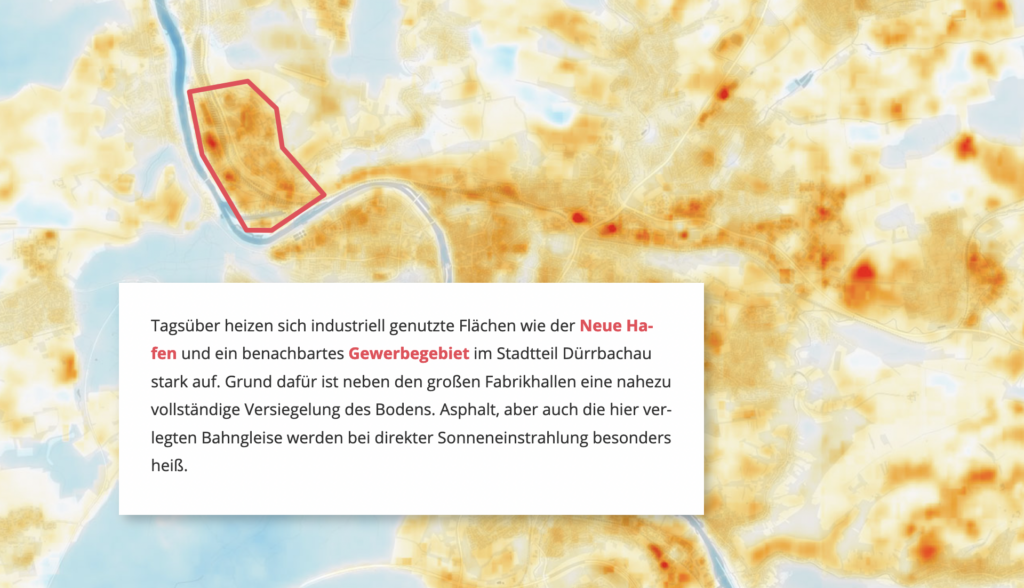
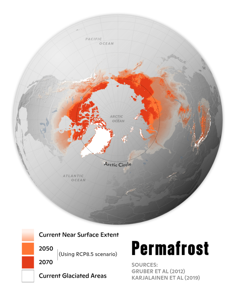
Bayrischer Rundfunk: In der Hitze der Stadt, September 20Greg Fiske: “Let the depth of this map sink in,” September 17 (Tweet)
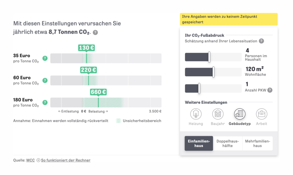
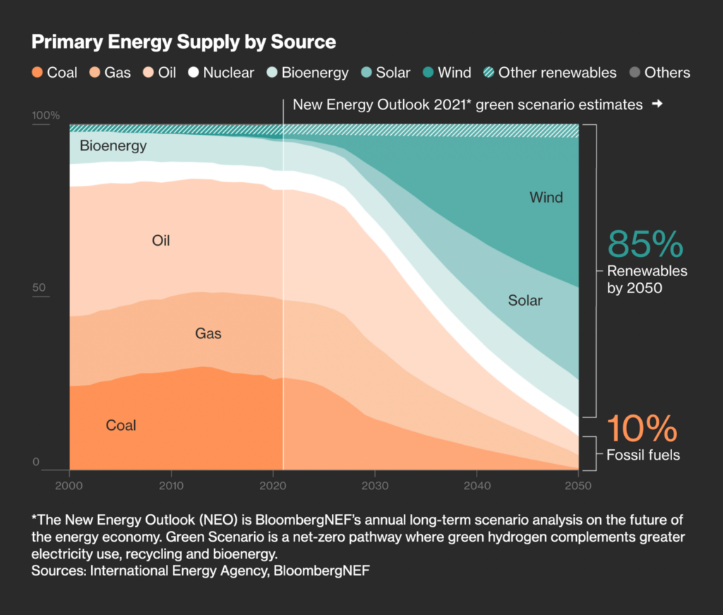
…and governments and the energy industry need to reshape and adapt. ZEIT Online offers a calculator for carbon prices, while Bloomberg does the math on how much money there is in clean energy:
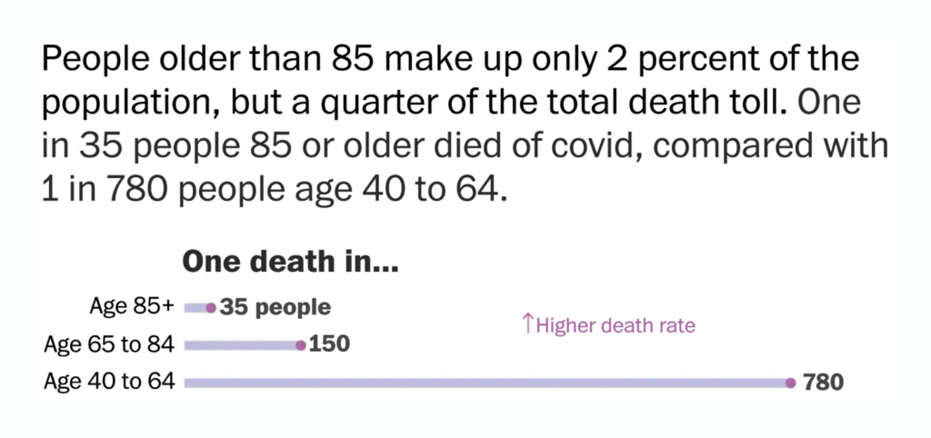
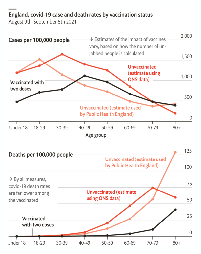
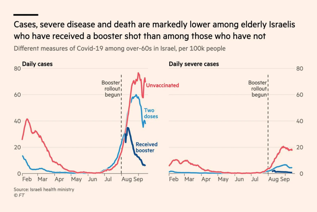
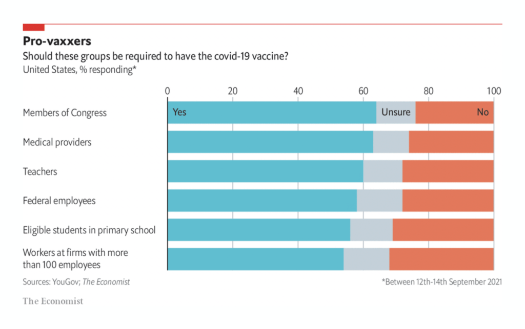
Vaccines still work, though. (Including booster shots.) Lots of the sorrow could have been prevented by more people getting a COVID-19 vaccine, as the New York Times shows:
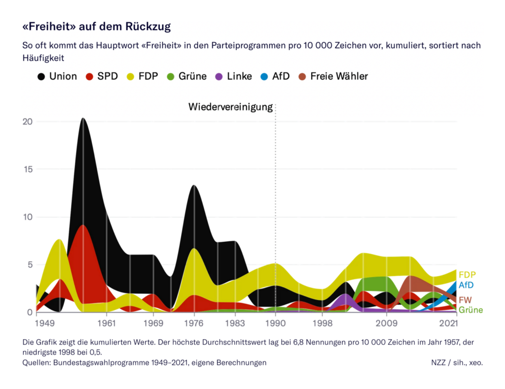
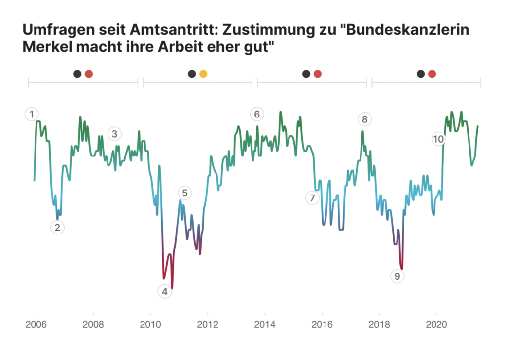
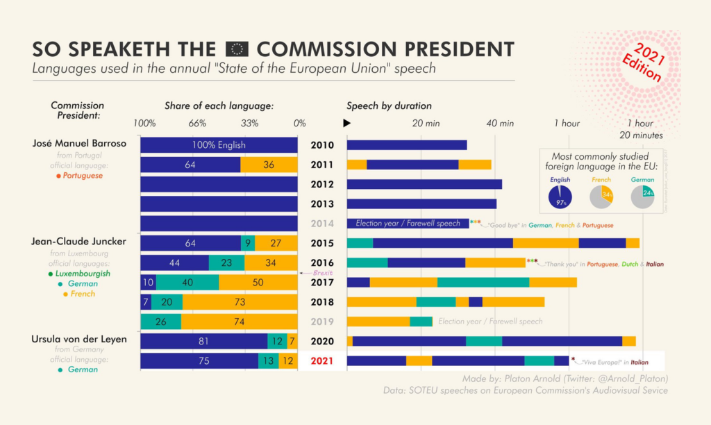
This election in Germany will be special, with Angela Merkel stepping down as chancellor after 16 years. How did Germany change in the meantime? Some news organizations tried to find out:
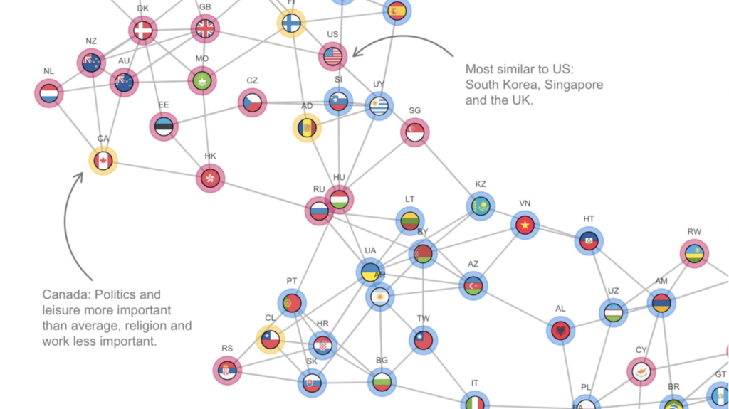
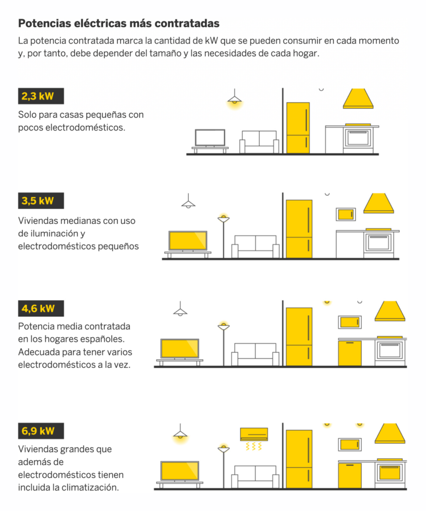
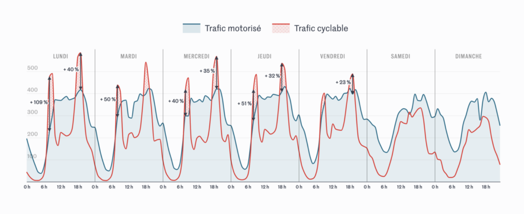
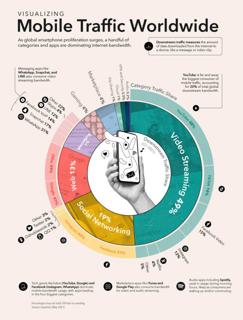
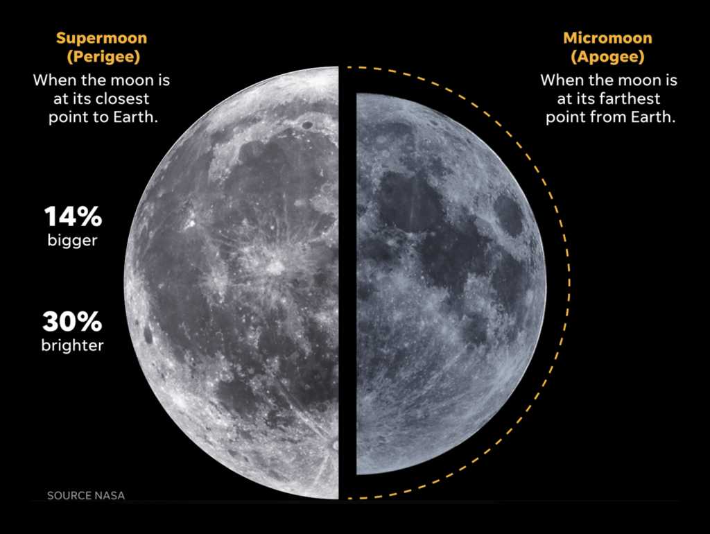
Lots was visualized besides the mentioned topics. Here’s a colorful mix of electricity usage, sports, mobile usage, the size of the moon, and how close countries are to each other when it comes to what they value:
Information is Beautiful will publish a new book in January 2022: Beautiful News. Each day for a full year, they visualized data that showed positive news about the world, and the book will feature these visualizations. Find them on Instagram.
Help us make this dispatch better! We’d love to hear which newsletters, blogs, or social media accounts we need to follow to learn about interesting projects, especially from less-covered parts of the world (Asia, South America, Africa). Write us at hello@datawrapper.de or leave a comment below.
Rose Mintzer-Sweeney
(she/her, @rosemintzers) is a data vis writer on Datawrapper's communications team. She likes words, numbers, pictures, and all possible combinations of the same. Rose lives in Berlin.
Lisa Charlotte Muth
(she/her, @lisacmuth, @lisacmuth@vis.social) is Datawrapper’s head of communications. She writes about best practices in data visualization and thinks of new ways to excite you about charts and maps. Lisa lives in Berlin.


Comments