Data Vis Dispatch,
September 6

The best of last week’s big and small data visualizations

Welcome back to the 60th edition of Data Vis Dispatch! (Usually) every week, we’ll be publishing a collection of the best small and large data visualizations we find, especially from news organizations — to celebrate data journalism, data visualization, simple charts, elaborate maps, and their creators.

Until the end of September, we’re taking a little late-summer break and publishing the Dispatch only every other Tuesday. You can expect the next Dispatch on September 20.

Without further ado, here’s the best from last week (and a bit from the week before). Recurring topics include the floods in Pakistan, the droughts and heat in a lot of other parts of the planet, and the increasing energy costs.

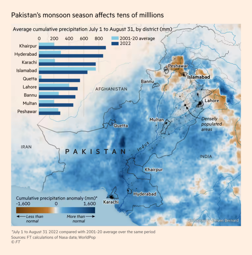
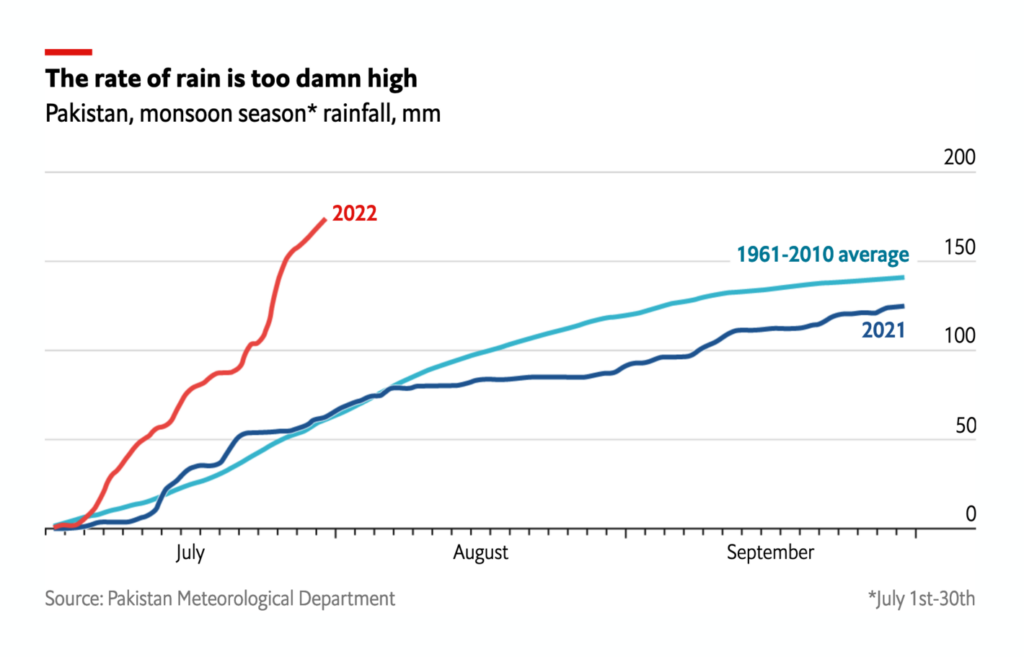
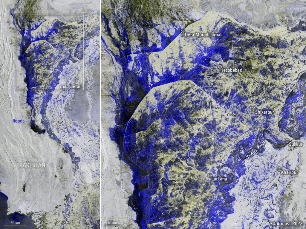
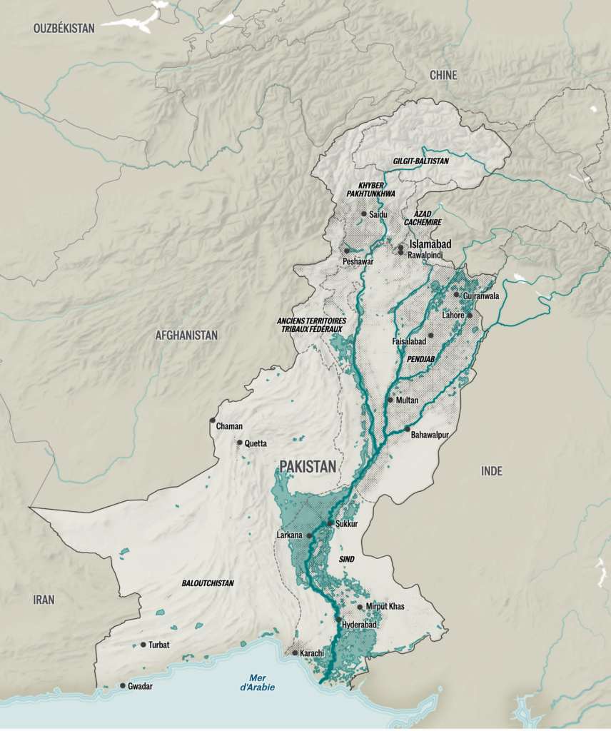
First, the devastating floods in Pakistan, caused by heavy monsoon rains in August:

The Washington Post: See the scale of Pakistan’s flooding in maps, photos and videos, August 31
Reuters: Floods in Pakistan, September 1
Financial Times: Climate graphic of the week: One-third of Pakistan submerged by flooding, satellite data shows, September 5
The Economist: Why are Pakistan’s floods so bad this year?, August 31
The European Space Agency: Pakistan inundated, September 1
Le Monde: Le Pakistan ravagé par le changement climatique, September 2

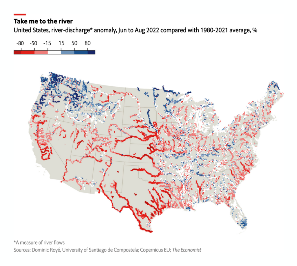
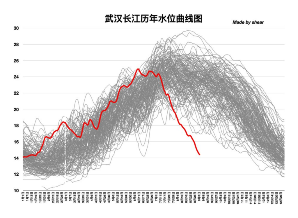
While Pakistan gets too much rain, the U.S., Europe, and parts of Asia get too little. Several news organizations reported on droughts and rivers with low water levels:

USA Today: Nearly half the US has endured a drought in 2022. Will it get worse? Yes, experts say., August 30
The Economist: How severe drought is affecting much of the northern hemisphere, August 25
Le Monde: Infographie : la Loire, un fleuve au ralenti, August 27

Süddeutsche Zeitung: Europas Flüsse: Trocken wie selten zuvor, August 26
Jim Yang: “The water level of the Yangtze River in Wuhan has reached an unprecedented low point in the same period in more than 150 years!”, September 4 (Tweet)

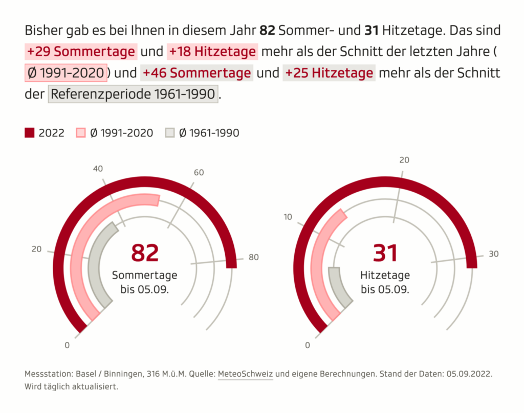
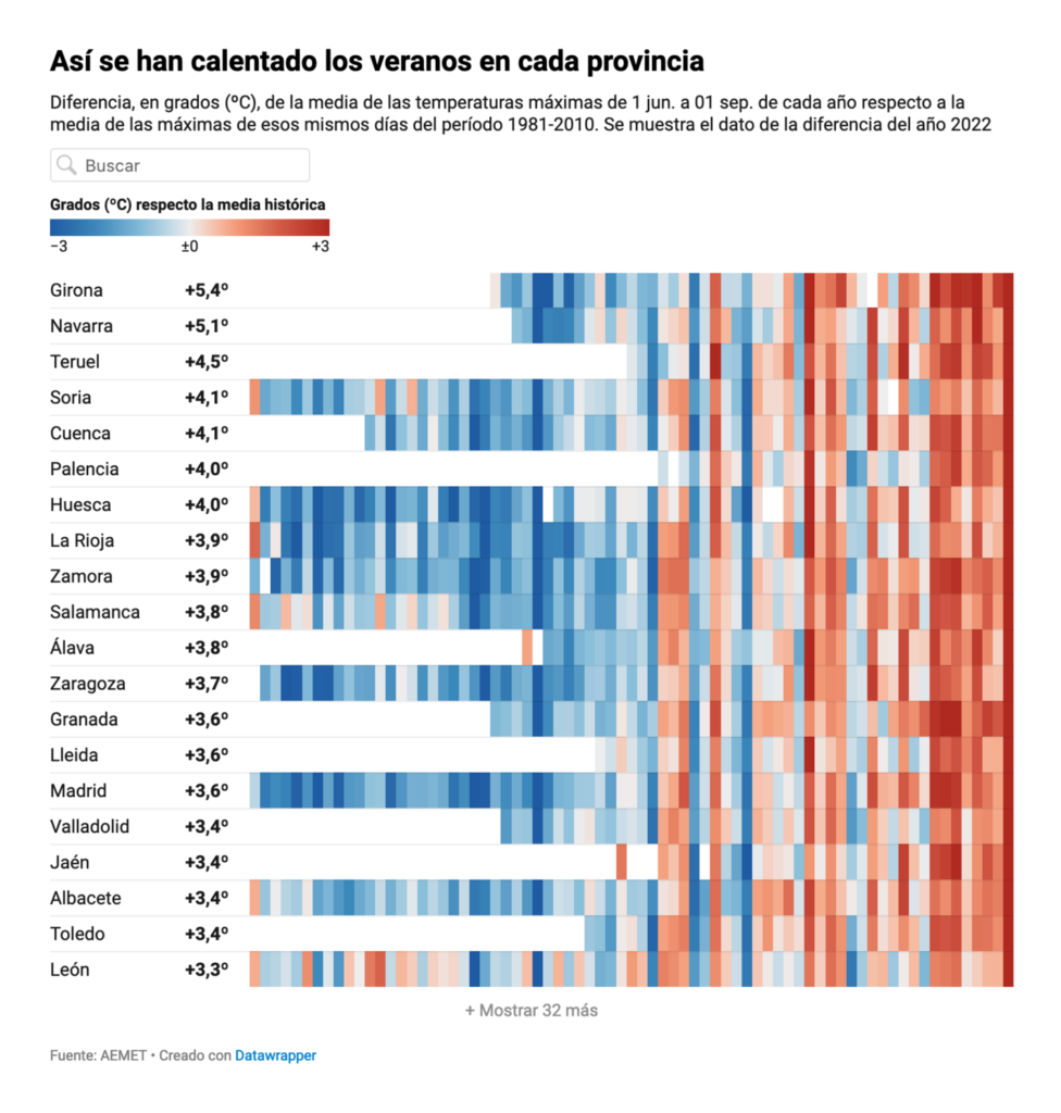
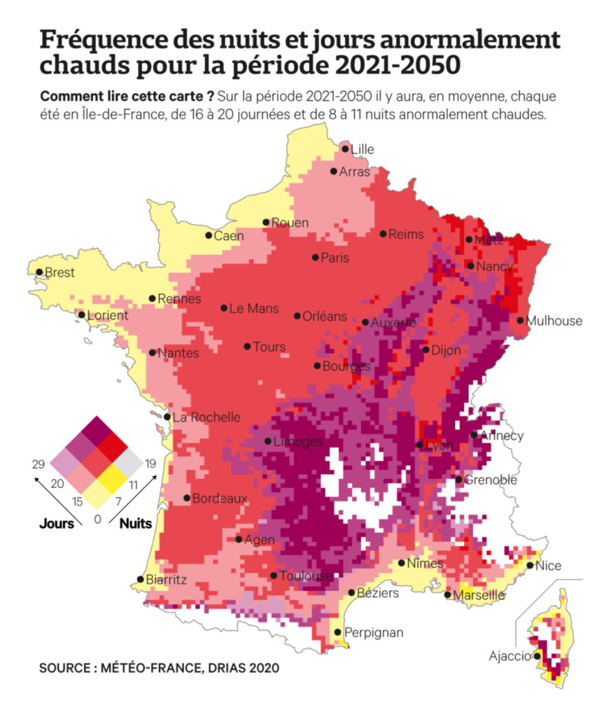
Like heavy rainfalls and droughts are, hot temperatures is another consequence of climate change that the northern hemisphere had to deal with this summer. The Swiss broadcasting company SRF launched a daily updating climate dashboard, while Hungarian visualization team Atlo shows how Hungary’s weather might change until the end of the century:

SRF: Am Puls des Planeten – Zahlen und Fakten zur Klimakrise, August 30
Atlo: Magyarország klímája ötven év múlva, September 5
Scientific American: This Hot Summer Is One of the Coolest of the Rest of Our Lives, August 31
elDiario.es: Calor de récord en media España: el verano más caluroso en 31 provincias desde que hay registros, September 3
Les Echos: Climat : la France va compter de plus en plus de régions chaudes, August 30

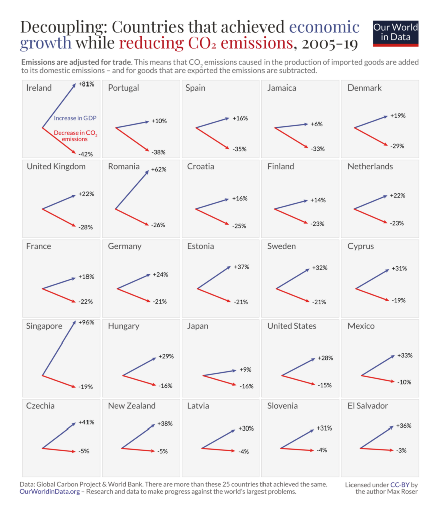
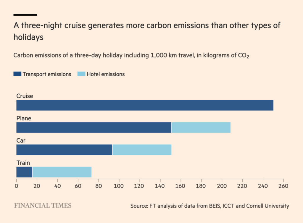
To reduce CO2 emissions, we don’t need to lower ecomic growth, as many countries have demonstrated (but we should give up on cruises):

Max Roser: “More and more countries achieve to decouple economic growth from CO₂ emissions. Just made this new chart that shows the evidence for 25 countries. Growth is up, emissions down.”, September 3 (Tweet)
Financial Times: The cruise ship conflict: Europe’s port cities vs floating hotels, August 28

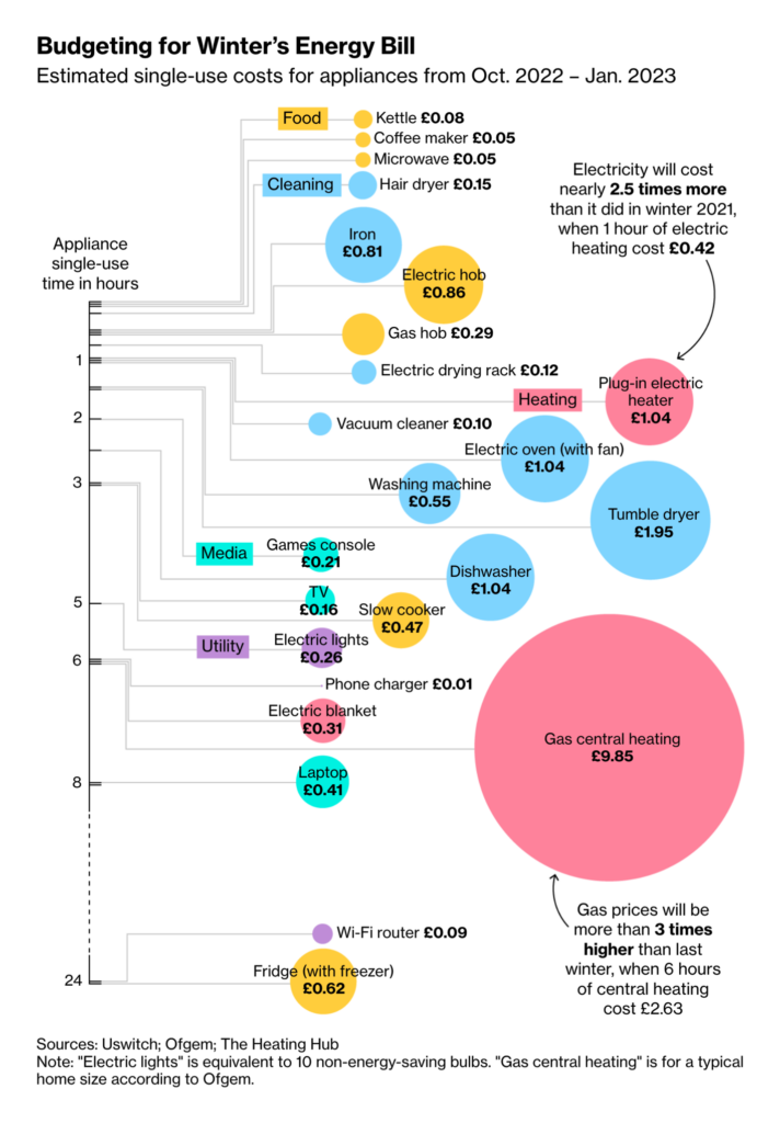
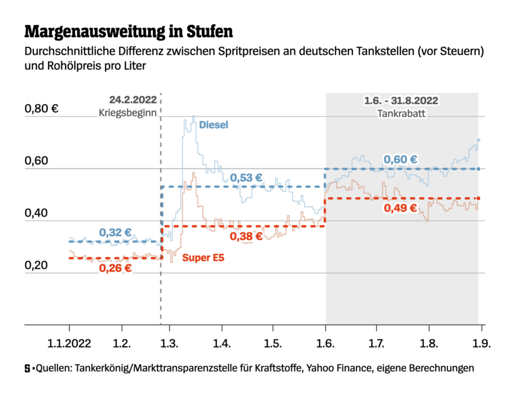
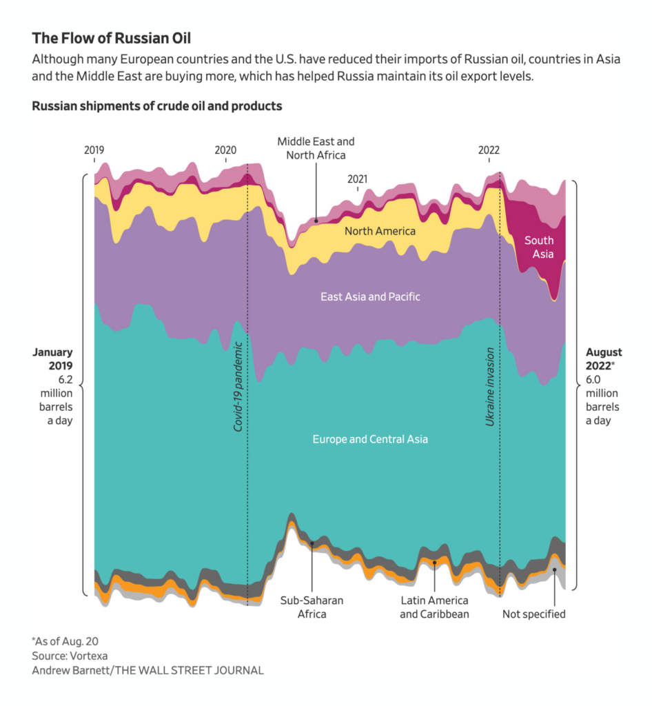
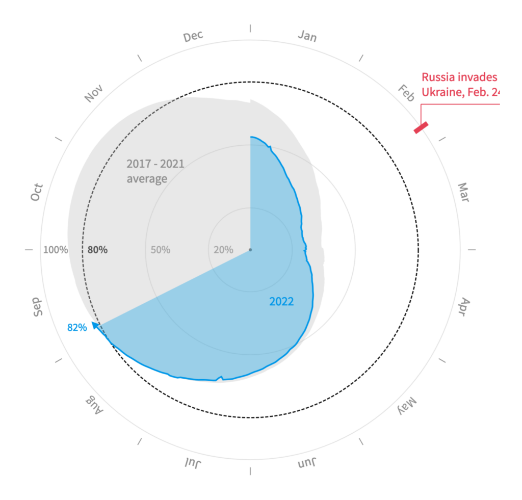
After summer comes winter – and energy becomes a more important topic. Consumers face high prices for gas and electricity, while EU countries try to fill their gas storages despite the Russia-Ukraine war:

Bloomberg: How Much Will It Cost to Run Household Appliances In the UK?, September 2
SPIEGEL: Warum verstromen wir in Deutschland immer noch Gas?, August 30
Le Figaro: Dans quelles communes consomme-t-on le plus d’électricité ?, August 26
SPIEGEL: So hoch sind die Profite der Mineralölwirtschaft durch den Tankrabatt, September 1
The Wall Street Journal: Russia Confounds the West by Recapturing Its Oil Riches, August 29
Reuters: 81.9% of EU gas storage is filled., September 4

When it comes to demographics, we learned that the Chinese population could be down to 800 or even 500 million people by the end of the century:

The Wall Street Journal: China’s Economic Slump Bodes Ill for Birth Numbers, September 4
John Burn-Murdoch: “Lots of attention (rightly) on projections that China’s population might fall by roughly half by end of this century, but not sure people appreciate quite how widespread this dynamic is. More than a dozen countries (most of them in Europe) are set to shrink even faster.”, September 5 (Tweet)

Financial Times: The growing link between values and earnings may spell trouble, September 2
The Economist: America’s fight over abortions has fired up women voters, August 30

The terrible conflicts in the Ukraine and Taiwan brought us beautifully designed maps:

The New York Times: How China Could Choke Taiwan, August 25
Reuters: Six months of the war in Ukraine, August 24
Reuters: Zaporizhzhia on the frontline, September 1

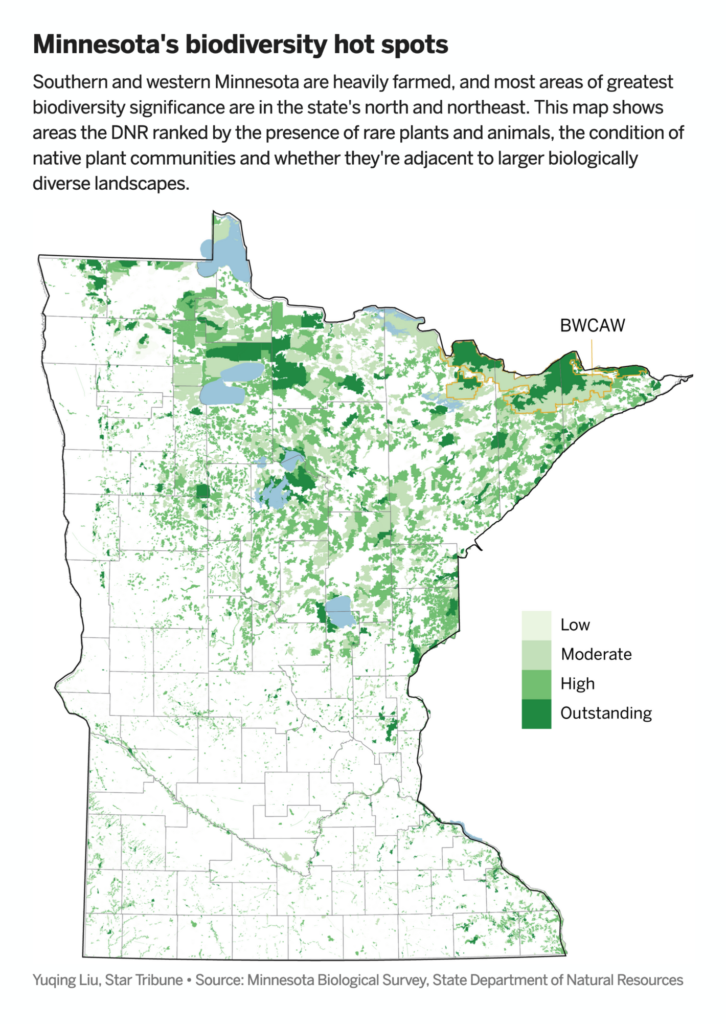
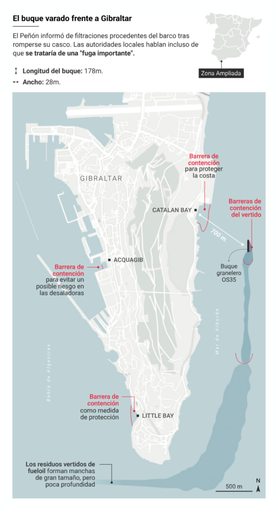
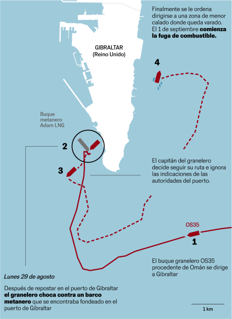
And we got more maps thanks to environmental issues, like Minnesota’s declining biodiversity – and the leak of Diesel cargo by a semi-sunken ship off the coast of Gibraltar in Spain:

Star Tribune: The sixth mass extinction threatens Minnesota’s natural legacy, September 4
El Confidencial: El alcalde de La Línea alerta de que el vertido del OS35 ya ha llegado a las playas del municipio, September 2
El País: Gibraltar confirma una fuga “importante” de combustible del barco semihundido junto a su costa, September 1

Here’s some better news: We found so many visualizations about sports that it gets its own section this week 🎉!

Washington Post: The wins, losses and comebacks that made up Serena Williams’s career, August 28
Star Tribune: What makes Justin Jefferson just so good?, September 4
De Tijd: De Super League? Op de transfermarkt is die er al, September 2
The Wall Street Journal: New York Yankees’ Aaron Judge Slugs His Way Toward Home Run Milestone, September 6

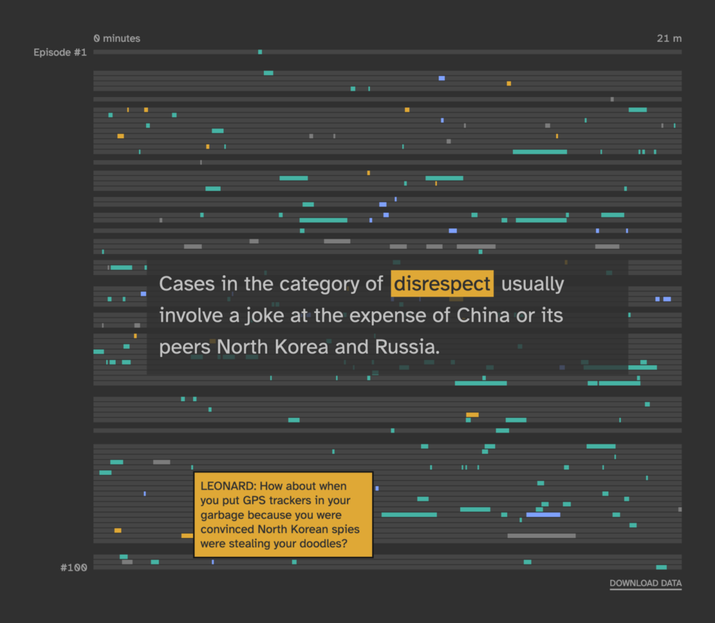
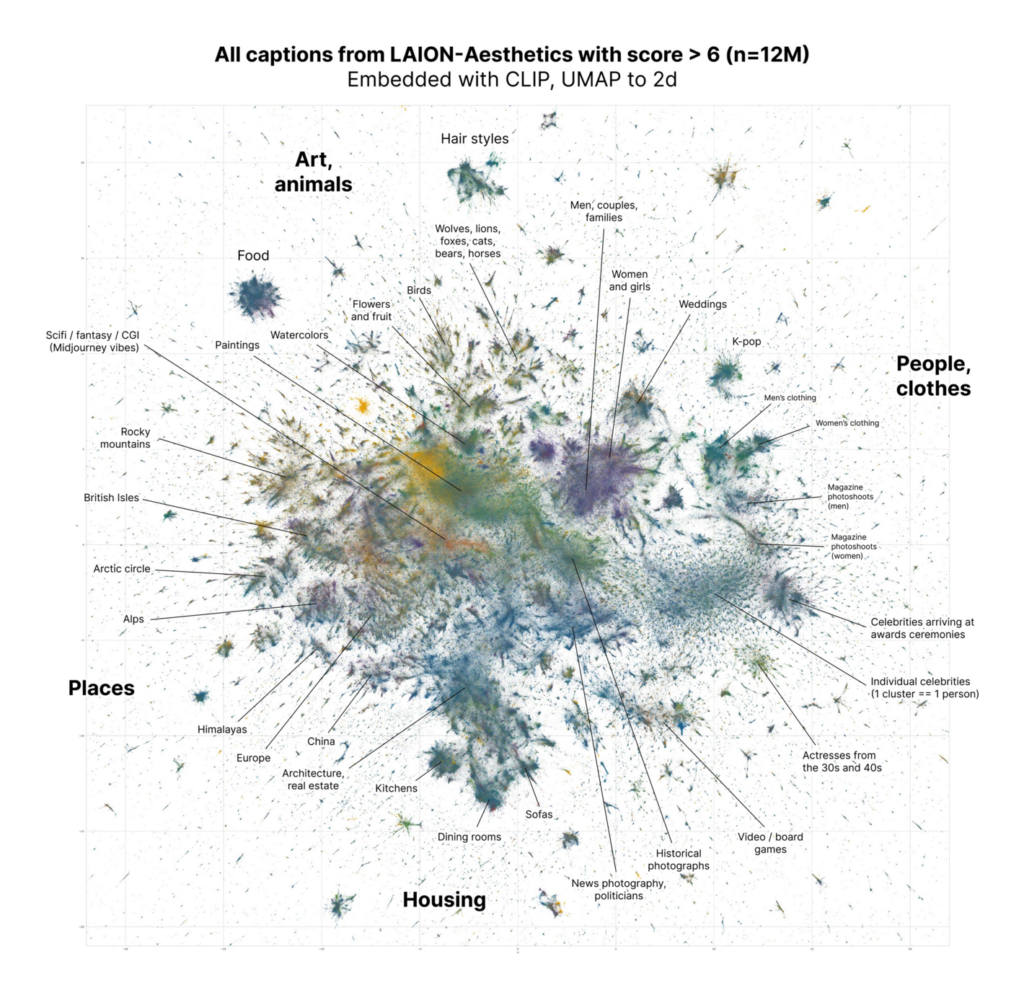
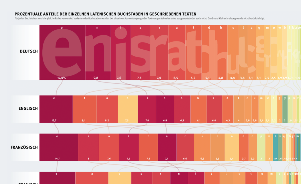
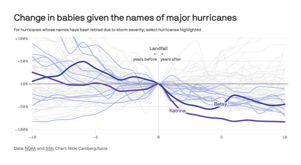
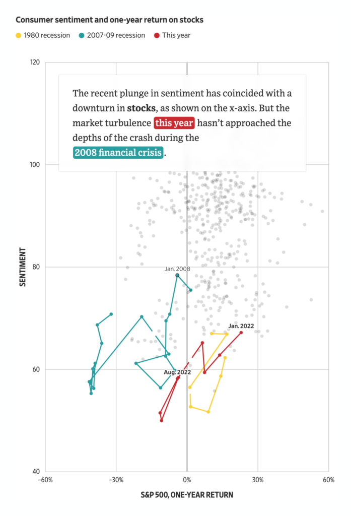
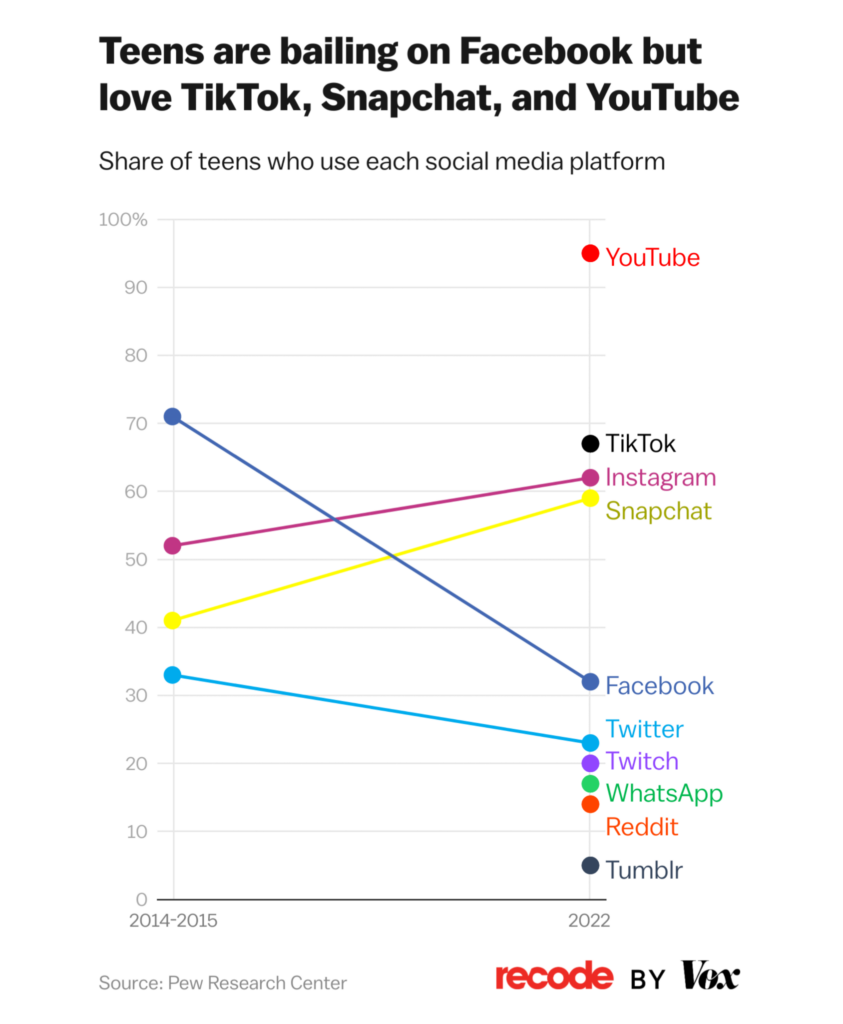
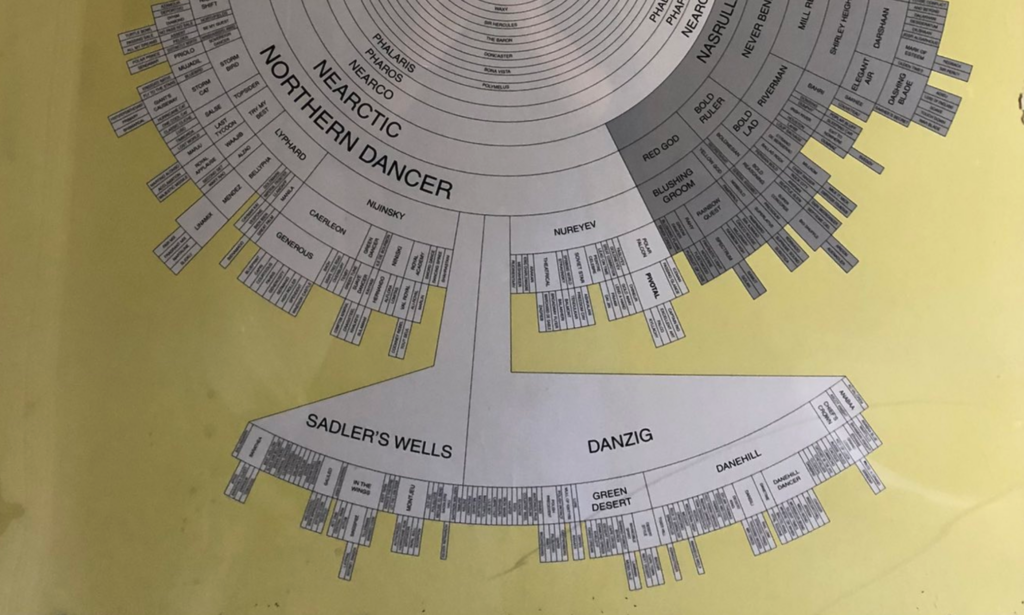
And in our miscellaneous section, we got some interesting visualization types for you: A rotated flow chart, a hyper-detailed network graph, a connected scatterplot, a Marimekko chart and much more:

Reuters: Back to the Moon, August 26
The Washington Post: How second-choice votes pushed a Democrat to victory in Alaska, August 31
The Pudding: The Big [CENSORED] Theory, August 30
David McClure: “Inspired by various recent efforts to make sense of the text2img datasets – here’s all 12M captions from LAION-Aesthetics with score > 6, embedded with CLIP and UMAP’ed to 2d. Color is the domain of the image URL.”, September 1 (Tweet)
Berliner Morgenpost: Schreib mal ein „e“…, September 4
Axios: How hurricanes wreck baby names, August 28
The Wall Street Journal: Consumers Feel Worse Now Than They Did During Covid Lockdowns, September 4
@flotsam: “A shaded relief map of Bolivia. #rayshader adventures, an #rstats tale”, September 3 (Tweet)
Recode: Where we’re spending our screentime, in 3 charts, August 31
Bloomberg: The Bitter Fight For Unions at Starbucks, One Year Later, August 30
Nathan Yau: Where We Find Meaning in the Everyday, September 1

What else we found interesting

The New York Times: What the F.B.I. Seized From Mar-a-Lago, Illustrated, September 3
The Washington Post: Our visual guide to helping the planet in your own backyard, September 6
Tobias Sturt: “Amazing piece of horse breeding data viz in this hotel gents, including an inception inclusion of the only race horse I know of with an isotype name: Potoooooooo (pot-eight-o’s)”, September 4 (Tweet)

Applications are open for a…


Help us make this Dispatch better! Write us at hello@datawrapper.de with your feedback, or leave a comment below.

Want the Dispatch in your inbox every Tuesday? Sign up for our Blog Update newsletter.

The next Data Vis Dispatch will come out on September 20.

Comments