This article is brought to you by Datawrapper, a data visualization tool for creating charts, maps, and tables. Learn more.
Data Vis Dispatch, September 5
The best of last week’s big and small data visualizations

Welcome back to the 109th edition of Data Vis Dispatch! Every week, we’ll be publishing a collection of the best small and large data visualizations we find, especially from news organizations — to celebrate data journalism, data visualization, simple charts, elaborate maps, and their creators.
Recurring topics this week include pandemic recovery data and the end of summer.
Let’s start this week with a look at four especially beautiful animated stories from the New York Times:
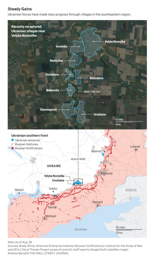
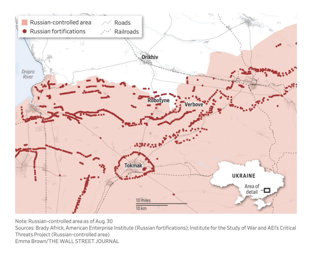
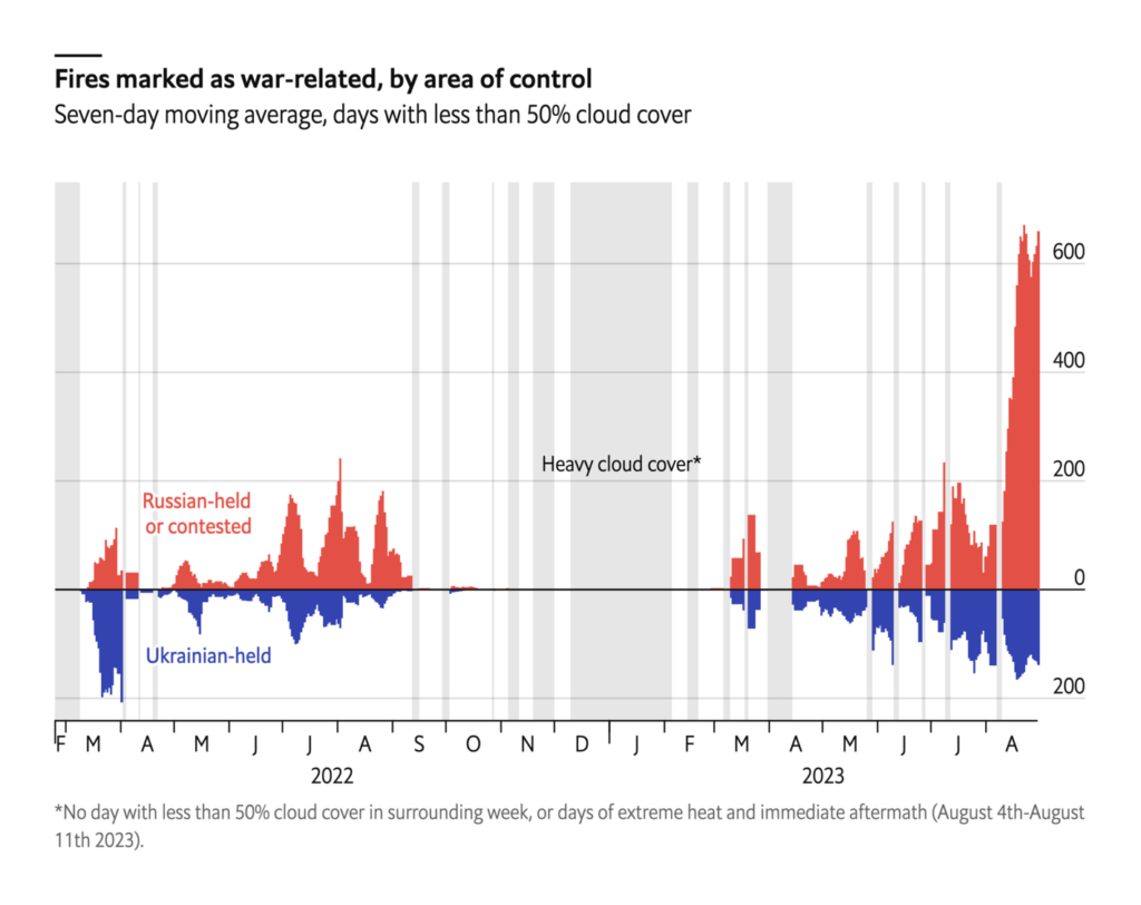
The Wall Street Journal published a series of detailed visualizations on Russian fortifications in southern Ukraine:
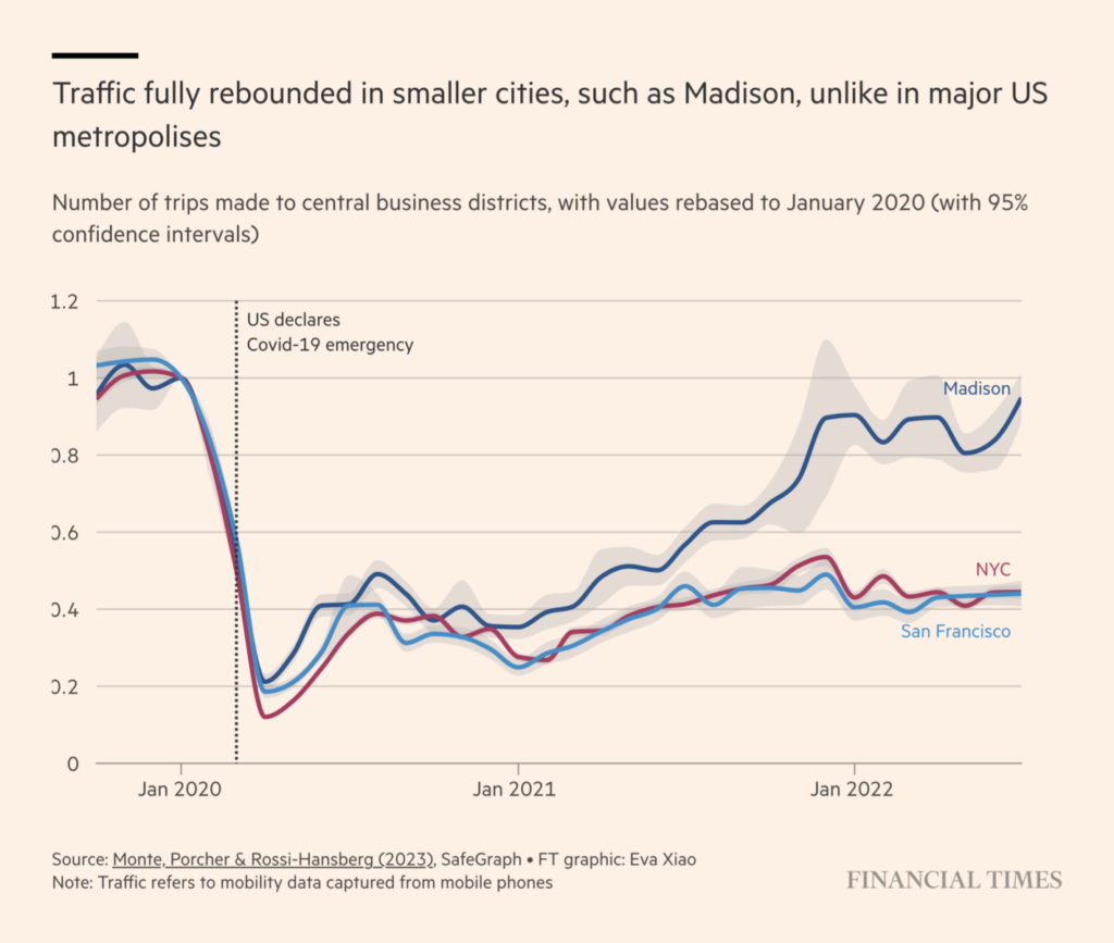
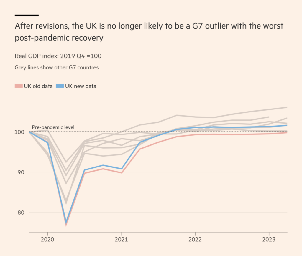
While the Financial Times highlighted new and newly revised data on the pandemic-era economic recovery:
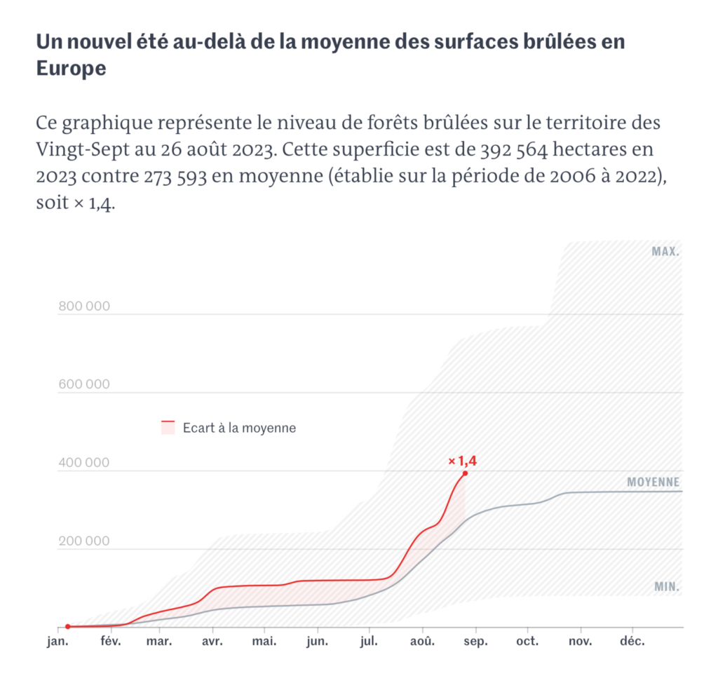
We had another week of maps and charts on this summer’s wildfires:
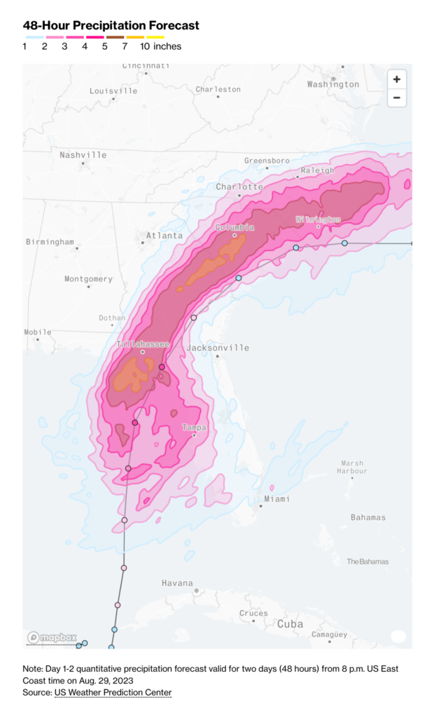
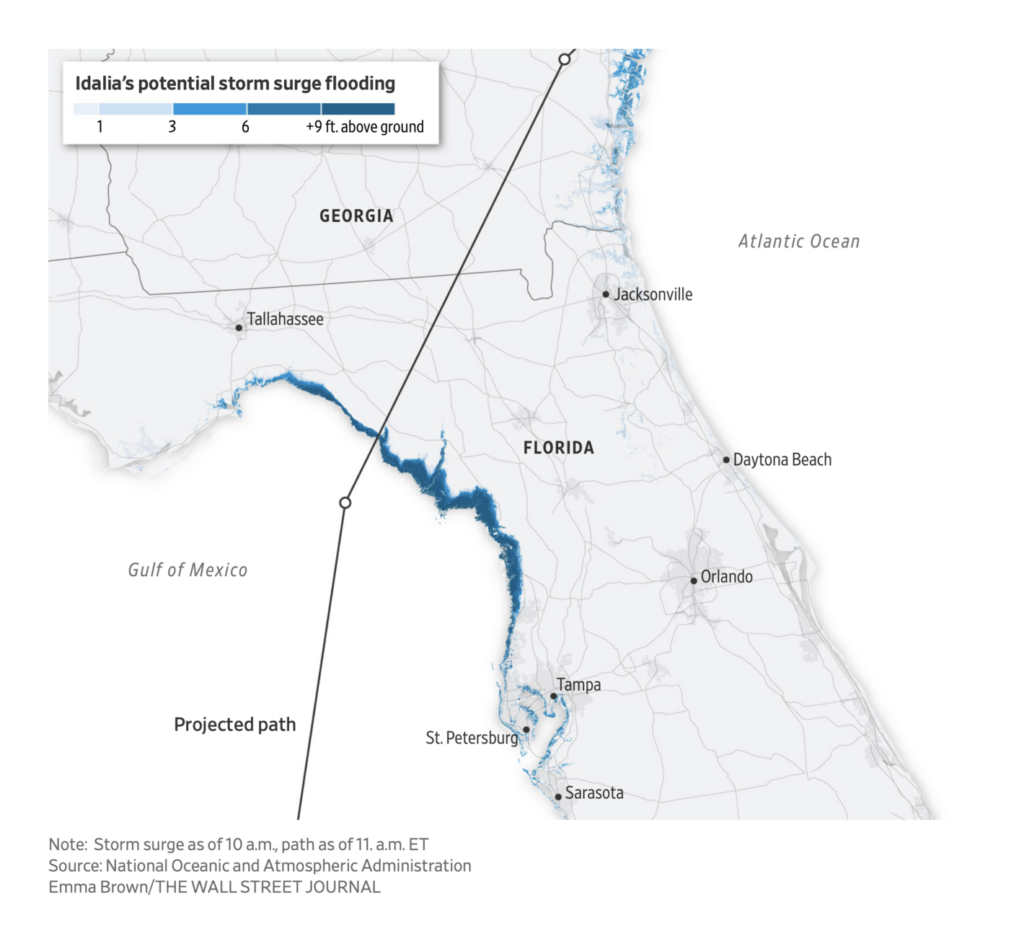
But summer is coming to a close — which means hurricane season in the Atlantic:
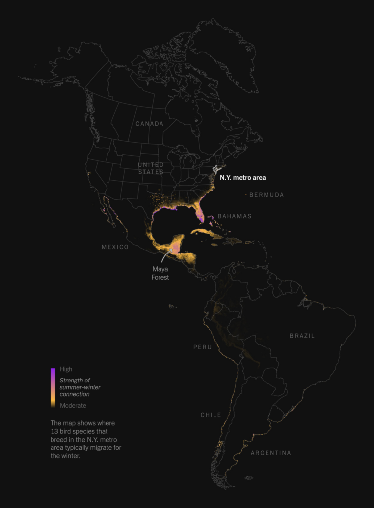
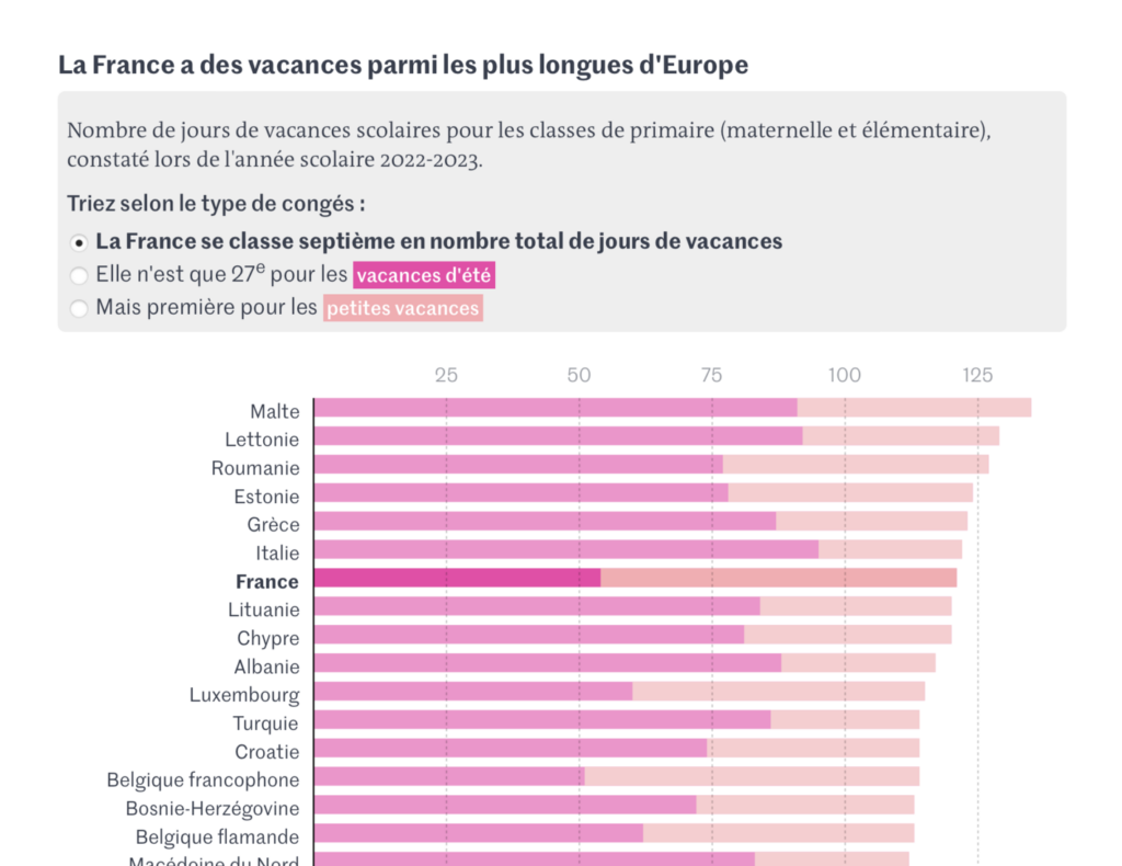
As the seasons change, migratory birds fly back to their northern habitats and French schoolchildren return to their desks:
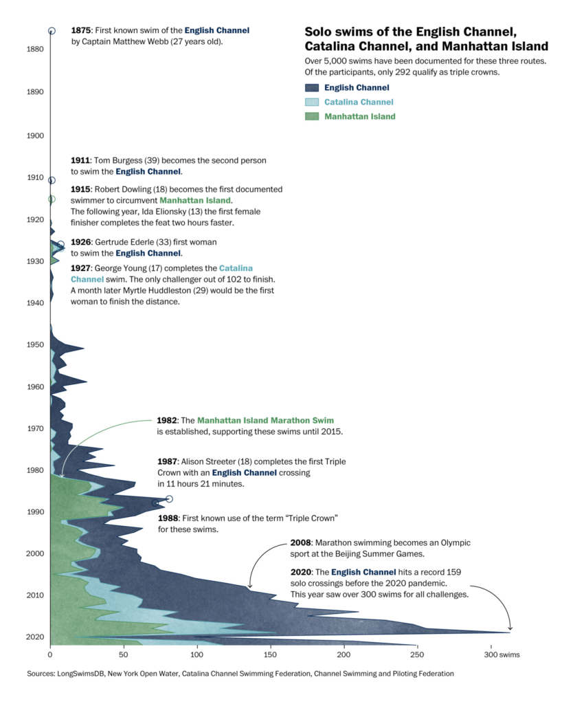
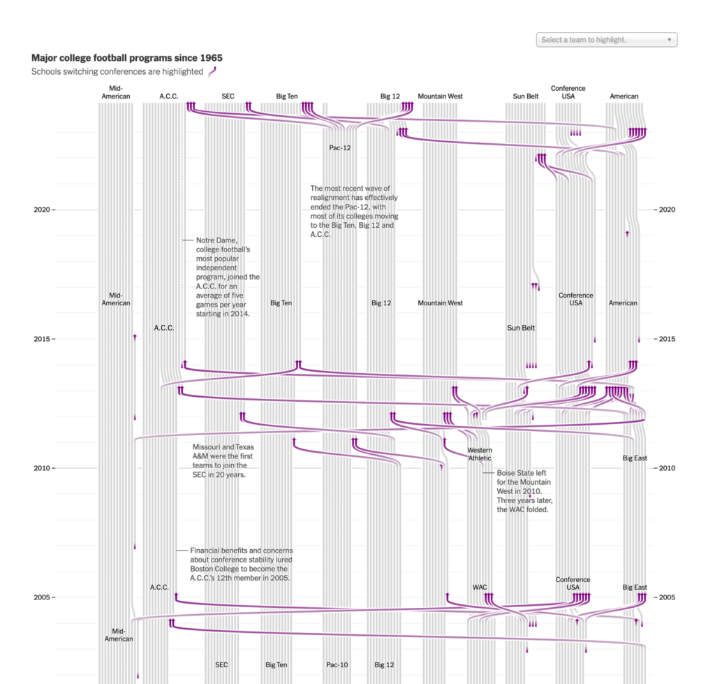
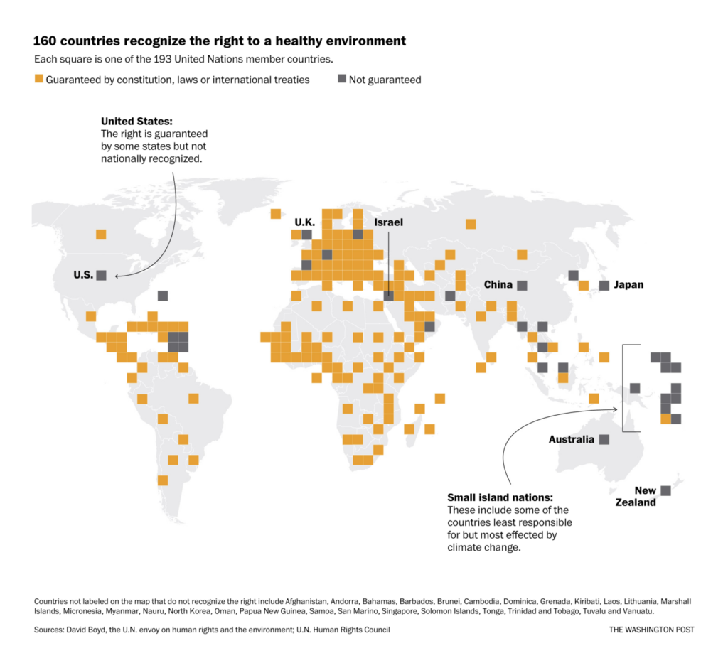
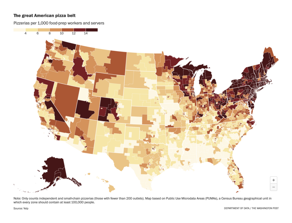
Other standout charts and maps covered everything from open water swimming to environmental rights to America’s “Pizza Belt”:


What else we found interesting
Applications are open for…
- A visual journalist at FiveThirtyEight
- Two graphics editors at the Financial Times
- A visual projects editor at The Guardian
- An elections graphics reporter and an elections news apps developer at NPR
- Nominations for Information is Beautiful special awards
Help us make this dispatch better! We’d love to hear which newsletters, blogs, or social media accounts we need to follow to learn about interesting projects, especially from less-covered parts of the world (Asia, South America, Africa). Write us at hello@datawrapper.de or leave a comment below.
Want the Dispatch in your inbox every Tuesday? Sign up for our Blog Update newsletter!


Comments