

New: Automatically label data points in line charts
September 18th, 2024
3 min
This article is brought to you by Datawrapper, a data visualization tool for creating charts, maps, and tables. Learn more.
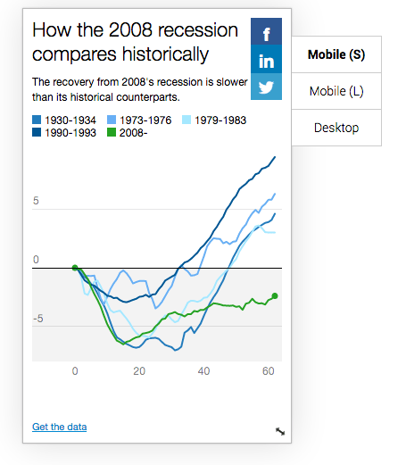
For most media outlets, smartphone readership has now outgrown readership on traditional desktop or laptop computers. Today, Datawrapper launches 3 updates to make all charts mobile-first by default:
There’s nothing you have to do or change to activate these updates. They will be applied as default for all charts published with Datawrapper. To see how you can use the new features please check out a specific post the Datawrapper Academy.


Comments