

New: Keep your account secure with two-factor-authentication
March 27th, 2024
3 min
This article is brought to you by Datawrapper, a data visualization tool for creating charts, maps, and tables. Learn more.
Our founder Mirko Lorenz on how Datawrapper came to be

Ten years ago today, Datawrapper launched its first public beta. Our founder and chairman Mirko Lorenz tells the story of how Datawrapper came to be — and hears from four people who were closely involved in the beta version’s success.
Ten years ago, I was desperate. Frustrated. Tired, after almost two years of public speaking, thinking, describing, pushing data-driven journalism. In 2010, I had initiated a round-table conference in Amsterdam to discuss how we could use data in the newsroom, where some other desperate souls showed up. All of them were the only data people in their organizations. They were coming from The New York Times, The Times, The Guardian, they were journalists and scientists working for universities.
I like to innovate, to think about how something could be done differently and better. I don’t care about how and why things are the way they are, if there is a better way. In journalism, the use of data was too complicated in 2012. Creating one chart, even just a simple line or bar chart, would mean hours of work for the graphics department. Hours!
Creating one chart would mean hours of work for a graphics department in 2012. Hours!
– Mirko Lorenz
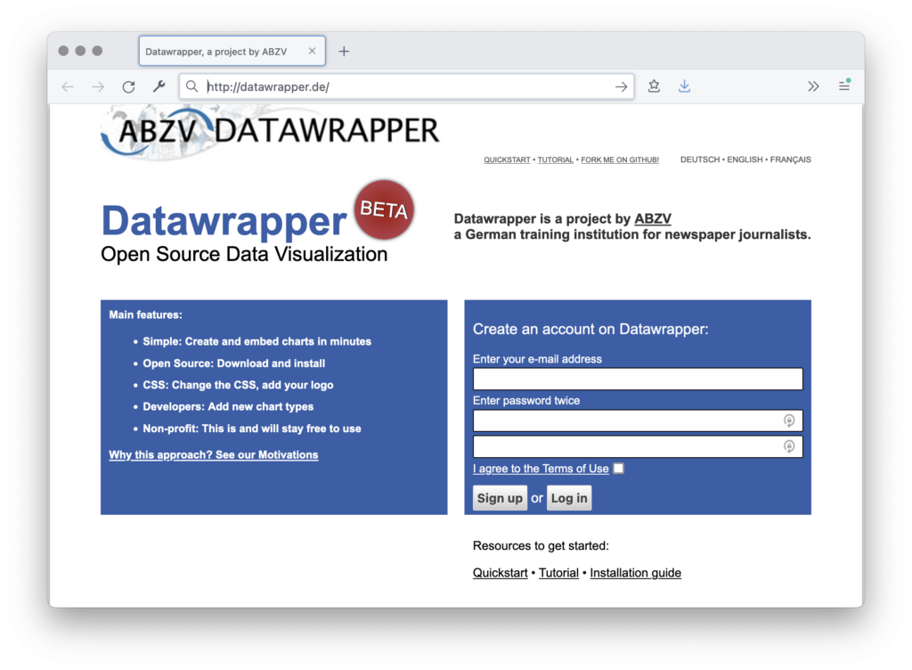
“Why not use new visualization libraries like Raphaël, the new D3.js, to make this much, much simpler?” I thought, and scribbled the name “Datawrapper” on a piece of paper. I secured the .de domain the same night. Then we even got initial funding from ABZV, a training institution for journalists, where I worked as a trainer.
The initial reaction from peers was: “Forget it. It’s too complicated. You can’t do that. Charts change based on the data. There is so much to consider, the layout, the colors, the data, the viewpoint. You will never finish such a project. You can not simplify this — because it is inherently complicated.”
This is all true. But here we are. The initial version was simple, but worked. I announced it on Twitter on February 23, 2012:
Every week there were more users and more charts created. Several newspapers started using the beta. We had no marketing, just word-of-mouth.
Thank you, Nicolas, for coding the beta version. Thank you, Sonja, for creating and publishing the first Datawrapper chart used by a newspaper. Thank you, Andy, for spreading the word. Thank you, Simon, for using the early version of the tool on the Guardian Data Blog.
Let’s hear from them:
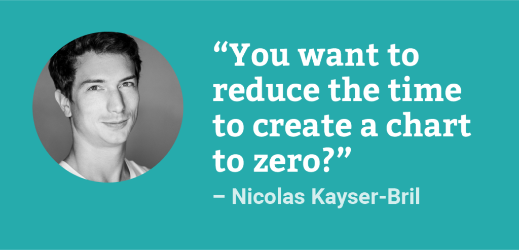
Nicolas Kayser-Bril, a pioneer data journalist, coded the initial public demo. We discussed the app a lot in the process. The critical question was: What scope should the project have? At one point, Nicolas said: “I think I get it now. You want to reduce the time to create a chart to zero?” A few days later, he came up with a version based on Raphaël. Today he works as a reporter for Algorithm Watch.
“I never thought that the prototype I coded ten years ago would turn into the best charting tool available. That so many journalists, not all of them data-minded, produce thousands of adequate, legible charts daily makes Datawrapper one of the most important weapons in the fight to restore sanity.”
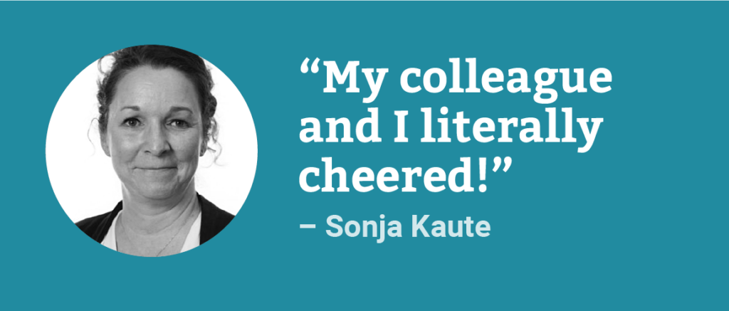
A few hours after the launch and its announcement on Twitter, journalist Sonja Kaute created and published the first chart for a newspaper. Back in 2012 she worked for Ruhr Nachrichten, a German regional newspaper.
“I remember my ‘Datawrapper moment’ fondly and well. I was working at the online desk of Ruhr Nachrichten and my colleague and I loved to experiment with new tools! However, neither of us were data journalists and we were constantly under a lot of time pressure. It was frustrating: we often failed to create charts because the available tools were too complicated, and you had to invest a lot of time without knowing if you would get any results. Our time and our technical know-how were simply not sufficient.
Then Mirko Lorenz announced on Twitter that a new tool was available. Datawrapper promised to enable all journalists to create charts in just a few steps. I was eager to try it out right away! And indeed: It took me only a few minutes to create a simple line chart on a topic that was currently in the news. That was a real bright spot at the time — my colleague and I literally cheered!
Datawrapper enabled me to create many data-driven stories in the years that followed. That caught the attention of others as well, and not just at Ruhr Nachrichten.”

Even back then, the blog Visualising Data was already the go-to place for data vis people to get updates. Andy wrote a note about the launch of Datawrapper a day after I announced it on Twitter. He says today:
“I am so excited to see Datawrapper reach this magnificent 10-year milestone. It has been a pleasure to have had a ring-side seat to witness this decade-long story of growth and evolution, all down to the efforts of some of the smartest minds and sharpest thinking in the data visualisation field.
From the outset, it would be reasonable to describe Datawrapper as *just* a tool, helpfully enabling the creation of elegant digital visualisations for the web.
A decade later, the product we now see has matured far beyond that initial scope, expanding its representation options and considerate design features. Quite unlike many other data visualisation applications, where the tool and the underlying craft of visual communication sit apart, Datawrapper synthesises these into a complete package. To grasp Datawrapper is to grasp data visualisation. There are no gimmicks. Nothing is superfluous: everything included within the product and through the rich resources available alongside is entirely centred on equipping users with the means necessary make the best visualisations possible.”
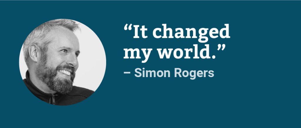
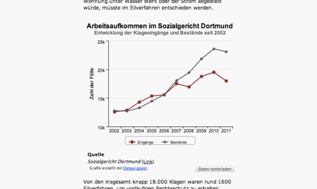
Simon was and is a pioneer in data journalism. In 2012, he was the editor of the data blog at The Guardian. Simon took a pragmatic approach: Each day, he aimed to extend reporting by looking at the most relevant numbers and making them accessible — often using the beta of Datawrapper in hundreds of iterations. This very public usage helped initially establish the tool.
“Datawrapper has made dataviz possible for everyone — it changed my world by being able to quickly create classy, embeddable visuals on the fly. And today, the next generation of data journalists in my class use it too. I love that this tool, created by journalists, for journalists, is there to change the world for everyone. And it’s free!”
I am grateful for the experience of the past ten years: The incredible rise in usage of Datawrapper. The fact that thousands of journalists, analysts, researchers, and students use the tool. That we have a free offering which is usable by everyone. The experience of working with a team of brilliant people. Working with Gregor Aisch for (almost) ten years. With David Kokkelink since 2015. With Exo, Florian, Ivan, Lisa, Anna, Elana, Hans, Fabian, Simon, Daniela, Jakub, David, Aya, Eddie, Rose, Margaux, and Marten, who joined one after the other starting in 2017.
We are still not done. The last ten years came with excellent results. Thanks, everyone. And now, onwards: For the general problem of data communication and usage is all but solved.


Comments