What we built for you in 2024

It’s been a busy year at Datawrapper! Since the start of 2024, we’ve developed two new visualization types, launched a PowerPoint add-in, introduced text annotations to a whole new family of charts, and made it easy to collaborate with comments, edit history, and an improved archive in our app.
We asked the designers and developers who worked on these features (and many more!) to tell us about the year from their perspective. What are they most proud of? What were the challenges and surprises? Here's what they had to say.
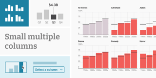
We started the year with the launch of small multiple line charts, followed by arrow maps just in time for the U.S. election.
Multiple Lines and Arrow Maps

Adding annotations to Multiple Lines was challenging! We wanted to enable users to repeat text annotations and range highlights across panels and to easily drag annotations between panels to rearrange them. It was worth it, though: We knew from a user survey that many users wanted to have small multiple lines, but the positive feedback that we received exceeded our expectations. It was amazing to see so many users put the new chart type to great use in very creative ways immediately after launch.
Ivan, vis developer

When it comes to arrow maps, I was excited to find that a lot of the functionality of the existing size legend could easily be reused for the arrow legend, although there were quite a few details to iron out. And after the U.S. election, we spotted some embellished Datawrapper arrow maps in printed publications, which was pretty cool!
Elana, co-CEO and head of vis development
Annotations in bar, range, and dot charts


Annotations are so useful — we knew we had to add them to bar charts as well! The most enjoyable part here was building on top of the solid core of annotations from other chart types that we already knew work well. We didn’t have to reinvent the wheel.
Ivan, vis developer
The second big theme of the year? Collaboration. At our Unwrapped conference in March, we launched both live collaboration and edit history.
Live collaboration: See who else is editing a visualization


Working on the initial prototype and seeing that it was possible to add such an amazing feature to a large application like Datawrapper was a big motivation. There were a lot of technical challenges throughout the project, but the whole process of solving these was very motivating.
Pascal, app developer

It was quite a challenge to design a presence indicator that shows where other users are in the interface, because of the complex and very versatile UI of Datawrapper. We wanted to inform users where their colleagues are without making it too distracting. That's why we didn’t go for the cursors you might know from other apps, but for a small, nonintrusive bubble that appears next to the control the other user is editing.
Alex, designer

This feature required work on lots of different fronts. Besides implementing the presence indicator, we had to solve what happens when multiple people make opposing edits at the same time. Bringing all the different parts together was scary and challenging but also so satisfying when they eventually did fall into place.
Marten, head of app development
Edit history: Restore past versions of your visualizations


With live collaboration, we saw more scenarios where users might want to go back or compare their visualization with an earlier version, so we prioritized edit history to be released at the same time.
But since editing a visualization is such a common operation in Datawrapper, we had to plan for an enormous number of versions stored from day one. This meant we had to come up with an architecture to support high data volumes from the get-go, rather than gradually ramping up in usage.
David, co-CEO
Big improvements to our visualization archive


The archive is one of the most important features of Datawrapper. Improving it meant we could facilitate the workflow of our users, so they now need to spend less time organizing and searching for visualizations and get more time to build them.
Julian, app developer

What surprised me was how many distinctly different workflows people have that all feel completely natural to them. What makes sense for an individual user can be completely different than what makes sense for a team of ten, or a team of hundreds. Thinking through all these scenarios and making the solution powerful enough for every case while keeping it easy and understandable for simpler scenarios was a very fruitful process.
David, co-CEO
Comments & notifications


Comments and notifications added a whole new layer of interactivity to Datawrapper! It was nice to be able to start without many existing constraints in terms of implementation.
Toni, app developer
Another big project and new territory for us was developing a free add-in to bring Datawrapper into PowerPoint.
Datawrapper PowerPoint integration: Embed & create visualizations directly in PowerPoint


I found it satisfying to be able to bring the entire Datawrapper experience into PowerPoint. Doing so required pushing the Office.js API to its limits — we had to come up with a lot of clever workarounds to bring this integration to life. And it was great to see how much usage love the add-in received almost immediately after launch — I thought it would be a much more niche or power-user type feature than it ended up being.
Jack, app developer
Our existing maps and chart types got important updates too.
Map cropping, inset maps and pattern overlays

While the primary use case we had in mind for the pattern overlay was election reporting, it was great to see the feature prove useful for all sorts of use cases. The user experience here was a challenge — in particular, finding the right balance between allowing multiple patterns while not overly encouraging it (since it can lead to hard-to-read outcomes), and nudging users to apply the feature in the "correct" way, via an additional column in the dataset.
Elana, co-CEO and head of vis development

Crop to data is a simple toggle in choropleth and symbol maps — but as in much of Datawrapper, there’s a lot of complexity hidden behind it. We had to rewrite the code that scales the map based on the maximum height and padding so that it could also take into account the data present.
Elliot, vis developer
Value labels in line charts


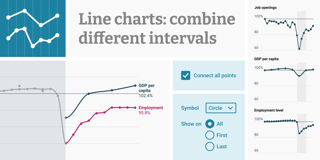
Value labels in line charts were one of the most requested features from users — but very challenging. We had to develop an algorithm to show as many labels as desired, but avoid overlaps with other labels and annotations.
Luc, vis developer

We knew that if we managed to really get it right, it could be another marker for the kind of quality and attention to detail and "magic" we strive to offer.
Elana, co-CEO and head of vis development
And more!
We couldn't even fit all of 2024's new features into one post. Here's just a few more of the things we added this year:
- An easier, faster, and more flexible editing experience in line charts
- Two-factor-authentication for Datawrapper accounts
- A better way to control the height of your charts that especially improves the mobile experience of Datawrapper visualizations
- A new trash where deleted visualizations are stored for 30 days
- Stacked color legends in all visualization types, heatmaps for text columns in tables, and inset maps and globes for all map types
It's not just our designers and developers — you all shape Datawrapper, too. Thanks to everyone who created data visualizations with Datawrapper in 2024, gave us feedback, and let us know about features they wanted to see! Datawrapper would not be the same without you. Keep writing to us: support@datawrapper.de.
To be the first to know about Datawrapper feature launches, sign up to our feature updates newsletter. We're looking forward to a new year with even more new features in 2025.


