Fix my chart » Simple data
Welcome back to Fix My Chart, an advice column for all your data visualization questions. We look at real charts, maps, and tables, and figure out how to solve their problems together. Does your chart need a tune-up? Write in here!
Hi Rose,
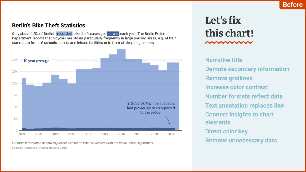
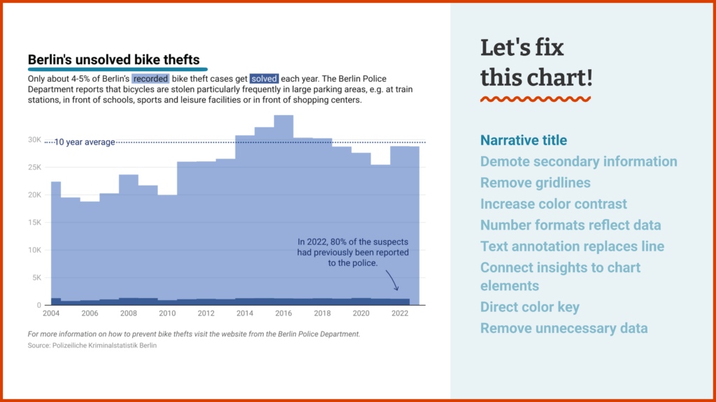
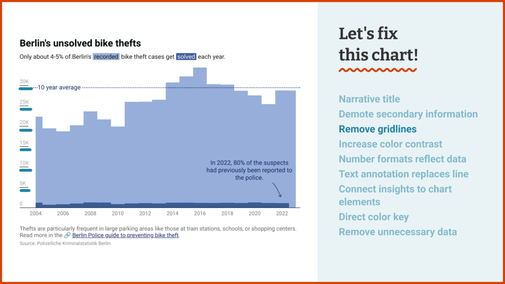
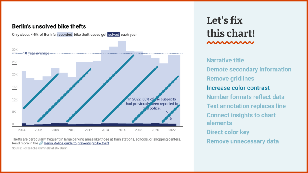
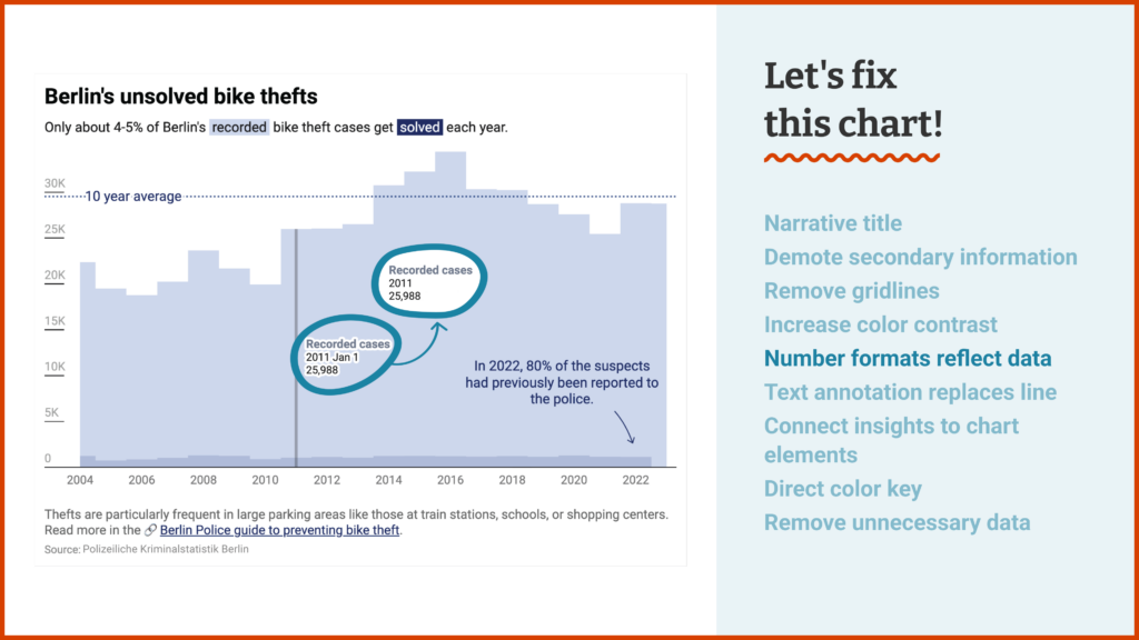
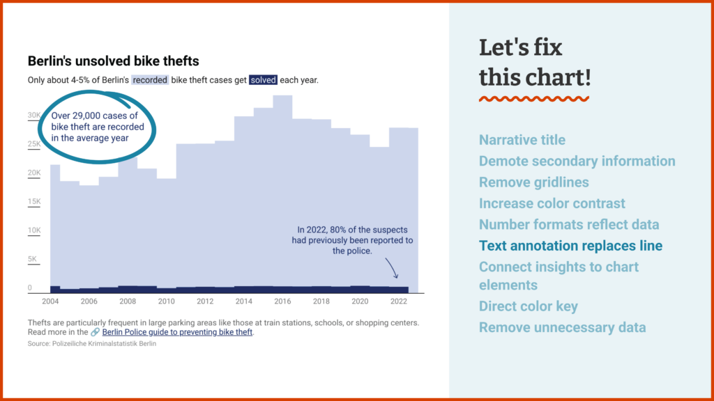
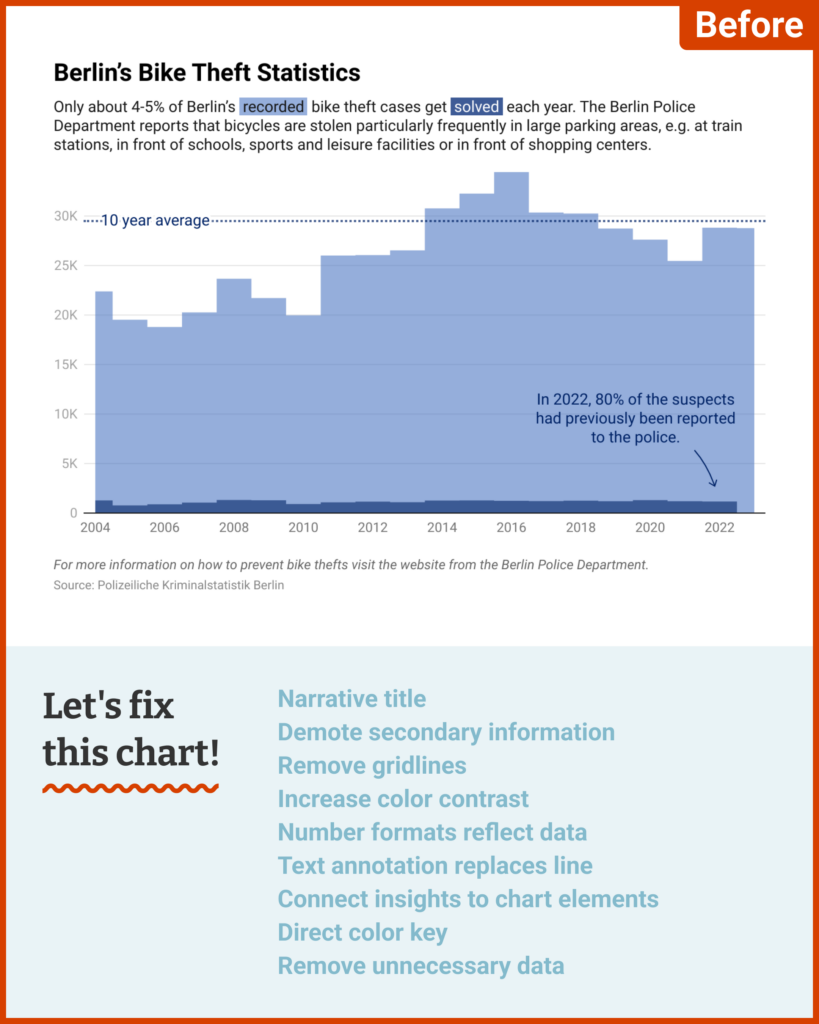
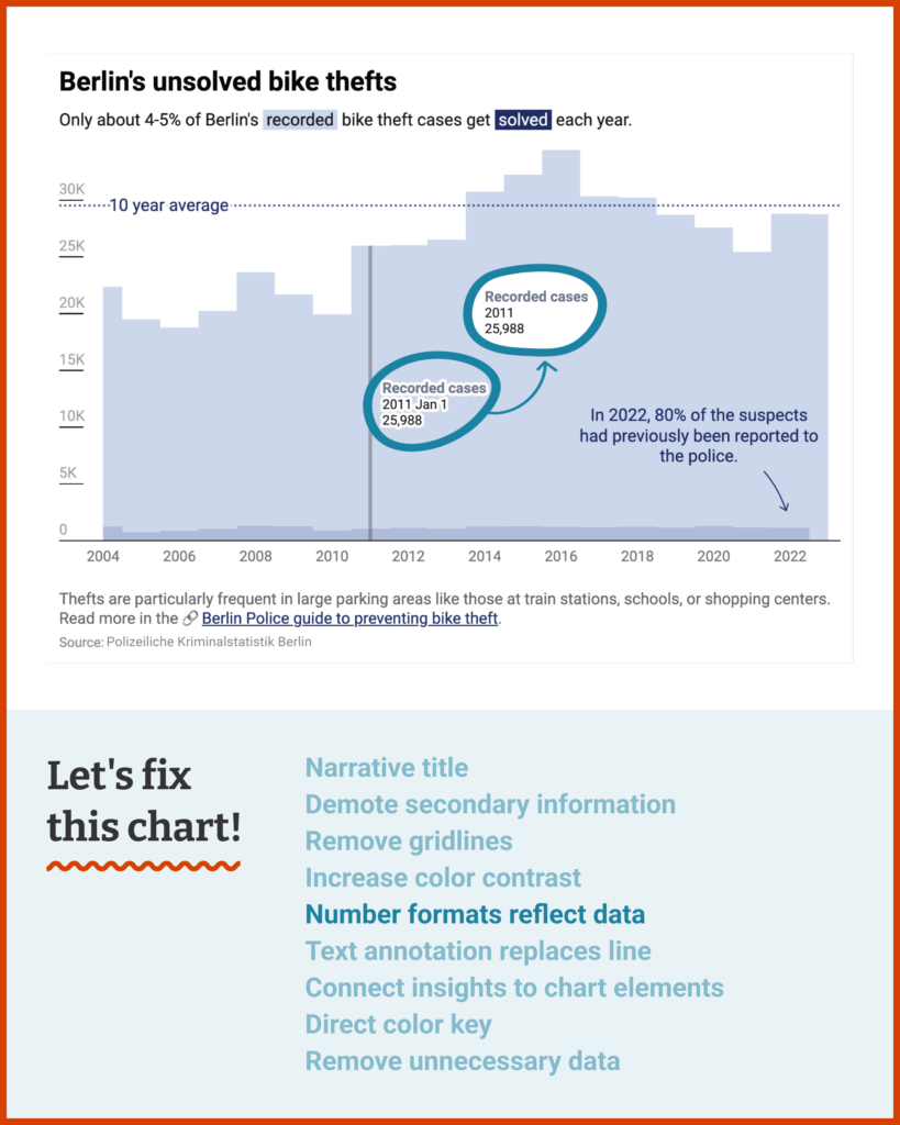
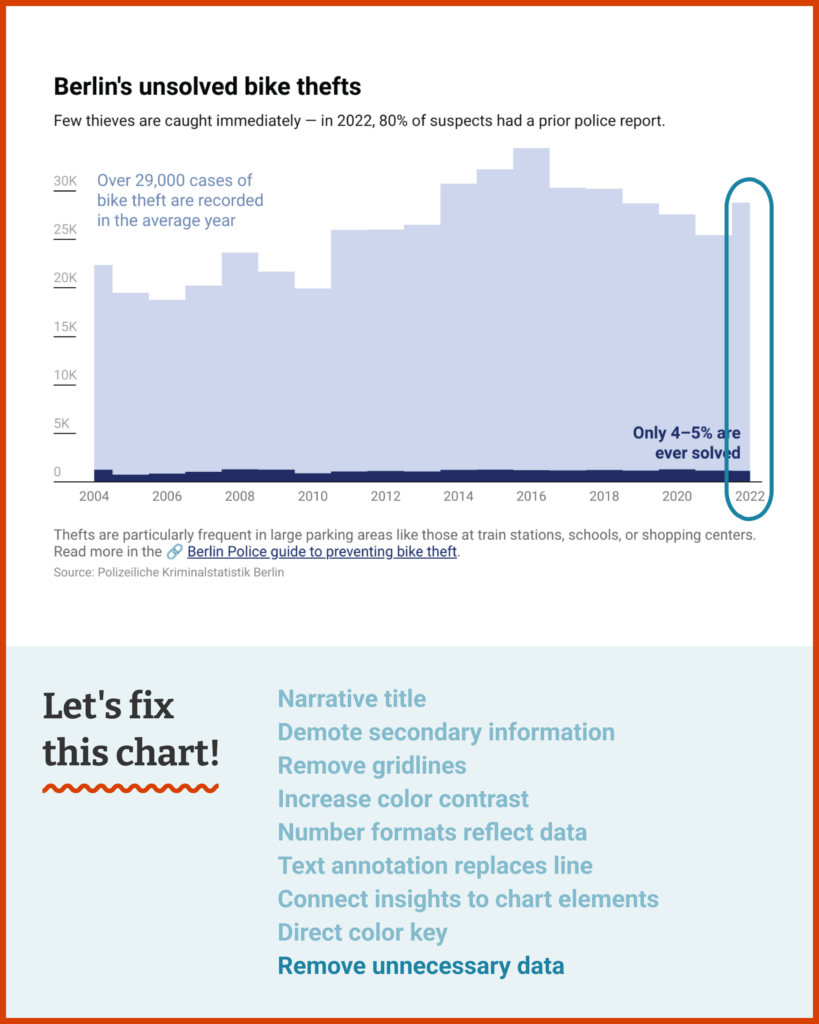
As I was recently affected by a bike theft, I wondered how many of those cases actually get solved in Berlin over the years. I found that the Berlin police have official crime statistics in their yearly short reports.
I aggregated a few years from their statistics, but couldn’t find a way to visualize this huge gap between reported and solved cases beautifully. Maybe you have an idea how to fix that?
A.
Dear A.,
Some data sets are a bit shy — they won't just come out and say clearly what they mean. In those cases, the job of the visualization is to add explanations, add context, add statistical measures, and generally squeeze and shape the data until a clear interpretation emerges.
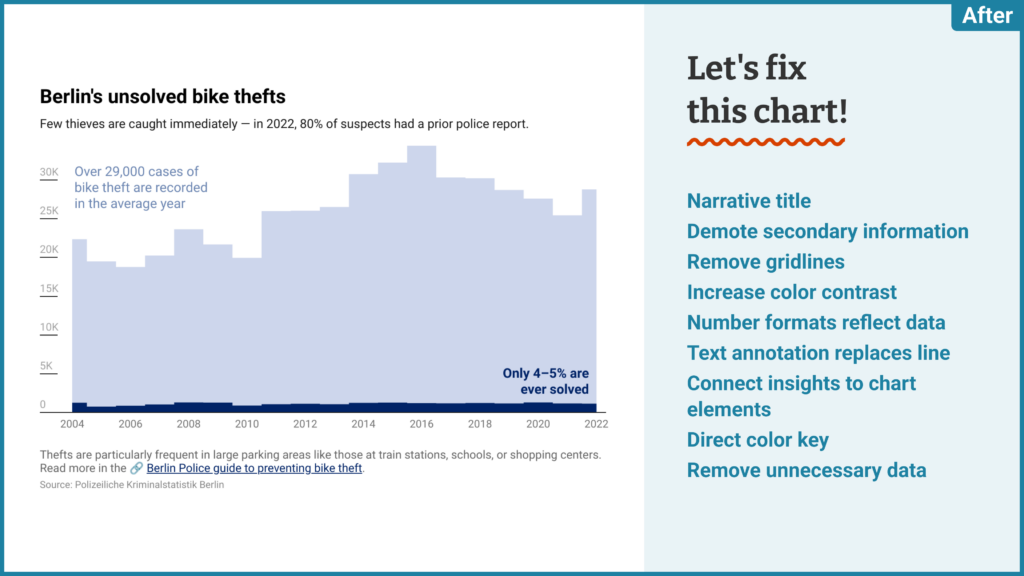
But this data set isn't shy at all. As you say, the gap between reported and solved cases is incredibly stark! All we need is to let that simplicity shine through:
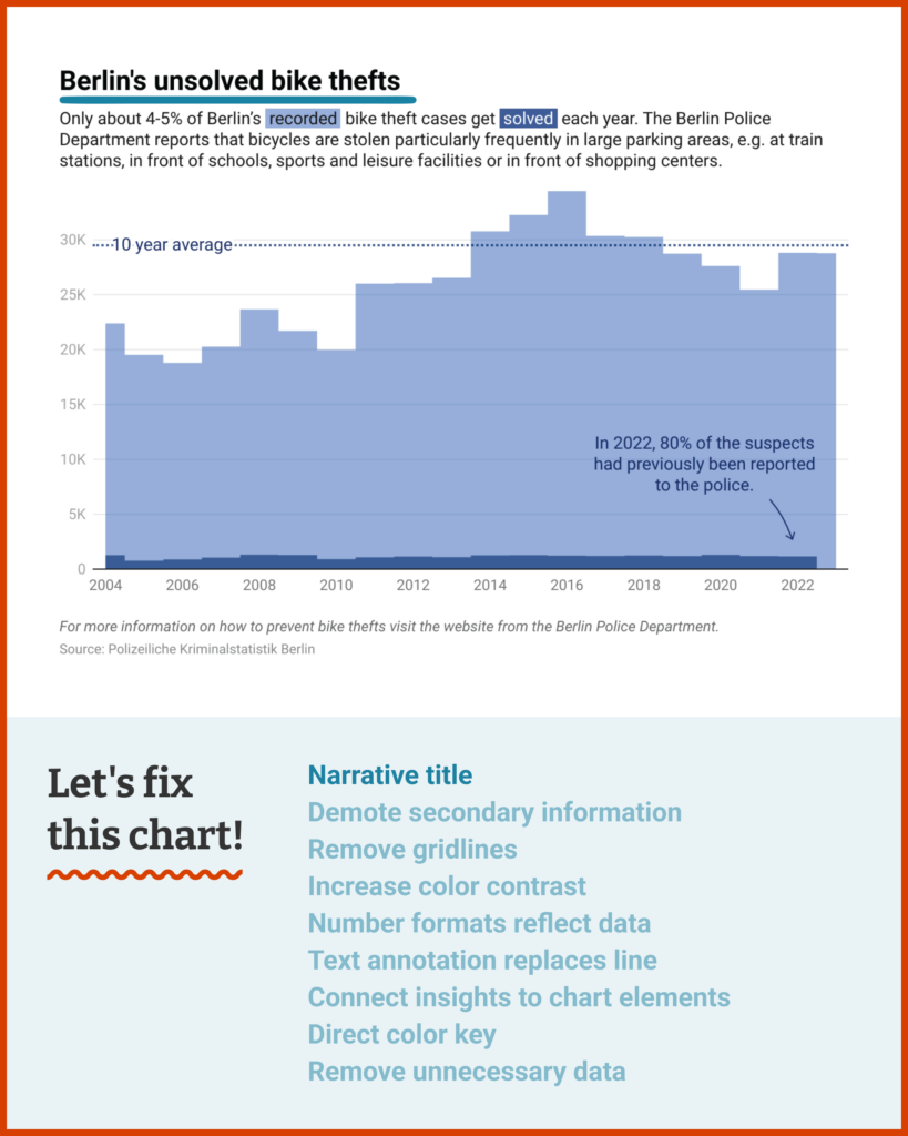
A few simple changes will let your data speak for itself:
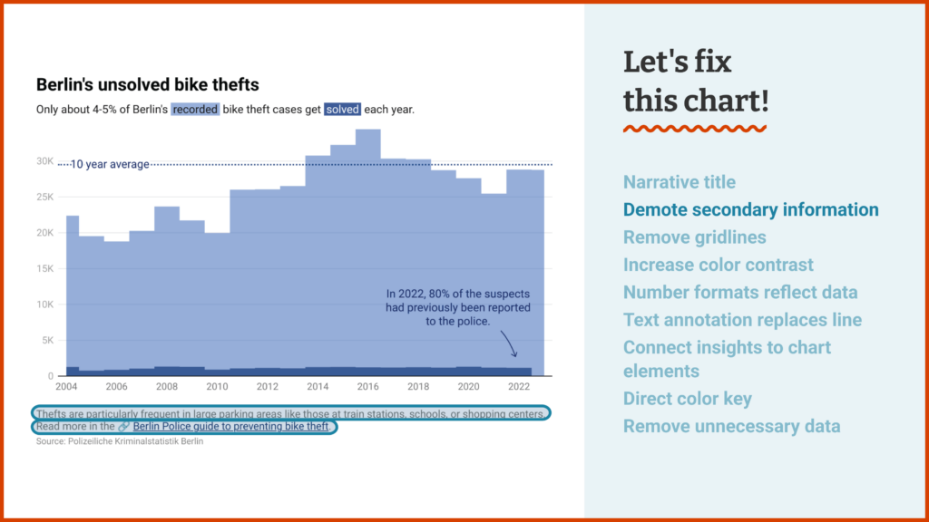
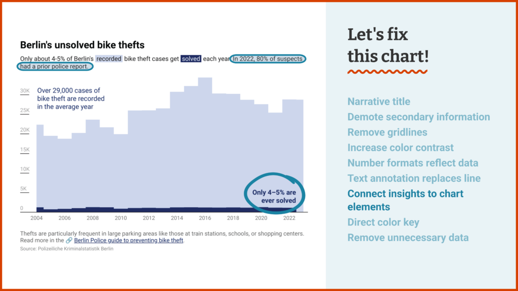
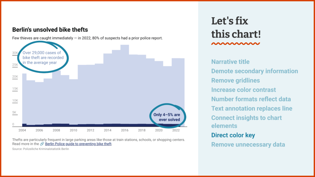
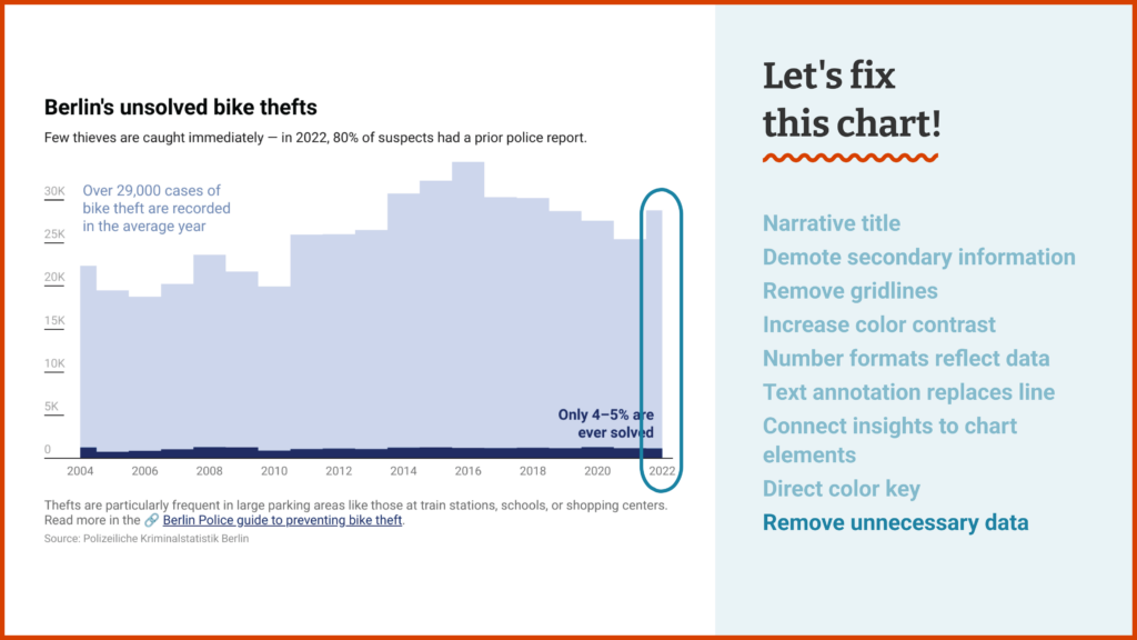
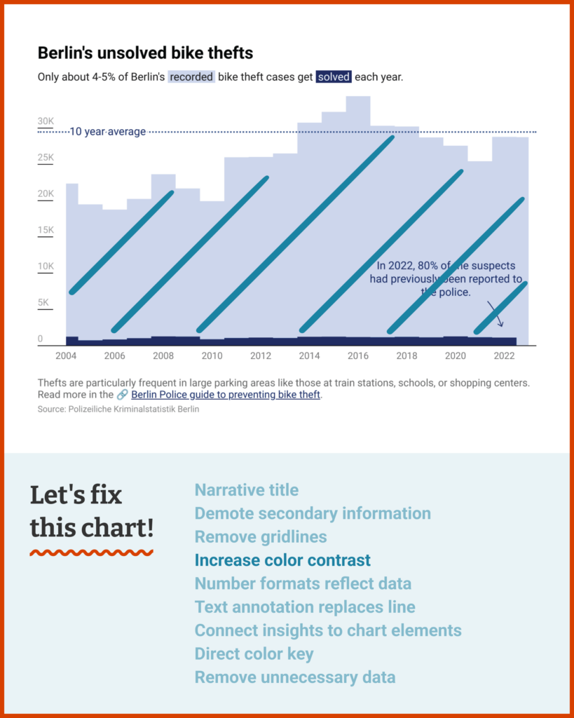
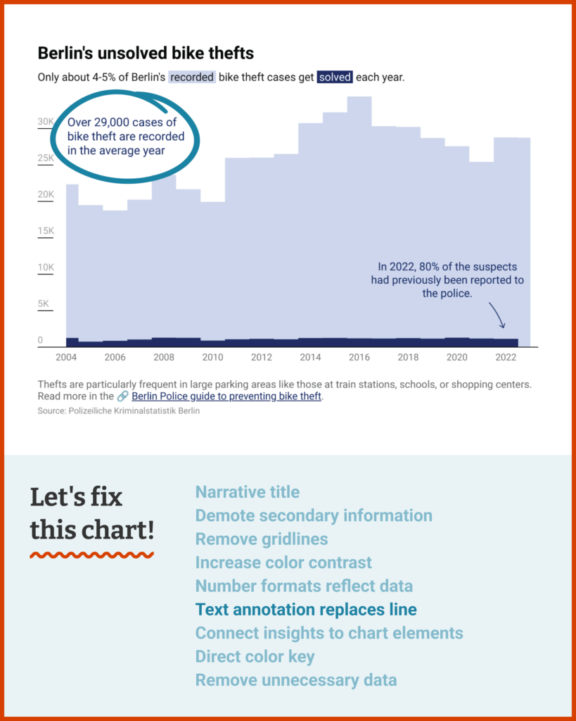
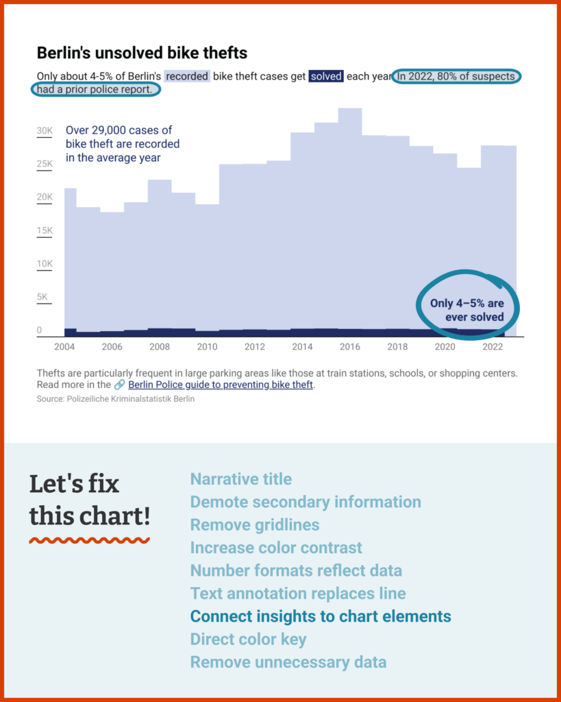
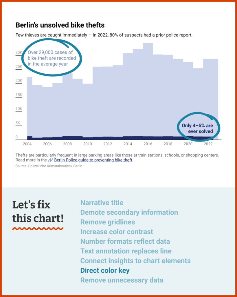
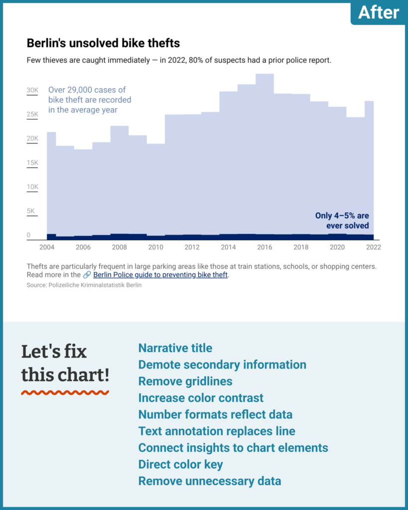
- You can draw a distinction between restatements of the core data (like the fact that only 5% of thefts get solved) and information that you're adding on to the data (like the fact that 80% of suspects had a prior report). Most of time "restatements" should be more closely connected to the chart itself — for example, as annotations.
- To that end, let's use text annotations to create a direct color key explaining what the chart's two areas represent — and emphasizing the difference between them.
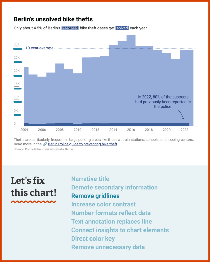
- Other information can be moved further away — either to the subtitle, if we still want it to influence how readers interpret the chart, or all the way to the footnote, if it can wait until later.
- Finally, we can literally increase the contrast by adjusting the color palette and minimizing "noisy" elements like the chart grid.
Here’s where that got me! You can see under the hood in your own Datawrapper account by hovering over this chart's top right corner and clicking “Edit this chart.”
Til next time,
Rose
My mailbox is open for your letters with questions, struggles, and every kind of data vis consultation. I’m looking forward to hearing from you!




Comments