Fix my chart » Using text elements

Welcome back to Fix My Chart, an advice column for all your data visualization questions. We look at real charts, maps, and tables, and figure out how to solve their problems together. Does your chart need a tune-up? Write in here!
Dear Rose,
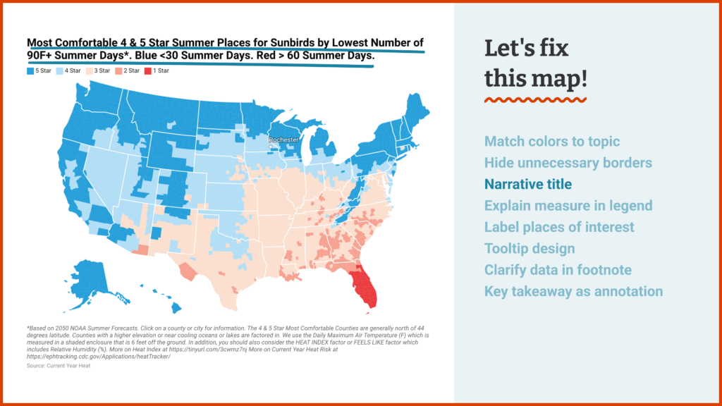
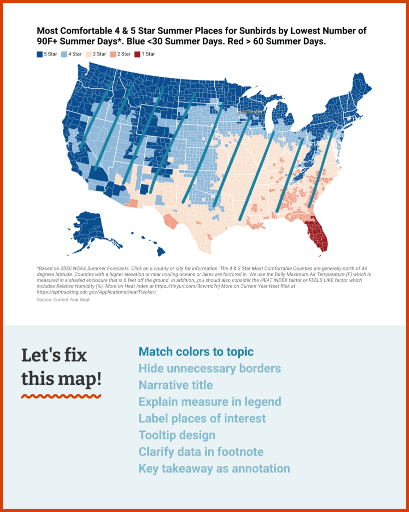
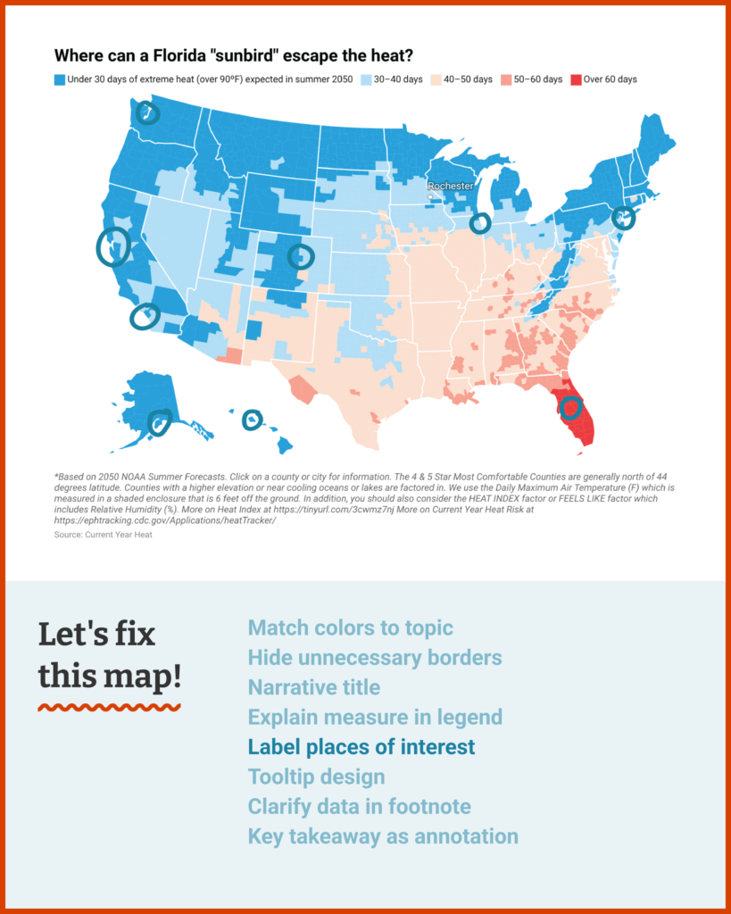
Here’s some data viz about USA Goldilocks counties in a “hot” summer in this era of dramatic climate change and ever rising temperatures. The data looks at 3144 USA counties in terms of the number of 90F degree days projected in 2050.
I am looking at Summer Havens because it is too hot in Winter Haven, Florida in the Summer. I will become a Summer Haven sunbird and fly north in the Summer. This is the opposite of snowbirds from Canada and the Northern USA who head south in the winter for warmer temperatures.
I am a Datawrapper newbie. This is my first map.
I would sincerely appreciate it if you could comment on the map and critique it for areas to improve.
Kind Regards,
George
Dear George,
What I love about this map is its crystal-clear purpose and perspective. You collected this data to answer a concrete question that personally interests you: Where can you travel in the summer to escape the heat in your hometown? That clarity is the foundation of a beautiful data visualization. Adding a few finishing touches will be a breeze:
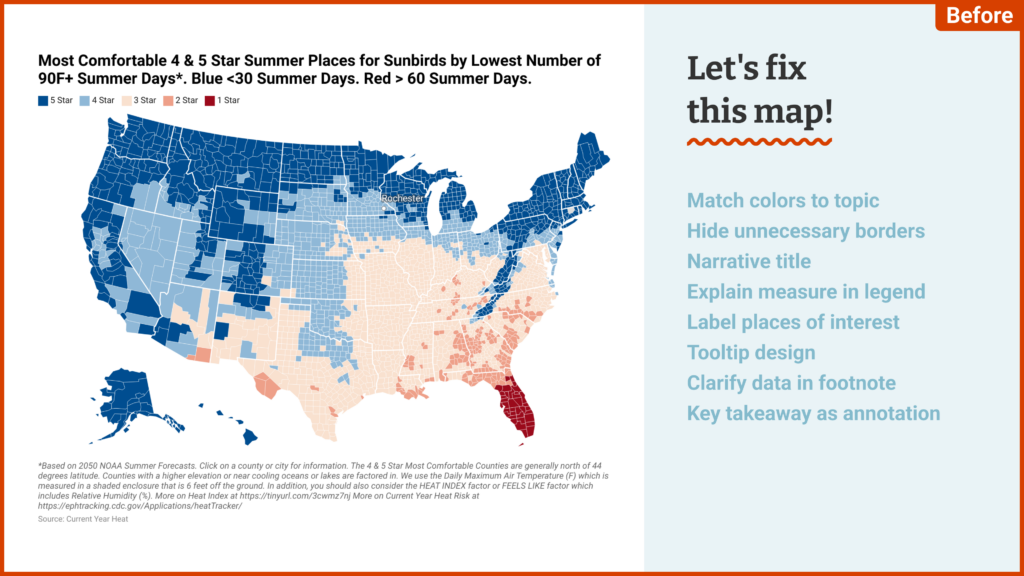
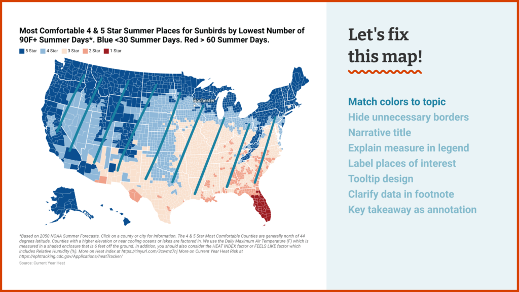
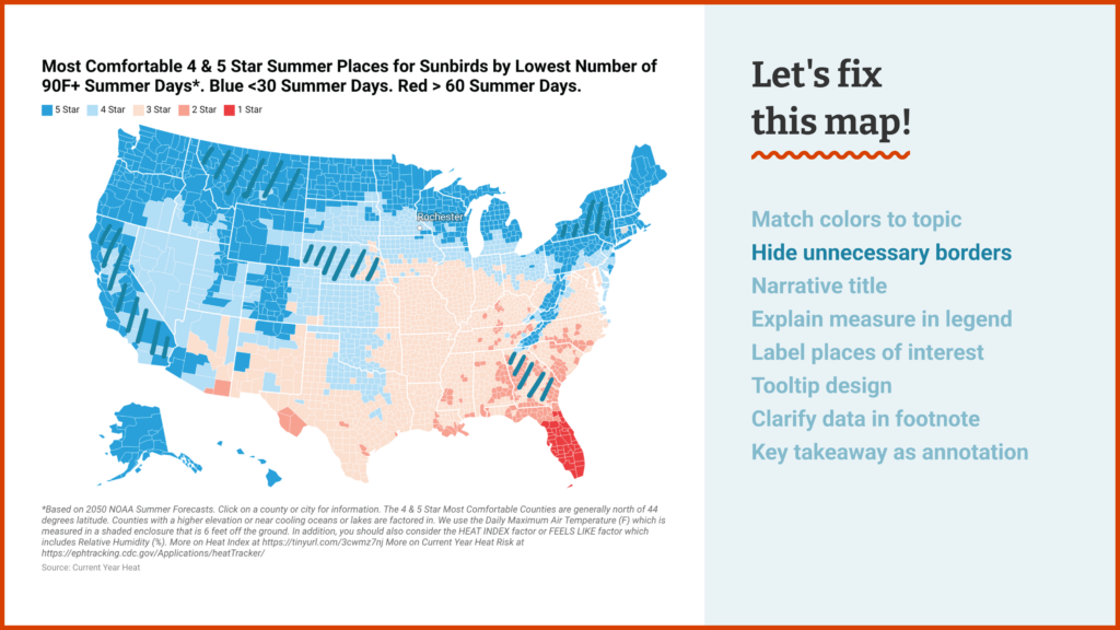
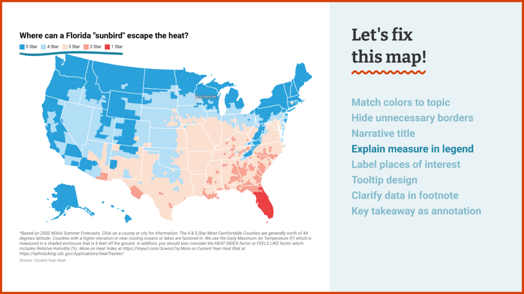
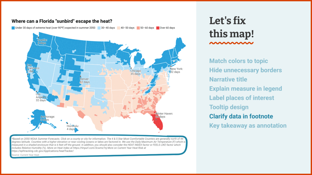
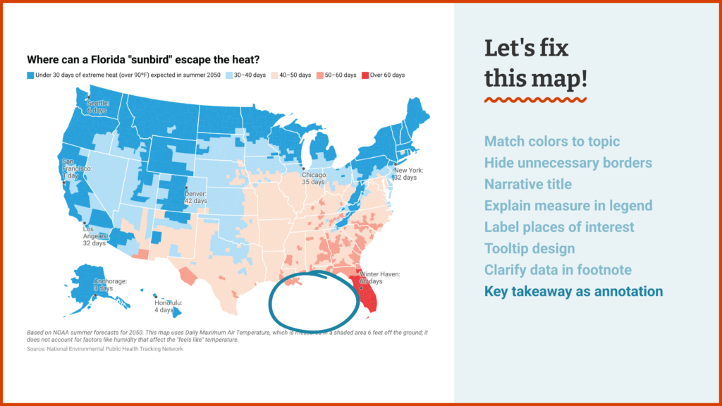
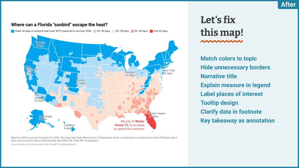
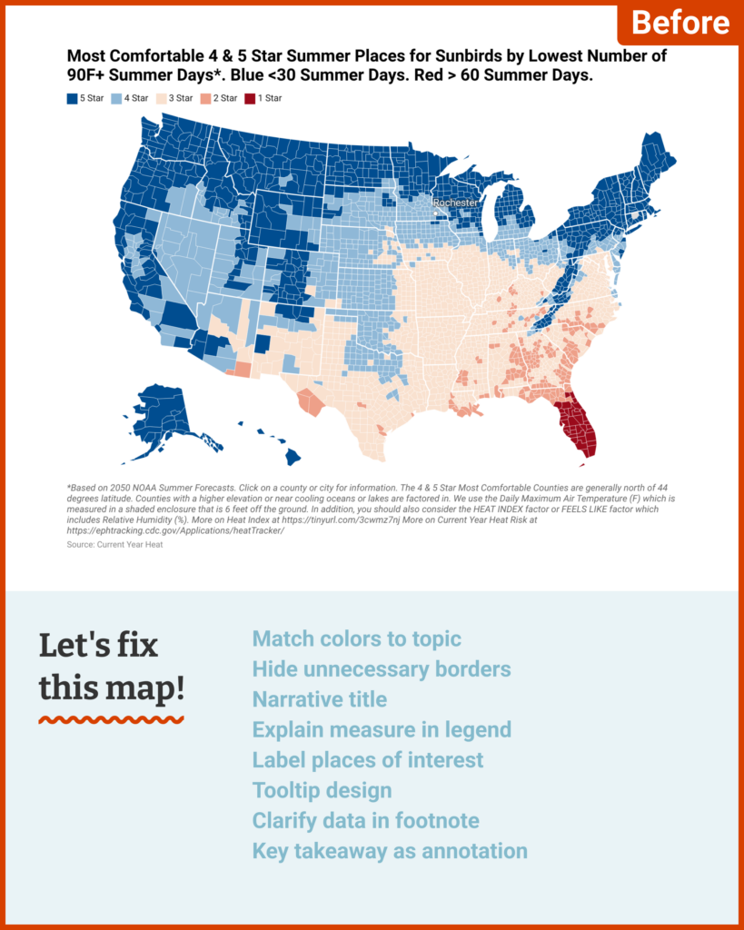
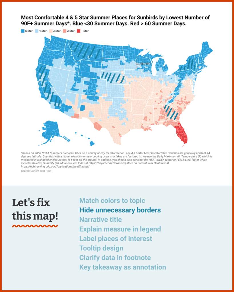
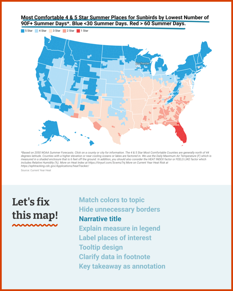
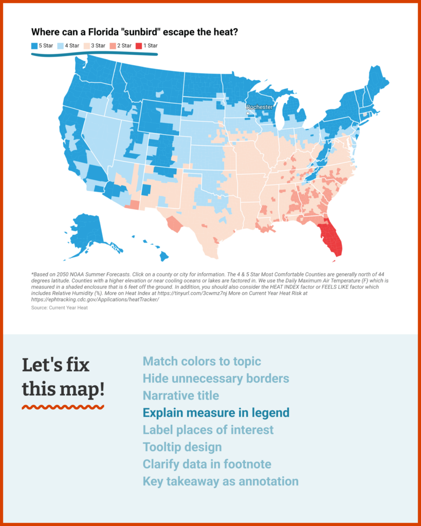
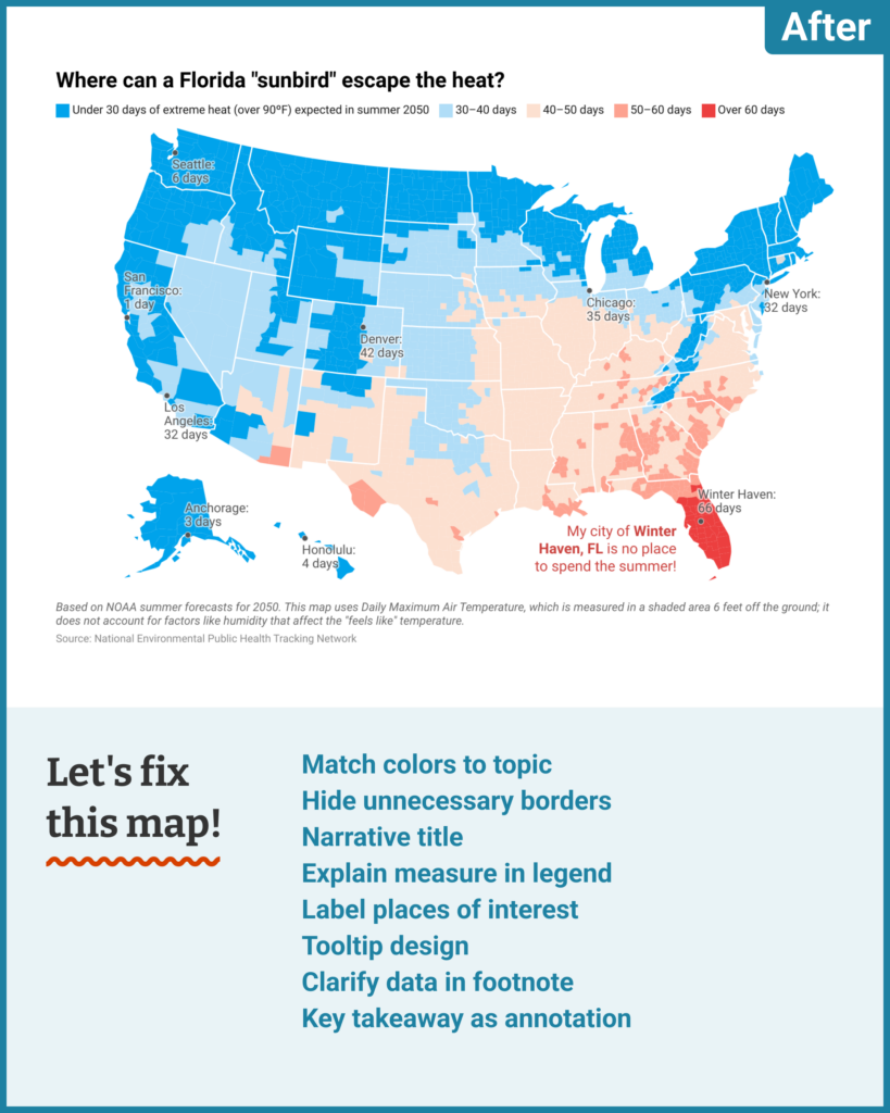
There are three main text elements in this map: the title, the color key, and the footnote. Let’s think strategically about how to divide the work of communication between them:
- This map was created to answer a compelling practical question — the title is the perfect place to spell it out.
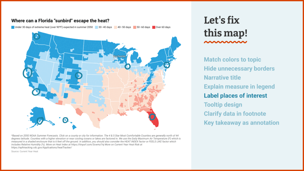
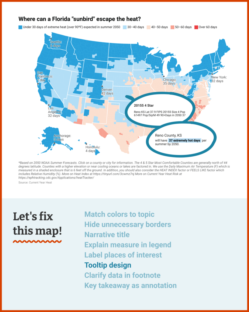
- The measure you’ve chosen to visualize for each county is the number of hot summer days predicted for 2050. Let’s cut out the star rating system and explain that measure directly in your color key — that’s one less layer of abstraction for readers to deal with.
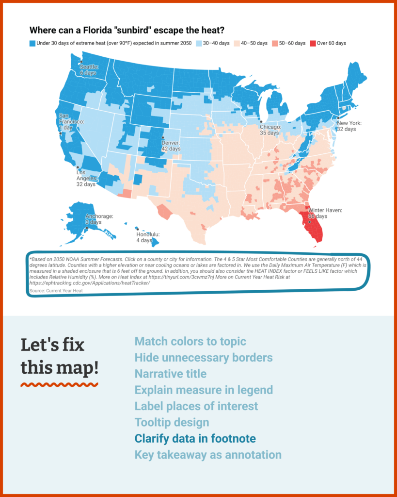
- Any complex prediction will hide some assumptions and inputs. Transparency is important, which is why it’s great that you already link to the source of your data. That means we can cut the footnote down to the basics of what’s necessary to understand the map in front of us.
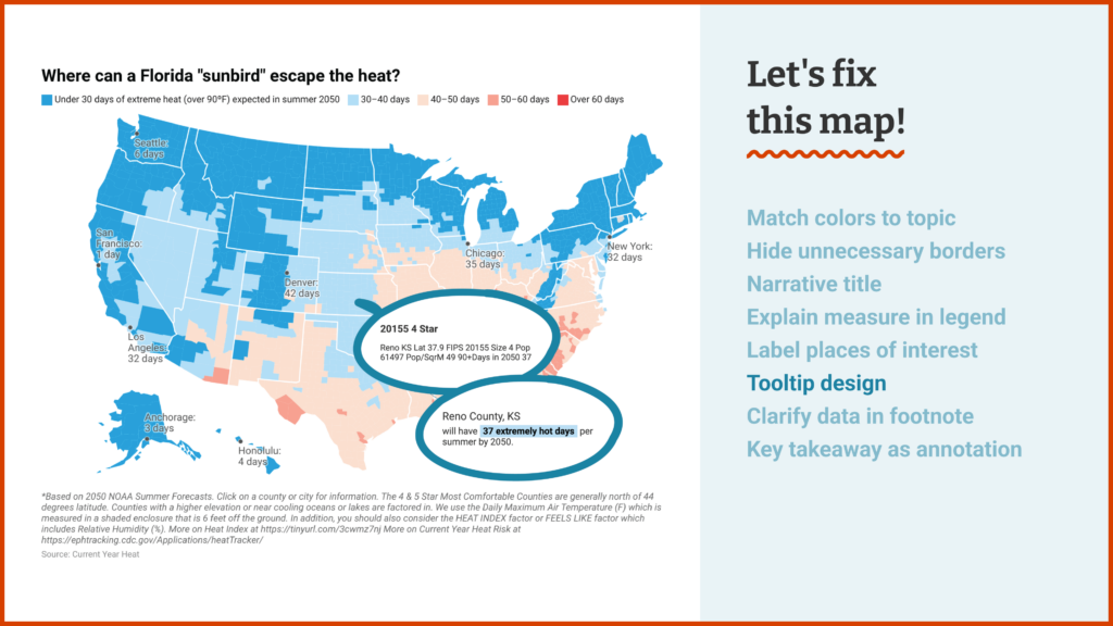
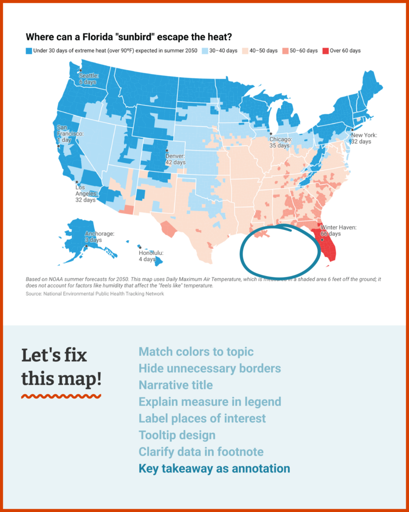
- Bonus text: We can add an annotation to help orient readers to your perspective, and city labels to point them towards potential solutions to your question.
Here's what I'd suggest! Readers joining us, you can hover over the top right corner and click “Edit this chart” to see this version in your own Datawrapper account.
Til next time,
Rose
My mailbox is open for your letters with questions, struggles, and every kind of data vis consultation. I’m looking forward to hearing from you!


Comments